Step inside this retro-inspired Scandi-style house in Leicestershire
Building a house was never this family's intention, but this Scandi-style house is a beautiful example of what can be achieved with a little creative vision

After inheriting some money, this couple thought that a small property development project seemed like a good investment idea. The idea was to renovate, sell, and hopefully make a small profit. They never expected the project that they took on in the end though - building a house on the site of a Fifties bungalow in Leicestershire that they bought at auction. 'I was a bit blinkered by the ugliness of the house itself, but my husband saw the lovely views and the big oak tree in the back garden and we started to imagine a very different house,' says one of the owners.
The couple came up with a plan to strip the property back to just three original walls, and reroof to make space for rooms in the eaves. They also wanted to increase the natural light that was available inside the 'dingy' interior, so they moved the front entrance to the side of the building. This allowed them to create a double-height hallway which the other rooms flowed from.
In terms of style, the couple were quite clear on what they liked: 'I would describe our style as eclectic with a Scandi slant...and a bit utilitarian.' With that in mind, they decided upon a simple palette of white, grey and oak (or other natural woods), with a couple of additional pops of colour. This would act as the ideal backdrop for their collection of mid-century modern furniture.
1/15 A minimalist approach
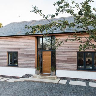
'I love the clean lines and good craftsmanship of Scandinavian design, so I tried to incorporate it into our home,' says the owner, Rhiannon Payne, who runs her own interior design business called My Designer Friend. This began with the property's exterior, which was clad in larch timber - a move that instantly gave it a distinctive Scandinavian feel. With time, the larch cladding has already begun to silver giving 'the house a beautiful softness.'
2/15 Entrance hall
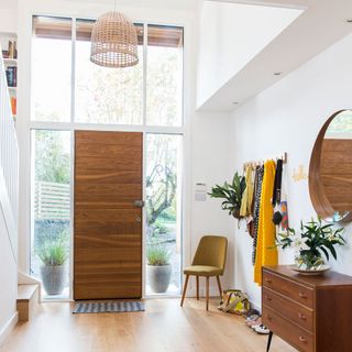
The couple created the double-height hallway as part of the bungalow redesign, and it certainly plays its part setting the tone for the whole house.
The wood-panelled front door is set in a grid of tall windows, which reach almost all the way to the ceiling, letting in natural light as well as views of the garden beyond. This enhances the sense of nature brought indoors and the choices of natural materials and tones - from the solid timber floor and retro dresser to the woven pendant shade and tactile upholstery.
Similar Ladderax chest
Ebay
Round mirror
Ikea
Get the Ideal Home Newsletter
Sign up to our newsletter for style and decor inspiration, house makeovers, project advice and more.
3/15 Hallway storage
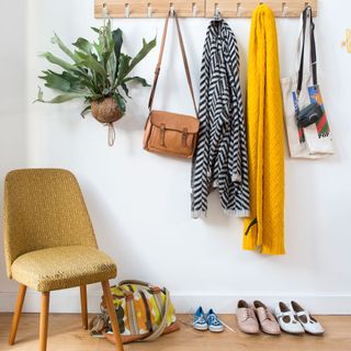
As well as a storage recess (ideal for books and personal trinkets) at the bottom of the stairs, the couple added neat storage for coats, bags and accessories in the hallway.
Two peg rails were attached to a long wall for extra coat hanging space. And there's even room for a retro hanging plant, too, to emphasise that natural feeling in the space!
Similar coat hooks
Umbra
Similar chair
Habitat
Similar hanging plant
Grace and Glory
4/15 Open-plan kitchen diner
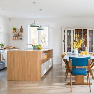
One of the things on the couple's wish list was a beautiful open-plan kitchen, living and dining space. 'I wanted a light-filled space that would make the most of the views across the open fields, and where we could spend the majority of our time when we're home,' says the owner.
They decided to paint all the walls white in this space, and throughout the rest of the house. This means that the other materials and pieces really shine - from the colourful retro dining chairs to the warm wooden surfaces. 'It lets me add character with artwork, accessories and furniture.'
Similar dresser
La Maison Chic
Similar table
Matt Antrobus
5/15 Kitchen island
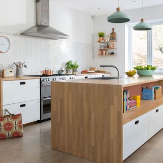
'The kitchen appears much more expensive than it was,' say the owners, who chose the base units from Ikea's basic range. They personalised the finish by having bespoke Formica-face birch ply doors made to give it a luxurious feel.
This elevating of basic materials can be seen elsewhere in the kitchen. The herringbone tiling is a prime example of how to boost a plain metro tile and make a feature of it.
Kitchen base units
Ikea
Drawer fascias
Matt Antrobus
Similar tiles
Topps Tiles
6/10 Kitchen shelving display
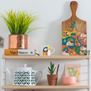
String shelving has become a design classic, and fits perfectly in this home with its collection of mid-century modern pieces. The kitchen units have plenty of storage space, so this little shelving unit brings together a display of personal favourites that add character to an otherwise blank white wall. 'I like things to be useful and look good, too,' says the owner.
Similar string shelving
Utility Design
Teapot
Scandinavian Design Centre
7/12 Dining area
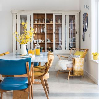
Design decisions were made as the couple went along with the renovation and decoration of the house. One example was the huge glazed dresser in the kitchen, which dominates the space - 'we lost a window to have wall space for it, but it stops the room looking too functional,' they say.
A modern farmhouse classic, the dresser works with the clean decor throughout the space: 'It's the perfect complement to Scandi design; no frills, no fuss, no flounces.' Punches of colour come from soft furnishings and the fresh teal and mustard pieces that bring this home to life.
Similar dresser
Bedsite
Similar chair
Heal's
Similar throw
Clare Loves
8/15 Living room corner
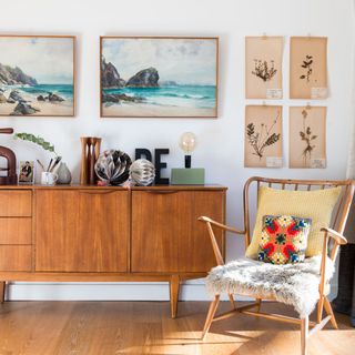
The owners always keep their eyes peeled for vintage finds, and have a knack for arranging these together to create a space that's original and also welcoming. 'The original Ercol armchair came from a charity shop, I found the tapestry cushion in Sweden and a neighbour gave me the framed pictures.' Combined, they make for a cosy corner with a clear mid-century modern style.
Similar chair
Lee Longlands
Similar dresser
West Elm
9/15 Snug
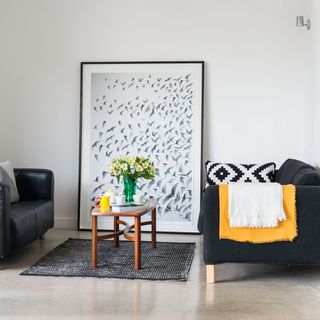
The snug in the open-plan area features a mix of styles. 'I love mid-century furniture, but I don't want a space that looks the same as everyone else's,' says the owner. 'So I mix design classics and eBay finds with good-quality high street buys.'
A large framed black-and-white print, which reflects the patterned soft furnishings in the snug area, makes a striking focal point in this space. Rather than hanging it on the wall, the couple chose to place it on the floor and lean it against the wall - this means that it can be switched with other pieces in the house, so the decor never feels tired.
Similar sofa
Ikea
Similar coffee table
The Old Cinema
10/15 Bedroom
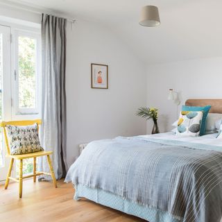
The simplicity of Scandi schemes can make them look stark, so this couple used layers of luxurious materials to offset the cool effect of the pale walls and understated furniture.
The calming effect still remains, due to the streamlined furniture. Clutter is kept to a minimum - hanging bedside lights on the walls, rather than sitting them on bedside tables or on the floor, emphasises that sense of spaciousness and lightness.
Similar bed
Made
Cushions
John Lewis
Similar bedside lamps
Lighting Superstore
11/15 En-suite bathroom
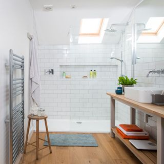
In the couple's en suite, oak floorboards and a freestanding oak-topped vanity unit keep the look fresh, rather than clinical. High gloss surfaces - from the floor-to-ceiling tiling in the shower to the oversized mirrors and clear glass shower panel - give this bathroom a bright and energising atmosphere. What better way to start the day?
Similar vanity unit
Oak Furniture Solutions
12/15 Bedroom sitting area
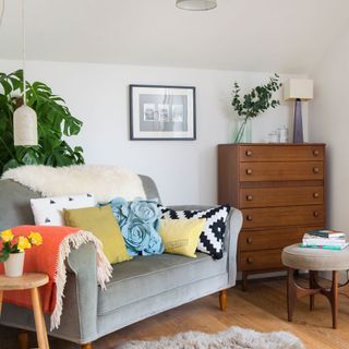
A corner of the bedroom has been converted into a cosy snug for reading. Featuring a sofa that's piled with cushions and a sheepskin throw, and a concrete pendant light that the couple made themselves, gives this private lounging area a modern luxe look worthy of a boutique hotel!
Similar sofa
Loaf
Similar chest of drawers
Rose and Grey
13/15 Guest bedroom
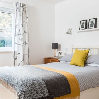
In the guest room, pattern rather than furniture has been used to add character to the space. Sticking to a monochrome palette in this small room helps a mix of geometric, striped and nature-inspired patterns work together. Pops of yellow add warmth to the otherwise cool scheme and emphasise the Scandi theme.
A picture ledge is a simple place to display art work and accents. 'They're great for the indecisive,' say the owners. 'We regularly move the prints around to refresh a room.'
Picture ledge and bed linen
Ikea
Similar bed
John Lewis
14/15 Dressing area
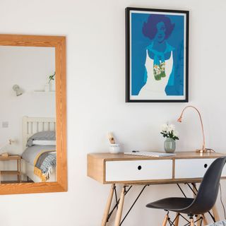
Scandi-inspired furniture and colour palettes are simple enough to let a flamboyant picture - such as this vibrant blue design hung over a dressing table in the guest room - steal the show. A copper lamp adds a warm glow and gives the mid-century-style table a modern update.
Similar print
Art.co.uk
Similar table
Habitat
Similar lamp
Ikea
15/15 Children’s room
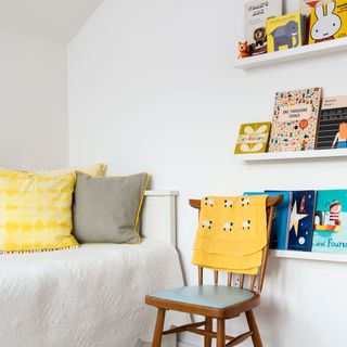
The simple palette of white and neutrals with a pop of colour works beautifully in a children's room too. Picture ledges make a perfect storage spot for bedtime reading - which also adds instant colour and imagery to the neat little bedroom.
'Don't rush to finish a space,' say the owners. 'We always feel like this house is a work in progress and see change as part of the process of creating a great home.'
Similar bedspread
Marquis & Dawe
Picture ledges
Ikea
This house tour originally appeared in Ideal Home, February 2017

Heather Young has been Ideal Home’s Editor since late 2020, and Editor-In-Chief since 2023. She is an interiors journalist and editor who’s been working for some of the UK’s leading interiors magazines for over 20 years, both in-house and as a freelancer.
-
 5 decluttering trends to try in 2025 – these are the trends taking off on social media at the moment
The experts share their top tips for getting on top of clutter this year
By Ellis Cochrane
-
 ‘We decorated by using colour to influence how we feel in each space.'
Check out this luxurious, well- thought-out family home, packed with stunning design features and striking artwork
By Marisha Taylor
-
 How to care for Fiddle Leaf Fig to make the most of this swoon-worthy statement plant
It brings a tropical flair to any interior scheme
By Holly Reaney