Want to feel productive? These are the colours for you!
Super efficiency and high levels of productivity are something we all want, but quite often find challenging to achieve
Could the right colours in your home change your life?
Alexandra Arens, co-founder at interiors brand Claribel, shares her thoughts on which colours will help you feel productive, and why they chose the colours in their upcoming summer collection.
Work environments, regardless of what that physical space may be, are full of distractions. These interruptions come in the shape of noise outside your window, a chat with colleagues, constant phone notifications or even a coffee break.
Regardless of what the cause of the disruption may be, it is not uncommon to find yourself easily side-tracked. Whether at home or in the workplace, many of us want to be the most productive version of ourselves, but often ignore the subtleties in our environment influencing everything we do.

According to the latest international comparisons published by the Office of National Statistics, the average European worker produces more in four days than a British equivalent does in five. The United Kingdom’s below-par productivity performance is alarming and needs to change – but how?
While I don’t claim to have the answers to the UK’s productivity problems, I believe that a person’s level of productivity begins at home – and I do know a thing or two about this. Getting this space right and geared in the direction you need it is the first step in improving not only your efficiency, but also your mood. Everything around you contributes to motivation levels and this ultimately impacts your overall output.
After much reading on the subject, as well as my own experience, I wanted to tell you about three colours I suggest introducing to your home that are not only on trend, but are certain to boost your productivity.
Sign up to our newsletter for style inspiration, real homes, project and garden advice and shopping know-how
White

For the purposes of this guide I will obviate the fact that these days white is 'given' many names, and comes in a range of nuanced shades. To clarify: I am talking about a neutral white; any shade of “white” that is not too yellow, not too grey, and not too blue.
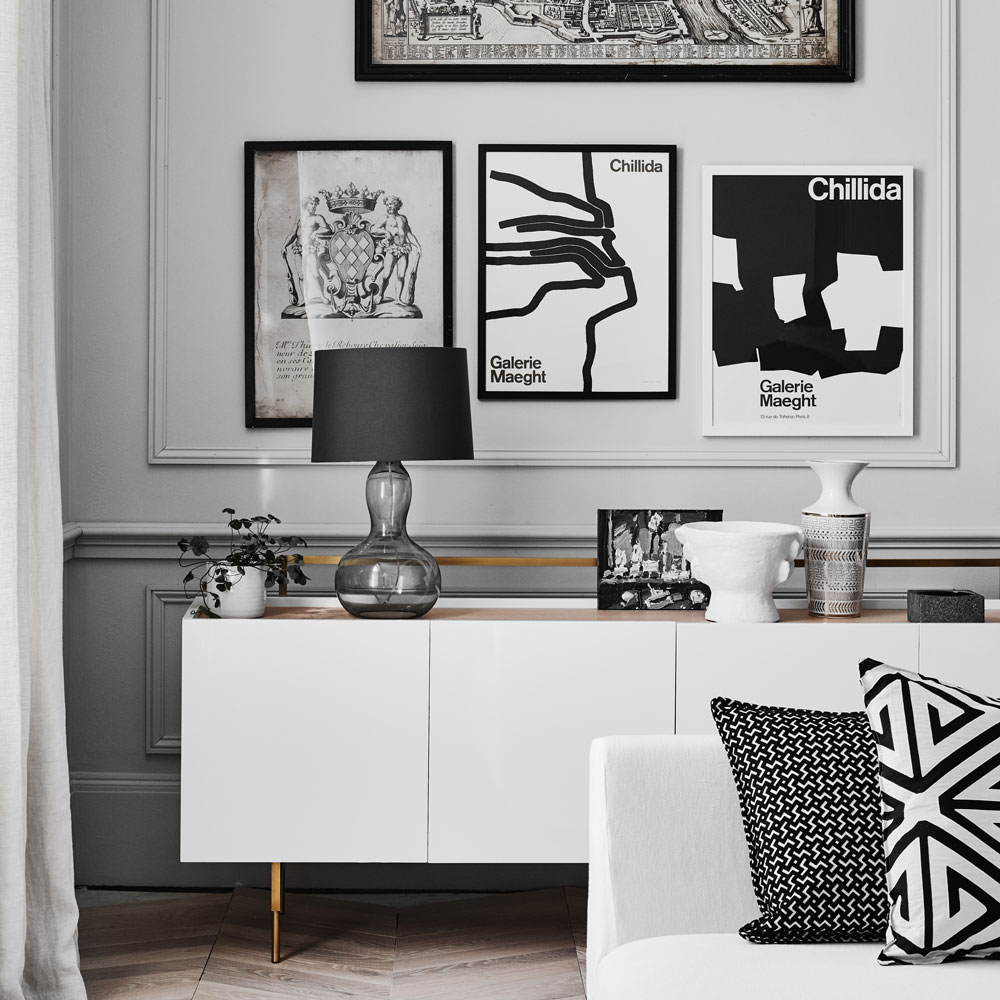
White is often used as a ‘safe’ base colour for our homes; it used to be many people’s 'go-to' palette for the start of their interior styling and colour schemes. Over time this changed and prints and dark colours became the trend. Recently the Scandi trends in home decor have happily led us back to the beauty of White. Think of it as the perfect backdrop for the main event, and the best foundation to build upon; much like the start of your day. Increasing whites and ivories and other similar neutral colours in the home are essential to productivity levels; the neutrality has a soothing effect, and a space of peace and tranquillity is created as well.
Related: The best white paint – how to choose the right shade for your walls
One of the benefits of a white base is that you can add any accent that suits your personality and mood. Whether it is neutral cushions, trays, candles, or picture frames these can be mixed and matched with the prints and colours of your choice. Having a great deal of white gives you the possibility of bringing in many things to increase the vibrancy of your space. It is a good colour for light reflection, brightening any room the moment the sun comes out. Furthermore, white is a colour in and of itself; while it is often used as a base, it should definitely be thought of as a colour for accent pieces. The white-on-white trend has become increasingly popular both because of the clean look it offers, as much as the effect it has on the mind. Among other benefits, once you have white as a central colour – clutter cannot escape your view, and the fact that it’s highlighted encourages you to take care of it.
A light background is minimalistic. It leads to a fresh thinking cap, and will encourage you to think further about the decisions and tasks of the day.
Gold

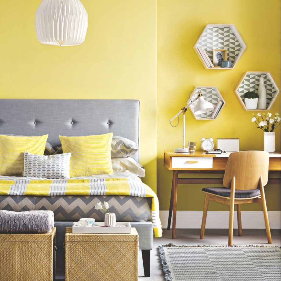
Gold is a power colour – it yells confidence and achievement. It brings character and elegance when used correctly. Furthermore, I have found that for a person’s productivity, it does wonders. Gold accents also have this influence because of their yellow undertones. The colour yellow is typically associated with emotions, which in turn explains why it has such a moving effect when used as an accent in your home.
Gold is often associated with boldness, sophistication, and wealth, and tends to have this influence on individuals who decorate with, and use it in their homes. Few hues bring out the freshness of a space more than golden accent. Cushions with gold foil prints, throws, tableware, wall decor with a gold finish can work wonders and give your space the desired Midas motivational touch for increased productivity.
A note of caution though: garish decor is not what you should be going for. You may want to stop before painting a wall entirely in gold (although done right it can look fantastic) as it could be too concentrated and thus distracting; start by using this colour as an accent and see how it makes you feel.
Turquoise

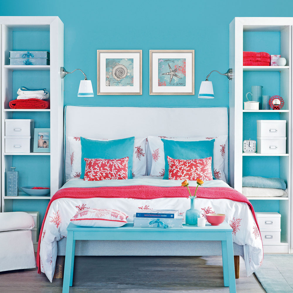
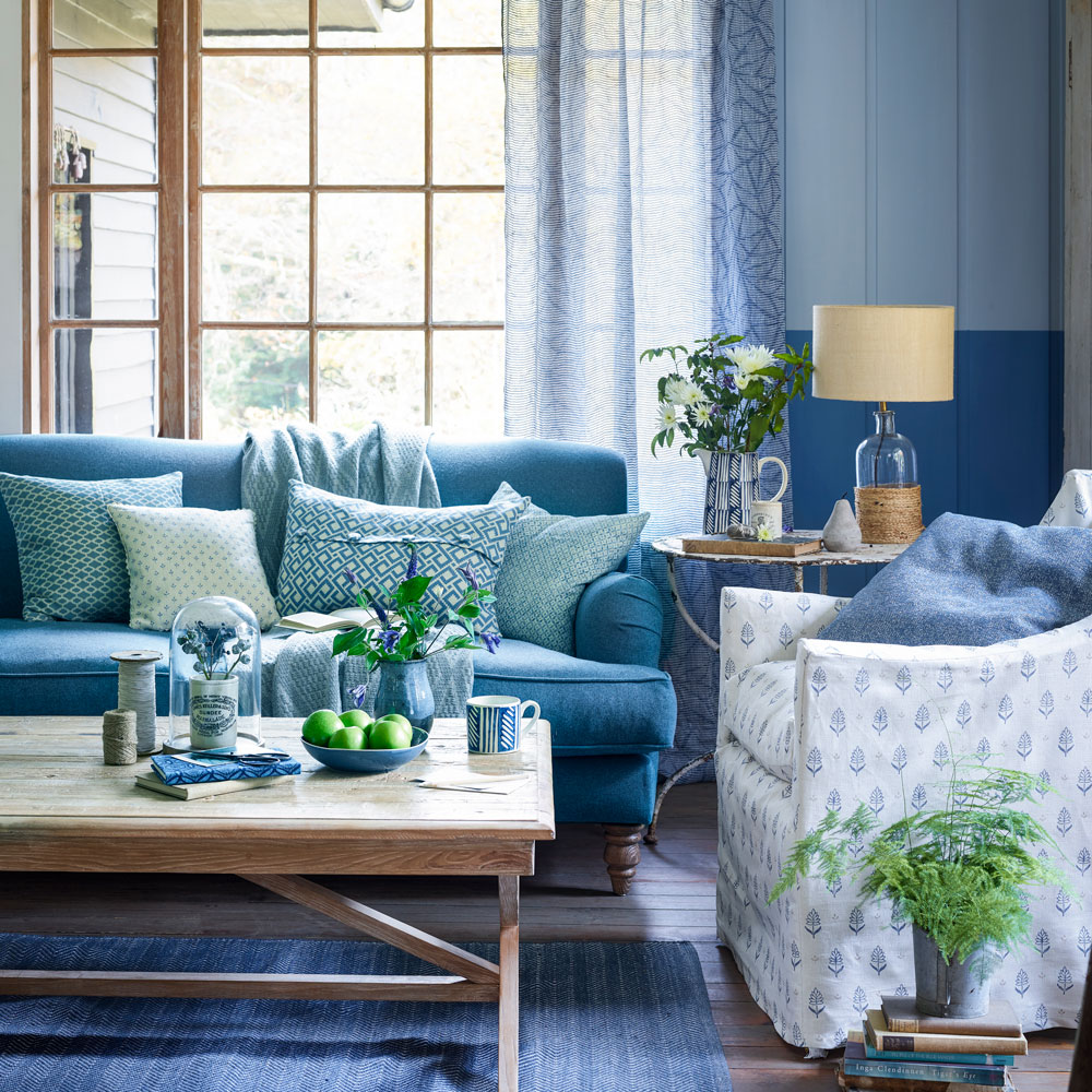
Turquoise is an interesting colour, and I propose it as an accent because it brings in the colour blue, which is typically associated with productivity, but also with green, which is soothing and provides balance. It is a bold and bright colour to have in a home that will certainly wake up any room and space. By adding turquoise as part of your home’s palette it can help to make you more alert and observant, as well as motivated.
If you introduce a turquoise cushion or an object with a splash of this refreshing colour, it can help you to get going early on in the day. It is perfect for kitchens, breakfast rooms and bathrooms. When you wake in the morning and your home has turquoise as part of its palette, it should have the effect of a sunny day and help you to jump up and start it. You will become more alert, more thoughtful, and more awake due to its vividness- exactly the kind of start we all need.
Why do we use colour?

Colour is vital in helping you feel productive – and you can use it in clever ways throughout your home. Everyone can use colour to positive effect. Find inspiration around you. Ask yourself; which colours make you feel the happiest, which shades motivate you and which tones relax you? These are the colours that will help you to achieve more and live a healthier, more successful home and work life. It all comes down to equilibrium and colours should always be presented in a well-balanced and thoughtful way.
Related: Can you guess the most popular front door colour for 2018?
Now, I do have an additional tip that goes hand in hand with picking the right colour. We all know the famous saying of ‘a tidy desk is a tidy mind’. It is imperative to de-clutter the space that surrounds you and that you work in. If you are surrounded by knick-knacks and unnecessary (for lack of a better word) stuff, your productivity is not going to be at its best. Following the Scandi principle of Lagom, it is just important that when it comes to accessorising your space you remember to have 'just the right amount'.
Will you be using any of these colours in your home?
Jennifer is the Deputy Editor (Digital) for Homes & Gardens online. Prior to her current position, she completed various short courses a KLC Design School, and wrote across sister brands Ideal Home, LivingEtc, 25 Beautiful Homes, Country Homes & Interiors, and Style at Home.