7 ways to work Dulux's Colour of the Year into a scheme
How to use the Colour of the Year in your home
Dulux announced its Colour of the Year for 2016 yesterday and it's called - drum roll - "Cherished Gold".
That's ochre to you and me. Mustard in some parts. Old gold in
others. How do you use it though?
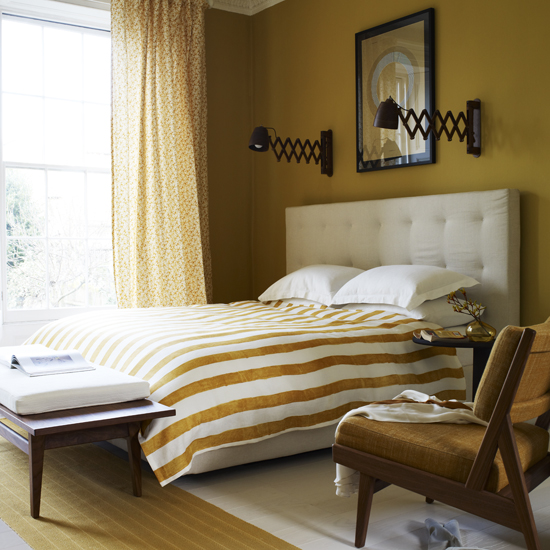
1. Use it all over Ochre has a naturally earthy feel which means, when used en masse, it instantly makes a room look cosy.
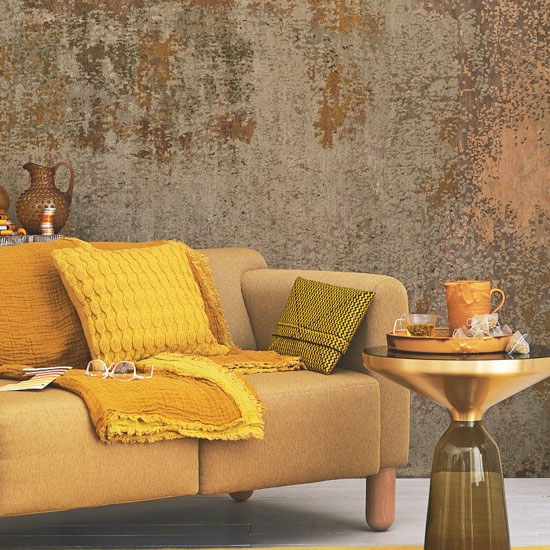
2. Bling it up Whatever you call it, it's rich, sophisticated and, while on
first glance a tricky colour, with careful use can be quite
sophisticated. Here it prevents bold gold accents from being too flashy, adding a burnished quality to a scheme.
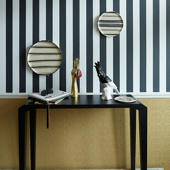
3. Make new with monochrome A black and white colour combo always spells design success and here, the addition of ochre just makes it that little bit different. The contrast between the anaglypta pattern below the dado and the bold stripes above offers a fresh take on pattern layering.
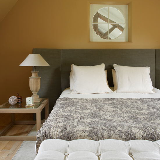
4. Layer the earthy tones A bedroom is perhaps the room where ochre may feel unflattering. But partnering it with tonal neutrals keeps thing cohesive, enabling ochre to take on a rich, earthy quality.
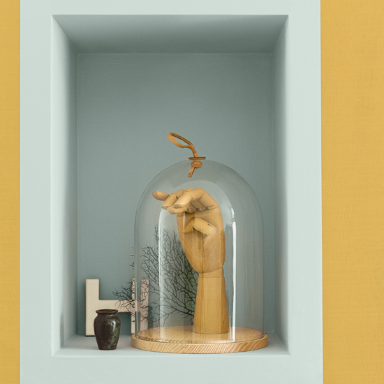
5. Contrast it with pastels Partnering it with contrasting shades, such as a duckegg blue, can also be quite striking.
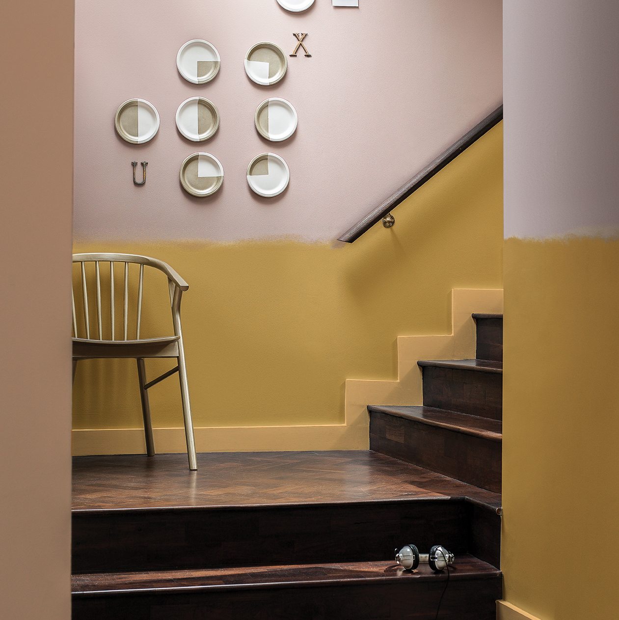
6 On trend with two-tone Or this soft dusky pink, which works surprisingly well in this two-toned hall space. Love the way, rather than going for a traditional dado, they've gone for a subtle colour fade between the two shades. So modern!
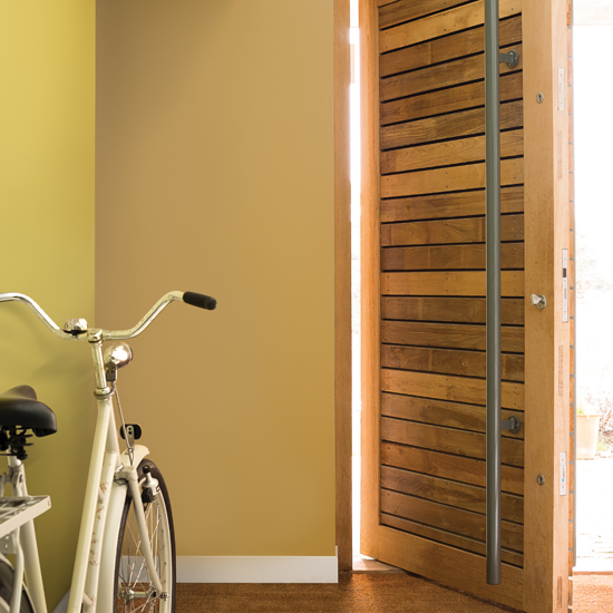
7. Side by side contrast Make a hall a bit more interesting by painting different walls in similar, but subtly different, tonal golds.
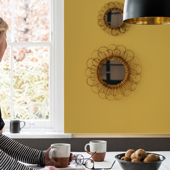
Dulux came to its decision to select gold as the colour following a rigorous research process involving global tastemakers who were invited to pitch their ideas on what colour most represented the mood of the moment. These ideas were based on what was going on in the economy, fashion, design as well as general social trends. This all resulted in a three-day forum where they thrashed out the palette that we'll be using (hopefully) to paint our walls with next year. Nice work if you can get it!
Check out Dulux's special Colour Futures trend report for more info on the colour palettes chosen to represent the zeitgeist.
Get the Ideal Home Newsletter
Sign up to our newsletter for style and decor inspiration, house makeovers, project advice and more.
Tamara was Ideal Home's Digital Editor before joining the Woman & Home team in 2022. She has spent the last 15 years working with the style teams at Country Homes & Interiors and Ideal Home, both now at Future PLC. It’s with these award wining interiors teams that she's honed her skills and passion for shopping, styling and writing. Tamara is always ahead of the curve when it comes to interiors trends – and is great at seeking out designer dupes on the high street.
-
 Will a conservatory add value to your home and how can you maximise it?
This is what the pros say
By Amy Reeves
-
 I’ve been looking for a new signature scent for my home and The White Company's new fragrance is the exact summer holiday smell I needed
Santorini smells fresh, summery and sophisticated
By Kezia Reynolds
-
 How to remove algae from garden walls in five steps – and the cleaning product experts rave about for tackling it fast
Experts share their top tips for getting garden walls algae-free
By Katie Sims