25 of the best colour combinations that will work in any room
It's time to ditch beige and embrace the best colour combinations around this year – prepare to be surprised!

Sophie Warren-Smith
Planning a room update but no idea what colours to choose? Using colour, and more than one together is on the rise, the days of all-white and beige are long gone. And some of the best colour combinations and paint ideas can come from those unexpected pairings that seem to break the rules, but actually look wonderful together.
'Deciding on a colour scheme for any room is not an easy task. With so many beautiful combinations out there, often simplicity is best,' advises Patricia Gibbons from the design team, Sofa.com.
Make the struggle of choosing colours easier, by taking a look at the trusty colour wheel. There are three key colour combinations that are guaranteed to work together. A ‘tonal’ scheme is the simplest, as it includes only different tones of the same colour, going from light to dark. A ‘harmonious’ scheme uses shades that sit next to each other on the wheel, such as blue and green, and is a simple way of creating an easy-to-live with look.
Then lastly, there’s the ‘contrasting’ scheme, which is the most vibrant of the three. Contrasting schemes are based on two colours that sit directly opposite each other on the wheel, such as yellow and purple. Often referred to as complementary colours, these pairings are guaranteed to add drama to any room.
'The key to creating perfect colour combinations is balance,' says Jemma Dayman, hard flooring buyer, Carpetright. 'Pick a concise palette and think carefully about the shades you pick and how you use them.'
The best colour combinations for 2023
Whether you're a maximalist or minimalist, there's a colour scheme for you, our guide to the best colour combinations will inspire and make choosing the best paint colour so much easier.
‘As a nation, we are all getting braver with colour and much more creative with it too,’ says Marianne Shillingford, Creative Director at Dulux. ‘One colour on our walls just isn’t enough any more. And the wonderful thing about paint is that the results you get from it are instant and so new trends appear almost instantly.’
Get the Ideal Home Newsletter
Sign up to our newsletter for style and decor inspiration, house makeovers, project advice and more.
So whether you prefer a calm, tonal scheme, a relaxed, harmonious interior or a dramatic contrast colour pairing, find your favourite from our best colour combinations for the next year.
Creative Director of AkzoNobel, Marianne Shillingford’s core objective in her role is to help people to be more confident about using colour in their projects. That might involve everything from working on new colour ranges and tools to writing press features and recording videos. I also work on delivering practical training in our Dulux Academy and seminars at trade events.
1. Go vibrant with orange and crisp white
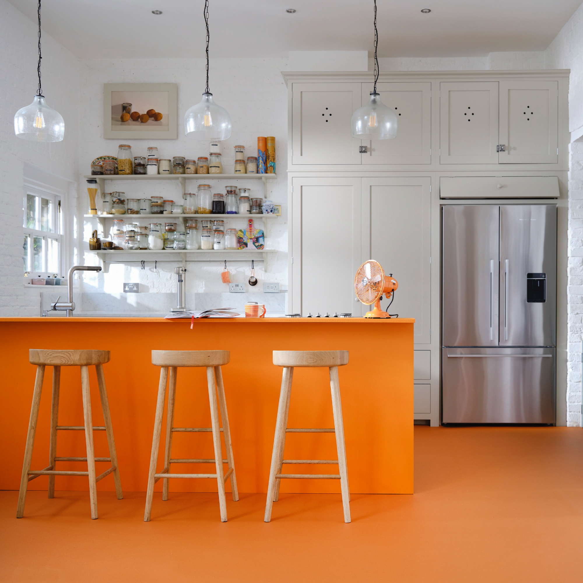
An exciting colour combination is orange and white – not for the faint hearted, but how could you not be happy walking into a kitchen painted in those shades?
Keep the colour lower down, so paint the island and match the floor and use white elsewhere for balance.
'Orange is fairly versatile, but is best paired with harmonious accents that compliment,' says Jemma Dayman, hard flooring buyer, Carpetright. 'Neutrals, such as white, will hero the colour whilst simple, tonal accessories will create balance and mellow it. For a truly impactful look, pair with saturated tones of green, black or navy.'
2. Opt for an eclectic combo of navy and flax
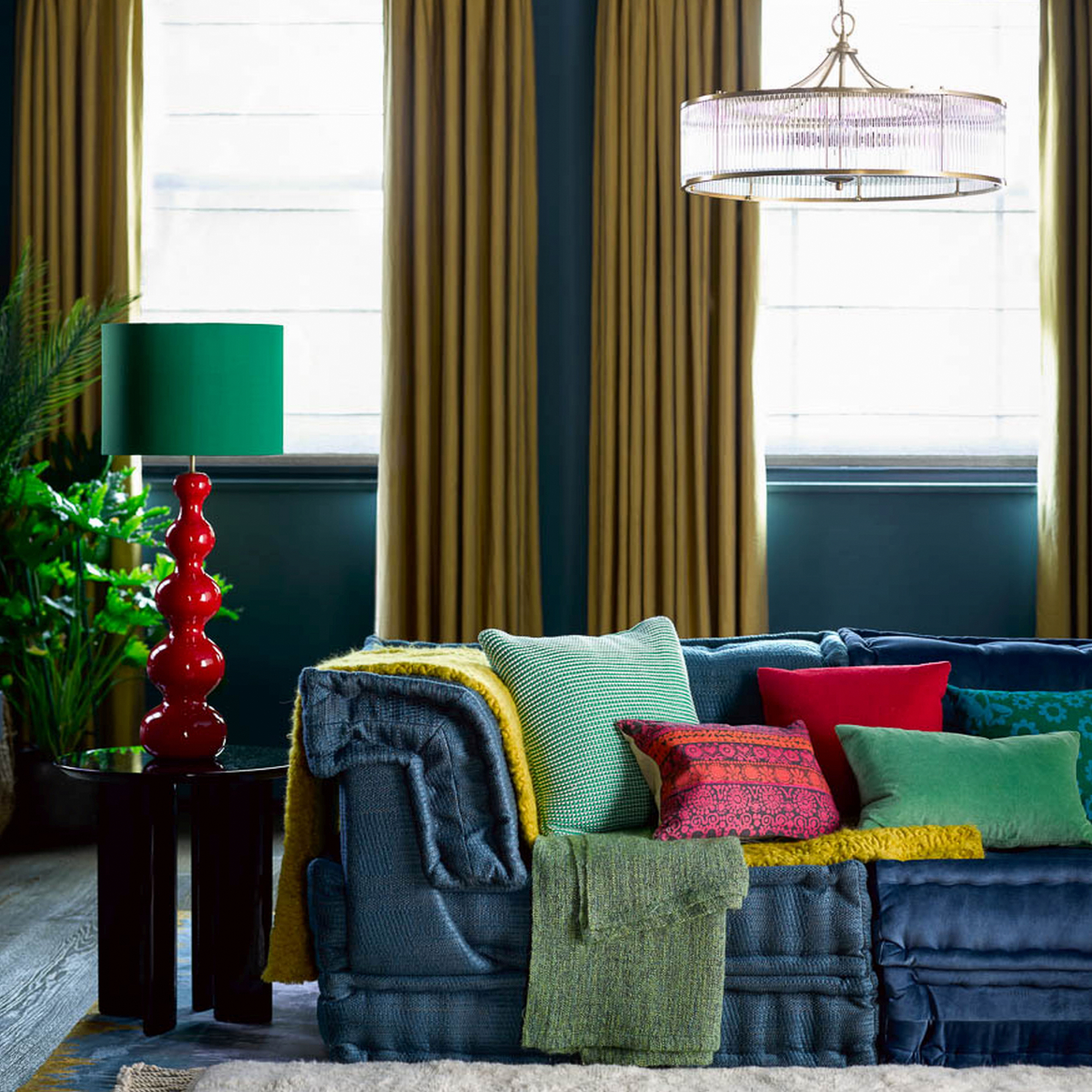
If you prefer a darker base consider navy – it's a good starting point and a shade that goes well with most lighter colours. Flax is a natural colour that's not as bold as mustard but contrast beautifully against navy.
Team it with pops of red and shades of green like forest and grass. Keep your floor neutral so it doesn't detract from the other colours.
3. Don't forget the classic blue and white
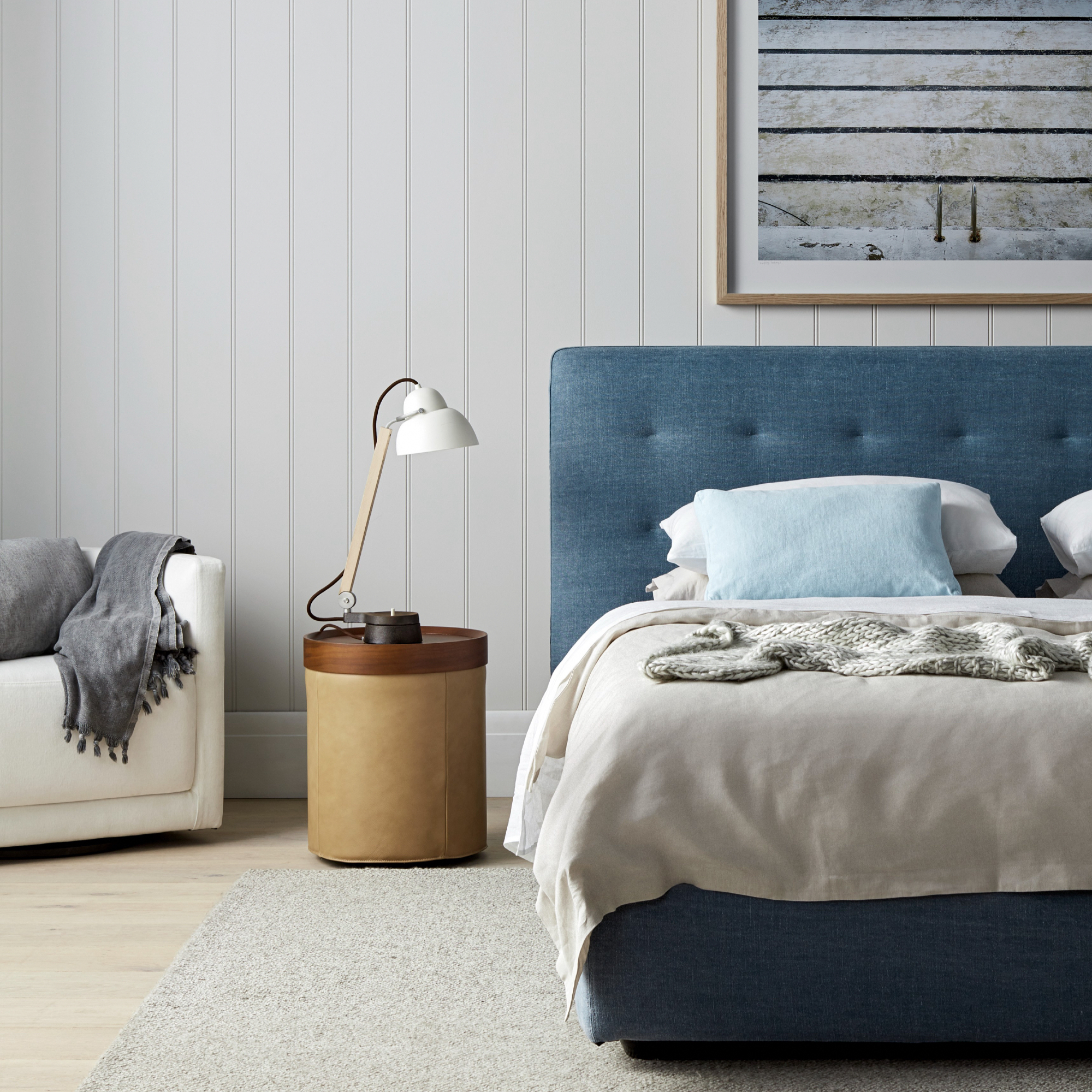
Not much beats the beauty of a blue and white coastal bedroom scheme – tongue and groove painted walls, a comfy blue upholstered bed and pops of pale blue and taupe.
This colour scheme speaks for itself, keep the accessories simple – a white armchair, artwork above the bed and a stylish white table lamp on leather and wood side table are all you need.
4. Choose contemporary red with off-white for a fresh look
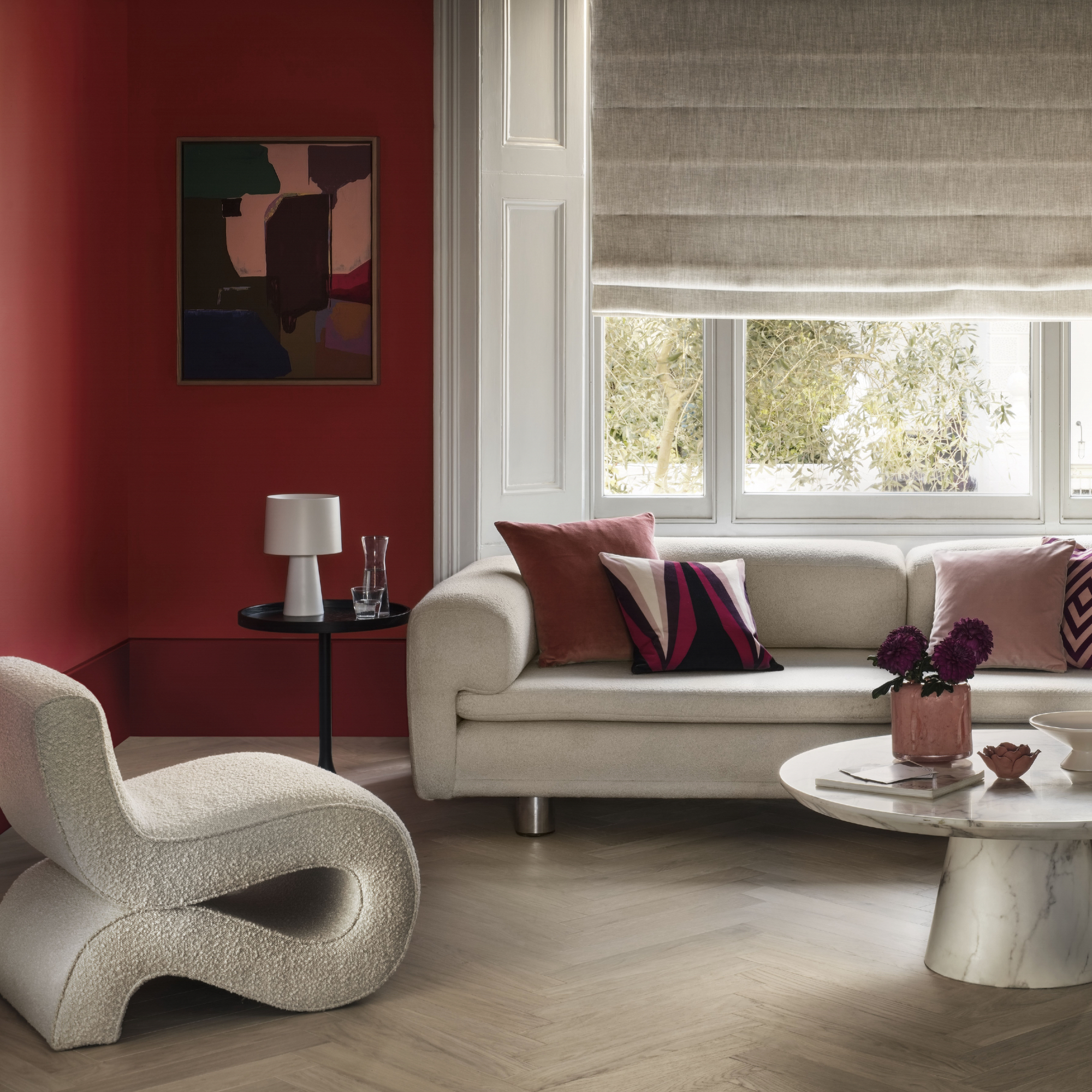
Red might not be your first thought, but if you have a pale floor, furniture and blinds or curtains, it won't be overpowering as a living room paint idea.
'Deep reds and burgundies create a warm, cocooning feel when paired with off-whites and pale wood tones,' says Natalie Mudd, creative director, The Wood Flooring Company. 'Ideal for large, open-plan spaces, the contrast of this autumnal pairing creates a cosy and intimate space. The off-whites emphasise the warm undertones and rich red hues; perfect for living rooms and snugs.'
5. Relax with soothing lilac and indigo
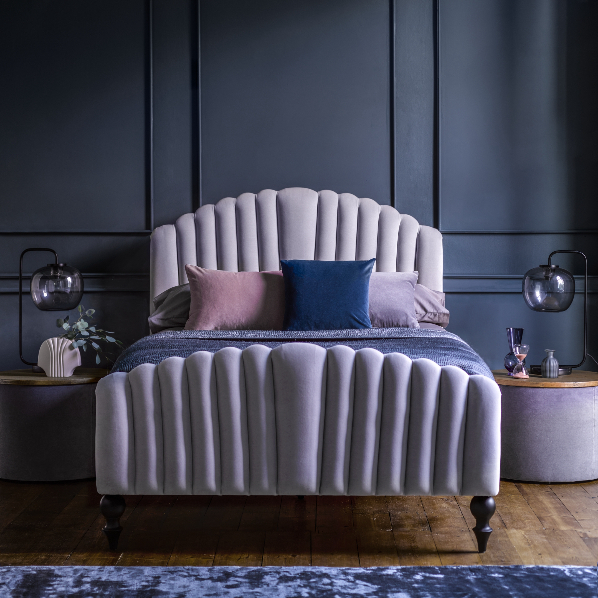
Not a colour scheme you may consider, but a cosy and cocooning one for sure. The bed in a pretty shade of lilac is the focal point that prevents the rest of the scheme from feeling too 'heavy'. It is a perfect calming bedroom idea.
'Deciding on a colour scheme for any room is not an easy task,' says Patricia Gibbons, part of the design team at Sofa.com. 'With so many beautiful combinations out there, often simplicity is best. The bedroom being a place we go to relax, you don’t want to overcomplicate things, so start with focusing on one colour that is non-negotiable.
'Once you’ve locked that in, consider pairing it with hues that lie in the same area of the colour wheel. These will not only complement each other but stay timeless and classy. Blues, purples and all their varying tones are an increasingly popular hue for the bedroom as they elevate the feel of the room, creating a peaceful atmosphere, with a dash of elegance and luxury.'
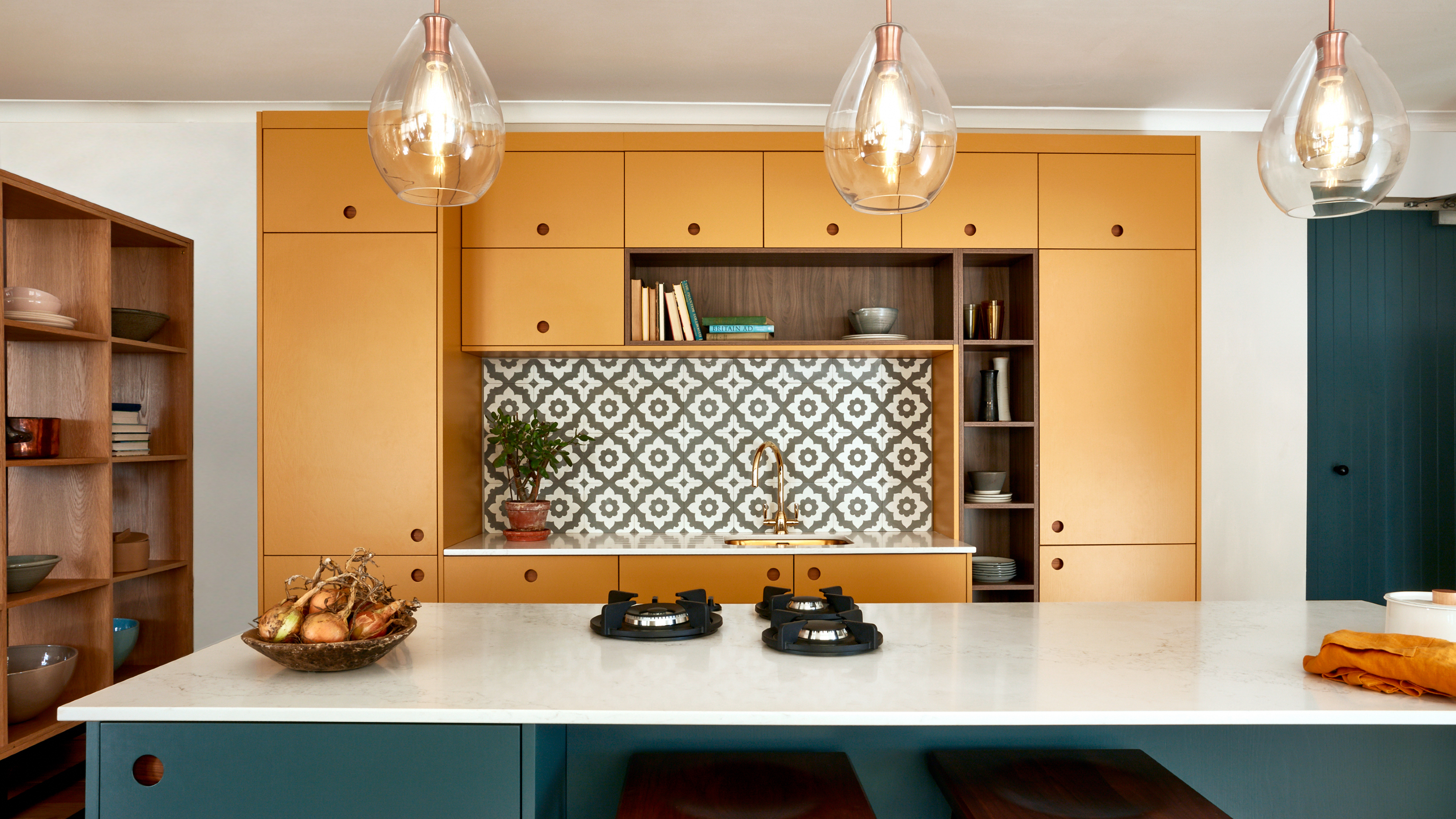
6. Go unusual but interesting with teal and mustard
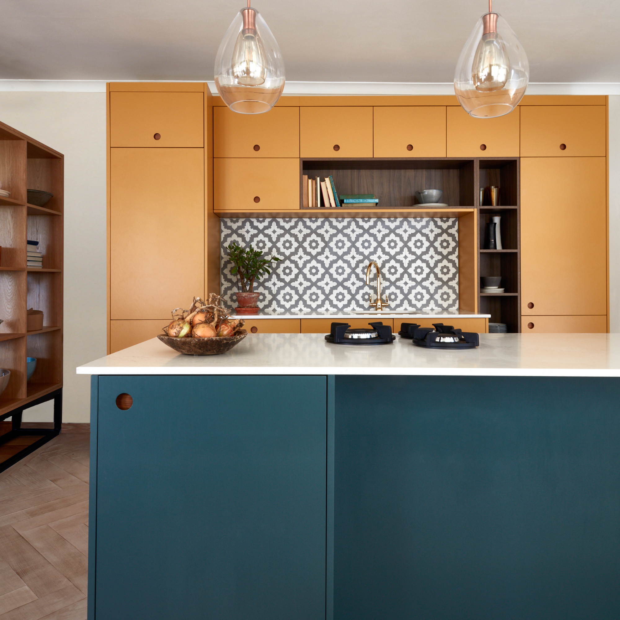
If you're struggling to come up with a combo that you love then look to the past for inspiration – there are so many eras to choose from but the 70s are having a resurgence in home decor trends and they have some fabulous colour schemes to copy.
'For a statement look, opt for a 70s style colour combination, such as mustard and teal, and pair with dark wood cabinetry,' says Elizabeth Sherwin, creative director, Naked Kitchens. 'This unexpected combination oozes character, perfecting the balance of a vibrant yet mature space, creating a harmonious environment. To modernise the look, think about incorporating a bold pattern and select a few key features such as the brass fixtures and make them work seamlessly throughout the design.'
7. Embrace calming aqua green and sky blue
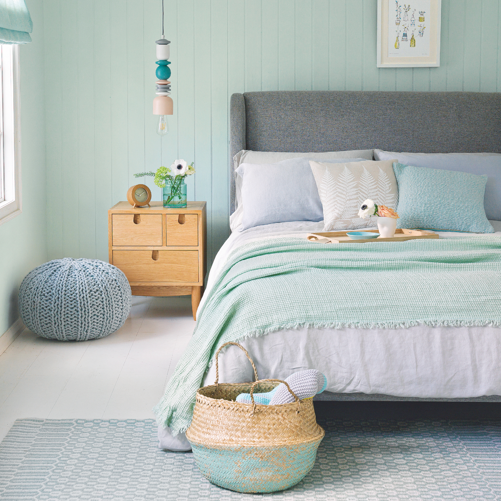
The colour combination of aqua green and sky blue is most definitely going to create a soothing bedroom scheme. It is the ideal small bedroom colour idea as it will brighten up a space that has low ceilings and is on the small side.
A mid-toned grey upholstered bed will work well and act as a neutral that will anchor the rest of the scheme.
7. Add drama with charcoal and navy
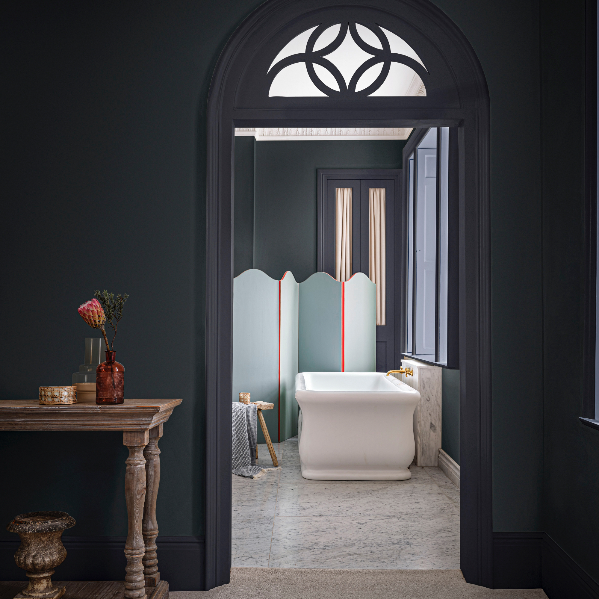
There are so many wonderful colour combinations to choose from and one way to create a soothing feel even if you prefer the moodier end of the colour palette is to pick two shades that are similar in tone.
'Blues are well-renowned for being the most calming of all colours, so pairing soft pale blues with a deeper blue creates a harmonious colour wash to create a restful environment,' says Anna Hill, brand director, Fenwick & Tilbrook. 'We love our Cool Breeze with Great Lake or Temple Linen, or as seen in this bathroom image, inky tones of Flat Iron and River Stone balanced out with paler Oceans and Aged Copper creating a rich and restful scheme.'
9. Be uplifted by lime green and pink
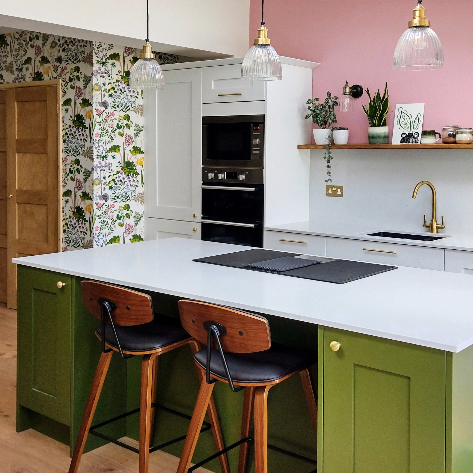
Wallpaper ideas are a great starting point for a new scheme and you can choose two colours that you love from it to use in the space. Lime green and pink are a fabulous pairing, in fact, any shades of pink and green work well tougher.
White will balance other colours perfectly, so if you're worried two bright colours will be overpowering use it as a worktop, cabinetry and splash back.
'Pink and green are both vibrant colours that can bring a fresh and lively atmosphere to a kitchen space,' says Mara Rypacek Miller, managing director, Industville. In a kitchen, where energy and creativity are often desired, these colours can help create a visually stimulating environment.
'Green is often associated with nature and growth, while pink can evoke feelings of floral beauty. Combining these colours can bring a touch of nature indoors, creating a sense of tranquillity and harmony in the kitchen. Retro, Industrial-style lights are an ideal pairing with these colours as they suit any era and style of home, providing a modern-rustic update.'
10. Stand out with a jewel-like combo
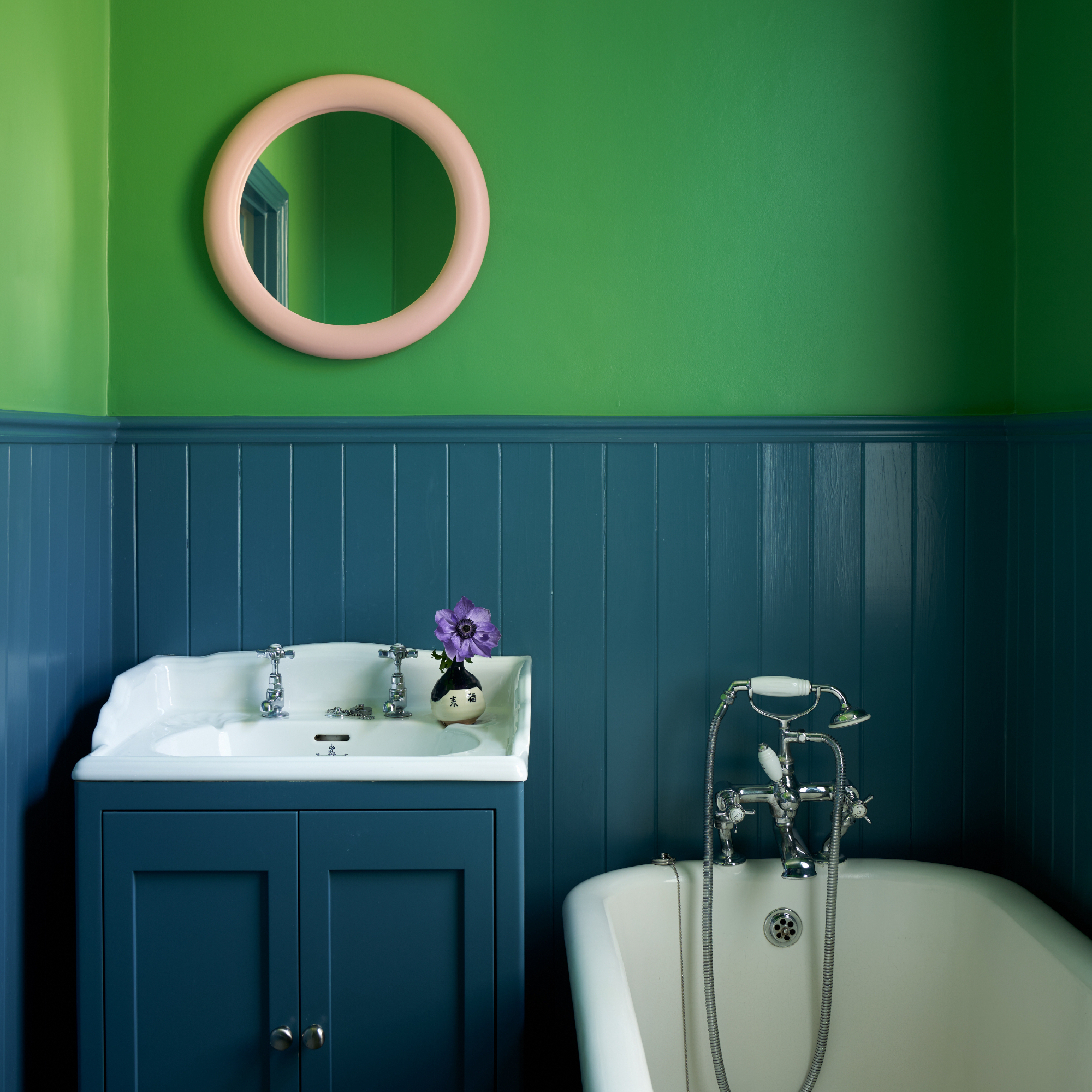
What's great about choosing bathroom colour ideas is that you can go wild as the space is small, it means you can invest in the tiles you loved or that bright green that you know won't work in any other room of the house.
'Ignore the old adage of blue & green should never be seen (together) – utter tosh – they can play harmoniously together whether of similar weight or dark to light!' says Patrick O'Donnell, brand ambassador, Farrow & Ball. 'At the jewel end of these colour families they create a rather sophisticated yet joyful option.'

Patrick O’Donnell has been bringing his impeccable eye for colour to Farrow & Ball since 2012. Over that time, he has been a Showroom Manager, Global Colour Consultancy Manager and now Brand Ambassador. However, he is best known as the much-loved face of Farrow & Ball on social media
11. Mix neapolitan colours for an uplifting look
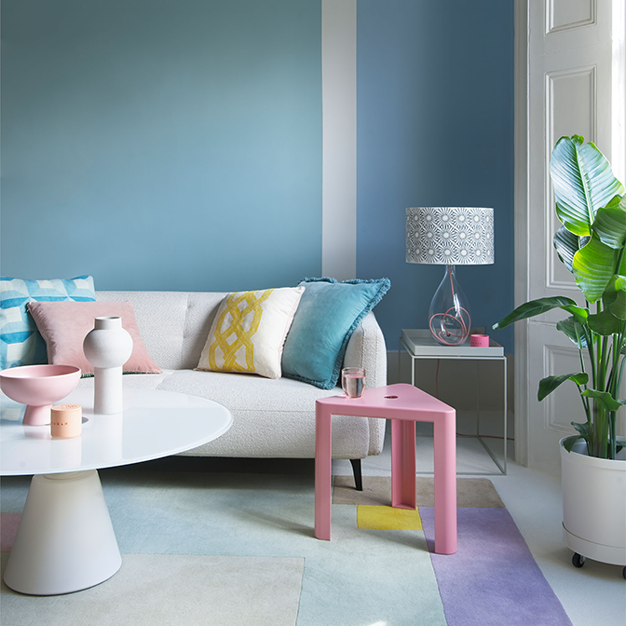
Clean, fresh pastels like mint green and cool blue will create an upbeat, mood-boosting feel used as a background colour. Keep larger pieces of furniture neutral in off-white and biscuit tones so that colours don’t fight for attention. Add heat by mixing in warmer ice cream tones here and there, such as soft rose pink and sunny yellow.
Try a creative living room paint idea to combine the colours with real impact. ‘Create a colour-block wall of uplifting blues and greens by dividing the area with an off-centre stripe of white,’ says Ideal Home’s Decorating Editor, Nicky Phillips.
12. Make a statement with warm ochre and smart navy
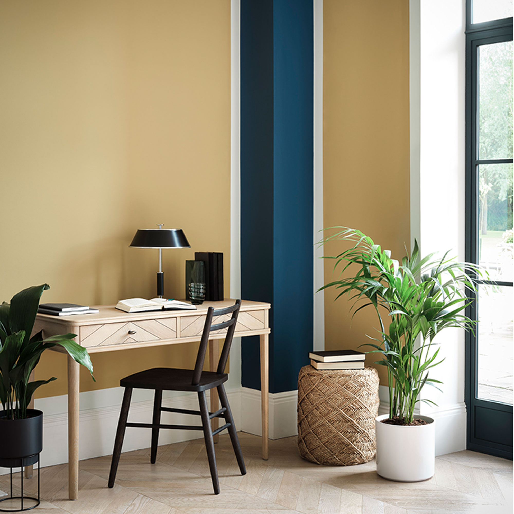
Create a warm and comforting scheme for your WFH space using warm neutrals and earthy tones that will settle the mood without proving a distraction.
‘Using complementary colours from opposite ends of the colour wheel can make a lovely statement such as this strong blue and warm yellow,’ says Anna Hill, Brand Director for Fenwick & Tilbrook. ‘Alternatively, using different tones of the same colour, such as pink, or neighbouring colours on the colour wheel is a softer way to use bold colours that can feel more relaxing on the eye.’
13. Contrast lush green and orange for standout style
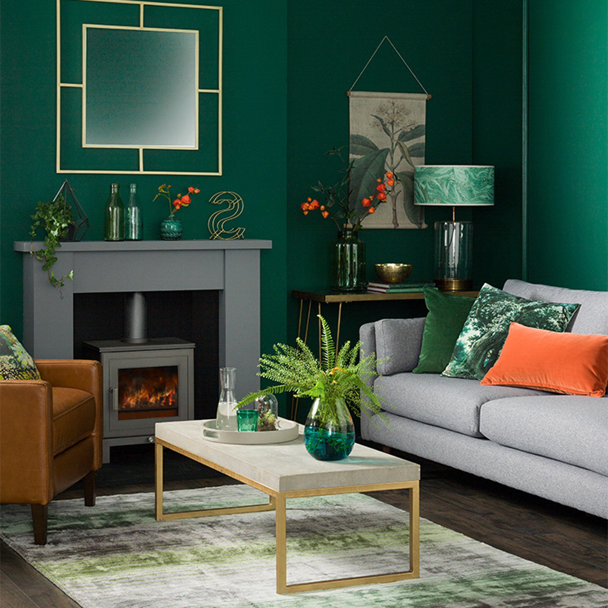
Green is a dynamic but refreshing colour that can make a relaxing backdrop for a living room. Grey furniture and flooring will bring calm to a bold scheme like this, but it’s the accent details that will bring it to life, from burnt orange and tan leather on cushions and upholstery to flashes of gold and copper on accessories.
‘Use a shade of green this dark on one or two walls only - or in a room with big French doors that fill it with light,’ says Ideal Home’s Decorating Editor, Nicky Phillips.
14. Swirl dusky pinks and berry shades
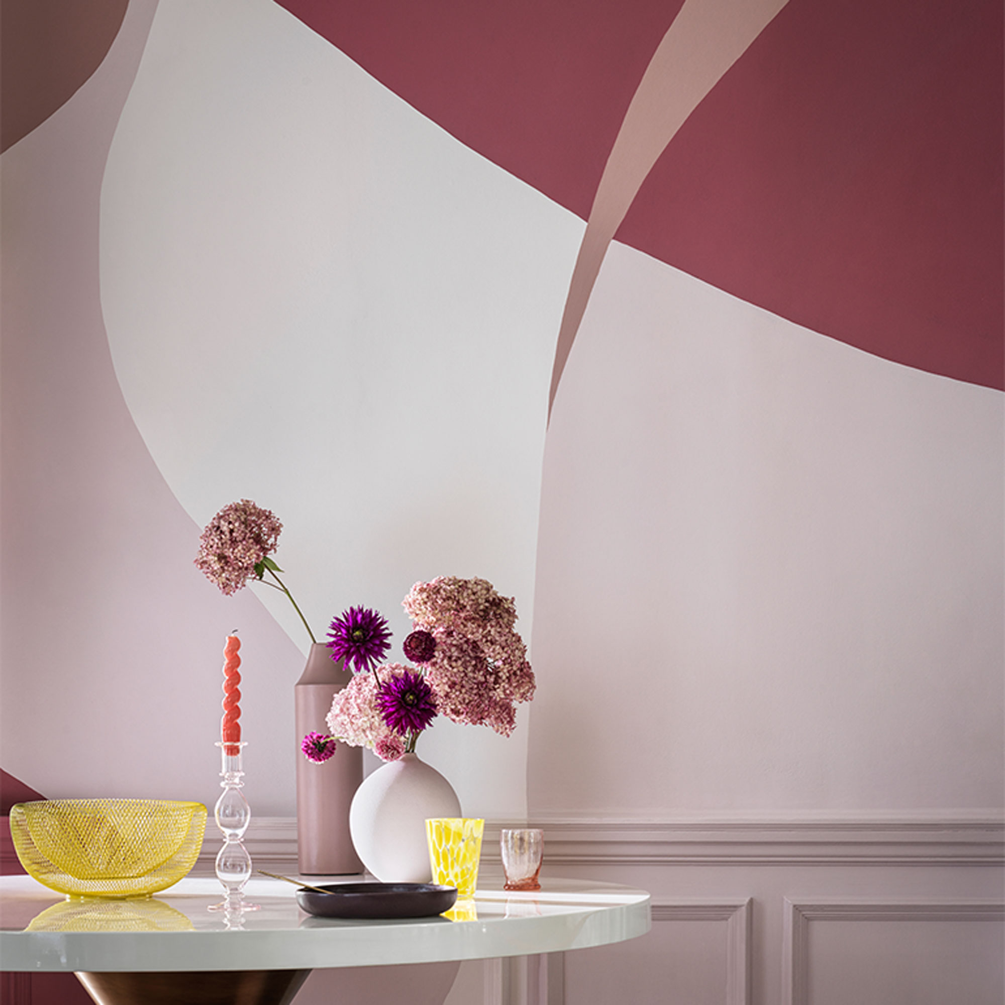
Though it may be loved by little girls, pink is a versatile colour that can work in any space…not just bedrooms. Try dusky pink in a hallway idea teamed with swirls of raspberry and damson for a grown-up look that is anything but saccharine. Or balance masculine and feminine, by pairing blush pink with accents of dark grey and black to add an edgy element.
'It’s always interesting to see what the latest colour combinations are for the coming year,’ says Justyna Korczynska, Senior Designer at Crown. ‘Look at magazines, social media and blogs for inspiration and to see new trends and what colours you are naturally attracted to.’
‘People are becoming much braver with their painting skills, often creating impressive designs and effects with different colour combinations.’
15. Set a soothing tone with calming neutrals
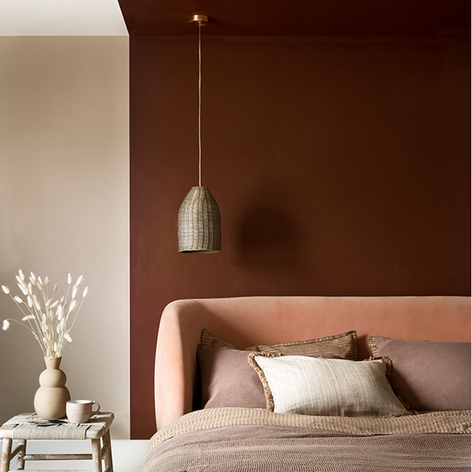
Warm, earth-toned colours will make any space feel cosy and inviting, so a tonal neutral palette like this is perfect for a soothing bedroom scheme. Take a statement headboard to the next level by continuing a painted area behind the bed onto the ceiling, to create an extra-cocooning feel.
‘To achieve a chic and contemporary scheme, style pale and earthy browns with coral and salmon pinks. Finish with accessories in a bolder colour, such as ochre or burgundy, depending on the tone of pink you choose,’ says Sue Kim, Senior Colour Designer at Valspar. ‘Adding textures, such as silk cushions and woven rugs will elevate this further and prevent the scheme looking dull or flat.’
16. Immerse the room in tonal teal and emerald
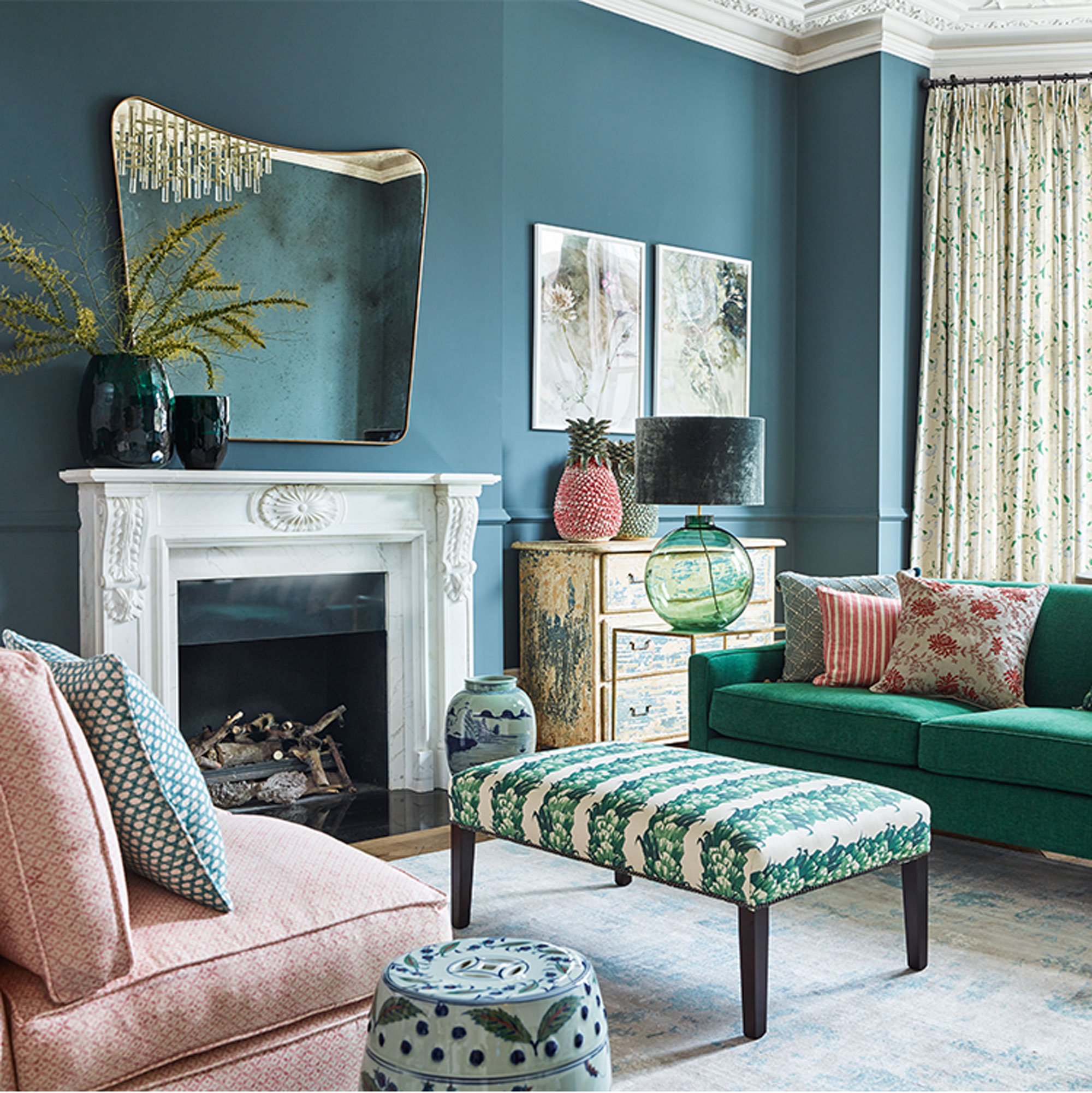
Team plush teal with emerald green for a grown-up living room scheme that feels rich and enveloping. Darker colours like this, that sit next to each other on the colour wheel, add depth and visual interest but as there are no harsh contrasts the scheme won’t feel jarring on the eyes. Accents of warm corral picked out in patterns and prints will bring warmth to temper teal’s coolness.
‘Use touches of coral in three different areas to create a triangle that brings a sense of balance to the space,’ says Ideal Home’s Decorating Editor, Nicky Phillips.
17. Indulge in plush plum and luxe gold
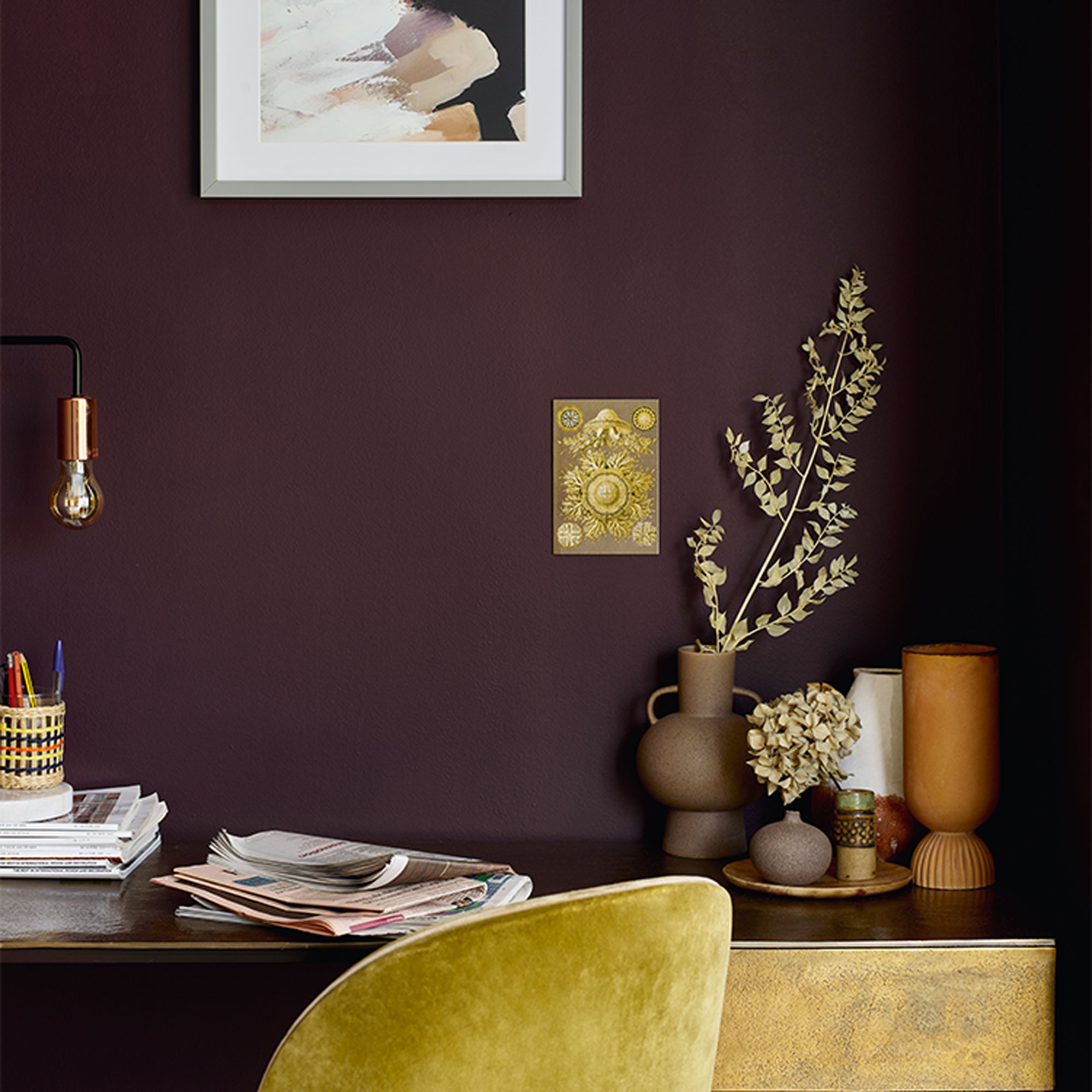
Plum is a rich, lush colour that will add depth and weight to a room. While pretty intense used wall-to-wall, instead try using plum as an accent colour in an alcove or on a feature wall to create smaller pockets of colour that won’t be as overpowering.
‘Plum works really well with a host of colours, from dusky pinks and lilacs to browns, blues and greys. Be bold and use it with mustard gold, deep orange or smokey blue - the results will be spectacular,’ says Colin Roby-Welford, Creative Director at Fired Earth.
18. Pair steely grey with lively yellow
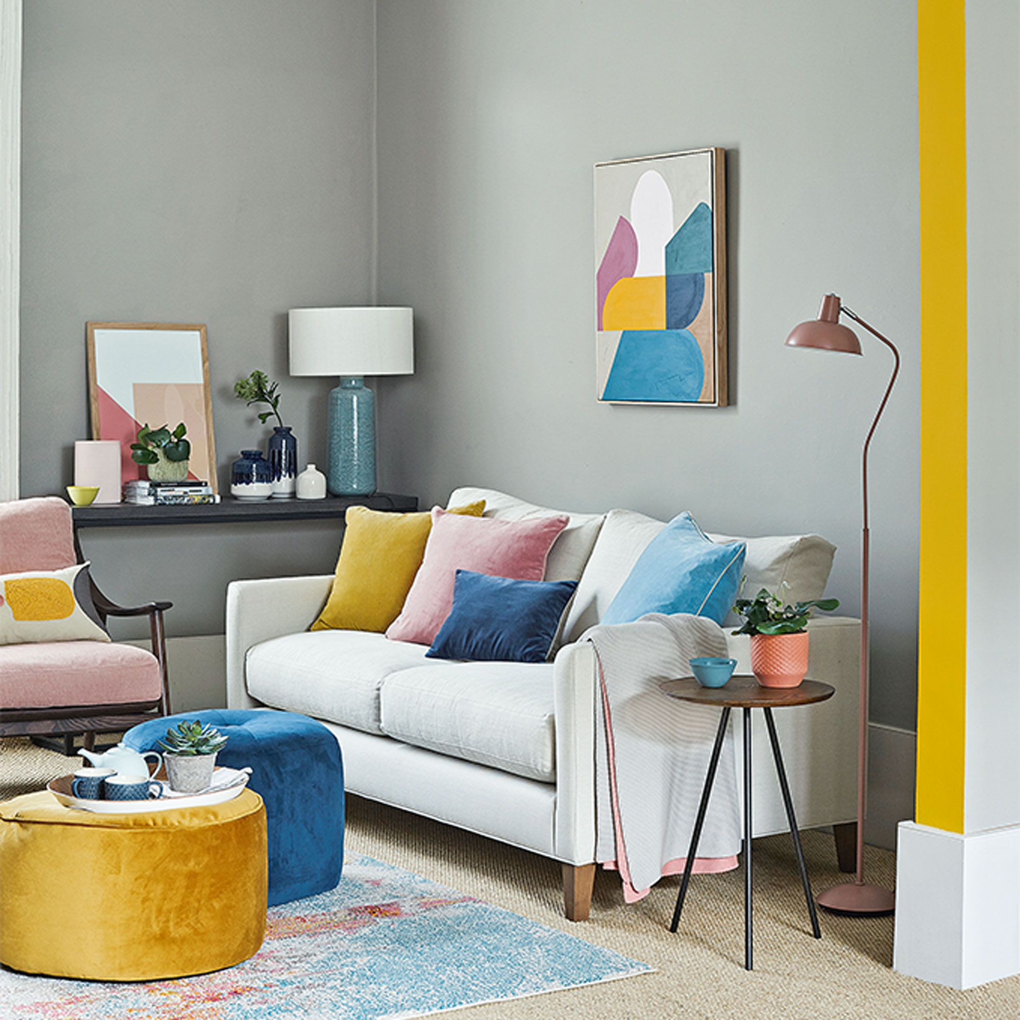
All-grey schemes can sometimes look a little drab, but adding a cheery accent colour to a grey living room idea will act as an instant pick-me-up. Spot colour is a quick and simple way to add style and painting an archway will help define the different areas in a knock-through living space. Plus painted features are easy to change if you switch up accent accessories or fancy a seasonal swap around.
‘The received wisdom is that the most striking colour combinations are achieved when you use colours that are opposite on the colour wheel like yellow and blue or red and green,’ says Justyna Korczynska, Senior Designer at Crown. ‘I think that unusual colour combinations also work really well, and at the moment love a mix of pale grey with mustard and shots of rose pink.’
19. Balance soft coral with cool tones
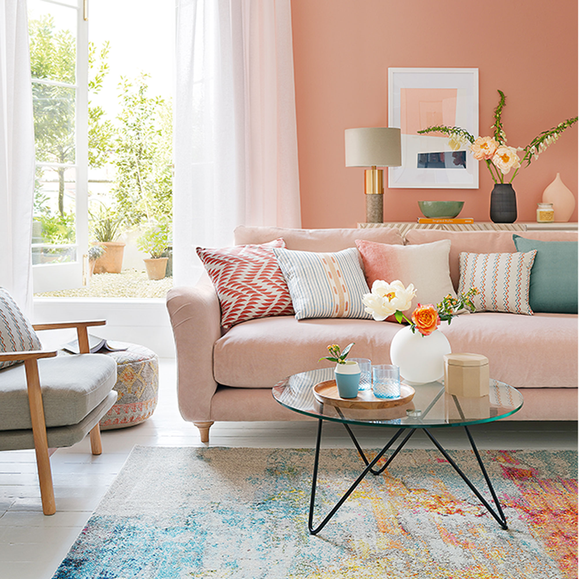
Faded tones of terracotta and soft coral will give any room a warm, natural glow so are ideal for living rooms and bedrooms. Coral comes alive in summer sunlight, but on cold grey days it will lend a gentle warmth, so is an easy fix for north-facing spaces. Shades of cool grey and fresh blue are perfect accent colours that will bring balance to a warm coral scheme.
‘Try this colour if your furniture is simple and modern,’ says Ideal Home’s Decorating Editor, Nicky Phillips. ‘It will look too sugary with traditional cottage-style or shabby-chic pieces.’
20. Grass green with white brings an upbeat mood
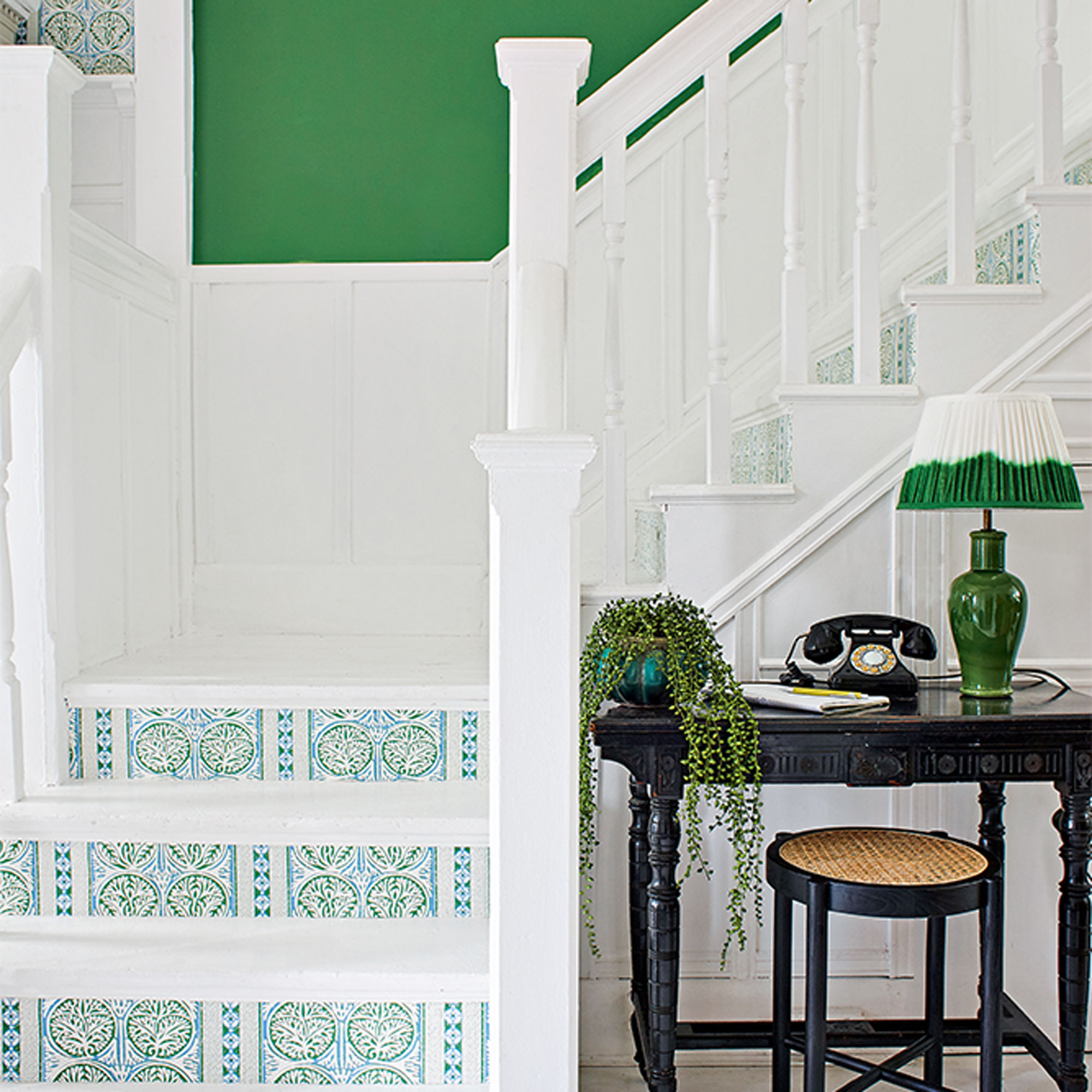
Bright, fresh and invigorating, green is a versatile colour that will suit any interior, from traditional to contemporary. Bring white into the mix to make green pop, creating an upbeat combination that will make tight spaces and light-starved rooms feel bright and airy while increasing the feeling of spaciousness too. Green and white also make for a lively pattern combination, from fresh florals and leafy green prints to modern geometrics.
‘Our connection to nature and the world around us has never been more important – during the pandemic, or post. Which is why colours that nod to nature will continue to be important long into next year, and beyond,’ says Marianne Shillingford, Creative Director at Dulux.
‘Forest green paint. Earthy browns. Sea-blue paint. Sandy yellows. After so long trapped indoors we have come to appreciate the power of nature to uplift and revitalise us. Colour wise we are throwing open the doors and windows and inviting every shade of nature in for tea.’
21. Mix calm stone with sunny yellow
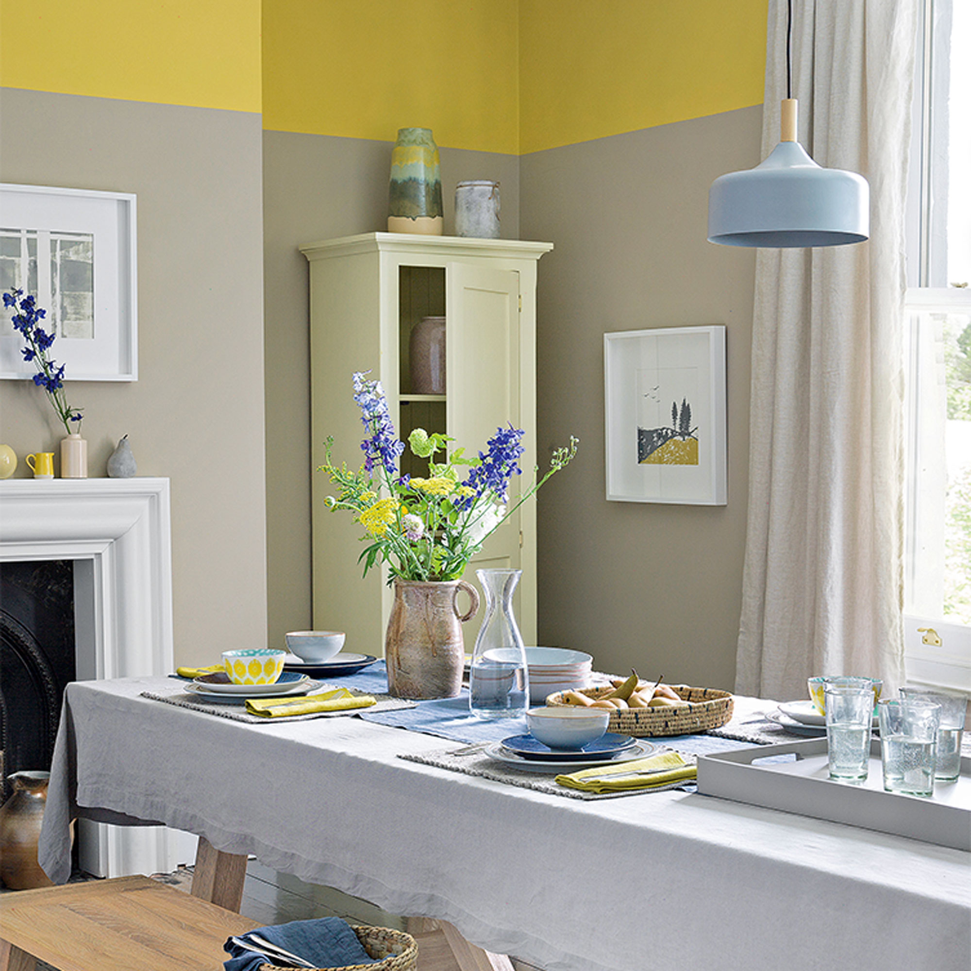
While neutrals make grounding backdrop colours, they can feel flat and cold without another colour to lift them. Warm yellow will bring instant sunshine to a space and it won’t take an overload of colour to work its magic. Brighten up a neutral dining space or breakfast room by painting a band of sunny yellow around the top of the room and tie the scheme together with warm yellow tableware, ceramics and linens.
‘Brown neutrals can be sludgy and dull unless you cut through them with the right accents. We used mimosa yellow and calm, denim blue,’ says Ideal Home’s Decorating Editor, Nicky Phillips.
22. Combine earthy naturals for a grounded scheme
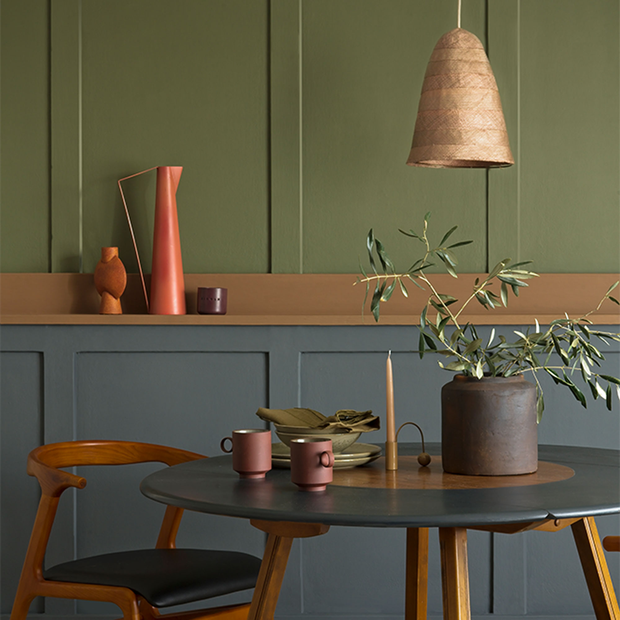
It makes sense that colours that sit naturally together outdoors will work equally well indoors too. Colours of nature can have a calming, restorative effect when used inside the home and sit well with furniture in rustic timbers, natural stone and woven textiles. Bring outdoor greenery into the mix with plants and foliage that will aid the feeling of well-being.
‘Grey and brown are both earthy, neutral colours but they can go well together. If paired thoughtfully you get an organic look that captures the natural beauty of wood and stone,' comments Marianne Shillingford, Creative Director at Dulux. 'Grey is cool, versatile and casual so it can work as a canvas on which to express yourself, whilst warming browns make a living room cosy and inviting.'
23. Add drama with midnight blue and blush
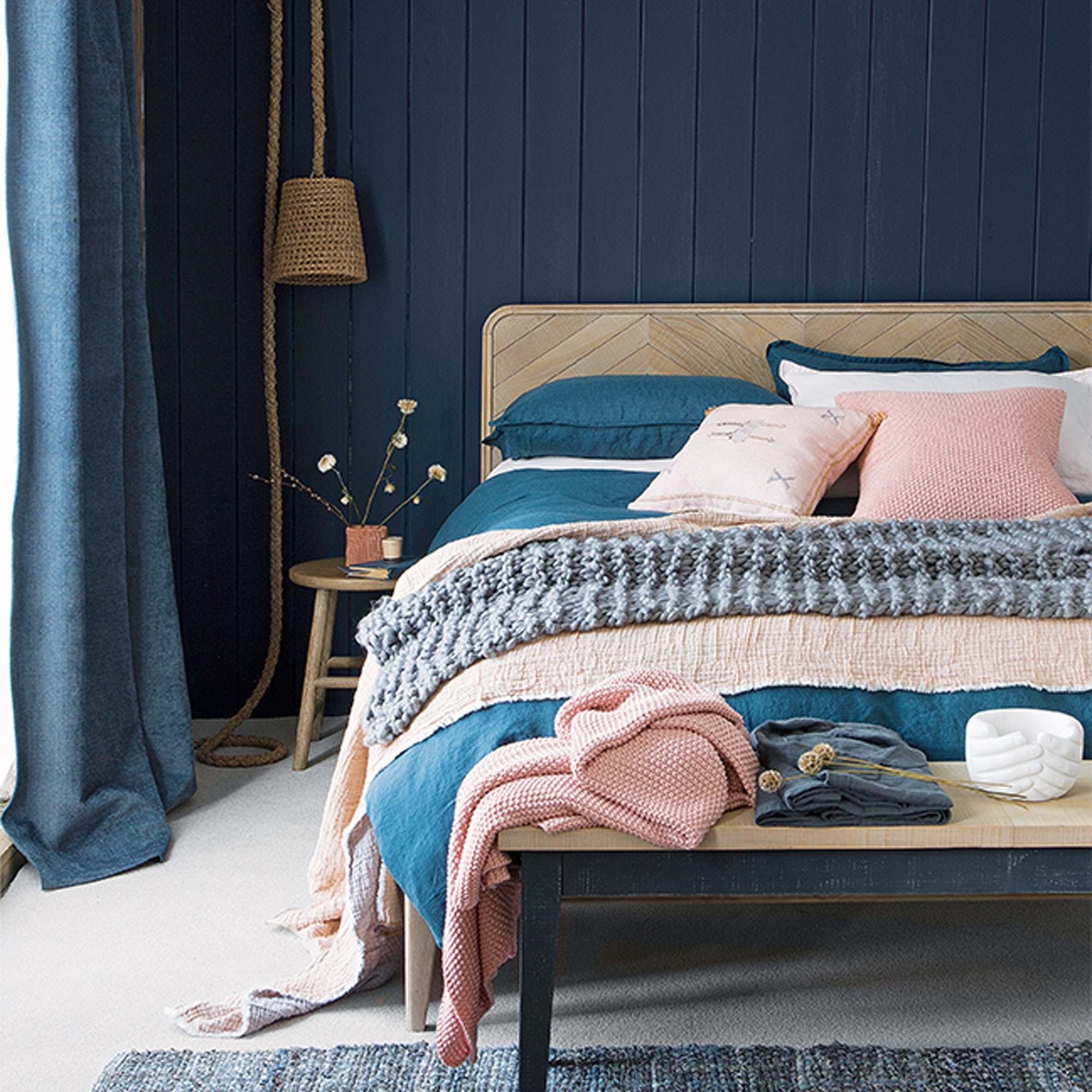
Ink is the darkest of the blues and the perfect colour choice for a blue bedroom idea, making the space feel instantly calm and relaxed. Dramatic and immersive when used on its own, give inky blue a softer, more feminine edge by pairing it with delicate blush pink. Faded linens and soft, tactile knits in delicate pinky tones will add warmth and help to lighten the mood a little.
‘With so much colour going on, don’t complicate a scheme like this with bold or busy patterns. A touch of stripe or a soft sketchbook motif is enough,’ says Ideal Home’s Decorating Editor, Nicky Phillips.
24. Try powder pink and smart taupe
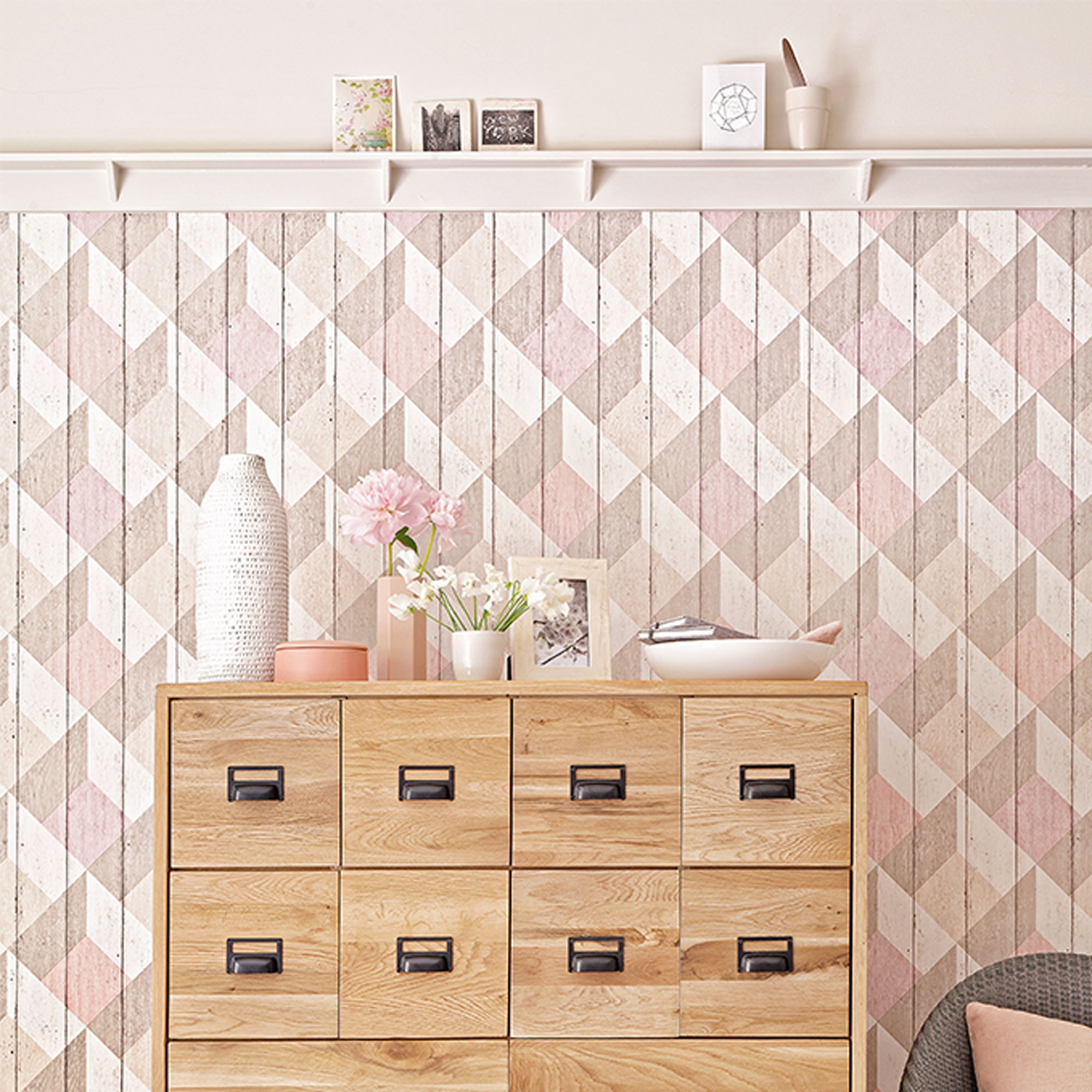
Not really a true pink, think of powder pink as more of a neutral. Calm and quiet, it will give a room a barely-there layer of colour and will blend in rather than contrast. Offset pink’s girly side by teaming it with taupe or mushroom for a smarter look with a bit more of a modern edge.
‘No longer just for kids’ zones or playrooms, these pale pigments are being painted in all manner of grown-up spaces, from ultra-creative WFH studios for media types, to super-fancy kitchens for dedicated foodies,’ says Marianne.
‘If you add a little grey to a pastel it becomes very swank indeed so consider shades like Pink Parchment, Milled Flour, Borrowed Blue or Beach Grass. Once you’ve chosen your favourite, paint the walls, ceiling and woodwork in the same colour.’
25. Partner dusky purple with zingy green
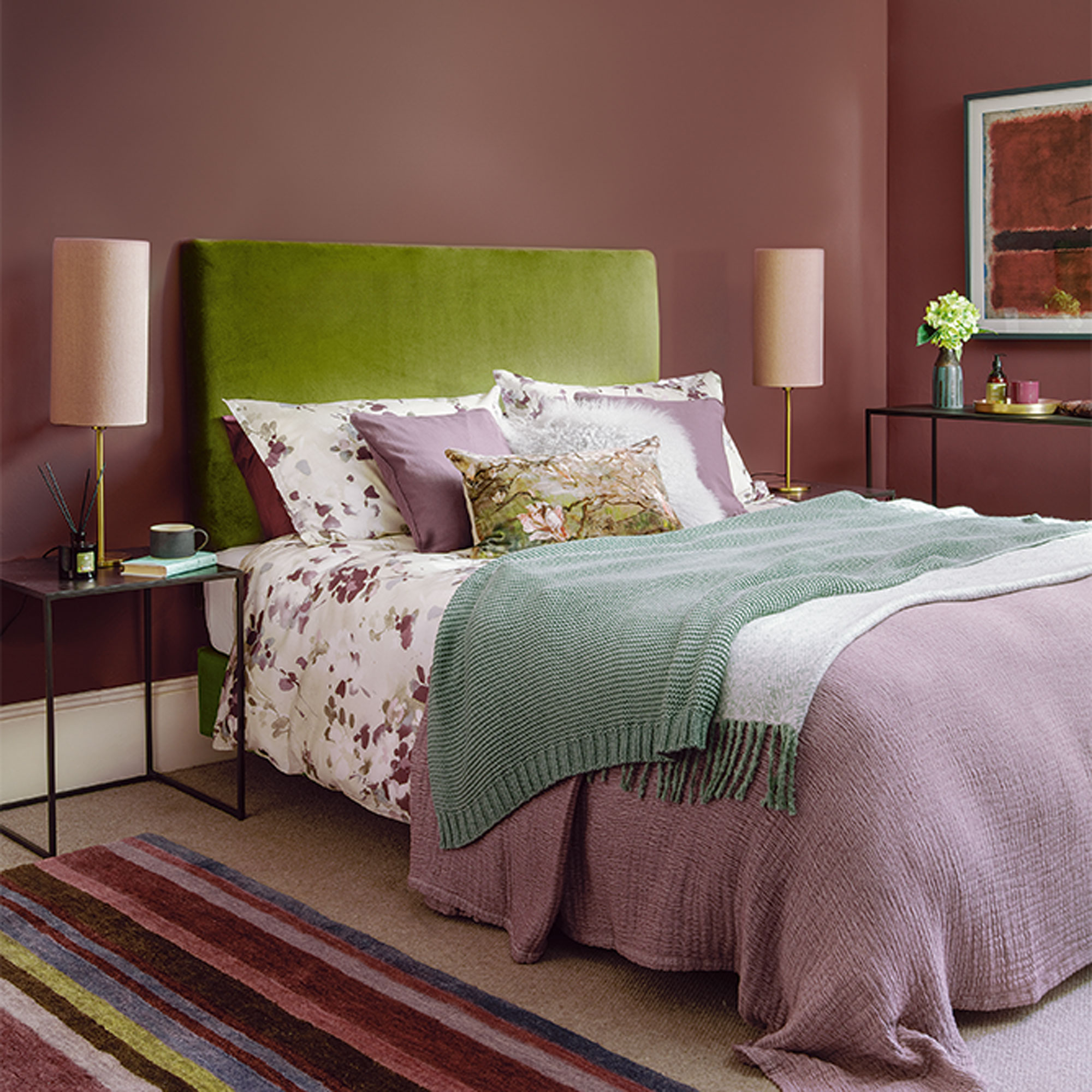
Dusky purple is perfect for giving larger, light-filled spaces a more intimate feel so is an ideal colour for bedrooms. Warm and soothing, without being too challenging, try working in a few accents of zingy green to help uplift and lighten the mood just a little.
‘To capture the zeitgeist, pair plum with jewel-toned emerald or botanical lime green. These two colours are a wonderful foil for one another,’ says paint and colour expert, Annie Sloan.
What are the most calming colour combinations?
Calming colour combinations are those that have the same tonal value. This is they have the same visual impact as each other, one of the colours isn't brighter or darker than the other, rather they match.
Take pastels shades as an example, a pale blue and a pale pink will have the same tonal qualities which means they will be harmonious when used together. If you add in a dark or brighter shade you'll be adding contrast.
What colours work well together?
A tonal scheme is a good place to start if you are unsure about which colours to put together. Also known as tone on tone, this type of scheme is the simplest of all the colour recipes you can use to decorate with as it includes only different tones of one colour (both lighter and darker).
A harmonious scheme uses shades that sit next to each other on the wheel. Choosing adjacent colours is a straightforward way of creating an easy-to-live-with scheme and harmonious colours are the most widely used group in interior design.
A contrasting colour scheme (also known as complementary colours) is created by using two colours that sit opposite each other on the colour wheel. This is often the most challenging of the three schemes to get right, as colours can be cold and warm, or equally vibrant.
What two colours go well together?
The main guide for choosing the best colour combinations is to choose colours that you love, after all, you'll be living in the space so pick shades that make you happy. We asked Patrick O'Donnell, brand ambassador, Farrow & Ball for his favourite combinations:
'Pink and chocolate make great bedfellows – calming and smart, the chocolate acts as a great counterpoint to the gentleness of the pink bringing some modernity to the aesthetic especially if used on the trim or as a block of colour on something like a bookcase or wardrobe.
'Charcoal & spice – whilst a black room may feel an overwhelming option, highlight it warming tones of spice red and burnt orange for a deeply dramatic yet cocooning option and even an option for poorly lit rooms as you are playing with the natural light limitations.
'Earthy pinks and vibrant reds – a colour clash of sorts but as they share underlying colour DNA they make a bright and cheery partnership bringing warmth and vitality to any room, whether kitchen cabinetry and walls or two tone sitting rooms with the stronger colour anchoring the room to dado rail height.'
How do I choose a colour combination?
To choose the best colour combinations it can help to follow the 60-30-10 rule when choosing combinations and determining what colours go well togther. This works by dividing a colour scheme into percentages, with one main colour that represents 60% of the scheme - this could be wall colour, flooring or furniture.
The secondary colour should then represent 30% of the decor, which again, might be furniture, curtains or soft furnishings. Finally, the last 10% of the colour scheme should be designated to an accent colour, used for accessories, such as cushions, lamps, ceramics and wall art.

Lisa is Deputy Editor of Style at Home magazine and regularly contributes to sister title Ideal Home. She has written about interiors for more than 25 years and about pretty much every area of the home, from shopping and decorating, crafts and DIY to real home transformations and kitchen and bathroom makeovers. Homes and interiors have always been a passion and she never tires of nosying around gorgeous homes, whether on TV, online, in print or in person.
- Sophie Warren-SmithContributor
-
 I spent the afternoon looking through Wayfair's garden sale – these are the 6 pieces I'm buying immediately for summer
These are my must-have garden buys from the sale
By Holly Reaney
-
 Stripes have got a bold new look – here’s how to make the trend work in your home, according to interior experts
Add a pop of personality to the classic pattern
By Maddie Balcombe
-
 What to do if you've sown the wrong grass seed – experts reveal exactly how to fix it and get your dream lawn back on track
Don't panic! Follow this easy guide to putting it right
By Natalie Osborn