Cath Kidston reveals her 5 golden rules for decorating that she uses in her own home
The design queen shares her love of colour and pattern – and explains how to make it work in your own home

Sign up to our newsletter for style inspiration, real homes, project and garden advice and shopping know-how
You are now subscribed
Your newsletter sign-up was successful
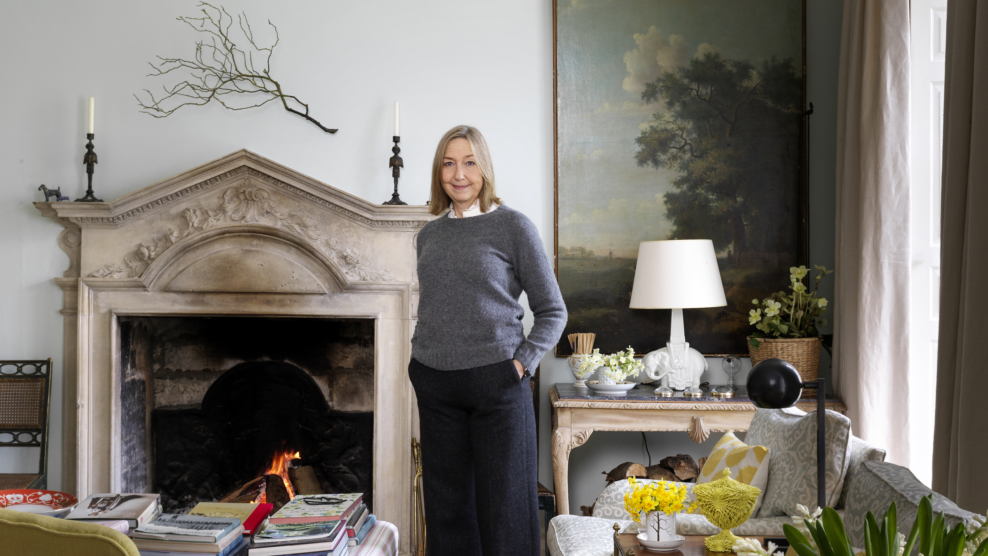
Cath Kidston’s country home is a honey-coloured hideaway near Stroud in Gloucestershire, with views that stretch for miles. The ‘higgledy-piggledy’ property, built as a farmhouse in the 1600s, then smartened up with a new frontage and Gothic windows in the 18th century, retains its old stone floors and huge fireplaces, and Cath has lovingly decorated around these to create an interior full of the colour, warmth and personality we would expect from her.
She also has an equally beautiful home in London's Notting Hill – all her design signatures are there, but the look is smarter and more contemporary, which proves that her essential decorating rules can work in any home.
Here, she talks us through her design thinking, plus why you’ll always find a touch of red in her room schemes.
Article continues belowThis article first appeared in Country Homes & Interiors. Subscribe and save here.
1. ‘It’s okay to throw out a furniture plan’
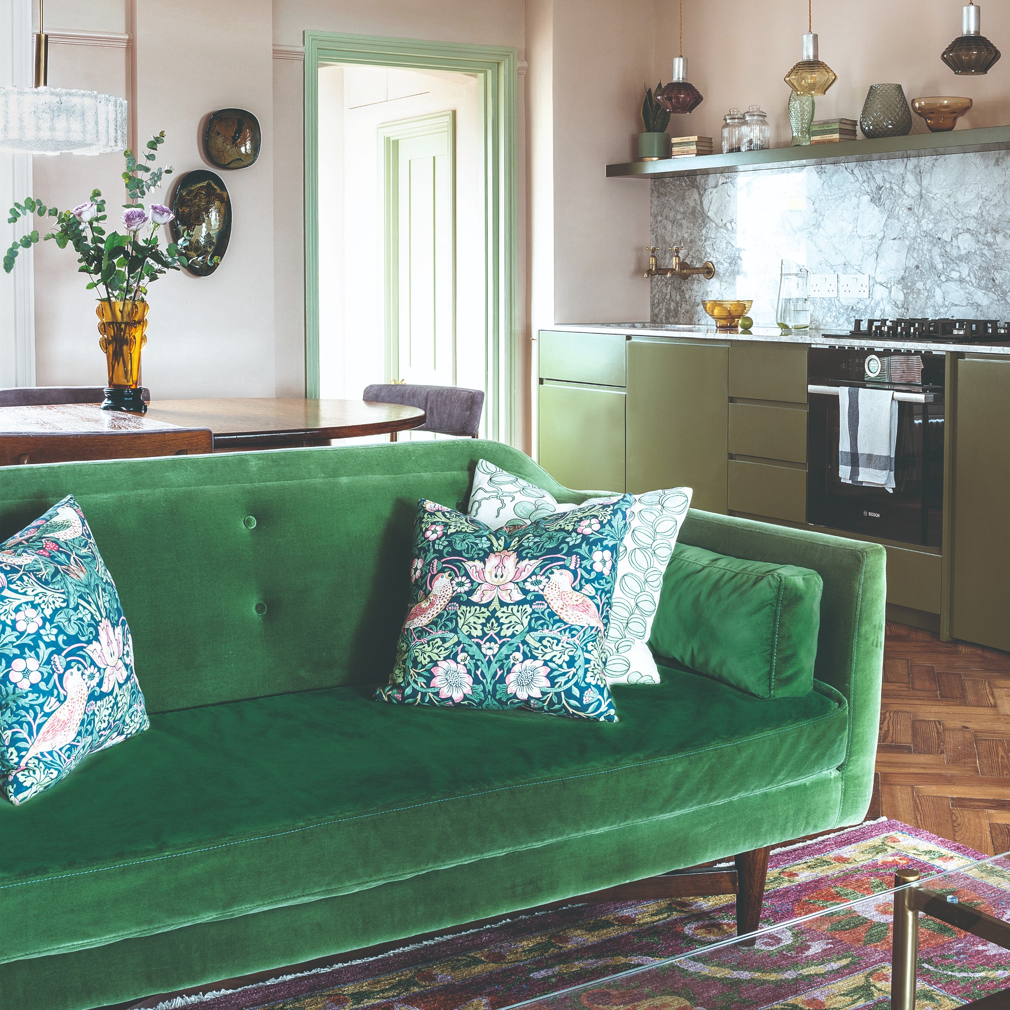
Having a clear idea of how you want to arrange your furniture can help when you're buying one of the best sofas, working out where to put a rug, or making sure you don't trip over side tables and footstools. But sometimes what works in your head or on paper doesn't look right in the room itself. And in that situation, it's okay to throw out the plan and start again, claims Cath.
‘My sitting room is rectangular, and I drew a fairly traditional furniture plan, putting armchairs on either side of the fireplace and a sofa opposite in the middle of the room, with a table behind. But it closed up the room so only half of it was being used' she says. 'Instead, we made two different seating areas in the room, but without shutting it off in the middle.'
This simple switch made it easier to move around the space, and meant both ends of the room could be used by different people at the same time.
Sign up to our newsletter for style inspiration, real homes, project and garden advice and shopping know-how
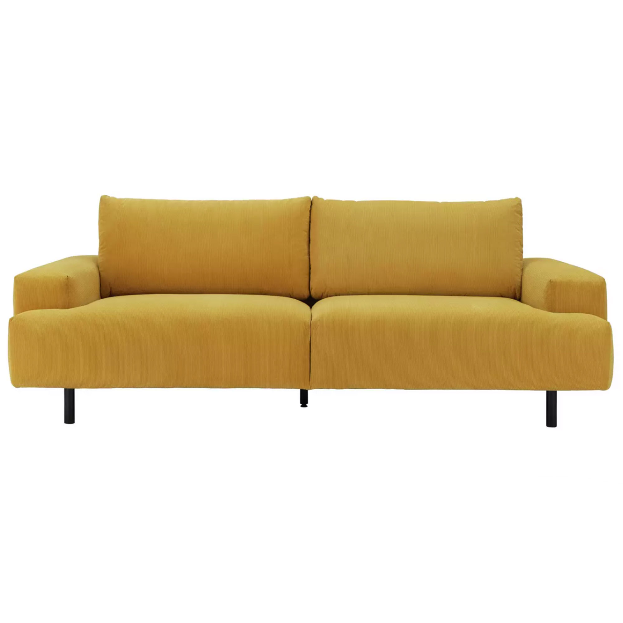
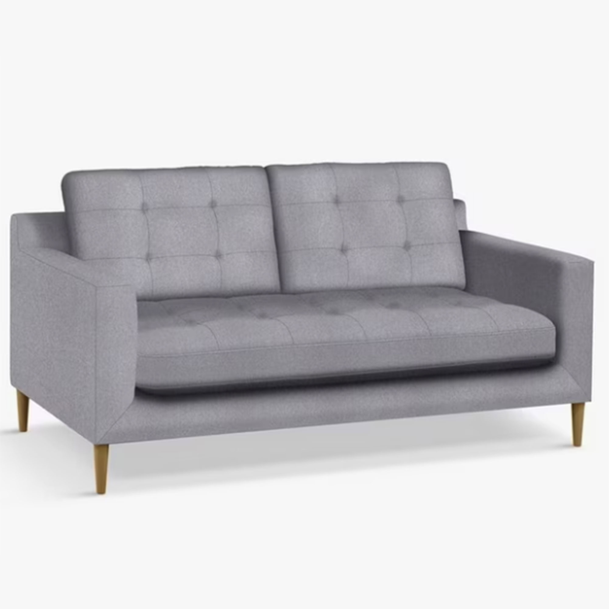
‘My other tip is always to buy a straight-back sofa,' says Cath. 'You see those beautiful sofas with curved backs but if you move house they look odd if they're plonked in the middle of a room; a straight one is a lot more adaptable if you go from place to place.’
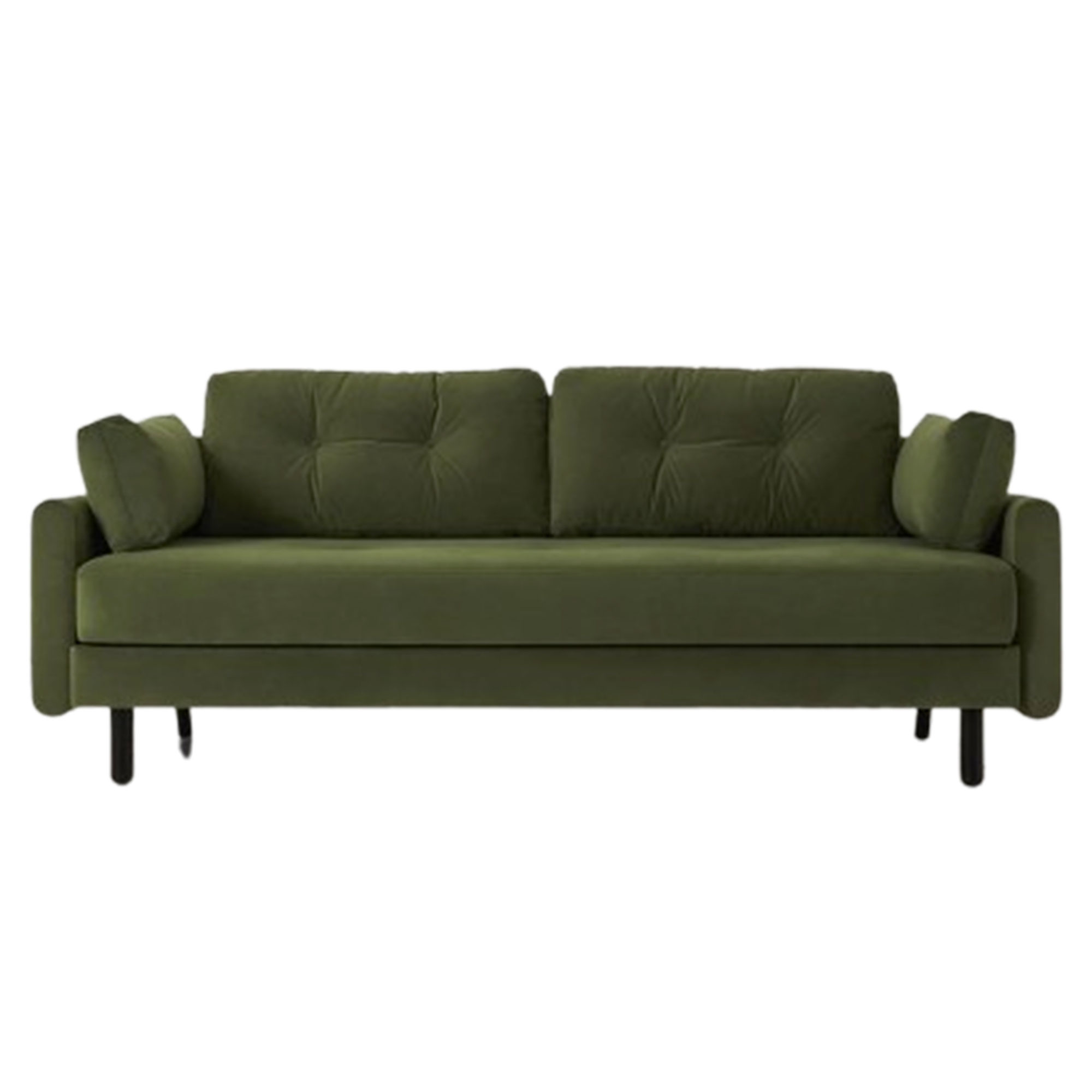
Get more bang for your buck by choosing one of the best sofa beds for your seating. It can be delivered within 24 hours, too.
2. ‘Never underestimate comfort’
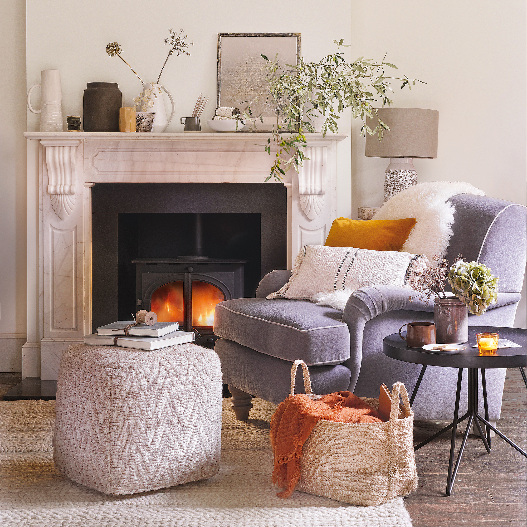
It's easy to fall in love with a statement chair or a hotel-style bed, but are you actually going to spend time hanging out there? We've all been in homes where the saggy sofa in the kitchen is where everyone sits, while the smart replacement in the sitting room never gets used!
‘When I was decorating, I thought about where we were going to spend the most time – and it was bed, the kitchen and watching TV. So I bought two lovely big squishy armchairs with footstools for the TV room. And I have knitted fleece on the seats which I can put in the washing machine so the dogs can go on the chairs. It’s practical, but it also makes it cosy and comfy,' says Cath.
‘This is the room in our house where people feel most at home, I think, because it's colourful, very light and sunny – it's almost like a playroom. And no one thinks twice about putting their feet up, because we’re inviting them to.'
3. ‘Make change easy’
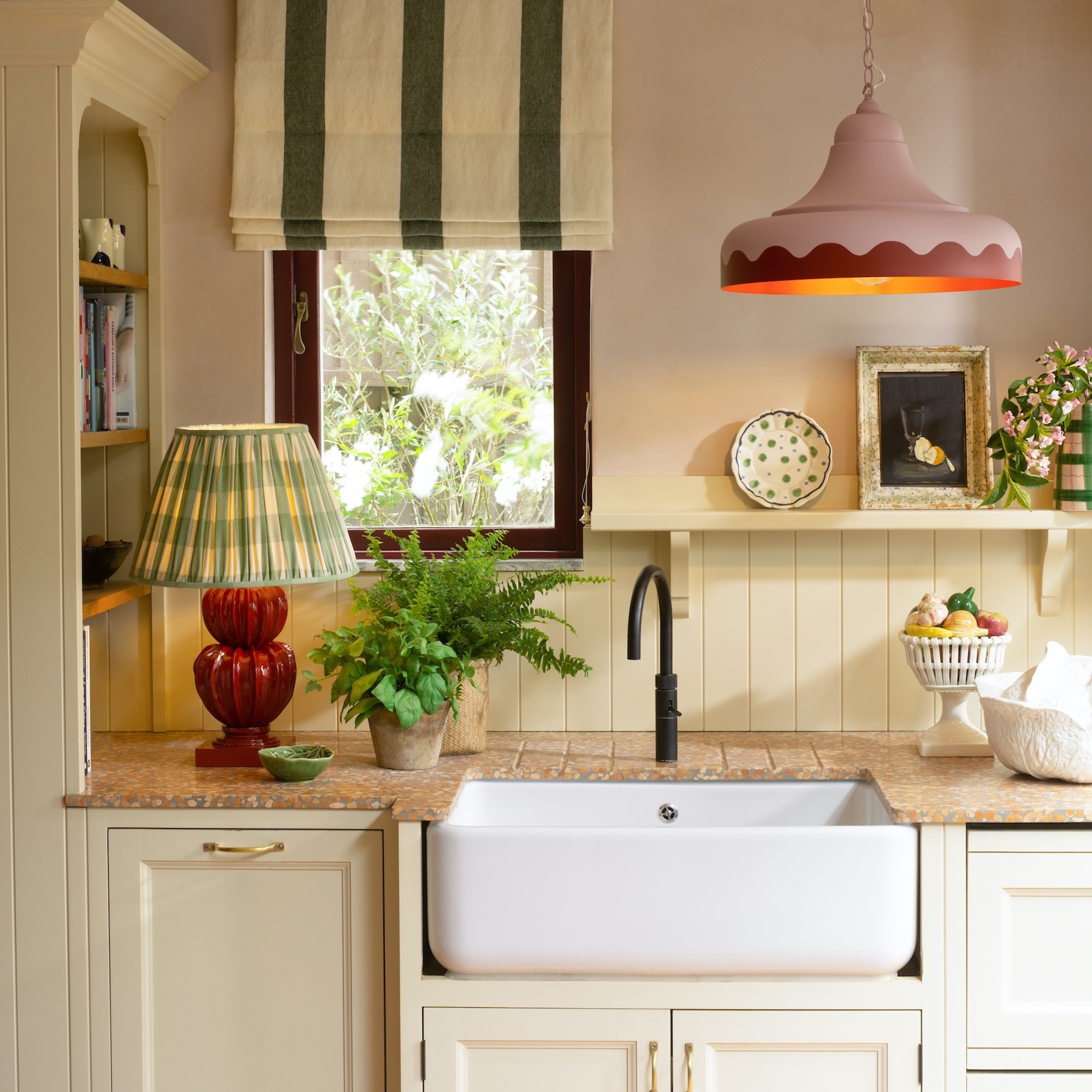
The best decorating schemes can flex with the seasons, your needs and even your mood. It's all down to having a great baseline for your decorating – a favourite colour on the walls, say, or the perfect kitchen units – then being able to add or take away colours, accessories and furnishings to switch up the look when you want.
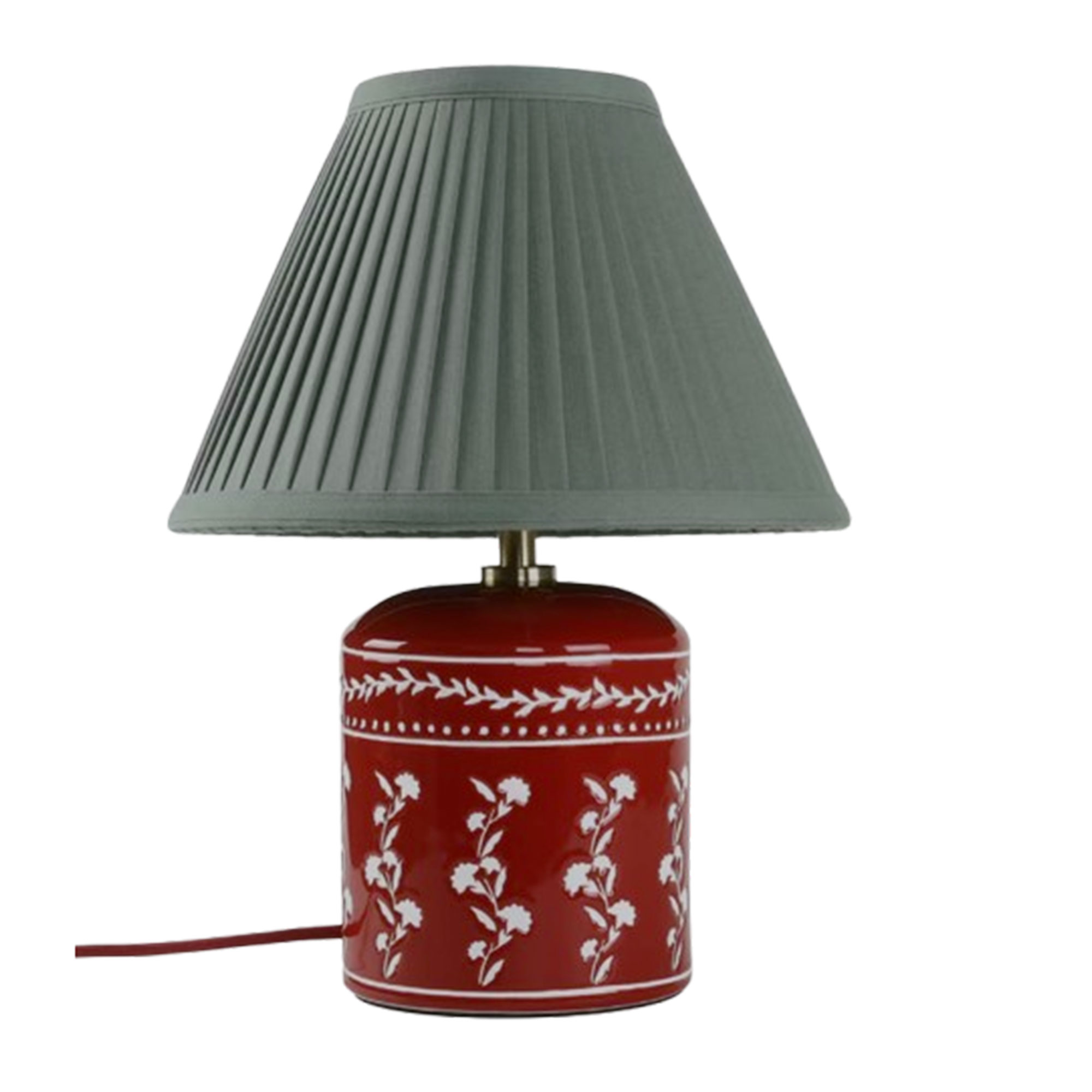
‘I'm looking at my kitchen thinking I've been meaning to replace the handles. I had to put them on in an emergency when we moved in,' Cath says. ‘This room really changes. I can swap the cushions or the tablecloth, or put plants on the island. What I love now are the beautiful cordless lights you can put on the table.'
4. ‘Always add a touch of red’
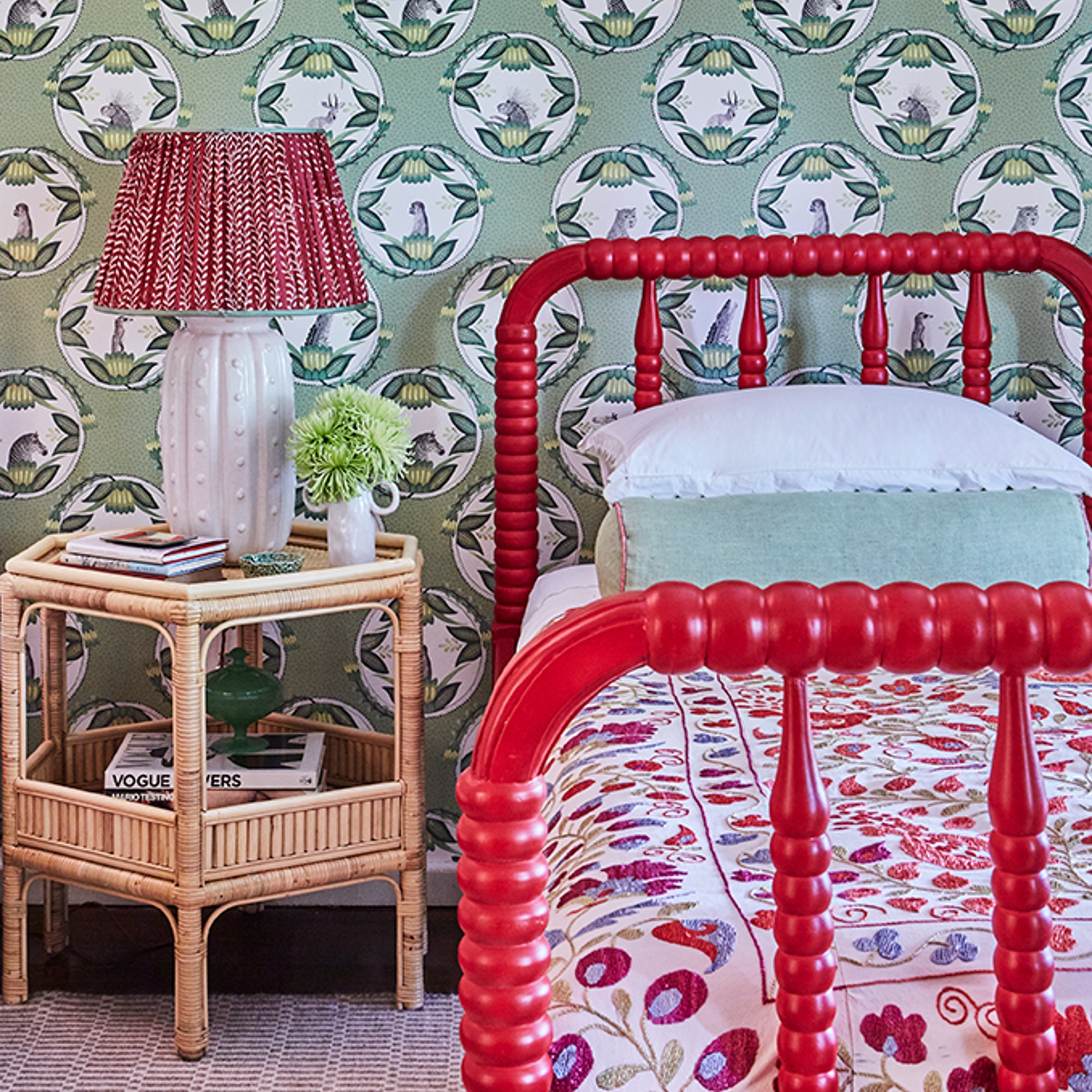
Cath Kidston was a fan of the unexpected red trend before it became a thing. ‘Using colour is very intuitive, but I’ve always loved to add red as an accent. I think the same with yellow,' she says.
'I start by making Pinterest boards. In the TV room. I built around the rug we’ve had in our previous two houses – it's reds, blues and yellows, so that was the foundation for the rest of the colours. I added the painting with a yellow background that my aunt gave me, then I found the blue tables and the pink chairs. But it felt a little bit too matching, so I added the emerald green fender as a splash of extra colour.’
5. ‘Be true to yourself’

Everyone has a style identity, and while you may want to switch up a look from time to time, the essence of what you love will likely stay the same. That's good, because it means you can create a decor scheme you always enjoy spending time in.
‘I obviously love florals, they’re a part of my DNA, but I tend not to have chintzy stuff downstairs,' explains Cath. 'It comes out in the bedrooms, where I have flowery pillowcases or a headboard covered with a big old piece of flowery Indian cotton my sister gave me.
'I tend to start plainer and then build up with a decorative pattern. And there are certain things I find really warm a room up, like bookshelves because books naturally bring these sort of jewel-like colours. You could have just a plain beige room and add great pictures and fresh flowers.
'Everyone has their own taste and style handwriting. I want my home to feel welcoming and just a lovely place for people.’

Andrea began her journalism career at Ideal Home and is currently Editor of our sister title, Country Homes & Interiors, which celebrates modern country style. Andrea is passionate about colour and how it can transform both our homes and our sense of wellbeing, and has completed The Power of Colour course with the prestigious KLC School of Design. Andrea's career spans interiors magazines, women's lifestyle titles and newspapers. After her first job at Ideal Home, she moved on to women's magazines, Options and Frank. From there it was on to the launch of Red magazine, where she stayed for 10 years and became Assistant Editor. She then shifted into freelancing, and spent 14 years writing for everyone from The Telegraph to The Sunday Times, Livingetc, Stylist and Woman & Home. She was then offered the job as Editor of Country Homes & Interiors, and now combines that role with writing for idealhome.co.uk.
