Farrow & Ball's releasing 12 new paint shades – these are the ones I predict we’ll soon be seeing everywhere
Meet the 9 brand new paint shades and 3 archival colours Farrow & Ball is launching this week
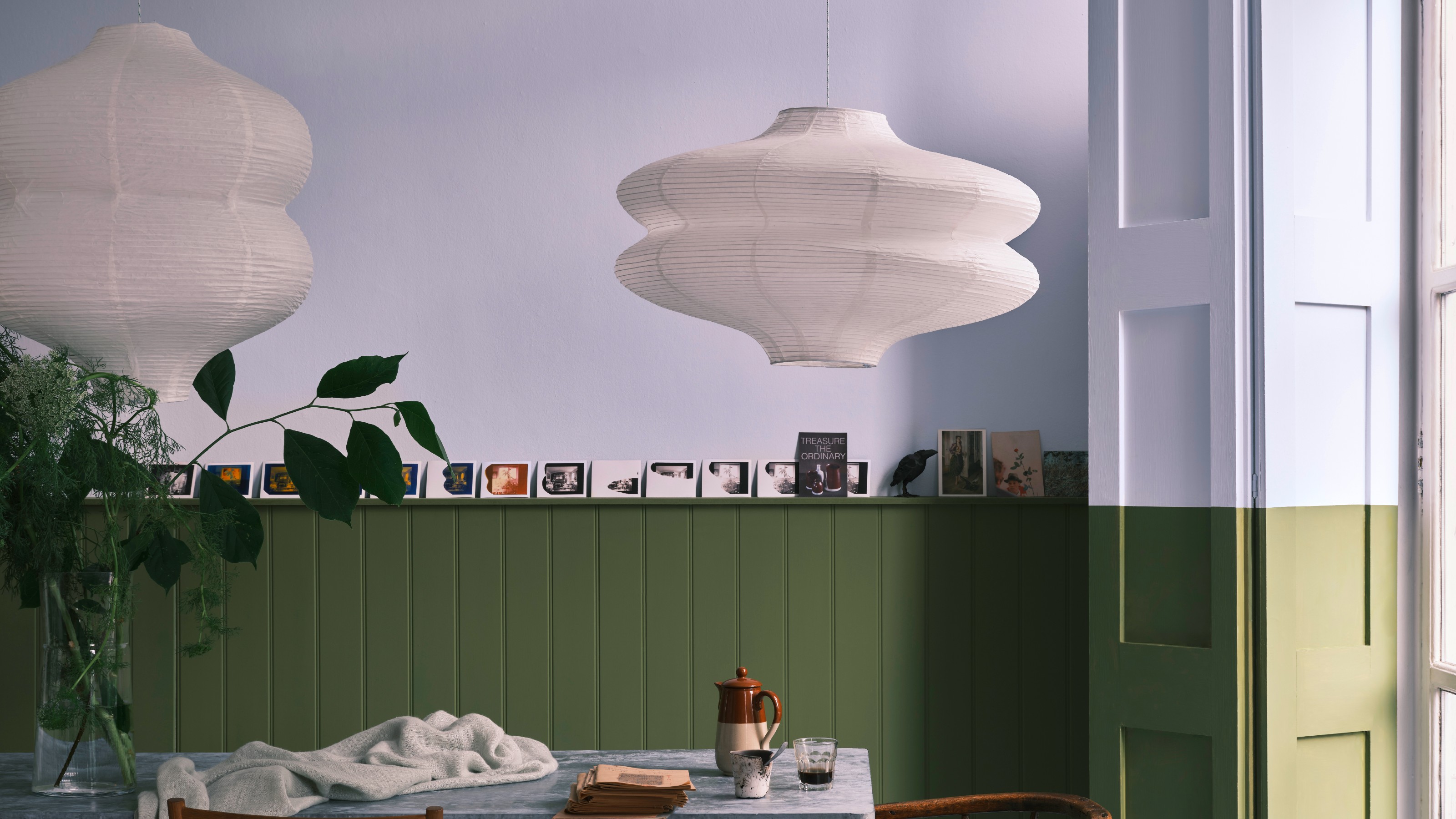

Most likely when you think of paint, Farrow & Ball will be one of the first brands - if not the first - that springs to mind. Despite its impressively extensive but also perfectly curated library of 132 shades, one of the things that doesn’t happen often is a new paint shade launch from the paint brand. For reference the last new launch was back to 2022. But on Thursday (27th March) we’re getting lucky because Farrow & Ball is launching not one but 12 new paint colours.
If you couldn’t tell already, I’m truly excited because not only do these shades further confirm some of the hottest paint trends of 2025 like the fact that earthy shades are certainly here to stay, but with this release, Farrow & Ball is doing something it never usually does. You see, only nine of the paint shades are brand new, while the other three are archival shades that are being re-released. And it’s perhaps these three shades - Etruscan Red, Broccoli Brown and Sap Green - that I’m personally most excited about.
A post shared by Farrow & Ball (@farrowandball)
A photo posted by on
‘I love delving into our archive, there are some real treasures tucked away in there and I’m thrilled these three are getting another turn in the spotlight,’ says Charlotte Cosby, Farrow & Ball’s creative director.
But without further ado, let’s meet the new shades joining the Farrow & Ball ranks – including the ones I think will take over as some of the most popular go-to paint ideas.
The new Farrow & Ball paint shades
Etruscan Red
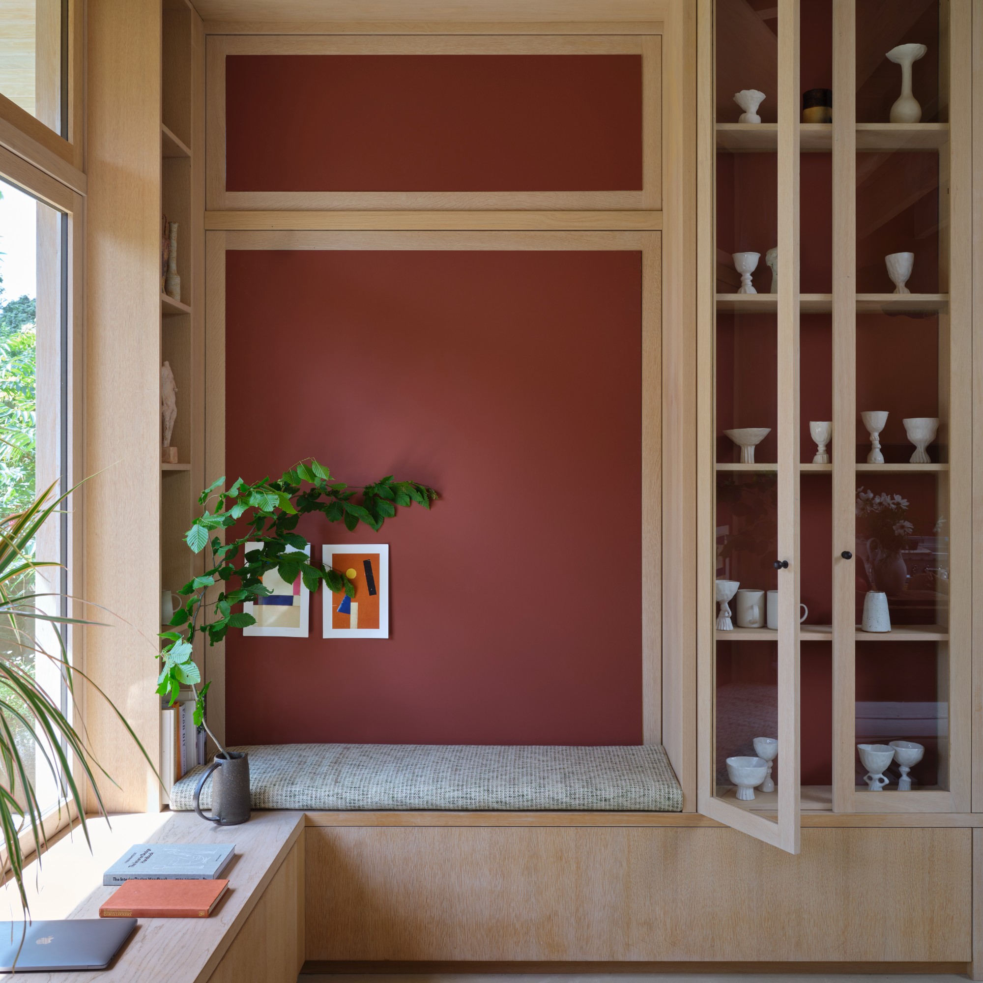
Not to play favourites, but if I was pushed to select my top pick from the new line-up then it would be the dark and earthy Etruscan Red. Featuring a brown base, this grounded shade is named and inspired by the Etruscan ancient civilisation that occupied today’s Italy and is known for its use of a similar deep red hue.
Farrow & Ball notes that it’s less intense than its Preference Red shade – so if you love red but find it too overwhelming to decorate with, this could be the perfect shade for you. And I’m pretty sure we’re about to see a lot of this colour popping up everywhere very soon.
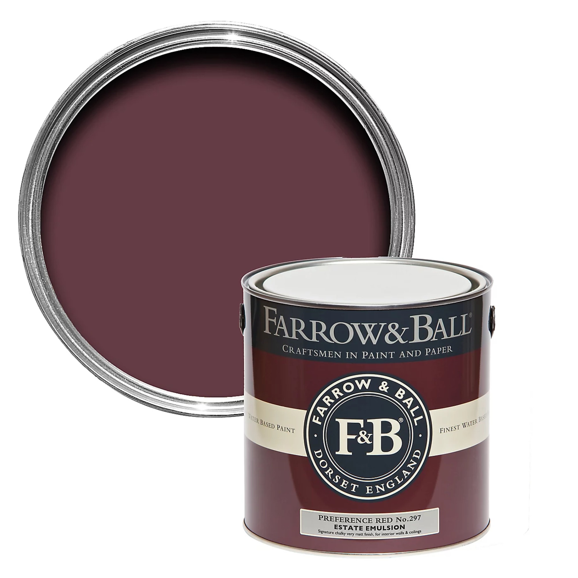
In comparison to Etruscan Red, Farrow & Ball's Preference Red is a Baroque-inspired shade and currently the darkest red in the collection. But not for long.
Broccoli Brown
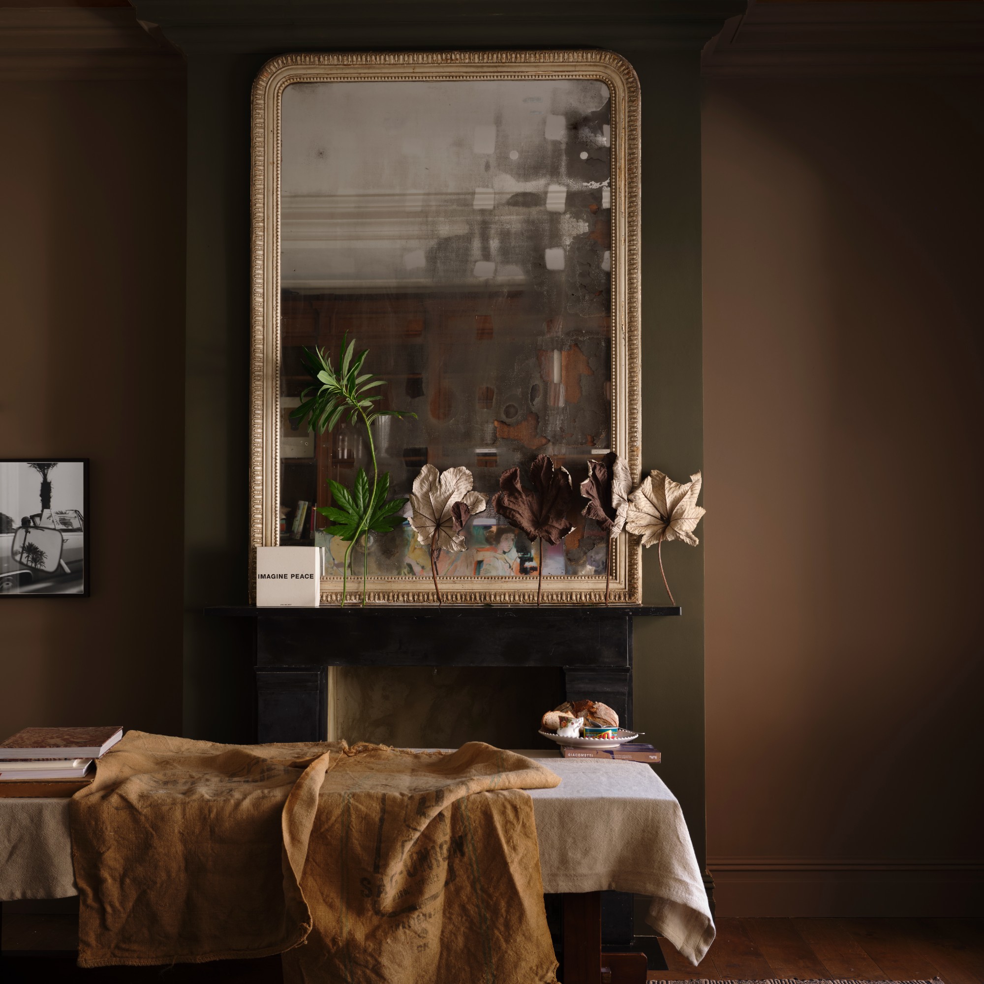
Ever since Pantone’s revealed its colour of the year for 2025 to be Mocha Mousse, a soft brown shade, various shades of brown have been popping up in homes and interiors a lot more. So I’m not surprised even Farrow & Ball has opted to relaunch one of its archival brown shades, Broccoli Brown.
Get the Ideal Home Newsletter
Sign up to our newsletter for style and decor inspiration, house makeovers, project advice and more.
This shade is certainly on the darker side but it’s sure to create a cocooning, warming feel in any space you apply it too with a strong connection to nature and the Earth.
Sap Green
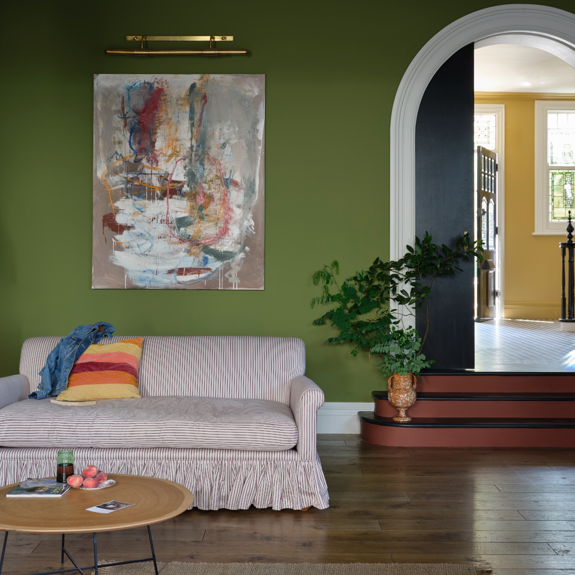
Sap Green by Farrow & Ball has been used all over the walls in this living room.
Sap Green is the last archival shade of this launch. And while it’s not the only green in this collection, it’s certainly the most vibrant.
Due to the popularity of biophilic design ideas, green has been a go-to colour choice for many homes ever since the pandemic. Last summer, four green shades defined the season, including olive green – which is exactly how Farrow & Ball describes Sap Green, ‘an enticing olive shade’.
Marmelo
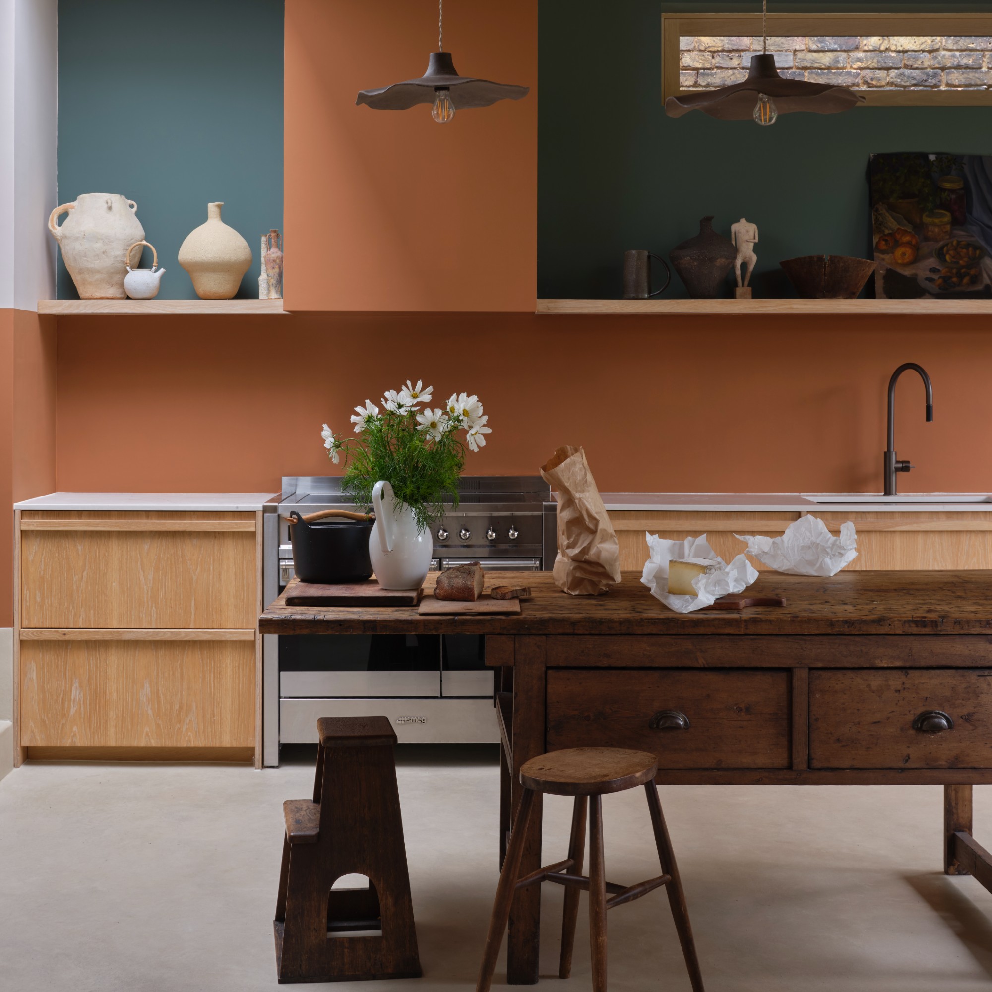
Marmelo by Farrow & Ball has been used to pick out the cooker hood and splashback.
Marmelo is perhaps the most unique of the new launches. So it’s not entirely surprising that it’s also the brand’s creative director, Charlotte’s favourite. ‘Marmelo, named after the quince that inspired marmalade, is one of my favourite new colours. Who could fail to be comforted by that familiar orange reminiscent of warm, buttered toast and conversations around the breakfast table,’ she says.
The greens – Douter, Dibber and Reduced Green
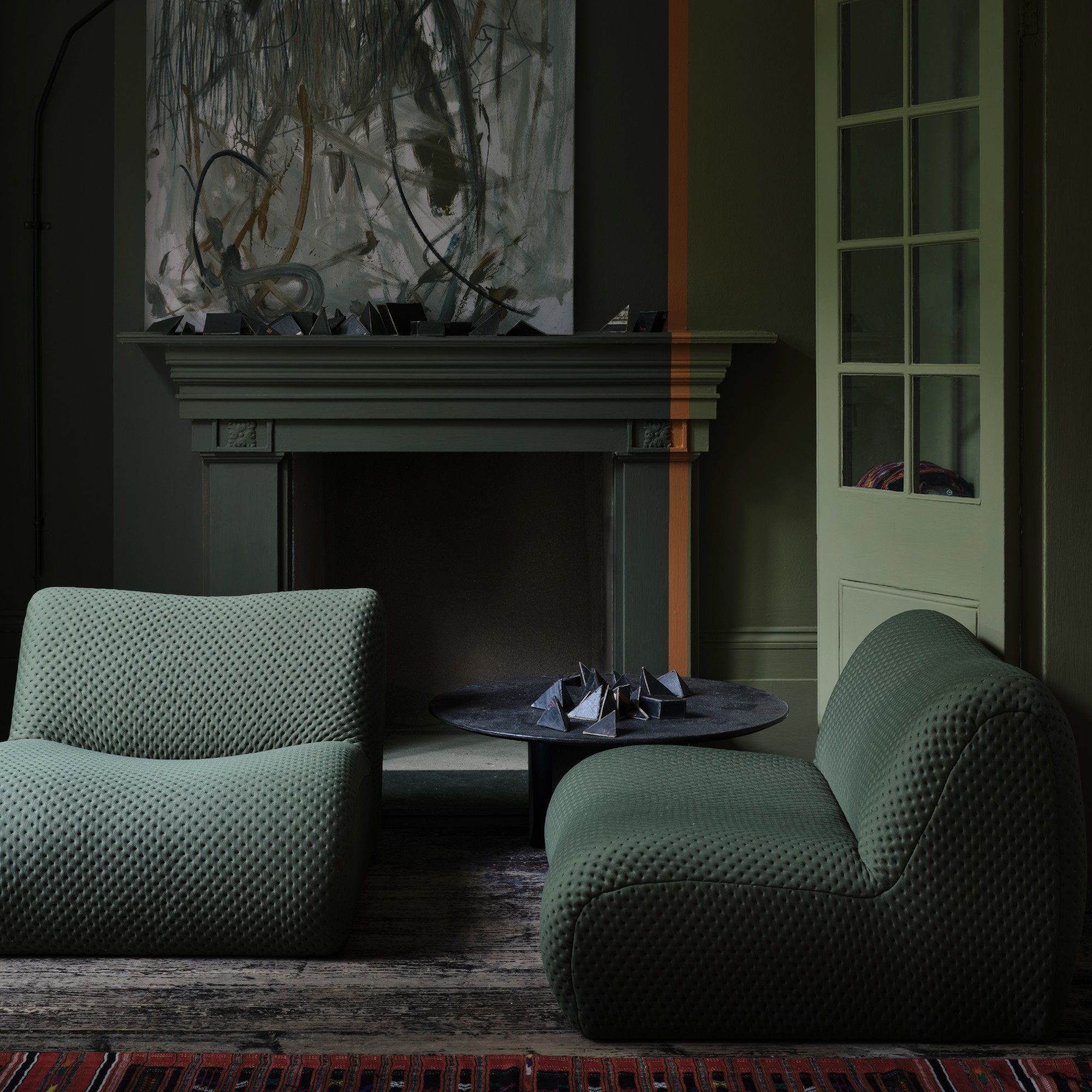
This living room has been drenched in Farrow & Ball'sReduced Green and Dibber paint shades, separated by a line in Marmelo
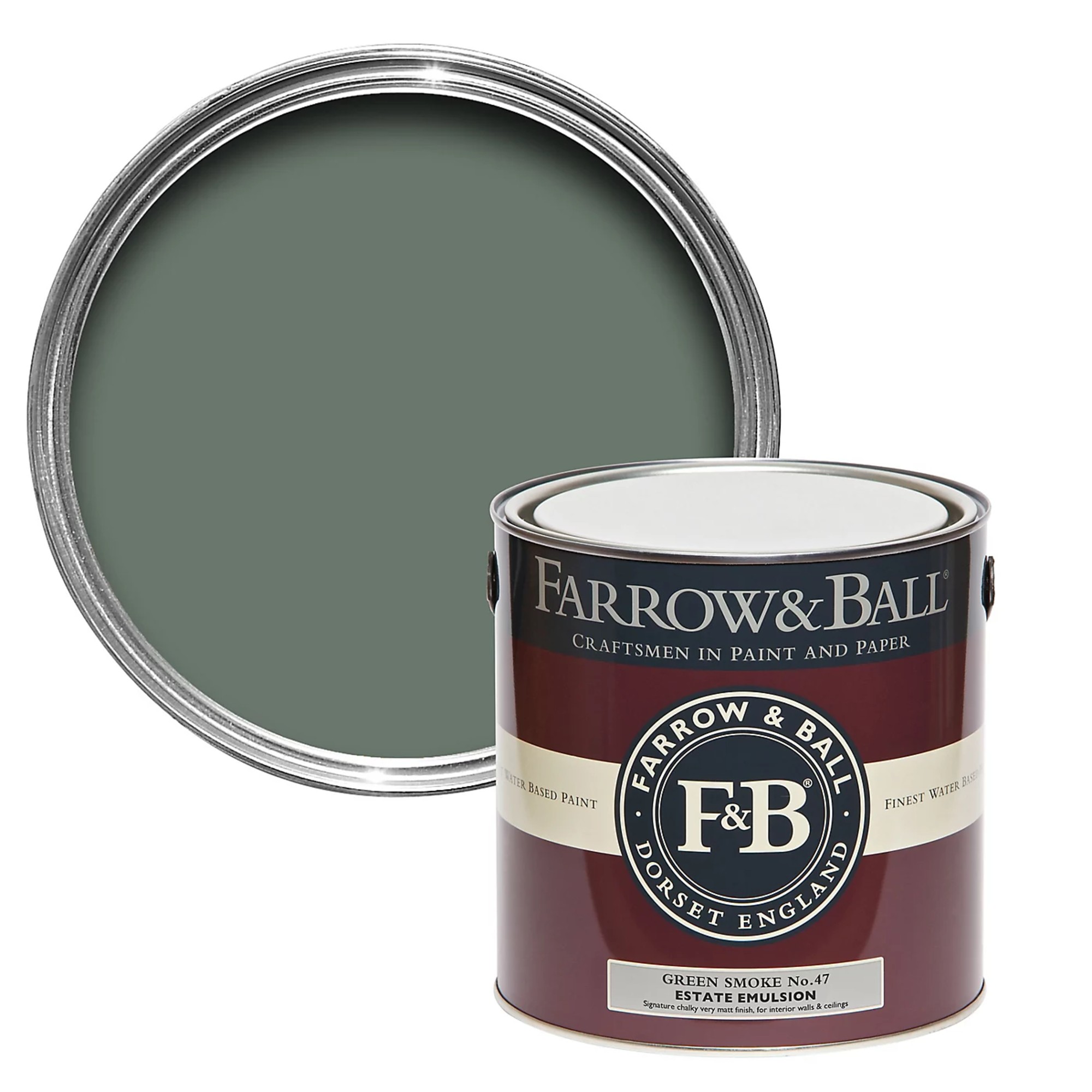
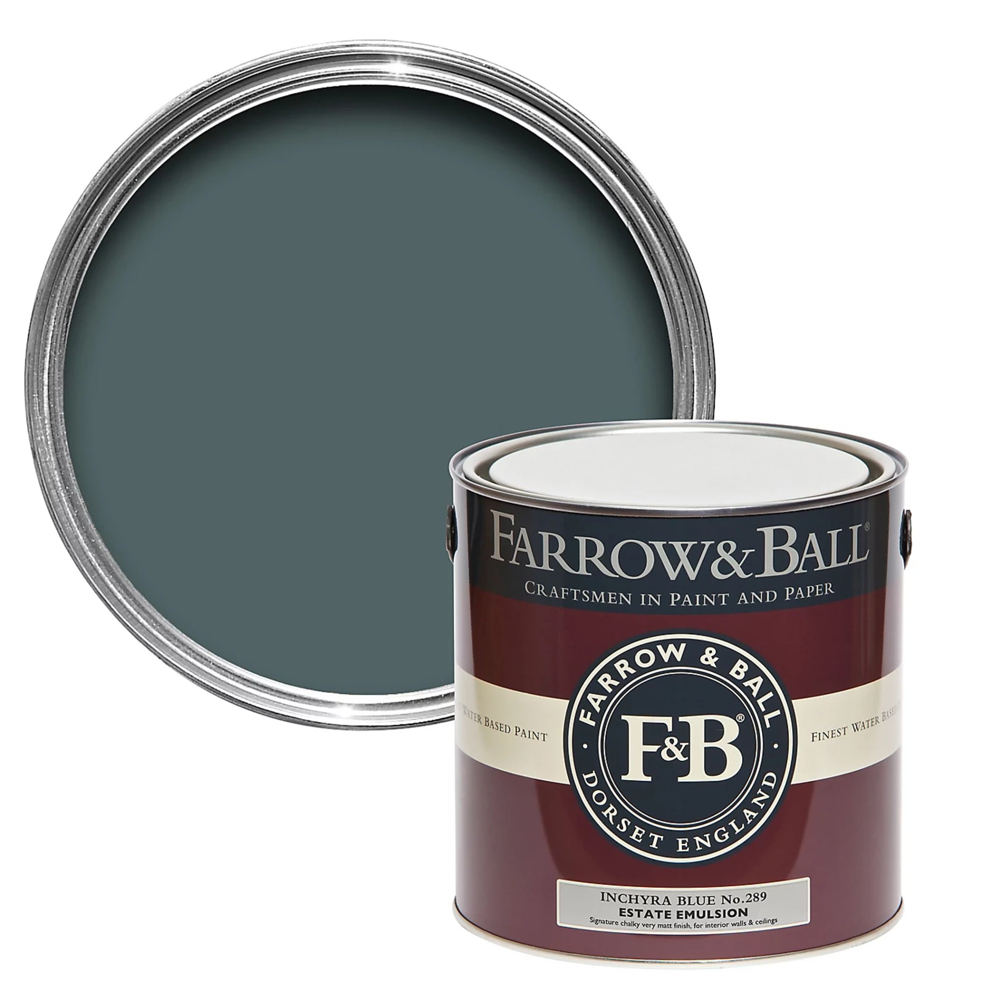
The new launch includes three new shades of green: Douter, Dibber and Reduced Green. ‘I have a real soft spot for Douter,' Charlotte at Farrow & Ball says. 'It sits somewhere between Inchyra Blue and Green Smoke. It was inspired by traditional brass candle snuffers and I always think candlelight brings a magical quality, whether it’s a dinner party or just a cosy evening in.'
Aside from the smoky grey green Douter, there’s also Reduced Green - an extremely dark shade with an intense brown pigment that makes it appear as just brown to some - and Dibber, named after the gardening tool you’d use to poke holes in the ground to plant seeds. And while Dibber is also a muddied take on green referencing the natural world, it’s lighter and brighter than the dark Reduced Green.
The pastels – Scallop, Sizing and Kakelugn
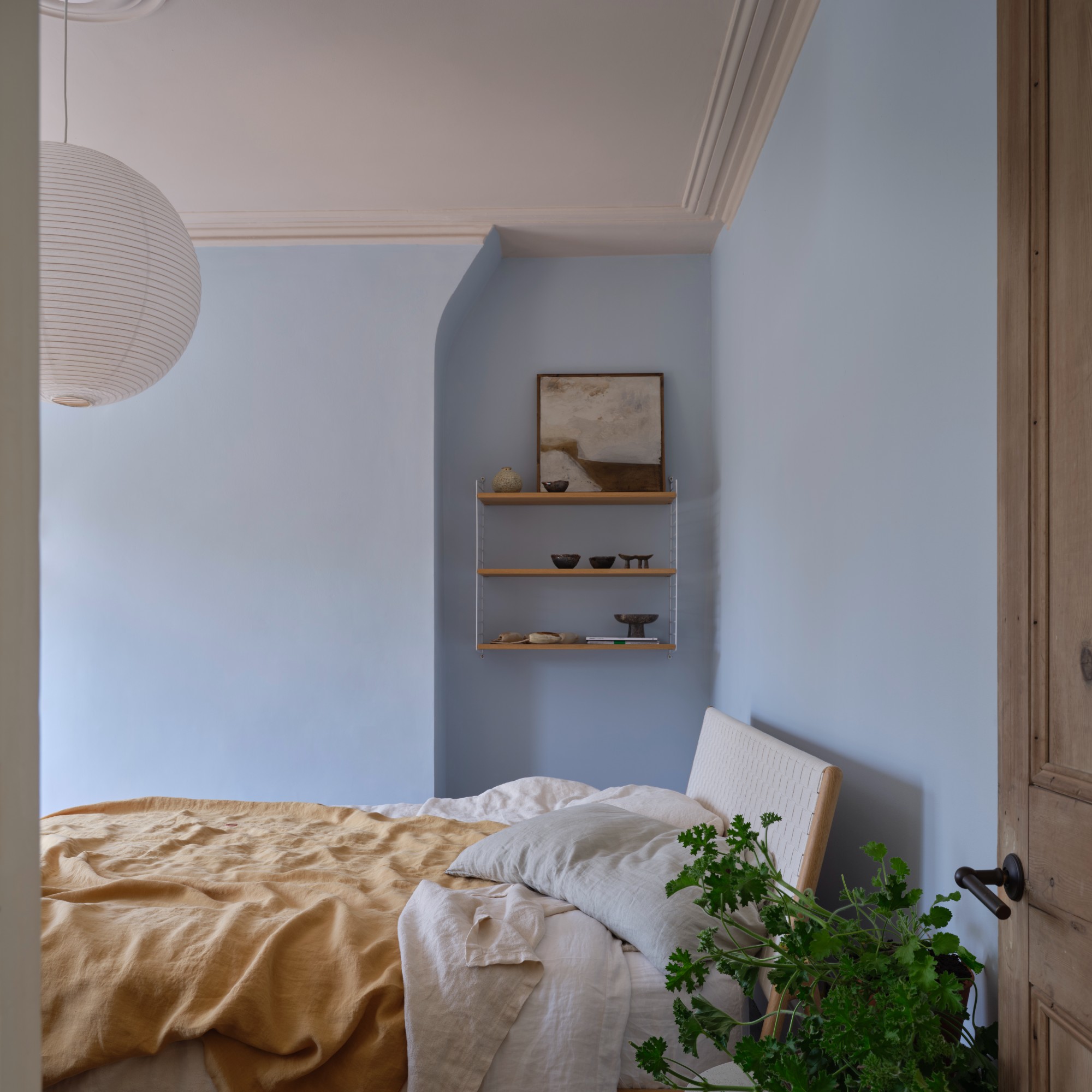
The walls in this airy bedroom have been painted in Farrow & Ball's Kakelugn blue shade and the ceiling in Scallop
Alongside the dark and earthy shades in this new release, some light and serene colours are on hand to balance it.
Soft pinks and light blues are among the most popular living room colour schemes at the moment. So these new Farrow & Ball colours will fit in with the current mood perfectly.
Starting with Scallop, a soft take on a salmon pink, it is a lighter reinterpretation of Farrow & Ball’s existing Dead Salmon shade.
Meanwhile, both Sizing and Kakelugn are light shades of baby blue. The former is the softer of the two, providing just a whisper of blue colour in its undertone and bearing a crisp, almost neutral quality. But if you’re after a bit more colour than that, Kakelugn is the one for you, named after Swedish folkloric fires that usually bear this very shade.
The brand also calls this ‘the cleaner interpretation’ of its Light Blue a shade that has been highly requested.
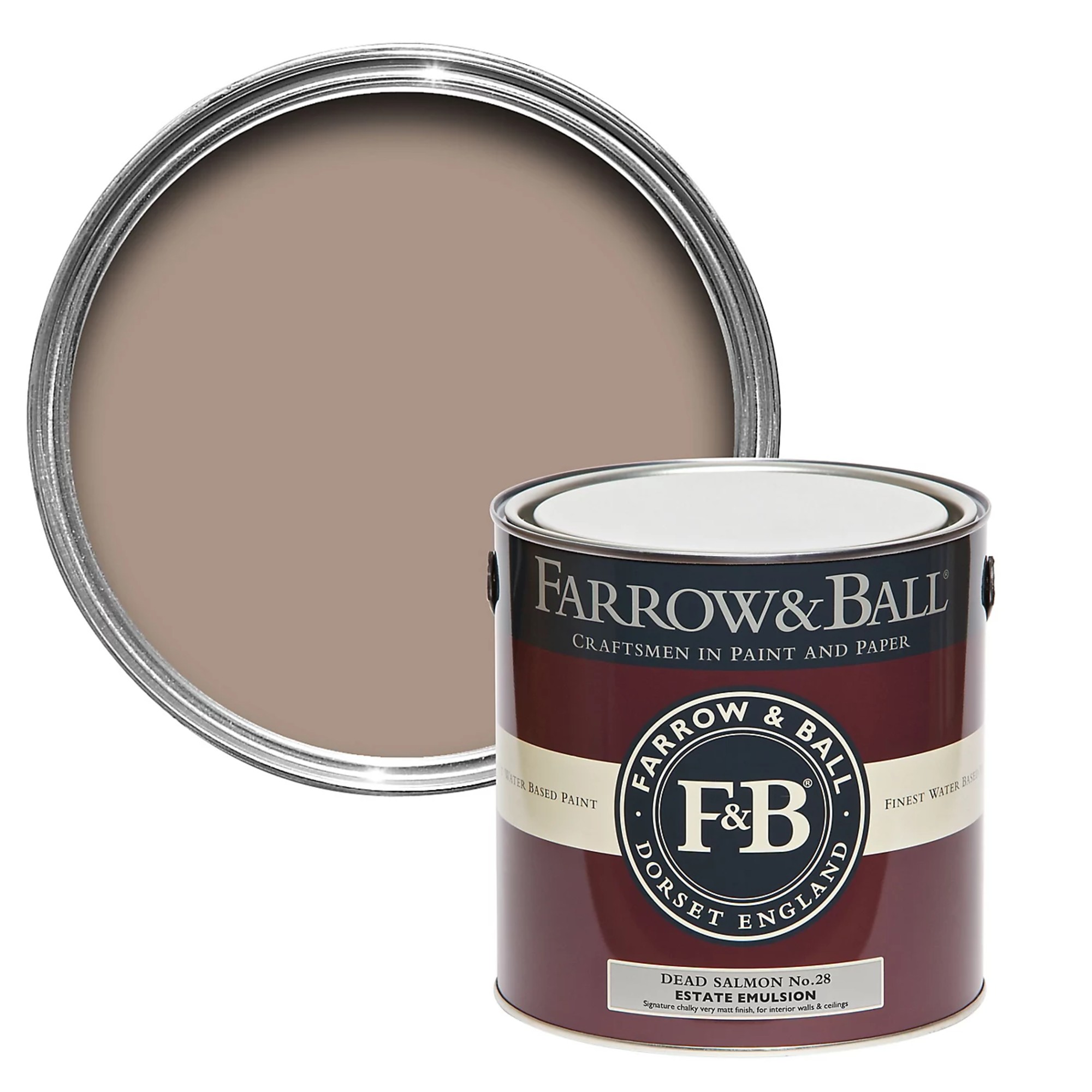
Soft salmon pink - inspired by the flesh of the namesake fish - like this one and the upcoming Scallop works perfectly in living rooms and bedrooms alike.
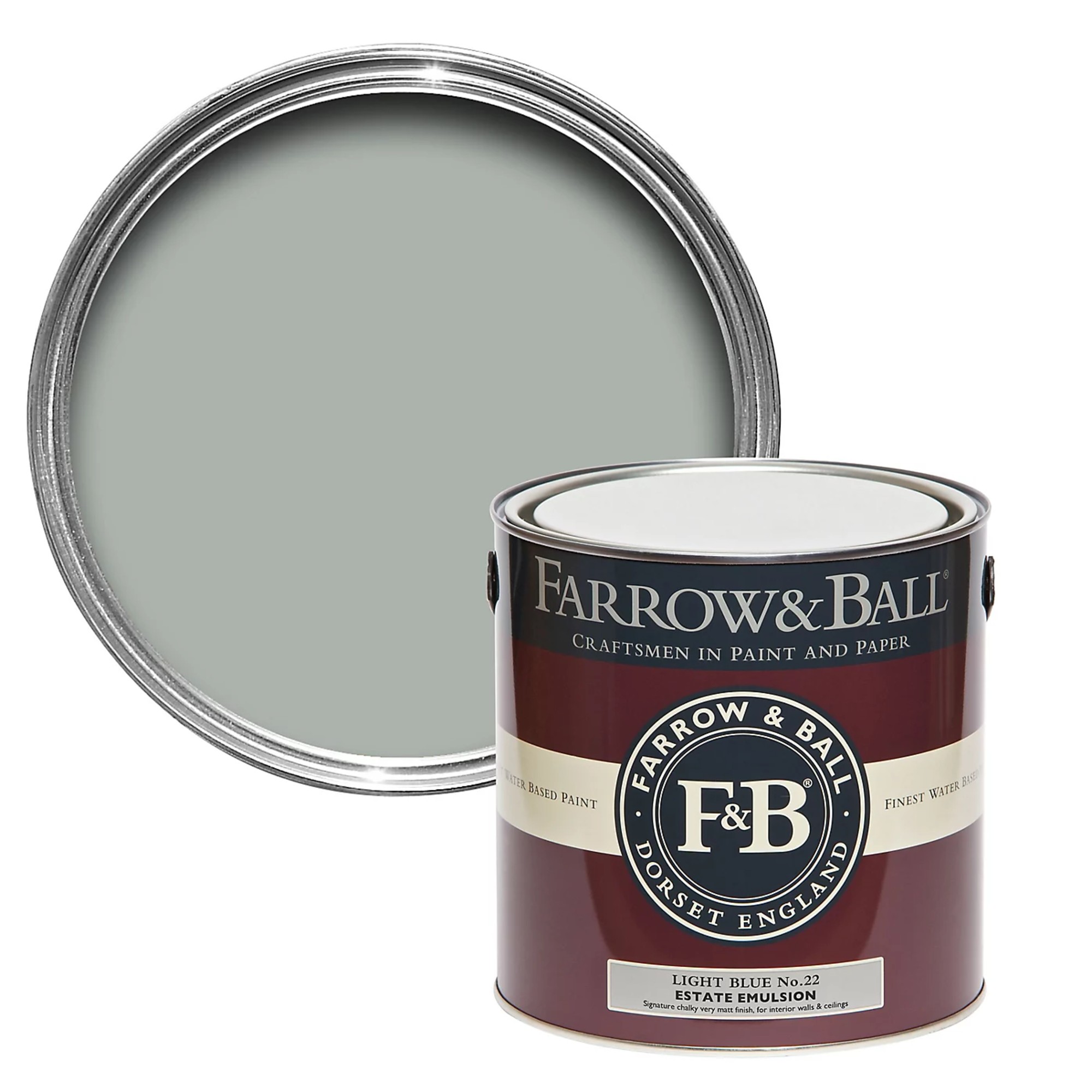
Farrow & Ball's Light Blue paint shade is a more of a 'silvery' blue with a slight green undertone than a true baby or sky blue one might expect. That's why the iminently dropping Kakelugn is going to be such a welcome addition - and an instant hit I predict.
Duster
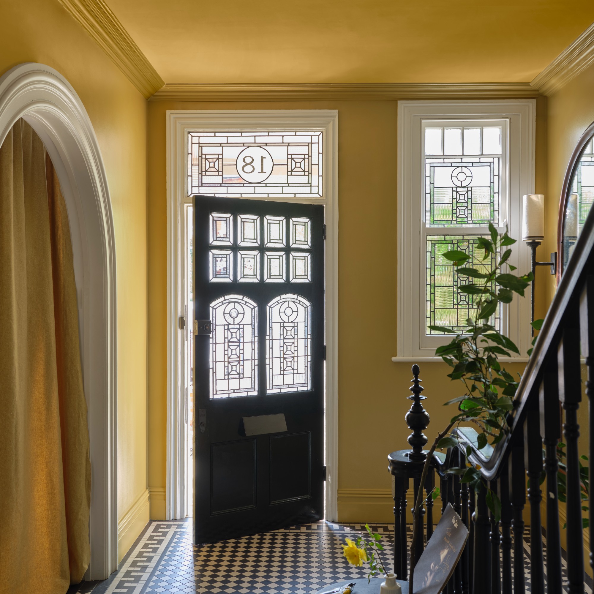
Who would have thought that bright yellows would be a home decor trend come 2025? The first hint was Dulux’s colour of the year, True Joy. But now, even Farrow & Ball is adding to it with its new Duster shade. Described as a deep ochre, this shade has a rather humble inspiration behind it as you may have guessed from its name – and that’s the bright yellow cloth we use to wipe and dust all surfaces at home.
Naperon
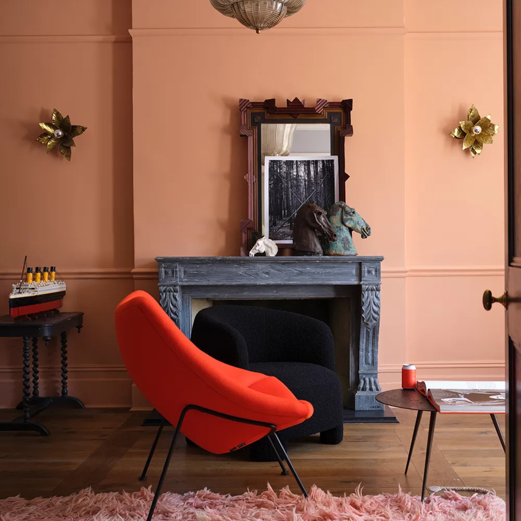
Is it just me that’s absolutely obsessed with terracotta shades? Every room, storefront or building covered in a terracotta colour is one I start lusting over and want to recreate at home. Naperon is Farrow & Ball's answer to this trend, a vibrant clay shade.
The full new range will launch on Thursday and we can't wait to see how these shades are interpreted and used throughout the home. Which is your favourite new paint colour?

Sara Hesikova has been a Content Editor at Ideal Home since June 2024, starting at the title as a News Writer in July 2023. She is now also the Ideal Home Certified Expert in Training on Furniture, and so far has tested 80 different sofas.
Graduating from London College of Fashion with a bachelor’s degree in fashion journalism in 2016, she got her start in niche fashion and lifestyle magazines like Glass and Alvar as a writer and editor before making the leap into interiors, working with the likes of 91 Magazine and copywriting for luxury bed linen brand Yves Delorme among others.
You must confirm your public display name before commenting
Please logout and then login again, you will then be prompted to enter your display name.
-
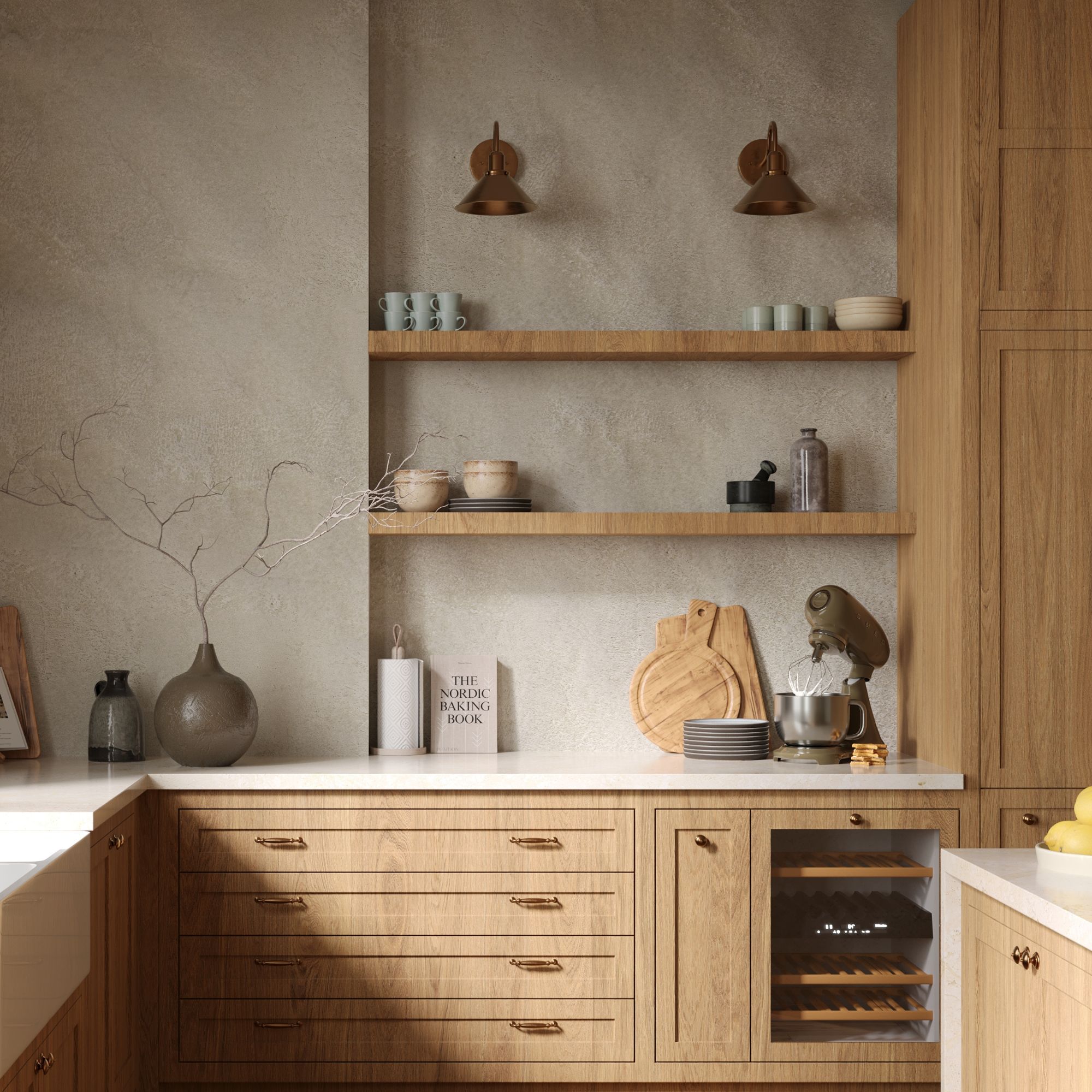 Wood drenching is the calming new twist on the colour drenching trend – here’s how to make the look work in your home
It’s easier than ever to embrace natural materials
By Maddie Balcombe
-
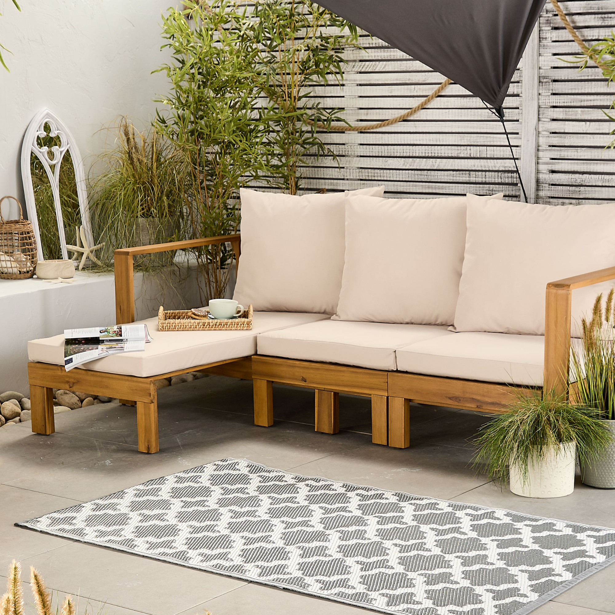 Aldi is launching a £200 day bed with four different features - its sleek design is suited to the whole family
You don't want to miss out on this Specialbuy
By Kezia Reynolds
-
 How to set up a drip watering system that saves water and a lot of effort
Keep your plants hydrated (and your water bill down) with this clever garden watering solution
By Natalie Osborn
-
 I've been waiting to try out the Ninja Slushi for months – this is what happened the first time I tried it
The Ninja Slushi is the stuff of dreams for summer entertaining
By Molly Cleary
-
 IKEA has drenched its BILLY bookcase in this year’s ‘it’ colour - but you’ll have to act fast if you want to get your hands on one
I'm obsessed with this gorgeous limited-edition colourway
By Kezia Reynolds
-
 My go-to Ninja coffee machine just had a major price drop. It's more affordable than I've seen it before
It makes coffee shop quality achievable at home
By Molly Cleary
-
 I'm a kitchen decor editor and didn't like this tableware trend - until I saw H&M Home's designer-look plates
They made it easy to justify a new crockery set
By Holly Cockburn
-
 Have we just had a sneak peek at Ninja's plans for pastel air fryers? These new US-exclusive Crispi colours are giving us hope for the same in the UK
Ninja's spring colours collection i the US has sparked some serious appliance envy
By Molly Cleary
-
 I'm suffering serious kitchen appliance envy over Ooni's new standmixer that sold out in 4 hours, but it's finally back in stock
Here's why the Ooni Halo Pro Spiral mixer is a big deal for at-home breadmakers
By Molly Cleary
-
 I’ve been looking for a new signature scent for my home and The White Company's new fragrance is the exact summer holiday smell I needed
Santorini smells fresh, summery and sophisticated
By Kezia Reynolds
-
 Should your doormat go inside or outside the front door? According to experts I've been getting it wrong for years
Experts reveal the best spot for a a doormat based on your preferences and where you live
By Sara Hesikova
