

Summer 2024 is the summer of green. Don’t let anyone tell you otherwise. There may have been a few other colour micro trends but the season has been firmly dominated by a handful of very specific green shades, each of which has found its way into the world of interiors.
The four green colour and paint trends in question? It all started with sage green before olive green was declared as the colour of the summer back in April. Then as singer Charli XCX’s album Brat dropped this June, everyone quickly got obsessed with the punchy green seen on the cover of the album, now known as ‘brat green’. Most recently, we’ve been seeing pistachio green everywhere this month, especially on social media where it’s been trending all of this week.

With the rising popularity of biophilic design ideas and bringing the outside in in the past few years, green has become a go-to colour choice for many homeowners. But while jewel emerald greens and dark forest greens have thrived in the past, there are new trendy green shades on the block now.
‘Green is a brilliant all-rounder,’ says Stephanie King, content and creative lead at Dulux. ‘As it sits in the middle of the colour spectrum, it’s got something of everything that makes it a less polarising or “safer” choice for most people. It’s also a colour found abundantly in nature, it’s familiar, comforting and grounding. Surrounding ourselves in life-giving, biophilic greens that remind us of nature outside our four walls can look to remedy that feeling of unease and instead promote a sense of wellbeing, calm and tranquillity.’
And the now favoured green tones are no different – so let’s meet them, see which is the right green for you and how to best style them in your home.
Sage green

Sage green is defined by its muted nature and grey undertones which in turn makes it almost as neutral as grey or beige.
‘Sage green is the OG of the green world. Its muted, grey tones give off “timeless” as the overall vibe so it’s the perfect choice where you want classic and sophisticated mixed with modern to create a lasting look for a good while,’ Stephanie says.
Tash Bradley, Lick’s director of interior design and colour psychologist, adds, ‘Sage green or, Green 02 as we say at Lick, is our most popular colour, and due to its versatile possibilities, we aren’t surprised! People are often drawn to sage green as it’s the colour of the outdoors, which has the relaxing and wonderful effects of being surrounded by nature.’
How to style sage green in your home?

Sage green is the perfect choice for any green bedroom ideas – or any other spaces where you want to promote a calming atmosphere.
‘Sage green works beautifully in living rooms or bedrooms where a serene and peaceful atmosphere is desired,’ says Sam Sutherland, Flitch interior stylist. ‘It pairs beautifully with soft neutrals like beige or cream, as well as dusky pinks and gold accents. For sage green, lean into natural textures like linen, wood, and rattan, complemented by soft lighting and minimalistic decor.’

Lick's Green 02 is the ultimate sage green shade as already outlined by Tash. And we can't get enough of its innately neutral and calming qualities. Depending on the light, we'd say it tends to look less grey once applied to walls than on the picture here.

Cookware brand Our Place has been championing sage green for a while now as the cult favourite Always Pan is available in this very shade - and it's one of the bestselling colourways here in the UK. But this week, Our Place also launched its tableware collection in the sage shade - and we're so here for it.

We are still not over ruffle-trimmed, gingham (or at times striped) cushions. So when we saw this sage-coloured one from Dunelm, we couldn't contain our excitement. It's very pretty and cottagecore but sage green can be those things, too.
Brat green

As already discussed, the ‘brat green’ trend can be fully credited to singer Charli XCX and her album cover which is covered in this vibrant shade with the title Brat written across in black letters.
‘Brat green is a saturated, vivid shade of green that exudes playfulness,’ says Michael Rolland, managing director at The Paint Shed. ‘It's typically a bright, almost neon green with a slight yellow undertone, giving it a bold and eye-catching appearance.’
Stephanie adds, ‘Brat green is a bright, statement colour which takes us back to the 90s, where one of the most desired colour combinations was a zesty, nostalgic lime green paired with pops of orange and hot pink. Its unapologetic, hit-you-between-the-eyes tone gave us all a burst of fresh, youthful energy at a time we were all yearning for long-awaited summer weather.’
How to incorporate brat green in your home?

Out of all of the green shades, brat green is the one we recommend to be careful with as it can go very wrong very quickly. Instead of covering whole rooms or even walls in this bold shade, experts advise opting for smaller accents.
‘Brat green should be used in moderation, due to its boldness. Consider the colour for small focal points like shelving or alcoves rather than all over walls. Though brat green can offer a bold look within the home, it may be harsh in some rooms. I would always advise against using overly saturated shades such as brat green in a bedroom, as this is where you want to be able to relax and this shade can often prevent that. Creating a relaxing environment is important when decorating a bedroom, so be sure to opt for colours which aren’t overstimulating,’ Michael says.
When styling the brat green shade, you could embrace the entire aesthetic of the ‘brat girl’ that is linked to it, too. ‘Neon lights, quirky artwork, contemporary gadgets and nostalgic trinkets, a blend of vintage and futuristic furniture, and an energising and playful colour palette are all very brat girl coded,’ Tash says.

'Phthalo Green by Little Greene is the ultimate brat green shade,' says Michael at The Paint Shed. And we couldn't agree more. Few other paint brands have been so bold as to create such as a punchy shade of green as this one.

If you're going to partake in the 'brat girl' aesthetic you might as well do it properly. With Charli XCX's trending hit song Apple, why not incorporate a brat green storage container in the shape of an apple and fill it with jewellery or other small-sized necessities?

Wiggle lamps are one of the latest lighting trends - so this brat green Dunelm table lamp is covering two different trends at once. And it's looking pretty groovy while doing it.
Pistachio green

Similarly to sage green, pistachio green, too, is a muted shade of green. But it is a bit more fresh and lively – as well as youthful. All of which sounds perfect for a summer aesthetic so we’re not surprised it is enjoying much popularity at the moment.
‘Pistachio has a strong yellow undertone to it. This tone of green sits on the warmer side of the family. It’s also lighter in tone, therefore it has a certain freshness to it that can have positive associations with spring and new beginnings. With these properties in mind, Pistachio has excellent versatility being a strong, warm yet fresh, youthful green,’ Stephanie explains.
How to use pistachio green in your home?

‘Pistachio green paint colours for living rooms appear soft and spring-like, especially when matched with fresh white paint on ceilings and covings,’ suggests Tobie Lewis, paint and interior expert from Valspar Paint. ‘Pairing a pistachio green paint with linen, bamboo, and wood furnishings creates a bright yet comforting atmosphere for all of your family and guests to relax in.’
But pistachio green can be used beyond green living room ideas as it is a very versatile and uplifting shade. ‘Pistachio green is ideal for kitchens or bathrooms, bringing a fresh, lively feel. Pistachio green complements light wood tones, crisp whites, and pastel colours like lavender or peach. It shines in spaces with clean lines, mid-century modern furniture, and pops of metallic accents,’ Sam says.

Not only that this Dulux paint in the Willow Tree shade looks like a delicious pistachio cream, it's also washable, durable and easy to care for. It's a win-win!

Made with lightweight 100% cotton muslin, which is made to be extra breathable and crease-proof, this duvet cover is perfect for the warm summer months. Especially since it's doused in a fresh pistachio shade! And there are matching pillowcases and sheet available too.

Pooky's Cookie lampshades are classic and timeless - and so is this pistachio shade that it comes in. Perfect for a pendant light above a kitchen island or a bedside table, it's also currently 50% off. So better be quick!
Olive green

The olive green trend is perhaps the most grown-up and sophisticated of the bunch, coming into prominence at the end of this spring and beginning of the summer.
‘Olive green is a more sophisticated shade than the popular greens from previous years such as leaf greens. This shade is a rich, smokey green with yellow and brown undertones. It has a natural, earthy feel, often associated with the outdoors,’ Michael explains.
How to work olive green into your home?

‘Olive green is perfect for studies or dining rooms, creating a cosy and grounded environment. It harmonises well with deep browns, rich burgundy, and metallics like brass or copper. Olive green can be styled with vintage or rustic elements, warm wood, and leather for a cosy, sophisticated ambiance,’ Sam says.
But if you want to opt for an earthy and grounding kitchen or living room colour scheme, then olive green can be the perfect choice in these spaces, too.
‘Olive greens will help to give depth and warmth to a space while making the space feel inviting. The deep tones blend effortlessly with wooden surfaces and neutral tile flooring too. Gold or brass fittings such as taps, and door handles can be added to complete that laidback luxury feel that many of us try to achieve in our kitchens,’ Tobie at Valspar says.
One paint idea we’ve been seeing over and over again done with olive green is covering just the ceiling with it and painting the walls either in white or a lighter neutral colour. ‘If you aren’t feeling quite as brave, then perhaps consider it just on the ceiling and slightly bring it down onto the wall, giving the same effect,’ Sophie says.

In our eyes, the Olive Colour paint by Little Greene is the ultimate olive green paint. It's perhaps on the darker side - there are lighter alternatives in the colour family on the market - but it is rich and beautiful nonetheless.

Olive green and velvet are the ideal pairing as the material adds a lovely depth to the colour. And this budget-friendly M&S cushion is the perfect example.

The Componibili cabinet by Kartell is a design classic that works perfectly as a bedside table or a side table next to a sofa. And we're currently loving this dark olive green colourway more than any other.
We all have our favourites at the Ideal Home office - but which one is the right summery green for you?

-
 5 signs you’ve taken decluttering too far — and how you can pull yourself back, according to organisation experts
You might have to start resisting the urge to purge
-
 What is the Party Wall Act 3m rule and is it something you should be worried about? This is what the experts say
Don't get caught off-guard by the Party Wall Act 3m rule — our expert guide is a must-read
-
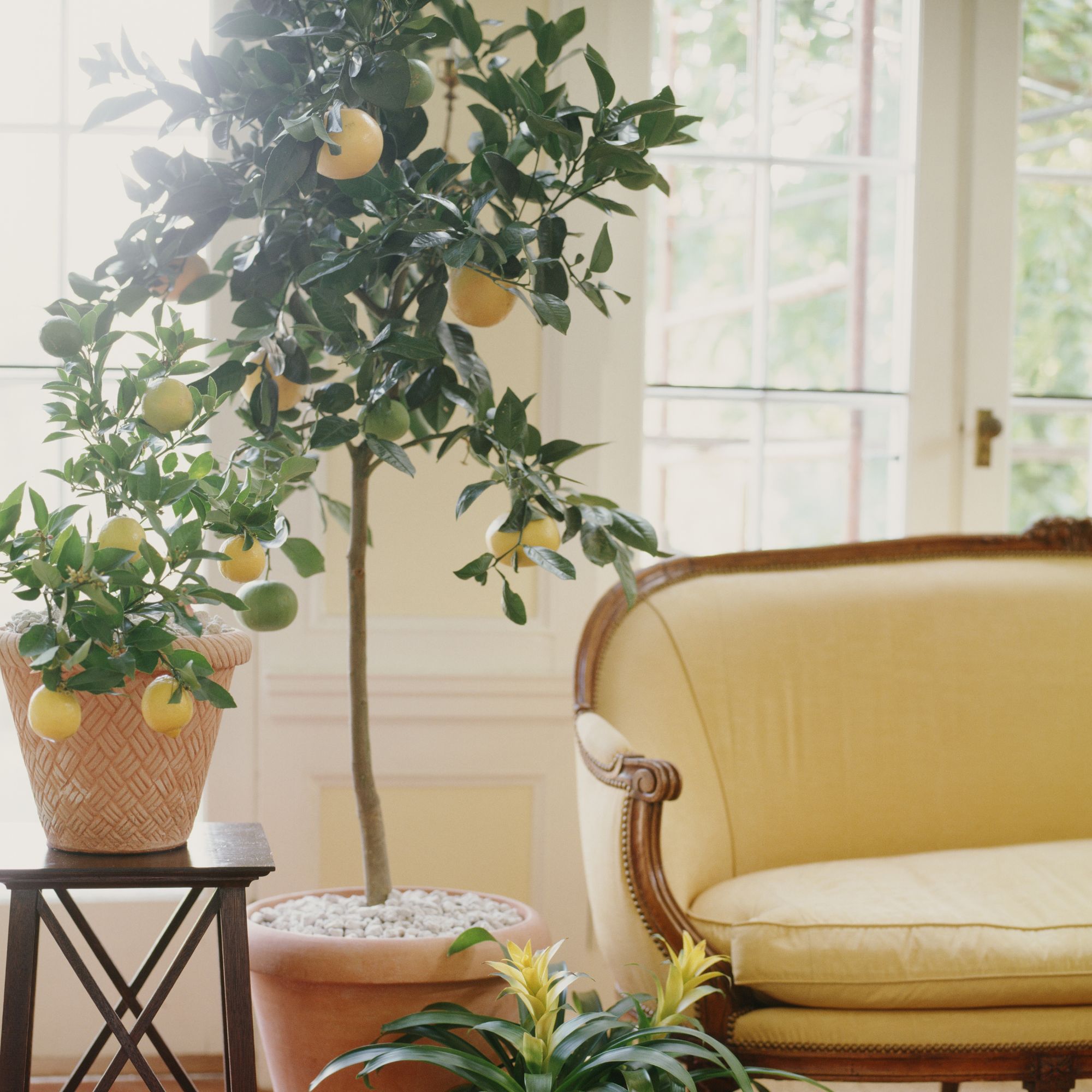 Shoppers can’t get enough of The Range’s lemon tree, but I’ve found an even cheaper bestseller at B&Q - it’s perfect for a Mediterranean look
Welcome the summer with this glorious fruit tree


-
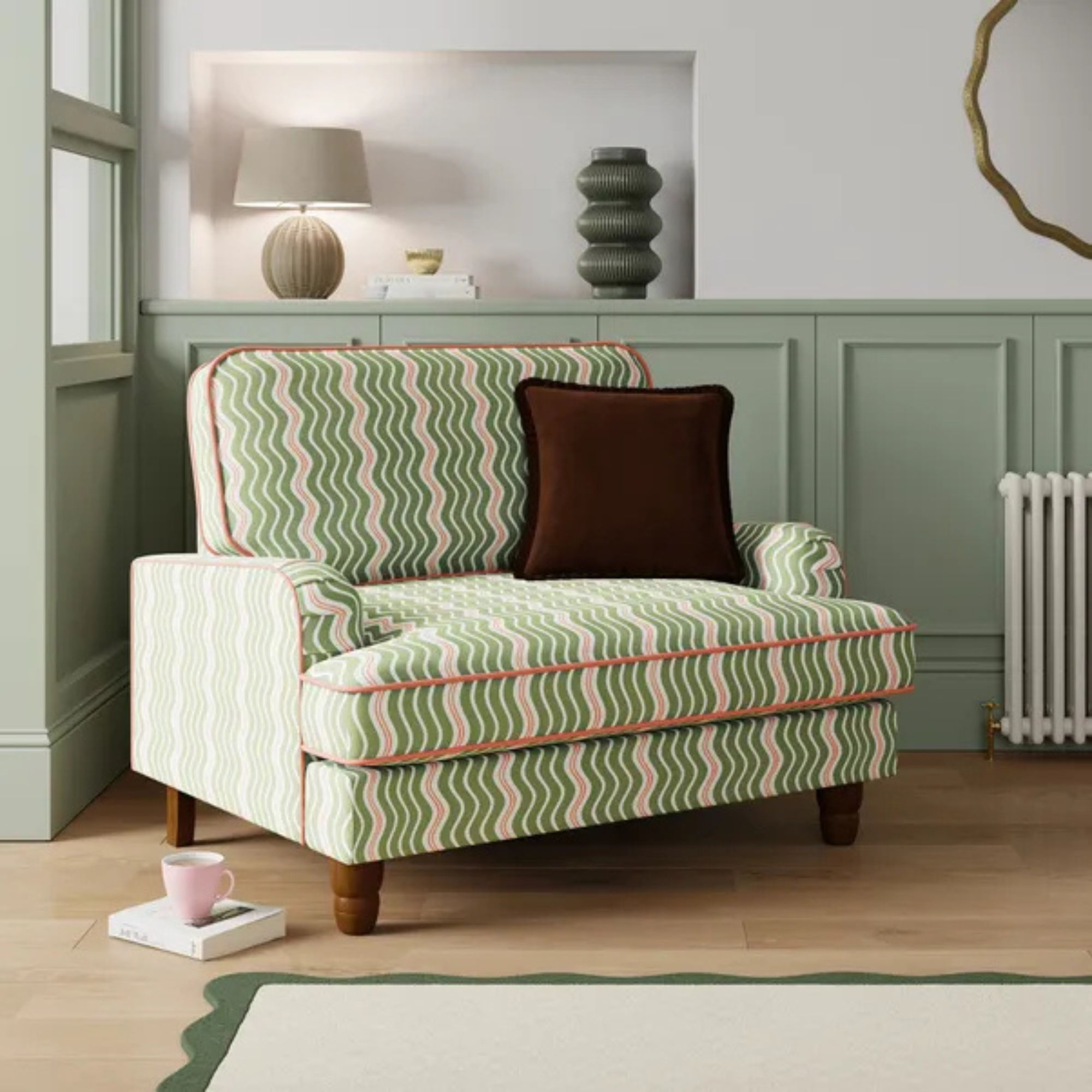 Dunelm has given its cult snuggle chair a new look - it's swapped classic stripes for another emerging pattern trend
I'm obsessed with this fresh new style
-
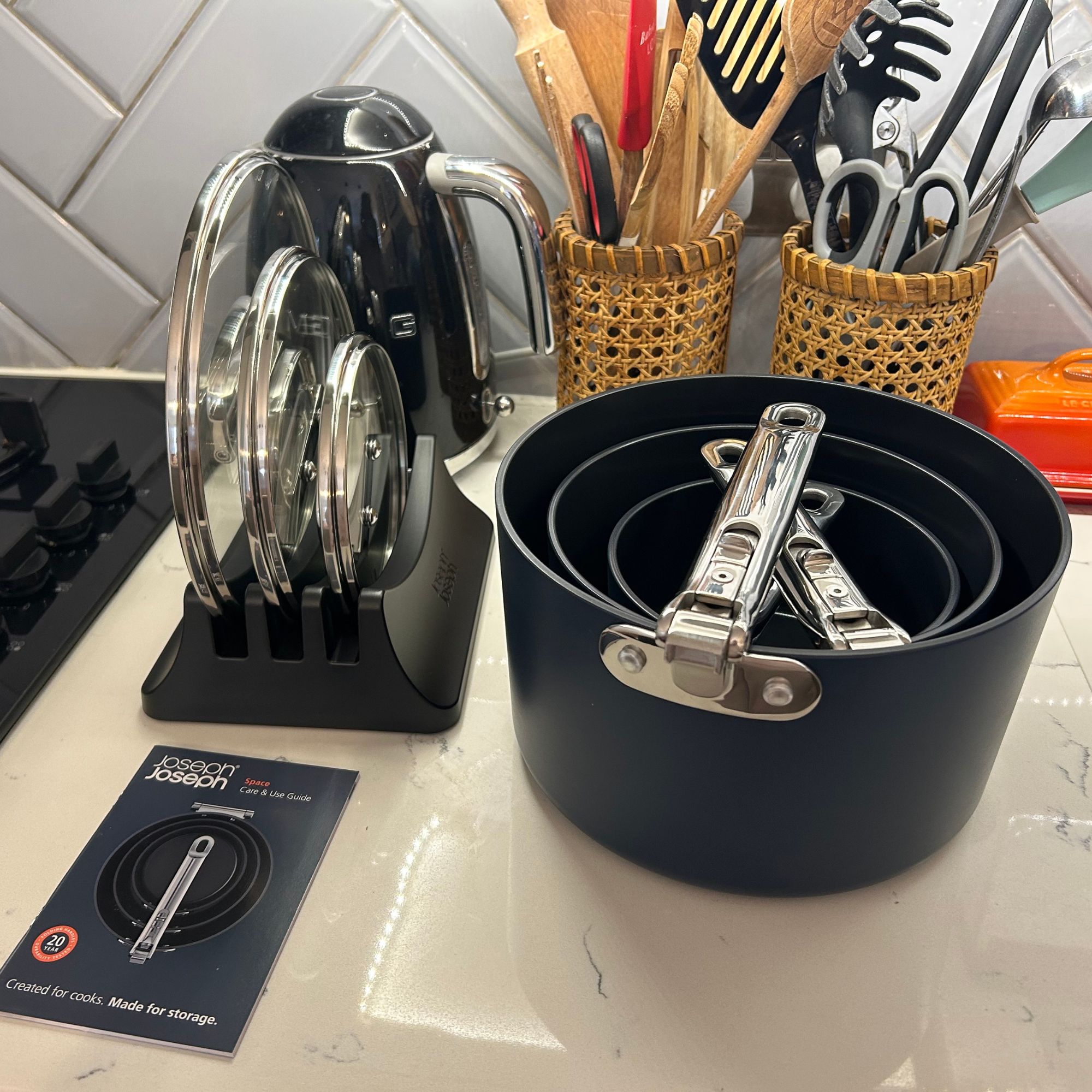 I tried Joseph Joseph's pan set with foldable handles – the space-saving design is just one of the many highlights
Small kitchen? I tested this innovative Joseph Joseph space-savvy set which has foldable handles — and I loved it
-
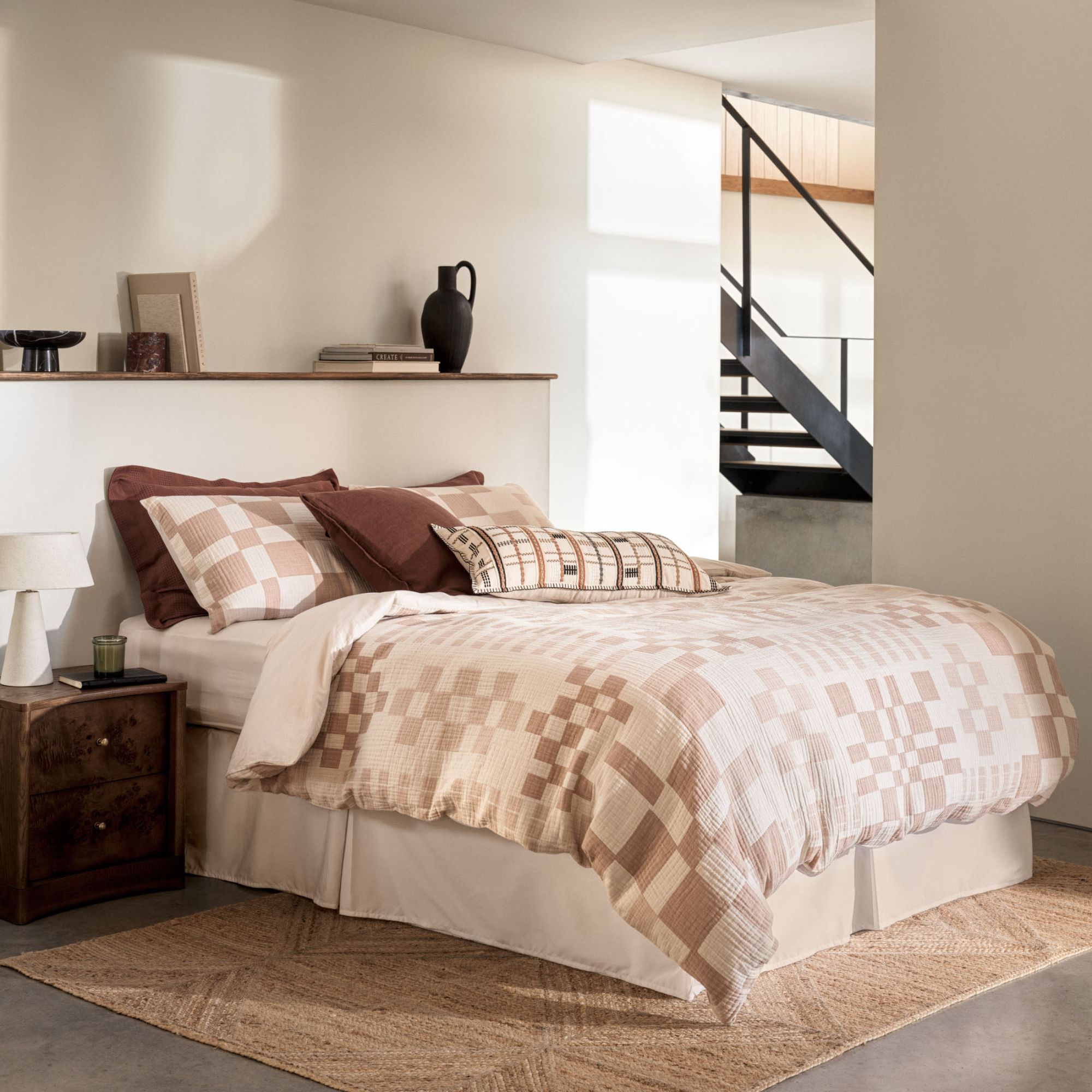 As a stylist, I spend hours looking for bedding for photoshoots, and I just spotted these 6 expensive-looking sets at M&S
Get a little luxury at a high-street price
-
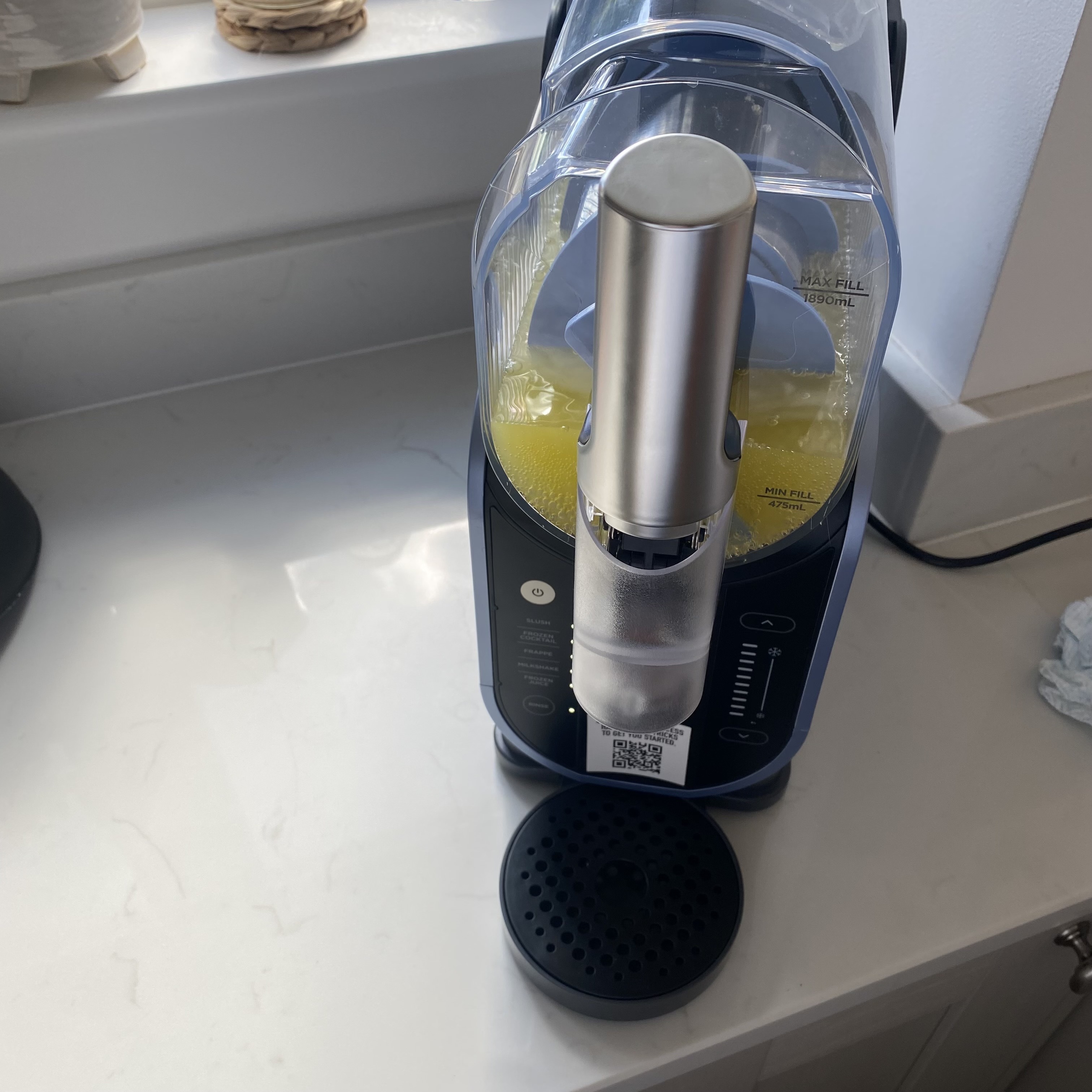 I've been waiting to try out the Ninja Slushi for months – this is what happened the first time I tried it
The Ninja Slushi is the stuff of dreams for summer entertaining
-
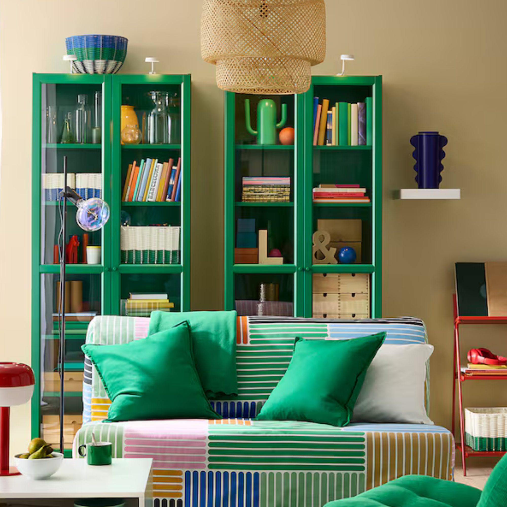 IKEA has drenched its BILLY bookcase in this year’s ‘it’ colour - but you’ll have to act fast if you want to get your hands on one
I'm obsessed with this gorgeous limited-edition colourway
-
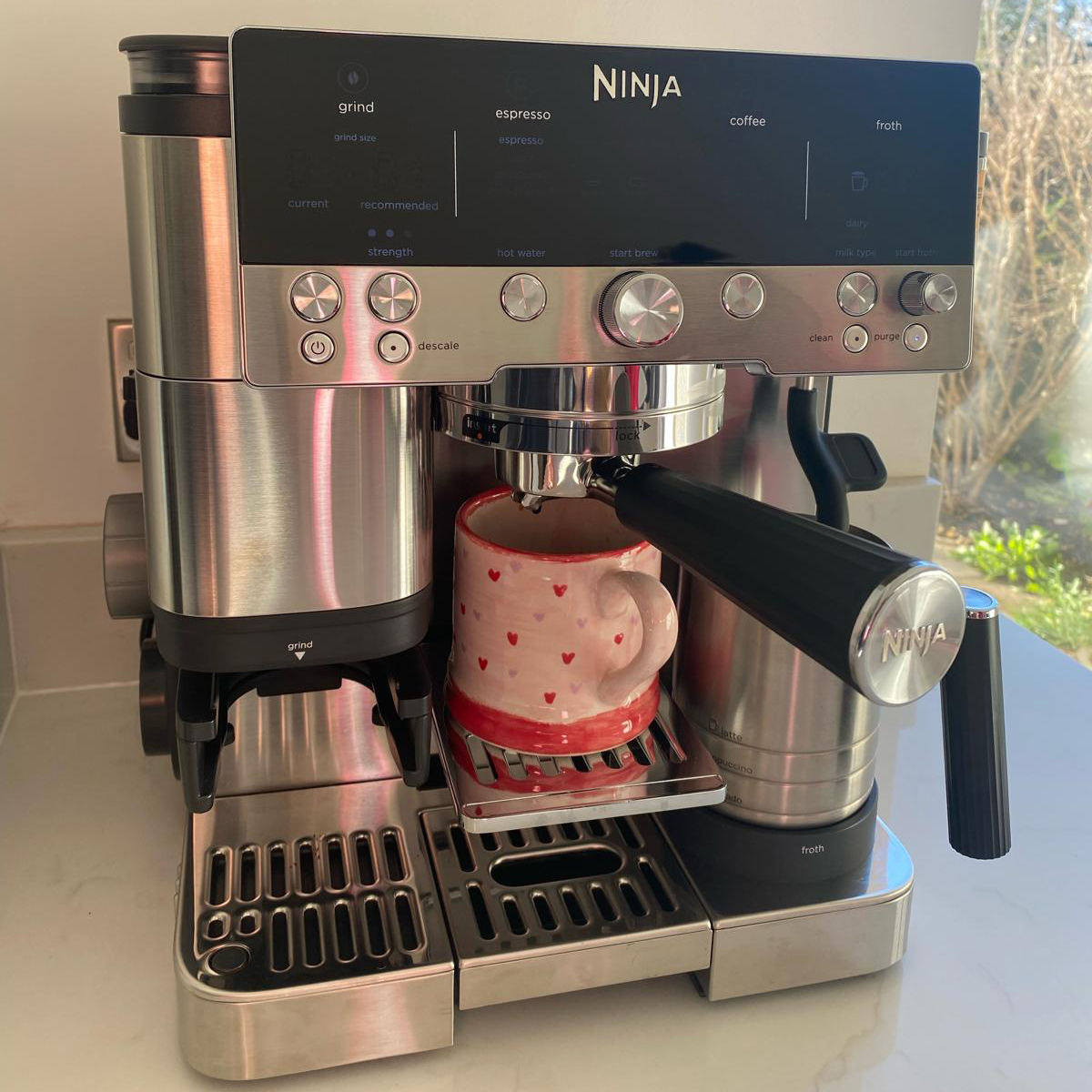 My go-to Ninja coffee machine just had a major price drop. It's more affordable than I've seen it before
It makes coffee shop quality achievable at home
-
 I'm a kitchen decor editor and didn't like this tableware trend - until I saw H&M Home's designer-look plates
They made it easy to justify a new crockery set
-
 Have we just had a sneak peek at Ninja's plans for pastel air fryers? These new US-exclusive Crispi colours are giving us hope for the same in the UK
Ninja's spring colours collection i the US has sparked some serious appliance envy


