How many colours should you have in a room? The magic formulas decor experts use to get it right
Can a scheme seem too busy with colour? Is monochrome overly monotonous? Here's how to get the balance right
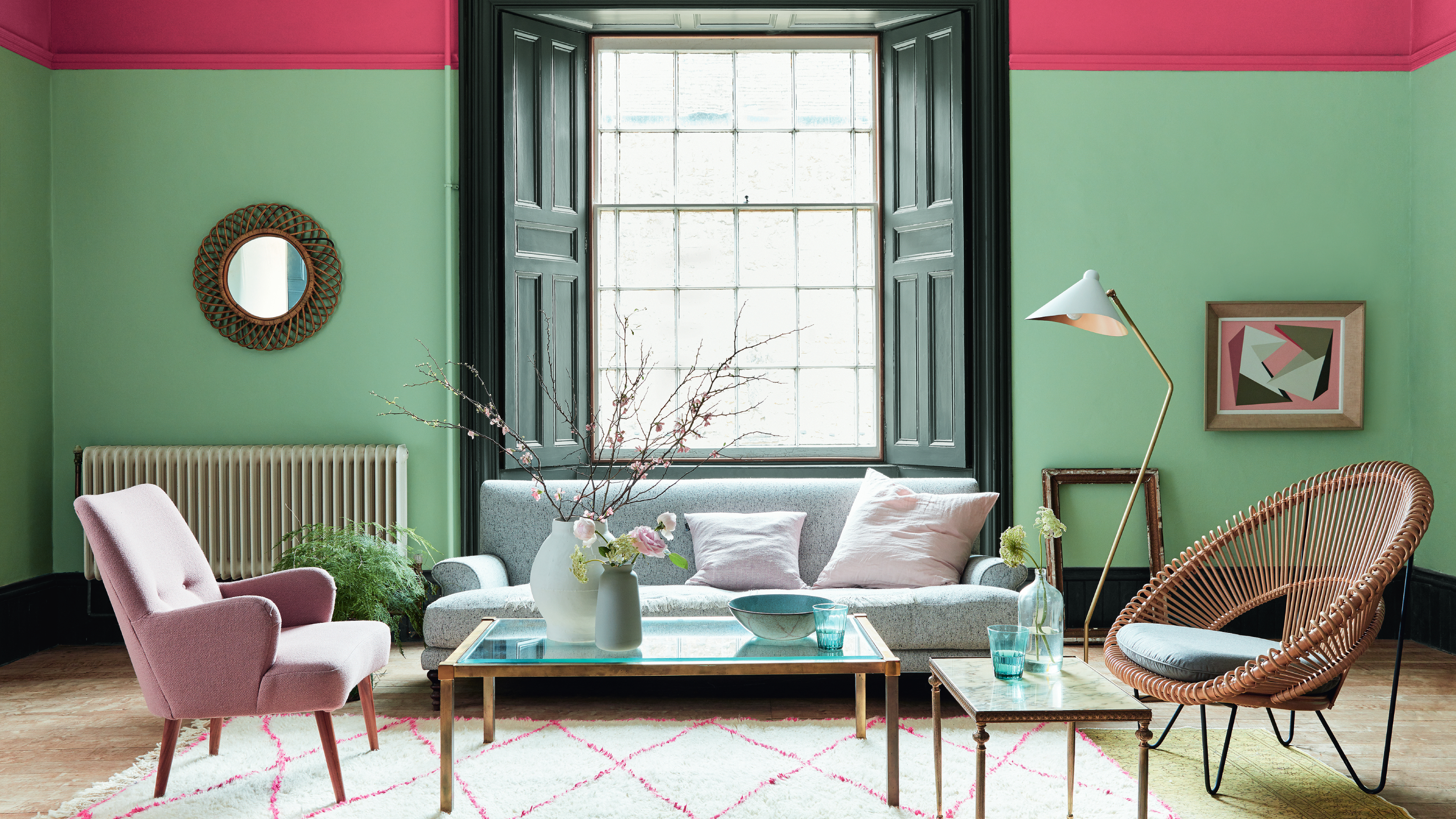

Whether you're starting with a completely blank canvas or working around existing features like a carpet or sofa, choosing a colour scheme for a space can be tricky. And while you may find it easy to start with pink walls, or a particular curtain fabric, knowing when to stop, colour-wise, is often more difficult. So how many colours should you have in a room so that it looks considered, rather than chaotic or one-note?
While personal taste is always going to influence the colours you choose (and how many there are), there are some guidelines and decorating principles that can help you ensure that your design is cohesive and stylish.
We've asked colour and interior design experts for their view on the optimal number of colour combinations you should have in a room – and how you should distribute them for a successful scheme.
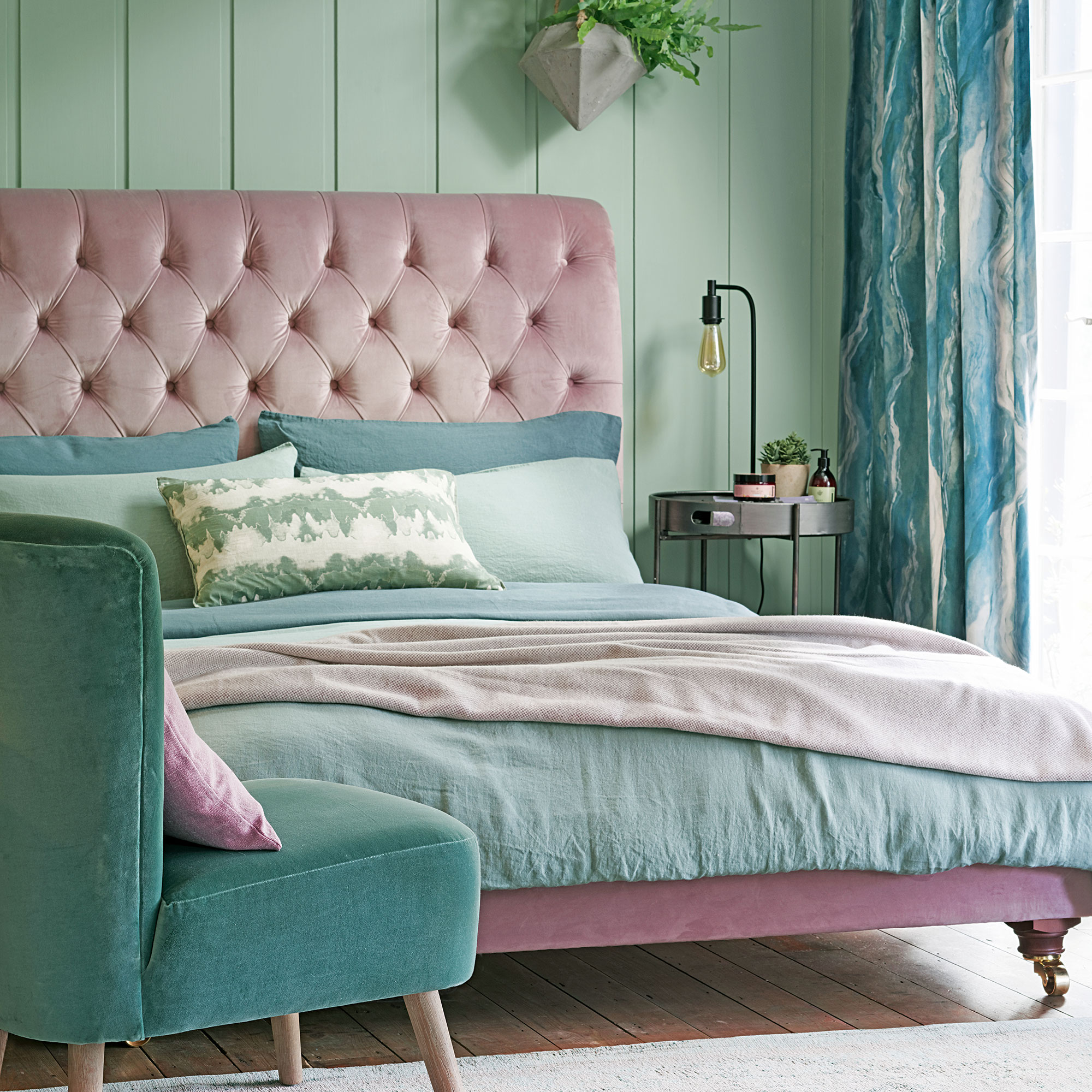
What is the three-colour rule?
Simply put, the three-colour rule dictates that you stick to a main palette of three colours when decorating any room. This will ensure that the end result is visually appealing and not an overwhelming riot on the senses – or conversely, overly coordinated and dull.
'The three-colour rule is one that you should probably aim to break in the long run,' Marianne Shillingford, creative director at Dulux, tells us. 'But basically, it’s all about sticking to three colours and varying tones of the same colours in the accessories to create a coordinated look. It’s an elegant and simple solution for when decorating choices are bamboozling you.'
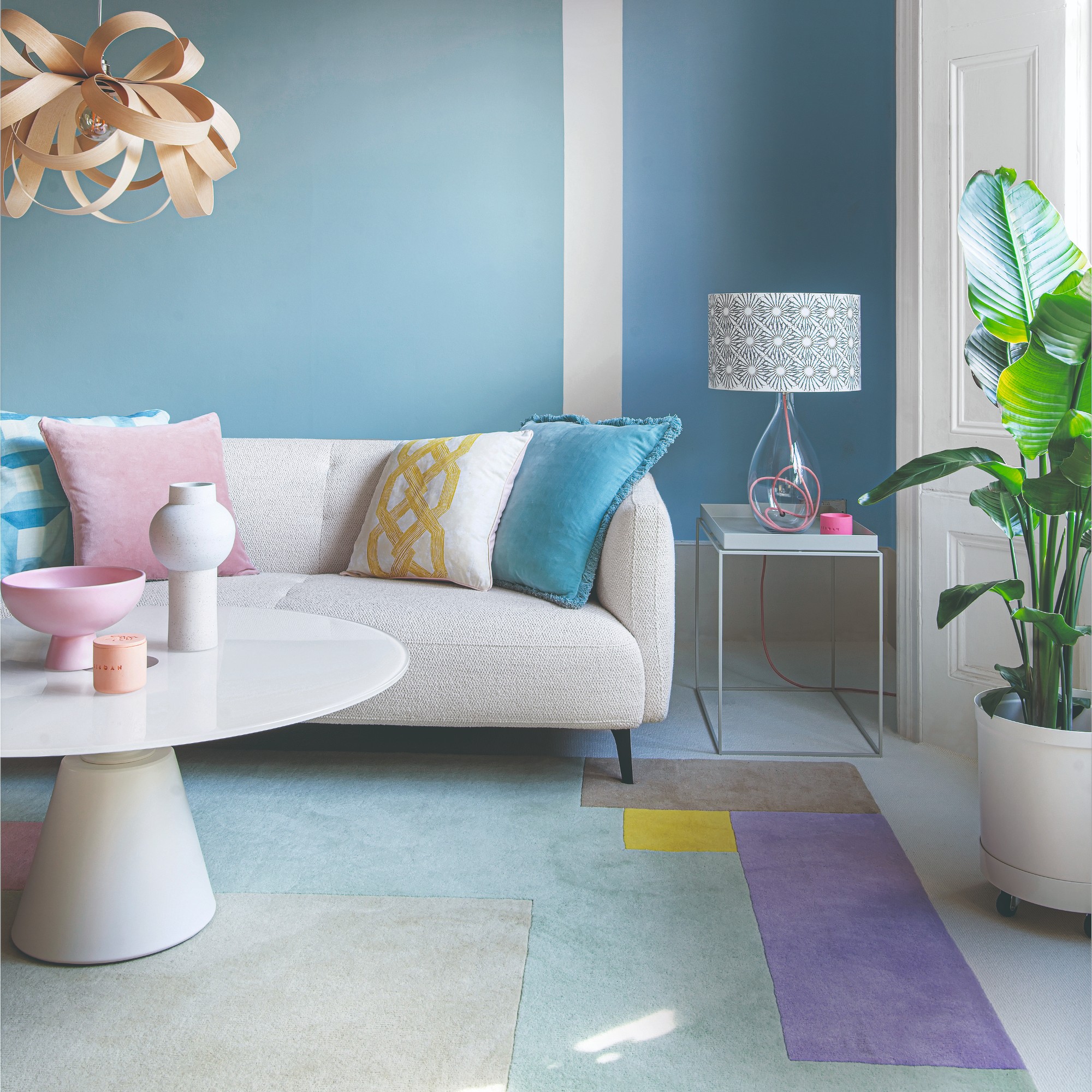
In the world of interior design, the three-colour rule is often referred to as the 70-20-10 rule or the 60-30-10 rule, these breakdowns being the percentage split of colours in each room.
'The 70-20-10 rule is really just a reminder to first use your dominant colour in the room, then add the complementary colour and then add a disruptor colour,' adds Ann Marie Cousins, interior designer and founder of AMC Design. 'Your dominant is often a neutral.'
Get the Ideal Home Newsletter
Sign up to our newsletter for style and decor inspiration, house makeovers, project advice and more.
Can you use four colours in a room?
'Absolutely,' says Sophie Clemson, interior designer at The Living House. One thing we like to say at The Living House is that your room should reflect your personality. So if you’re a colour enthusiast, don’t be afraid to go bold and use multiple colours.
Marianne Shillingford agrees. 'Trends like maximalism and cluttercore have shown us the effectiveness of combining multiple colours, textures and patterns, often with amazing impact. You can also use paint trends – like adding stripes to walls – to combine 4-plus colours into one scheme, which can be used in playful or sophisticated ways, depending on the vibe of the space.'
'We love to see something a little surprising in a room, similar to the unexpected red theory, which has become a popular trend this year,' Sophie adds. 'Remember, in order to create a cohesive look in the room, choose a colour palette for the whole room – this could have four colours in it, and it will help you create a well-designed space.'
'The dominant colour should take up about 60% of the room,' says Ann Marie. 'We don't always follow this rule, and it is OK to add an additional disruptor colour providing it sits well within the palette that you've pulled together.'
'So if you had, for example a grey sofa and carpet in your sitting room and you're seeking to redecorate, you might not want to get rid of your new sofa. When your sofa is sitting in a room that is full of pale greys, it will look flat and kind of lost,' Ann Marie explains.
'However by painting your walls rich green, for example, Card Room Green or Green Smoke by Farrow and Ball, you can then add in damson as your complementary colour and duck egg blue as your disruptor colour to complement the greys and the greens. You’ve then created a palette which is easy to live with but also complements the expensive sofa without the need to start from scratch.'
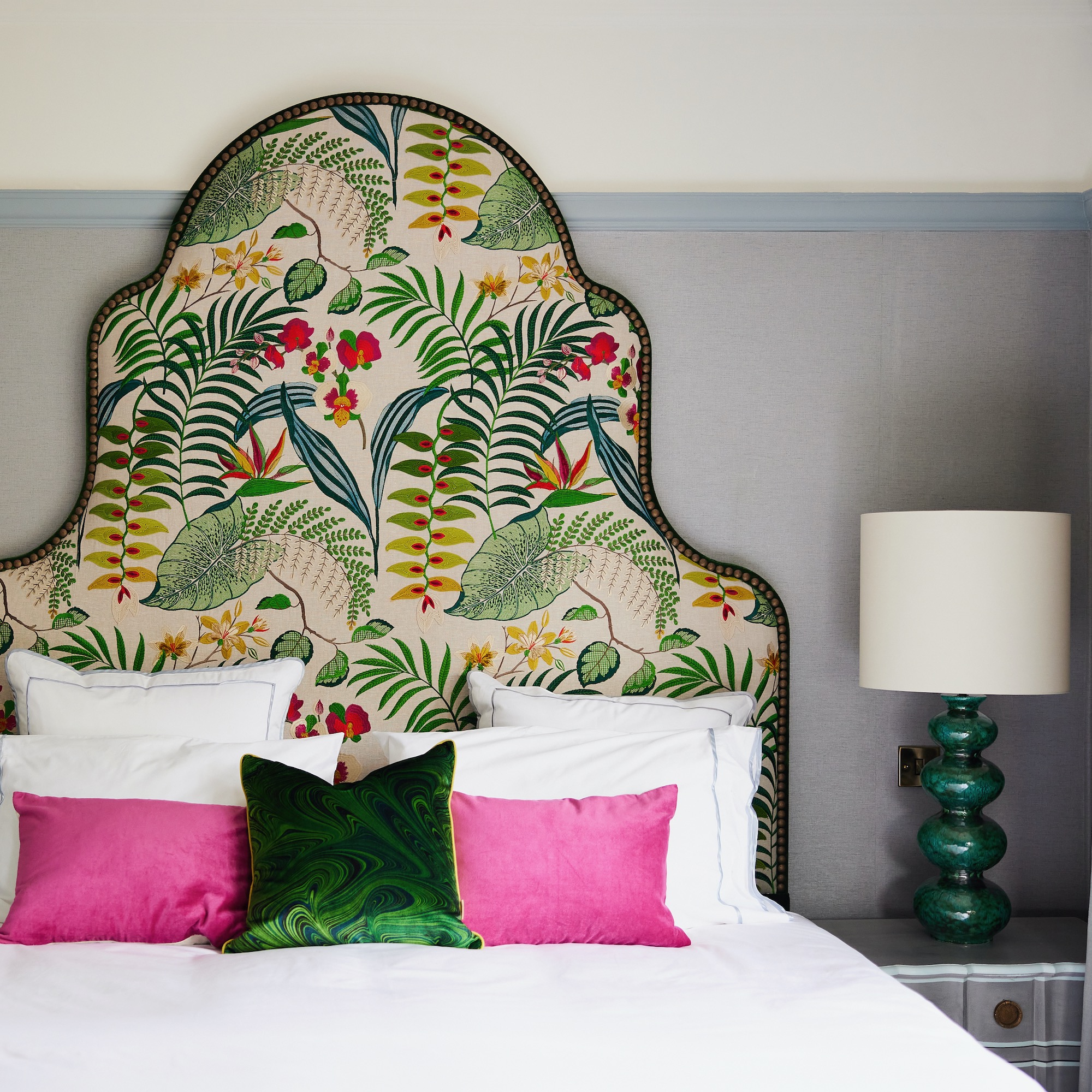
'We tend to avoid any rules around how many colours you can use in a space,' says Cathy Dean, founder of Studio Dean. 'I think this can be limiting. While we do not want a house to look like Mr Tumble should live there, as long as your base palette is cohesive you can go up and down within your colour range to bring depth and a convivial feel to a space.
'We also like to include a colour from adjoining spaces just as an accent to introduce that colour before you enter the next space. This creates flow and continuity.'
Do different tones or shades count as different colours?
Each of our experts views this slightly differently. 'When considering whether different tones or shades counters different colours, it really depends on how different those shades are,' says Ann Marie. 'If you are going for a monochrome palette – for example, only using shades of green to decorate your room – and those shades are very close to another, we would normally count them as one colour, at least for the purpose of adding interest. So if you had a forest green sofa, and a forest green armchair, perhaps with a texture, but very similar colour, we would count that as one colour because of the visual interest it provides.
'You therefore need two other colours in order to add interest to the room. If your shades are only fractionally different colours the eye will read them as all being the same colour.'
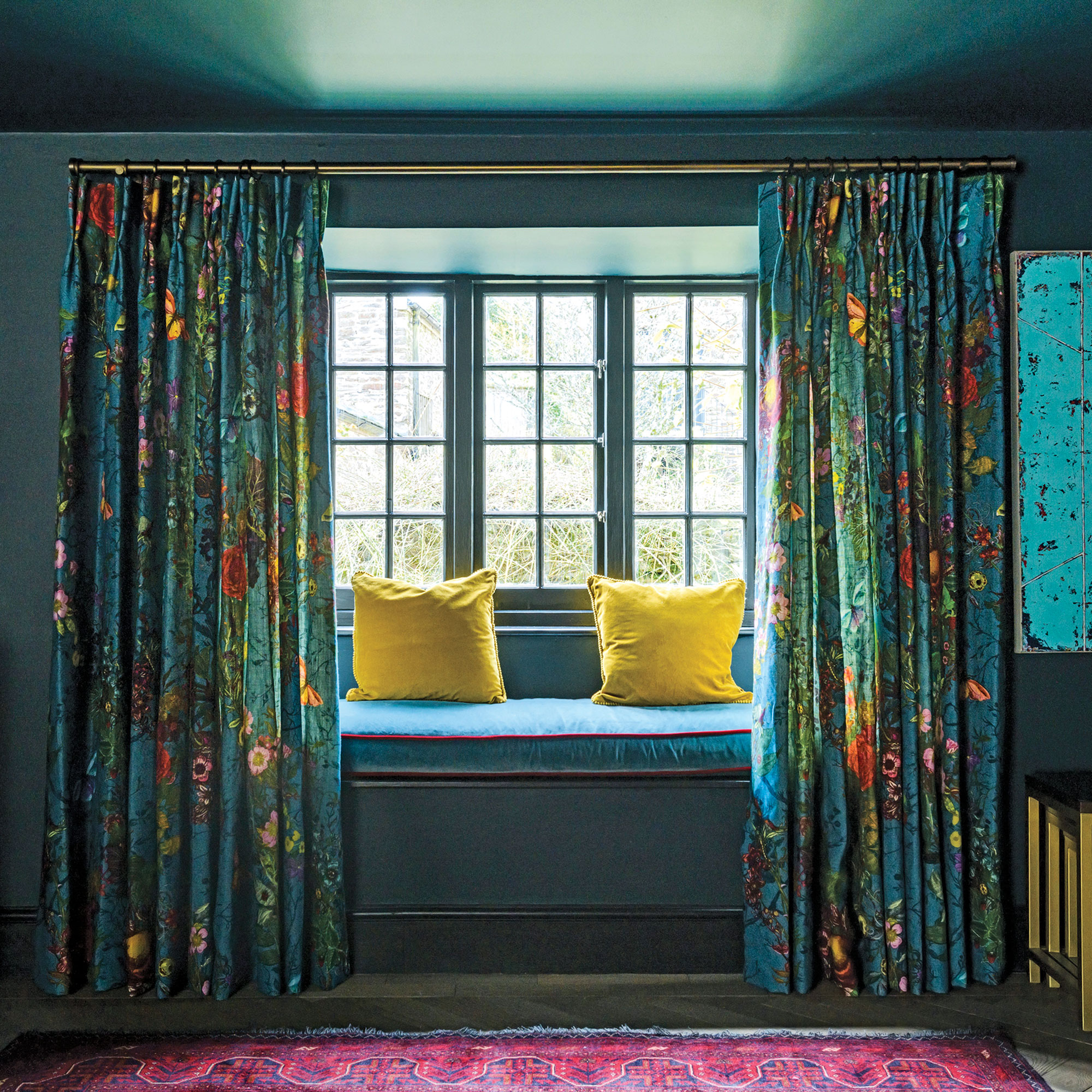
Rob Abrahams, founder and CEO of Coat Paints, on the other hand, believes that all tones and shades can count as different colours. 'Tones are pure colours with the addition of black pigment,' he says, 'and a shade is the addition of grey pigment. Adding black will make the colour darker, and adding grey will reduce the "chroma", making the colour appear more muted – effectively taking the brightness out.'
'The amount of black or grey pigment you add to a colour can have a wild impact, making the same pure colour look entirely different. So different tones or shades of the same colour can, in effect, look like completely different colours to most people.'
'In essence, 'shade' is another word for describing a colour and ‘tone’ is a version of the same colour that is lighter or darker,' adds Marianne. 'Different tones of one colour can be used effectively in a room to alter the way it looks in terms of size, height and width. Use light tones to make walls and objects look further away from you and deeper tones to make walls and objects look closer to you and more impactful.'
Top tip: 'We all see colour differently,' says Sophie. 'If you’re an interior designer or a colour expert, you're more likely to pick up on different tones within one colour. For instance, some greys can have purple or blue tones, which can affect how a room feels. This is why studying the paint colour is important when choosing a colour for your room – they can look different depending on the natural light.'
How to plan your colour palette for a room
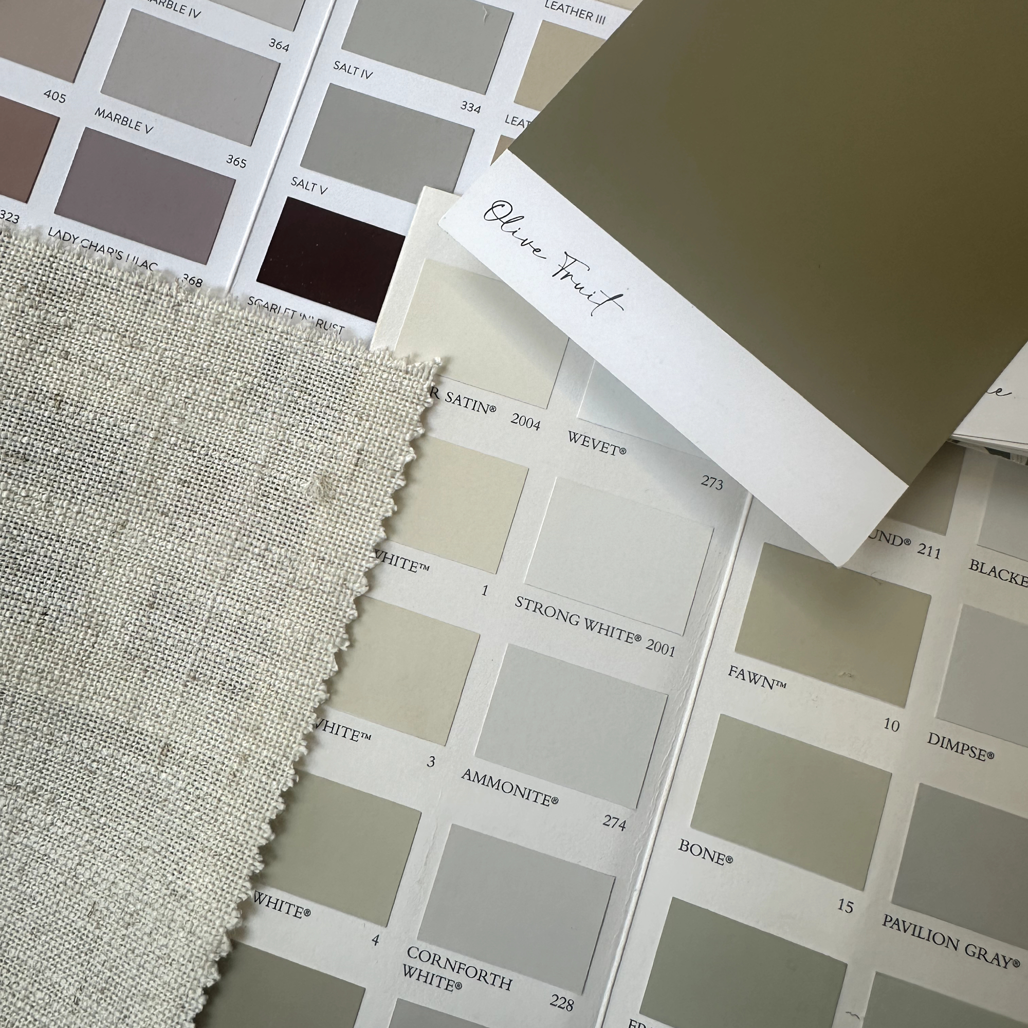
'Firstly, we recommend considering which way the room faces when choosing a paint colour,' says Sophie at The Living House. 'If you have a north facing room, you will want a paint colour that has warm undertones; otherwise, it could feel a little chilly, so always check which way the room faces. We suggest gathering inspiration to see what colours you’re drawn to and taking a look at Pinterest for colour palette suggestions.
'If you’re looking to add wallpaper to your room, this can be a great way to get a colour palette. If it has lots of colours within the wallpaper, you can pull the colours out and create an easy palette for your room.'
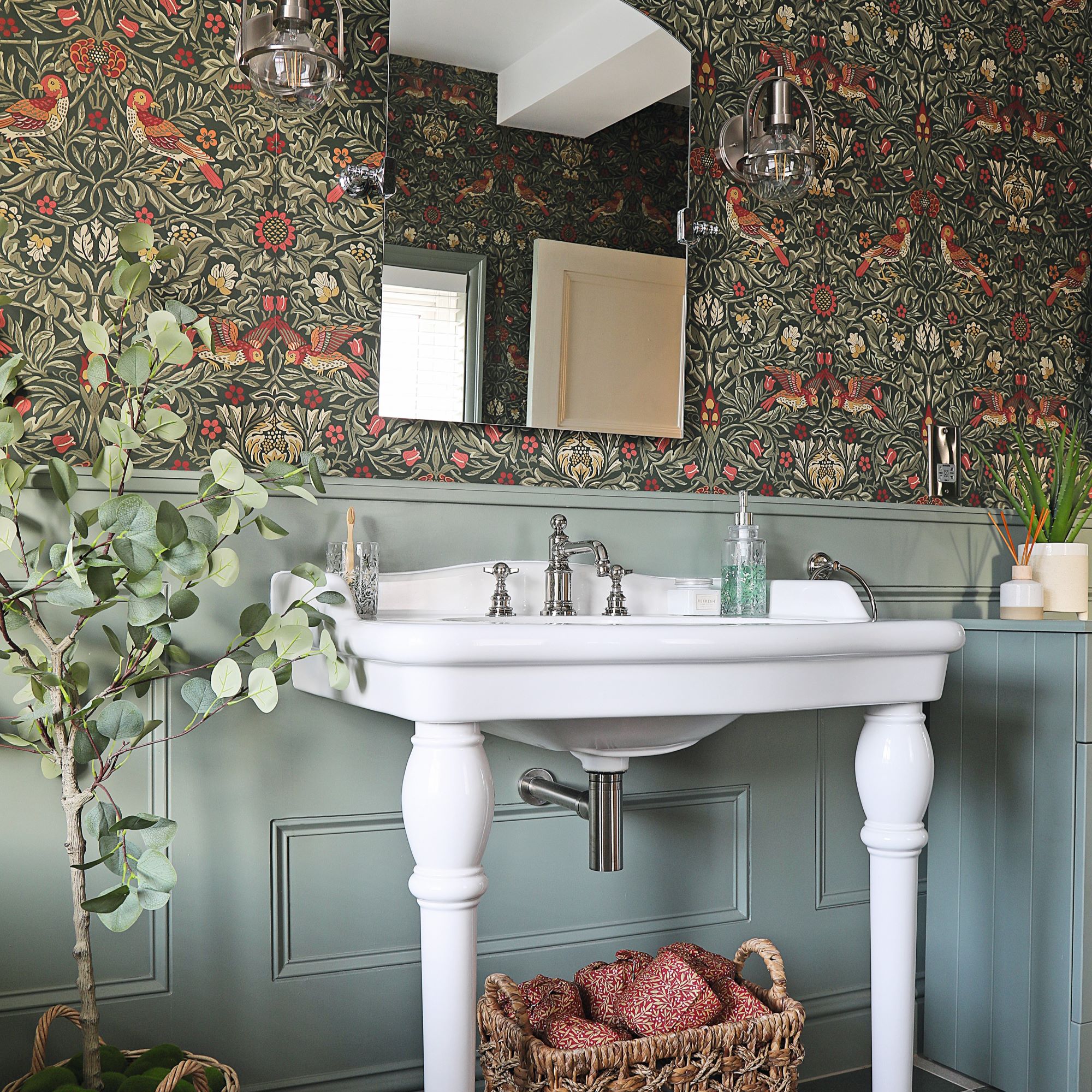
Ann Marie Cousins prefers to start by thinking about the colours you are drawn to in your day to day life. 'That could be the colour of the clothes that you wear, or the interiors you are drawn to in bars, restaurants and hotels,' she says. 'Then think about the vibe that you like, and whether that is boho, elegant, mid century, or classic. Once you have done so, this will then start to inform your choices, as your colour palette needs to work with your style.'
For example, mid-century palettes employ colours such as teal, olive green and mustard. A French country palette, on the hand, might include a French blue-grey, sage green, taupe and a pop of lemon yellow. Art Deco schemes often focus on jewel colours like emerald green and aubergine, with plenty of gold accents.
'Most of us have some sense of ‘gut feel’ when it comes to colour,' says Rob Abrahams. 'Whether that’s a natural preference for neutral shades, or a deep love for dark and moody ones. Anchor your palette first with this decision, and it’s easy enough to plan a palette around it once you have that start point.'
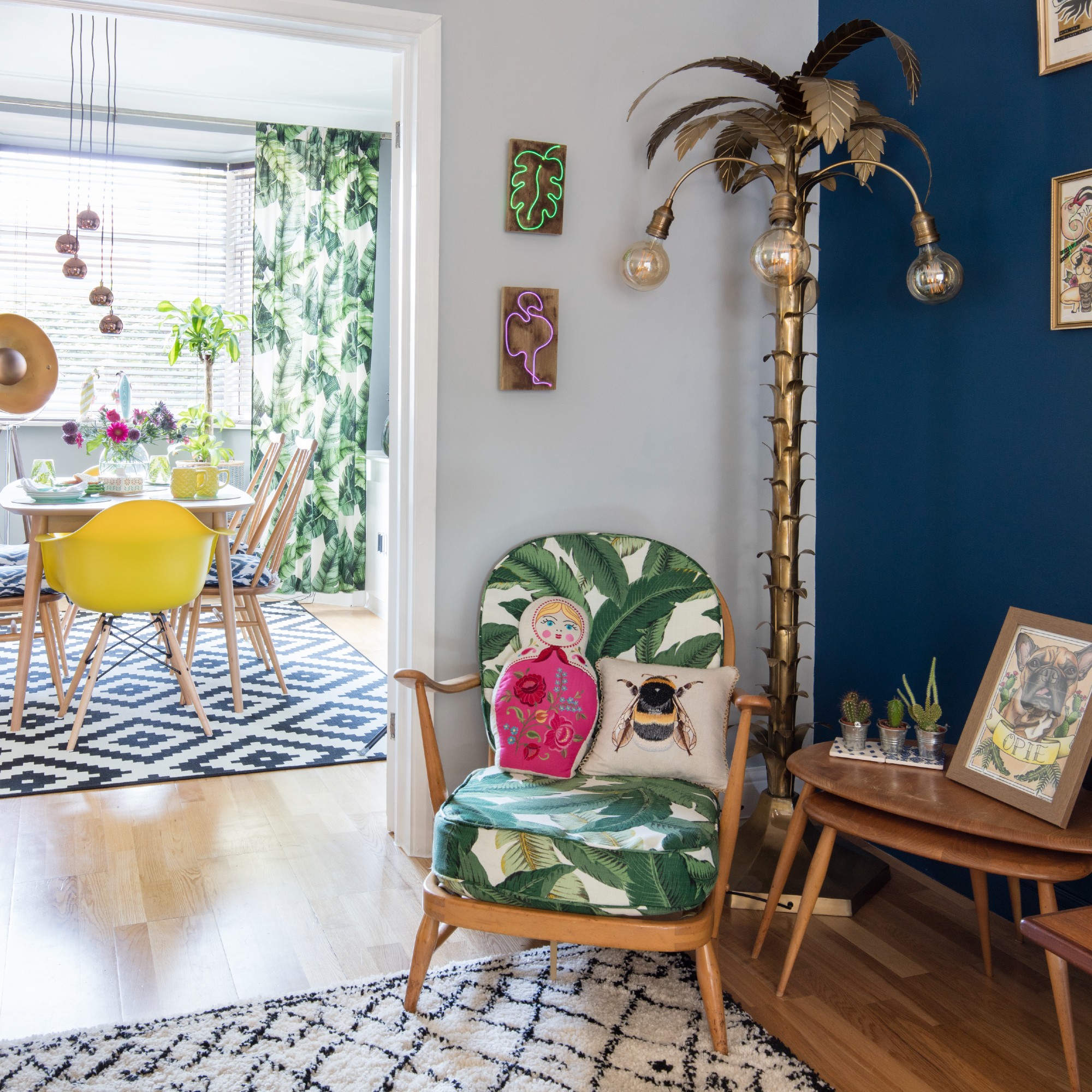
'Next, think about your main dominant colour, and whether you want to create a monochrome room or use colours either adjacent to your dominant colour on the colour wheel or those that are complementary,' advises Ann Marie. 'You can buy colour wheels at art supply shops, and you’ll probably have a very instinctive reaction about whether you favour a monochrome scheme or one which uses more colour.'
'Once you figure out what your dominant colour is, everything else will flow as you remember to add balance to the room,' she continues. 'Even if you favour a light and airy neutral, you need to add some complementary colours and textures so that it does not look bland. So even if you favour shades of white, add richness in the woods that you use, or the colour and texture from the plants that you put in the room.'
FAQs
What is the 70-20-10 rule for colours?
'The 70-20-10 rule is where you have 70% of a dominant colour, 20% of a secondary colour, and 10% of an accent colour,' says Sophie Clemson, interior designer at The Living House. 'If you're feeling overwhelmed when choosing a colour palette for your room, using the 70-20-10 rule will help guide you in the right direction and keep you on track.'
'It's an oldie but a goodie, and a really simple way for nyone to think about creating balnce in their colour scheme,' adds Rob Abrahams. 'Simply choose your lead colour first for roughly 70% of the space – that's most often the wall colour. Then, 20% of the space should be a complementary colour to create some visual difference, but without being a total contrast. So think different shades of the same colour.'
'Then the remaining 10% should be given to a contrast colour, which creates a very clear distinction in the scheme. Think about the current 'unexpected red' theory taking over the internet. That's the 10% and it can work just as well with plenty of different colours.'
A quick breakdown of the 70-20-10 rule
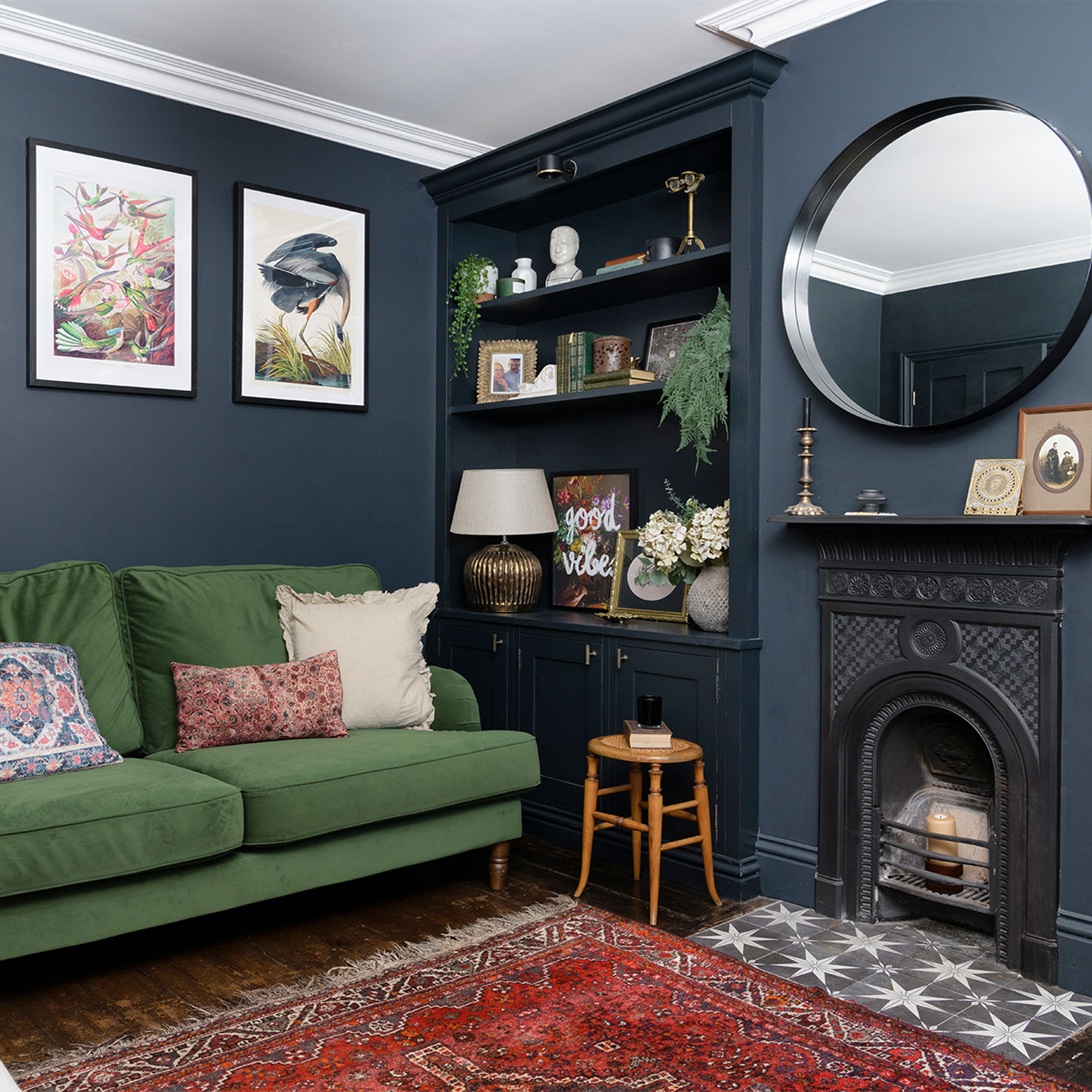
70% dominant colour: This will be the main colour used in the room. It will likely be the colour used for the walls and perhaps the floor or the rugs that cver it. It could also cover large pieces of furniture like wardrobes, sofas or beds. Think of it as the backdrop to your design.
20% secondary colour: Found in furniture, soft furnishings like curtains and feature walls, this complementary shade should make the room feel more interesting without clashing with or overwhelming the dominant colour.
10% accent colour: The final piece in the decorative puzzle, the accent colour is intended to contrast with the primary and secondary colours to make the look feel more exciting or bold. Use it in cushions, artwork and accessories like vases, lampshades and picture frames.
'The 70-20-10 rule is indeed important for the colours you choose, but remember the colours are not just what you place on your wall, large pieces of furniture in a bold colour count toward this colour equation,' says Cathy Dean. 'If you have gone for a deep red sofa then that is probably all you need in that accent to achieve the full 10%. If, however it is cushions, throws and vases, you'll need to pull more through in the tone to get the effect.'
'Our spaces tend to be a neutral backdrop with the accent colours brought in to highlight,' adds Cathy. 'This really can be as simple as choosing a flower in the colour tone, a piece of artwork with the colour in or a good old cushion.'
What is an anchor colour?
'An anchor colour is when a colour helps to ground the room,' explains Sophie. 'This could be the main shade used on the walls or a colour that features throughout the room in smaller elements. We particularly love to use black in a design scheme to help anchor it – this could be with lighting or accessories.'
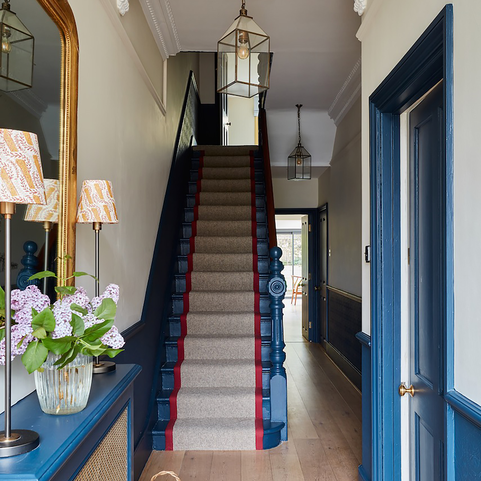
'An anchor colour is the main colour in your space, which is usually darker or richer than the neutral you have used,' adds Ann Marie. 'In this sitting room, our anchor colour were the navy skirtings, door casings and shelves, which tethered the neutral palette of the off white walls and the neutral carpet, giving it context and stopping it looking too wishy washy.
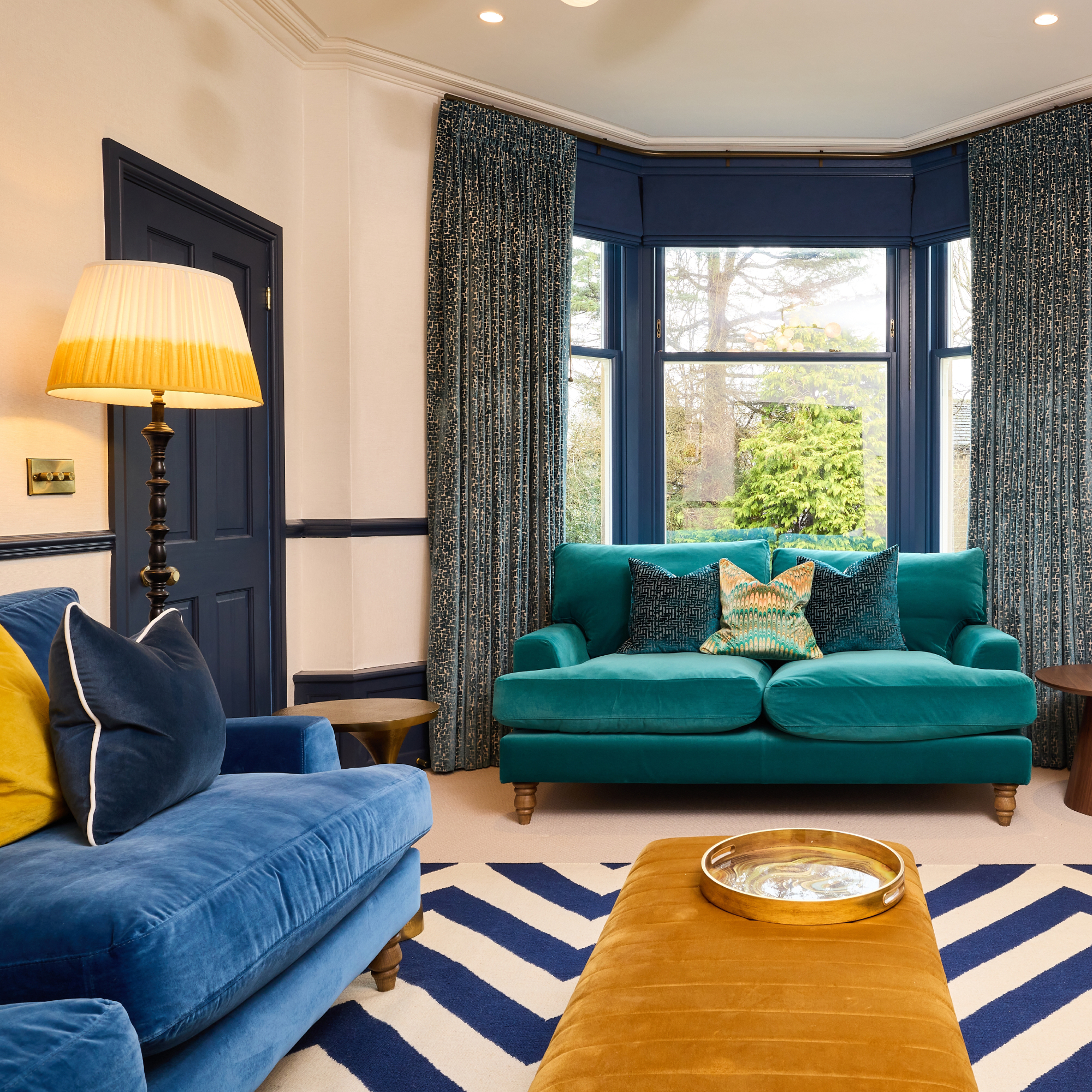
'An anchor colour is easy to live with, you need to be able to happily look at it daily, feel comfortable there and that does not fight with anything in the space,' says Cathy Dean. 'It is the backdrop, the canvas and it has the correct undertone to tie together with the colours you want to bring into the space.
'Colours should not "pop" or fight against the anchor,' she adds. 'They instead should feel like they are all part of the same family with the anchor being the central tone.'

Amy Cutmore is an experienced interiors editor and writer, who has worked on titles including Ideal Home, Homes & Gardens, LivingEtc, Real Homes, GardeningEtc, Top Ten Reviews and Country Life. And she's a winner of the PPA's Digital Content Leader of the Year. A homes journalist for two decades, she has a strong background in technology and appliances, and has a small portfolio of rental properties, so can offer advice to renters and rentees, alike.
-
 Shoppers can’t get enough of The Range’s lemon tree, but I’ve found an even cheaper bestseller at B&Q - it’s perfect for a Mediterranean look
Welcome the summer with this glorious fruit tree
By Kezia Reynolds
-
 What colours make a small bedroom look more expensive? 7 shades, recommended by the experts
Give your bijou bedroom a luxury look with one of these transformational shades
By Holly Walsh
-
 5 reasons to use Farrow & Ball 'Green Smoke' in a kitchen – the earthy tone that's on trend for 2025
Could this be the perfect shade for your kitchen?
By Holly Walsh