How to style a display cabinet – how design experts zhuzh up shelves in 10 easy steps
Fed up with dull displays that attract more dust than likes? Up your #shelfie game and learn how to style a display cabinet from the pros
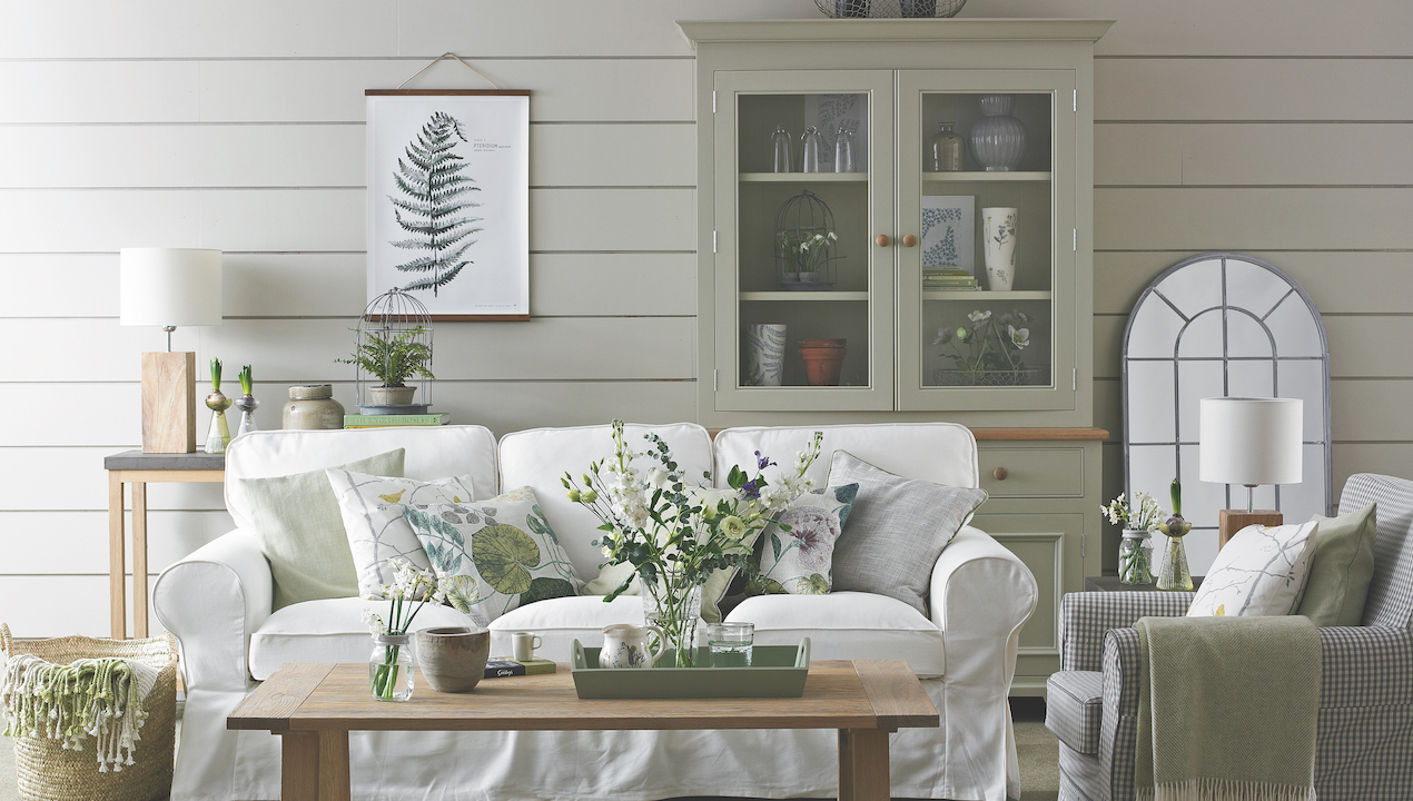

Display cabinets are a go-to for delivering style and sophistication in any room. Built-in or freestanding, glazed or open-shelved, learning how to style a display cabinet adds next-level opportunities to showcase your personality and precious memories.
However, whether they make up part of your living room storage ideas or are pride of place in a dining room, there is a subtle art to making a display cabinet truly shine.
‘The best display cabinets tell a story via travel mementoes, family heirlooms or themed collections of the things you love,’ says interior designer Oliver Steer. ‘They also offer creative flex, letting you play with arrangements by mixing materials and rotating items seasonally, without having to initiate a complete room revamp.’
But what if, heaven forbid, you need to use your precious display cabinet to store items that are not pretty but are very necessary and have no other tenable home in your home? Oliver says stylish storage solutions are the answer. ‘Attractive organisational boxes, baskets and cubbies can be used to hide everyday items, ensuring your display cabinet remains both visually pleasing and purposeful,’ he explains.
How to style a display cabinet
As when learning how to style living room shelves, there are lots of easy ways to make your display cabinet appear elegantly curated, without any professional skills.
Following the advice of our experts, who have years of training between them, is a smart place to start!
1. Consider the backdrop
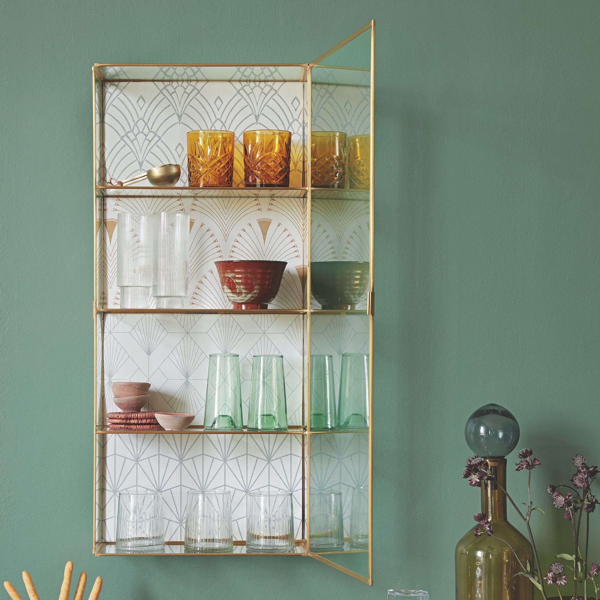
Before you put so much as a candle inside your display cabinet, take a look at the back panel and decide whether it would benefit from a glow-up. Some display cabinets will already be blessed with beautiful back panels, perhaps in antique timbers or classic tongue and groove panelling, which require no extra TLC. But sometimes leaving the back panel bare is a missed opportunity, and can be a very easy DIY project to tackle one weekend.
Get the Ideal Home Newsletter
Sign up to our newsletter for style and decor inspiration, house makeovers, project advice and more.
To enhance an uninspiring display cabinet interior, designer Oliver Steer recommends exploring textured wallpapers for sophistication or infusing opulence with luxurious materials like decorative tiles or marble.
‘You can also express your individuality through personalised artistry with custom decals or stencils,’ he adds. ‘Consider themed murals for a cohesive look and embrace versatility with removable wallpaper or fabric. Introduce glamour with reflective surfaces like mirrored panels.’

Award-winning interior designer Oliver Steer offers a truly bespoke service that allows no compromises, from complete room transformations to entire property interior design and renovations. Dedicated to delivering outstanding luxury living, Oliver has worked across hospitality and premium retail, as well as with private clients to bring visions and dreams to life in their home.
2. Curate the contents
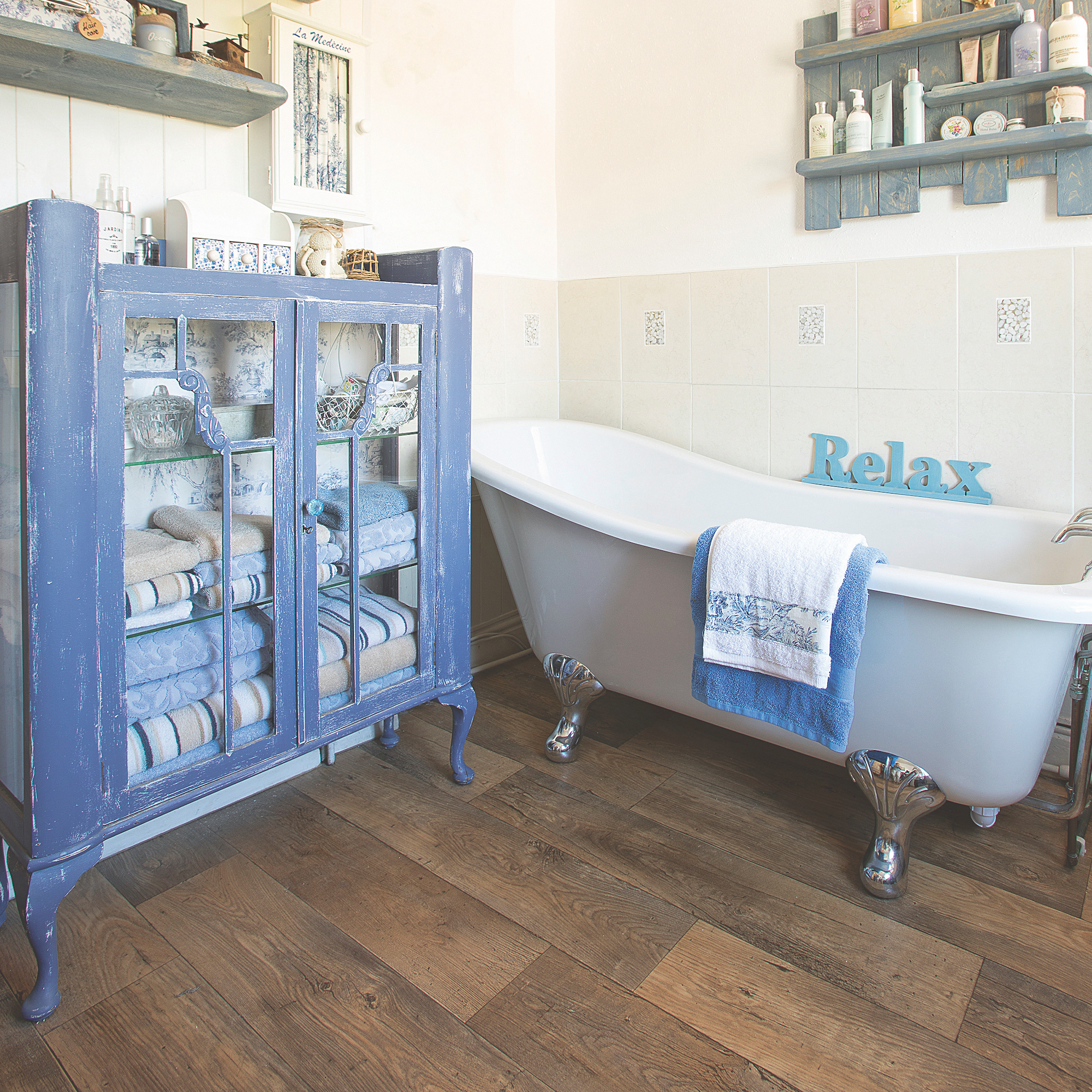
When planning what to put in any display cabinet, it helps to start by deciding whether its use is purely decorative or if there needs to be an element of practicality in play. This is often steered by location and type of cabinet. In a kitchen or dining room, they are more often used to store items that are useful, such as crockery, cookery books, water carafes and so on. In a living room, you may prefer to focus purely on ornaments, framed photos and items that have no use beyond prettifying the space.
Interior designer Oliver Steer likes to strike a balance between aesthetics and functionality when curating a display cabinet. ‘For example, you might Include visually appealing items like decorative sculptures and unique vases, but also consider practical elements such as stylish glassware and decorative storage boxes,’ he explains.
3. Establish a colour palette
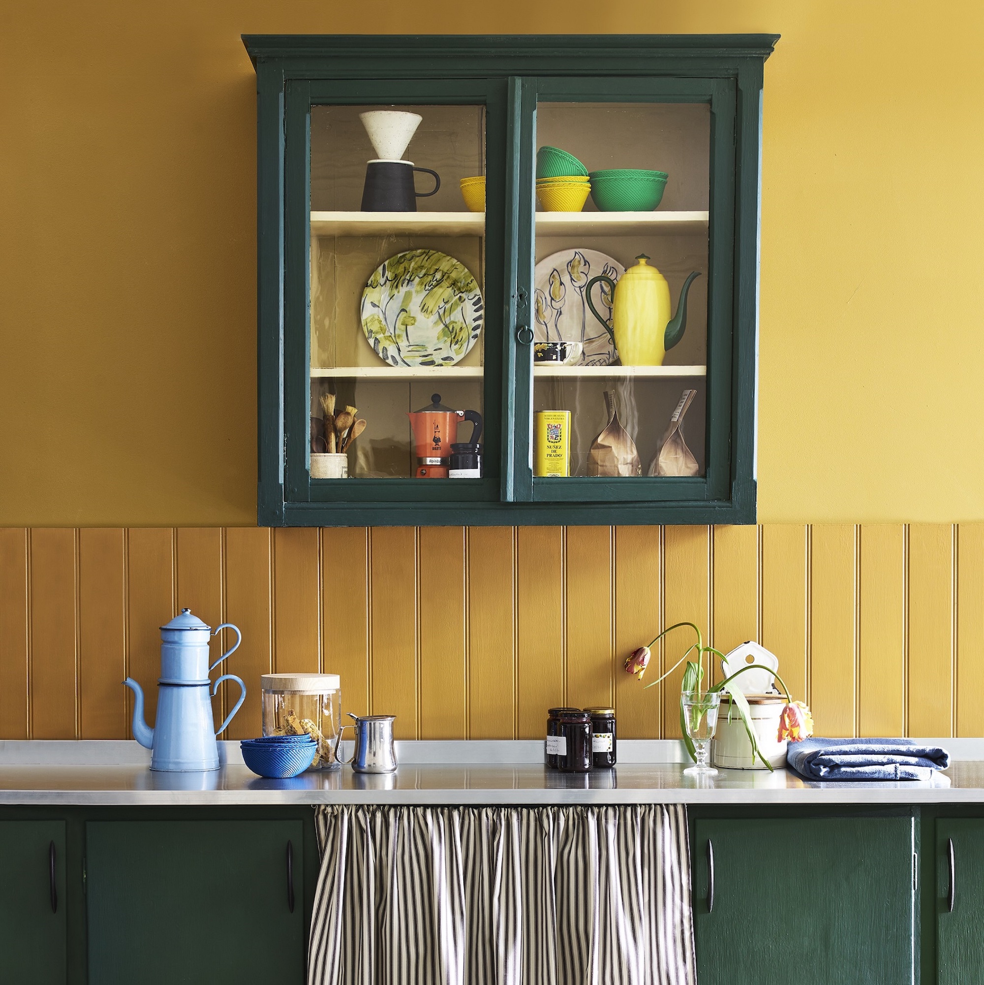
You may decide to go full matchy-matchy with the colour of items displayed, or mix it up for a more relaxed look, but whatever you do, aim for a common colour thread that links everything together. Not just inside the cabinet, but coordinating with the colour palette in the room it’s located in.
‘I like to have fun with the colour. For example, colour co-ordinated books in blocks of yellow or blue,’ suggests interior designer Benji Lewis. ‘An assortment of colourful objects can also look lovely and demonstrate a confident styling approach. Perhaps some antique ceramics with Murano glass pieces brought together with a few silver photo frames.’

Benji Lewis trained at the KLC School of Interior Design and worked for Bonhams Auctioneers and a major Interiors house in London before successfully setting up on his own in 2004. As well as working face-to-face with clients, he also conducts virtual consultations in the UK and globally via his Zoom That Room service.
4. Look at the bigger picture
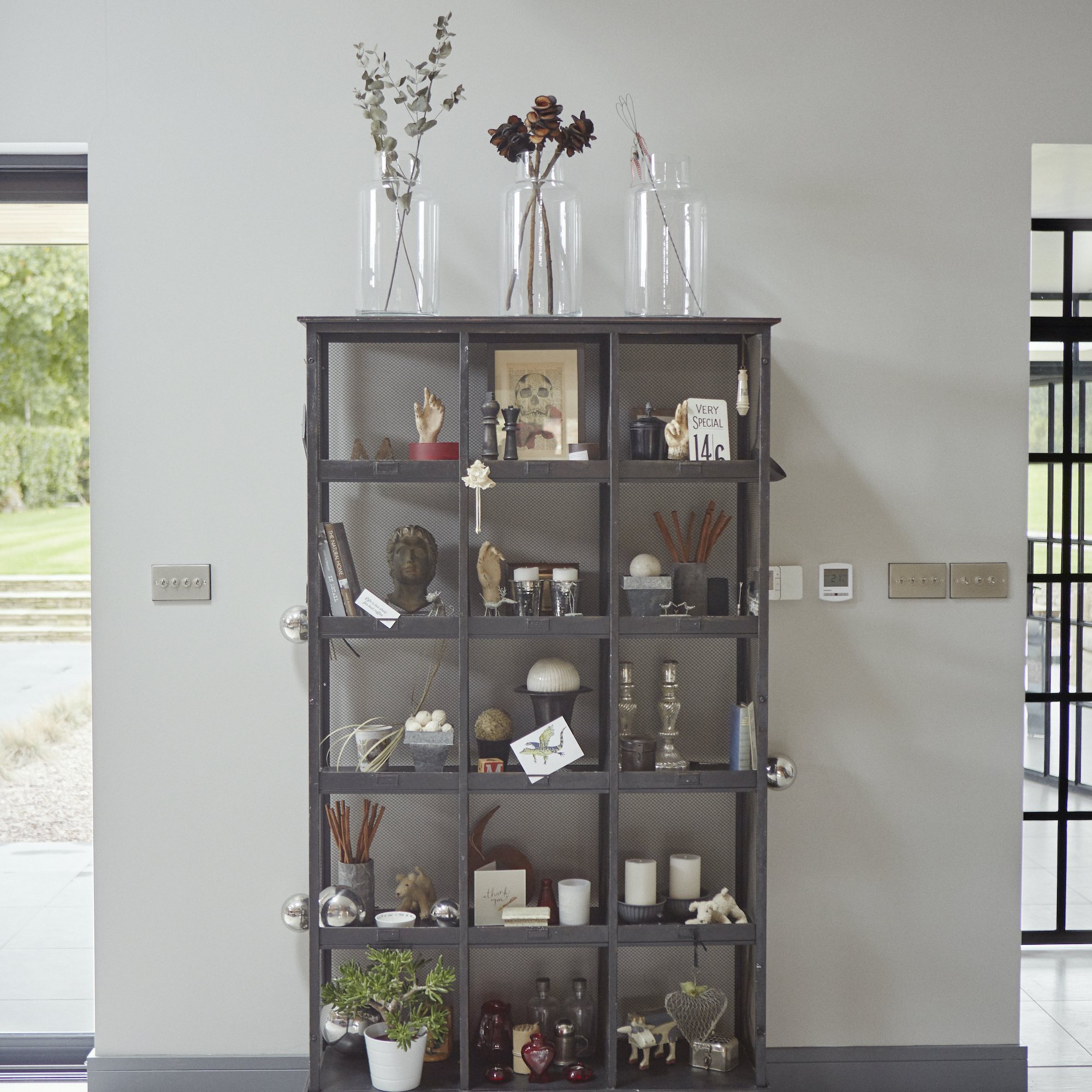
A common mistake when styling display cabinets is to focus on one shelf at a time. The pros plan the overall composition first, before even thinking about the finer details. The aim is a balanced display that looks purposeful and poised, not a complete shamble.
‘If your display cabinet is very tall, and the higher shelves are hard to reach, consider sketching out a rough plan in terms of height and shape for each item. This way you won’t need to be up and down a step ladder all afternoon,’ suggests interior designer Louise Robinson.
Don’t forget that the higher the shelves, the taller the items will need to be to see them from the ground. Use a stack of horizontal books to elevate some pieces if necessary. Sometimes it can be hard to appreciate the bigger picture when you’re styling up-close. Try taking photos as you go, as a record of what does and doesn’t work in different positions, and then move things around until you’re satisfied.
Louise Robinson runs her creative design studio from North London, specialising in bespoke and colourful designs that feel relaxed and authentic, characterised by a close attention to detail with an emphasis on natural materials and finishes.
5. Think about height and depth
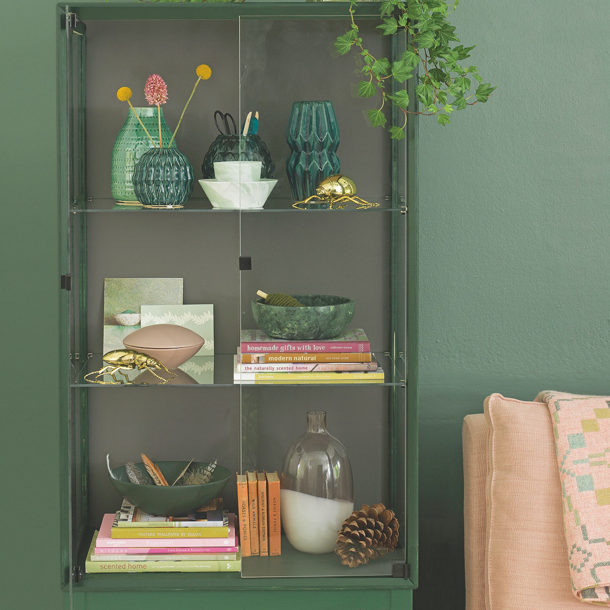
Before placing items inside your cabinets, take a little time to arrange them by height order. Obviously, taller items should go nearer the back and not be allowed to block sight of shorter, daintier items. But they can also come forward in places to create some pace and movement.
Think of undulating heights rather than rigid lineups. ‘Use small Perspex plinths to give certain objects a little extra height and prevent them getting lost on the shelves,’ adds interior designer Benji Lewis.
6. Embrace blank space
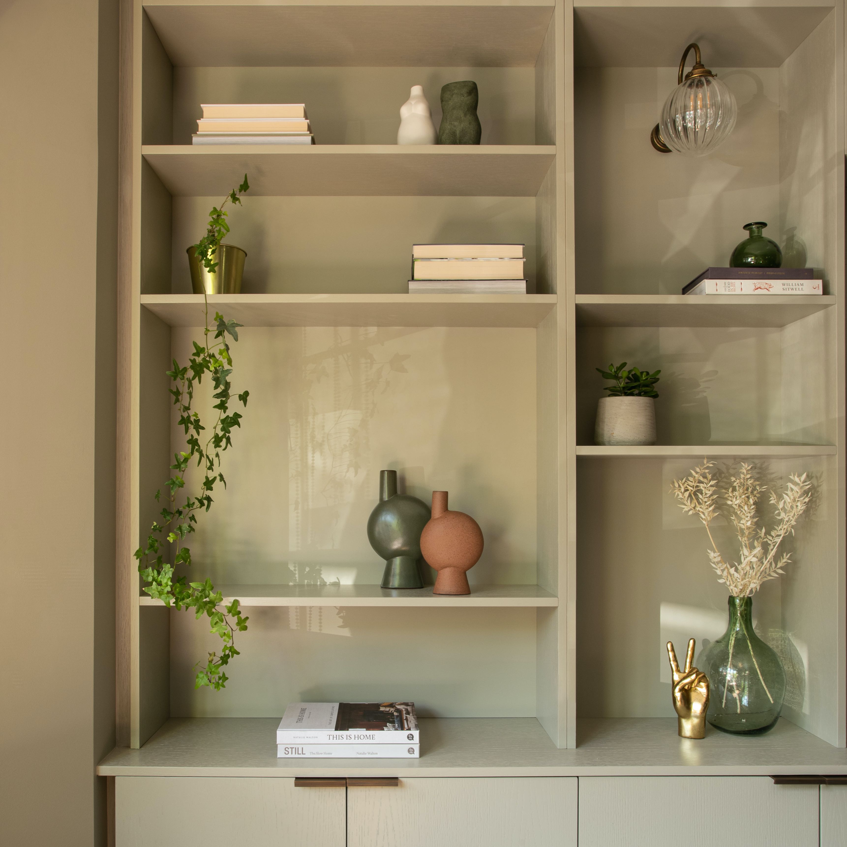
Maximalists can go ahead and ignore this step. Everyone else, take note: blank space is your friend when planning any display cabinet edit. ‘Stop arranging when your display shelves are dressed but not overcrowded as negative space is crucial to a successful display,’ explains interior designer Ruth Milne.
‘Leaving some air to your shelves helps to bring more value to the object on display and creates more of a focal point. Offsetting items throughout your shelving also helps to lead your eye over the entire shelving display.’
Minimalists will particularly appreciate how moments of emptiness can give the eye a rest. A whole movement called 'hush your home' has emerged from this tip to prevent potential clutter anxiety from ruining your enjoyment of an artfully arranged display cabinet.

Ruth Milne is founder of Studio Milne, a London-based interior design practice specialising in residential and boutique commercial projects in London and beyond. A professionally trained interior architect, her projects begin with spatial planning and deliver bespoke solutions that push physical and aesthetic boundaries.
7. Add layers of interest
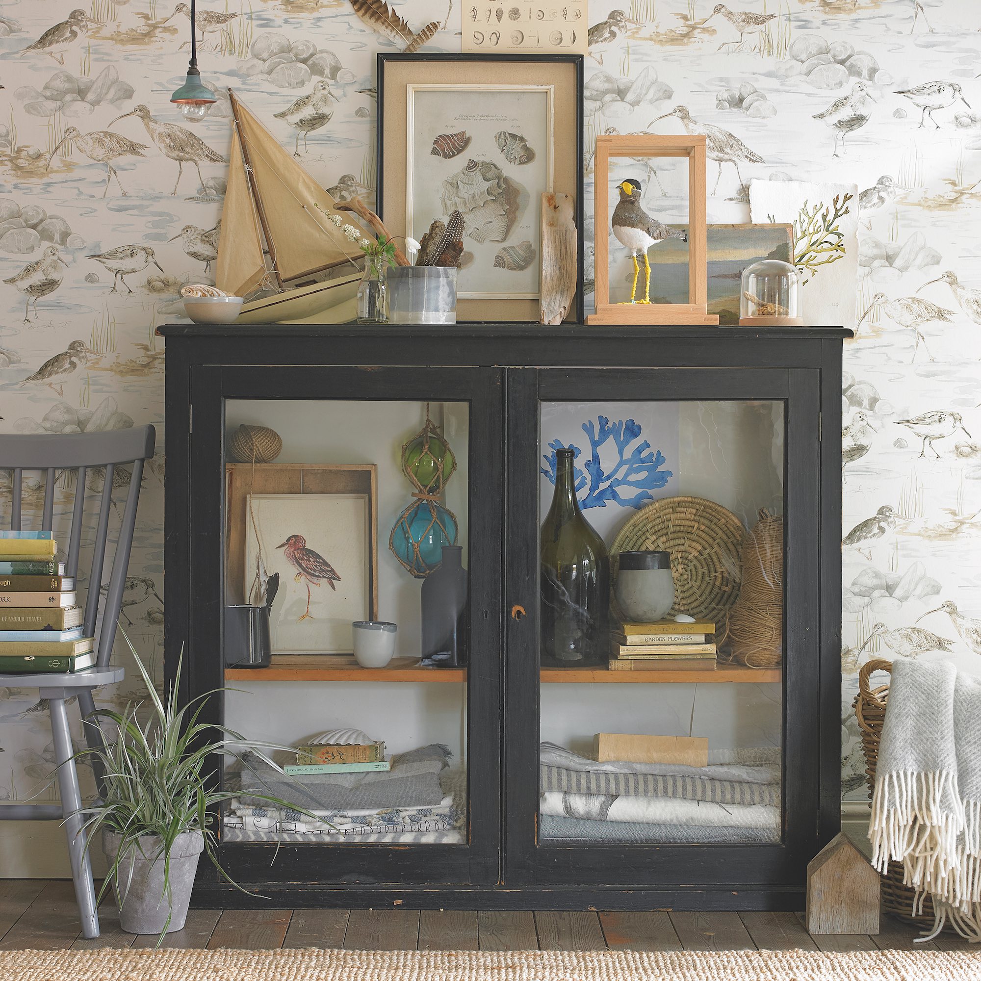
‘Layering is a great way to add interest as you can play with different combinations of colours, materials and profiles to create mini-collections within a larger display,’ explains interior designer Louise Robinson. When arranging smaller vignettes, working in odd numbers by grouping in threes, fives and even sevens, can help make everything feel more relaxed and less contrived.
‘Try to avoid uniform stacks which can look a bit flat, and instead use pieces that taper in size, and I aim to maintain a vague sense of symmetry across the overall display so that it feels balanced and works nicely as a wider collection of pieces,’ adds Louise.
8. Pull in some texture
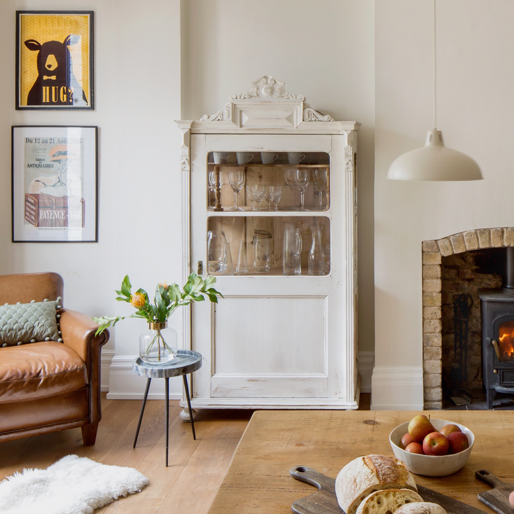
Even if you never plan to touch the items stored inside your display cabinet, it’s still worth introducing a few textural materials to create visual warmth. It can be as simple as mixing up matt and glazed finishes on glassware, or going for a Scandi vibe with some wood, rattan or textured stone moments.
'You want your display to look like an authentic collection of pieces that’s relaxed and inviting, rather than anything overly staged or too uniform. Bringing in some texture will help break things up and add character,’ explains interior designer Louise Robinson. ‘Here, we wanted to use the vintage display cabinet to store glassware, so the texture was provided by the cabinet’s rustic timber interior, which literally shines through.’
9. Install lighting

‘Not only can lighting the interior of your cabinet really elevate the display, but it can also enhance the visual aesthetic of the entire room, creating a relaxed atmosphere and an additional layer of ambient lighting that’s easier on the eye than overhead lighting in the evenings,’ says Melissa Denham, interior designer expert at Hammonds Furniture.
The most sophisticated interior lighting is discreetly installed, so that you only see the glow of illumination, not the physical light fittings. LED light strips hidden at the back of each shelf are ideal and you can pick up battery-powered versions for £2 at Primark. Alternatively, you could install glass shelving and illuminate it with downlights from above. In a bigger cabinet consider fitting small directional lights to throw special items into the spotlight, in the manner of a museum exhibition display.
10. Switch things up
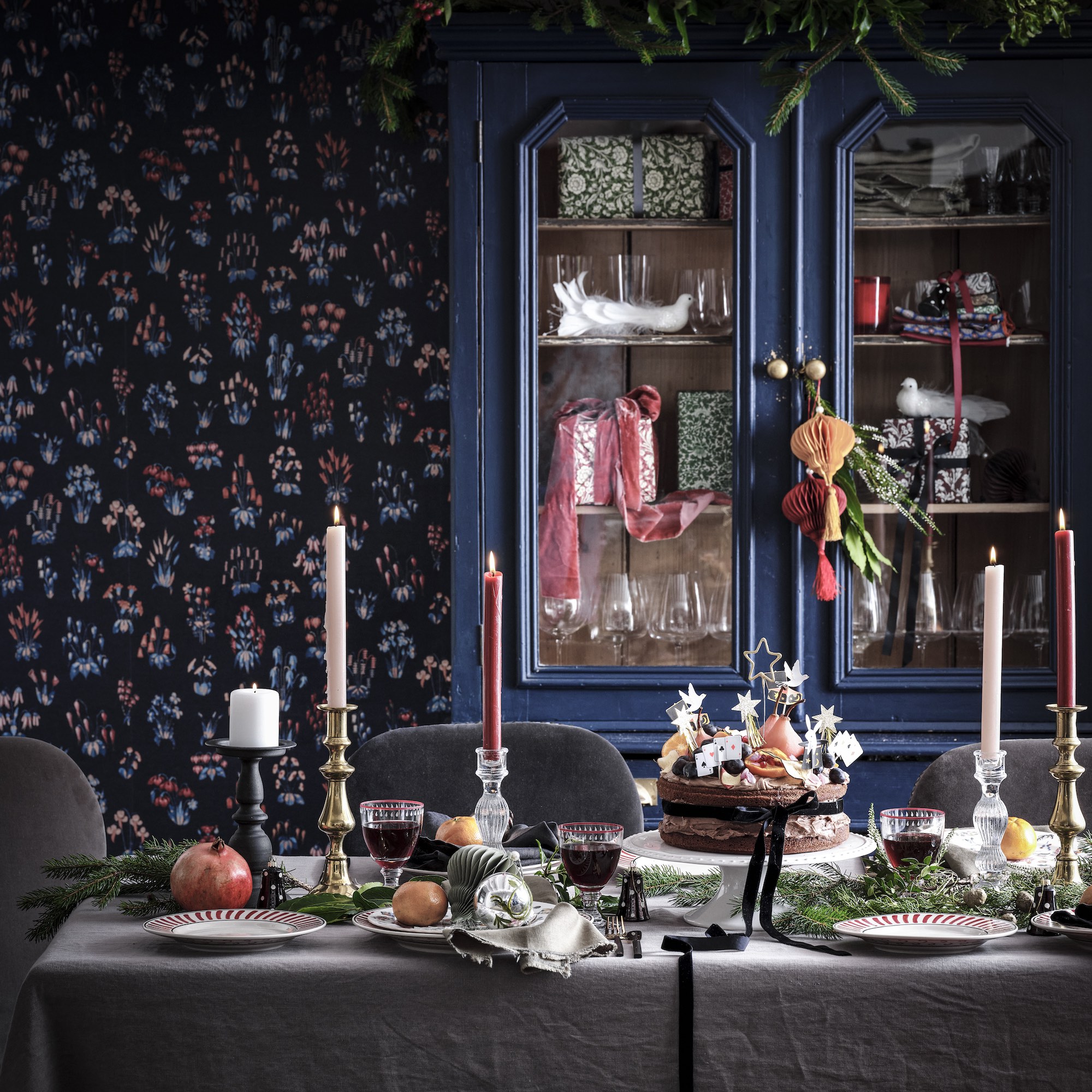
While it’s good to know when to stop faffing with your cabinet contents and move on with your life, one of the best things about display cabinet ownership is the opportunity to switch things up when you fancy a change. For example, you can add some Christmas ideas to it for the festive season.
‘Changing up the style in your display cabinet is a simple and effective way to refresh the room,’ agrees Melissa Denham, at Hammonds Furniture. We’re not suggesting a complete overhaul unless you’re up for it, but adding in a few fresh new colours or shapely items can reinvigorate and freshen things up.
‘Just re-painting the back panel can be enough to wake up the room, it doesn’t need to be anything bold or vibrant if that’s not your style, a subtle change with warm neutrals also offers a nice contrast to your existing room. You may even want different colours when creating a cosy room for winter and a vibrant one for the summer or perhaps dress it up for festivities like Christmas, Easter or Halloween,’ adds Melissa.
FAQs
What should I put in a display cabinet?
It’s probably easier to discuss what you shouldn’t put in a display cabinet than it is to list the eleventy-billion possibilities that you could! In short, avoid anything ugly. Beauty is in the eye of the beholder of course, but it’s safe to say that glass display cabinets are not the place to store your jumble of random cables, odd socks or the toilet cleaner.
Interior designer Benji Lewis is a firm believer that whatever you showcase in your glass-fronted cabinet must reflect your style and interests. ‘Otherwise, things stand to look anodyne and impersonal,’ he says. ‘Collections of one type of thing, for example, Mid-Century Glass looks good, or you could curate your displays according to a colour theme but based on personal memories and keepsakes.’
How can I make my display cabinet look nice?
You can improve your chances of style success if the display cabinet in question is a nice piece of furniture in its own right and will look impressive regardless of what you put inside (provided it’s not toilet cleaner). Look out for display cabinets with striking design features, like arched doors, decorative cornicing and shapely legs.
Vintage display cabinets are especially characterful, and often very well made. Taking good care of your cabinet will also help it look nice – refresh the paint if the shabbiness isn’t deliberate or, if you’re handy on the tools, sand-back and reseal a wooden finish to restore its lustre. ‘Do be sure to keep the glass doors pristine with a vinegar-based spray,’ adds Benji Lewis. ‘If the glass is grubby or smeared the objects on display will always look unloved.’
Now you're armed with all the tools for shelf styling success, it's time to get creative and bring your display cabinet to life.

Linda Clayton is a professionally trained journalist, and has specialised in product design, interiors and fitness for more than two decades. Linda has written for a wide range of publications, from the Daily Telegraph and Guardian to Homes & Gardens and Livingetc. She has been freelancing for Ideal Home Magazine since 2008, covering design trends, home makeovers, product reviews and much more.
-
 Will a conservatory add value to your home and how can you maximise it?
This is what the pros say
By Amy Reeves
-
 I’ve been looking for a new signature scent for my home and The White Company's new fragrance is the exact summer holiday smell I needed
Santorini smells fresh, summery and sophisticated
By Kezia Reynolds
-
 How to remove algae from garden walls in five steps – and the cleaning product experts rave about for tackling it fast
Experts share their top tips for getting garden walls algae-free
By Katie Sims