This "dated" hue takes centre stage in Lick's 2024 Colour Palette of the Year – with a bold rebrand
We can definitely get behind it
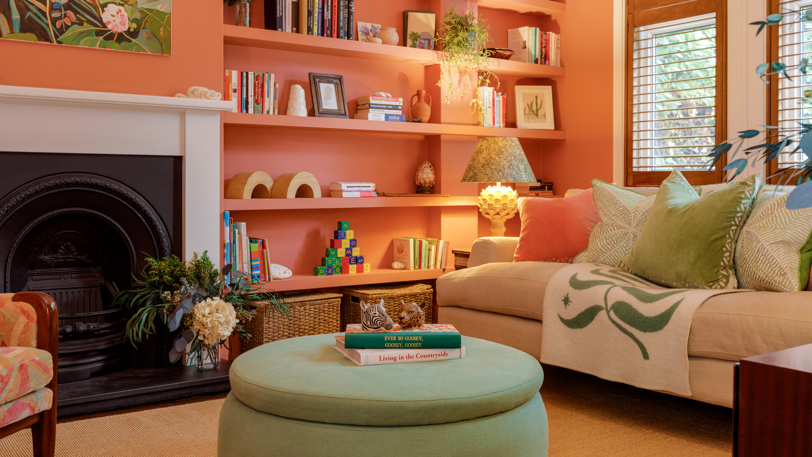

Colour-centric home decor brand, Lick, has just announced its 2024 Colour Palette of the Year and if there's anything we've taken from it, it's that beige is back but sporting a new reputation that we can most definitely get behind.
From warming neutrals to zesty oranges, refreshing blues, and revitalising greens, Lick's 2024 Colour Palette of the Year aims to embrace an optimistic future as well as new beginnings – and given our claim that the beige paint trend has just got a rebrand, a new beginning feels fitting.
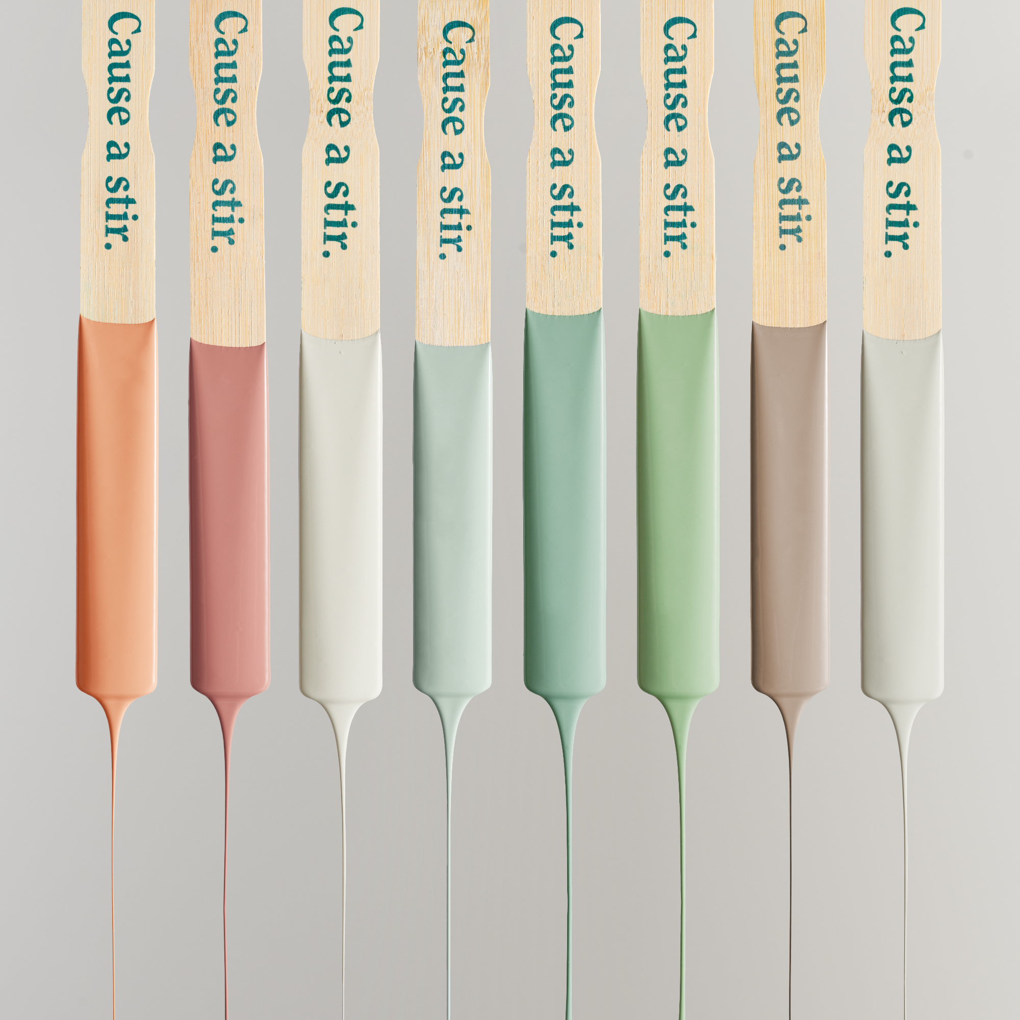
Lick 2024 Colour Palette of the Year
Amidst this neutral colour trend forecast, Lick's 2024 Colour Palette of the Year embraces the principle of unlearning what we think know about beige, and seeing it in a new light.
With versatility and colour psychology in mind, Lick's colour palette has been inspired by three key feelings: Grounding Neutrals, Energising Reds and Oranges, and Uplifting Blues and Greens.
Commenting on grounding neutrals, Tash Bradley, director of interior design and colour psychologist at Lick says, 'In 2024 we are going to see people celebrating colour in a more contemporary way.'
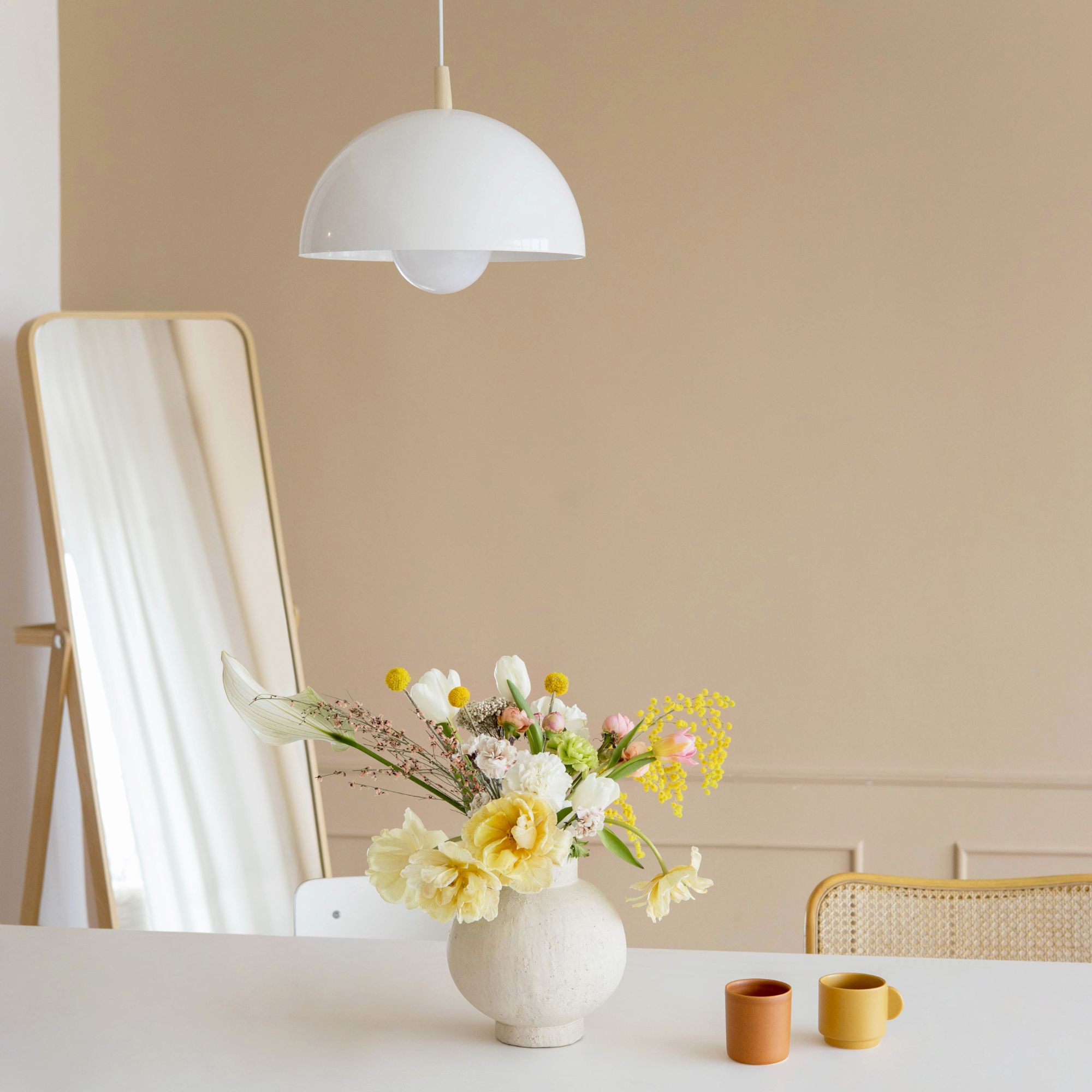
'Grey-based neutrals are being swapped for warmer, yellow-based neutrals. Enduring and timeless, and subtle and soothing, they pair beautifully with the fresher, more vibrant colours in our palette, creating a sense of balance and harmony.'
That's right, we're saying goodbye to the colder grey living room ideas and embracing cosier, cocooning neutral living room ideas.
Get the Ideal Home Newsletter
Sign up to our newsletter for style and decor inspiration, house makeovers, project advice and more.
However, instead of simply layering beige on beige on beige (you get the point), we're introducing refreshing and invigorating colour combinations into what would otherwise be a neutral colour palette.
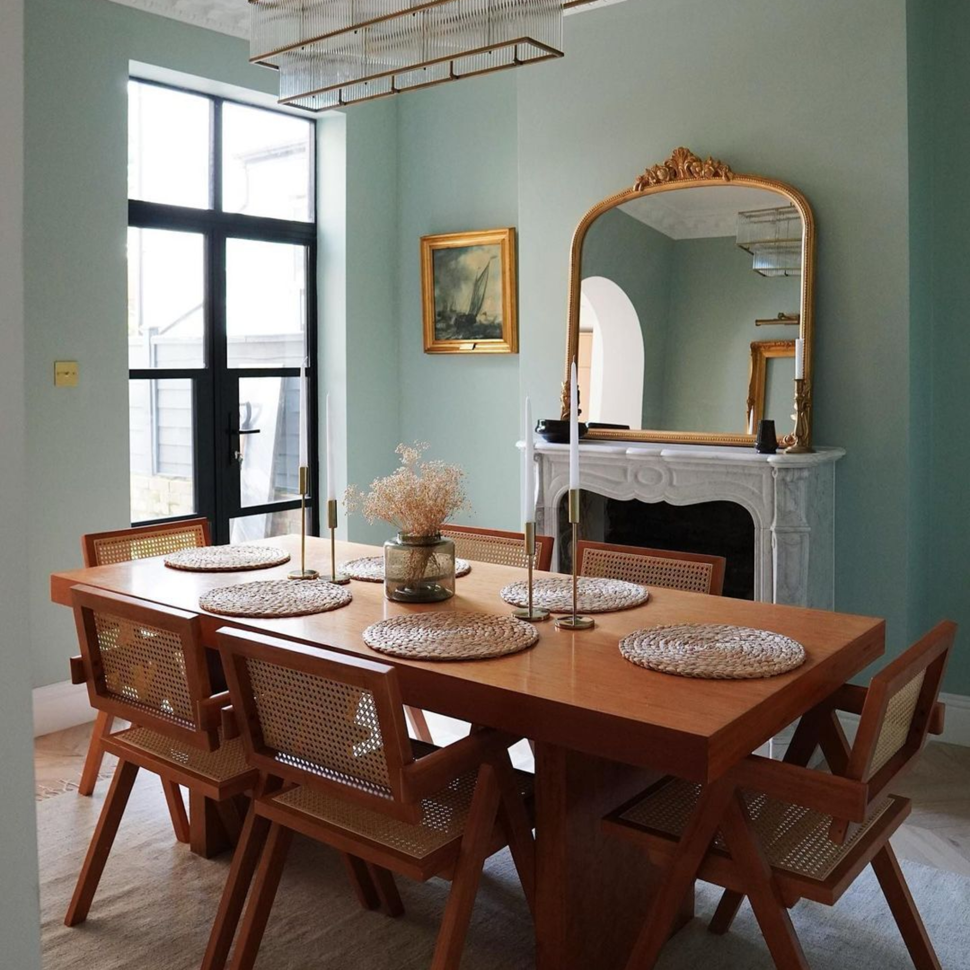
Why is beige having a comeback?
'The biggest problem we have with beige is not with the colour itself, it's with the name we use to describe it,' explains Marianne Shillingford, creative director and colour expert at Dulux.
'Beige may sound like the definition of a damp weekend or a tasteless meal (enter, interior beige flags in a home) but like it or not, we all have more than a bit of beige in our homes and for good reason.'
'Beige is in fact a family of hugely versatile natural warm stone hues that can be teamed with almost any other colour,' she assures.
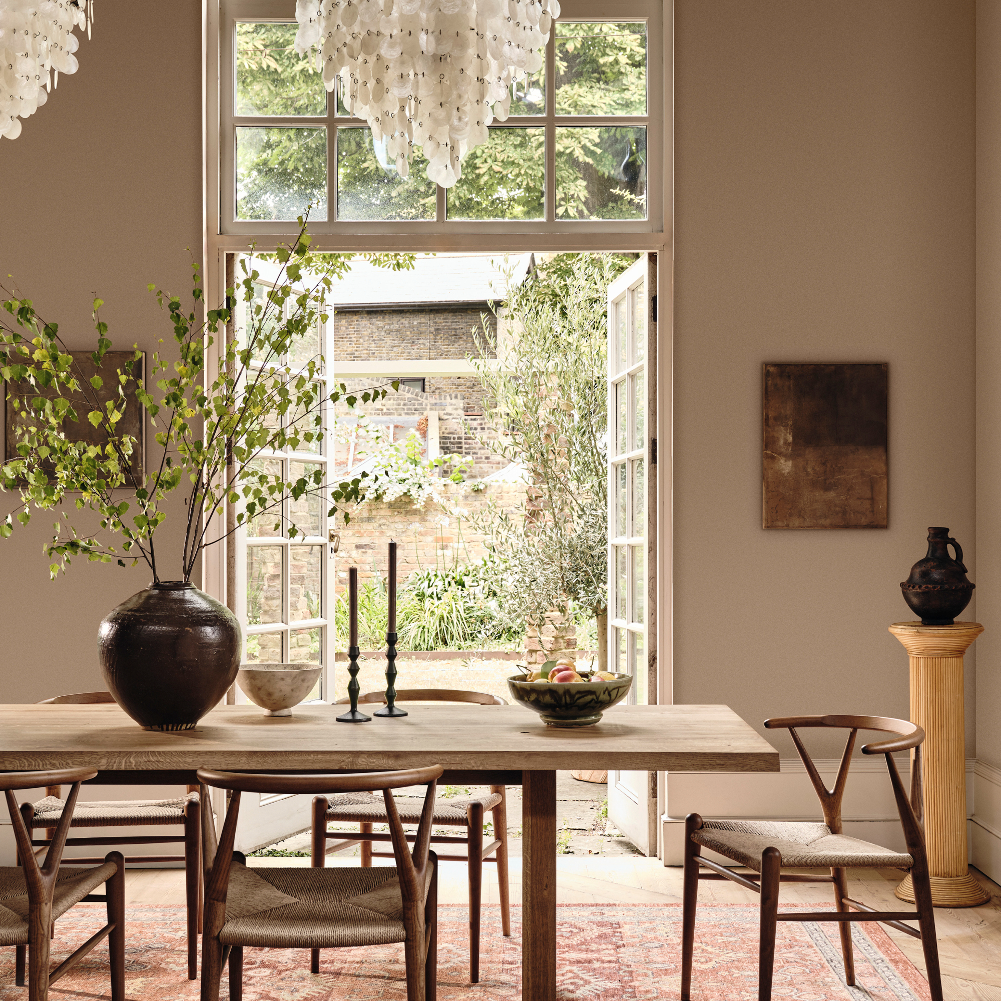
'Beige is undeniably making a resurgence in both fashion and interiors and is being used in more creative ways than it once was,' starts Emma Bestley, co-founder and creative director at YesColours.
'The beauty of this neutral hue is that it serves as an ideal blank canvas for personalisation and creativity, providing a versatile backdrop that allows homeowners to experiment with accent colours, textures, and patterns.'
Emma continues, 'While we're used to seeing full beige schemes in the past, many homeowners are now experimenting with this gentle hue and incorporating it into more vibrant palettes.'
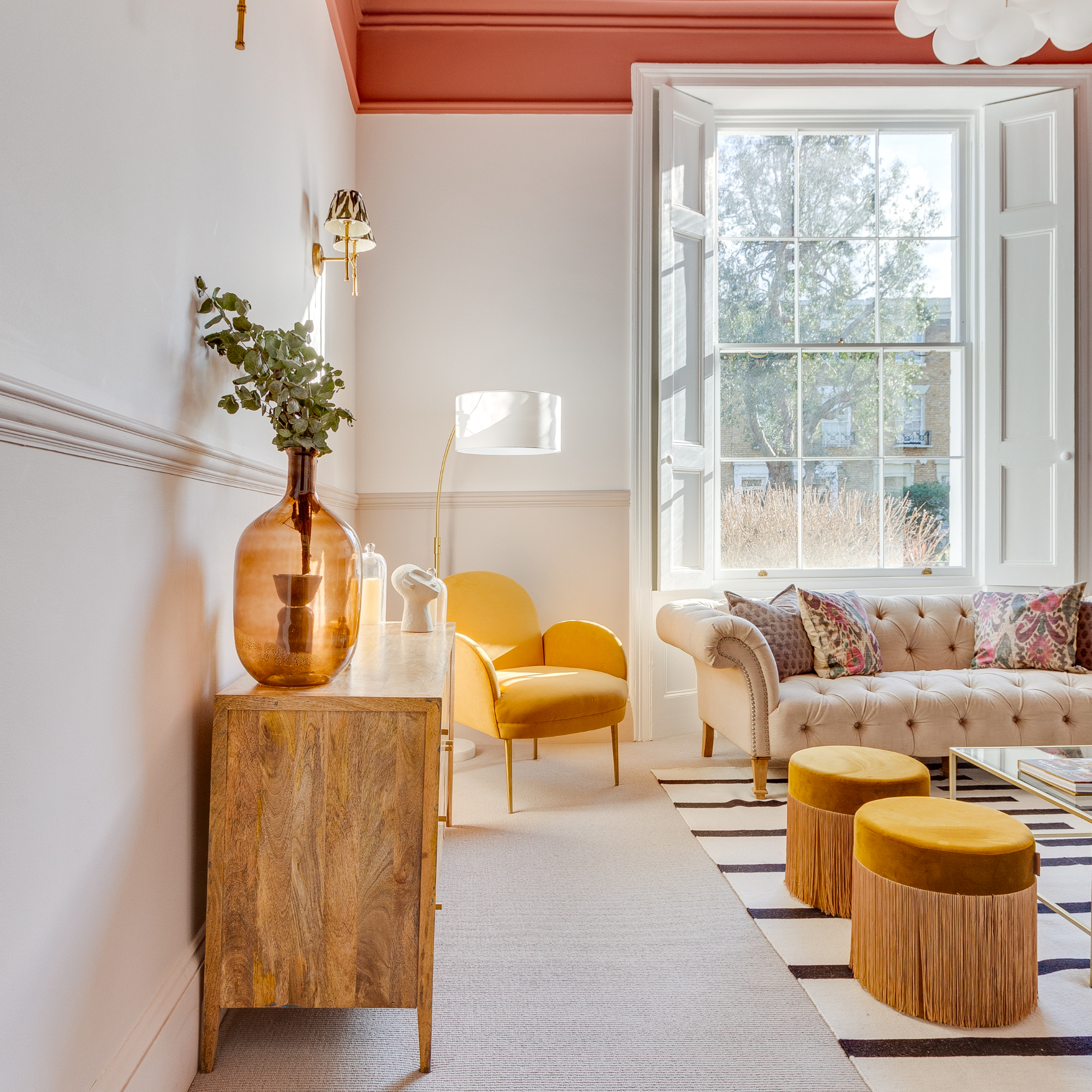
Commenting further on pairing beige with other colours, Sarah Lloyd, paint and interiors specialist at Valspar Paint says, 'Neutral colours like beige, grey, white, or cream can all complement these bright bursts of colour without clashing or competing for attention.'
'Beige provides a calming and soothing backdrop next to brighter colours. No one wants to be overwhelmed when walking into a room, beige is the perfect toner for more exciting colour features.'
This is where the other colours in Lick's 2024 Colour Palette of the Year, the energising reds and oranges as well as the uplifting greens and blues, join beige centre stage to shine.
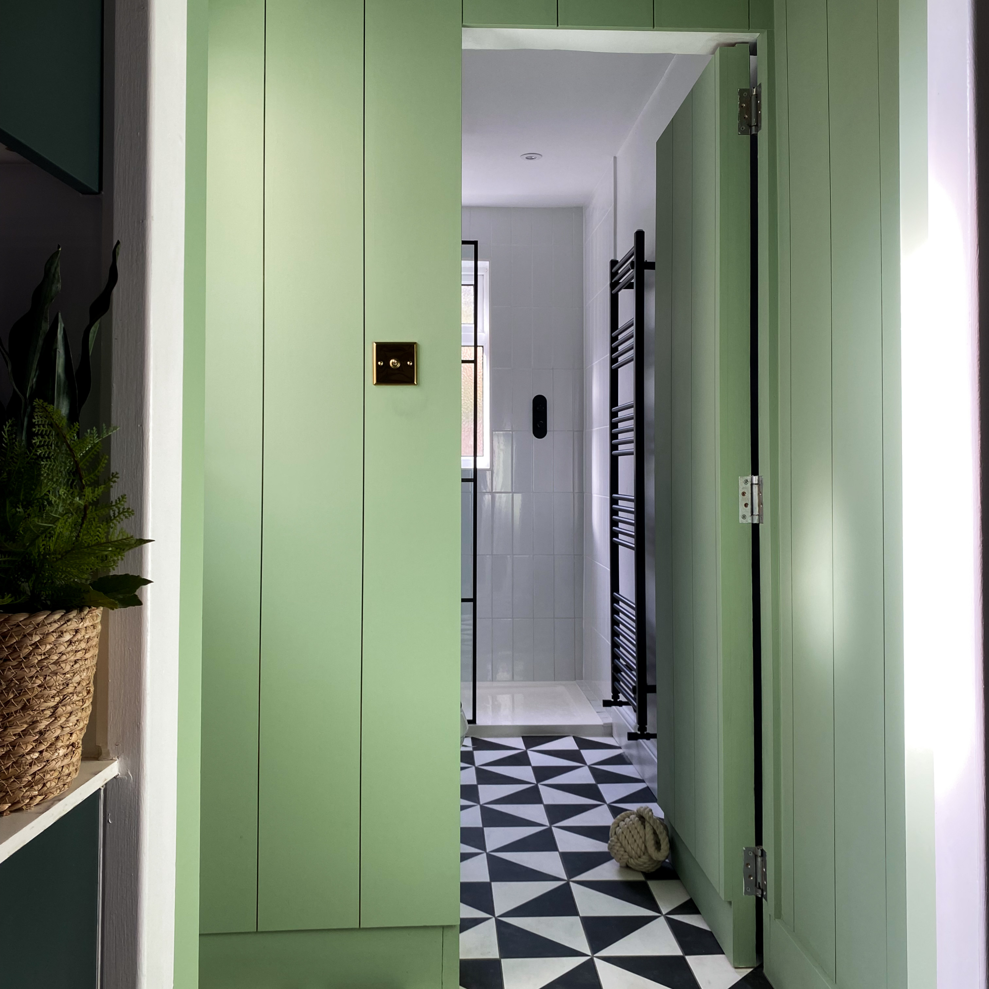
Commenting on these energising colours to pair with warm, beige neutrals, Tash at Lick says, 'More and more, I've seen clients leaning towards these fresher blues and greens due to their uplifting, contemporary feel. They make a room feel bigger, brighter and will leave you feeling refreshed when you’re around them.'
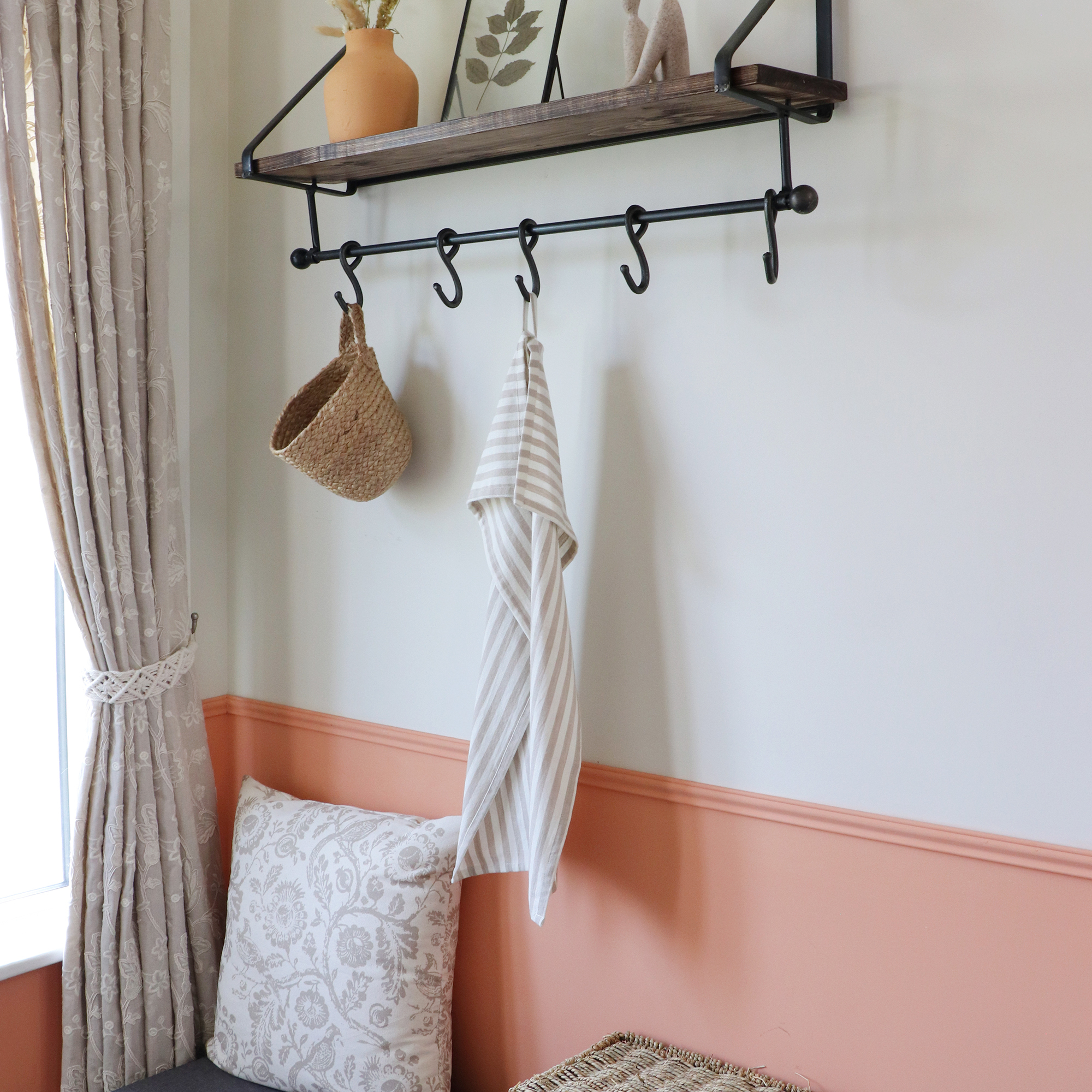
Shifting focus to the more electric hues, Tash continues, 'Red and orange are social colours. Red attracts the most physical attention. Orange is optimistic and friendly.'
'Both colours have the ability to stimulate, energise, and spark conversation. When introduced as accent colours in a home, they create a focal talking point, lending themselves particularly well to ceilings.' Did someone say colour drenching?
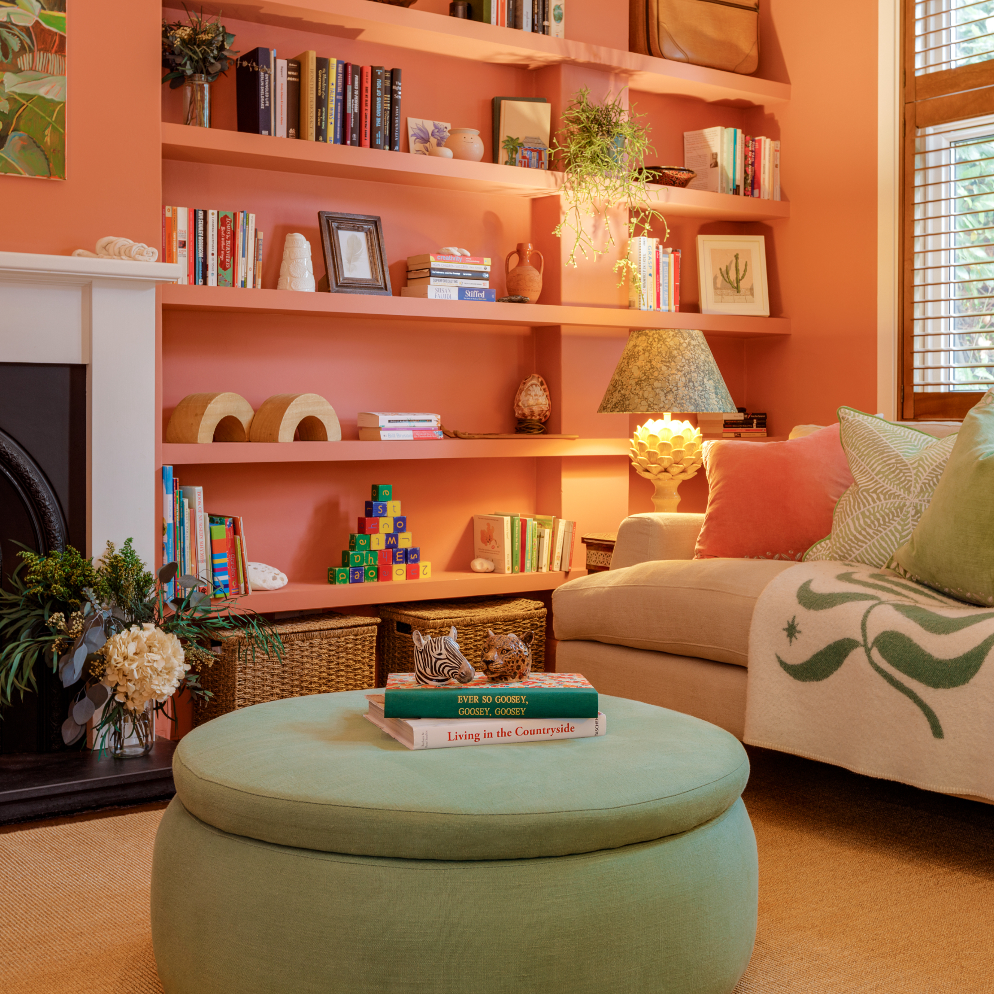
Sarah at Valspar concludes on this, 'Inviting and captivating, these colours are going to provide a bright yet sophisticated pop of colour in your space and beige will be the perfect neutral accent, offsetting the brightness of these colours with a versatile warmth.'

Jullia was Ideal Home’s Junior Writer from 2022-2024 and the Ideal Home Certified Expert in Training on Vacuums having spent over 60 hours testing different models. She’s always loved all things homes and interiors, graduating with a bachelor’s degree in Architectural Studies from the University of Nottingham where her love for writing blossomed following her internship at ArchDaily. Now focused on home tech and cleaning, Jullia works on writing features and explainers to help people make the most of their home appliance investments, putting the newest launches through their paces. When she isn’t writing, she loves exploring the city, coffee shop hopping, and losing hours to a cosy game or book.
-
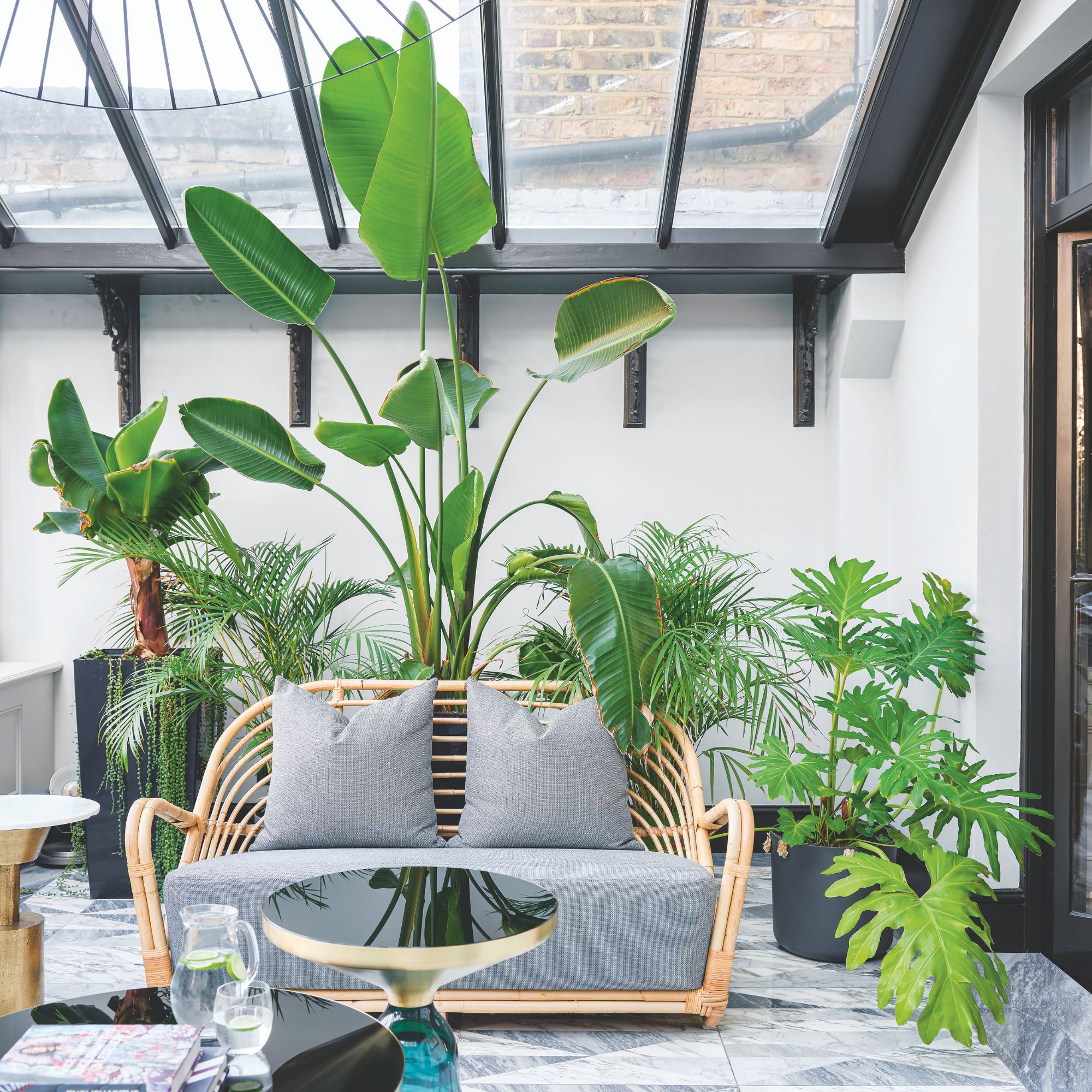 Will a conservatory add value to your home and how can you maximise it?
This is what the pros say
By Amy Reeves
-
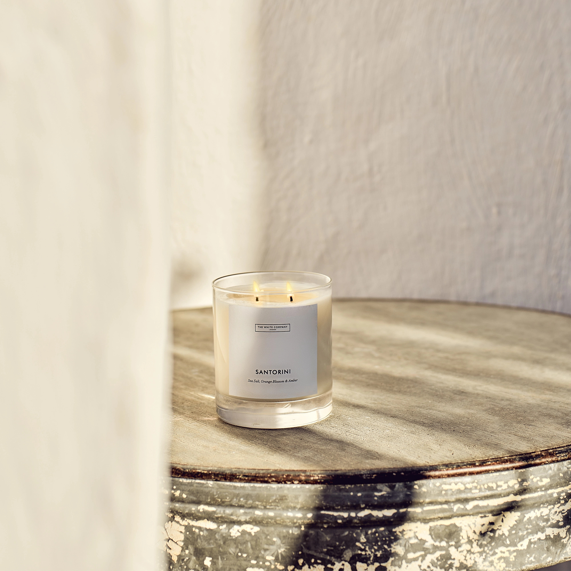 I’ve been looking for a new signature scent for my home and The White Company's new fragrance is the exact summer holiday smell I needed
Santorini smells fresh, summery and sophisticated
By Kezia Reynolds
-
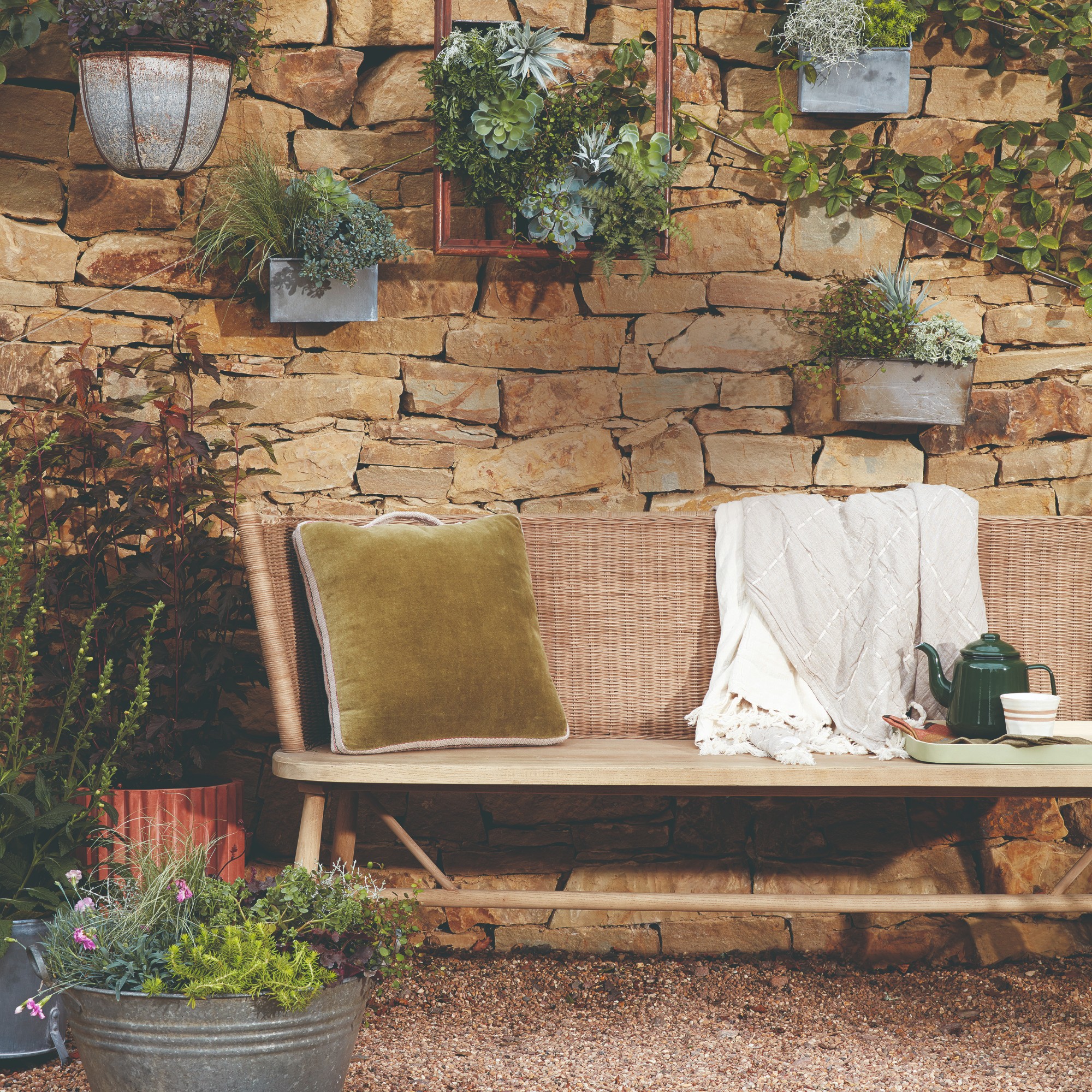 How to remove algae from garden walls in five steps – and the cleaning product experts rave about for tackling it fast
Experts share their top tips for getting garden walls algae-free
By Katie Sims