Paint the town and your walls red because this fiery colour is making a comeback
Is this primary colour making a comeback? Here’s all you need to know about the newest interiors colour trend
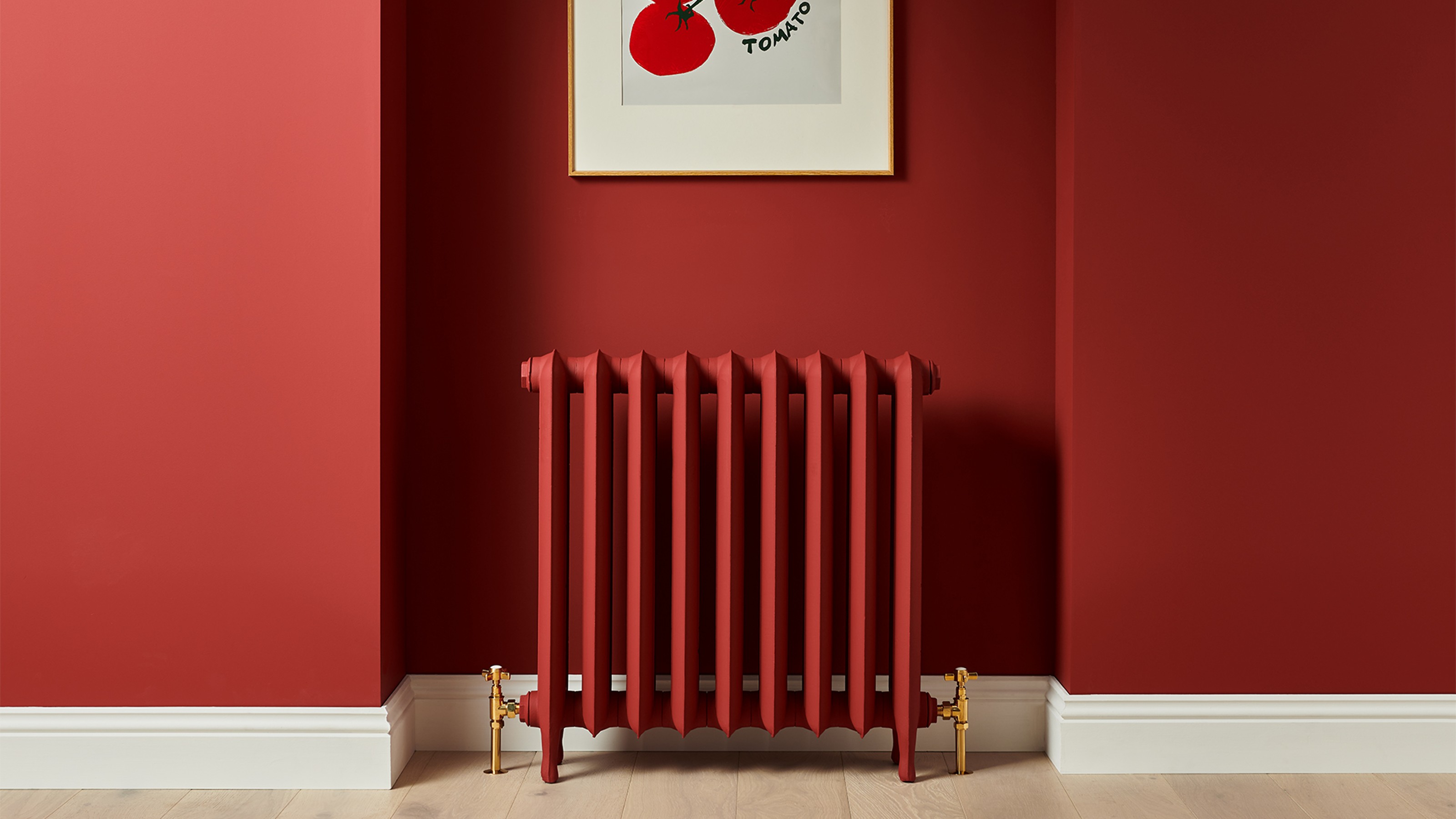

Red is a powerful colour, symbolising confidence, energy and warmth among many others. But as exciting as this fiery hue is, it can end up looking cheap or just simply wrong if not done correctly, whether that’s choosing the wrong shade or pairing with unsuitable colours. Not to mention outdated. But red is having a renaissance.
Over the course of this year, red paint ideas of all shades have been gaining popularity among customers, whether it’s bright, primary reds, darker shades going into burgundy or earthy, terracotta tones. And this colour micro trend is peaking right now as paint brand Lick announces a particularly delicious collaboration with none other than Heinz ketchup, matching the popular tomato sauce’s exact shade in its paint.
But how can you incorporate this bold statement into your home? And what colours go well with it? We asked our experts to give us the intel.
Red paint colour micro trend
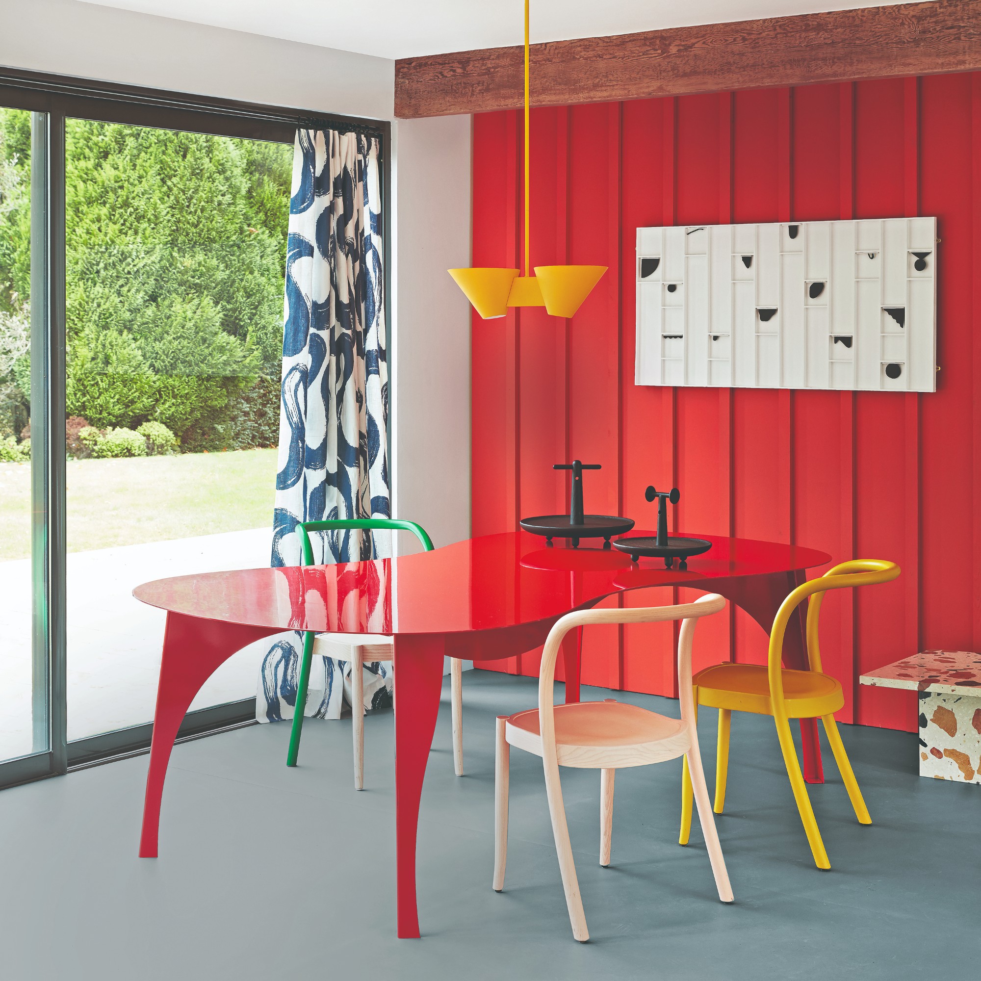
Named Red HTK 57, the Lick x Heinz paint is a darker shade of red nailing this summer’s tomato girl trend.
‘We’ve designed Red HTK 57 with a dose of black pigment to tone down its intensity and give you the confidence to drench all four walls and your ceiling in colour,’ says Tash Bradley, Lick’s director of interior design and colour psychologist.
She continues on red’s popularity seen this year, ‘Red is modern, contemporary, bold and playful, and I’ve noticed this year that people are bringing a pop of primary colour into their homes and wanting a little more fun. Red has a child-like, softness to it that is so charming and is perfect if you’re looking to spice up your home with flourishes of a primary colour.’
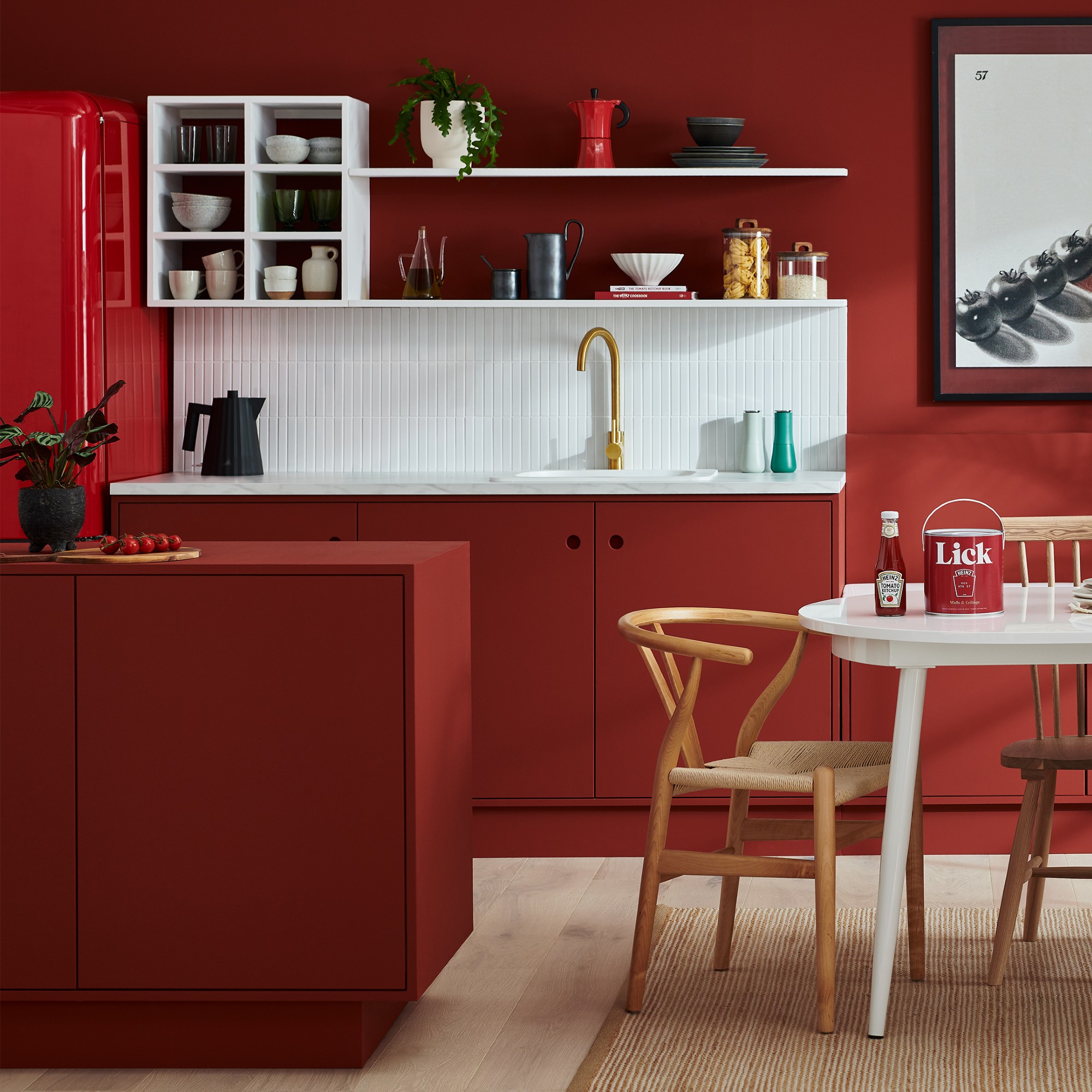
But Lick isn’t the only brand that’s pushing the red renaissance forward and noticing the rise in the colour’s popularity.
Get the Ideal Home Newsletter
Sign up to our newsletter for style and decor inspiration, house makeovers, project advice and more.
‘Over the past 12 months, we have seen an increase in popularity and interest in our red paint hues,’ says Jessica Plateo from Craig & Rose Paints. ‘Customers are keen to have fun with the different shades, bringing visual intrigue and colour depth into their homes.’
‘Red across all shades in the palette has been making an appearance in interior design throughout 2023. From bold, vibrant and rich reds associated with creating energy and intrigue, to earthy, delicate pastels for a more subdued, flowing scheme.’
And it’s not just your walls that you can dress in the colour red. Your flooring, whether it’s rugs or tiles, can also be enlivened with red. And so can your home accessories.
‘Recently people are certainly gravitating towards richer, earthier tones that bring a comforting warmth to any scheme,’ says Steve Corcorcan, decorating consultancy manager at House of Hackney. ‘We have noticed customers responding well to red tones for accents and accessories in their schemes.’
How to use red paint in your home
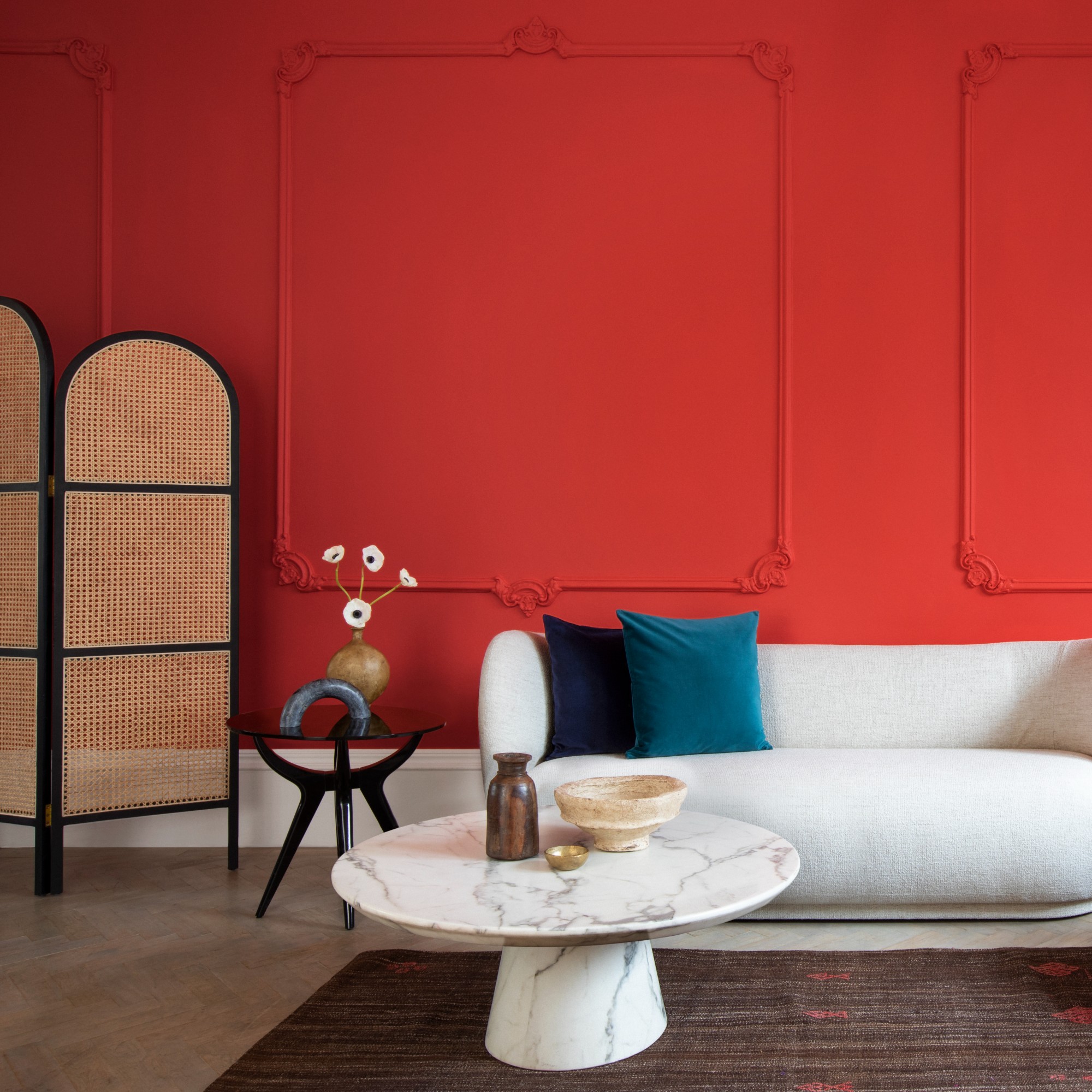
If you opt for red painted walls, there are two ways you can go about it – drenching or accents.
‘One of my favourite ways to use Red HTK 57 in a home is by colour drenching! Colour drenching means wrapping a whole room with your colour of choice,’ says Tash of Lick.
Katrina Dalley, interior design and trade sales executive at House of Hackney, shares an iconic example of drenching. ‘Red can be a difficult colour to navigate in the world of interiors but when used in the right way, it can really create impact.'
'For the more daring, it can be used all over an entire scheme such as Diana Vreeland’s iconic Garden in Hell sitting room scheme that is a constant source of inspiration for us here at House of Hackney.'
'This type of colour drenching is becoming increasingly popular in interiors with people taking the brave leap to use just one colour across every surface.’
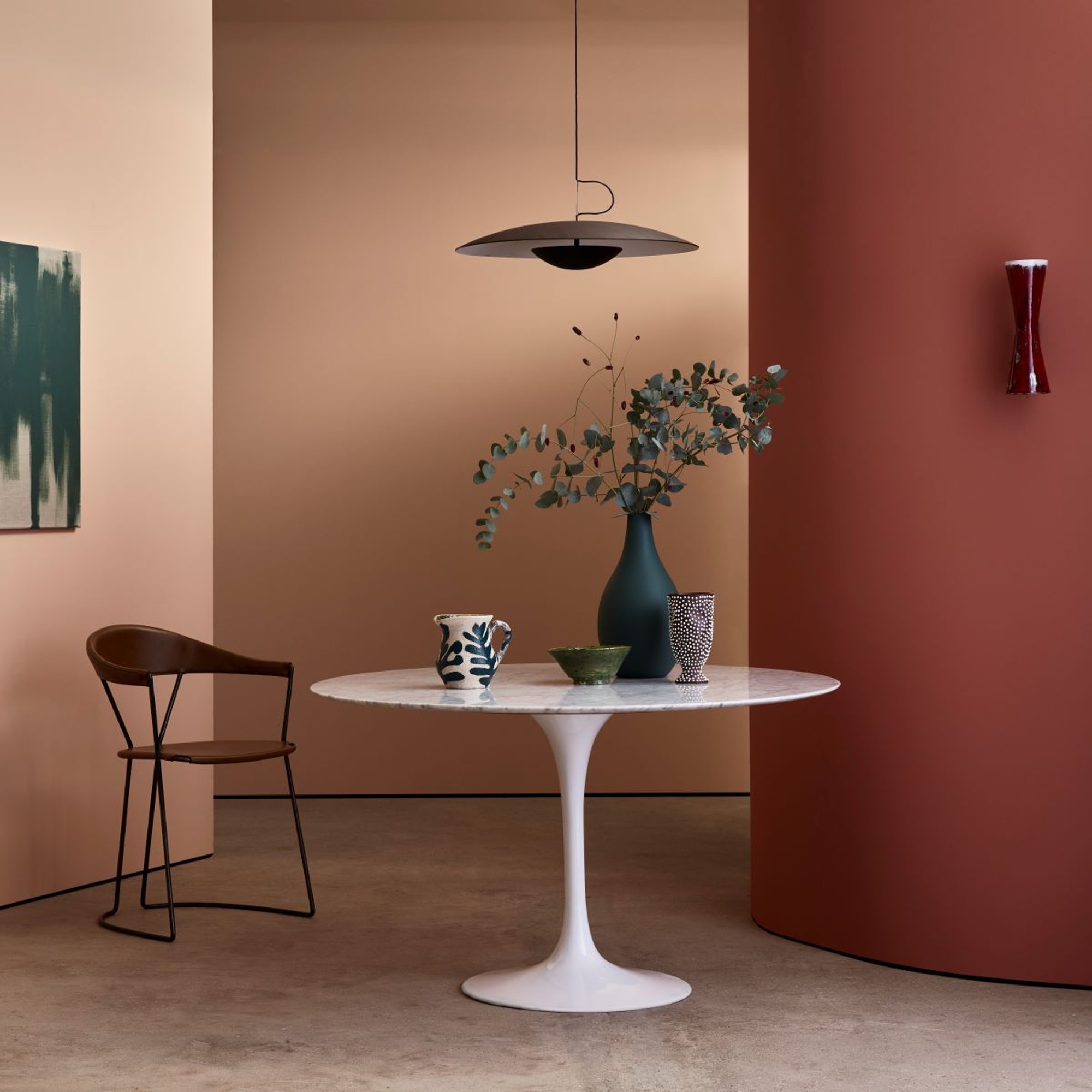
Tash continues on the option of red accents. ‘We never see colour in isolation, so when red is used as an accent colour against softer tones, it really stands out. Red has the longest wavelength of all the colours, meaning that it advances towards you and you’ll be drawn to it the most. With such a strong energising quality, a pop of Red HTK 57 has the power to elevate its surroundings and uplift the whole room.’
If used as an accent, Tash suggests pairing the new red with either classic white or soft blush pink.
But white and pink are not the only colours you can successfully pair with red, as Alan Russell, sales director at carpet and rug brand Louis De Poortere, points out. ‘This is where the colour wheel plays a key part in getting the right look. For a complete contrast, then an opposite spoke of the colour wheel would suggest an aquamarine look, which would result in a clean but primary focused aesthetic.'
'A popular choice for those looking to add warmth to cooler rooms would be to look at orange, peach and burnt ambers.’
Where to use red in your home
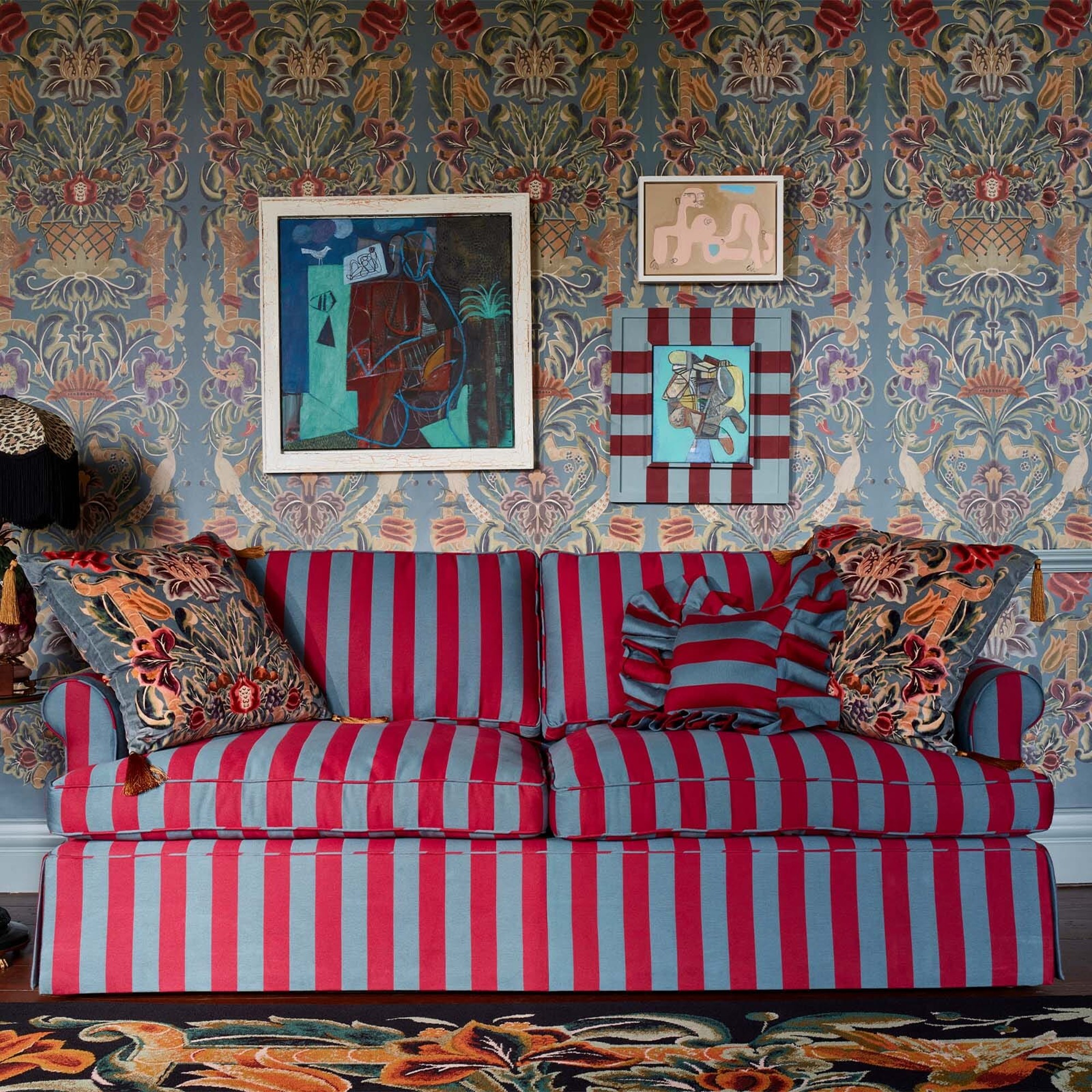
‘Red is one of the oldest pigments humans have had, and it’s been around for centuries. In the olden days, red was traditionally used in the dining room because it’s a grand, rich colour that demands a lot of attention,’ Tash explains. Not to mention the obvious gourmand quality of Lick’s Red HTK 57, which makes it the perfect dining room paint idea.
But it won’t go amiss as a living room colour scheme idea either, sure to add cosy warmth to your sitting room.
This colour trend is sure to rid your home of any dullness, whichever way you choose to add red to your abode.

Sara Hesikova has been a Content Editor at Ideal Home since June 2024, starting at the title as a News Writer in July 2023. She is now also the Ideal Home Certified Expert in Training on Furniture, and so far has tested 80 different sofas.
Graduating from London College of Fashion with a bachelor’s degree in fashion journalism in 2016, she got her start in niche fashion and lifestyle magazines like Glass and Alvar as a writer and editor before making the leap into interiors, working with the likes of 91 Magazine and copywriting for luxury bed linen brand Yves Delorme among others.
-
 Will a conservatory add value to your home and how can you maximise it?
This is what the pros say
By Amy Reeves
-
 I’ve been looking for a new signature scent for my home and The White Company's new fragrance is the exact summer holiday smell I needed
Santorini smells fresh, summery and sophisticated
By Kezia Reynolds
-
 How to remove algae from garden walls in five steps – and the cleaning product experts rave about for tackling it fast
Experts share their top tips for getting garden walls algae-free
By Katie Sims