Michelle Ogundehin warns against forgetting this invisible interior design rule
'It will make you feel soothed in a space'

Sign up to our newsletter for style inspiration, real homes, project and garden advice and shopping know-how
You are now subscribed
Your newsletter sign-up was successful
Interior Design Masters judge, Michelle Ogundehin, warns against neglecting this almost invisible but crucial element of decorating a home.
When it comes to the world of interior design, there are a few principles worth getting yourself acquainted with. From the standard talk of light and colour combinations to more complex ideas like scale and proportion, there's another one that is often overlooked: alignment.

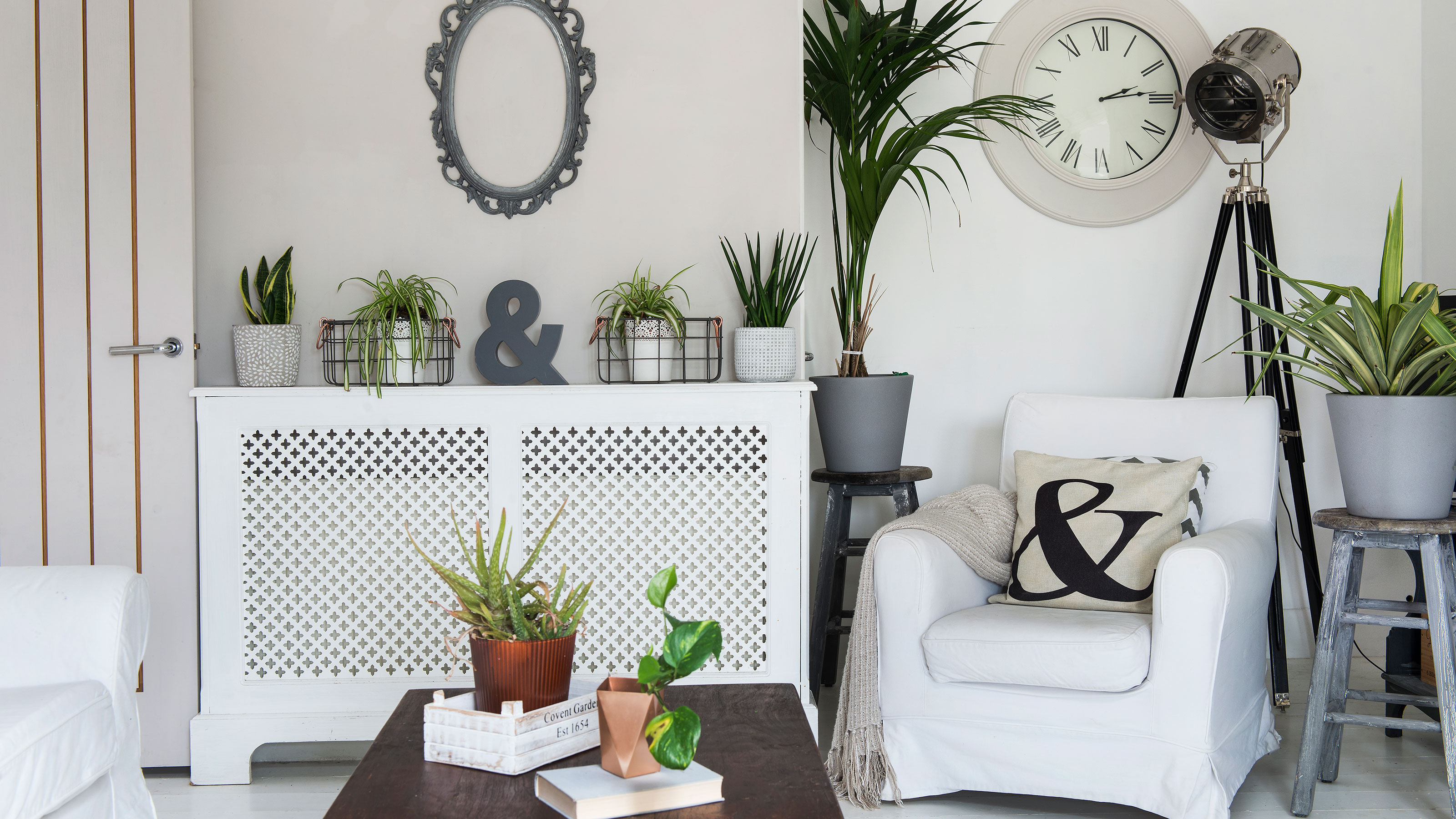
'I think alignment is sometimes something people forget. If you're aligning things with curtain rails, the tops of doors, or pictures, there's some sense of a visual line around the space that can often make it feel really restful from the chaos,' explains Michelle Ogundehin.
Article continues below'It's not something that you have to stick to rigidly – it should be kind of invisible and it will make you feel soothed in a space.' Perhaps it's something to think about the next time you plan to arrange living room furniture.
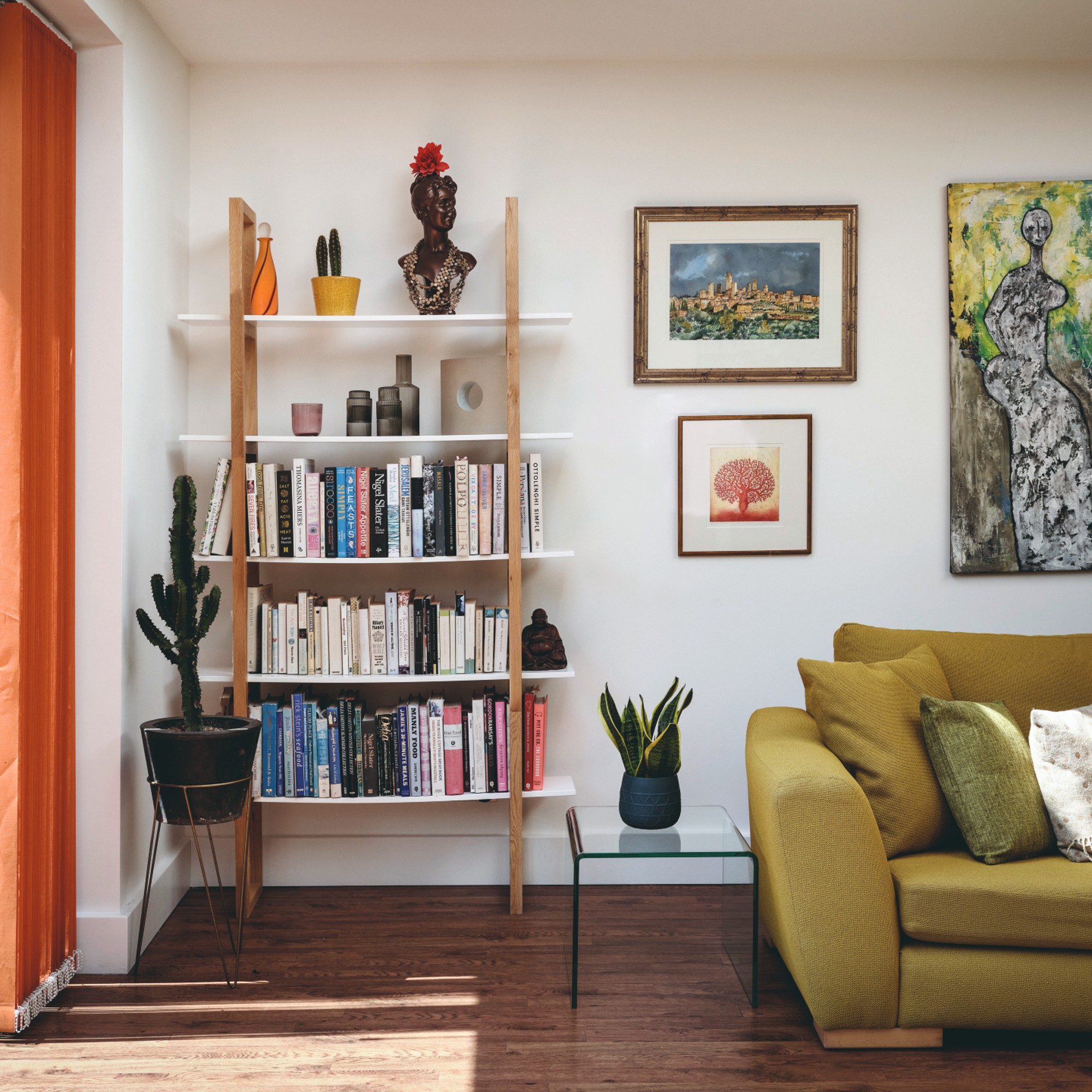
Paying attention to the alignment of elements within a space in your home is a surefire way to make any room look more put together and intentionally designed. If you're looking into gallery wall ideas, consider how each frame lines up with one another and other elements along the wall.
There's a time and a place to go out of the box and beyond the ordinary, embracing clutter-core, but considering alignment even in those particular design choices will keep everything cohesive.
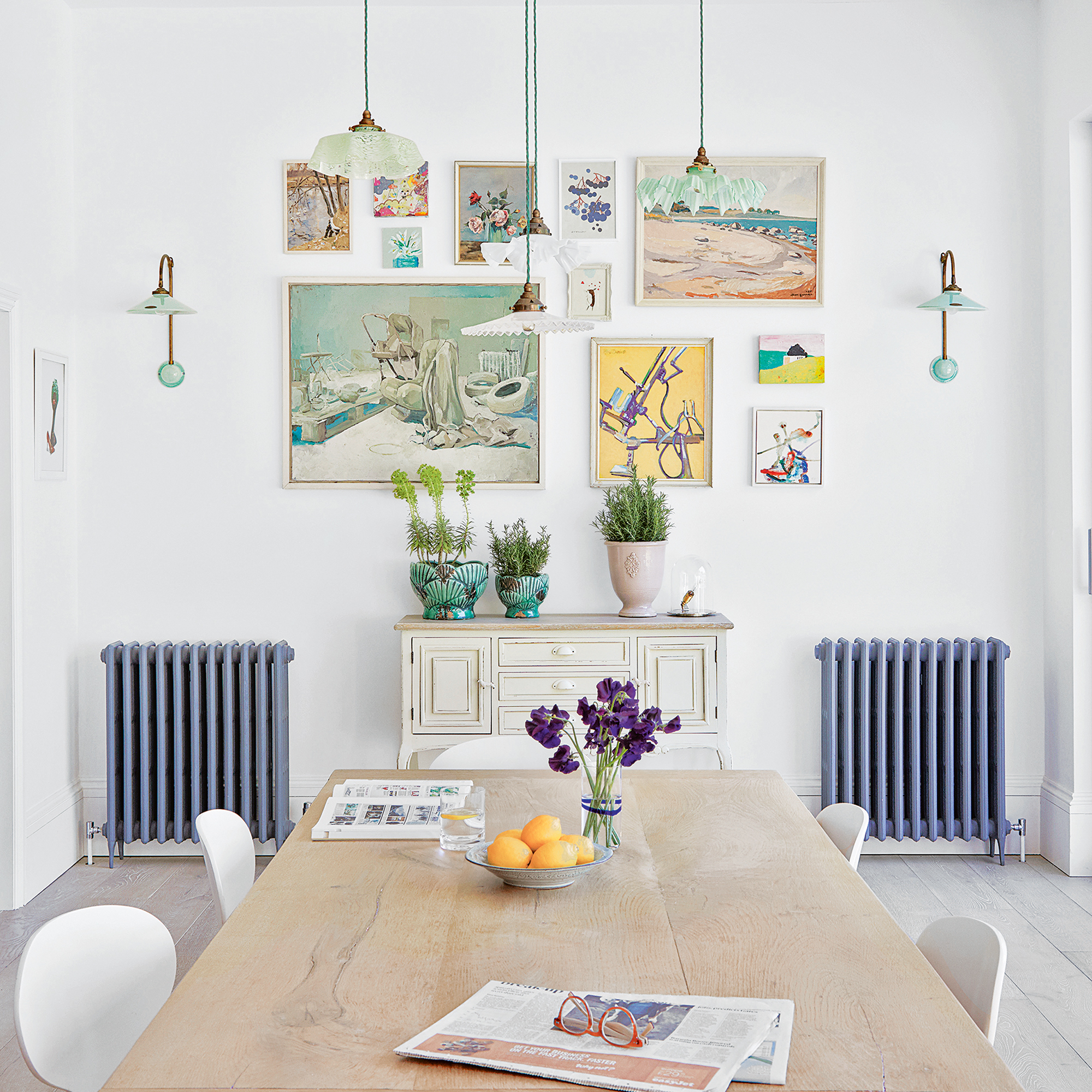
The Interior Design Masters judge continues, 'You have to think about how a space makes you feel. You can't always point to something superficially out of the corner of your eye and say 'it's that' but rather it's about the sum of elements.'
Sign up to our newsletter for style inspiration, real homes, project and garden advice and shopping know-how
And as Michelle Ogundehin pointed out, it's that visual line that connects everything that keeps you drawn to a space, even if there isn't a notable focal point per se or statement home decor piece.
Be sure to tune in to the first episode of Series 4 of Interior Design Masters, which will air on Tuesday 7th March at 8pm on BBC One and iPlayer, where you can catch Michelle Ogundehin as head judge alongside comedian Alan Carr.
If you need us, we'll be cosying up to tune into yet another series of awe-inspiring makeovers, tears, tension, and a whole brand-new batch of contestants to watch. Catch you there.
Jullia was Ideal Home’s Junior Writer from 2022-2024 and the Ideal Home Certified Expert in Training on Vacuums having spent over 60 hours testing different models. She’s always loved all things homes and interiors, graduating with a bachelor’s degree in Architectural Studies from the University of Nottingham where her love for writing blossomed following her internship at ArchDaily. Now focused on home tech and cleaning, Jullia works on writing features and explainers to help people make the most of their home appliance investments, putting the newest launches through their paces. When she isn’t writing, she loves exploring the city, coffee shop hopping, and losing hours to a cosy game or book.