

Since Bridgerton landed on our screens in 2020, it has held the interiors world in its regency grip. The Netflix show's third season focusing on Penelope and Colin Bridgerton lands on our screens 16th May, and according to Alison Gartshore, the show's Production Designer the show has had a 'glow-up'.
It sounds hard to imagine the glorious pastel-coloured show that inspired the regency-core home decor trend getting even more glamourous, but speaking to Ideal Home Alison reveals we will be treated to much more than the typical pastel shades this season.
'I think we've embellished what was there before, we've given quite a lot of the scenarios a glow-up,' says Alison Gartshore. 'I think the colours are a little stronger, I think the florals are a little larger and more spectacular. And I just think it looks really beautiful.'
The new Bridgeton colour palette
'Sugared almond palette, heavy on the florals,' is how Alison sums up the show's aesthetic in one sentence. But this season that look is being balanced with darker shades as we dive deeper into the character of the debutante Cressida Cowper who we met in season 1.

'We have got new colour palettes aside from the Bridgerton's colour palette, which we all know and love,' explains Alison.
'We see the Cowper's home for the first time, that is a very different colour palette to anything else we've seen in Bridgerton I think. We've got the charcoal greys and oranges in the Cowper house with oxblood red and black.'
'It feels quite oppressive, quite masculine, quite domineering,' says Alison. 'I really wanted to contrast with Cressida who's often dressed in very pale pastel pinks. I wanted her to look like a delicate bird in this heavy, dark environment.'

It's not surprising to see this dark and moody colour trend making its way into the popular Netflix show. The 2024 colour palette has been divided into two tribes: light and playful shades like peach and lilac, and dark and moody colours like navy and damson.
Alison teased that Cressida's bedroom is one of her favourite schemes in the whole show, so we can't wait to see what the Bridgerton set does with this darker colour scheme.

But it's not only the dark and moody shades that are new. We're also treated to a spin on last season's rich and sunny colour palette with Kate and Anthony's new apartment at the Bridgerton house.
'We wanted their space to feel a bit younger and fresher than the rest of the Bridgertons,' adds Alison. Kate's sunset colours from last season have been married with the traditional pastel and champagne shades of the Bridgerton family. So expect to see ochres, oranges, earthy shades and sunset pinks running through the new colour palette.
Once again we think this new scenery has the power to set off some new colour trends. We're already seeing a renewed interest in terracotta and yellows ahead of summer, and can't wait to see the regency spin on these shades.

When it comes to looking for colour inspiration Alison explains that alongside matching colours to the characters she looks to heritage paint brands such as Little Greene, Farrow & Ball and Edward Bulmer.
'We always look at the heritage paint colour ranges. They're often much better than the big brand names because they're a little bit chalky, and back in those days they used to use limewash,' she explains.
We can't wait to see what other home decor inspiration the new season of Bridgerton has in store for us on Netflix on the 16th May.
Get the Bridgerton look
If you're already hooked on regency style or want to hide subtle nods to the hit show in your home these are the pieces worth snapping up.

Pale pink and cream this subtle Bridgerton-inspired rug will elevate any living room, and it's washable.

Bridgerton's warm lighting scheme is down to a mix of chandeliers and wall sconces, and this chandelier is a perfect modern spin

Mirrors are a huge theme running through season 3 and this ornate over mantle mirror is a timeless option that will never go out of style

-
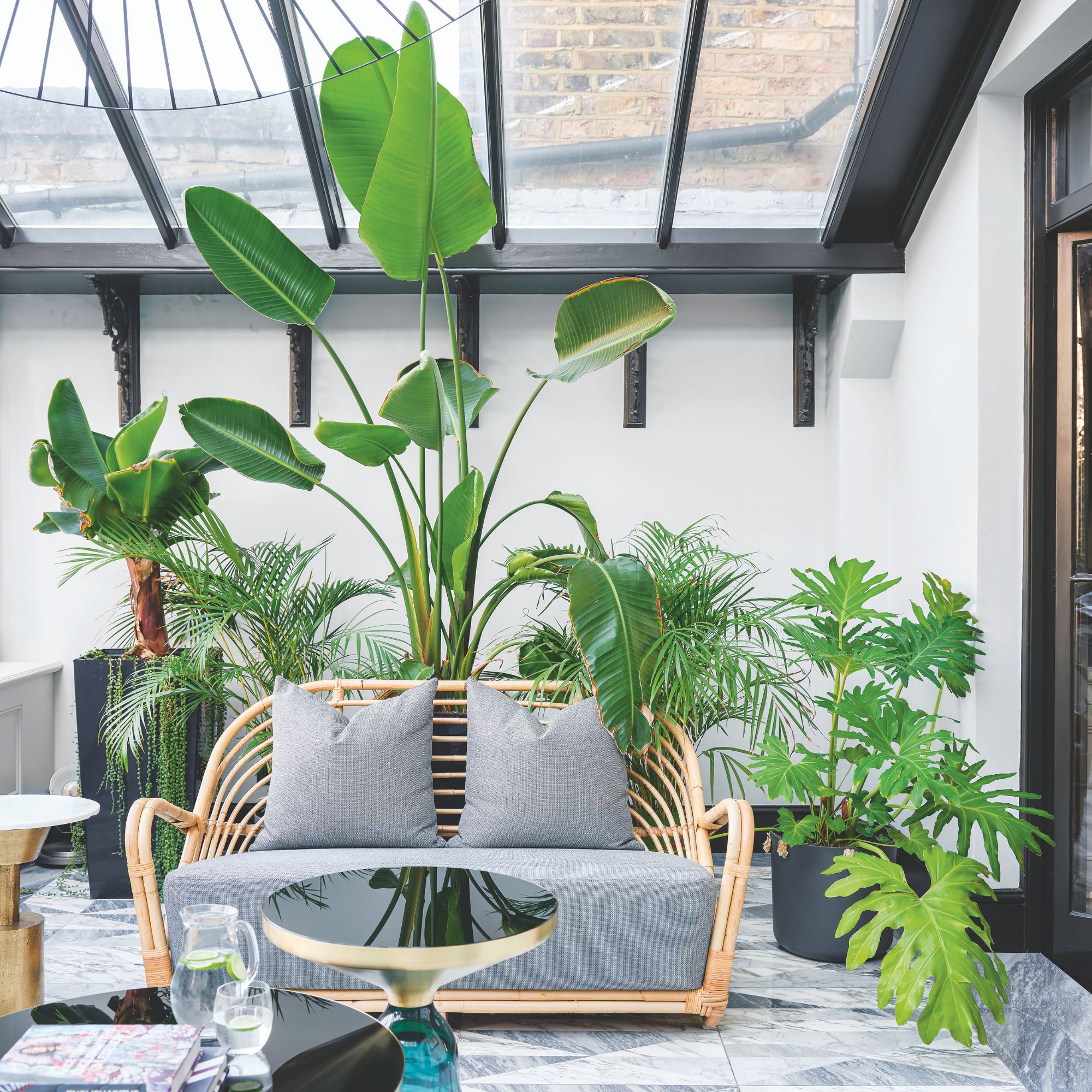 Will a conservatory add value to your home and how can you maximise it?
This is what the pros say
-
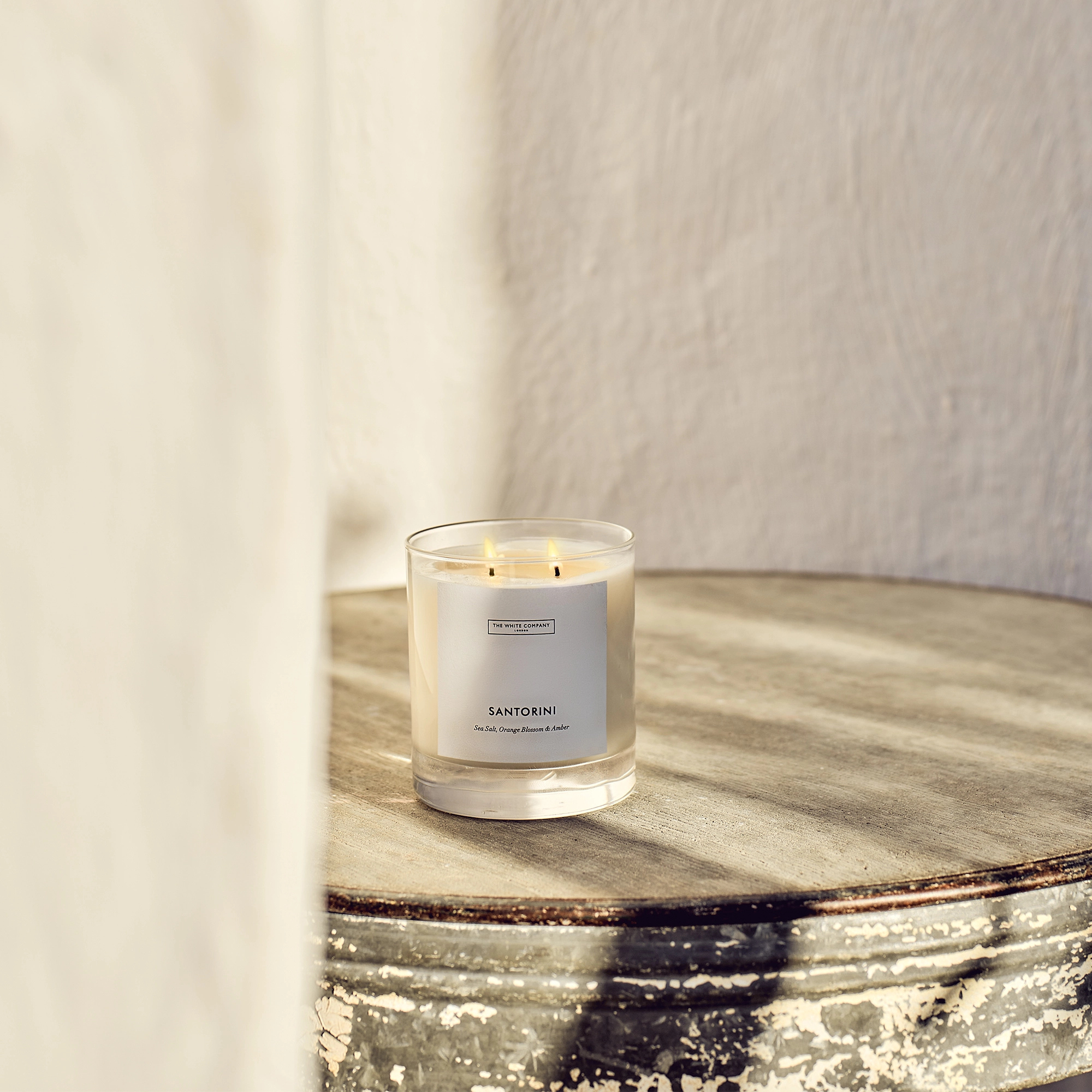 I’ve been looking for a new signature scent for my home and The White Company's new fragrance is the exact summer holiday smell I needed
Santorini smells fresh, summery and sophisticated
-
 How to remove algae from garden walls in five steps – and the cleaning product experts rave about for tackling it fast
Experts share their top tips for getting garden walls algae-free


