The popular patterns that are subconsciously stressing you out at home
What patterns to use and not to use to relieve stress and promote well-being

As we're coming off International Self-Care Month, it's important to remember to pay attention to your well-being all year round, not just this one month. For us, this starts at home and we always search for ways to boost our mood at home through cosy textures, calming colours, cheerful paint ideas and more.
But while bold colours and original patterns can be fun, experts reveal that some of the most popular motifs have the ability to cause stress, distraction and even headaches! I think we can all agree that nobody wants that. So what patterns should you ditch and which ones should you opt for in order to live in calm and harmony?
The stress-inducing patterns to avoid
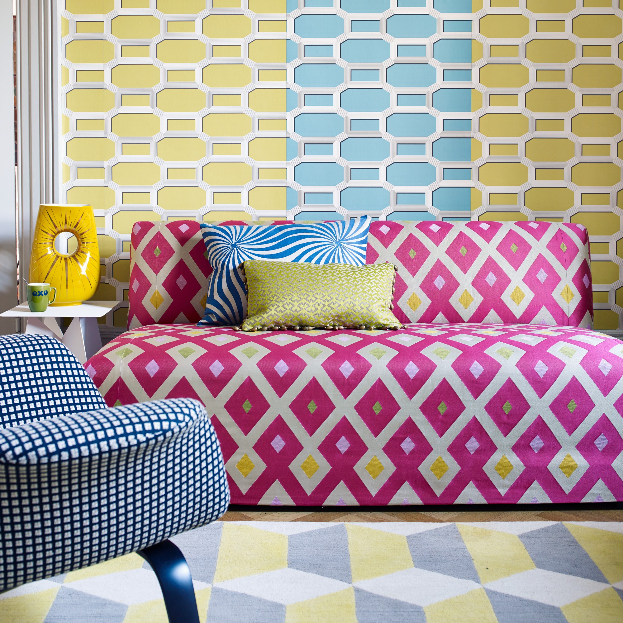
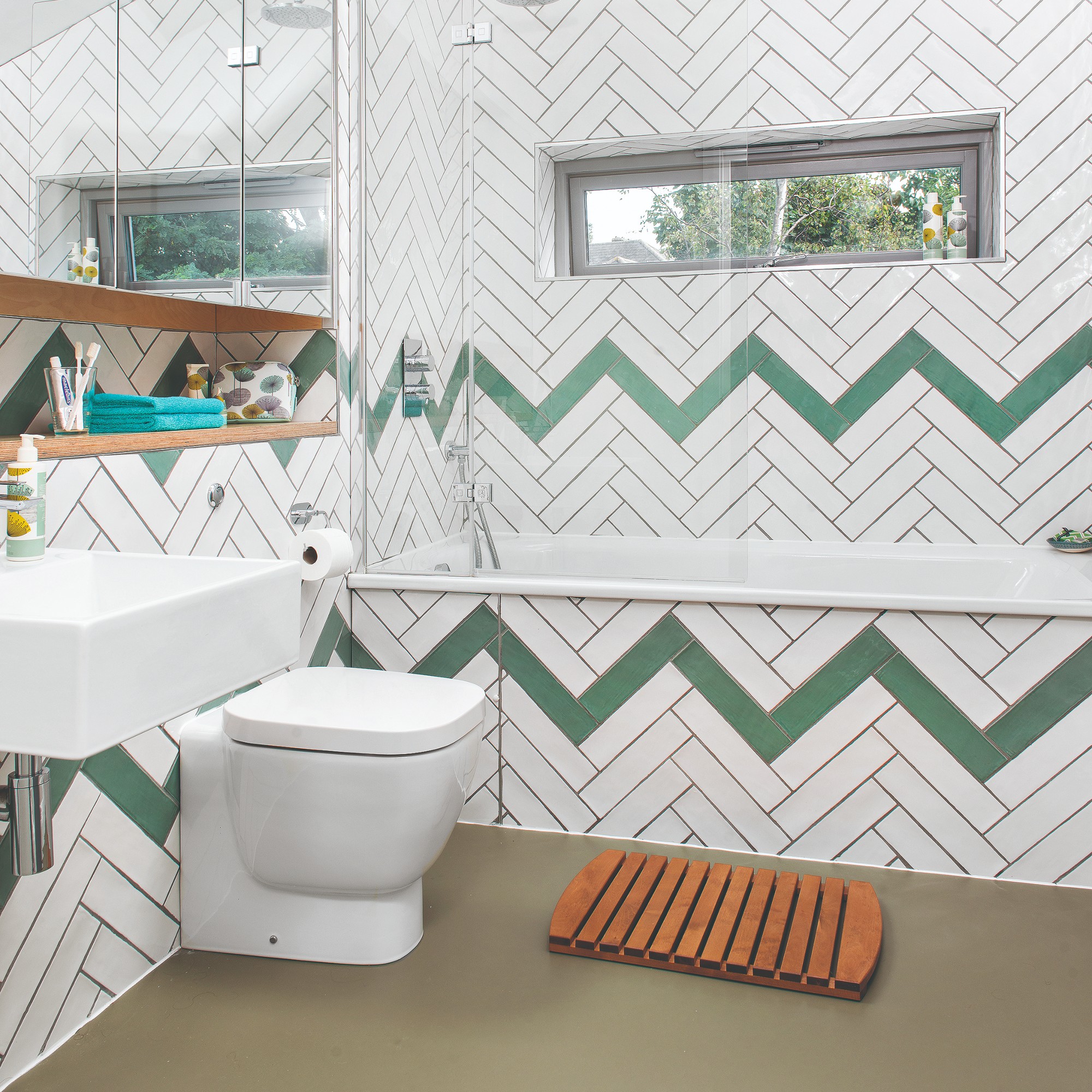
When it comes to patterns that are subconsciously stressing you out strong geometric motifs are some of the worst offenders. ‘I’ve visited brain-jangling homes with harsh geometric schemes where residents had developed regular headaches and confusion, and one particularly exclusive hotel where vibrant zig-zags and polka-dots caused migraine attacks for guests. So it’s important to get it right,’ says Suzanne Roynon, interiors therapist and member of the International Feng Shui Guild.
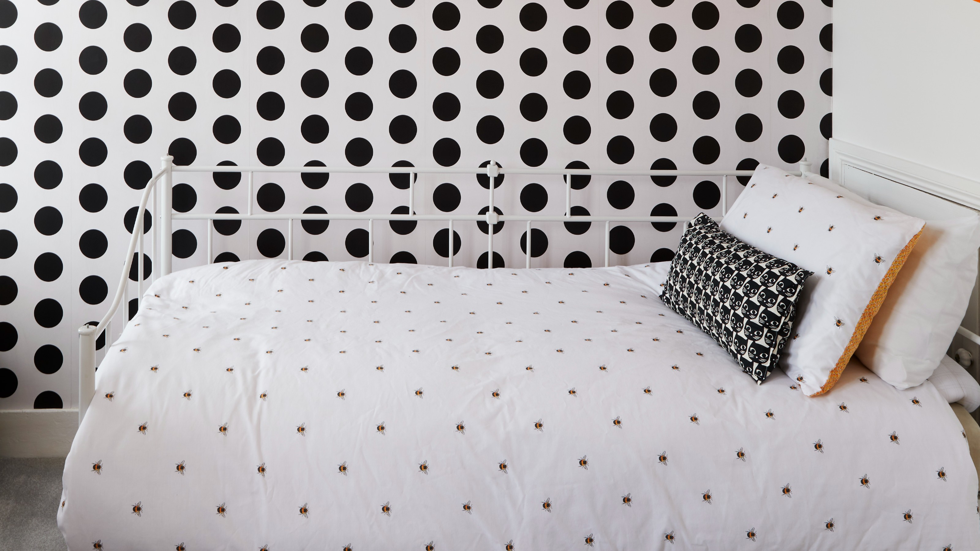
‘Avoid dots as they look like small holes. Dots and spots can cause subliminal stress and aren’t the best for evoking feelings of calm,’ warns style psychologist Dr. Dion Terrelonge who has recently worked with House of Fraser to find the best ways to incorporate a new trend combining mood-boosting and calming colours with a self care-promoting style into one’s lifestyle.
'Other researchers say that stress caused by dotted patterns and spots stems from social anxiety,' adds Dr. Sarah Boss, Clinical Director at THE BALANCE. 'The spots can appear as if they are a group of eyes or faces staring at you which can provoke an unpleasant reaction.'
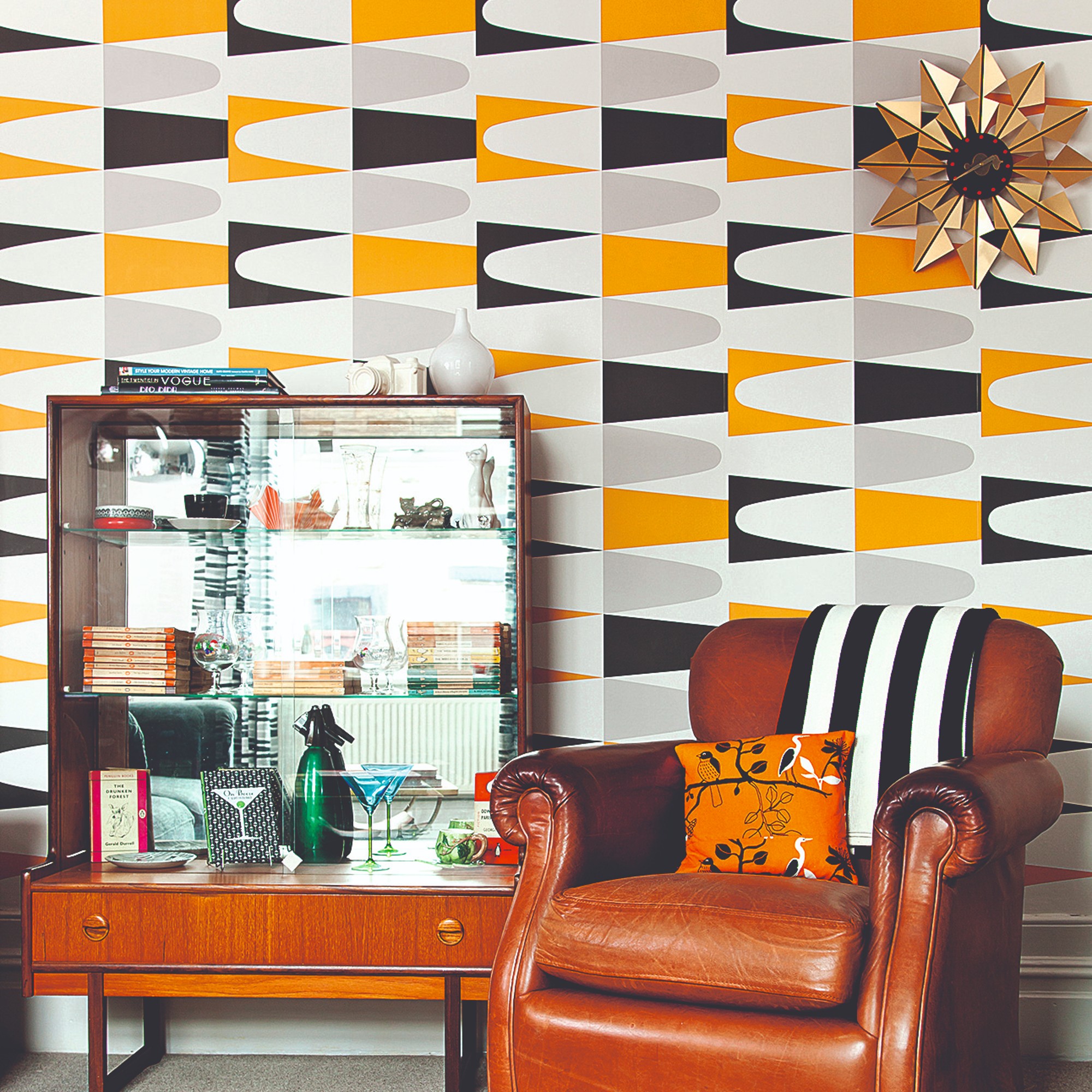
But according to Suzanne, the pattern itself is not the only determining factor. The shades used make a world of difference due to the effect of colour psychology in interior design. ‘It’s important to bear in mind that the depth or intensity of the colours used is often more relevant than the shape itself,’ she explains. ‘Where ‘loud’ colours jar the brain and can potentially be difficult to live with, using a variety of spot sizes or circular patterns in muted tones in walk-through areas can add interest.’
‘Colours and patterns should flow, complement each other, and not jar or pop to pull our attention,’ says Dr. Dion.
Get the Ideal Home Newsletter
Sign up to our newsletter for style and decor inspiration, house makeovers, project advice and more.
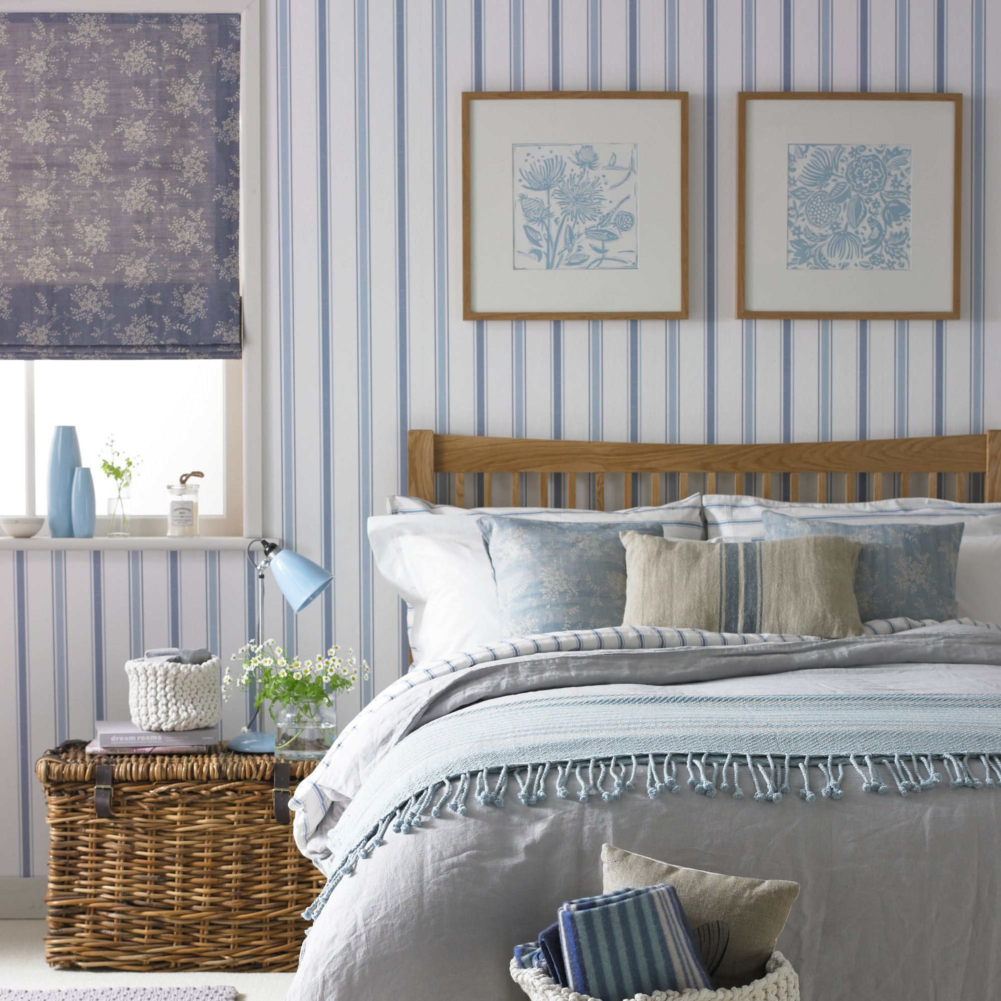
When it comes to pattern in interior design, the one confusing pattern in all of this is striped as it can be both good and bad. So one must tread with caution. ‘Carefully chosen stripes have the ability to suggest order and a different perspective. Used cleverly they can make a space feel more expansive and this has many calming benefits. However, a ‘barcode’ effect in strong colours is unlikely to have this impact,’ concludes Suzanne.
What patterns will create a soothing feeling in your home?
Even though most of us don’t spend enough time outside, nature-inspired design, also called biophilic design, is the best way to create a sense of calm, reducing tension and stress. 'Research shows that being outside or being exposed to nature can reduce feelings of stress and evoke feelings of relaxation. It can also help us to feel more free which has a hugely positive impact on mental health,' Dr. Sarah of THE BALANCE says.
Suzanne’s expertise in the principles of feng shui come into play here. ‘As we move into a new feng shui cycle, we can expect a shift towards connection with the countryside and a more organic feel in homes,’ she explains.
‘We’re already seeing this reflected in murals and abundant leaf-filled designs. The strength of trees and flexibility of plants to set down roots and grow in the most difficult of circumstances can bring a sense of tranquility which has been missing in many homes.’
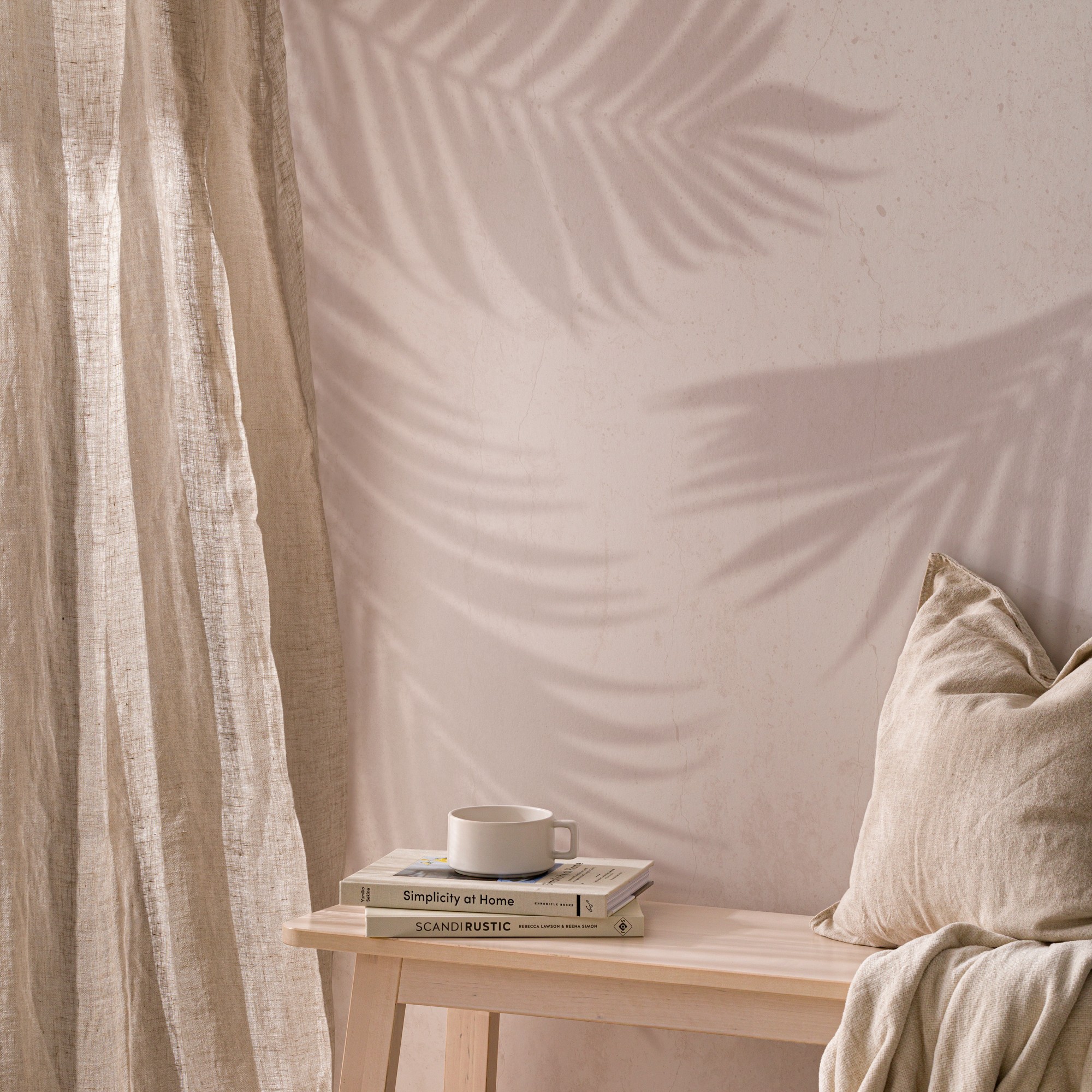
In her recent Instagram post, even TV presenter, magazine editor and author Michelle Ogundehin has admired the short-lived beauty of the shadow effect dappled light creates on the walls, wondering if it could be captured permanently.
Michelle asked and we delivered. You can either get artistic and attempt it in paint. Or you can invest in beautiful wallpaper like the Hovia Canopy design that recreates the serene beauty with palm leaf shadows. ‘Nature-themed wallpapers are some of our top bestsellers,’ says Catherine Jacob, Head of Design at Hovia. ‘Natural forms and biophilia inspire a lot of our designs, and it's clear that our customers particularly connect with them.’
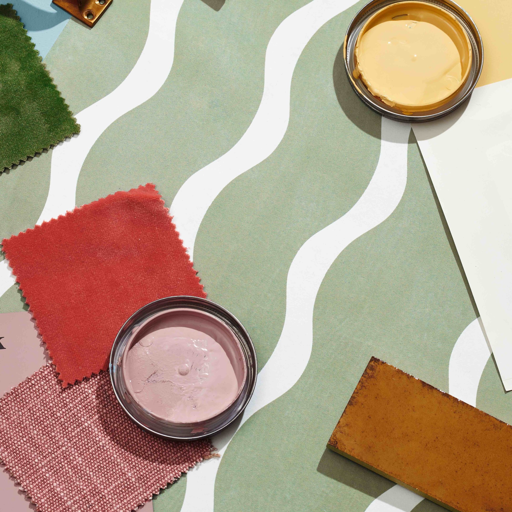
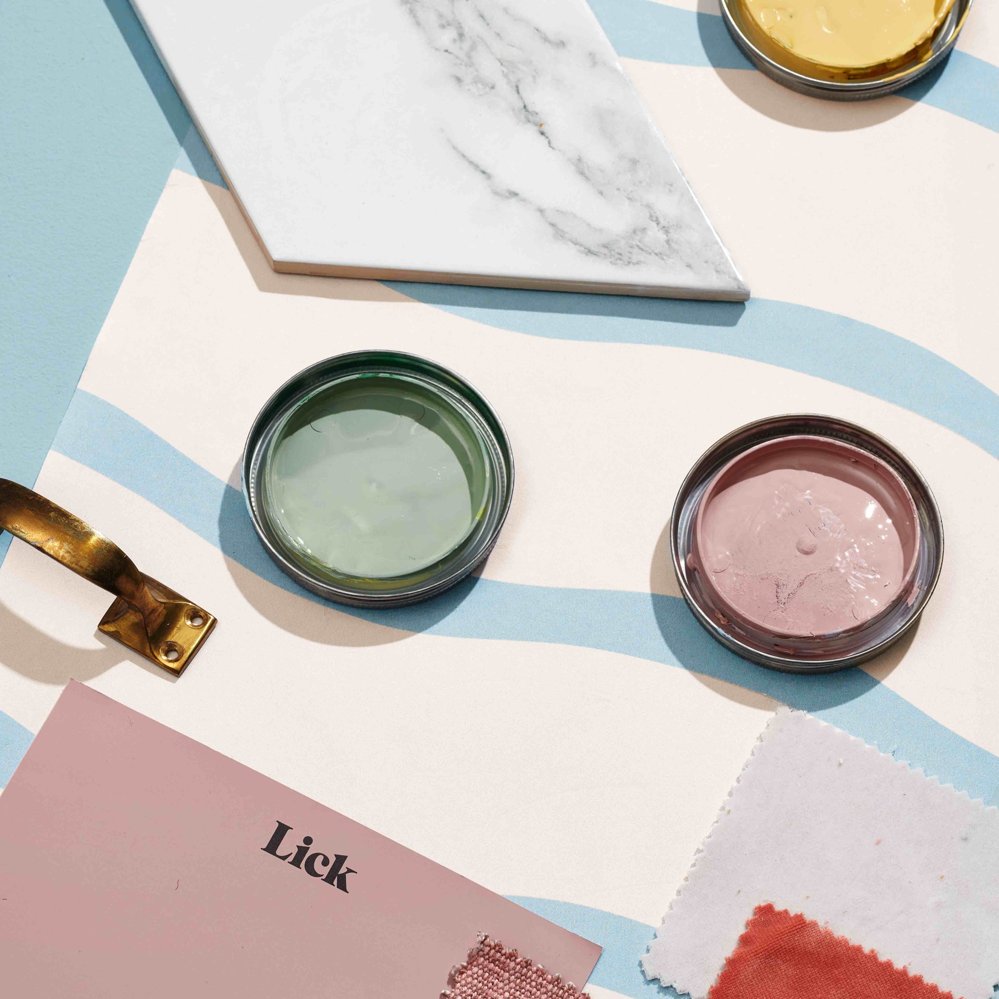
A wavy motif would make for another great addition to your home. And if you’re in the market for one, then you’ll be happy to hear that the paint brand Lick just released two wavy wallpaper designs in collaboration with mental health and suicide prevention charity Campaign Against Living Miserably (CALM) with 100% of profits over the next year donated to CALM.
‘We wanted to focus on breathing joy and personality into the home through pattern,’ says Charlotte Cropper, Lick’s International colour consultant and colour psychologist. The colour palette is intentionally soothing too - the light blue and pink combo of the Lick Mindful 02 wallpaper encourages relaxation and happiness and infuses warmth; meanwhile the muted green and cream pairing of the Mindful 03 boosts feelings of joy according to Charlotte.
‘Soft wavy designs can be great for inspiring calm because they are symbolic of flow. The repetitive aspect can reflect waves or contours and if soothing shades are used they can be deliciously meditative and help still the mind,’ confirms Suzanne.
So what’s the takeaway? Avoid harsh geometric shapes in bright colours where possible and instead, go for wavy or nature-inspired designs in soft colours to put it plainly.

Sara Hesikova has been a Content Editor at Ideal Home since June 2024, starting at the title as a News Writer in July 2023. She is now also the Ideal Home Certified Expert in Training on Furniture, and so far has tested 80 different sofas.
Graduating from London College of Fashion with a bachelor’s degree in fashion journalism in 2016, she got her start in niche fashion and lifestyle magazines like Glass and Alvar as a writer and editor before making the leap into interiors, working with the likes of 91 Magazine and copywriting for luxury bed linen brand Yves Delorme among others.
-
 Wood drenching is the calming new twist on the colour drenching trend – here’s how to make the look work in your home
It’s easier than ever to embrace natural materials
By Maddie Balcombe
-
 Aldi is launching a £200 day bed with four different features - its sleek design is suited to the whole family
You don't want to miss out on this Specialbuy
By Kezia Reynolds
-
 How to set up a drip watering system that saves water and a lot of effort
Keep your plants hydrated (and your water bill down) with this clever garden watering solution
By Natalie Osborn