

I don’t know about you but generally speaking, I'm not the biggest fan of purple. And after discussing the colour with the rest of the Ideal Home team, it’s clear that purple is a polarising hue. But that hasn’t stopped the purple colour trend from developing and becoming one of the most unexpected paint trends for 2025.
Last week, Google Trends reported that ‘purple’ is one of the top trending topics of the moment, and is being searched more now than at any other time so far this year. Of course, you could credit Halloween for this to an extent, as purple is a go-to shade during the spooky season. But the increasing craving for purple is something Lick and the paint brand’s director of interior design and colour psychologist, Tash Bradley have also noticed – that’s why Purple 03 was included in Lick’s colour palette of the year for 2025.
‘During our trends research over the course of this and last year, we noticed a significant rise in the popularity of the colour purple – in particular the deep, burgundy, plum purples,' says Tash. 'Visits to our Purple 03 page have seen a 100% increase year on year, as well as becoming one of our best selling colours.’
‘When you look at the Google search data, you also can’t ignore purple’s rising popularity. Google searches for “dark purple paint” have seen a 22% increase year on year, whilst “plum purple” and “burgundy” have seen a 49% increase. Purple’s popularity shows no signs of slowing down, either, which is why we’ve included it in our 2025 palette of the year.’

Why is purple set to be a colour trend for 2025?
Lick isn't the only paint brand that’s championing purple for the year ahea – Benjamin Moore is doing the same with its colour of the year for 2025, Cinnamon Slate, which is a mix of heathered plum and velvety brown.
‘Purple has gone in and out of favour over the years, but it saw a resurgence on the fashion catwalks of spring/summer 2024 – so it was only a matter of time before it filtered into our homes,’ explains Helen Shaw, international director of marketing at Benjamin Moore.
Michael Rolland, managing director and paint expert at The Paint Shed, has another theory as to why purple is on the rise, ‘Darker aesthetics are gaining traction, particularly with the rise of the “moody, romantic bedroom” trend on Pinterest, which has seen a 100% increase in the past year and a staggering 200% rise in searches over the last month. As home renovators seek to create moodier interiors, I predict purple will experience a significant surge in popularity going into 2025.’

Why is purple a divisive colour?
‘Since experiencing huge notoriety in the 1990s, the use of purple in interior design (and fashion!) has been a bit hit and miss, but there's an inevitability about us finding ways to use this enigmatic colour in interesting, stylish and current ways; we're definitely on the cusp of seeing some stunning purple rooms appearing in the near future,’ explains Andy Greenall, head of design at Paint & Paper Library.
So why has purple been dismissed as a viable colour scheme and paint idea for our homes for so long? Tash at Lick believes it’s about the particular shades we associate with the word ‘purple’.
‘Purple is not a very commonly used or seen colour – in nature or society. When I used to ask my clients what their least favourite colour was, they would always say purple (followed by brown). But when asked what purple shades they were thinking about in particular, only two would come to mind – lavender and “Cadbury” purple.'
'Lavender is very whimsical and soft, and for many was the colour of their bedroom growing up,' continues Tash. '“Cadbury” purple, by contrast, is very stimulating, joyful and can be seen as cheap. With only two associations and one being a very distinctive brand colour, it’s no surprise it has historically been a polarising colour.'

What shade of purple should you go for?
As Tash has already alluded to, it’s a lot about the actual shades of purple that you choose for your home – and the ‘grown-up’ jewel tones are definitely leading the way for the upcoming year.
‘The rise of jewel tones ties into the recent rejection of greige homes,’ says Lucy Steele, paint & interiors expert at V&CO. ‘They provide drama to the home, but the depth of the colour also makes them feel cosy and warm.'
'The appeal of jewel tones is that they are wonderfully vibrant and deep, and purple certainly fits into this trend,' continues Lucy. 'While not all purples are jewel-toned, deep purples have this same appeal. As we continue to get more bold with our interior design choices, I think we will definitely see purple become a big feature in the home.’
‘Now, people are becoming more and more colour confident, and we are seeing this move towards the richer tones of purple,' agrees Tash from Lick.
But at the same time, it’s all about what shade of purple appeals to you personally. With the pastel eclectic decor trending, you could also opt for a soft, pastel shade like lilac or lavender. Or as Helen at Benjamin Moore says, ‘For a soothing feel, try a purple that's closer on the colour wheel to blue or grey; the muted tones create a more neutral, natural appearance and an overall "quieter" room.’

How to use purple in your home
‘It's very easy to be seduced by the idea of purple, but harder to pull it off in a room. So I think lots of people are instantly put off because their experience of purple in interior design is not necessarily always a good one,’ Andy at Paint & Paper Library starts.
Depending on the purple shade you opt for, how brave you’re feeling and how much of an impact you want to create, there are a few ways to incorporate purple into your interiors.
Colour drench

‘My first tip is to be brave! Colour drenching is a great way to use and style purple in your home,' recommends Tash. 'Colour drenching involves taking one colour and painting everything in that room in the same one colour, from walls to woodwork to your ceiling. This is a huge trend at the moment and it is one that totally opens up the room as there is no breaking the eye.'
‘For instance, if you have dark purple on your walls and then a white ceiling, you’d notice the sharp line separating the colours,' she explains. 'Whereas colour drenching is actually a softer way to decorate, giving you the licence to go bolder with the colour choices as it hides shadows, lines, and corners. It may feel intimidating to drench with a dark colour at first, but the end result is just unbelievable.' This works particularly well as a bedroom colour scheme for a cocooning feel.
‘The way to carry it off is to be totally committed,' agrees Andy. 'Don't assume that leaving woodwork and ceiling in white won't make a difference – it really will! Pair a strong purple with a darker shade, not a lighter one. Even bringing another colour - it could be a confident pink or blue - this will give you a much more balanced palette than pairing with white or pale grey.’
Use it as an accent
If you don’t want to go all out with purple, the bold shade can be used as an accent colour, too.
‘For a more dramatic look, opt for darker purples like aubergine as an accent wall in a living space or in an entryway to create a bold statement,' suggests Michael from The Paint Shed. 'For lighter shades and particularly in smaller spaces, dusky lavenders can be a great choice to create a calming aesthetic. With purple, I’d always suggest starting with small accents and accessories and then building from that.'
Tash continues, recommending the trend of double drenching, ‘If you want to introduce purple as an accent, it looks stunning on a fireplace, or woodwork. Again, following the tonal scheme route, you could paint your room in pink and then do a Purple 03 fireplace. This is a great way to bring purple into your space.’
Pair with neutrals

Purple can also be paired with neutral colours, just make sure that the contrast between the two shades is not too stark.
‘For a more subtle take on decorating with purple, pair with greys and neutrals to balance it. Choose a grey with violet undertones such as Stormy Monday – this will work particularly well with stronger, bolder hues to create a harmonious finish,’ Helen at Benjamin Moore says.
Our top purple picks

If you're after a grown-up purple, then Lick's much-talked-about Purple 03 designed in collaboration with Soho House is the one. And it looks amazing paired with baby blue from the brand's colour palette of the year 2025.

Launched this season, this bed linen set from DUSK quickly became the brand's bestseller, flying off the virtual shelves. And with the 'moody bedroom' decor trending, we're not surprised.

You don't have to go for the darkest of purples to partake in the trend. If you prefer pastels, then we recommend going for something like this striped wallpaper from Next - it's cute, fun yet stylish at the same time.

If you're not afraid of colour (or purple) to begin with then you'll love this purple velvet cushion with a bright orange fringed trim from Oliver Bonas. Many others are obsessed with it already!

Enjoy a bit of duality with this Laura Ashley colour-blocked throw, embracing not one but two different purple shades. And its soft finish will keep you cosy all throughout the autumn and winter seasons.

Named after purple sprouting broccoli, this mauve paint is another one of those grown-up shades of purple. But this one is softer and more soothing than some of the darker, bolder tones.
So as our experts have said – be brave and have fun with the purple home decor trend!

-
 5 signs you’ve taken decluttering too far — and how you can pull yourself back, according to organisation experts
You might have to start resisting the urge to purge
-
 What is the Party Wall Act 3m rule and is it something you should be worried about? This is what the experts say
Don't get caught off-guard by the Party Wall Act 3m rule — our expert guide is a must-read
-
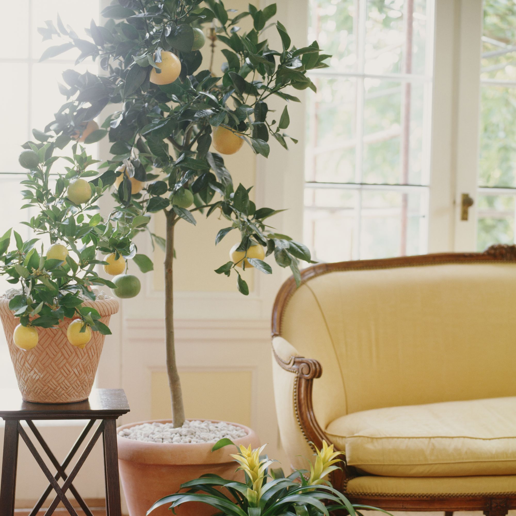 Shoppers can’t get enough of The Range’s lemon tree, but I’ve found an even cheaper bestseller at B&Q - it’s perfect for a Mediterranean look
Welcome the summer with this glorious fruit tree


-
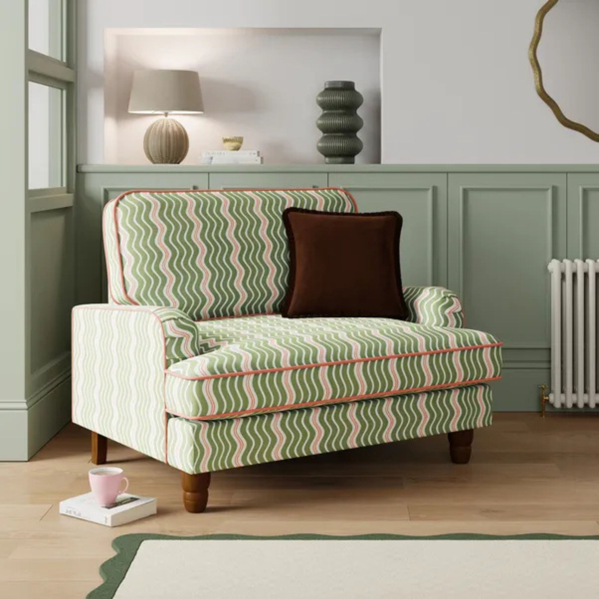 Dunelm has given its cult snuggle chair a new look - it's swapped classic stripes for another emerging pattern trend
I'm obsessed with this fresh new style
-
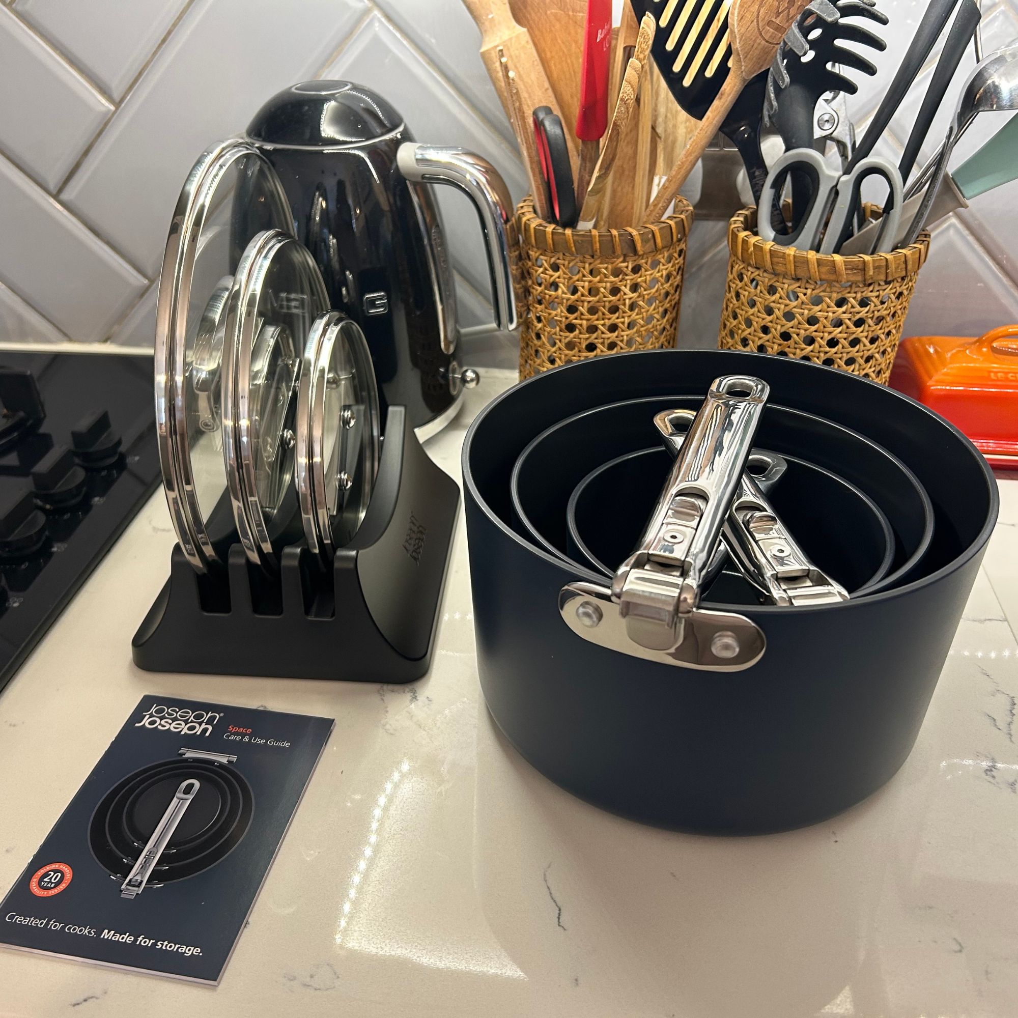 I tried Joseph Joseph's pan set with foldable handles – the space-saving design is just one of the many highlights
Small kitchen? I tested this innovative Joseph Joseph space-savvy set which has foldable handles — and I loved it
-
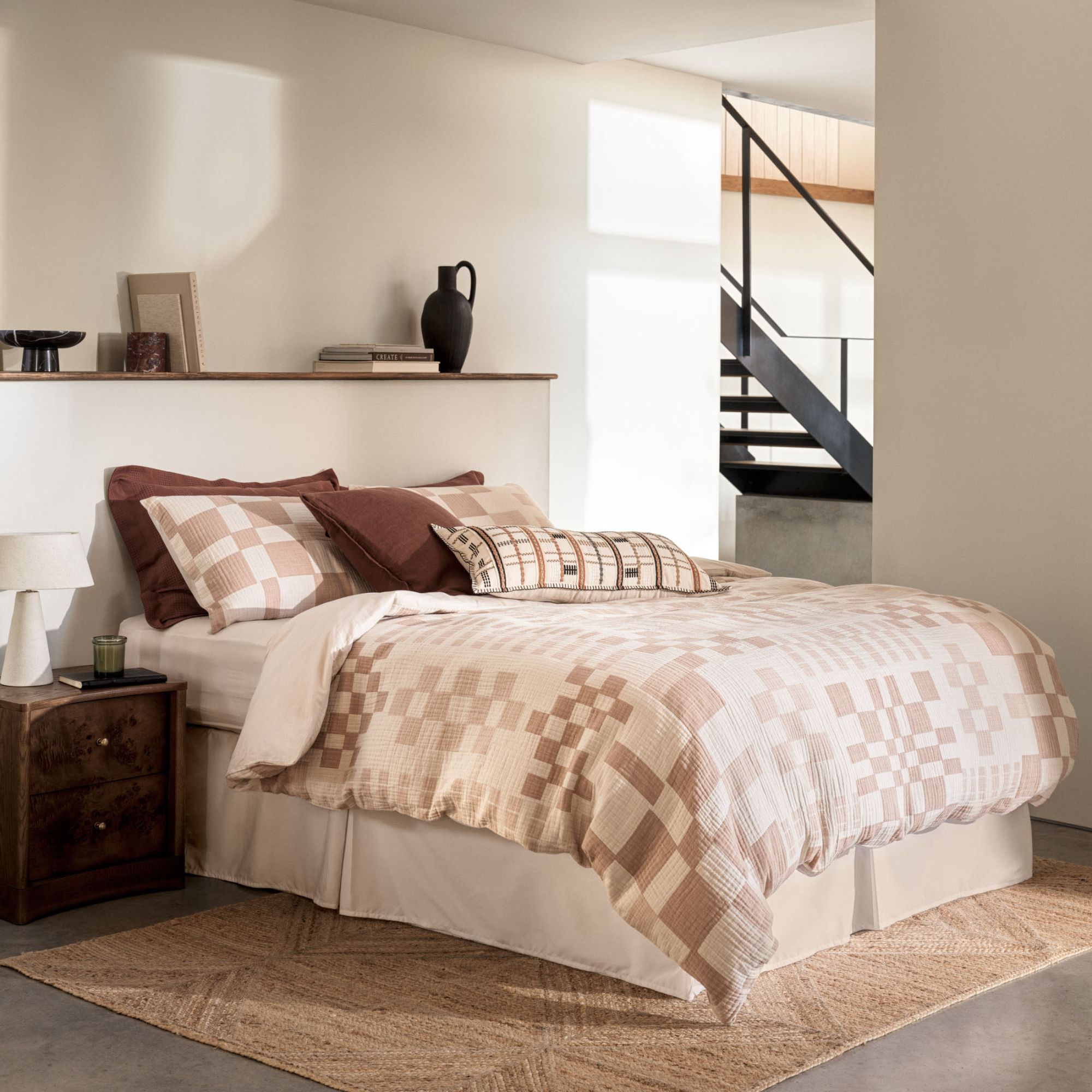 As a stylist, I spend hours looking for bedding for photoshoots, and I just spotted these 6 expensive-looking sets at M&S
Get a little luxury at a high-street price
-
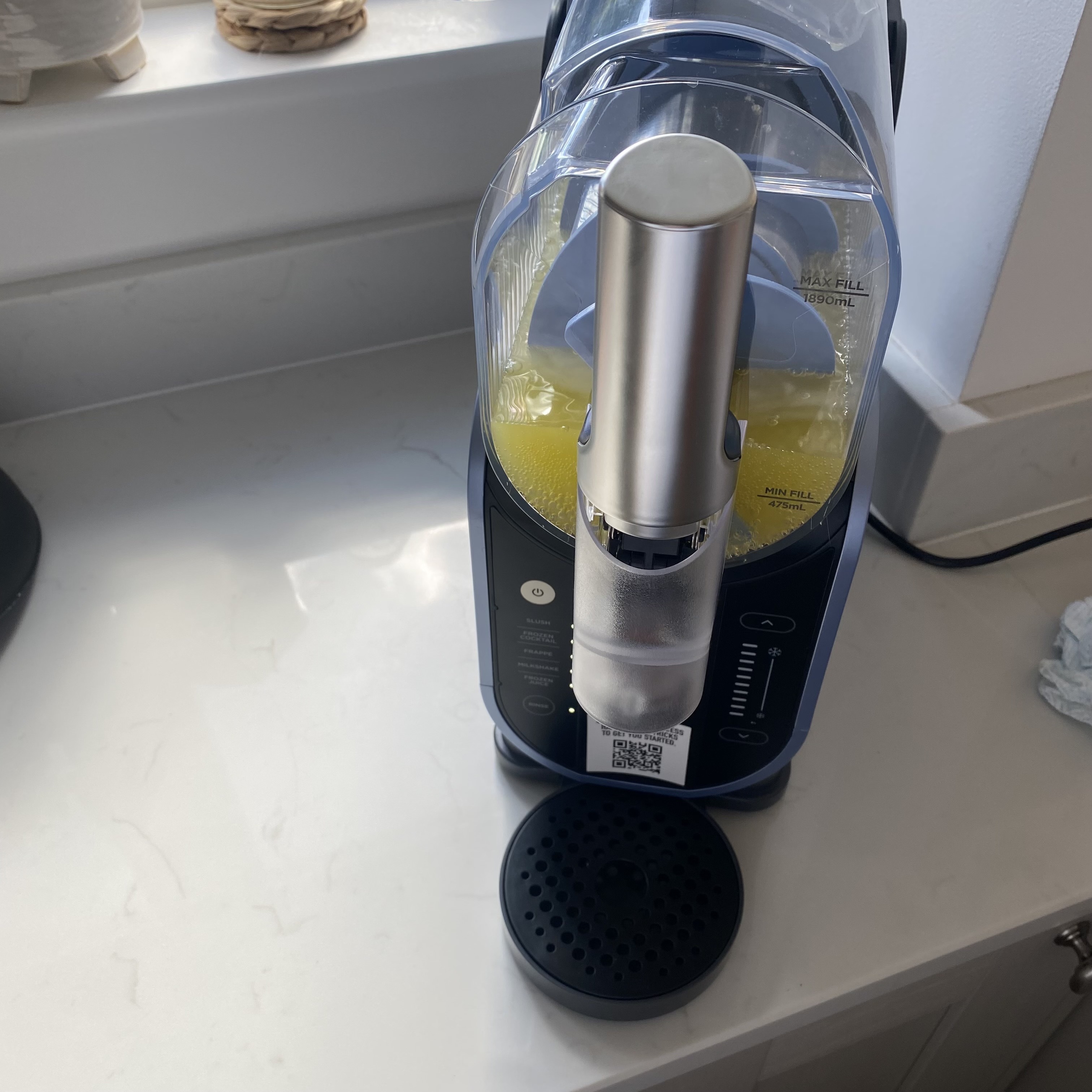 I've been waiting to try out the Ninja Slushi for months – this is what happened the first time I tried it
The Ninja Slushi is the stuff of dreams for summer entertaining
-
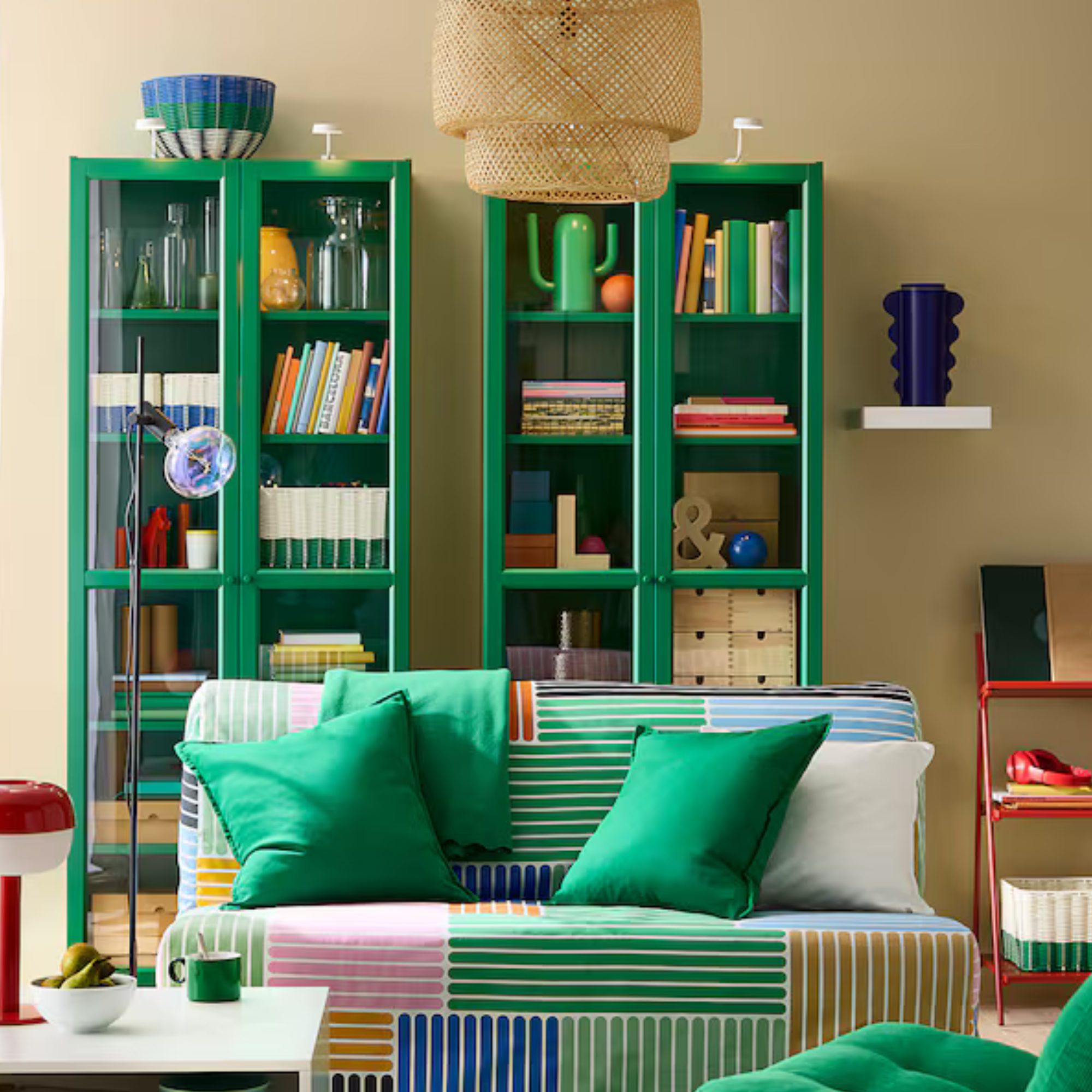 IKEA has drenched its BILLY bookcase in this year’s ‘it’ colour - but you’ll have to act fast if you want to get your hands on one
I'm obsessed with this gorgeous limited-edition colourway
-
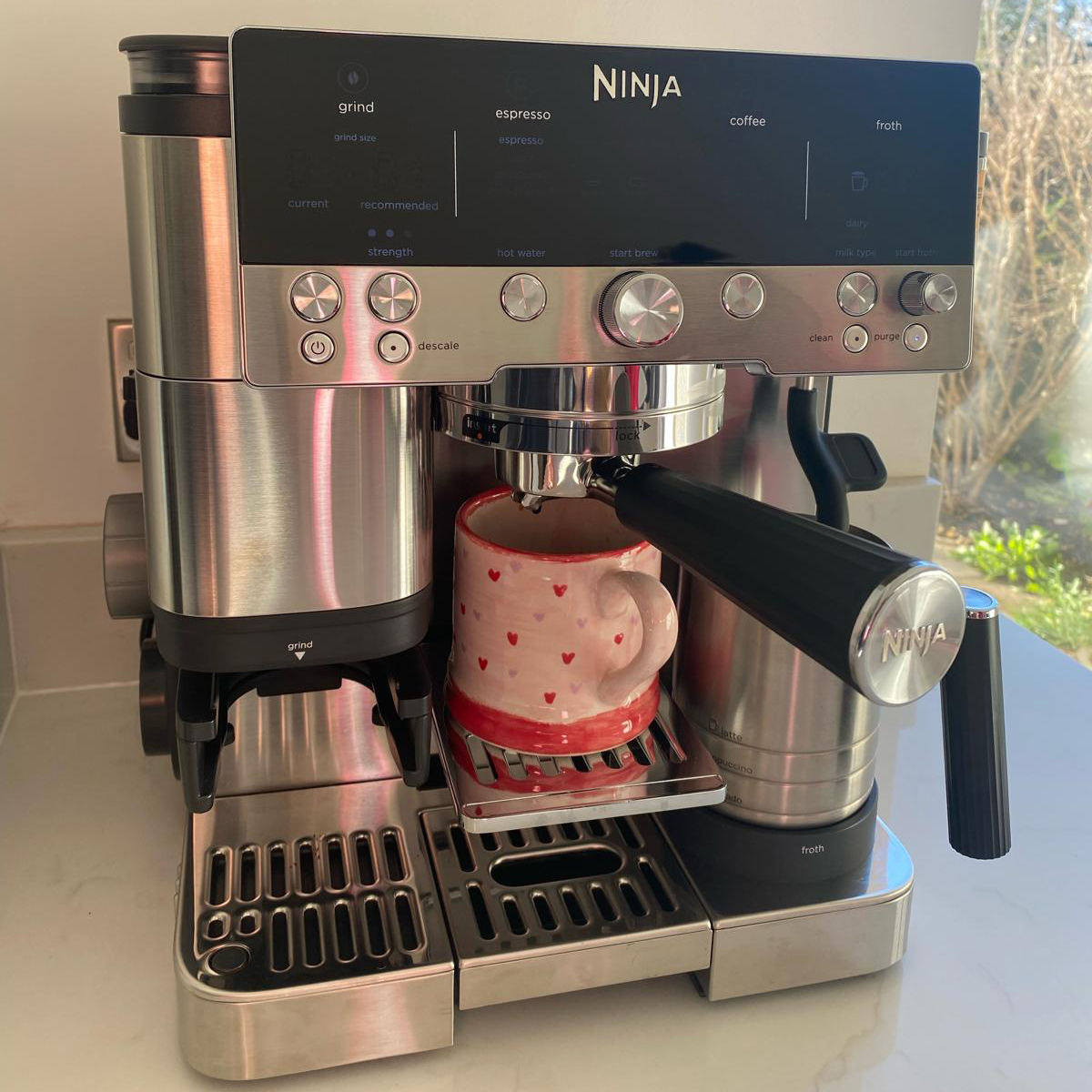 My go-to Ninja coffee machine just had a major price drop. It's more affordable than I've seen it before
It makes coffee shop quality achievable at home
-
 I'm a kitchen decor editor and didn't like this tableware trend - until I saw H&M Home's designer-look plates
They made it easy to justify a new crockery set
-
 Have we just had a sneak peek at Ninja's plans for pastel air fryers? These new US-exclusive Crispi colours are giving us hope for the same in the UK
Ninja's spring colours collection i the US has sparked some serious appliance envy


