Interior expert Sophie Robinson reveals the trick to stop a feature wall from looking dull and dated
The queen of colour shares the best way to make a feature wall look fresh and modern
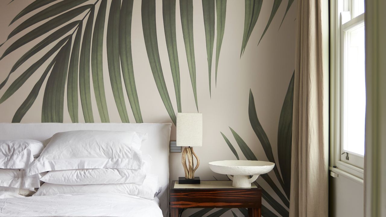

Feature walls are a handy way to save on a wallpaper design you love but can't afford to carry around the whole room. Unfortunately, this clever accent tool can easily look dull and dated when done wrong. However, interior expert Sophie Robinson has a trick to make sure your feature wall ideas always look fresh and modern.
Sophie Robinson is a colour queen with 20 years' experience as an interior journalist, author and presenter. When I was invited to see the new Harlequin collection she's designed in situ at her home, every room was bursting with mood-boosting colour. There wasn't a traditional feature wall in sight, but the interior pro pointed out that for anyone not as brave as her with their wallpaper ideas, a feature wall is a great option.
'I would rather they do one wall, than no walls,' she explains when I sat down to chat with her. But her top tip for nailing a feature wall is to swerve traditional wallpaper altogether and opt for a mural instead.
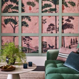
Sophie Robinson's feature wall tip
'Murals are a thing now,' she says. While a traditional feature wall would include a couple of rolls of wallpaper doing a repeat pattern, 'murals are really taking that place,' says Sophie.
The key difference between wallpaper and a mural is that wallpaper will have a regular and uniform look, whereas a mural will have less symmetry, a larger repeat and a more unique and varied look. Think of a mural as a large piece of art blown up to cover an entire wall. Murals can still come in multiple rolls like wallpaper that need to be pieced together, but some designs will come on a single piece.
'I've got a brilliant one as part of the Harlequin collection which is an abstract woodland scene, which I have in my office. I've chosen to take that mural on all four walls, of course, because why wouldn't I?' But she adds that it would still make a really strong statement on one wall.
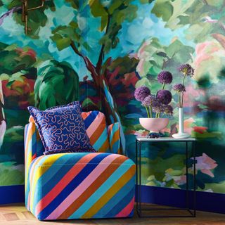
In The Woods Wallpaper
'They tend to be a bit more expensive than regular wallpaper, but you're getting so much more bang for your buck,' she acknowledges. 'You don't need to buy any artwork to hang in front of it, they do the whole job, all the heavy lifting.'
Get the Ideal Home Newsletter
Sign up to our newsletter for style and decor inspiration, house makeovers, project advice and more.
But what about the other walls? Sophie's trick to make sure the rest of the room doesn't look overshadowed is to select the paint shade for the remaining walls carefully. 'I would urge people to look at your wall and then take a colour within the mural as your paint colour,' she says. 'That's the other thing, don't just go and paint all the other walls white.'
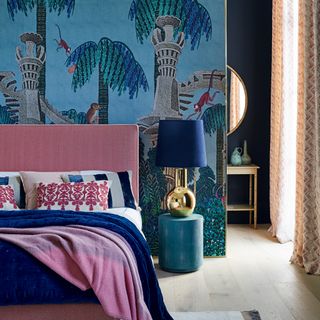
'So for example, the mural in my office has got a very pale sky blue as you get to the top and I've used that colour to paint the ceiling, to take the colour from the mural and then wrap it around the ceiling and the wall,' she explains. 'So the whole thing works together.'
'It's not just on its own on the wall, looking like it's waiting to be invited to the party.'
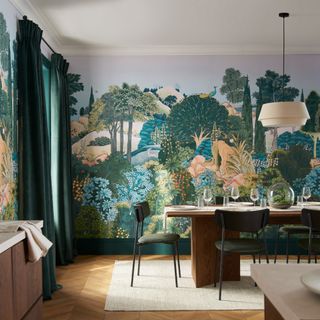
New Eden mural
How much do wall murals cost?
Murals are a growing home decor trend that is becoming more accessible. You can pick them up from places such as Dunelm for £40 at the more affordable end. However, the cost will all depend on the size of the wall you are planning to cover. For example, Graham and Brown have a stunning range of murals, and their prices start at £29.60/m². The new Eden mural, unveiled alongside their 2024 colour of the year is one of my personal favourites.
Like with wallpaper, it's all about working out what you can afford. It's best to take your lead from that when following Sophie's feature wall advice, but you'll be stunned by the results.

Rebecca Knight has been the Deputy Editor on the Ideal Home Website since 2022. She graduated with a Masters degree in magazine journalism from City, University of London in 2018, before starting her journalism career as a staff writer on women's weekly magazines. She fell into the world of homes and interiors after joining the Ideal Home website team in 2019 as a Digital Writer. In 2020 she moved into position of Homes News Editor working across Homes & Gardens, LivingEtc, Real Homes, Gardeningetc and Ideal Home covering everything from the latest viral cleaning hack to the next big interior trend.
-
 What’s the difference between conservatories and orangeries?
Experts break down the key variations you should know
By Sarah Warwick
-
 I’ve found the best solution for cleaning stains from a patio - and it’s only £8 on Amazon
The stains practically vanish!
By Kezia Reynolds
-
 How do you keep a wet room dry? 7 tips for a slip-proof shower room
Wet rooms have suffered bad press in the past, thanks to poor design – our top tips will help keep your space fresh and dry
By Natasha Brinsmead