

COAT just launched 33 new paint shades which is the brand’s biggest release to date. And all the Brits and UK residents alike will be happy to know that each of these colours is designed specifically to work with the UK’s lighting – or lack thereof, some might say.
COAT is one of those cool brands that sets paint trends for the rest of us to follow. So I fully expect to be seeing all of the new shades popping up everywhere soon, similarly to Farrow & Ball’s new shades released just a couple of months ago.

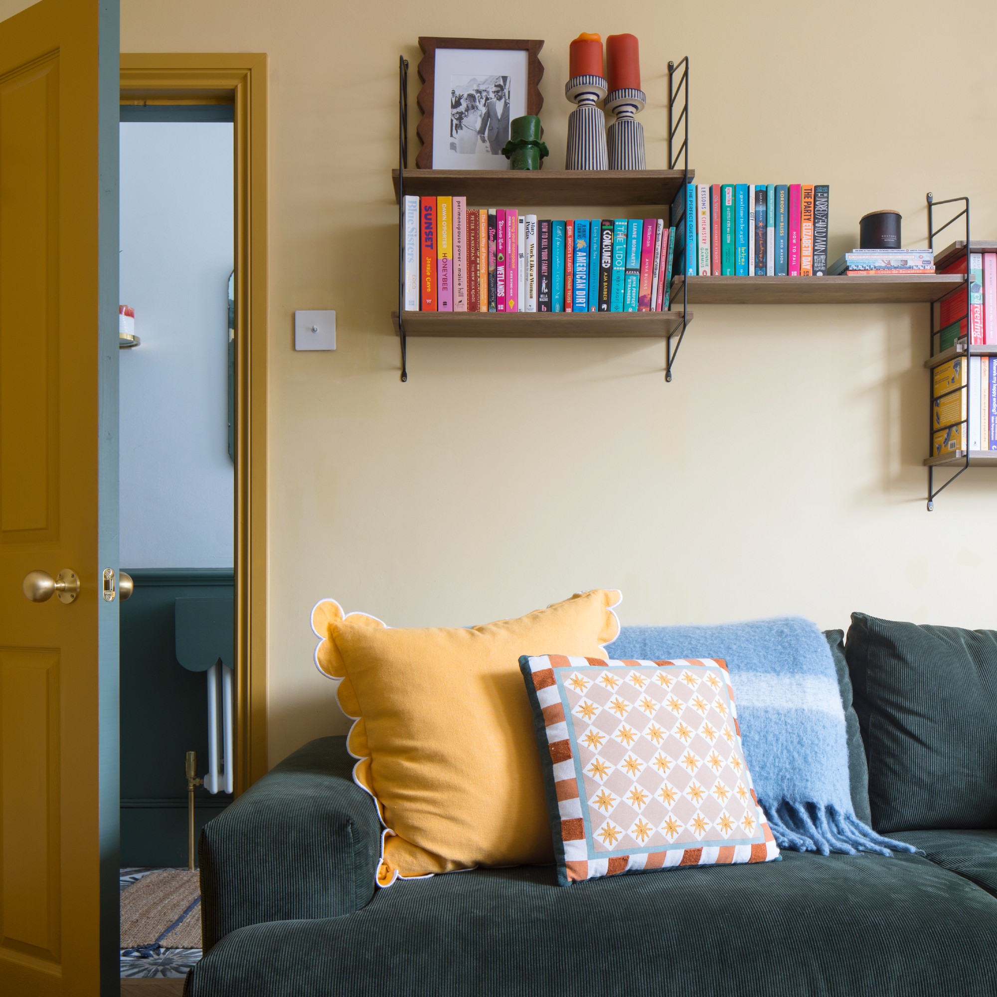
This living room is painted in COAT's Cheap Souffle and Camber
The new colour palette is largely made up of easy-to-use neutrals, as well as earthy tones which are all the rage this year. But it also fills a big gap in COAT’s colour offering which is yellow, including five new yellow paint shades in this drop – and it’s right on time as butter yellow is one of the biggest colour trends of this year.
‘Yellow was a big gap for us,’ says Rob Abrahams, COAT co-founder. ‘It’s a notoriously tricky colour; often too bright, too pastel, or too cold for UK homes. We’ve created yellow tones that feel mature and usable, even in dim or north-facing rooms.’

This hallway is painted in COAT's Sybil with contrasting dark red skirting boards in Smith & The Devil
How do the shades work with UK lighting?
It’s all about getting the tones and undertones of the paint shades right based on the typical cold and overcast weather we’re used to in the UK, according to Rob at COAT. He says the new paint shades are designed to ‘work beautifully with UK lighting, which is typically cool and diffused; think overcast skies, north-facing rooms, and low winter sun.’
He continues, ‘That means avoiding bright, synthetic shades that can look jarring or flat in those conditions. Instead, we focus on muted, desaturated tones with just a touch of black pigment to “hush” the colour. It gives the shade a softness and depth that shifts subtly throughout the day, always feeling sophisticated and livable.
Each new colour is tested in different spaces and lighting scenarios to make sure it holds up naturally and never feels too cold or too bold.’

The built-in alcove bookcase is painted in COAT's Retrograde
What to expect from the new range?
To be perfectly clear, only 19 of the colours are brand new. The other 14 are reintroduced shades from previous collaborations or limited editions - 9 of which come from the popular partnership with Jojo Barr of House Nine Design, including one of my personal favourites, the Spanked shade described as burnt terracotta red - which have proven so popular that the brand decided to make a permanent space for them in its core range.

Apart from developing its yellow offering, COAT is also adding to its browns and greens, the latter of which always proves to be amongst the most popular shades, always making an appearance in previous collaborations like the one with Coat Paint collaboration with Stacey Dooley.
‘As always, the green tones like Jonah and Retrograde are gaining traction, green is consistently one of our strongest categories,’ Rob says.
‘Sybil is an early favourite. We’re also seeing strong momentum behind our take on yellow, particularly Cheap Soufflé and Gwen. They’ve got that “butter yellow” appeal, but we’ve given them more depth and warmth with ochre undertones, so they’re easier to use in real spaces.’
Predicted bestsellers

Described as a deep plaster pink, Sybil is already enjoying some popularity since the launch last week. And given earthy pinks are trending, I'm not surprised.

If you're so enchanted with this new shade that you want to spread it to your dining table too, the colour of this set of dessert plates by La Redoute is pretty much identical. Dinner plates are available too.

Rather than butter yellow, this shade is called 'cream yellow'. And I think this description fits this soft, creamy shade perfectly. Perfect for those that want a touch of warmth without going too yellow.

Butter yellow is the biggest colour trend of the season, if not the year. And if you're not ready for full-on butter yellow walls then smaller accessories like this vase make for the ideal alternative.

You can't go wrong with green, connecting your home with the great outdoors through no more than a colour. And this deep green shade with a grey undertone is predicted to be among the bestsellers.

I've been enjoying the various raffia lamps from John Lewis this year. And this grey-green number is even chicer than the natural-toned styles in my opinion. It also perfectly matches the Retrograde green so you can colour drench down to your room's accessories.
Which of the new shades are you going to be adding to your home?

You must confirm your public display name before commenting
Please logout and then login again, you will then be prompted to enter your display name.
-
 4 ways to keep squirrels away from fruit trees and protect your future harvests
Get there before they do!
-
 This is the best Ninja product you've never heard of for summer entertaining – it's built for BBQ season
This cooler can keep things optimally cold for days
-
 Should you paint your walls as soon as you move in? Design experts say this is how long you should wait to avoid making a mistake
Paint experts reveal the best amount of time to wait before painting your new home's walls


-
Should you paint your walls as soon as you move in? Design experts say this is how long you should wait to avoid making a mistake
Paint experts reveal the best amount of time to wait before painting your new home's walls
-
 IKEA’s £3 USB anchors not only keep your charging cables neat and organised – but they’re also super stylish
Say goodbye to ugly tech accessories – IKEA’s new cable anchors are both clever and stylish
-
 I’ve tried Instagram’s most viral sofa IRL – it transforms into one of the most comfortable and innovative sofa beds I’ve ever sat on
The OMHU Teddy sofa is all over my Instagram feed – so I just had to give it a try!
-
 I saw all the best bits of Next Home's new collection IRL – these are the 6 things I'd buy before anyone else
I've already got a few in my basket
-
 I tried the world's first electronic all-in-one matcha latte maker - it's replaced my expensive coffee shop order for good
Making matcha at home just got so much easier
-
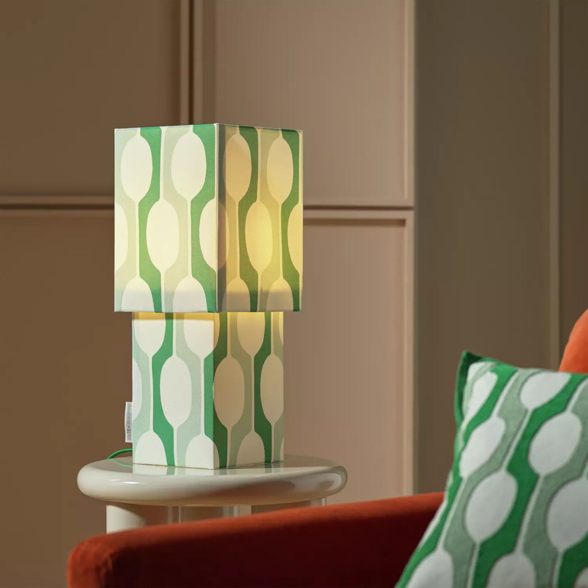 Habitat x Scion's new table lamp will add retro flair to any space – it’s my standout piece from the brand’s new collaboration
This might be the most stylish table lamp of the season
-
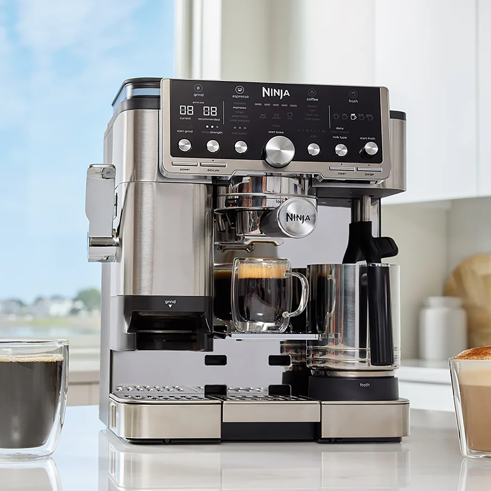 Ninja just quietly dropped an upgraded version of the sellout Luxe Café espresso machine on its website
Ninja has quietly listed its new Pro Series espresso machine on its UK website. We're impatiently waiting for a launch date
-
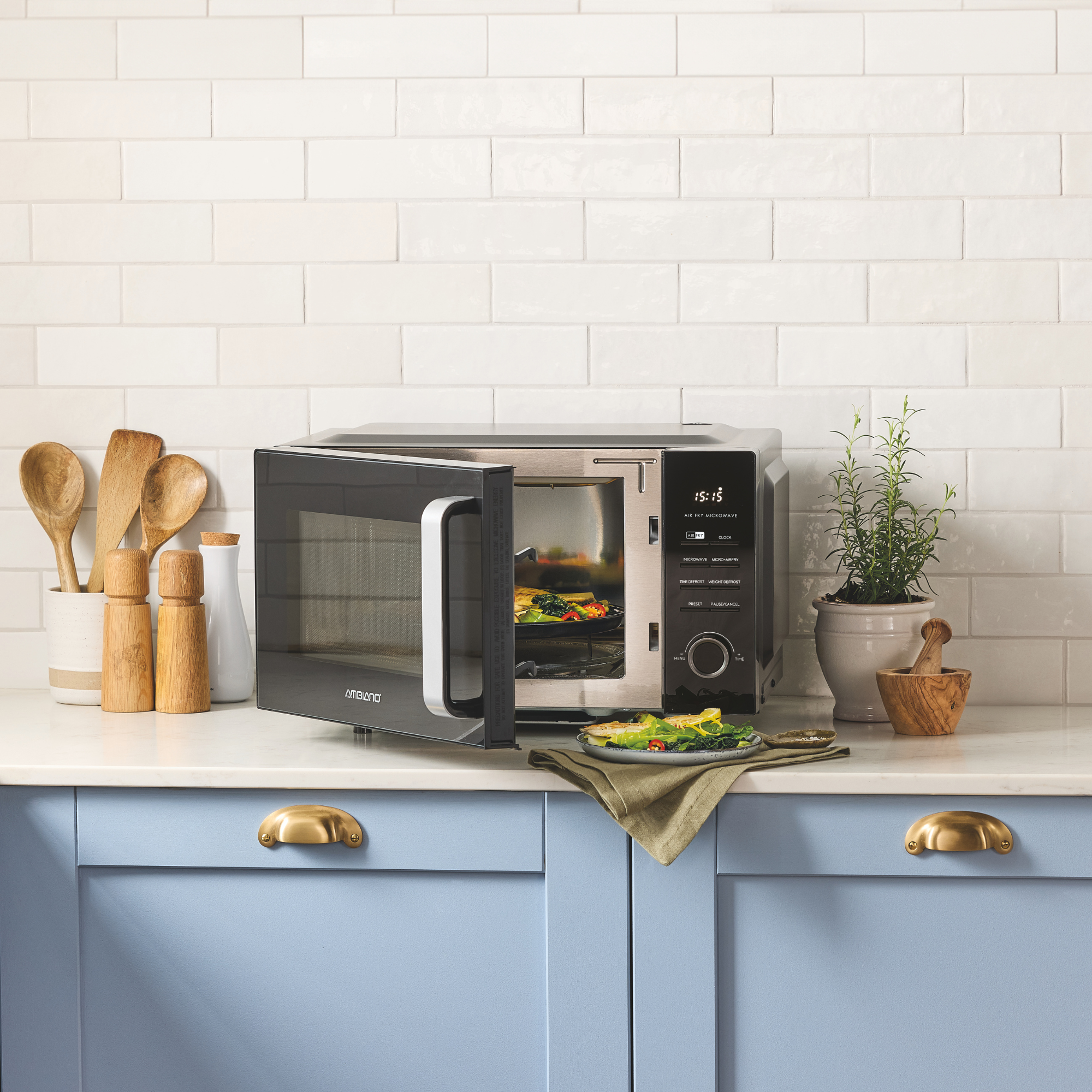 Aldi has launched a new air fryer with a special extra function – but you’ll have to act fast as it’s in stores right now
Can this kitchen gadget really do it all?


