

Blueberry has become a standout colour this year thanks to social media. But if you’re thinking about styling this popular colour at home, there are three shades you need to avoid pairing with it, according to experts.
Soft blueberry blue has become a key colour trend this year and part of the 2025 colour palette as we’ve gone crazy for the colour, whether that's on our nails, our matcha order or as part of our home decor.
Blueberry blue belongs to the sky blue family; this warm blue shade can be used to make a statement in your home. However, three colours won't bring out the best in this vibrant shade, and can make a garish combination.
1. Bright Green

It may sound surprising, given that green is now widely considered a neutral that will pair with anything, but blueberry is its kryptonite, and you should avoid pairing the two - especially bright greens.
‘Certain shades of green, specifically bright or neon green, don’t pair well with blueberry as they can clash and create a jarring interior. Blueberry and bright green are very bold shades, so when combined, they can be overpowering and distracting in a home. Similarly, neon green can take away from the sophisticated richness of blueberry,’ says Lee Trethewey, interior design expert at Sustainable Furniture.
If you want to incorporate green into your colour scheme, pops of soft sage green can work with blueberry without overpowering it. Think about the shade of green in a Blank Street iced matcha blueberry latte and you'll be onto a winning pairing.
2. Bright Orange

Blue and orange may be complementary colours on the colour wheel, but this doesn’t mean blueberry and orange work in interior spaces.
‘Bright orange and blueberry are both bold, warm-leaning colours that can easily overwhelm a room when paired. Being opposite on the colour wheel, their high contrast can be jarring rather than energising, particularly in residential interiors where you want colours to flow rather than shout. If you wanted a more finessed splash of orange, we’d suggest either a burnt orange or a pastel orange,’ says Camilla Lesser, Property Development Manager at Essential Living.
Because bright orange and blueberry are warm-toned, they can easily create a washed-out effect, which dulls your space. Instead, a pastel orange would emphasise the richness of blueberry blue, rather than wash it out.
3. Red

Primary colours - and the unexpected red theory - have been popular for a while, but this doesn’t mean you should embrace bright red and blueberry.
‘It's best to avoid combining blueberry and bright red as it can make your interior feel very juvenile and childlike. These are two very strong colours, so visually they are not very attractive, especially within a home, and they can often seem as though they are competing rather than complementing each other,’ says Lee.
‘If you wish to combine blueberry and red within your interior, it's best to stick to muted or deep reds. A burgundy shade is the ideal deep, rich colour for creating a sophisticated, yet dramatic statement that is perfect for a dining room or cosy living space.’
Cherry red has been a huge trend this year, and the depth of this sultry shade means it can be used alongside blueberry without overwhelming it.
Shop the blueberry trend
Now that you have those colour pairings in mind here are just a few of the ways I'm planning to bring this vibrant colour trend into my home.
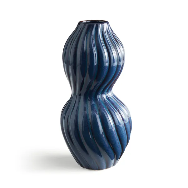
This glossy vase is drenched in a rich blueberry hue, making it not only a stand-out piece but an easy way to embrace this new shade at home.

This blue has a purple tinge which gives it an iridescent quality that catches this eye. Pair with soft pastels such as lilac, or go bold with a burnt orange.

Embrace a literal take on the trend with this decorative plate - perfect for any upcoming summer picnics.
When paired correctly, blueberry can create a rich, atmospheric space. Are there any colour combinations you recommend?

You must confirm your public display name before commenting
Please logout and then login again, you will then be prompted to enter your display name.
-
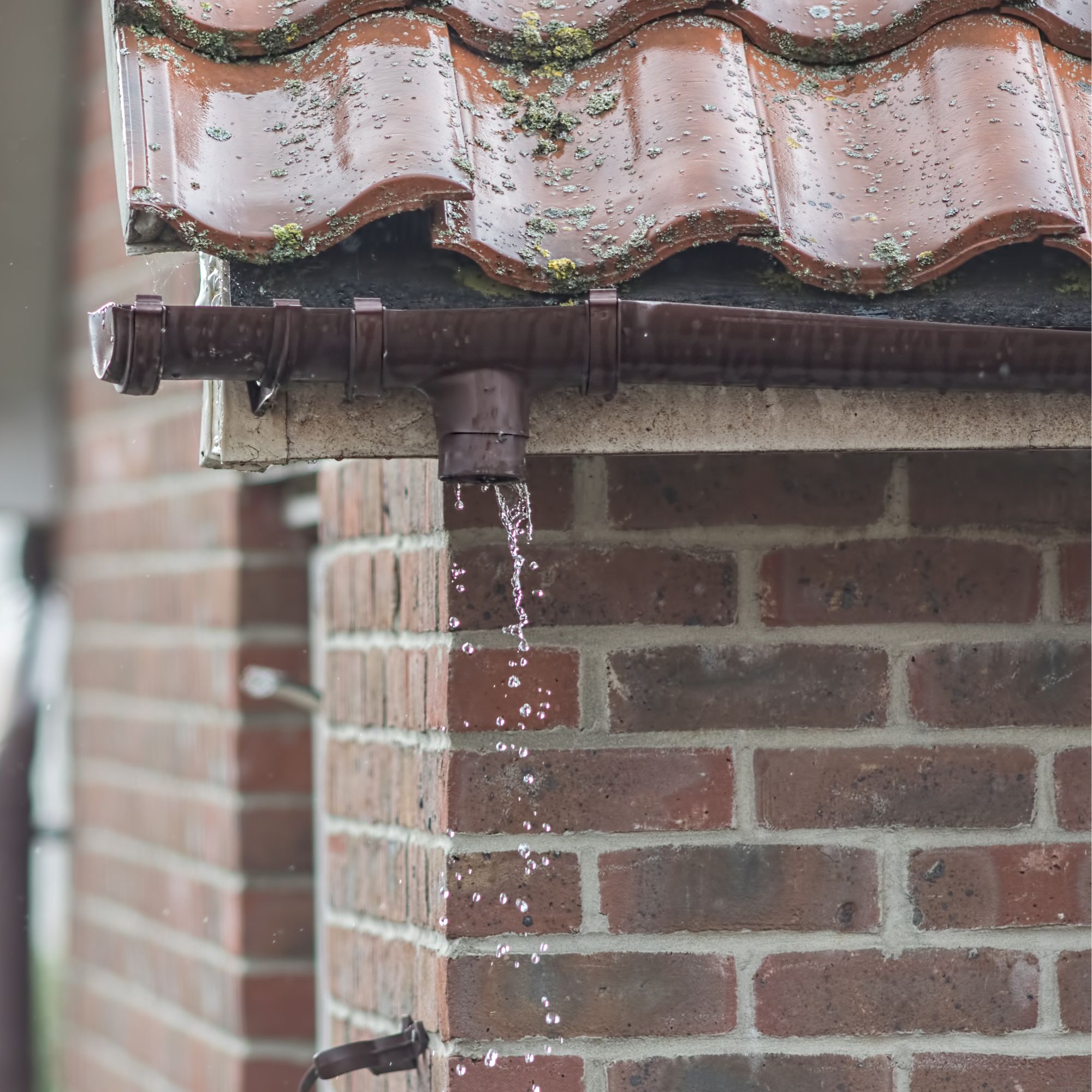 How to fix a leaky gutter – expert advice on what you'll need to get your gutters working properly again
7 steps to stop water dripping from your gutters
-
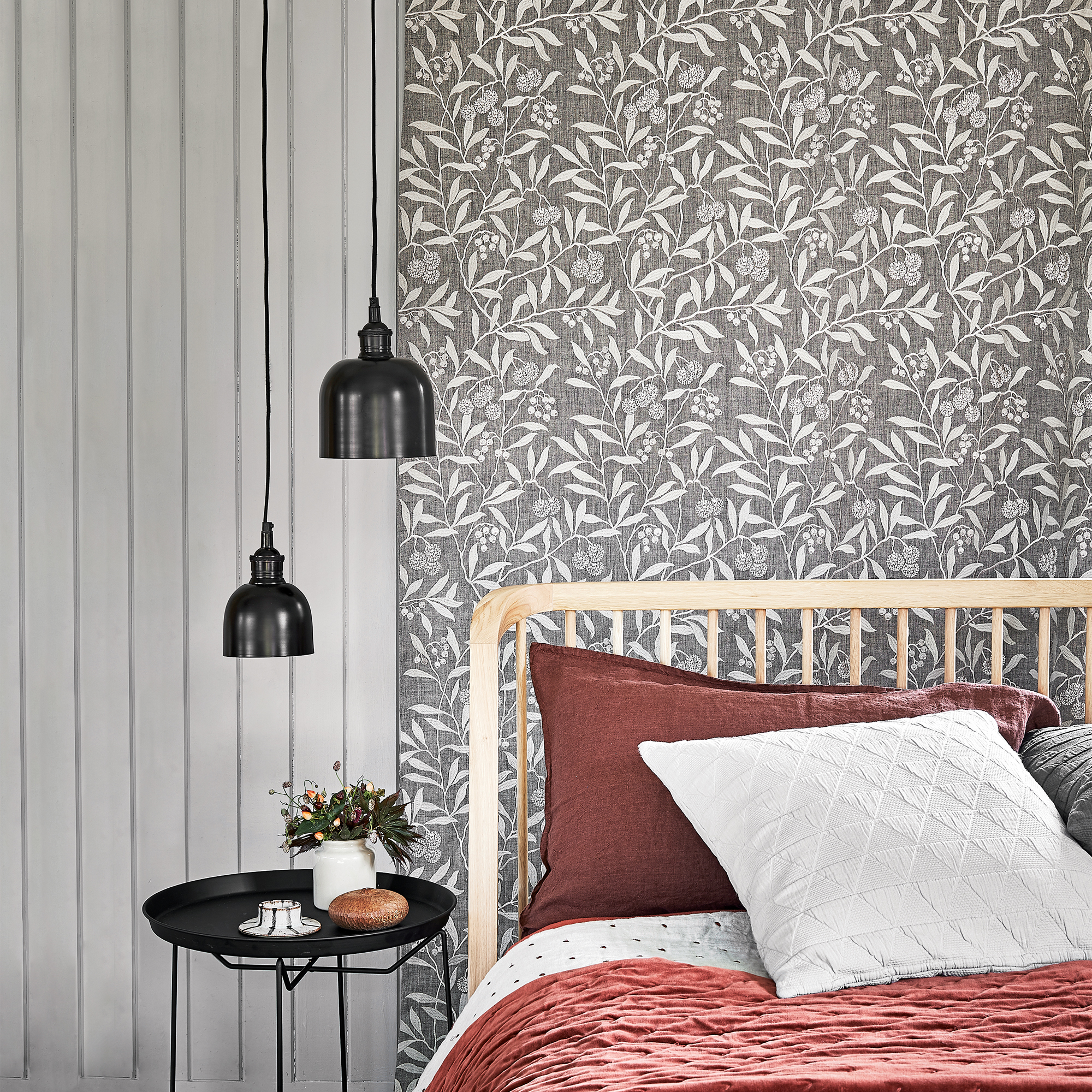 Amanda Holden's maximalist guest bedroom uses a smart decorating trick to make it look bigger
Interior experts say it's a masterclass in how to decorate a dormer bedroom
-
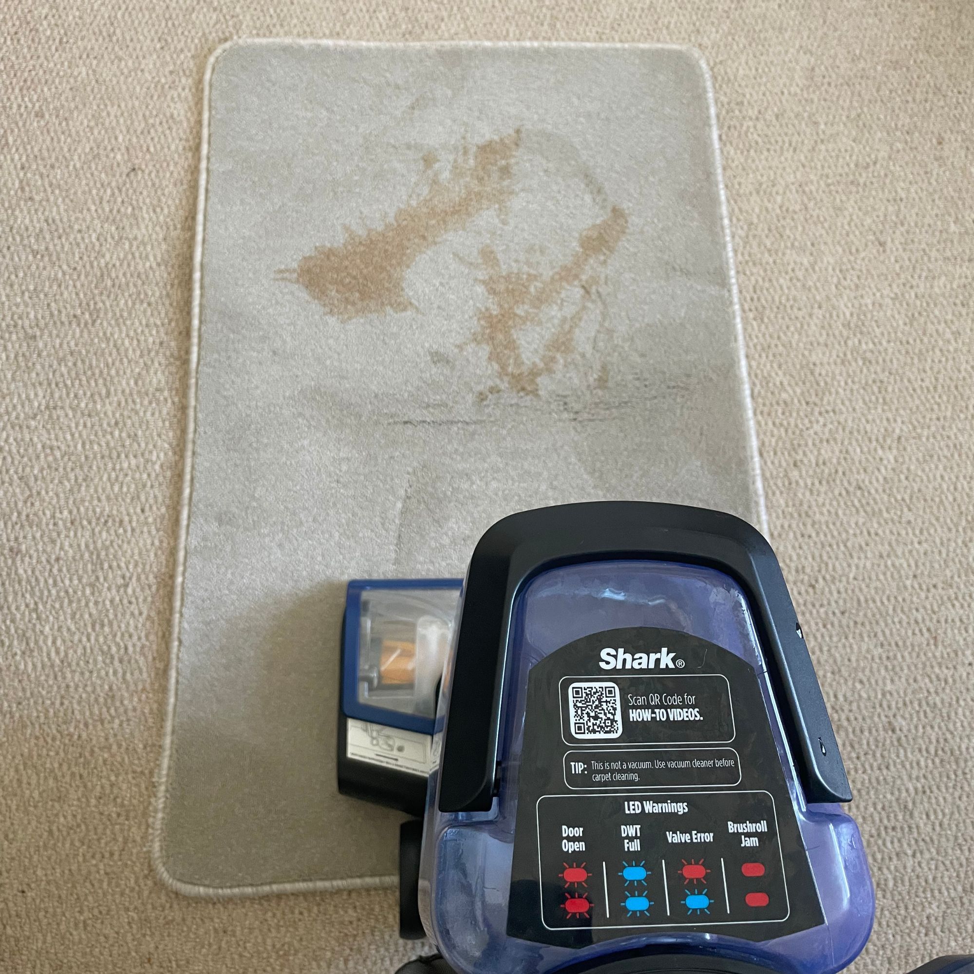 I threw wine, tea and mud on my carpets to test out Shark’s newest carpet cleaner — but after using it, you wouldn’t know
With the built-in spot cleaner, it's also a game-changer for pet parents


