10 cloakroom design mistakes to avoid at all costs, according to bathroom and colour experts
Don't make these key cloakroom design mistakes when considering your revamp
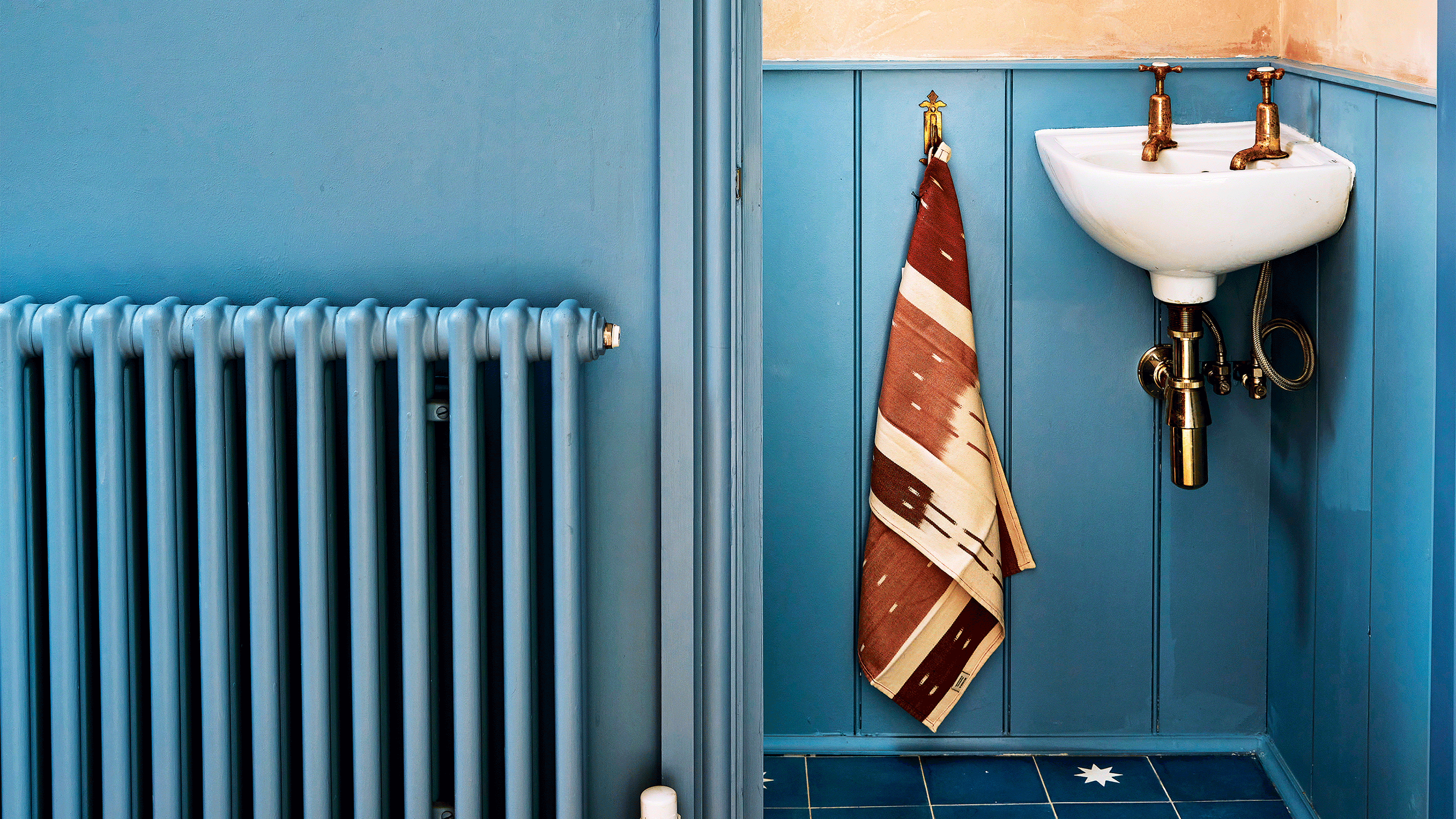
- 1. Choosing an all white scheme
- 2. Not considering your paint finishes
- 3. Failing to choose the best layout
- 4. Choosing a storage free space
- 5. Overlooking the benefit of mirrors (and a wall light)
- 6. Not using more than one tile design
- 7. Choosing the wrong shades
- 8. Using pedestal basins instead of wall-mounted
- 9. Believing you can't use wallpaper
- 10. Having a plain floor
- FAQs

Cloakrooms are usually the smallest room in the house and let's face it, often the most neglected. Cloakroom design mistakes are so easy to make as this space's identity can often get caught between a coat and bag dumping ground and a downstairs loo.
But that is number one on the list of cloakroom design mistakes right there – it's not large enough to be used for anything other than it is!
Still, cloakroom ideas can be fabulous, as they're small enough for you to have fun tiles and wallpaper that is either too bold or expensive for the family bathroom. However, it is still a tight space where getting the layout wrong or even the colours being a little off can spell disaster.
But, if you already know what the mistakes to avoid are it can make them so much easier to swerve. That's why we've rounded up advice from interior design experts to make your next cloakroom renovation foolproof.
Cloakroom design mistakes
Cloakrooms are where you can let your design mind run wild, but it comes with its own set of design rules.
'Treat small bathrooms as a sanctuary space, richly textured with art and colours that remove any of that clinical aspect. On that note, avoid clean whites and steer clear of sharp, cool yellows, as they do nothing to flatter the complexion,' advises Patrick O'Donnell, brand ambassador, Farrow & Ball.
1. Choosing an all white scheme
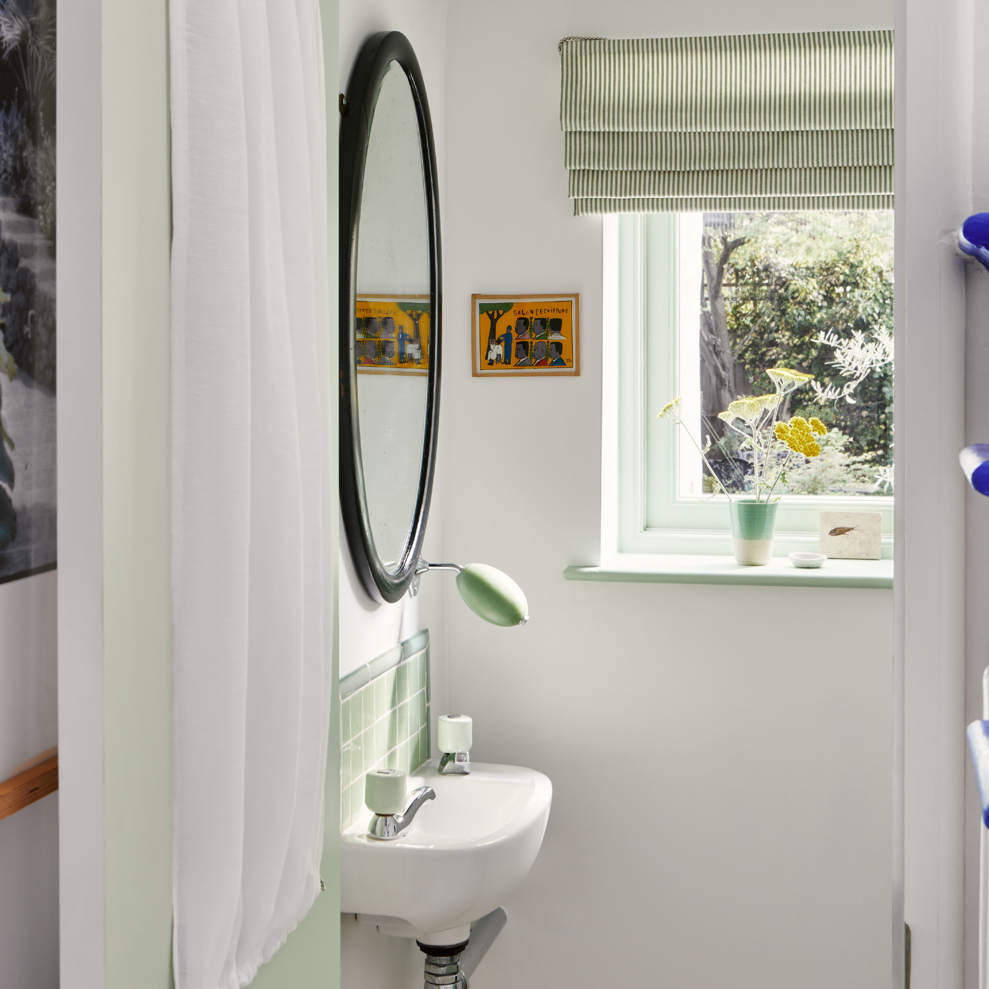
The temptation to paint a cloakroom in simply white alone is strong – and it can look fabulous of course, but choosing an accent shade to go with it will just add that extra touch of style to this compact room.
Get the Ideal Home Newsletter
Sign up to our newsletter for style and decor inspiration, house makeovers, project advice and more.
Dominic Myland, CEO of Mylands explains: 'Accenting an all-white cloakroom with a hint of colour on the inner woodwork is a creative and simple way to bring excitement to a small space.
'French Green TM No.187 is a vibrant pastel green colour that is classic but also injects newness and energy. Whilst Cotton StreetTM No.3, a clean and cool shade contrasts the uplifting pastel hue and coordinated green accessories.'
Once you've chosen your shade team it with tiles, towels and soap for cohesion.

Mylands is Britain’s oldest, family-owned and run paint and polishes manufacturer. In 1984 Dominic joined the business full time, having previously worked there in his school holidays from the age of 14. Working across all areas of the company from the factory to the boardroom, Dominic took over the company from his father in 1998 and continues the family tradition of perfection in paint.
2. Not considering your paint finishes
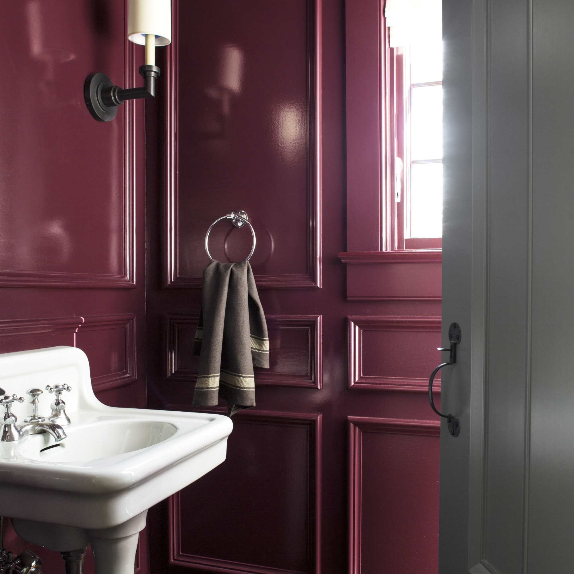
We all love a matt or chalky finish right? But we forget there are still other options on the market that might work better in a cloakroom. Paint colours with a sheen or high gloss help to reflect the light, which makes them perfect for small rooms.
'For the ultimate design statement, combine with a lustrous, high gloss finish to create a look that oozes luxury and opulence,' says Helen Shaw, international marketing director, Benjamin Moore. 'This not only looks the part, but choosing a finish that reflects the most light, can deceive the eye and make the room seem larger and brighter.'
The beauty of this, is that you can opt for darker shades as the glossy finish will make the space feel lighter and brighter.

Helen Shaw is part of Benjamin Moore's UK division. Colour expert and international marketing director, Helen and her husband Craig are founders of Shaw Paints, acquired by Benjamin Moore in 2020.
3. Failing to choose the best layout
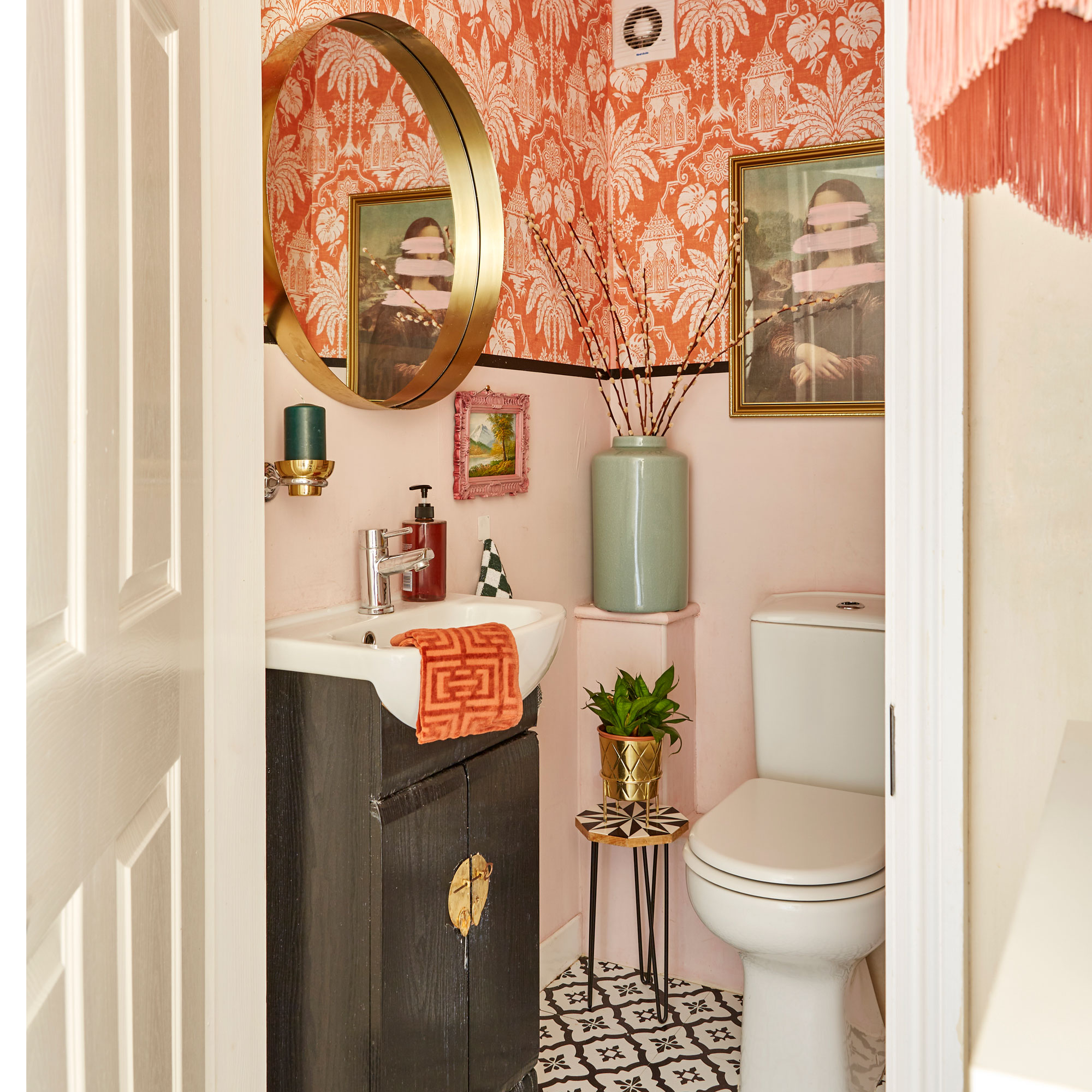
Layout is key when it comes to designing a cloakroom – yes, your options are limited but it pays to make the most of the space you have.
Firstly, consider the door – can you install a sliding design instead? They're a great way to save space. If not, look at where the door will swing in conjunction with the sink and toilet locations.
Plumbing is another aspect to think about, it's essential to keep this to a minimum whilst of course still providing you with everything that's required. Can it be boxed in so it's not in the way and an eyesore? These two elements are your first considerations when it comes to laying out your cloakroom and where key design mistakes can be made.
4. Choosing a storage free space

Even though it's not the main bathroom, it's still worth having some bathroom storage ideas within your cloakroom if at all possible. They can be one of the most frequented spaces so somewhere that stores extra toilet roll, hand towels and hand wash should be incorporated if possible.
Don't clutter up the floor if you can help it, utilise the walls instead and any alcoves you may have designed within the walls. Corner shelves or one above a mirror are a good option and hang some hooks on the back of the door.
5. Overlooking the benefit of mirrors (and a wall light)
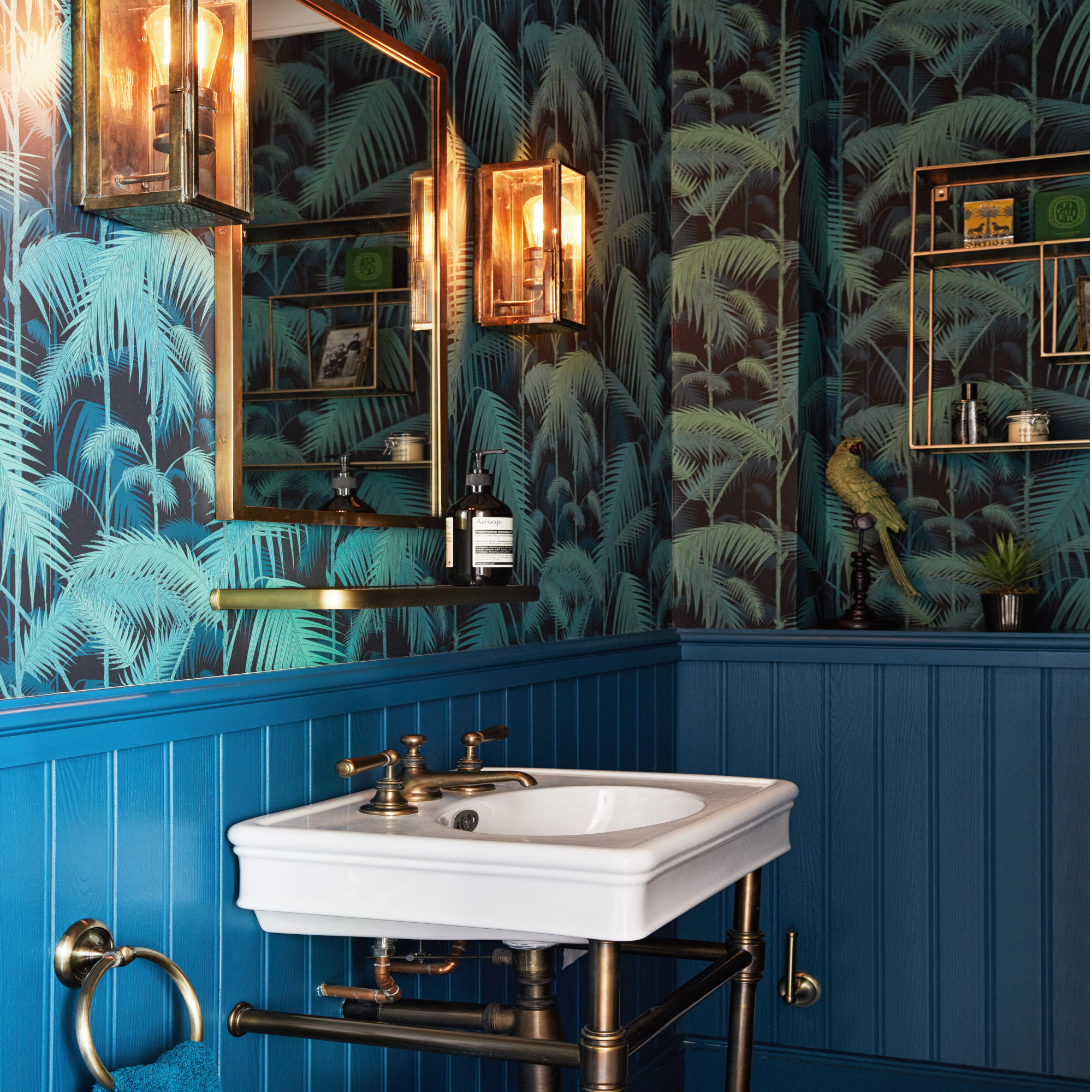
Hanging a mirror in a cloakroom is perhaps one of the best design features you can implement. Depending on the size and positioning, it can double the size of your cloakroom visually. It will lighten up the space too.
There are several designs to consider, circular will help the eye to flow around the space, whereas a rectangular or square design can work well in a more compact cloakroom. Some come with storage behind them too, so that's an aspect to consider.
Mirrors look great when paired with wall lights, 'Wall lights are a great space-saving choice for cloakrooms, particularly if you have low ceilings,' says Charlie Bowles, director of Davey Lighting/Original BTC.
6. Not using more than one tile design
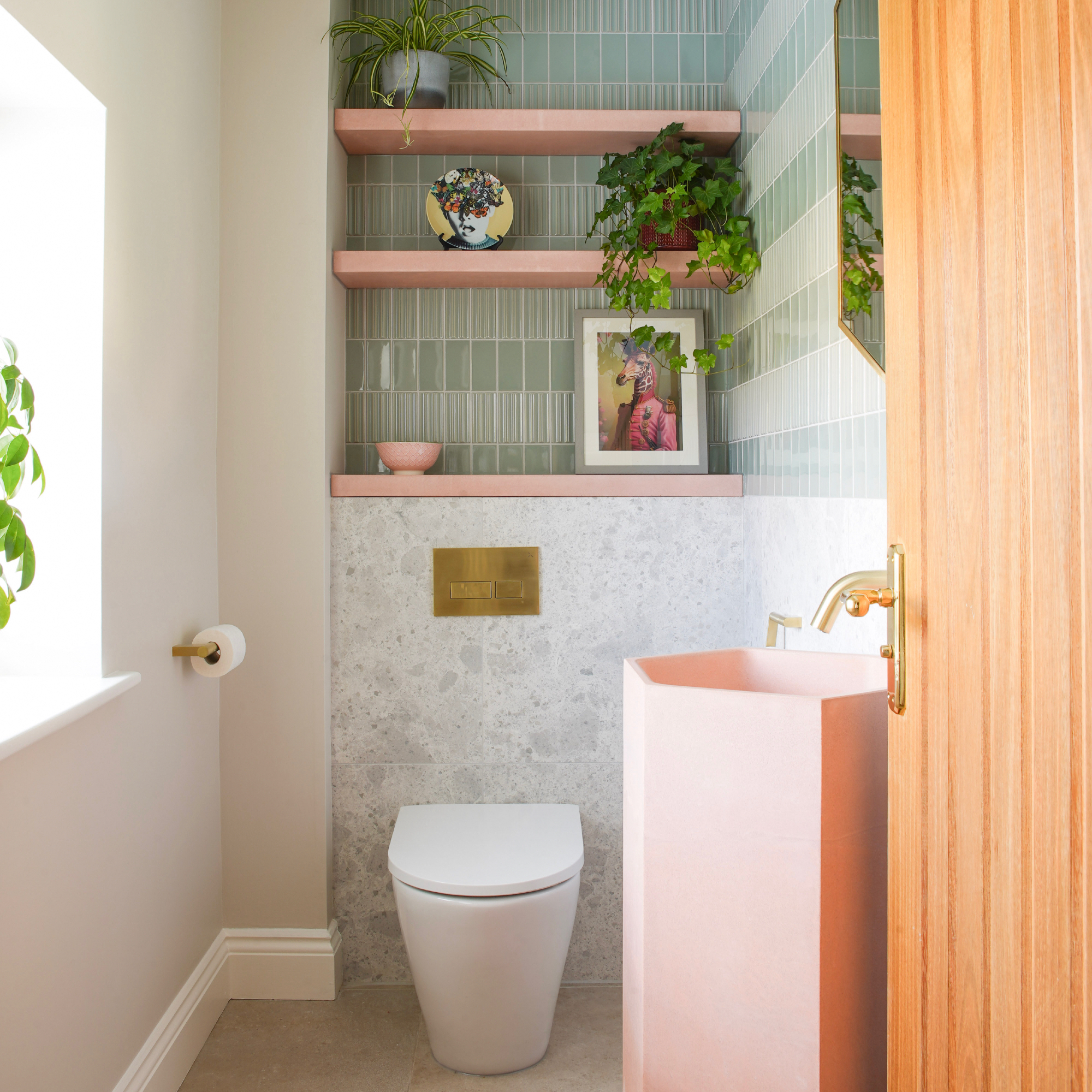
It is such a wasted opportunity if you don't go big when it comes to colour and pattern in a small cloakroom. This can be done through the cloakroom tile ideas, mixing and matching in true maximalist style is a big trend right now, so why not embrace it in the smallest room of the house?
'The classic downstairs loo has a minuscule cloakroom sink and a little patch of tiles behind it to stop splash marks,' says Grazzie Wilson, head of creative at Ca’ Pietra. But don’t limit your bathroom wall tiles to a postage stamp when the sky’s the limit.
'If your budget doesn’t allow for wall tiling left, right and centre, you could focus your tiles on one wall alone to make a feature. If you decide on this route, don’t think you have to stick to the same tiles. Be playful with your pattern, colours and textures, as cloakrooms lend themselves to being spaces where you can be more adventurous.'
7. Choosing the wrong shades
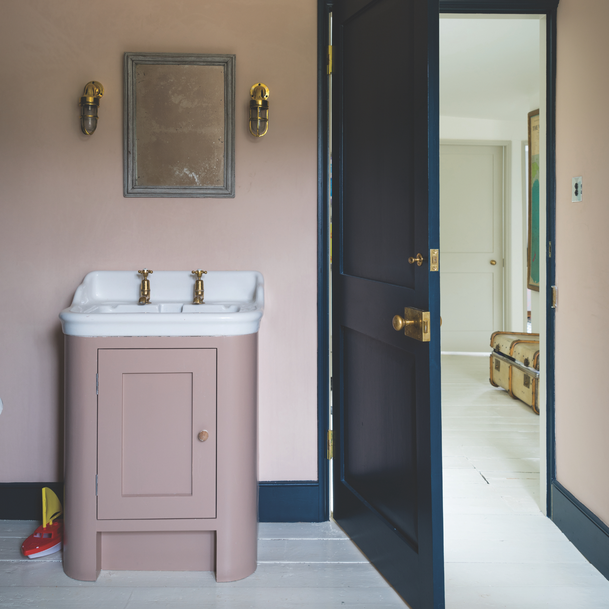
The colours you pick for your cloakroom will dictate how it feels, this is really important because some cloakrooms are usually window-less. The aim is to choose shades you love, but also those that won't make you feel hemmed in like you're in a cave.
'Earthy pinks still rule on the decorating spectrum and enhance the glow of complexion when preening in the mirror. If pink and green aren’t your thing, look to gentle mid-neutrals such as Jitney, which create warmth without making any strong design statement,' recommends Farrow & Ball's brand ambassador, Patrick O'Donnell.
The idea is to opt for shades that enhance rather than those that are too dark or too clinical.

Patrick O’Donnell has been bringing his impeccable eye for colour to Farrow & Ball since 2012. Over that time, he has been a Showroom Manager, Global Colour Consultancy Manager and now Brand Ambassador. However, he is best known as the much-loved face of Farrow & Ball on social media
8. Using pedestal basins instead of wall-mounted
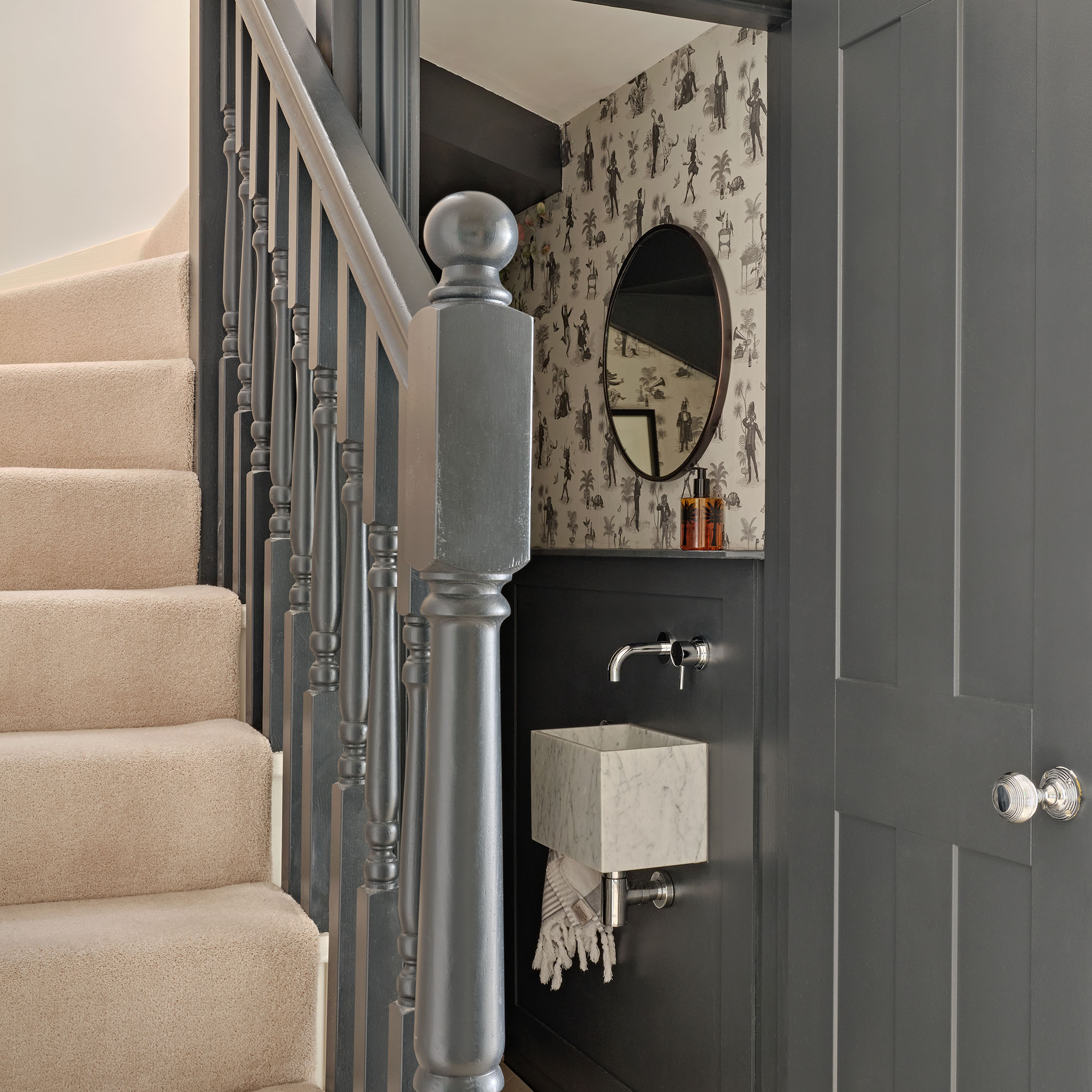
Every inch can matter and not considering this is one of the main cloakroom design mistakes that people make. Katie Parry-Stone, Cosentino UK Retail Expert lends her advice:
'Wall-mounted basins lend themselves particularly well to these areas of the home by providing a sleek and modern aesthetic without additional cabinetry or fixtures to create the feeling of more space.'
There are also wall-mounted toilets which are definitely worth considering in a cloakroom. The best port of call is to keep everything off the floor, that way you will create an illusion of space as it will be clutter-free.
9. Believing you can't use wallpaper
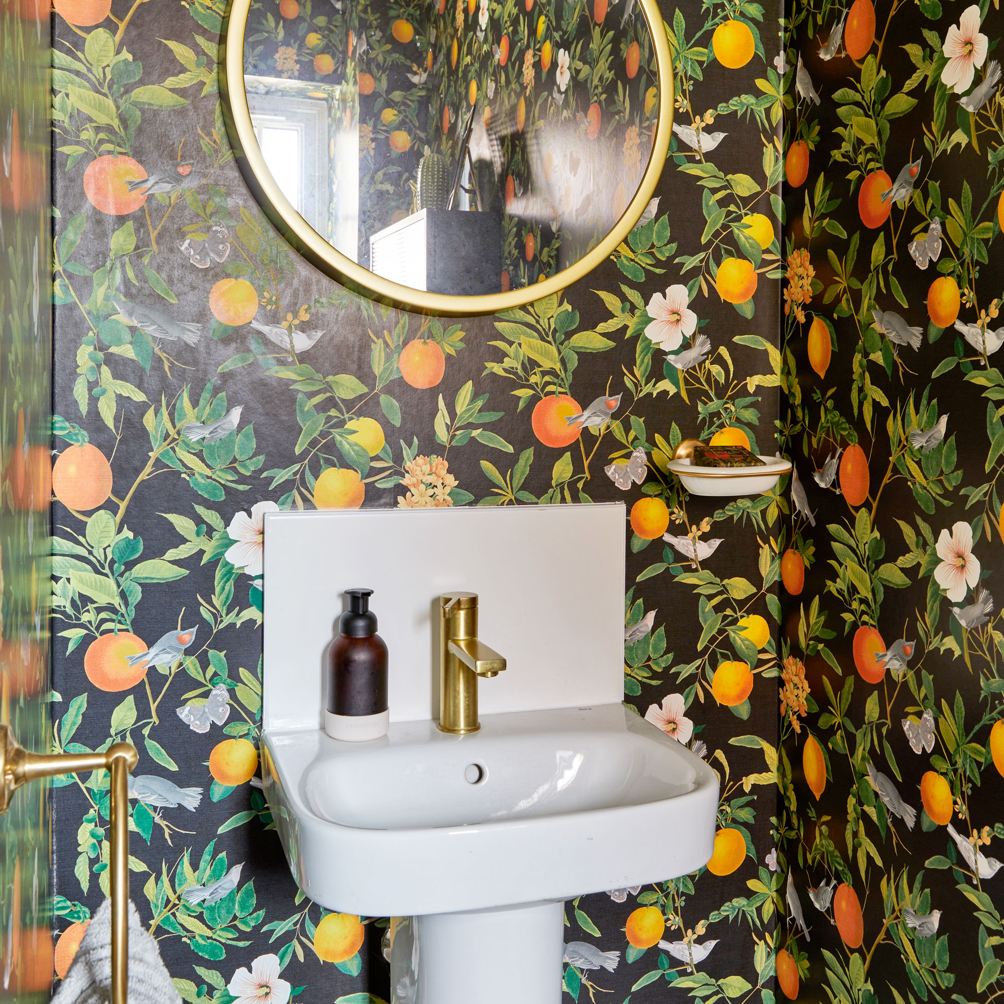
Wallpaper is an excellent choice in a cloakroom because it adds drama, colour and impact. It might sound counter intuitive, but bold designs can look fabulous and as you'll only need a small amount you can really splash out on a design that you adore.
We actually prefer larger scale designs for smaller spaces as they can make room feel larger than a ditsy design – florals are a great choice.
Keep the sanitaryware, ceiling and woodwork in a plain colour for balance and pick out towels in a shade that matches one from the wallpaper design.
10. Having a plain floor
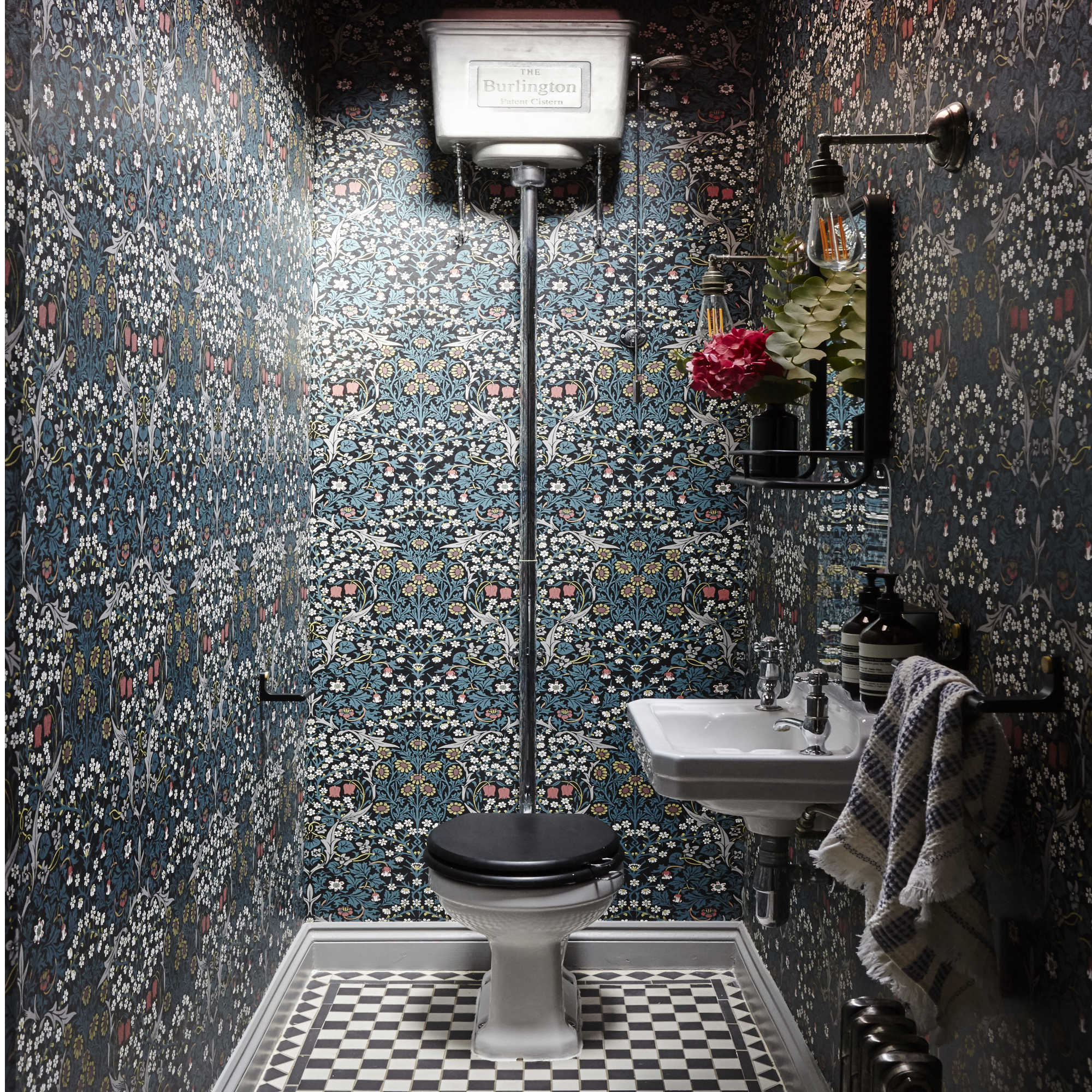
If the thought of a highly patterned wallpaper feels you with dread, then consider a patterned floor instead teamed with plain walls.
Floor tiles are a great addition to a cloakroom and you can opt from small hexes to large marble effect designs or bold graphic prints. Other materials aside from tiles to consider are rubber – it comes in many colours, or vinyl, both are great in spaces that are prone to splashes and moisture.
FAQs
What not to do in a small bathroom?
There's a tendency to keep safe – and white, but in actual fact being bold is a better approach than pale in a small bathroom.
'Incorporating a rich, bold paint colour is a fool-proof way to inject personality into often small and scarcely appreciated, cloakrooms,' says Helen Shaw. 'As a standalone space, it gives you the opportunity to use your most imaginative ideas to add character to a room.'
Where should the toilet be positioned in a small cloakroom?
The best place is where the door, when opened, doesn't bang on the toilet. So if the cloakroom is rectangular, keep it at one end, though technically, you will be guided by where the plumping is located.
Choose wall-mounted designs in the smallest size you can get whilst still being practical, this will give you a tiny bit of extra space back.

Sophie has been an interior stylist and journalist for over 22 years and has worked for many of the main interior magazines during that time, both in-house and as a freelancer. On the side, as well as being the News Editor for indie magazine, 91, she trained to be a florist in 2019 and launched The Prettiest Posy where she curates beautiful flowers for modern weddings and events.
-
 Shoppers can’t get enough of The Range’s lemon tree, but I’ve found an even cheaper bestseller at B&Q - it’s perfect for a Mediterranean look
Welcome the summer with this glorious fruit tree
By Kezia Reynolds
-
 What colours make a small bedroom look more expensive? 7 shades, recommended by the experts
Give your bijou bedroom a luxury look with one of these transformational shades
By Holly Walsh
-
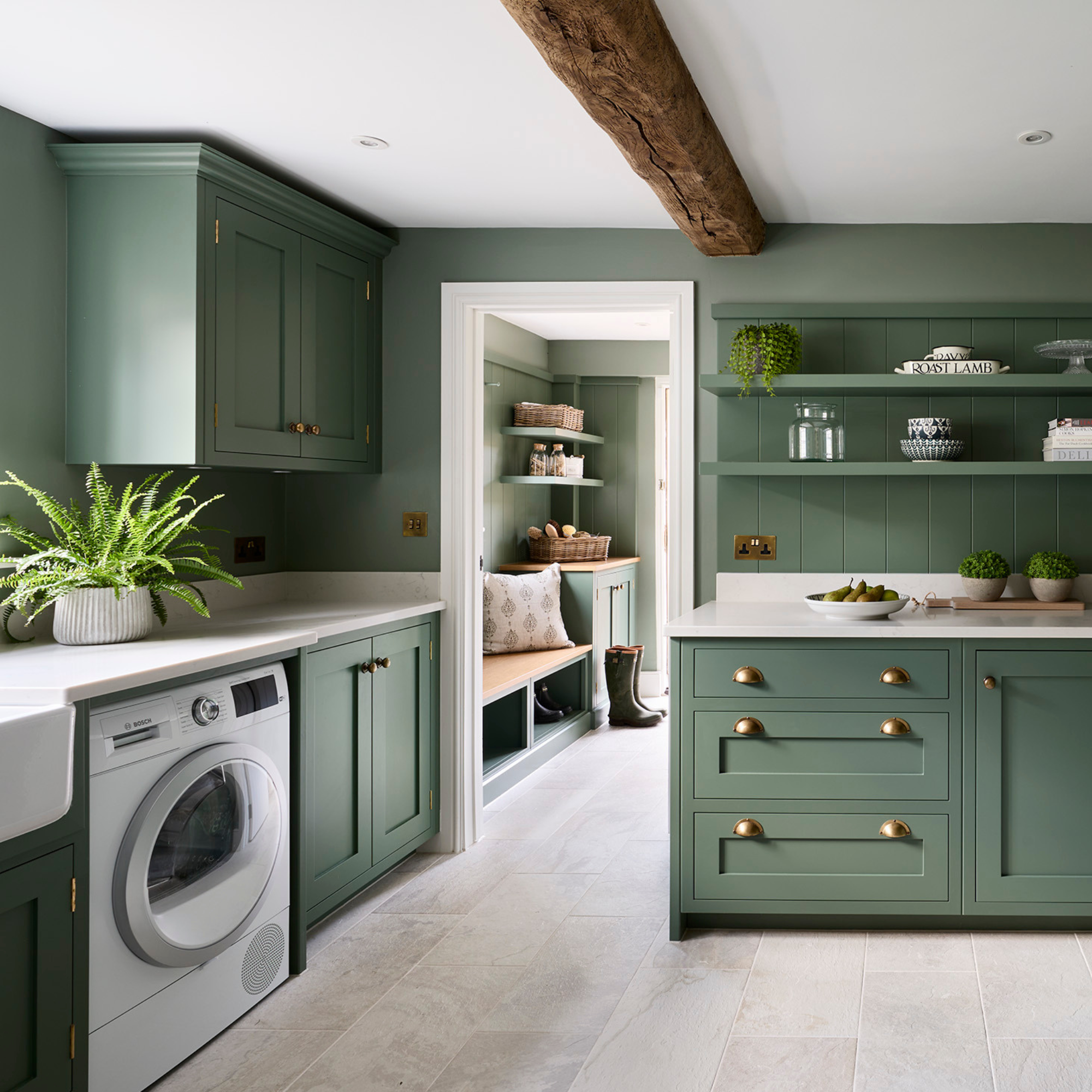 5 reasons to use Farrow & Ball 'Green Smoke' in a kitchen – the earthy tone that's on trend for 2025
Could this be the perfect shade for your kitchen?
By Holly Walsh