Do vertical or horizontal tiles make a small bathroom look bigger? The layout tricks that will create the illusion of space
Vertical or horizontal laying patterns could be the secret to a stylish and seemingly spacious suite. Let us explain...

Sign up to our newsletter for style inspiration, real homes, project and garden advice and shopping know-how
You are now subscribed
Your newsletter sign-up was successful
Ok so your bathroom is on the petite side. To be honest, most are. The average UK bathroom is in the region of 2.3 x 3 metres which isn’t that much smaller than a super king size bed. And that’s before we even think about spaces that are long and narrow, have awkward ceiling heights or are a little ‘interesting’ in shape and layout.
The things you put in your bathroom will have an impact on how big the space looks, even if the tape measure has other things to say. Tiles often cover a significant part of a bathroom on both the walls and floors, so it makes sense to choose designs that enhance the feeling of openness. Choosing vertical or horizontal tiles and laying them in a space-enhancing way to suit your specific needs could be the way to go when planning bathroom tile ideas.
Do vertical or horizontal tiles make a small bathroom look bigger?
When it comes to small bathroom ideas, tiles can be really transformative. And those that can be laid vertically or horizontally give you some creative freedom.
Article continues belowIt’s all about being really savvy in your choice – and that doesn’t mean you have to be boring either. Bold, colourful and patterned tiles can all work in a small space (if that’s the look you’d like), so long as you get the balance right.
Consider the overall mood you want to create, and how your tiles will work with your fixtures and fittings. Lighter colours will help you create an open, airy feel, while darker accent tiling can be used to create drama without closing in on the space.
How can I use vertical or horizontal tiles?
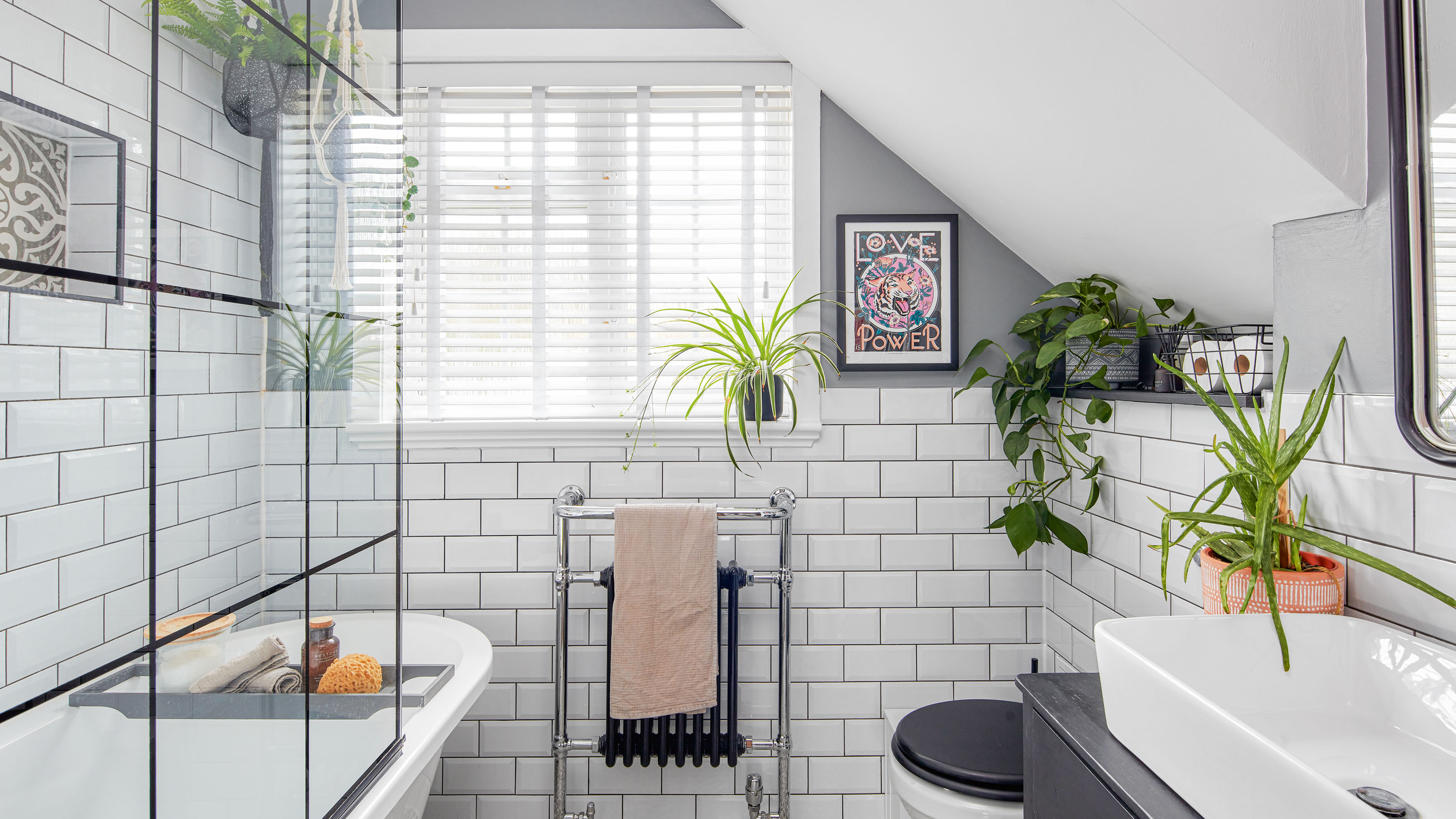
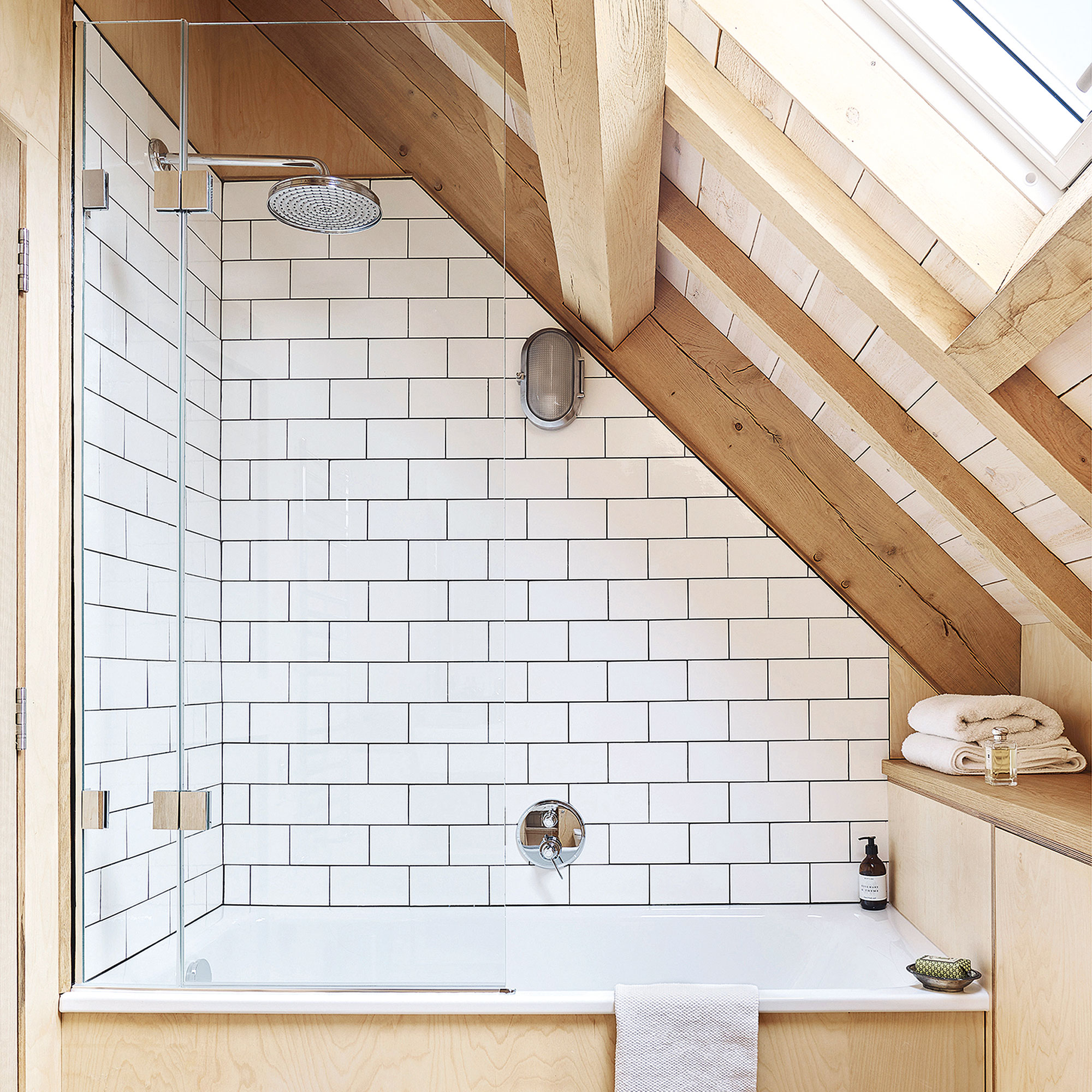
Generally speaking, narrow tiles like a classic metro or slimmer finger designs, will make a room feel taller when stacked vertically on a wall. They will make a space feel wider when applied horizontally. Then, plank-style tiles laid across a floor in the direction you want to make feel larger will trick the eye.
Running tiles in a brick bond or herringbone pattern can add visual interest and make a room appear larger. 'In bathrooms that are short on heights, such as loft conversions, you can also experiment with patterns: strips of different coloured tiles or diagonal layouts can draw the eye up or across the space, enhancing the sense of roominess,' says Abbas Youssefi, managing director of Porcelain Superstore.
Sign up to our newsletter for style inspiration, real homes, project and garden advice and shopping know-how
You can also stack tiles one on top of the other in a stack bond for a simple, modern look that’s bang on the latest tile trends.
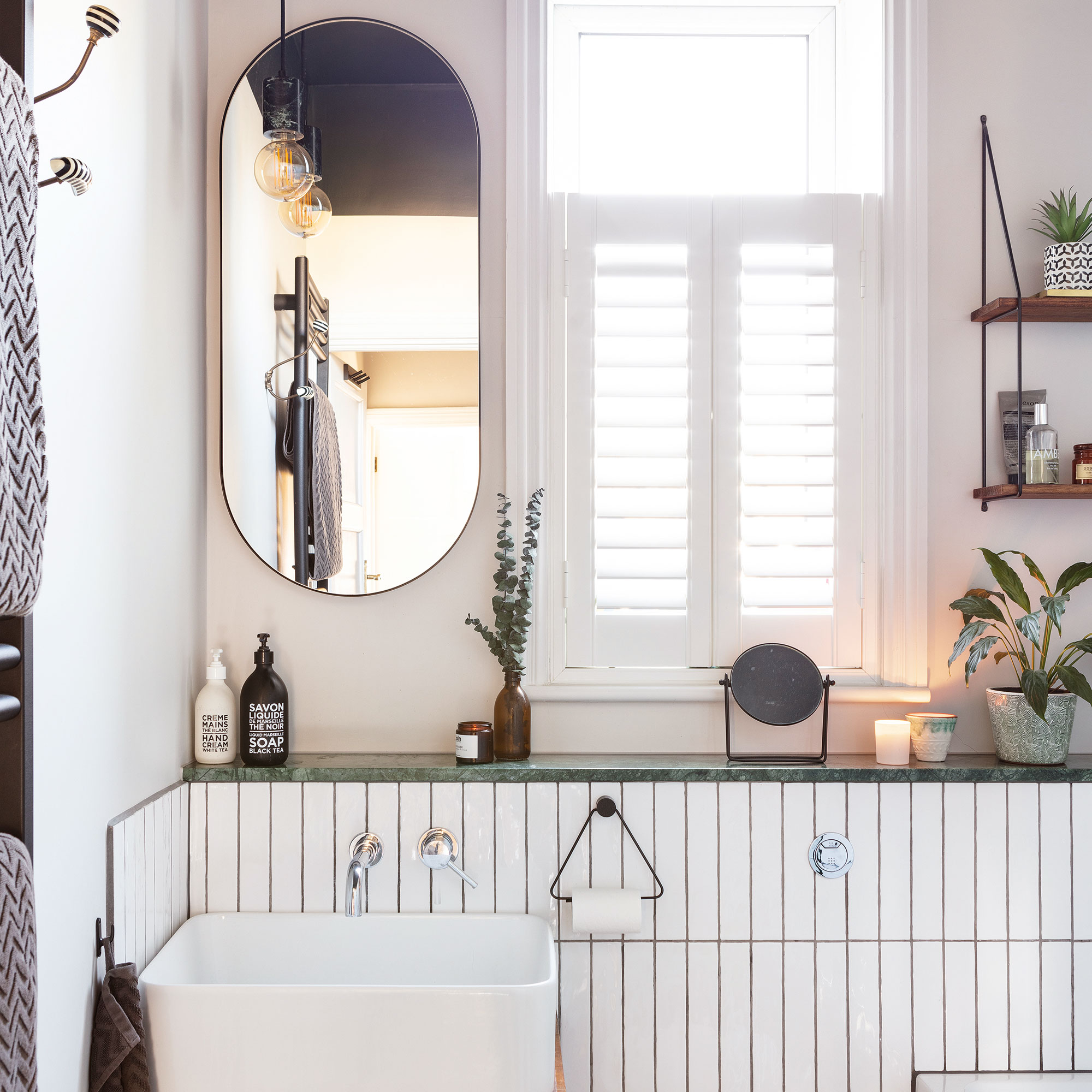
'Another huge trend right now is for extra-long wall tiles – at over double the length of traditional wall tiles, they will really help make narrow galley bathrooms feel wider,' Abbas says.
These layouts will enhance the feeling of space within your bathroom, depending on where you feel you need the illusion. Horizontal tiles will draw the eye along the length of the walls, adding the feeling of an extra bit of width. Vertical tiles, on the other hand, can make the ceiling appear higher, but may not have the same space-enhancing effect as horizontal layouts.
Highlight areas to boost space
It may be that sections of accent tiles arranged vertically will draw the eye upwards or horizontally across a floor when applied there. Think about where and how you want to enhance the space and go from there.
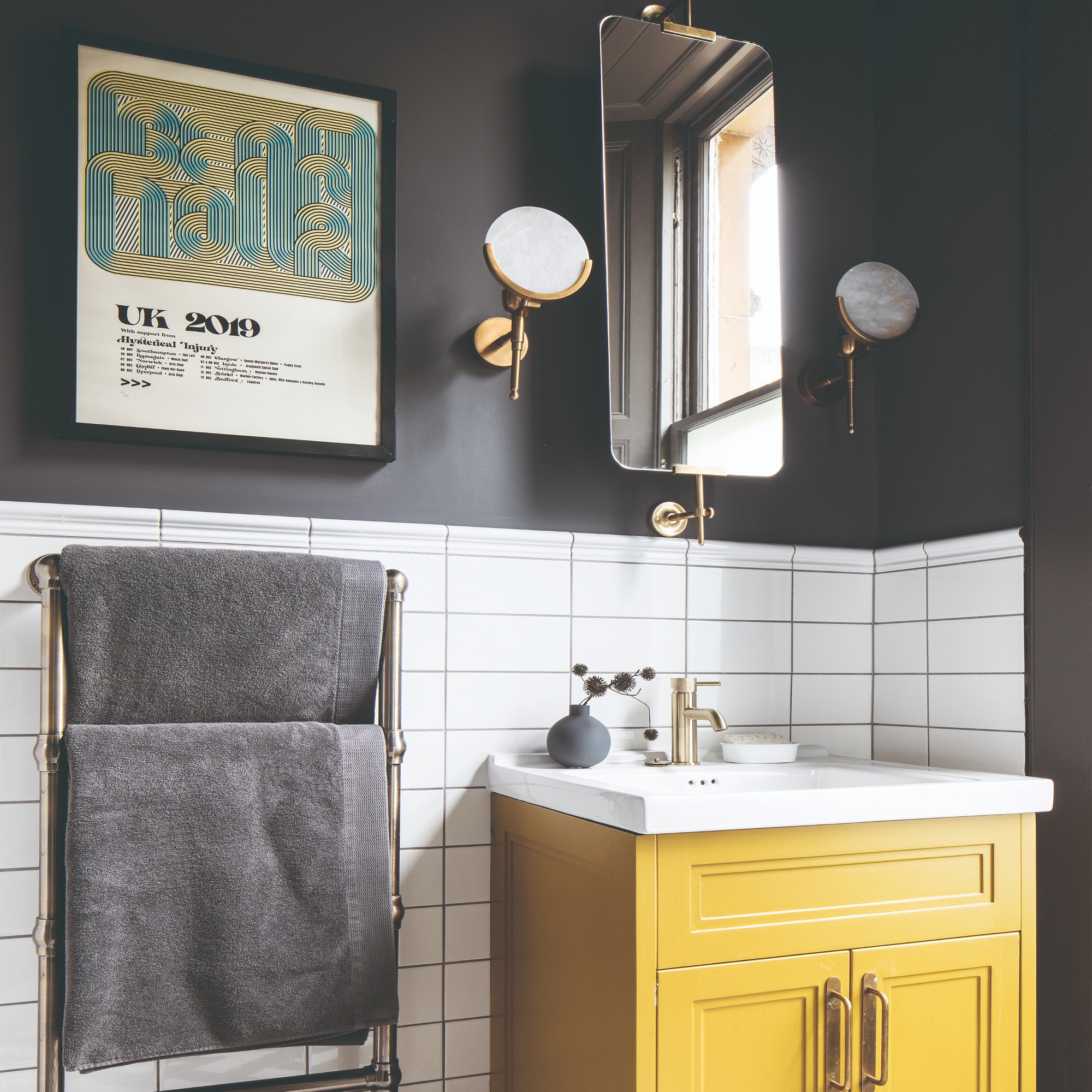
Even something as simple as a contrasting border strip of horizontal tiles in the middle of a wall could help widen the space.
Or if you have a narrow nook for showering or an area of lower ceiling height, a vertical tile could help suggest more height.
'Stick to simpler patterns and let one element be the focal point, ensuring the overall look remains harmonious and uncluttered,' says Louisa.
Can I use textured tiles vertically or horizontally?
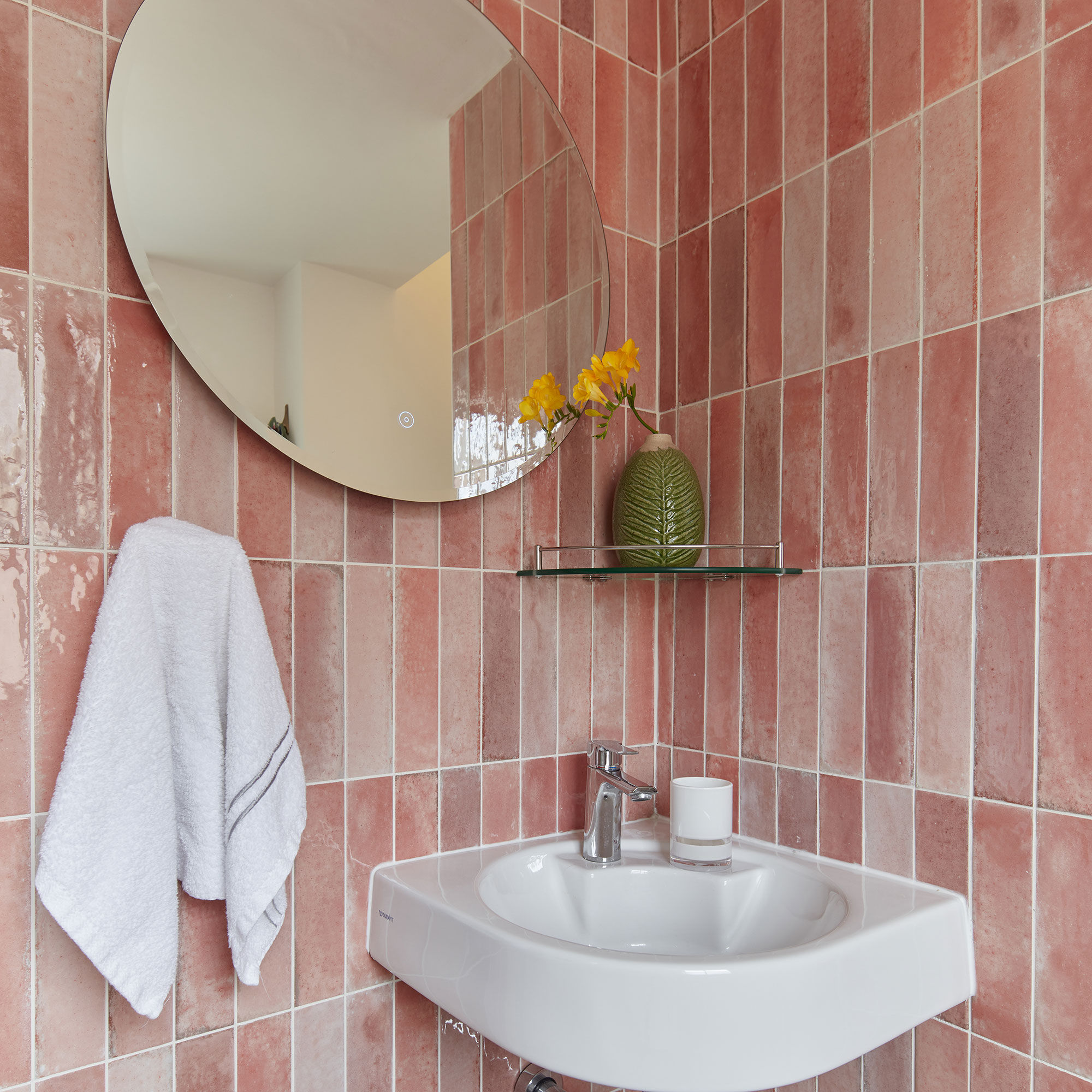
Textured tiles stacked vertically or horizontally on the walls can work well in a small bathroom. They add depth and interest without overwhelming the space. 'Using textured tiles strategically, such as on accent walls or within showers, enhances the bathroom design while maintaining a spacious and inviting atmosphere,' says Louisa Swannell, head of creative design at Walls & Floors.
You could use vertically or horizontally stacked textured tiles as a small backsplash to zone the basin area. How about taking the tile from the basin up to the ceiling in a vertical column format to draw the eye upwards and suggest more head height?
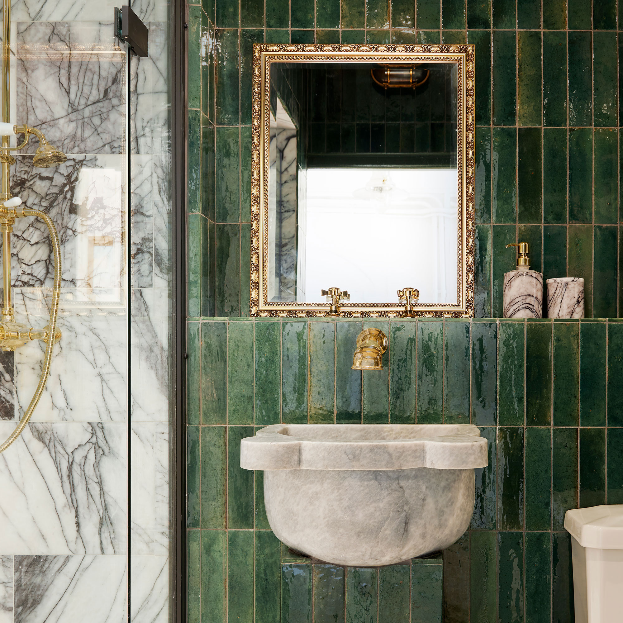
Will patterned vertical or horizontal tiles work in a small bathroom?
Geometric patterns with simple repeating designs are best for a small bathroom, so avoid any styles that feature designs that are small and busy. You could even use a plain tile to create a pattern yourself by laying different colours together to form a stripe formation, for example.
'On-trend diagonal tiles will add a sense of dynamic energy to smaller floors - you could even create your own simple checkerboard design by using plain white and black tiles together,' says Abbas.
'Less can be more, so instead of tiling your whole room in patterned tiles, why not consider a simple feature wall behind your shower, or contrast plain wall tiles with a striking decorative floor?'
FAQs
Do large tiles work in a small bathroom?
Larger tiles can make a small bathroom feel bigger by reducing the number of grout lines, which in turn creates a more seamless look. But, there’s always a balance. Avoid overly large tiles that can look out of place in tiny rooms, as well as leaving you with awkward slithers of cut tiles at the edges.
'I’d recommend using larger, rectified tiles (tiles that are precisely cut to allow for minimal grout lines) to enhance the feeling of spaciousness. It’s also a good idea to match the colour of your grout to the tiles,' says Abbas Youssefi, managing director of Porcelain Superstore.
Conversely, more grout lines can interrupt the visual flow, making the room appear smaller and more cramped. 'Steer clear of small tiles with numerous grout lines, as they can disrupt the visual flow. Instead, focus on light colours, larger tiles and simple, cohesive designs to create an open and inviting scheme,' advises Louisa Swannell, head of creative design at Walls & Floors.
What colour tiles work in a small bathroom?
Now we aren’t really here to tell you what bathroom colour ideas you should and shouldn’t choose for your home because it’s so subjective and we are all for letting those creative juices flow.
However, if you’re faced with a small bathroom and want to enhance the feeling of openness, there are some things you might want to consider. Does your bathroom have natural light? If not, can you counteract a cramped feel with better lighting? In small bathrooms that are short of natural light, it’s a good idea to choose glossy, lighter wall tiles that will bounce light around and increase the sense of space. 'Light, neutral tones such as whites and creams will always work well,' says Abbas Youssefi, Managing Director of Porcelain Superstore.
'However, cooler colours like blues and greens can also be refreshing and open up the space.'
Love dark shades? With the right balance, they can work incredibly well in a small bathroom too. There is a current trend towards darker hues of green and blues which can create a moody, bijou feel – the trick is to get the lighting right, or use mirrors effectively to bounce available light around the room.

Lindsay Blair is an editor, writer & content consultant with a focus on home design, interiors & lifestyle. Previously editor KBB Magazine and thesethreerooms.com, she has also contributed to The Times, Ideal Home, Build It & more.