Be inspired by this dream millennial pink bathroom makeover
Serving you pink, clean lines, a sculptural bath and some classic fixtures that bed the whole look into the setting of this Victorian house
This pretty pink bathroom makeover has been a long-time coming for the designers from 2LG Studio, Jordan and Russell. But once completed, it was a vision in pink, and suffice to say, they couldn't be more pleased with the finished result.
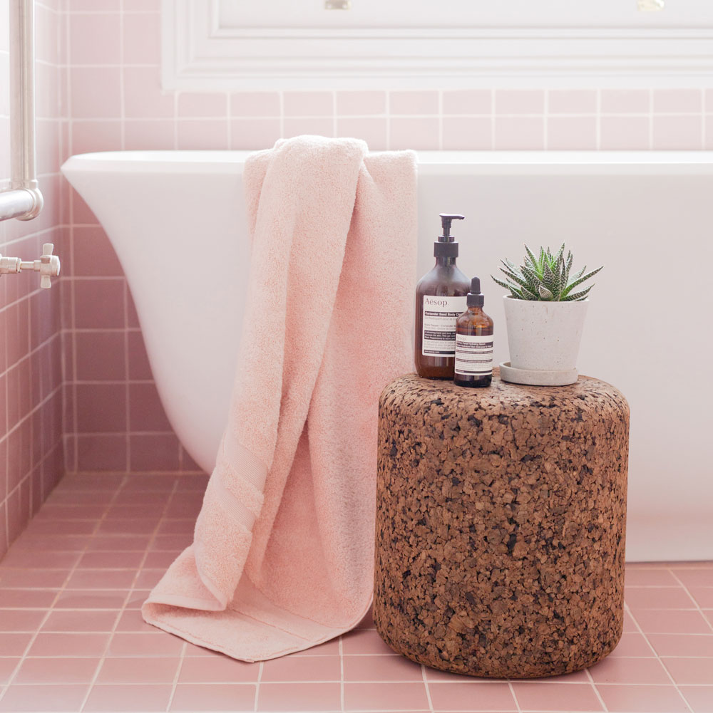
'After waiting patiently for two years, while we focussed on other areas areas of the house, we wanted this room to be just right and it needed to fulfill Jordan’s dream of the perfect relaxing bath and my dream of a big open shower room. It is a relatively small space and we have managed to both get what we wanted without the compromise, thanks to Victoria + Albert Baths and Tile Giant. Bathroom re-designs can be some of the trickiest projects, and this one was no exception, especially since the plumbing was ancient and needed totally re-newing. It was all worth it though and it feels like our favourite room in the house right now – such a luxury.'
Want more bathroom inspiration? READ: Upgrade your space with these bold bathroom colour schemes
'The sculptural lines of the beautiful bath give an 80's vibe and looks great against the more contemporary backdrop of this simple graphic grid pattern of tile,' says Russell.
Where did it begin?
The designers wanted to reference the period of the house, but they also wanted something that reflected their contemporary design aesthetic.
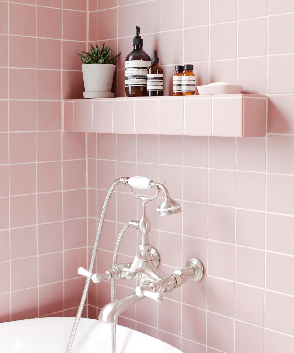
The Amiata bath was a key piece and around this the rest of the room fell into place. It has an Italian feel and they love its eighties vibe (so do we - feeling ever so slightly nostalgic). It’s a small space but this bath perfectly fits under the newly refurbished sash window to create a beautiful focal point. It’s made out of unique Quarrycast, a volcanic limestone composite, so it can handle these elegant curves and retains the heat beautifully.
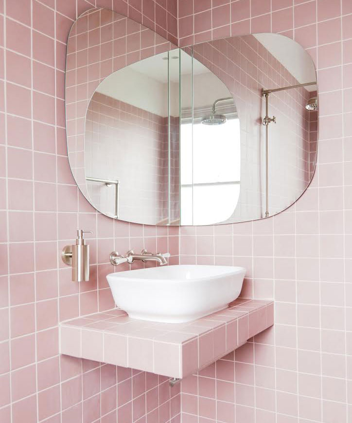
For the hardware they chose brushed nickel classic pieces that feel right for this period of the house, and the nickel is a beautiful option as its warmth fits beautifully with the other brass elements in the rest of their house. 'It’s the new must have metal finish,' say 2LG.
Get the Ideal Home Newsletter
Sign up to our newsletter for style and decor inspiration, house makeovers, project advice and more.
The shower was also important so they designed the layout with the shower in the centre of the room. It’s a wet room so it feels like the shower has loads of space around it.
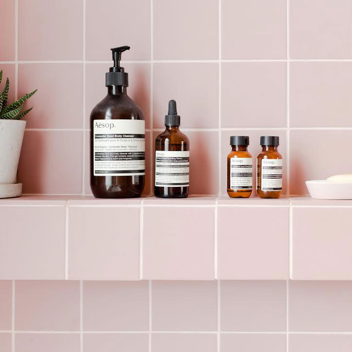
The tiles, from Tile Giant, are victorian pink quarry tiles. 'We hunted high and low for tiles but the second we saw the shade and texture of these we knew we had to have them,' they say. Usually you might expect to see this type of tile in a traditional victorian hallway or external pathway, but they work beautifully for an interior. They are through coloured, meaning that we could create shelving with them and keep the edges exposed. And the matt texture is so soft underfoot. Somehow they have managed to feel so contemporary whilst having an authentic connection to the victorian setting.
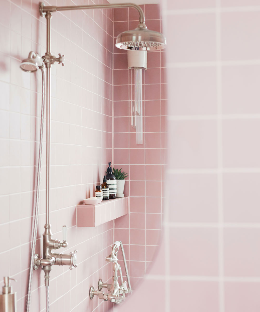
The designers wanted a bathroom storage cabinet with inbuilt shaver point so they have designed a bespoke corner mirror that hides storage shelves behind it. The shape of the mirrors we had cut to match the curves of the bath and the matching Amiata sink from Victoria + Albert Baths.
For 2LG the bathroom light was a key decorative item too. They designed this in collaboration with Ceramic artist, William & Co, and award winning lighting designer, Sarah Colson. They are both based locally and to showcase this artisan piece in their Design House was exactly what they set out to do when they bought the property.
Related: En-suite bathroom ideas that let your scheme shine bright
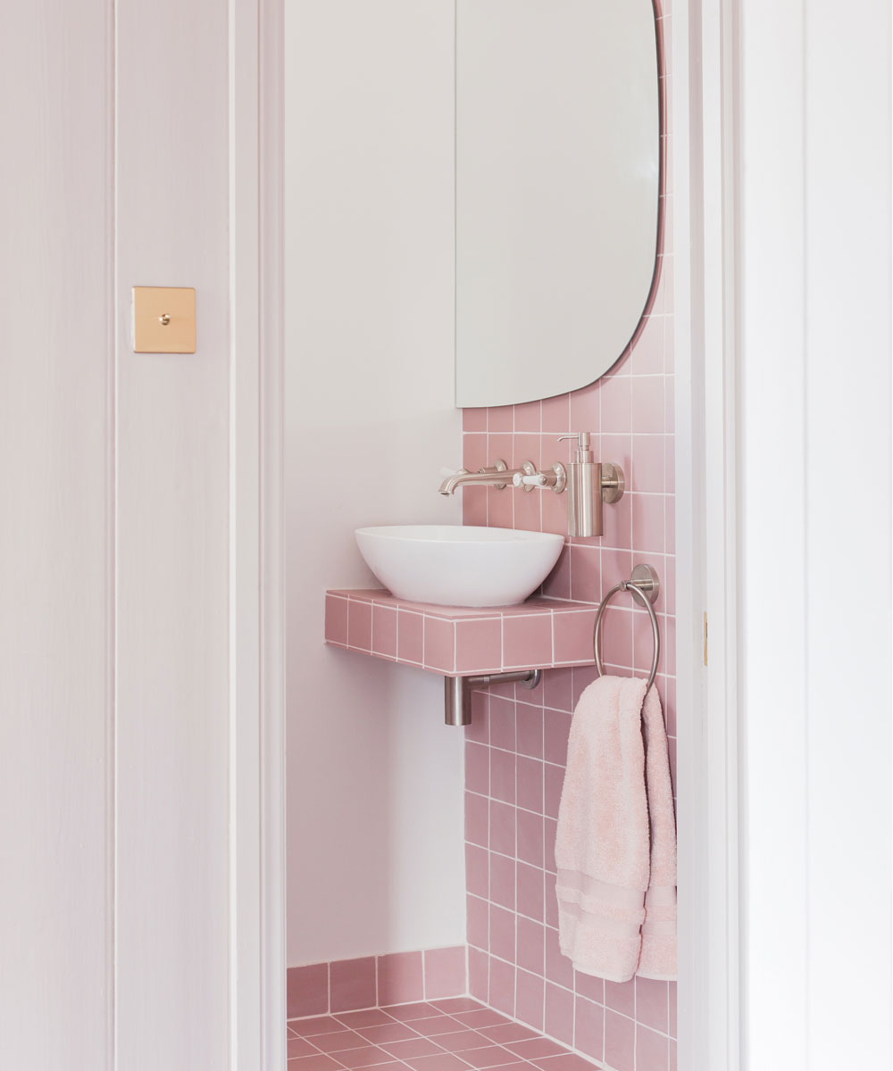
Finally, the bedroom that adjoins the bathroom had a sink in it when they bought the house. Old school and rather romantic. 'It allows us to have our somewhere to brush our teeth before bed and do a face-mask if we fancy,' they say.
The piece the designers chose is the Lario 100 vanity unit as it feels more like a piece of beautifully made furniture and less like a bathroom piece, with solid beech and cherry wood drawers. It’s a stunner. They finished it off with a bespoke paint finish on the drawer front to tie in with the woodwork in the room and this vintage pink ceramic round mirror above, to nod to the bathroom tiles.
Designers: 2LG Studio
Tile credit: Victorian Pink by Tile Giant
Bath credit: Amiata bath by Victoria + Albert
Small sink credit: Barcelona basin by Victoria + Albert baths
What do you think of this pink masterpiece? We hope it will inspire your next decorating project.
Jennifer is the Deputy Editor (Digital) for Homes & Gardens online. Prior to her current position, she completed various short courses a KLC Design School, and wrote across sister brands Ideal Home, LivingEtc, 25 Beautiful Homes, Country Homes & Interiors, and Style at Home.
-
 3 colours to avoid when painting window frames – experts say they might draw the eye, but not in a good way
These are the colours to avoid if you want to transform your window frames from drab to dazzling
-
 What do you do with stuff in your loft if you want to convert it? I’ve got 5 expert-approved solutions for you to try
If you use your loft for storage, what on earth do you do with all the stuff if you want to turn it into living space?
-
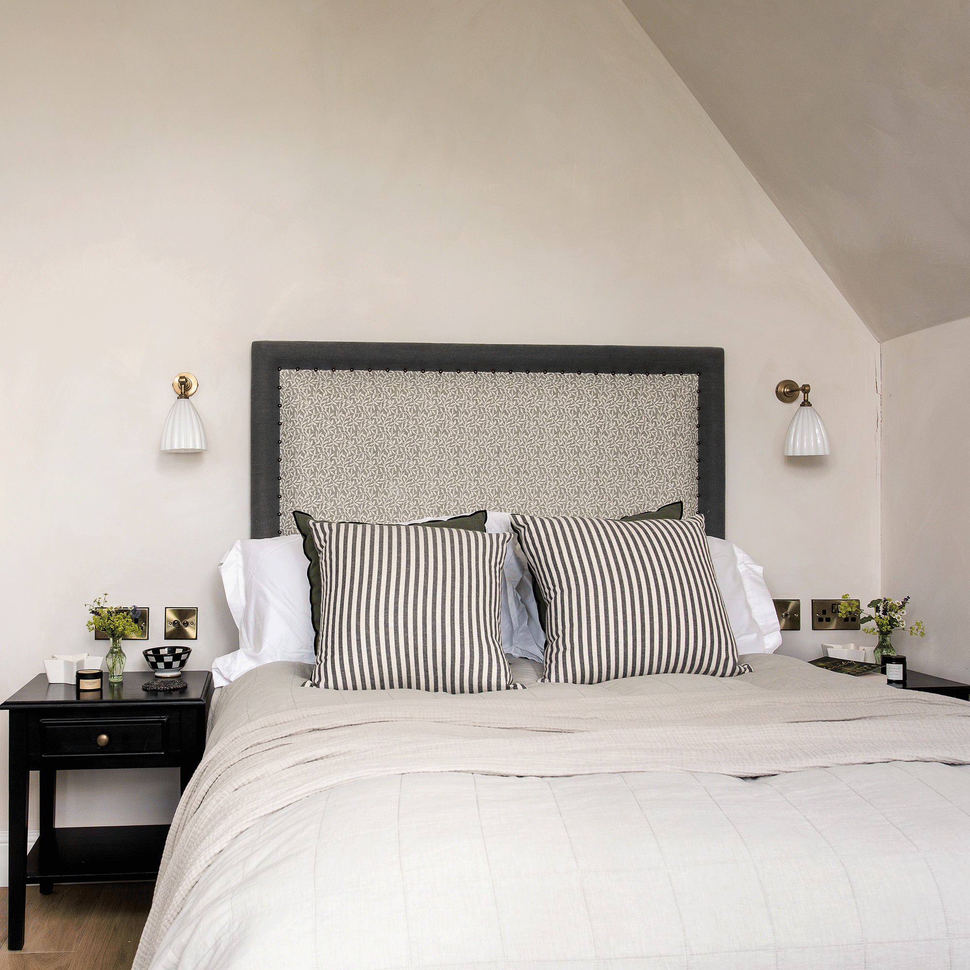 Where should bedside wall lights be placed? Lighting pros share the ideal height and distance that is both stylish and practical
Whether you like reading in bed or want to avoid the 'big light,' here's what you need to know...