Before and after: ditching the bath made all the difference in this now spacious bathroom
It's no longer cramped and bland
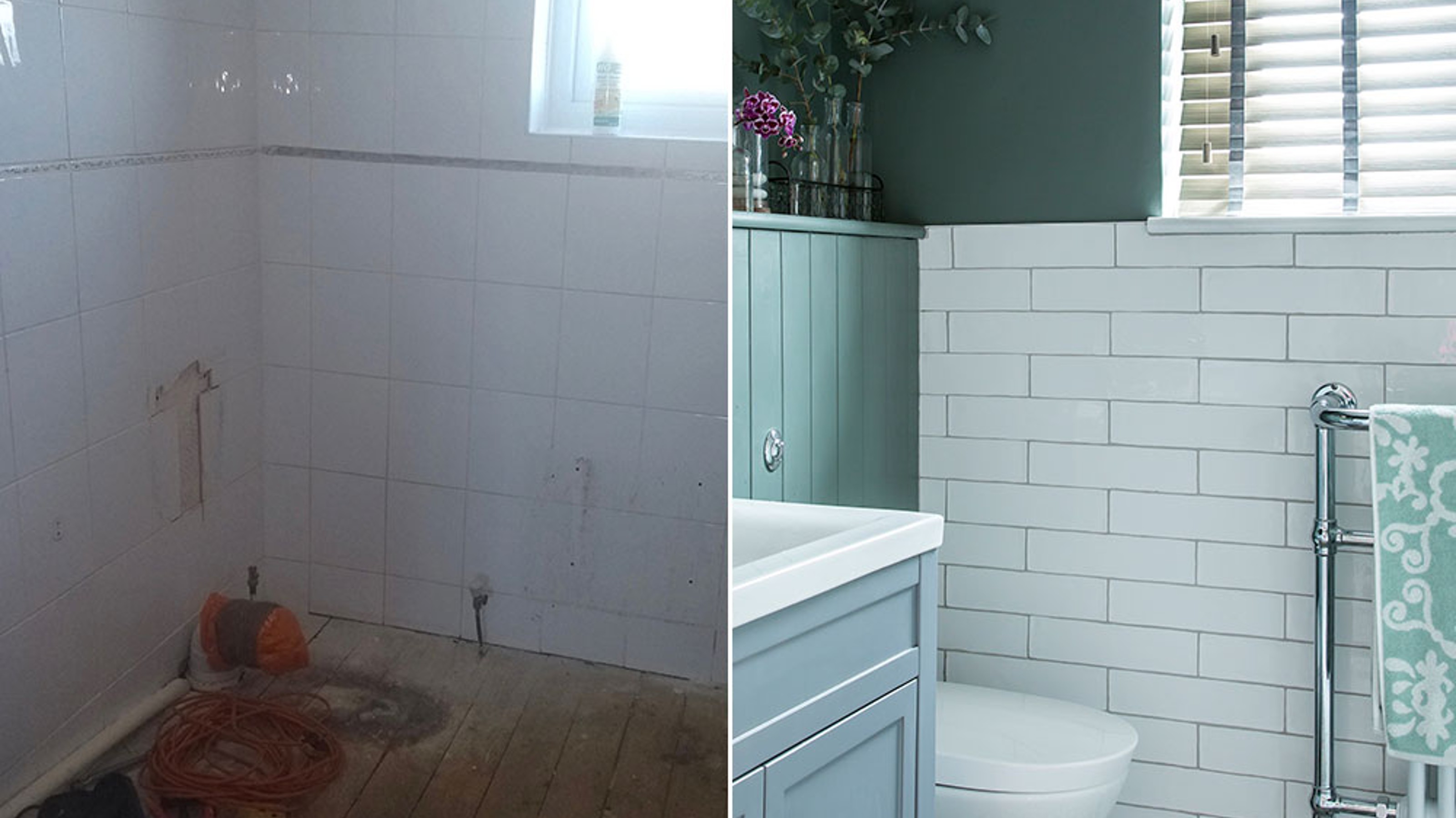

Being roughly just two metres square, the family bathroom of this three-bedroom, Eighties house in Cheshire could never be described as generous. 'Although it was clean and functional when we moved in, limited floor space meant it felt very cramped.’ says the owner. ‘What’s more, the stark white wall-to-wall tiling and uninspiring fittings made the room feel rather clinical and impersonal.'
Simply upgrading with a quality shower over the bath and retiling was the obvious solution, but the family are avid shower lovers, so agreed the key feature of the new room should be a spacious, powerful shower.
Get started on your own project with our bathroom ideas
They soon came to the conclusion that there was nothing really wrong with the layout, it was just that the existing suite was too big for the space. So with no complicated redesign or relaying of pipework to consider, they chose to design the room themselves.
'A friend suggested a good local plumber, who was happy to guide us,' says the owner. ' To save money, we ripped out the existing suite and flooring ourselves. However, we did bring in the professionals to remove the tiles and replaster throughout.
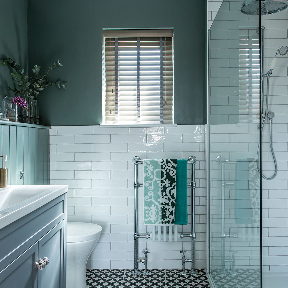
'One of our first, and most controversial, design decisions was to ditch the bath in favour of a generous wet room-style enclosure,' says the owner. 'However, on the advice of our plumber, we made sure the dimensions still allowed for a bath to be reinstated easily.'
By installing a slimline 700mm wide tray, the owners were able to claw back valuable floor space. Concealing all the exposed pipework plus a new cistern within both a half- and full-height false wall helped visually streamline the room and gave them a handy shelf.
Get the Ideal Home Newsletter
Sign up to our newsletter for style and decor inspiration, house makeovers, project advice and more.
'Along with the vanity and shower niche, carved out of the existing stud wall, it has tripled our storage capacity,' they say.
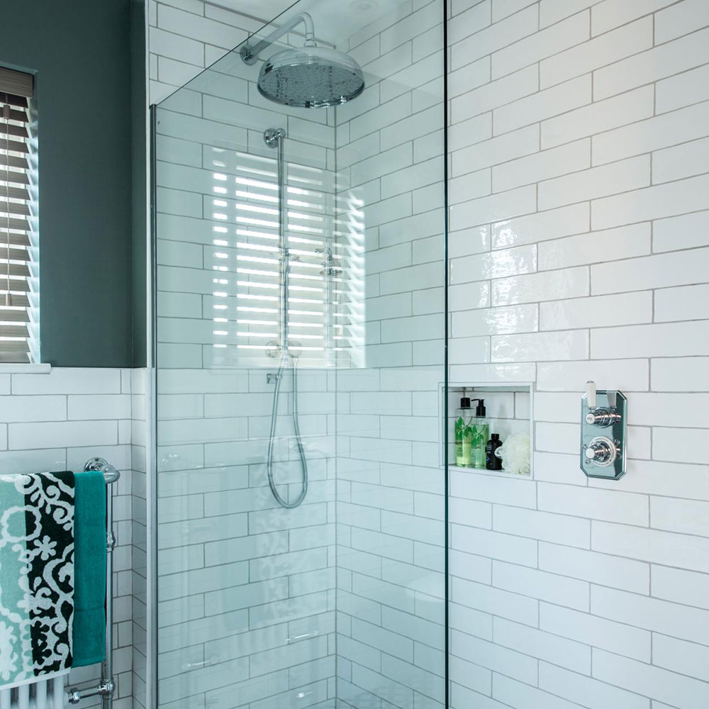
'Here, teaming a minimalist enclosure with low-level tray has enabled us to have that wet room look without the need for expensive tanking,' says the owner.
Related: Wet rooms – the essential guide to creating the perfect shower space
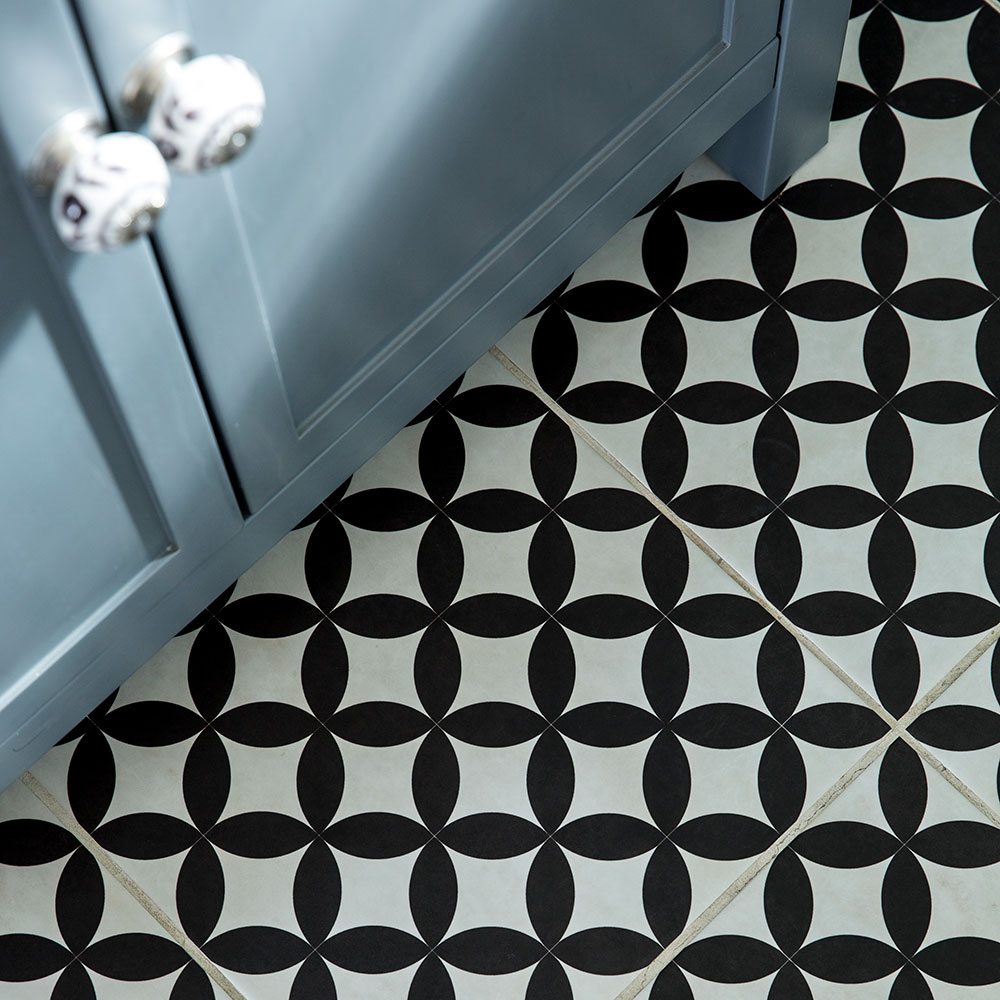
Introducing a bold pattern on the floor is a great way to add decorative interest without overwhelming smaller spaces.
‘My lovely ceramic tiles not only add decorative interest, but have proved a hard-wearing and practical option in this family room,' say the owner.
Get the look
Buy now: Bertie floor tiles, £28,29 per sq m, Tiles Direct
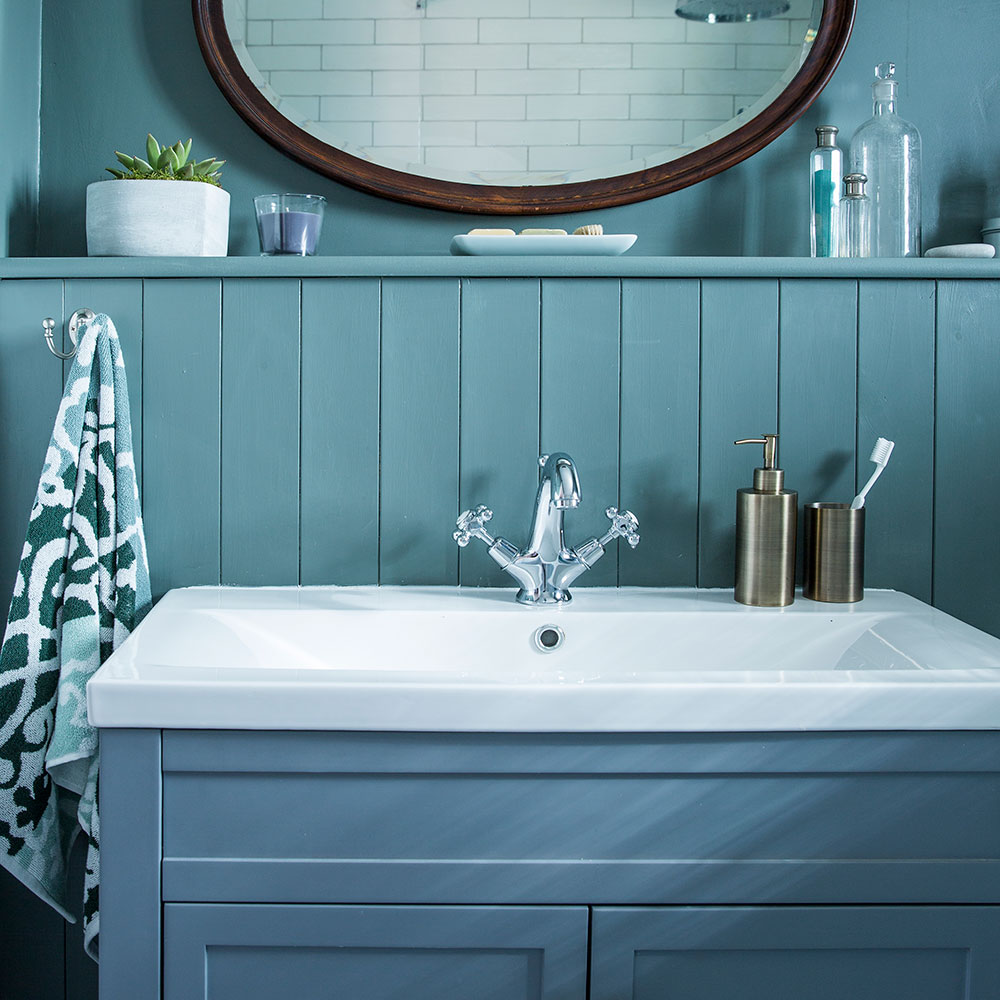
The various blue tones used in her bathroom lend a calm and tranquil look to this relaxing space. Also, the contrast against the tiled floor helps give the room an authentic period feel. Opting for a false wall, complete with handy ledge can help streamline small spaces by enclosing all ugly and obtrusive pipework, wastes and cistern.
‘I’m a huge fan of painted tongue-and-groove panelling, so it was the obvious choice when it came to boxing in,' says the owner.
Get the look
Buy now: Livid intelligent emulsion, £48.50 for 2.5ltrs, Little Greene
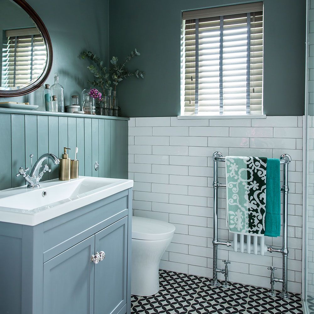
'For me, an eclectic mix can work well' says the owner. 'So I had no reservations about teaming our minimalist enclosure with more traditional fittings, such as the classic freestanding vanity and brick tiles.'
'With the colour scheme, most of our friends thought we were mad to paint the walls such a dramatic, dark green-grey, but I think offsetting them with white tiles and sanitaryware has kept the room both cosy and airy.'
'My favourite addition was actually free – it’s the vintage mirror given to us by my mother.'
Get the look
Buy now: 800 Melbourne Earl Grey vanity unit, £278.99, Soak.com
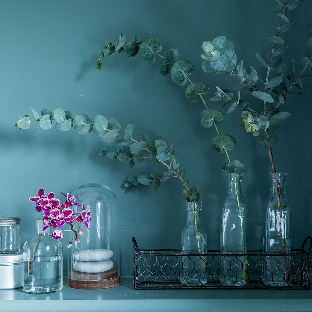
Vintage style high-street accessories sit proud on the shelf above the tongue-and-groove panelling.
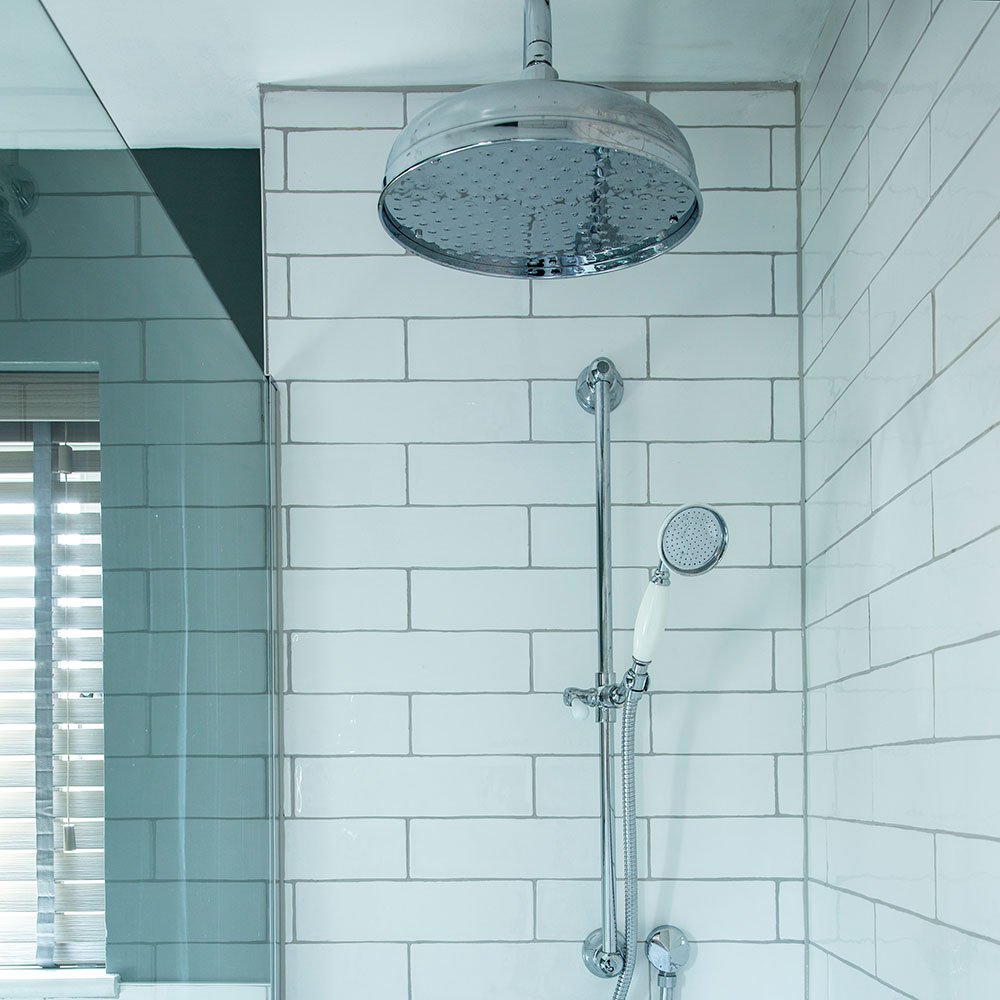
The oversized deluge shower is an indulgent and luxurious choice. If you're thinking of something similar, always check with a plumber first that you have an adequate water supply and pressure.

'In line with our mix-and-match theme, we chose a traditional-style, floor-mounted radiator and opted for a bespoke wood-effect blind in what, I’m proud to say, is now a luxurious and practical family bathroom, complete with ample floor space.'
Another inspiring project in blue: Before and after: mixing old and new has created a bright and beautiful bathroom
‘I’m so glad we had the courage of our convictions when it came to using colour and pattern in such a small space, as the bathroom now feels warm and welcoming.’

Thea Babington-Stitt is the Managing Editor for Ideal Home. Thea has been working across some of the UK’s leading interiors titles since 2016.
She started working on these magazines and websites after graduating from City University London with a Masters in Magazine Journalism. Before moving to Ideal Home, Thea was News and Features Editor at Homes & Gardens, LivingEtc and Country Homes & Interiors. In addition to her role at Ideal Home, Thea is studying for a diploma in interior design with The Interior Design Institute.
-
 5 signs you’ve taken decluttering too far — and how you can pull yourself back, according to organisation experts
You might have to start resisting the urge to purge
By Lauren Bradbury
-
 What is the Party Wall Act 3m rule and is it something you should be worried about? This is what the experts say
Don't get caught off-guard by the Party Wall Act 3m rule — our expert guide is a must-read
By Natasha Brinsmead
-
 Shoppers can’t get enough of The Range’s lemon tree, but I’ve found an even cheaper bestseller at B&Q - it’s perfect for a Mediterranean look
Welcome the summer with this glorious fruit tree
By Kezia Reynolds
-
 A £3 IKEA hack helped transform this bedroom into a scandi-inspired retreat
It's the ultimate thrifty makeover
By Laurie Davidson
-
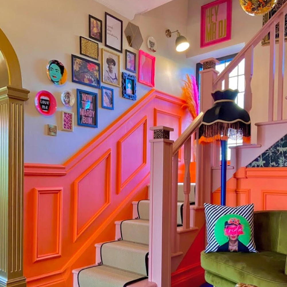 This colourful hallway makeover makes a bold first impression – it’s stunning!
It's a little bit extra and a whole lot of fun
By Laurie Davidson
-
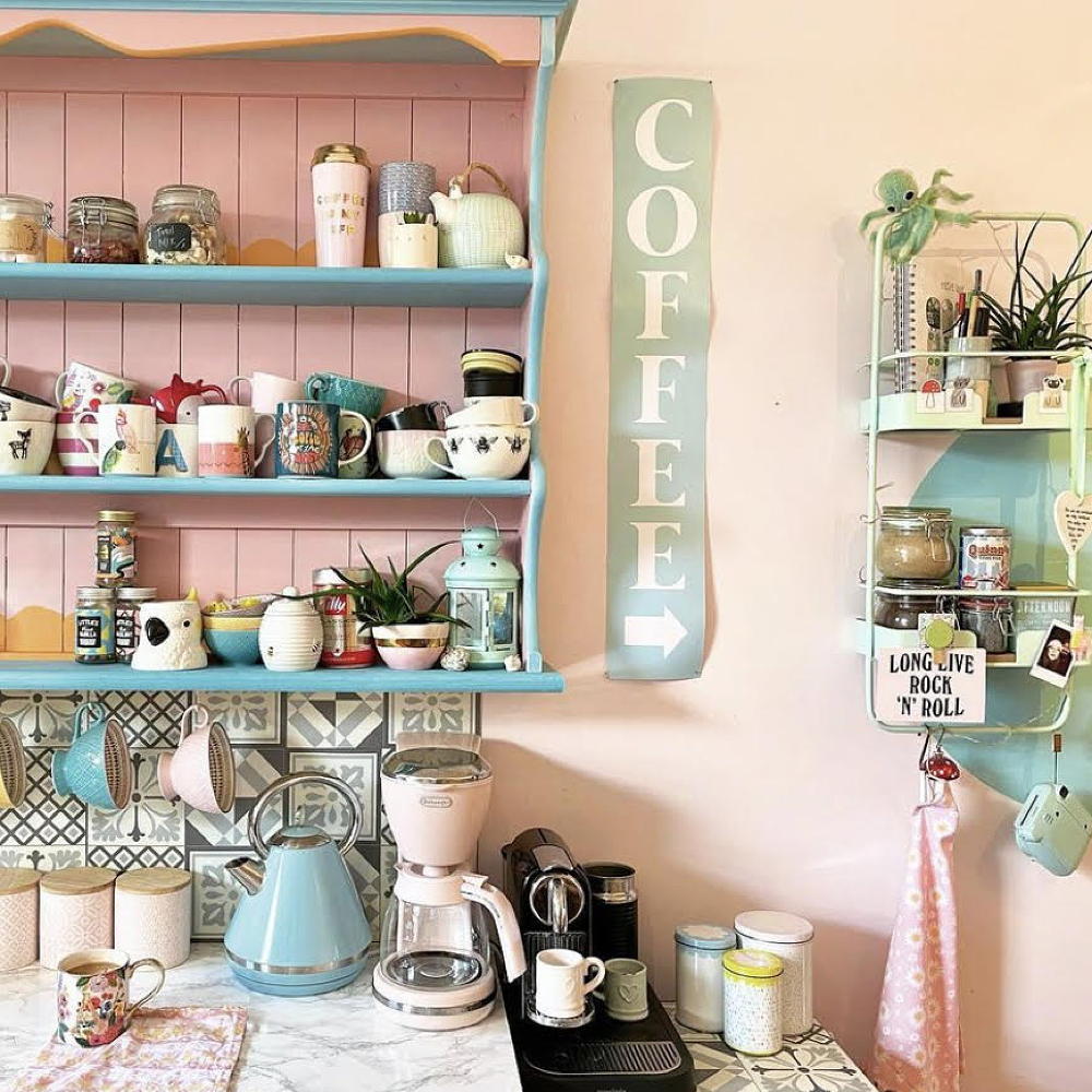 A dull kitchen was given an injection of colour and pattern for less than £250
Eye-popping pastels and gallery walls galore make this scheme pretty unique
By Laurie Davidson
-
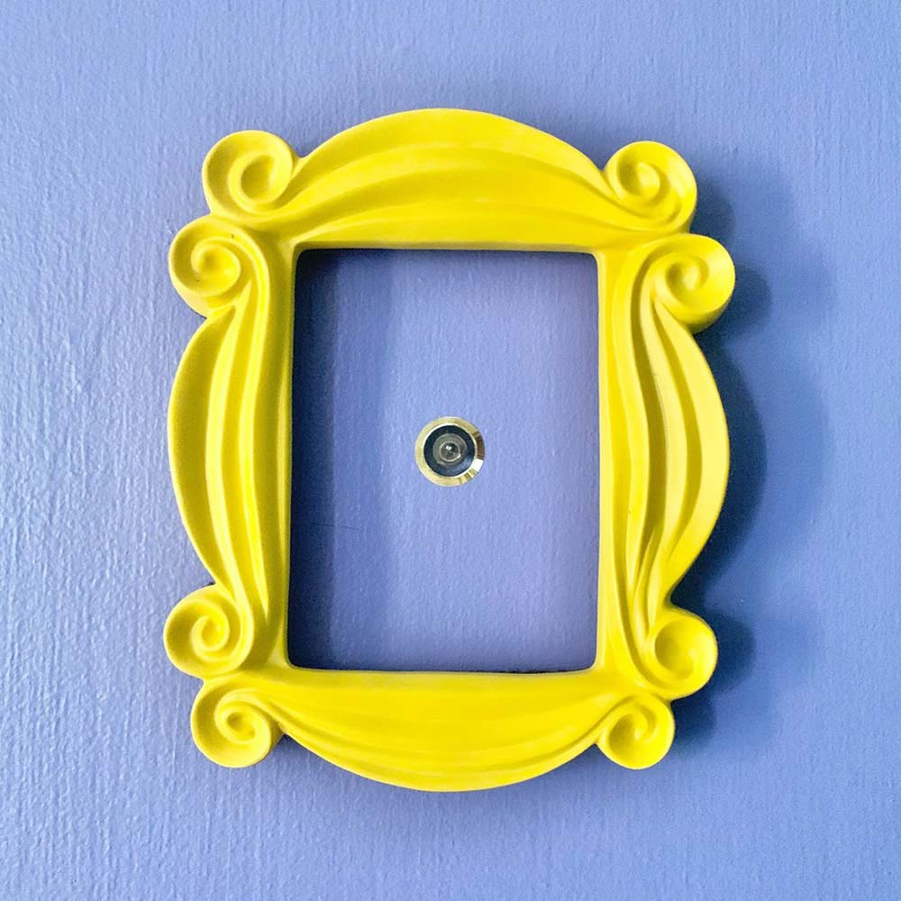 A DIY fan has recreated the Friends kitchen for less than £750
So no one told you renovating was gonna be this way...
By Millie Hurst
-
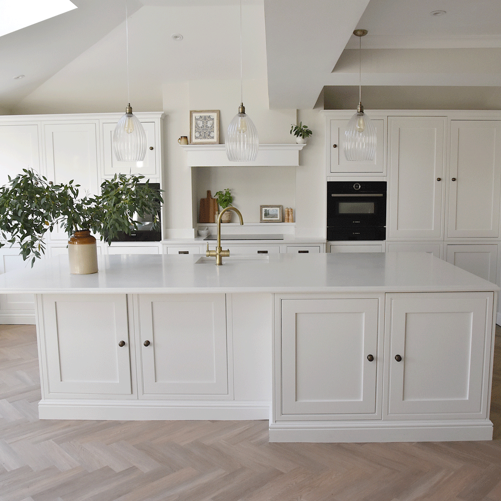 An interiors lover shares her stunning white kitchen makeover
It's now the kind of room you walk into and exhale
By Millie Hurst
-
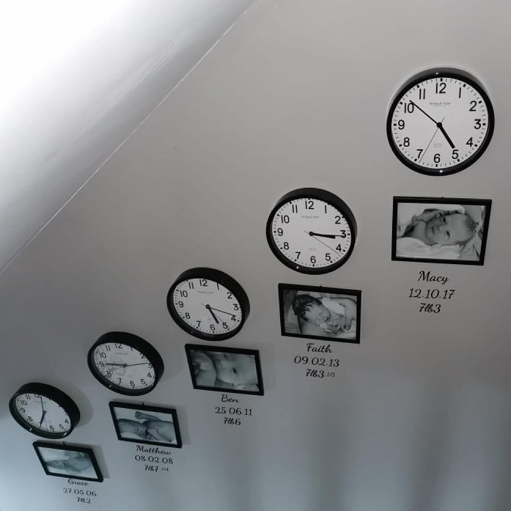 Mum created an adorable hallway tribute to her children for under £80
All it took was some wall clocks, frames and a bit of self-adhesive vinyl…
By Laurie Davidson
-
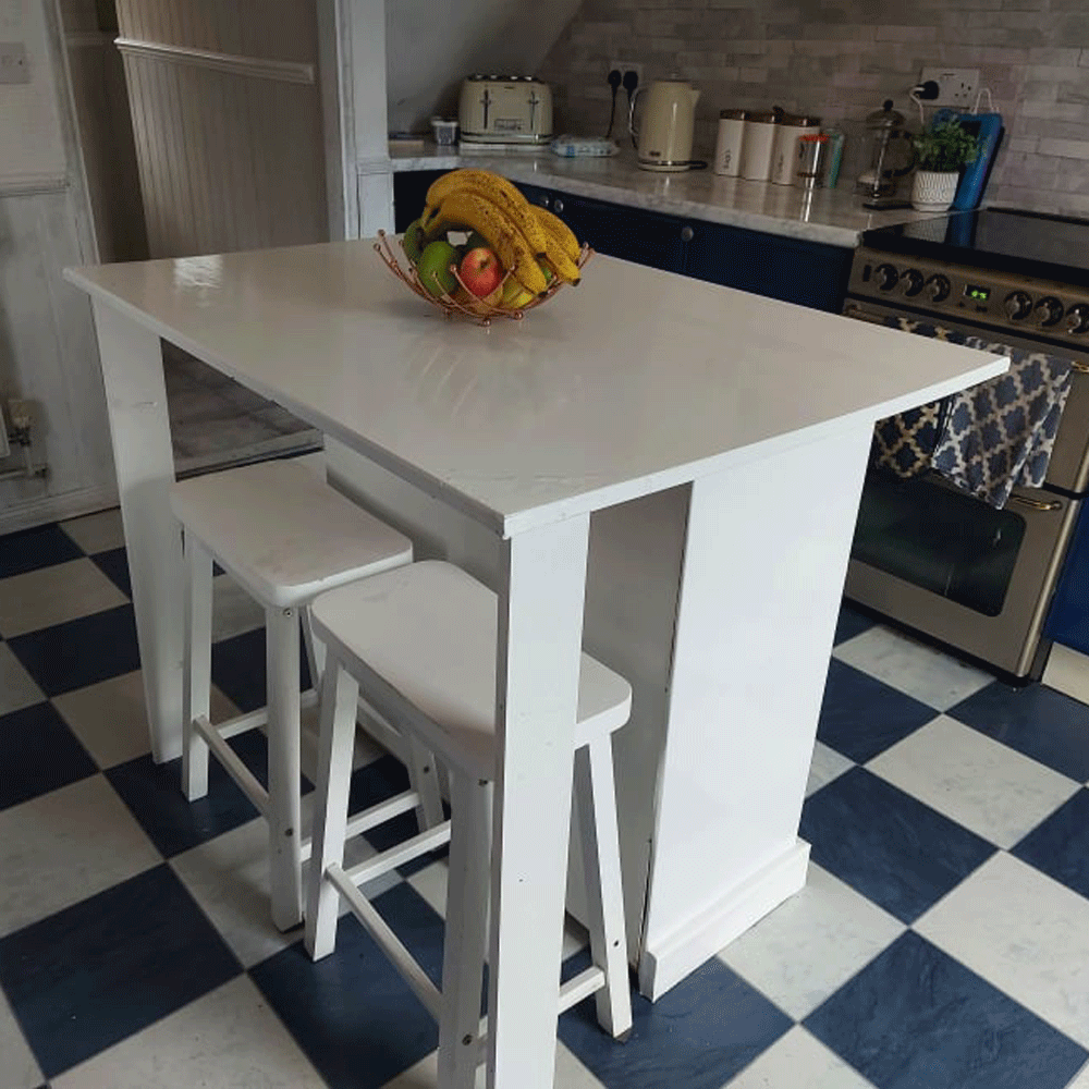 A thrifty DIY fan made a kitchen island for free out of an old set of drawers
'It took two days to complete and cost me nothing!'
By Millie Hurst
-
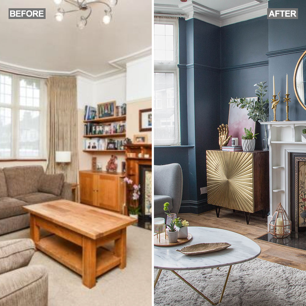 Before and after: A 'boring' neutral living room gets a glam and dramatic makeover
The owners took a risk and banished the beige...
By Amy Cutmore