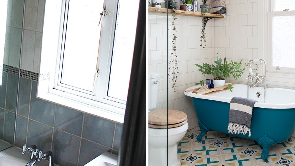
Before and after: mixing old and new has created a bright and beautiful bathroom
There's some cool and clever upcycling going on here

'We moved in 18 months ago knowing this place needed plenty of love and attention,’ says the owner of this three-bed Victorian semi i in Lincolnshire. ‘My partner and I wanted to stay in the area as we love it and were brought up here. Previously, we lived in a Victorian two- bedroom terrace on a busy road. We were planning to have children, so we needed more space.'
'We’d been looking for a while when we heard about this house,' she continues. 'My partner wasn’t very sure, as it was dark and dingy and needed so much work done to it. But I managed to convince him that it had everything we wanted.'
Get your space in order with more of our bathroom ideas
'In the bathroom at the back of the house, the layout was awful. The big problem was that you were staring at a brick wall from the doorway. There was no window in the back wall overlooking the garden and just a tiny one at the side of the house, where there was a small shower.'
'The bath was on the back wall so when we opened the door, it banged into the tub. The loo was straight in front of you, so that’s all you saw from the hall. The tiles were all dated and the floor tiles were brown, plus there was an enormous mirror, which just made the whole thing feel even more weird.'
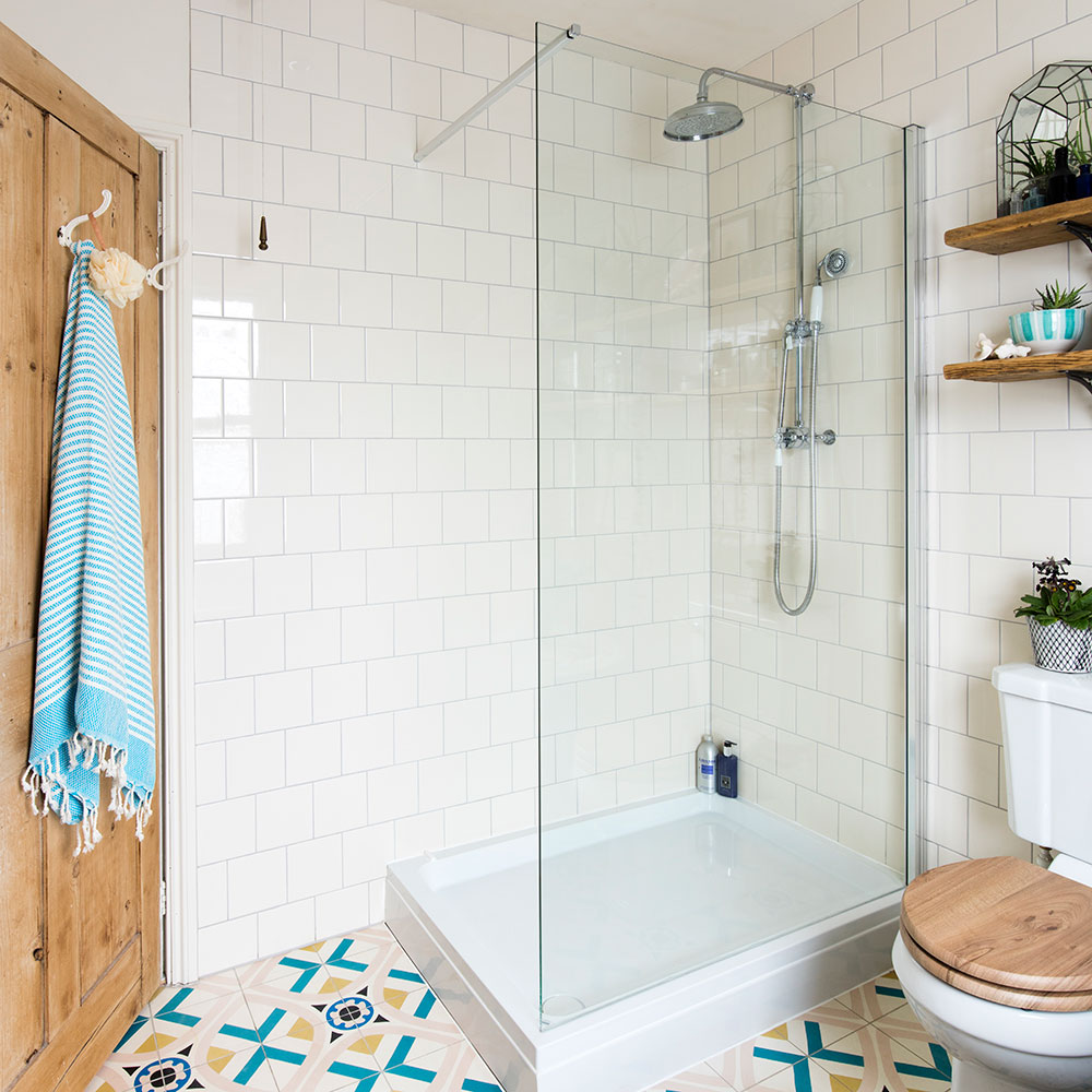
'We ordered a window in keeping with the age of the house for the back wall, to add some light. It’s not a bad-sized room, so we realised we could fit everything we wanted if we just arranged the layout differently.'
'There was space for a bath under the new window, and, if we blocked in the little window at the side, we could fit in a bigger walk-in shower. The loo could slot in next to that, with a basin unit on the opposite wall.'
Get the Ideal Home Newsletter
Sign up to our newsletter for style and decor inspiration, house makeovers, project advice and more.
Get the look
Buy now: Leap divider shower panel, £320, Mira Showers
Buy now: Flight shower tray, £175, Mira Showers
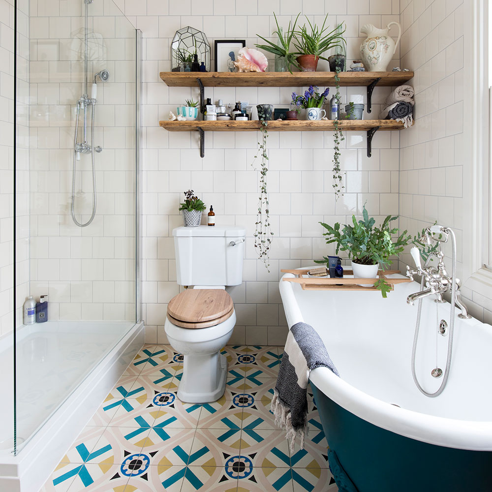
'Once the new window was in and the old one was blocked up, it made everything much better. We ripped out the existing fittings and it took us a day to smash up the mirror, as it was stuck to the wall.'
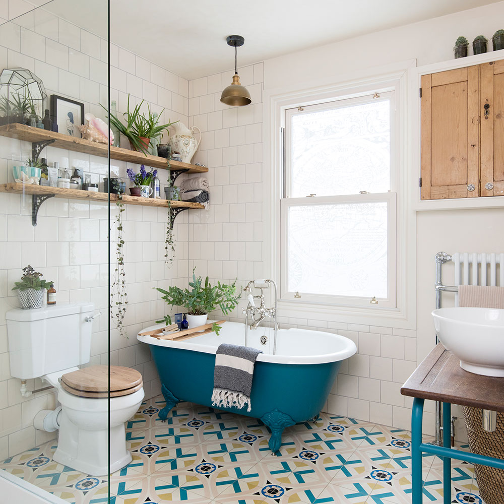
'I like an eclectic mix of old and new and didn’t want a contemporary look because of the age of the house. So we started with a roll-top bath, then we added a modern shower with retro-style fittings and a classic loo.'
Get the look
Buy now: Petite Millbrook bath, £875, The Cast Iron Bath Company
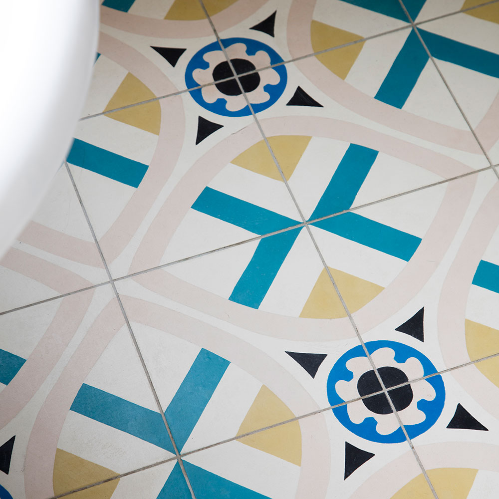
'I decided to go for dramatic floor tiles, smaller off-white wall tiles and a matching paint colour for the rest of the walls, as white would have been too stark. We bought loads of floor tiles, as they were great value. They were the key to the colour scheme.'
'I looked at the colours within the tiles – blue, pink, cream, yellow and black – and picked out the deep rich blue as my main colour.'
Get the look
Enquire online: Floor tiles, £81 per sq m, Mosaic del Sur
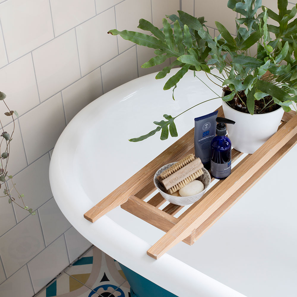
''I love Little Greene paints, so I found the nearest match, Marine Blue, and painted the outside of the bath with it, as well as an old mirror and the legs of the vanity unit.'
'A bath tidy is so useful on a roll-top tub,' adds the owner. 'I fill it with all my favourite things before I get in.'
Get the look
Buy now: Bath tidy, £49, The White Company
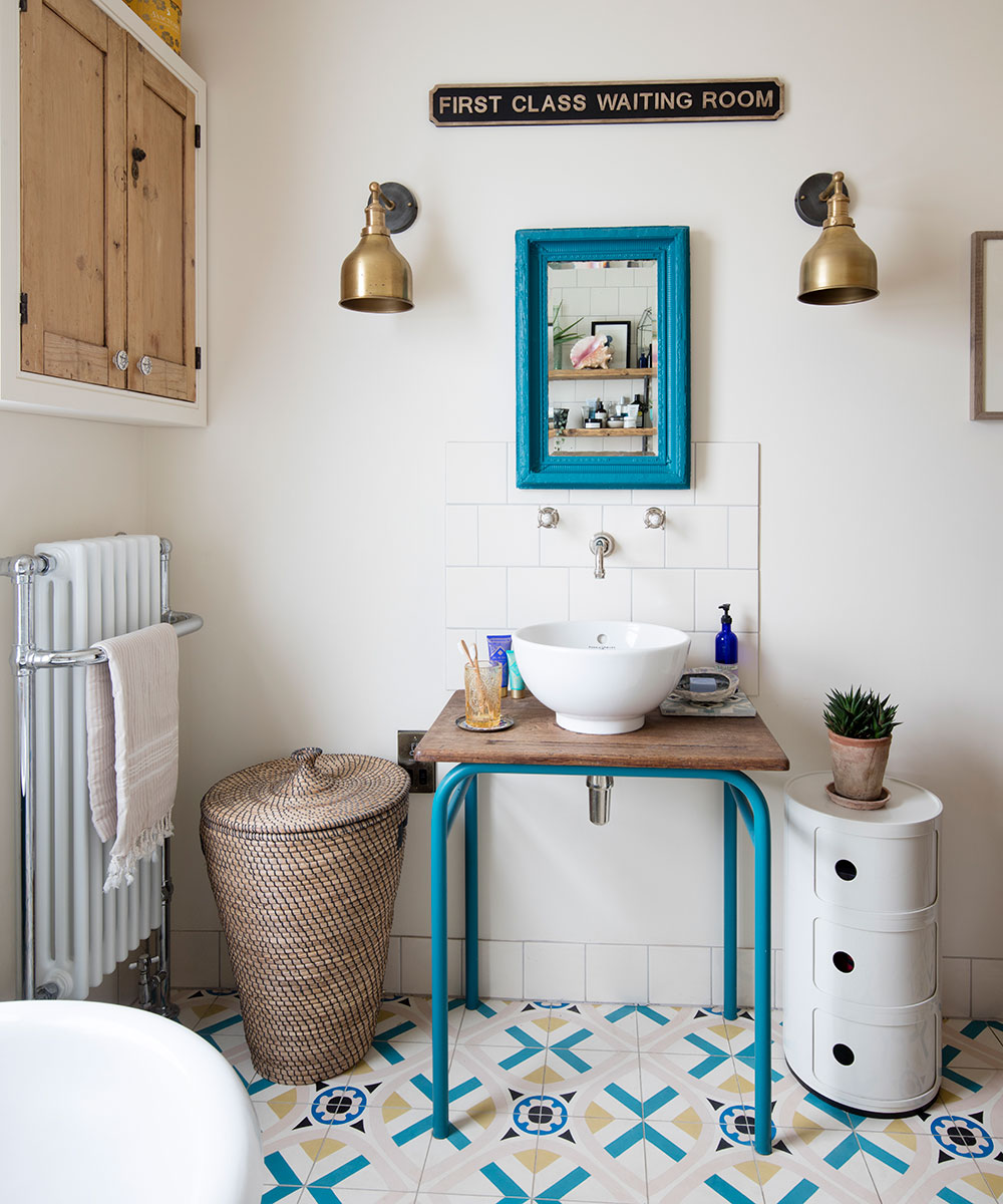
For the vanity unit, the couple wanted to do something different, so they found an old desk at an antiques market and fitted a bowl to it. The taps are set into the wall, which they were tiling, so there was room to hide the plumbing.
Related: How to upcycle a vanity unit – to create a super-stylish piece of furniture
Get the look
Buy now: Walls in Whitening intelligent matt emulsion, £48.50 for 2.5ltrs, Little Greene
Buy now: Vanity unit and mirror in Marine Blue intelligent eggshell, £62 for 2.5ltrs, Little Greene
Buy now: Perrin & Rowe table bowl, £293.53, Just Perrin
Buy now: Brooklyn cone wall lights, £79 each, Industville
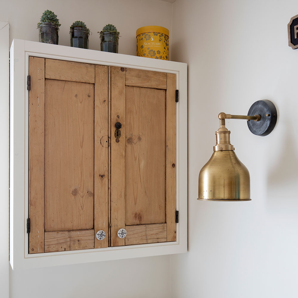
The owner saved one of the old kitchen cabinets to mount on the bathroom wall and just changed the knobs. 'It makes things personal and unique,' she says. 'That’s what I like to see in any space – a bit of individuality.’
More solutions: Wet rooms – the essential guide to creating the perfect shower space
'We've created a lovely, light-filled space with room for a proper walk-in shower and lots of our personality everywhere,' says the owner. 'We love it.'

Thea Babington-Stitt is the Managing Editor for Ideal Home. Thea has been working across some of the UK’s leading interiors titles since 2016.
She started working on these magazines and websites after graduating from City University London with a Masters in Magazine Journalism. Before moving to Ideal Home, Thea was News and Features Editor at Homes & Gardens, LivingEtc and Country Homes & Interiors. In addition to her role at Ideal Home, Thea is studying for a diploma in interior design with The Interior Design Institute.
-
 Move over, fences – dead hedges are the wild and wonderful alternative your garden will love and they're easier to build than you'd think
The perfect eco-friendly solution for small gardens
By Kayleigh Dray
-
 Did you know John Lewis can make your old curtains or rugs look like new? Their repair service is now available in all stores
John Lewis has added another string to its bow, and it's great news for your old homeware
By Kezia Reynolds
-
 This beautiful mixing bowl is the unexpected star of so many kitchens – including Mary Berry's and the Bake Off tent
This earthenware bowl proves that you don't have to spend a huge amount for a classic kitchen addition
By Molly Cleary
-
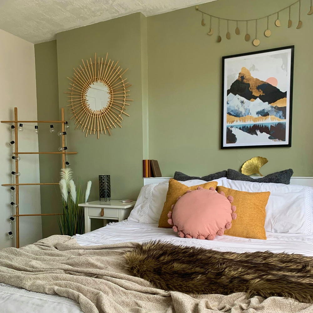 A £3 IKEA hack helped transform this bedroom into a scandi-inspired retreat
It's the ultimate thrifty makeover
By Laurie Davidson
-
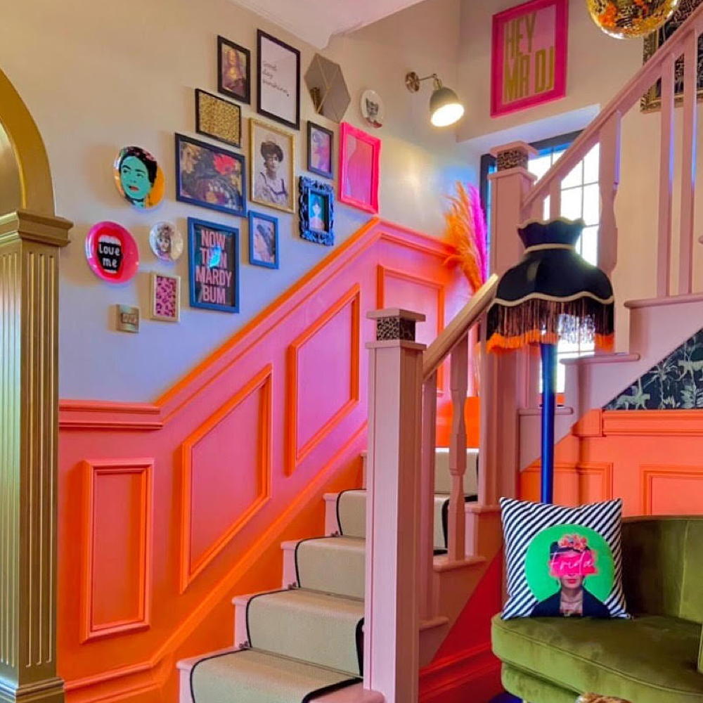 This colourful hallway makeover makes a bold first impression – it’s stunning!
It's a little bit extra and a whole lot of fun
By Laurie Davidson
-
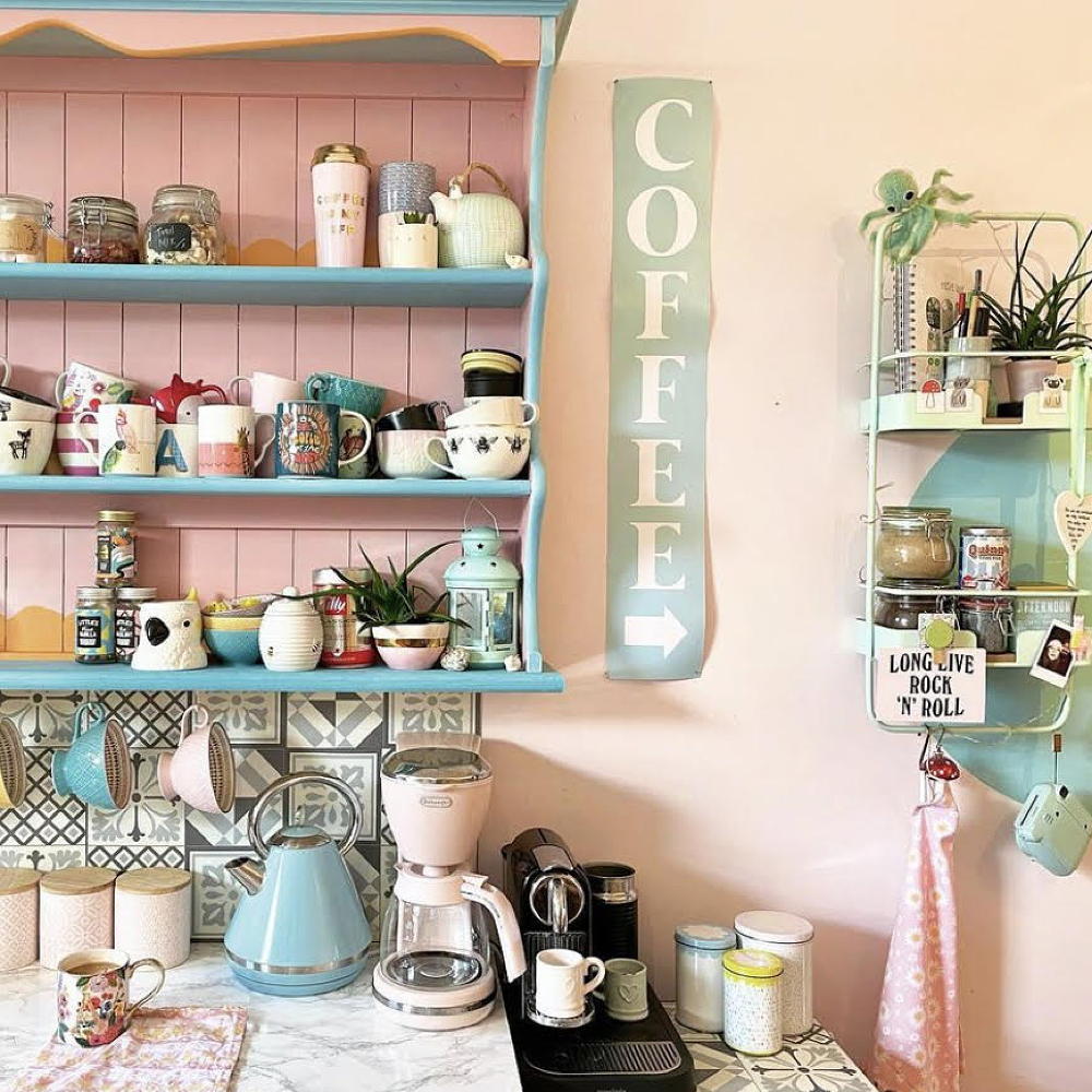 A dull kitchen was given an injection of colour and pattern for less than £250
Eye-popping pastels and gallery walls galore make this scheme pretty unique
By Laurie Davidson
-
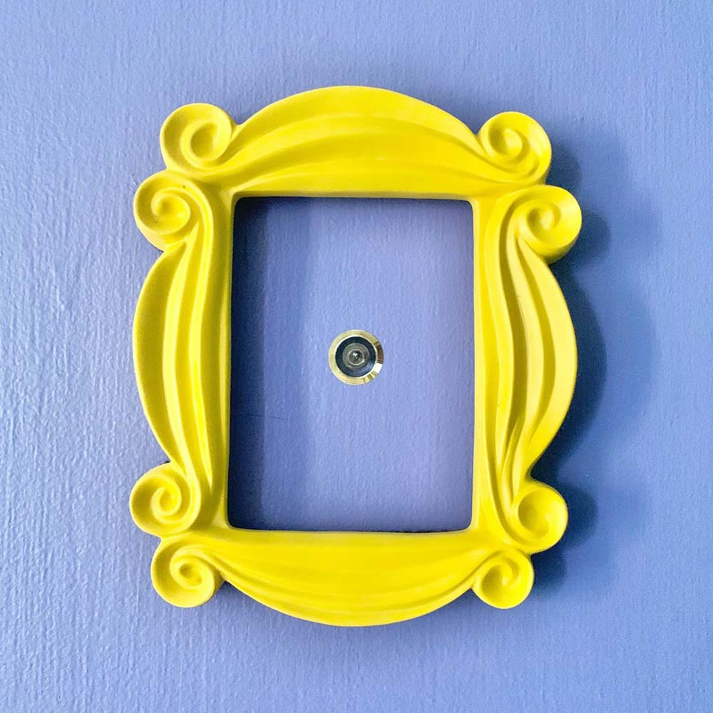 A DIY fan has recreated the Friends kitchen for less than £750
So no one told you renovating was gonna be this way...
By Millie Hurst
-
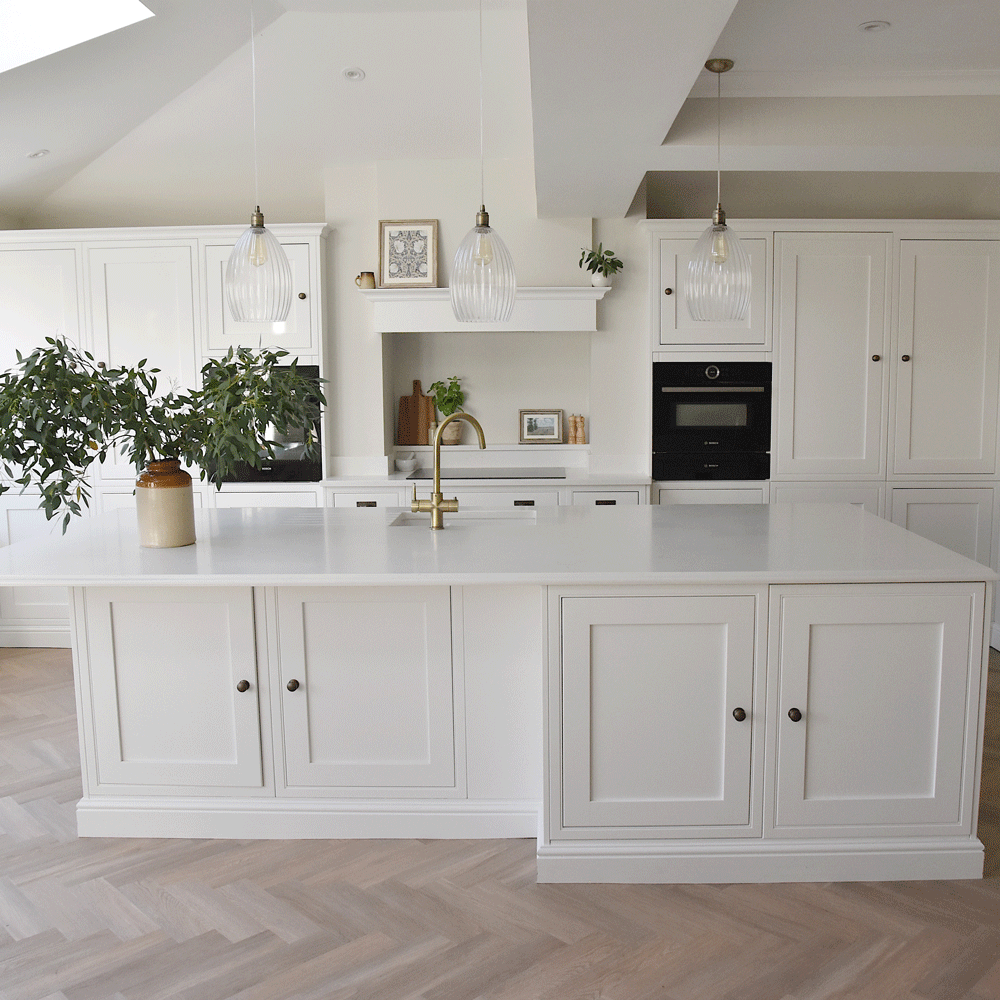 An interiors lover shares her stunning white kitchen makeover
It's now the kind of room you walk into and exhale
By Millie Hurst
-
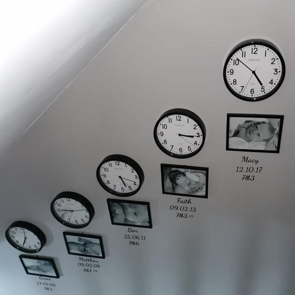 Mum created an adorable hallway tribute to her children for under £80
All it took was some wall clocks, frames and a bit of self-adhesive vinyl…
By Laurie Davidson
-
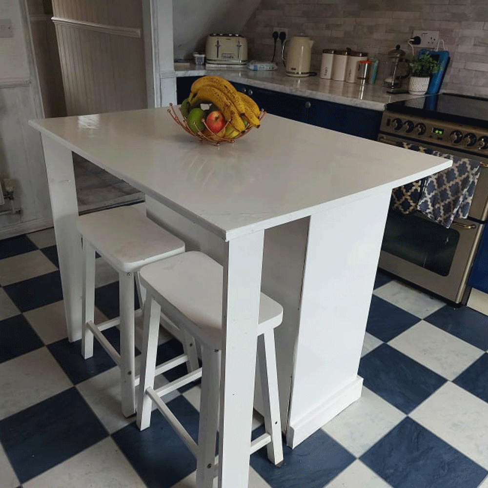 A thrifty DIY fan made a kitchen island for free out of an old set of drawers
'It took two days to complete and cost me nothing!'
By Millie Hurst
-
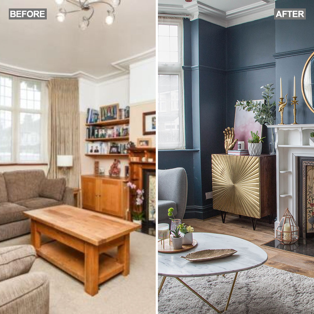 Before and after: A 'boring' neutral living room gets a glam and dramatic makeover
The owners took a risk and banished the beige...
By Amy Cutmore