I'm a home stylist and this is how I made the most of my small shower room with some clever design tricks
How I achieved a light-filled bathroom that feels far from cramped
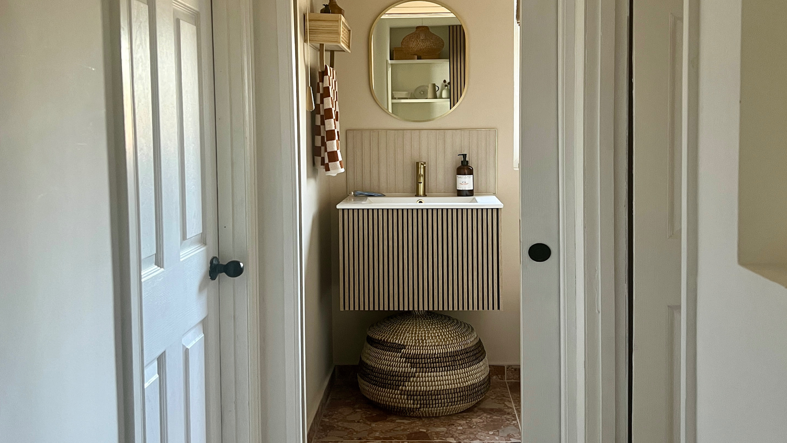
Over the last year I've been in the process of an upstairs extension. However, while the renovation gave me two new bedrooms, it also landed me and my boyfriend with a tricky small space that I embarked on turning into a petite bathroom.
As an interiors expert and home stylist, I'm a dab hand at quickly turning an uninspiring room into something special. However, even with all my experience of styling rooms to magazine shoots even I can be stumped by small spaces in my own home.
Bathrooms are notorious for not always being the largest of rooms, and this one measures 2.4 x 1.4m. My first choice was to install a pocket door which slides into the wall, reclaiming a little more space for my tiny bathroom.
But when it came to planning out the rest of the space there were a few questions my boyfriend and I needed to ask ourselves. Although a bath and shower would have just about fit, would they look too squashed? Did I need to implement some small bathroom flooring ideas? And what about bathroom storage ideas?
If you're in a similar dilemma and are trying to maximise every last inch of a small bathroom, these are my top tips for getting the most out of your room…
1. Choose a shower or bath
I've styled many bathrooms over the years and something that's pretty common is the age-old shower or bath question. Which is more useful? Should you substitute one for the other or try and cram them both in?
The downside to that is it can often leave you with a tiny bath that's not your roll-top of dreams, or a shower cubicle that's so small you find yourself banging your elbows as you wash your hair!
Get the Ideal Home Newsletter
Sign up to our newsletter for style and decor inspiration, house makeovers, project advice and more.
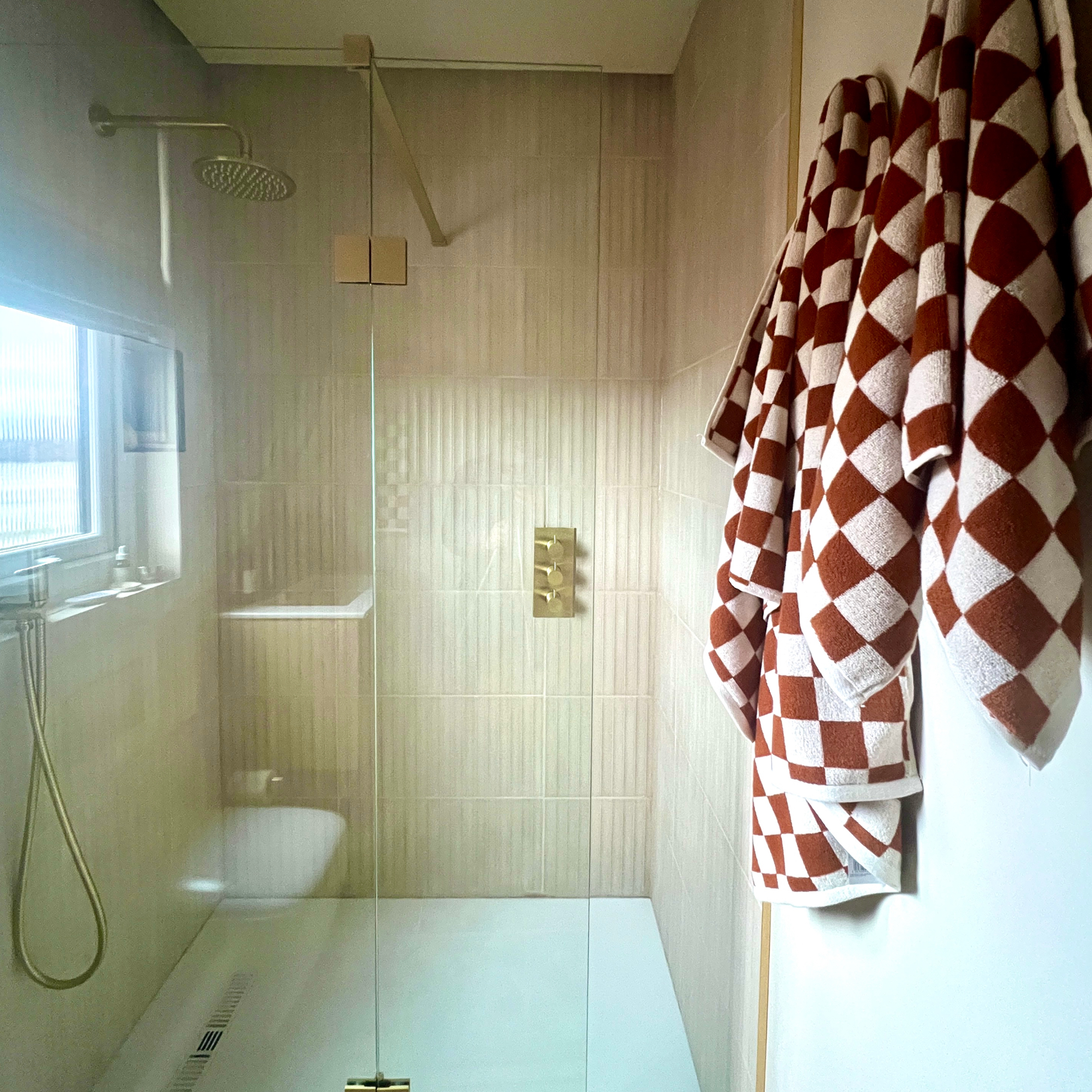
Luckily, as we have a bath in our main bathroom, I could concentrate on designing this as purely a shower room, allowing us to go for a decent-sized walk-in shower. We chose a Vito shower tray from Crosswater, which is ideal, along with a brass shower head that came as part of a shower bundle.
You'll notice we made sure the shower valves aren't directly under the shower head – so you can turn it on and wait for it to warm up before getting under the water! It's a small thing but little details like these are important.
I'm also really pleased we went for this pivot shower screen from Homebase, which is great for keeping any water from splashing out if you're having a walk-in shower. You can have the end folded in to create more room or folded right out when showering.
2. Go for wall-hung furniture
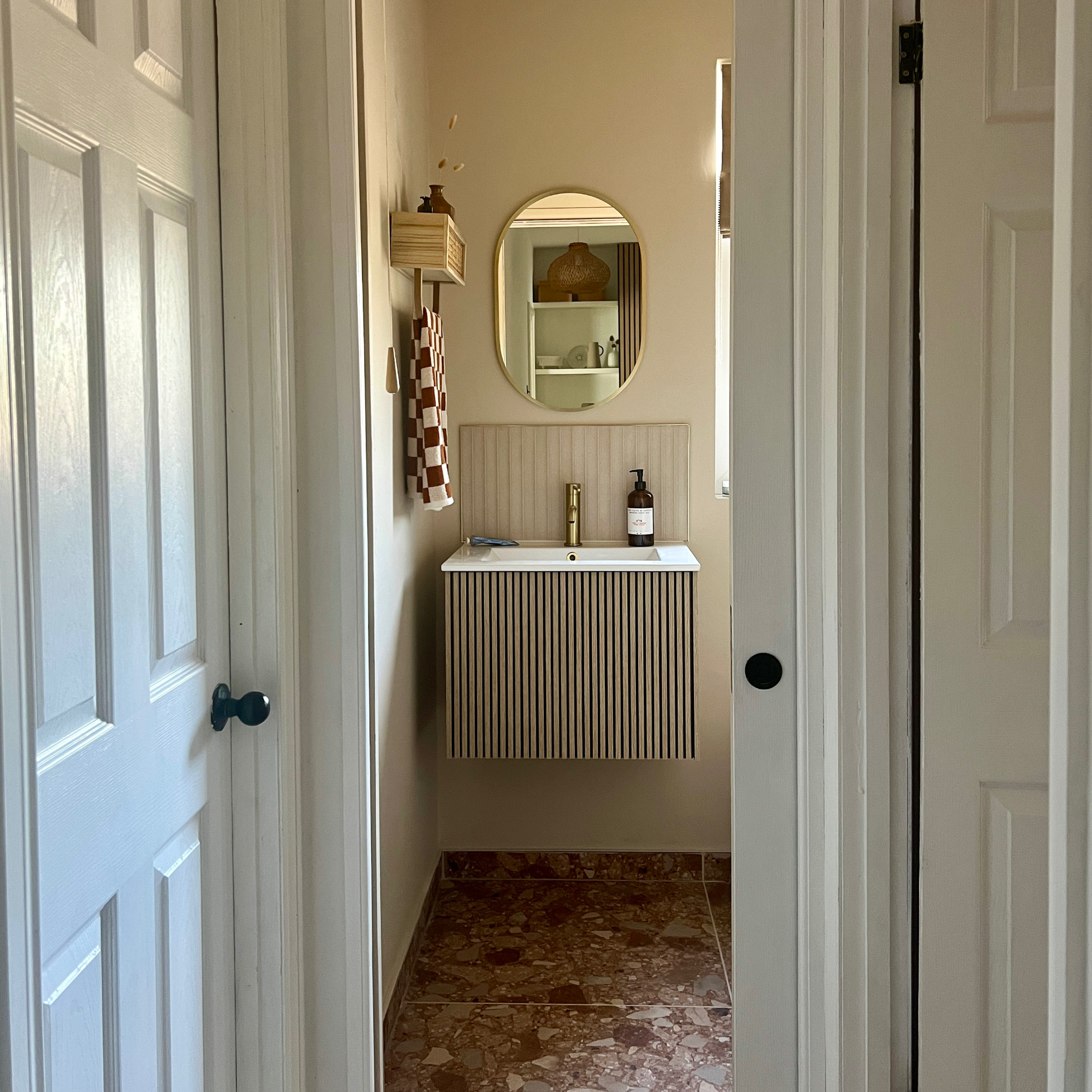
Wall-hung furniture was a no-brainer – I wanted to see every inch of floor space in order to make the room feel as large as possible. Trying to find a vanity that we liked took some time, until I discovered this Limit single-drawer unit from Crosswater, with its stylish fluted wood design and push-to-open drawer.
I'd say this was the starting point for the scheme actually – once I'd seen this design, I knew I wanted some elements of wood in the room to complement the light colourway we were going for. Plus it wouldn't take up too much space or look bulky in the room – and had storage in it too! The basin sits flush with the vanity, which means there's room for a hand soap on top.
3. Find a slimline toilet design
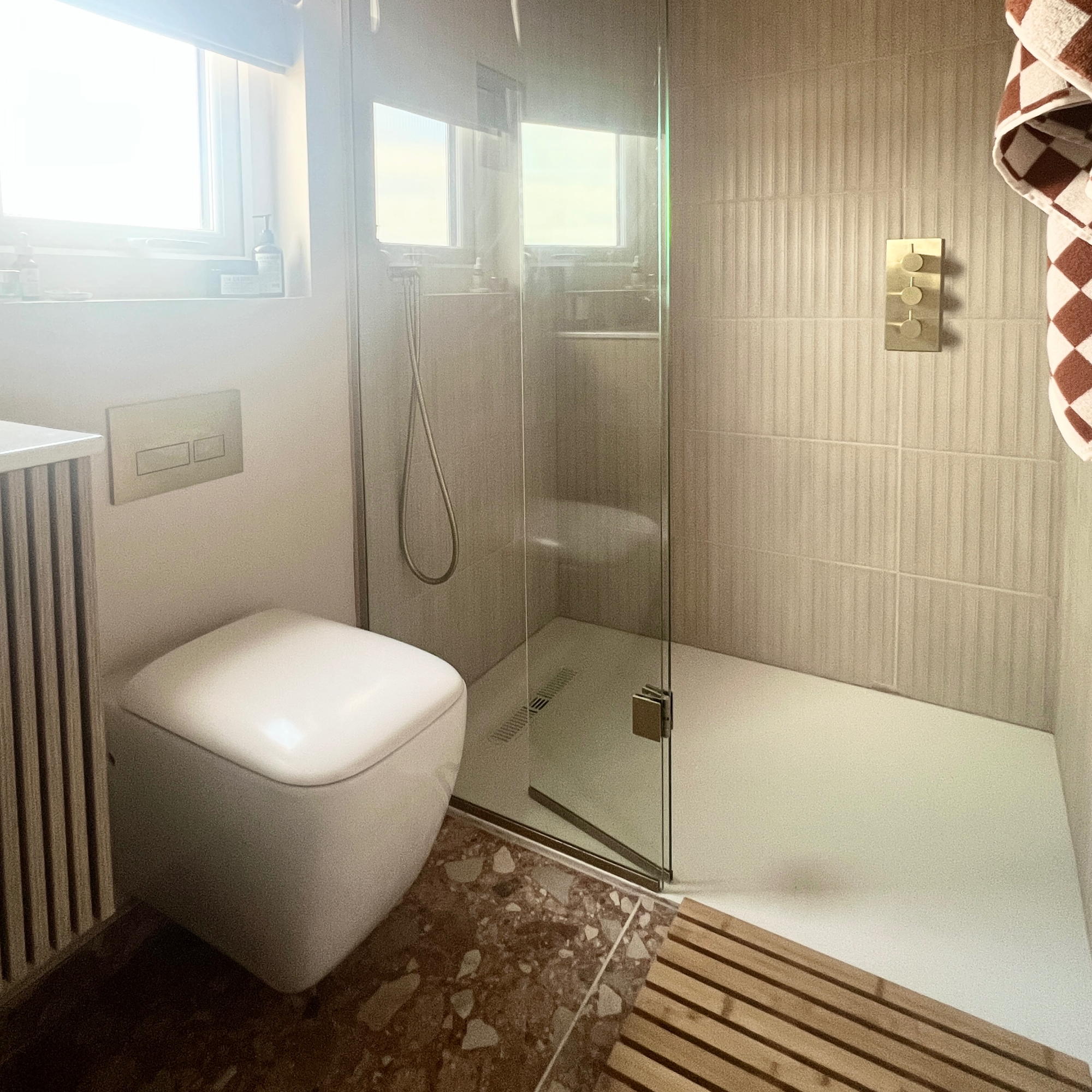
Another wall-hung piece that we took care to choose was the toilet. So many designs wouldn't have left us much room between the vanity and shower cubicle, and we didn't want the toilet to be the focus, when it's such a small space.
Instead, we went for Homebase's slimline Bathstore's Cedar wall hung pan and Bathstore toilet frame for a neat, streamlined finish. Having the frame means we could hide the cistern within the wall. I also like the shape of this loo as it makes it easy to clean around it.
4. Factor in storage
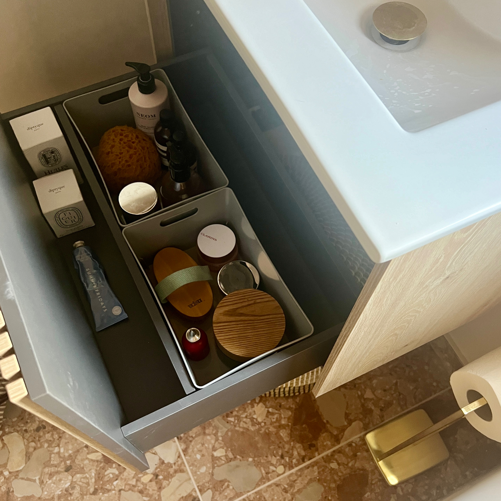
Storage in a small bathroom is really important. Get it right and it will blend into your scheme, giving you space to put everything. Get it wrong and you'll end up with either big bulky wall units or having to leave toiletries out because you have nowhere to put them! With this in mind, I knew I could fit most of the toiletries I needed in the vanity unit, which has a good-sized drawer and I bought some mini baskets to put inside to keep things neat.
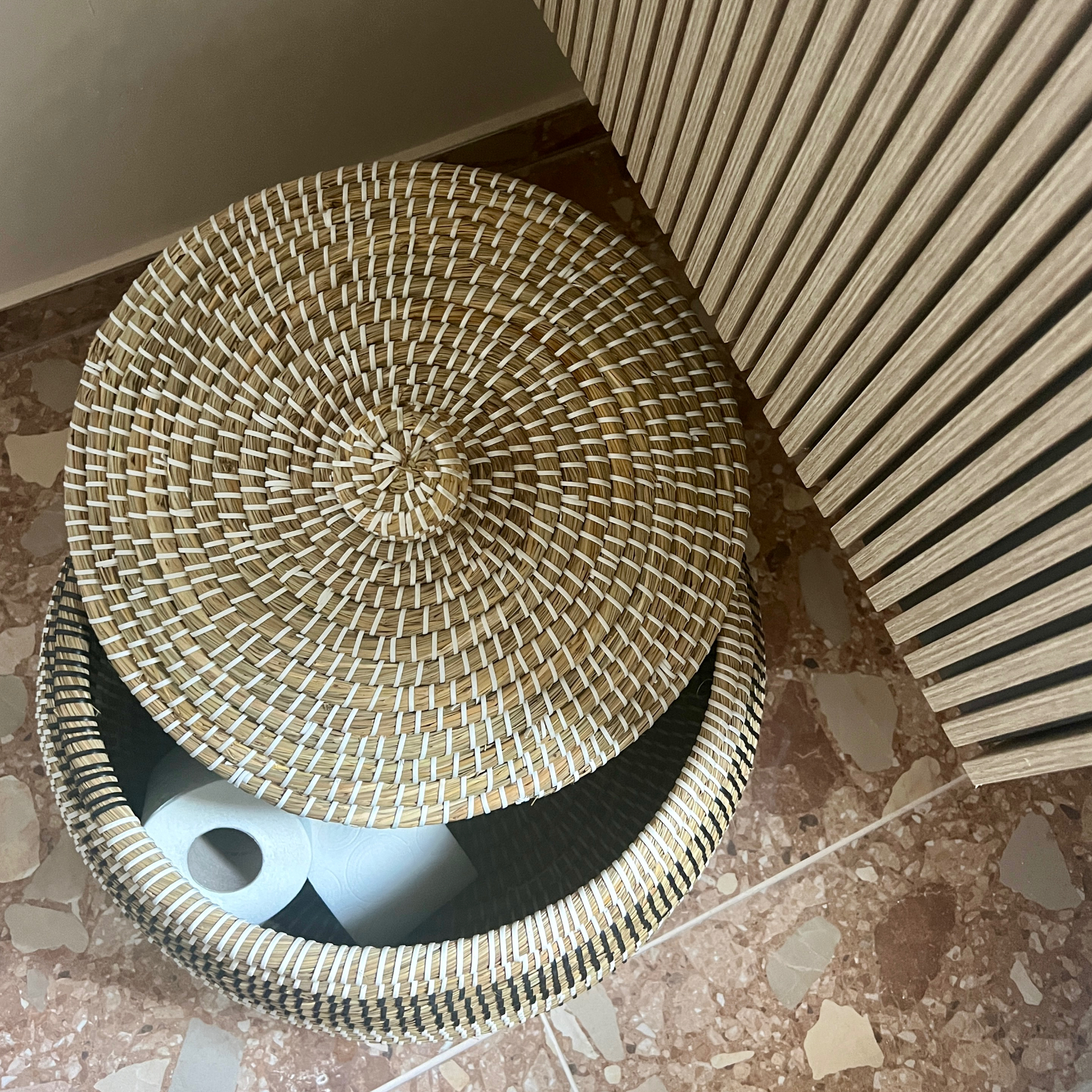
I also bought an Ali Baba-style basket that fits neatly underneath the vanity, which I use to store toilet rolls and anything else that doesn't fit in the vanity. Because it's decorative, it doesn't strike you as a big storage piece and the woven design works with the other natural materials in the room.
5. Pay attention to lighting
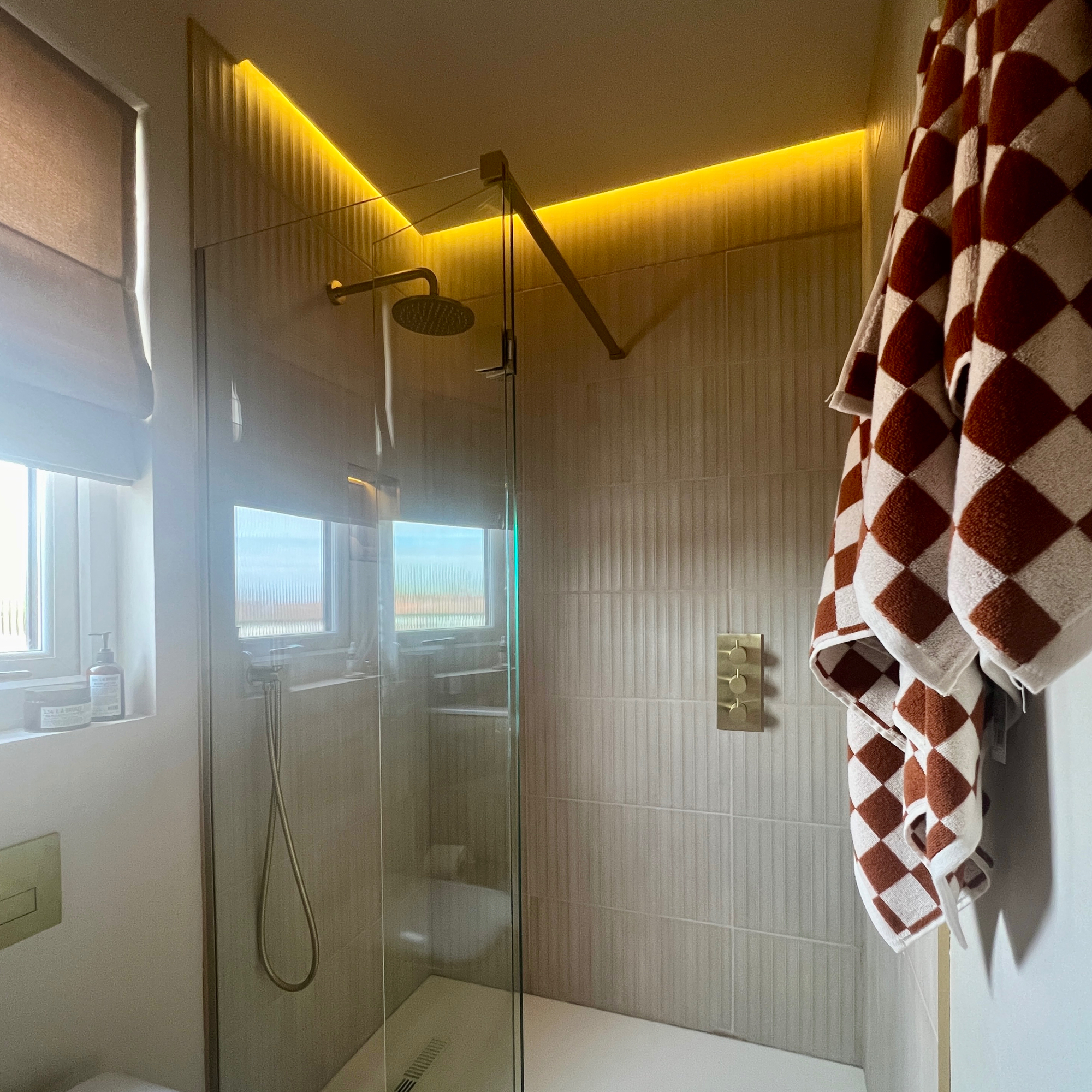
Having a small space doesn't mean you can't add in some swish features. Think of a chic hotel bathroom, for example, where there's no compromise on style whatever the size. Many include not only luxe fittings but clever lighting, too.
We decided to lower the ceiling by about two inches to create a recess, which we filled with LED strip lighting, which also filters down into a recess shelf in the shower. The reason we did this was to create some ambient lighting and it's really nice to have that instead of the main spotlights sometimes. It's controlled by a remote, so it's easy to turn on and off if and when we want it on.
6. Add interest with wall accessories
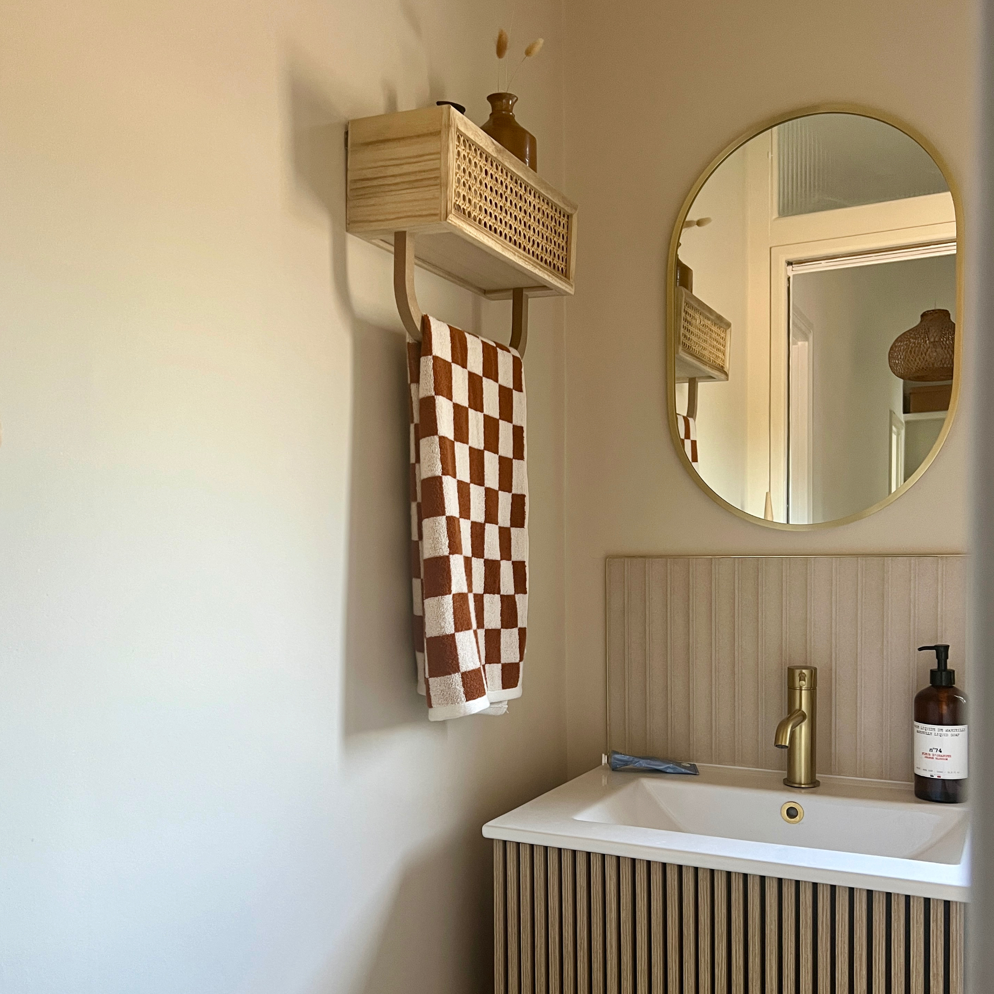
Leaving the walls clear of units gave the room a much more open scheme and I was keen not to fill them up with accessories. However, I still wanted to add some interest, so I went for a couple of small accessories that in my opinion make a big difference.
The first is this sweet little shelf from Dunelm, which I bought to store extra toiletries and double as a towel rail. Hanging it next to the sink means it's handy for having a hand towel close by when you've washed your hands.
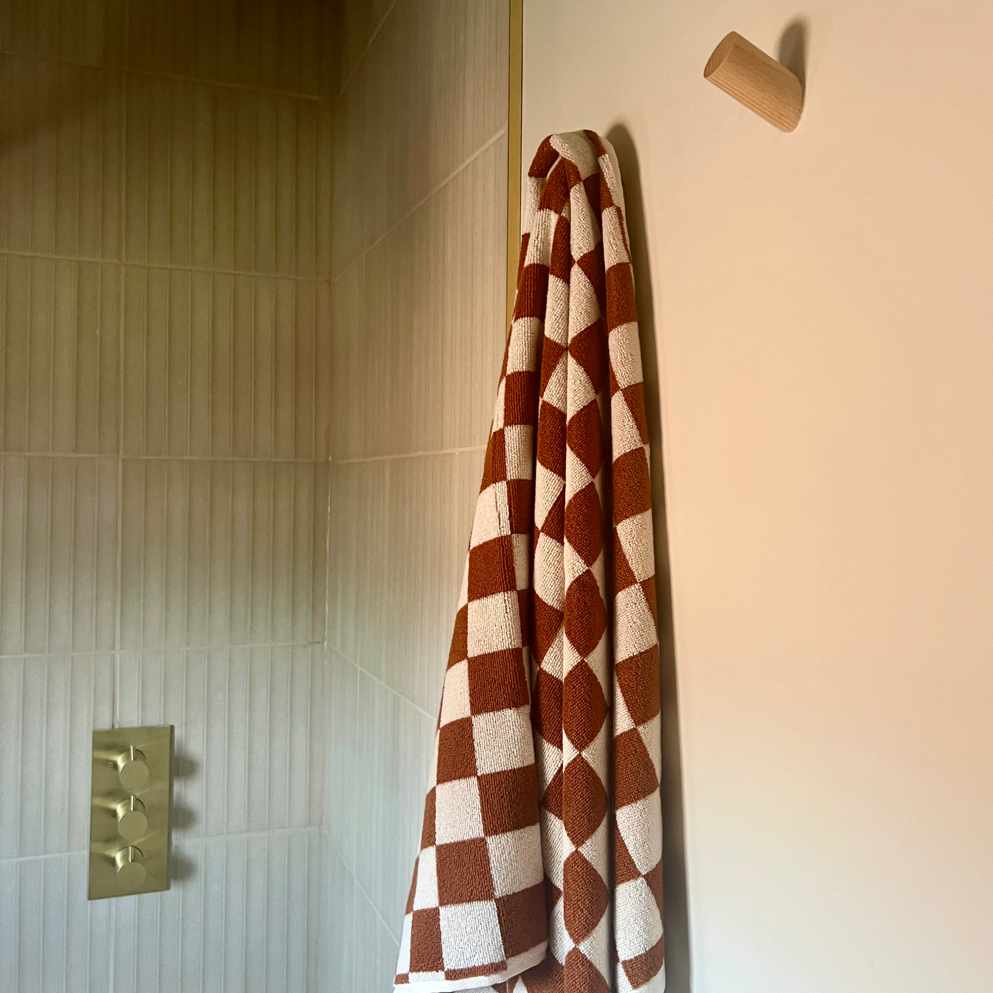
We also hung some wooden wall hooks from Amazon. Now – and this is probably quite controversial – I decided against having a heated towel rail and so these wall hooks are for the towels. The reason being that a) towel rails take up space and although we could have fitted one in, it would have made the room feel more busy, and b) as it's only really going to be for guests, I don't necessarily need one to dry towels each and every day.
7. Select interesting tiles
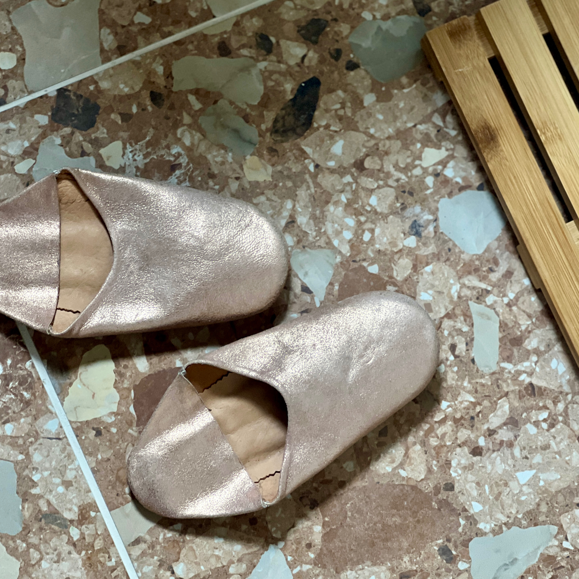
When I first decided to go for a neutral scheme in here, I didn't want it to be boring. So how do you bring in interest when you're going for light colours? With pattern and texture – which is where the bathroom tile idea came in.
I fell in love with these Chunk Brown Big Chip floor tiles from Claybrook instantly, with their shades of toffee and terracotta and terrazzo look. The tiles are a large size, which means we have minimal grout lines and get to see more pattern. In fact, I love them so much I just wish we had a bigger room to show them off more!
We used them on the floor and then also used them as upstands, so they flow slightly up the bottom of the walls.
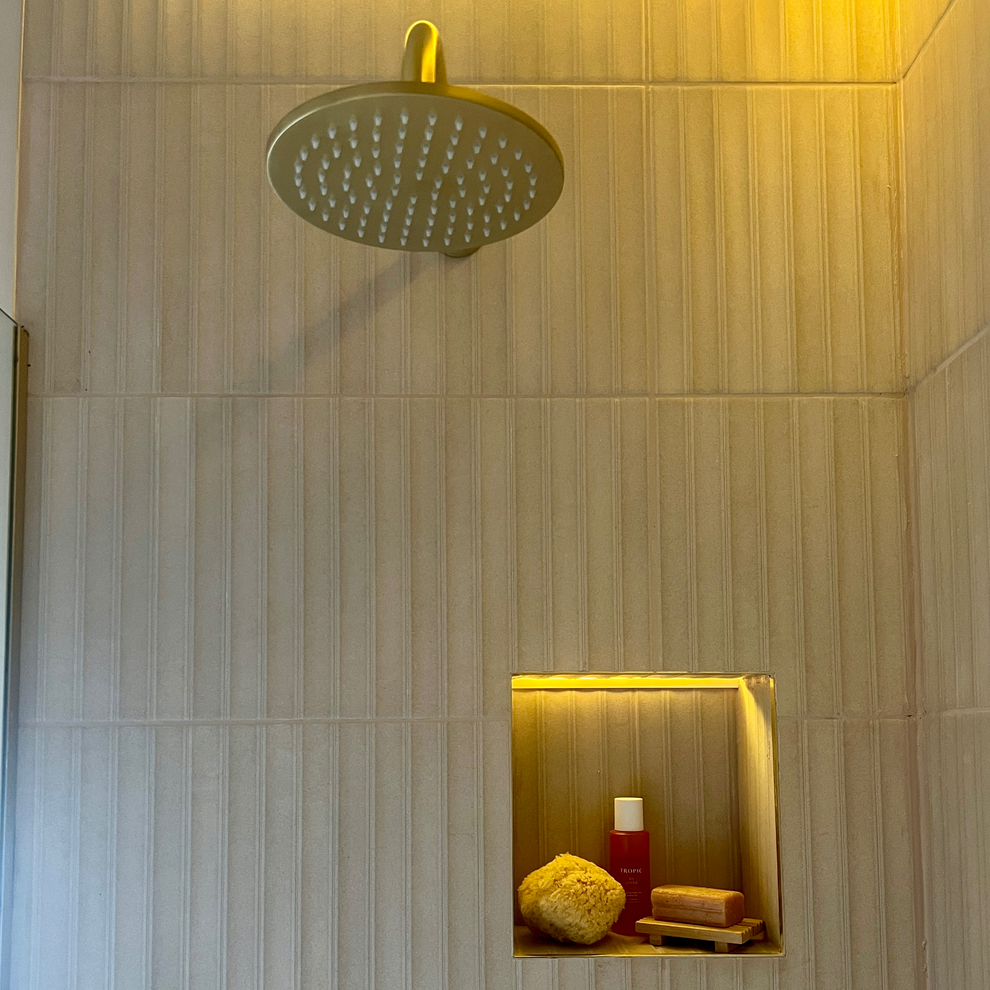
Because I'd gone for a patterned floor, I was keen to keep the walls pattern-free but still introduce some visual interest with a textured design. These Locke Almond Decor tiles from Porcelain Superstore are ideal as although they're a light creamy colour, they have a concave channel design to them.
The tiles can be hung vertically or horizontally, but we chose to have them hung vertically to echo the wood fluting lines on the vanity. We also used them in the alcove, which you can see here, but built them up very slightly so the water drains out of them and doesn't gather. They're simple but classy.
And there you have it – my tips for making a small shower space work hard for you.

Laurie Davidson is a professional stylist, writer and content creator, who lives and breathes interiors. Having worked for some of the UK’s leading interior magazines, styled homes up and down the country and produced sets for TV shows, adverts and top brands, it’s safe to say Laurie has had a pretty exciting career. Find her on Instagram at @lifeofaninteriorstylist or over at lauriedavidson.co.uk
-
 5 brilliant budget alternatives to paving slabs that won't cost the earth
Looking to pave your garden on a budget? Try these stand-ins...
By Sophie King
-
 Want to cook like Jamie Oliver? Here's the top-rated pan from his collection
Jamie's collaboration with Tefal has led to this casserole dish getting the best user reviews I've ever seen
By Molly Cleary
-
 7 best colours to paint a windowless bathroom that will transform the mood of a dark wash space
A bathroom without a view needn’t sink your plans for a warm and welcoming retreat
By Linda Clayton