Could the layout of your bedroom be ruining your rest? Here's what you should be doing instead
The expert guide to crafting a perfect layout for promoting sleep
Sign up to our newsletter for style inspiration, real homes, project and garden advice and shopping know-how
You are now subscribed
Your newsletter sign-up was successful
If something's feeling a little bit 'off' in your space, you might find that you've been making bedroom layout mistakes. In fact, they can be deceptively easy to overlook when planning the room.
After all, every size of bedroom ideas can fall prey to these mistakes. If the room is small, it’s easy to overcrowd it, making it tricky to navigate. If it’s a bigger space, it’s easy to fall into the trap of wasting the square footage by arranging the furniture poorly and having no clear divisions, leaving the room looking sparse and soulless.
Bedroom layout mistakes
The bedroom should be an oasis of calm, but often it’s crammed so full of items that it is anything but.
Article continues below‘In our hectic age, an era of constant connectivity, creating bedrooms to be a calm space where we can retreat and sleep well is so important,' says Mark Winstanley, chief creative officer at The White Company.
To help you regain this sense of calm and avoid living with bedroom layout mistakes, we’ve reached out to the experts, from Feng Shui advisors to interior designers and sleep therapists. Here's what they had to say...
1. Overlooking traffic flow
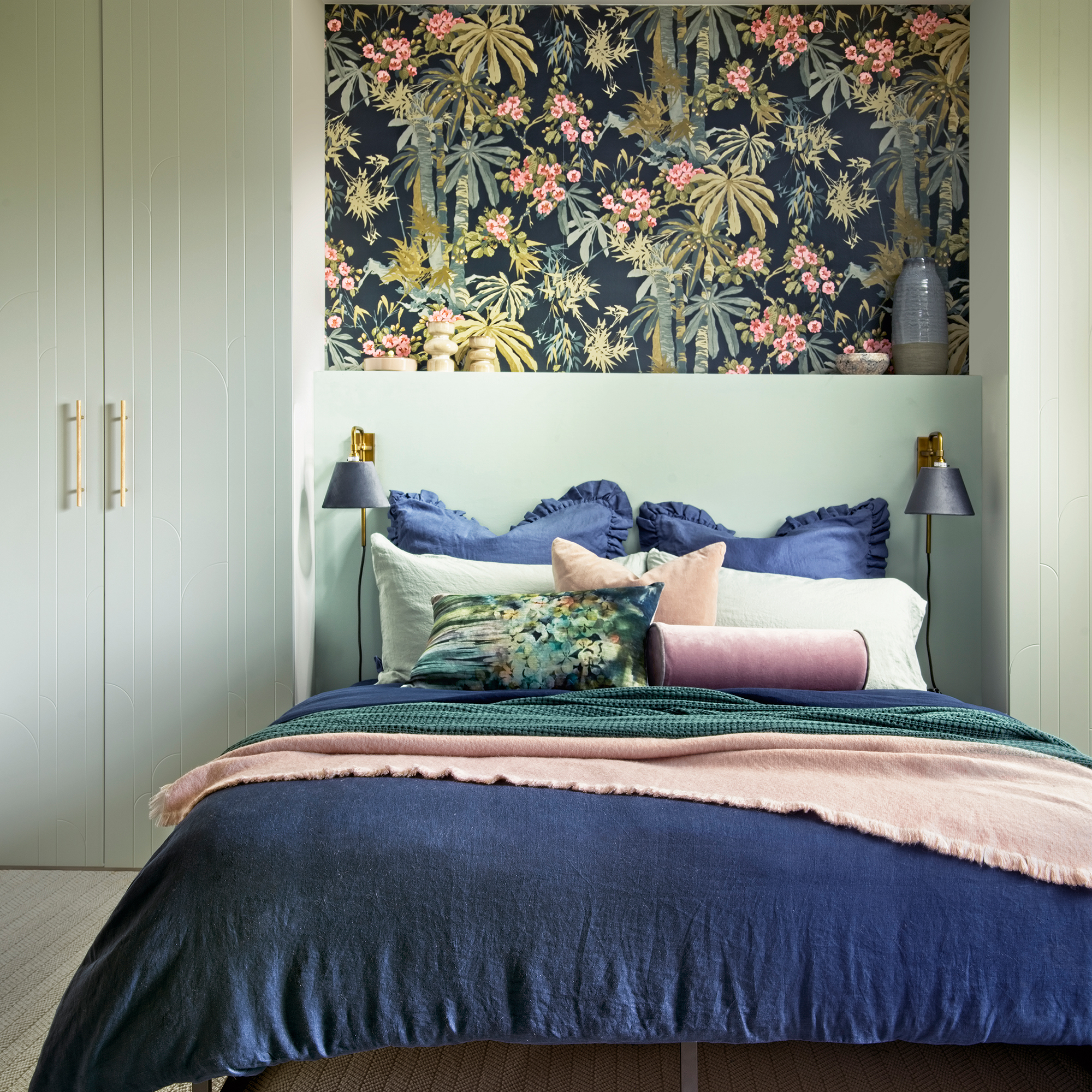
When visualising an ideal bedroom, a symmetrical space no doubt springs to mind. And whilst symmetry is of course important for arranging bedroom furniture, it shouldn’t come at the cost of manoeuvrability, especially when it comes to where you put your bed.
'Placing the bed too close to walls, furniture, or other objects can make the room feel cramped and hinder movement,' points out Sophie van Winden, co-founder of Owl Design. It's important to leave enough space around the bed for comfortable access and circulation. Catching your ankle on a bed leg is a horrible way to start the day!’
Sign up to our newsletter for style inspiration, real homes, project and garden advice and shopping know-how
Always consider the paths of travel when laying out your bedroom. If pathways seem too narrow with your current furniture, look into getting bespoke built-ins that will utilise every inch of space from floor to ceiling. And if that’s not an option, go for slimline storage furniture – every extra inch counts.
2. The wrong storage options
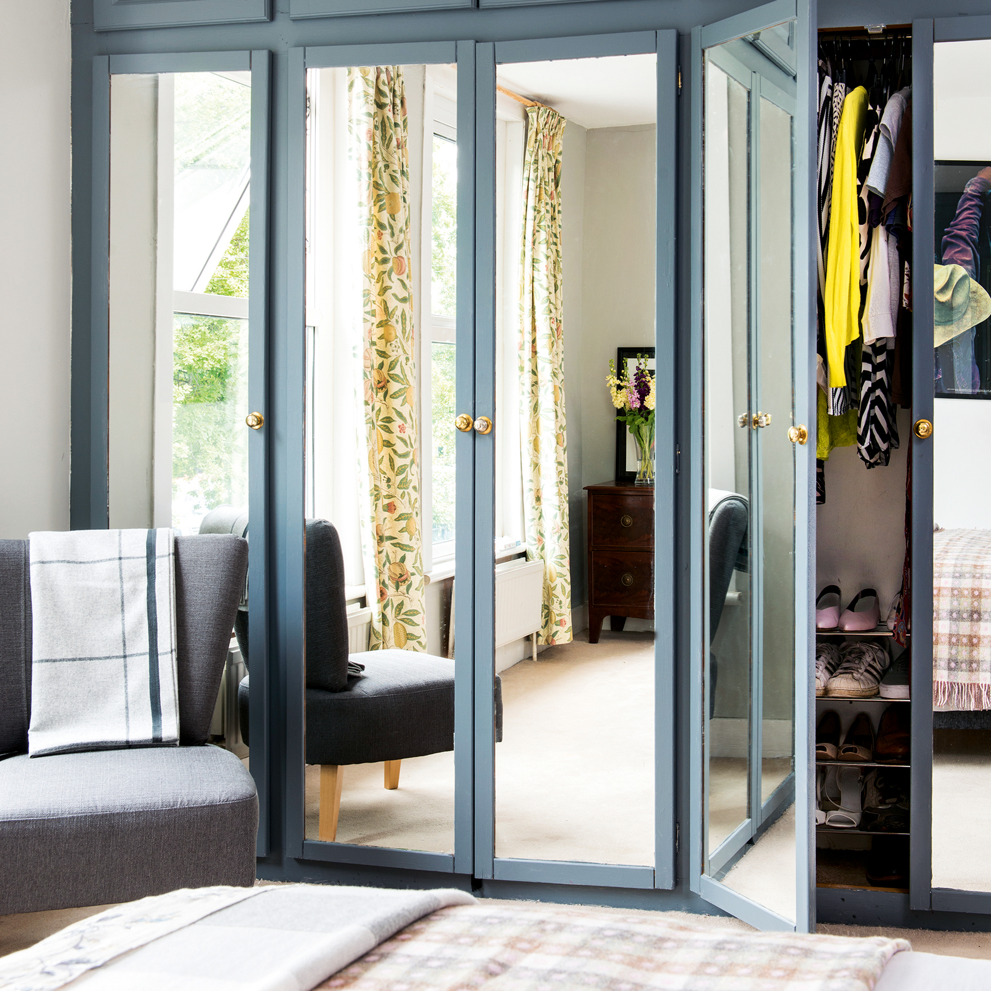
Open shelving can look really chic and a beautiful dressing table with your makeup and perfume on display looks pretty, but these bedroom storage choices could be making your bedroom feel anything but peaceful.
The most important thing to remember is that your bedroom should mostly be used for sleeping, therefore anything that makes resting harder is a no-go. ‘The physical context in which we sleep can help or hinder the quality of our sleep,' notes sleep therapist Tracy Hannigan.
'Many people use bedrooms as a place to store things out of sight of the other rooms in the house, and can include lots of open shelving and hanging storage. Using these methods of storage can be space efficient overall, however they can add mental stress to the bedroom environment.’
‘The more we have out, the more our primitive safety brain finds the environment stressful. Part of us sees all the wonderful things we own – but our safety system sees things it needs to scan for predators.’ So keep this in mind when planning out your storage options – tucked away is better than on display if you want a good sleep.
3. Going far too minimalist
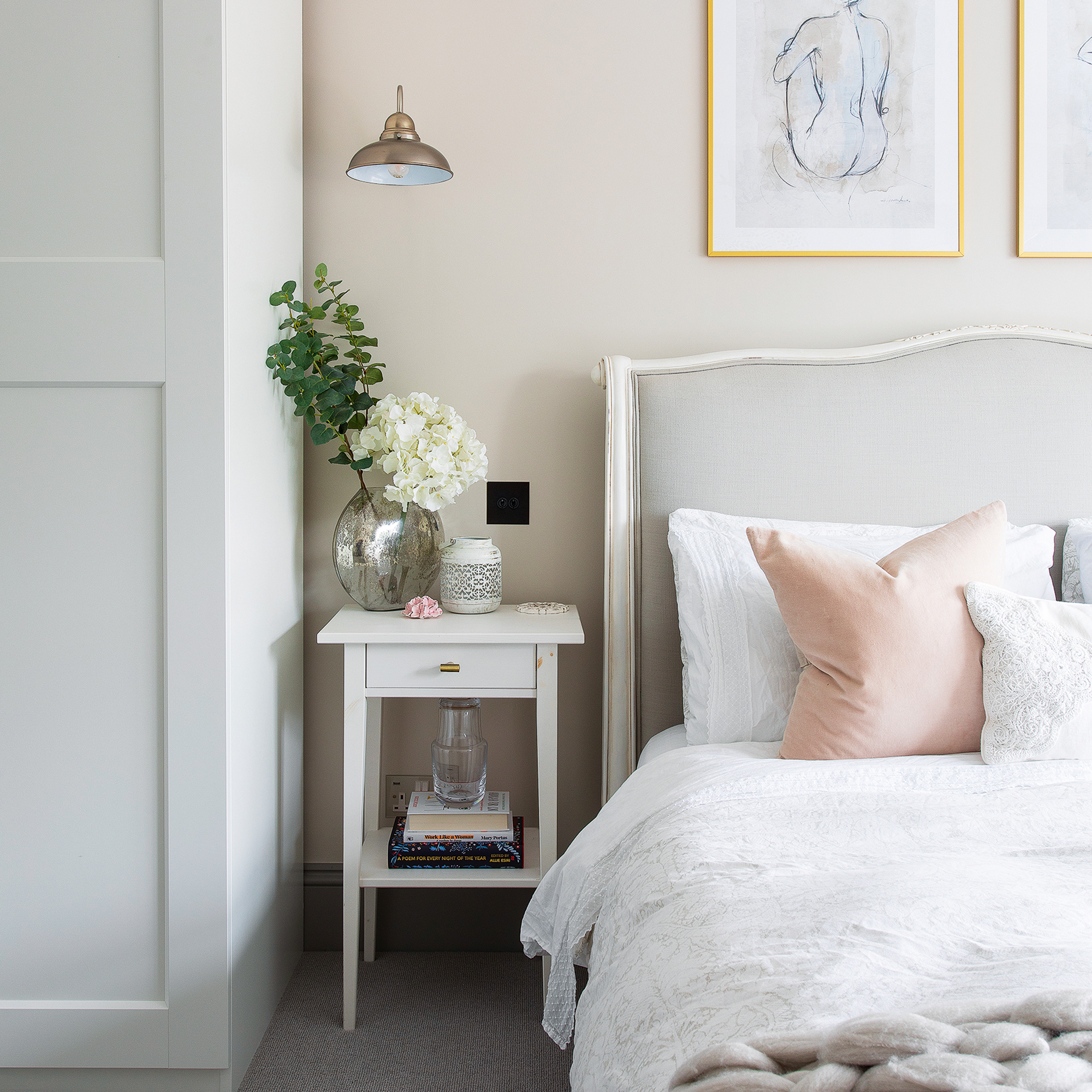
With so much talk of stripping away superfluous items from the bedroom, it’s easy to follow bedroom design tips too far in the minimalist direction and remove all personality from the room. Whilst you want clean surfaces and a relaxing environment, don’t be afraid to add interest with unique furniture pieces and layered textiles – as long as there is a method to the madness, some colour, clashing patterns and varying furniture materials can look great.
Another quick and easy way to stop a bedroom looking too basic is to add greenery. English ivy, monstera (cheese plant) and the peace lily are amongst many plants that can circulate oxygen and help you sleep better. Choose the one that works best in your room and place it near a window so it gets light exposure.
Lastly, consider whether a super minimalist bed, sans headboard, is the right choice. 'You need to have physical support behind you when you sleep otherwise the energy can’t settle,' advises Sarah McAlister, wellness design expert from The Feng Shui Agency. 'Even if the mattress is up against the wall, it feels bare and unsteady.’
'When you add an upholstered or plain wooden headboard, the space immediately feels more ‘held’ which is exactly the feeling you are aiming for to get a good night’s rest.'
4. Not having varying lighting solutions
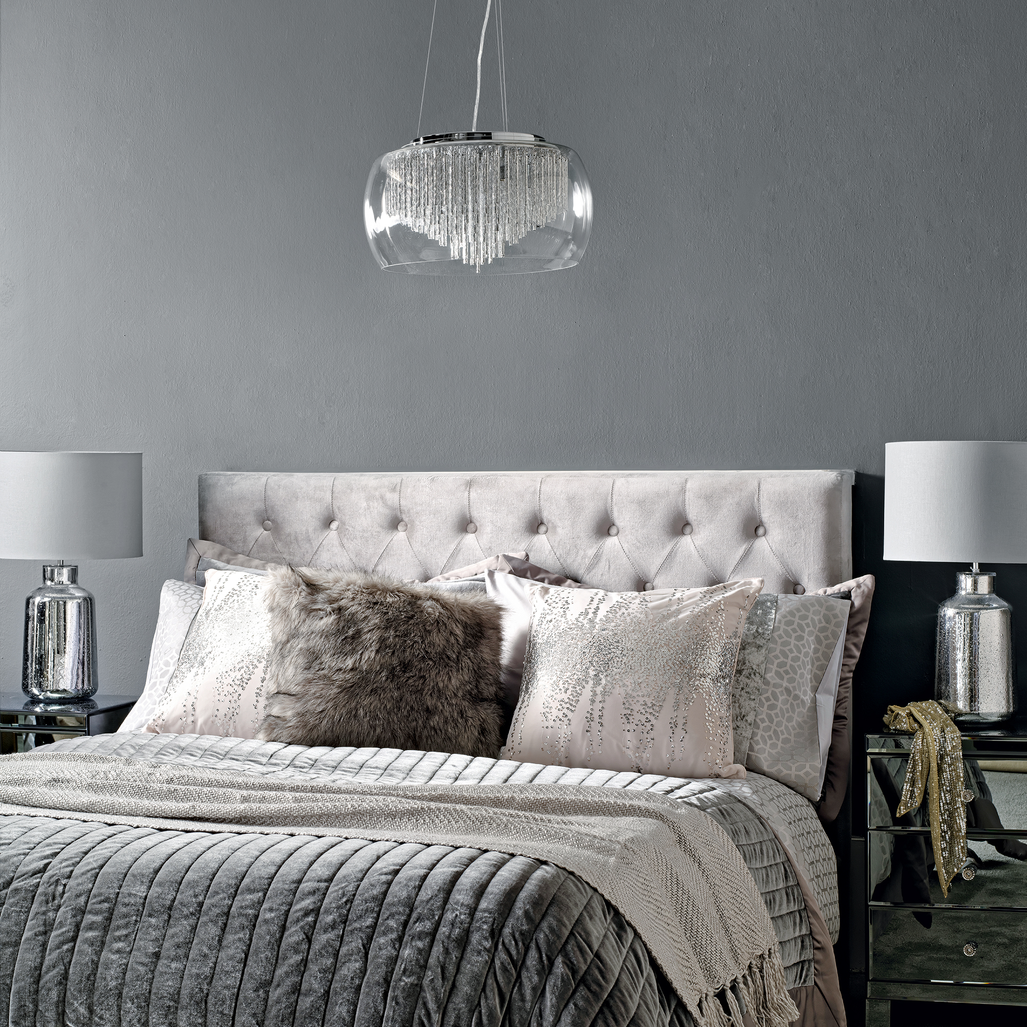
Bedroom lighting should work for all of the different functions needed, and where you place it is vital when it comes to bedroom layout mistakes.
‘Reading lights need to be placed at the right height, so they aren’t too harsh on the eye when you’re in bed, but give enough light for you to easily read,' says Sophie from Owl Design.
And don’t forget that one size doesn’t always fit all, ‘As beds vary in height, it is a good idea to work out the placement by lying in bed as if you were reading and manually placing the lamp until you find the perfect spot.’
Think about layering your lighting around the room. Aim for a cosy and inviting atmosphere that can become bright and functional or dark and intimate with the twist of a dimmer or the flick of a well-placed lamp switch.
And of course, whilst getting the lighting right is important, blocking it is vital too. Excess light impacts your sleep by disrupting your circadian rhythm, so blackout curtains or blinds are a must.
5. Pushing everything against walls
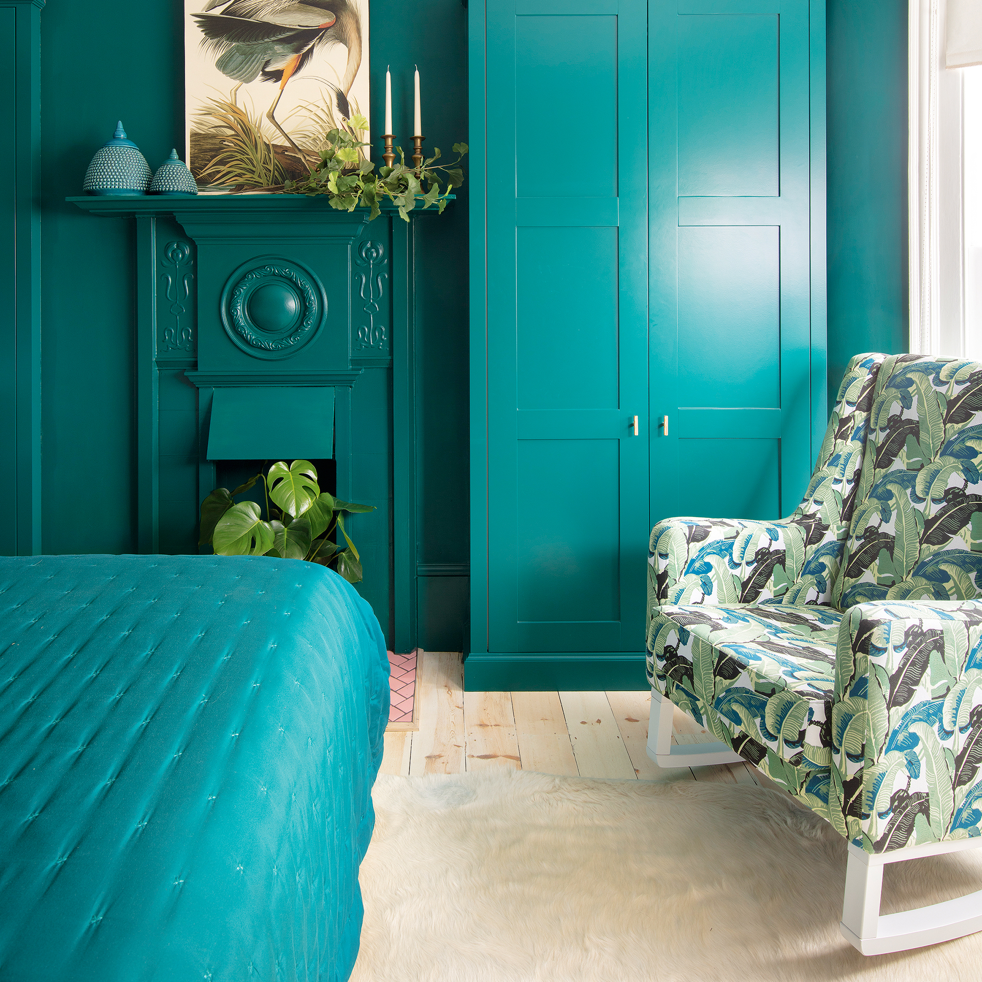
In a bid to make your small bedroom appear bigger, it’s easy to think pushing all furniture up against the wall is the way to go. But this is one of the bedroom layout mistakes to avoid - especially if you’re working with a large room.
Whilst wardrobes, drawers and beds should absolutely be against walls, tables and additional seating don’t have to be, especially if doing so blocks a window or something of architectural interest.
Instead, consider the focal point of the room, which is often the bed. Choose bedside tables that can house clutter but don’t feel these have to be pushed against the same wall as the bed, having them a few inches forward can create the effect of breathing space.
The same goes with seating. Think about how you’d like to use the seating – as a room divider? As a place to snuggle up and read a book before bed? As somewhere to chat after a long day? Angle the furniture accordingly and use rugs and lamps to help ‘zone’ the area.
6. Not having the right rug size
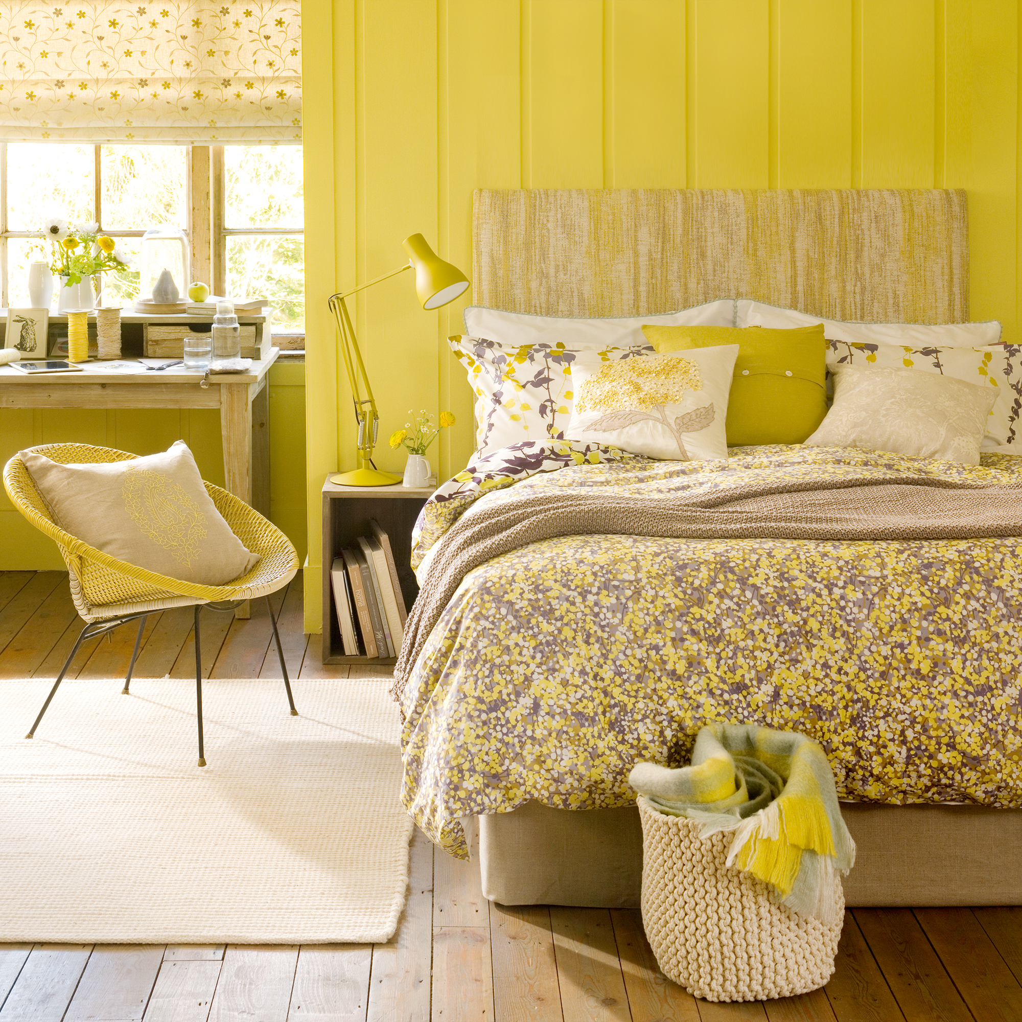
If you have hard flooring in the bedroom and want to add a rug to soften the look, a common bedroom mistake to avoid is choosing the wrong size. If you intend to place a rug under your bed, scale is important – the aim is to go for a rug with enough width to provide a soft landing place for feet on each side.
Your rug needs to be big enough to tuck under your bedside table at least half of the way so if you get out of the top of the bed your feet will still land on it. The rug should also come out around 18-22 inches at the foot of the bed too.
A general rule of thumb is to go for a 280 x 360 rug for a king-size bed in a master bedroom. But do measure the width of your bedside table and visualise exactly where you want your rug to finish before committing to a size that could be wrong for your needs.
If it’s not possible to get one large enough to go under your bed and tables, go for runners either side of the bed or smaller sheepskin style rugs placed exactly where you step out each morning will look great too
7. Having moody or chaotic décor
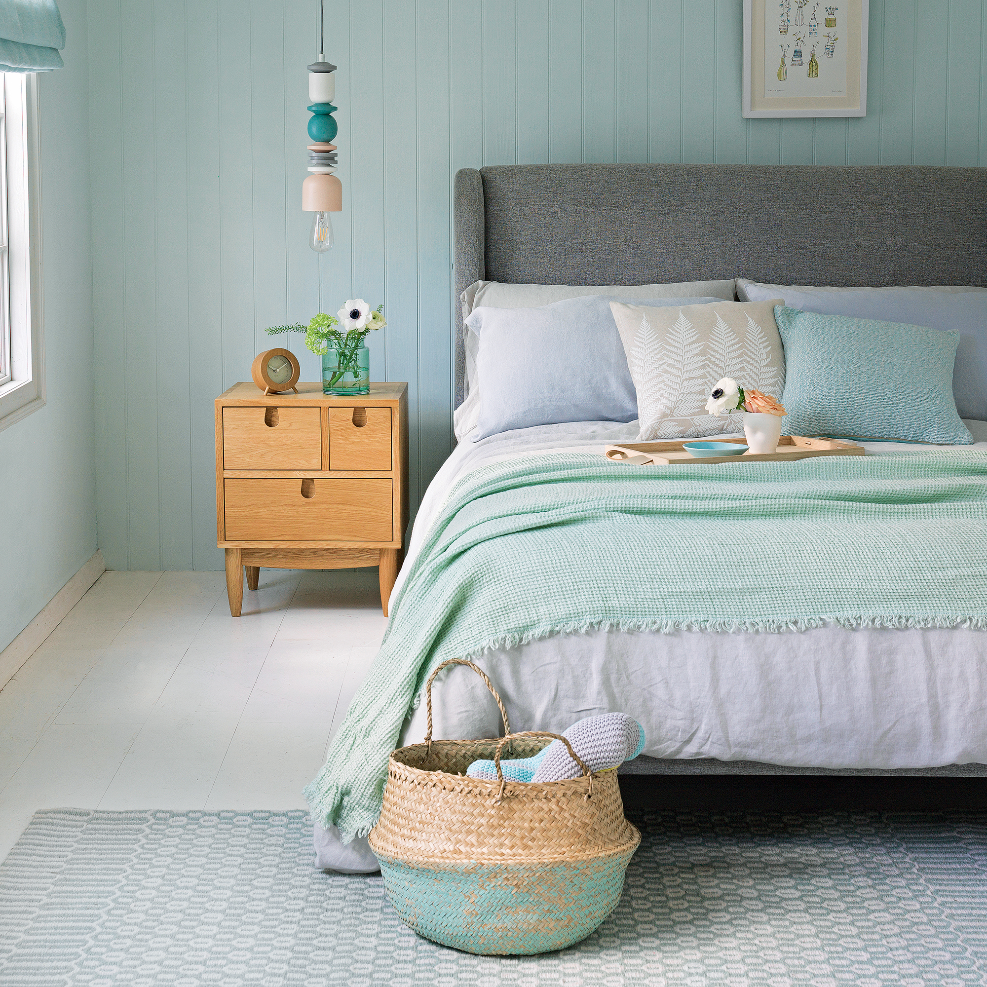
Having some personality in your bedroom is great, but as with anything, too much of a good thing can quickly turn bad. And according to Feng Fhui expert Sarah, this is especially true when it comes to decorative pieces and bedroom art.
‘The symbols you surround yourself with are very powerful,' explains Sarah. 'If you have images of stormy seas, craggy mountains, controversial modern art subjects or strongly clashing colours in your bedroom, your sleep will suffer. You need subconscious prompts around you that speak of quietude, restfulness and gentle energy.’
So, plan to keep bedroom wall decor, items and art work to those that emanate a calming vibe. Maybe leave the Jackson Pollocks for the living room.
What should you not do in a bedroom layout?
The number one mistake is not thinking about traffic flow when arranging furniture. ‘Inefficient traffic flow within the bedroom can lead to inconvenience and discomfort,' explains Sophie from Owl Design.
'Placing furniture or objects in pathways or obstructing natural movement can make the room feel congested. Ensure that there is enough room to move around comfortably.’
The second big bedroom layout mistake to avoid is not having the correct storage, whether it’s the wrong scale for the room, the wrong size to house all of your clothing and tech or is placed in a way that hampers manoeuvrability.
What are the mistakes when designing a bedroom?
There are many mistakes, including not utilising the space correctly, forgetting about scale when purchasing furniture and rugs and blocking natural light, traffic flow or extra square footage with furniture. But the biggest is forgetting that a bedroom should primarily be designed for sleeping.
Sleep Therapist Tracy Hannigan explains that a bedroom too full of ‘stuff’ could be keeping you awake. ‘There is evidence to support that a visually clear physical environment promotes sleep quality, and that efforts to declutter can help people sleep better. Shifting to storage solutions that keep things out of sight within the bedroom would be helpful.’
While you’re making an effort to tuck away hanging storage behind wardrobe doors and keep knick-knacks to a minimum, don’t forget all of your tech cables and wires. If they’re always on show, the bedroom will look messy and cluttered in an instant. Think about moving wall plug sockets to be better located for hiding wires away and purchase cable tidies and boxes that can disguise a mess of cords.
Should your bed face a window?
Oftentimes, especially in a smaller bedroom, there are only one or two options of where to place a bed, so don’t worry too much about having to face a window or facing a certain direction. Sarah from The Feng Shui Agency explains, ‘Feet towards a window is fine in general’.
Think more about your bed as a focal point in the room and where it should be placed to best achieve this and still maintain easy traffic flow.