Molly Mae's bedroom offers a masterclass in neutral colour schemes
'Good design is not just visually appealing but engages all the human senses'
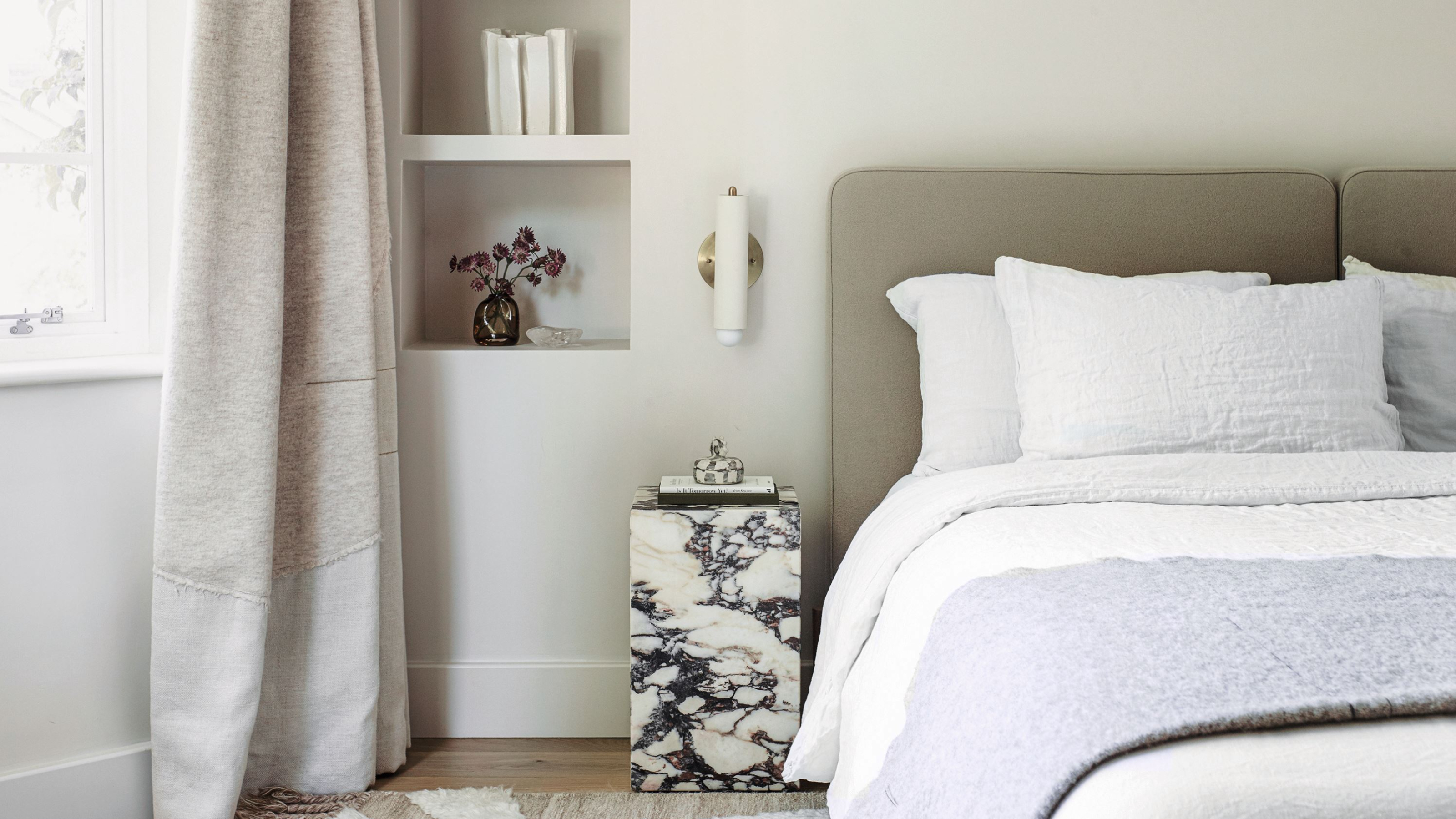

Former Love Island star Molly Mae took to Instagram to share her newest bedroom transformation, stripping back from a darker and arguably bolder bedroom colour scheme to one that's a lot more neutral and pared back.
While there's always a bit of discourse regarding neutral bedrooms, with some arguing heavily against them claiming they lack character or personality, you've got to admit that it's so visually pleasing when someone does a neutral bedroom right – and we think Molly Mae's got it spot on.
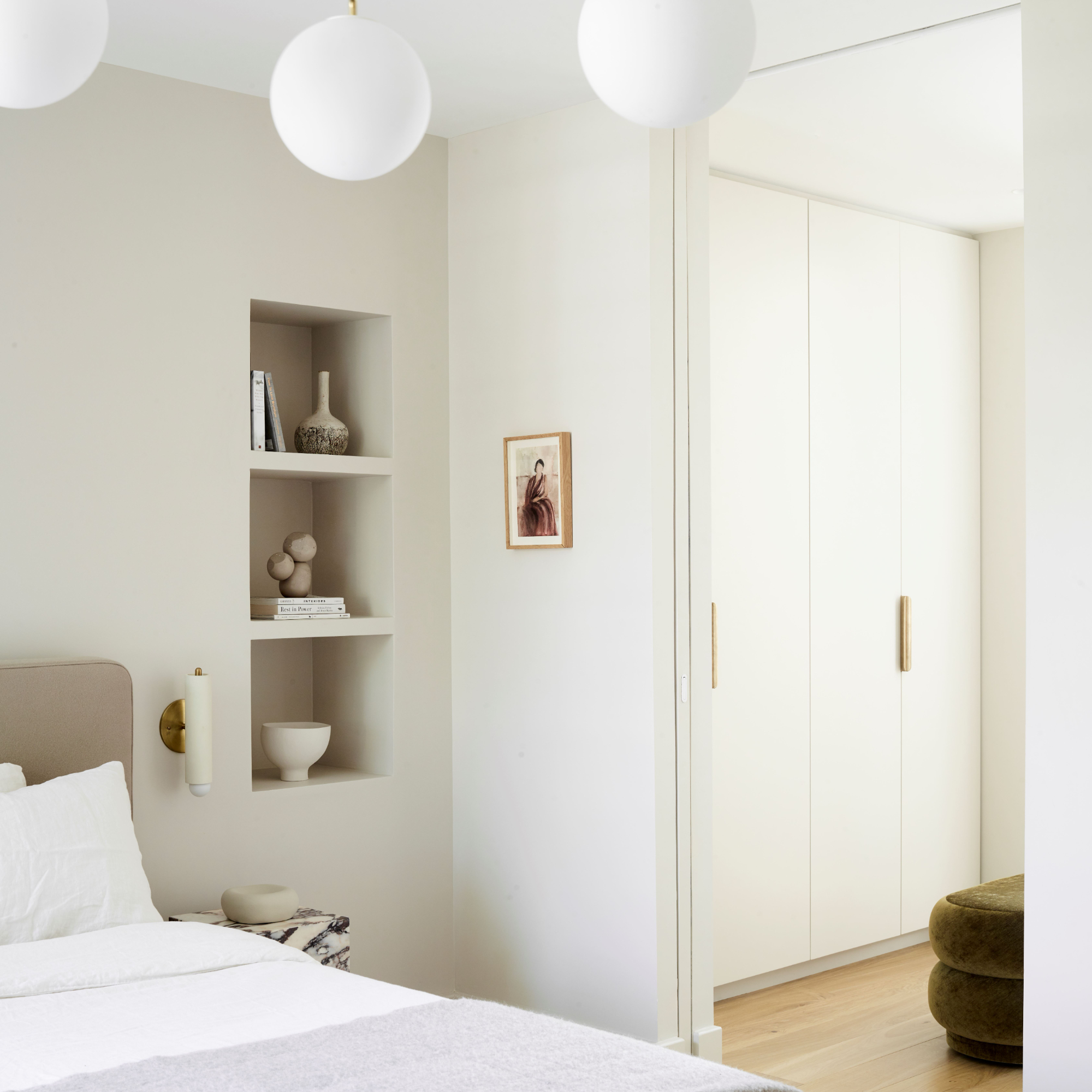
Molly Mae's neutral bedroom
Since Molly Mae created her home account, @mollymaison on Instagram, interior lovers have been obsessed with following her style choices in her living room, kitchen, and now, bedroom.
From her minimalist nursery to her grand bubble lighting choices, Molly Mae has got followers hooked on seeing what home decor trends she's got on her radar next – and it's easy to see why (hello, major quiet luxury vibes).
In fact, searches for 'neutral bedroom' and 'neutral lighting' are up 315% and 104% in the past week alone following the time she revealed her new bedroom design, according to Festive Lights.
A post shared by MOLLY-MAISON (@mollymaison)
A photo posted by on
Tips for designing a neutral bedroom, according to interior designers
We think what Molly Mae has really nailed with her neutral bedroom is that while it may be a monochromatic scheme in nature, she's kept the visual interest high through her use of texture, layering, and lighting.
'The design atmosphere we create is processed through all the senses in the same way that we sense the weather,' says Anca Enica, designer and founder of Atelier Chelsea Design. 'Good design is not just visually appealing but engages all the human senses.'
Get the Ideal Home Newsletter
Sign up to our newsletter for style and decor inspiration, house makeovers, project advice and more.
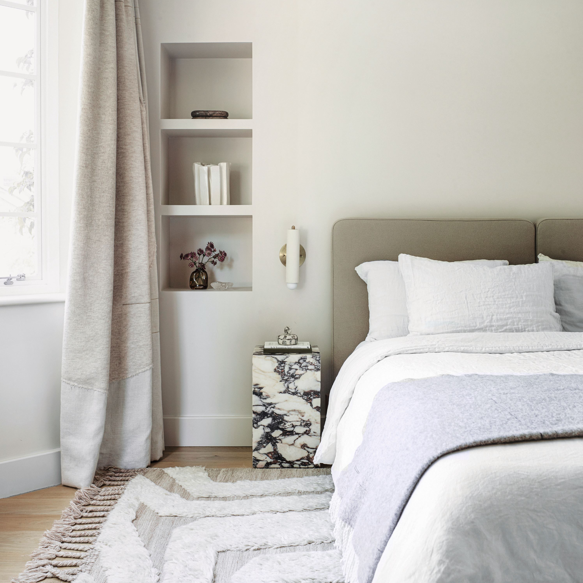
1. Texture
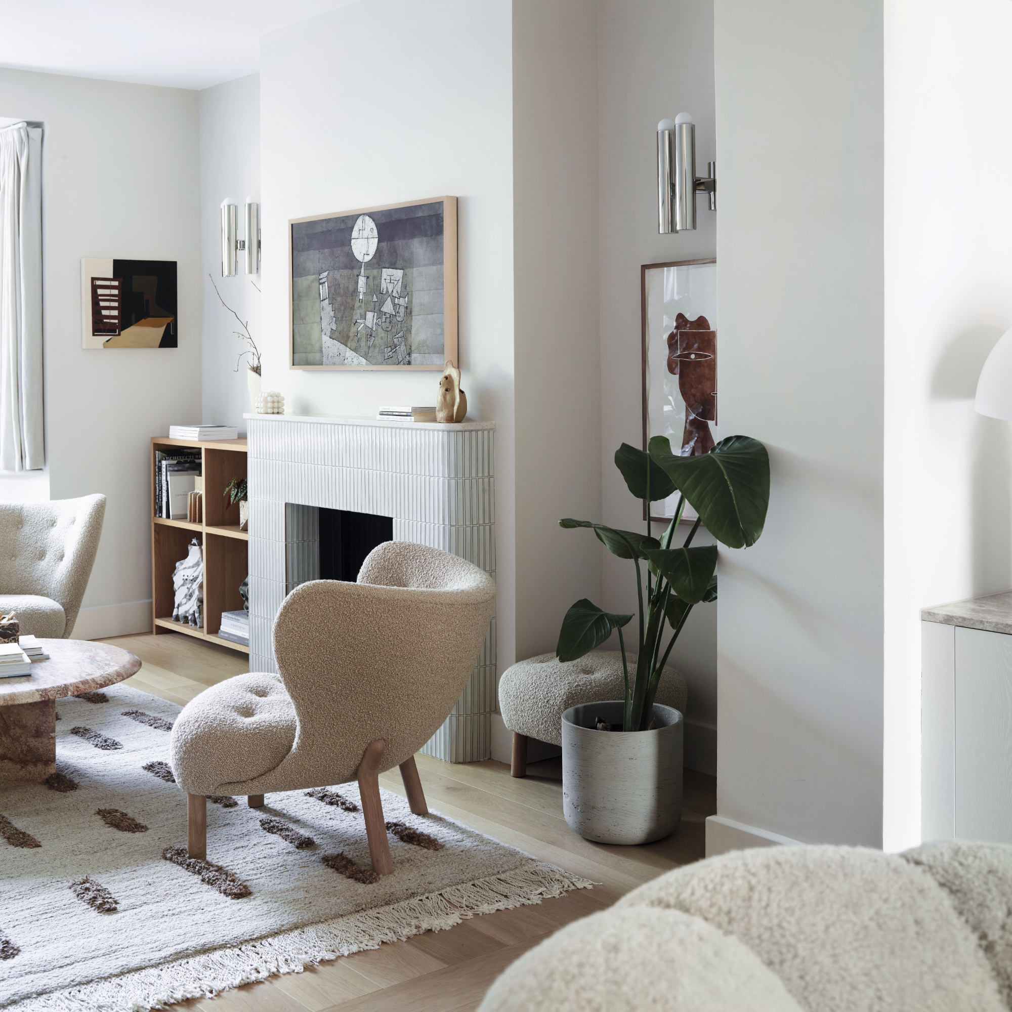
'Texture is like magic in interior design—it adds that touch of depth to a room, which works wonders when the space you are working with is neutral,' starts Sahar Saffari, senior interior designer at Hi-Spec Design. 'Natural nude tones are becoming more and more popular, but with this style, you do risk the space feeling a little flat.'
'A neutral material palette should be diverse and compel you to reach, touch and smell rather than just take a photograph,' adds Anca.
And that's where texture works as the secret ingredient.
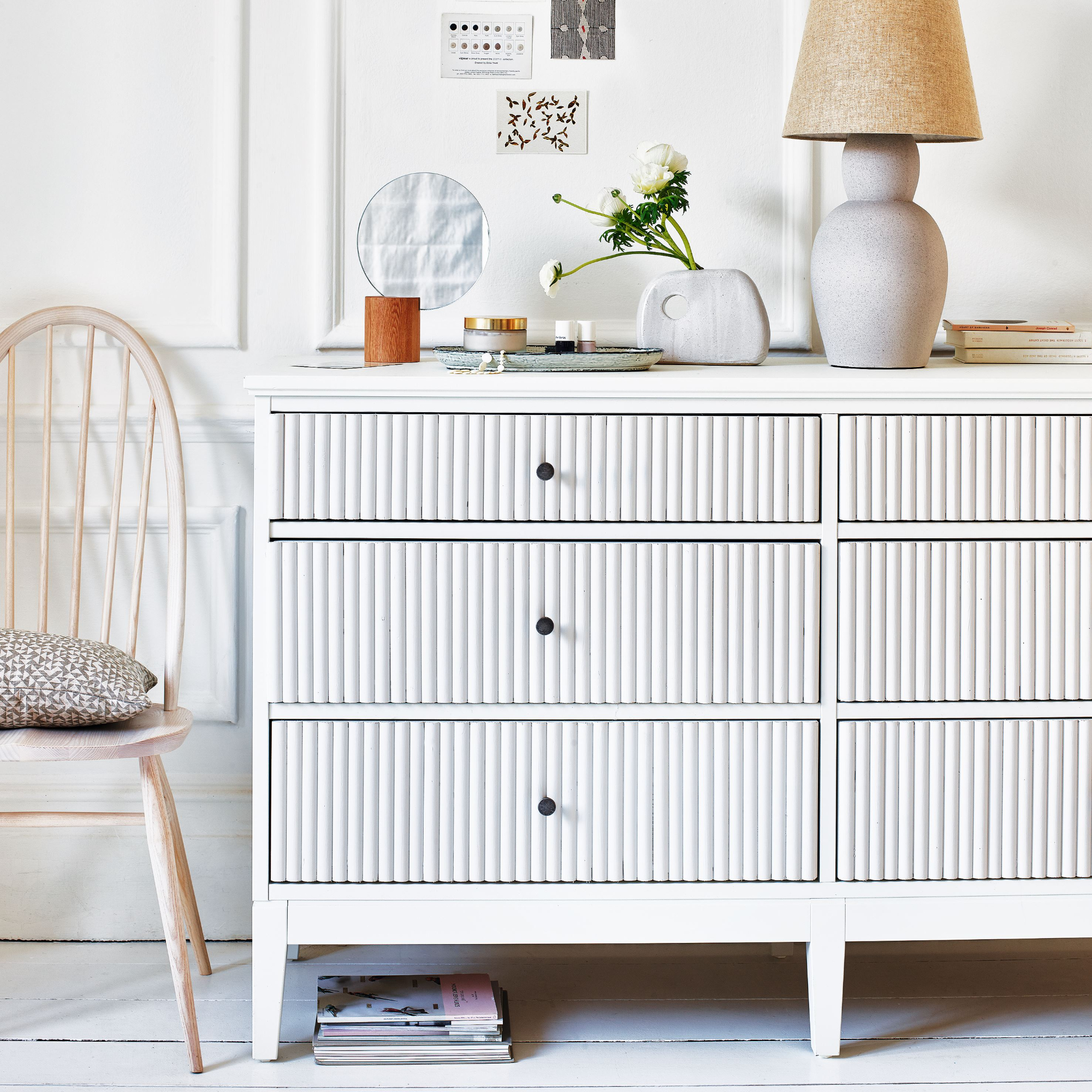
'When incorporating textures into a space, you need to have a mix. For example, if you have a smooth and sleek leather sofa, complement it with a plush faux fur throw, textured linen cushions, and a woven rattan side table,' suggests Sahar. 'This delightful interplay of surfaces will instantly breathe life into the space and make it more inviting.'
'You can see this is done well in Molly Mae's bedroom, she has a real mixture of fabrics on her sofa, cushions and throws, so although they are all the same, or very similar in colour, there is still something to catch the eye.'
2. Layering
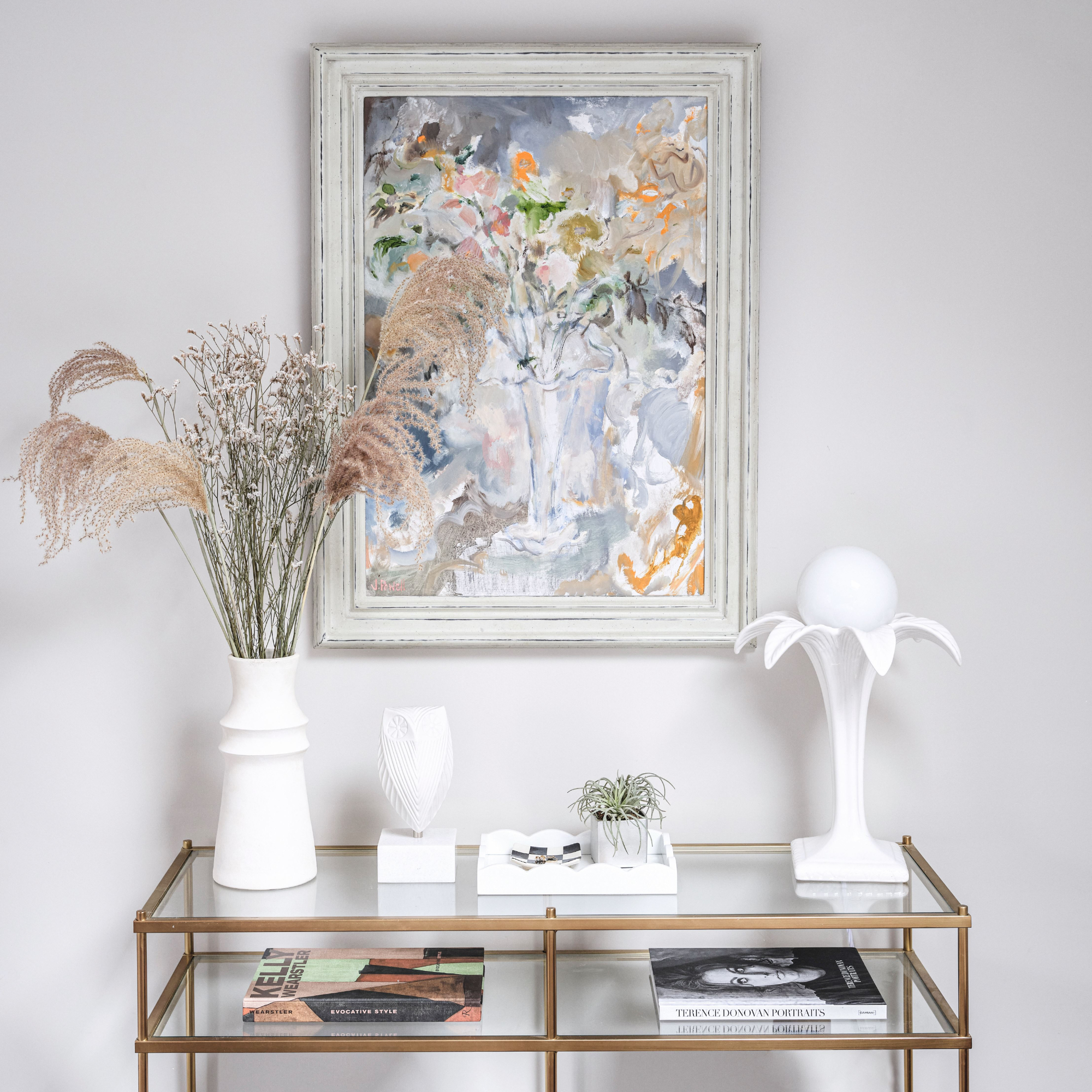
'Layering works by instead of sticking to traditional furniture arrangements, consider creating clusters of decor,' advises Sahar. 'Picture a corner with a tall potted plant, an artistic sculpture on a pedestal, and a vintage-inspired floor lamp—all within the same colour family.'
'This layering of elements not only adds visual interest but also sparks curiosity as people explore the different areas of the room. Molly Mae’s bedroom uses the hanging lights for this, as well as the sofa placement in the off-centre of the bed as opposed to by a wall.'
3. Lighting
'Lighting is also very important when it comes to adding depth to a room, having lamps or spot lighting to bring attention to different areas,' adds Sahar.
'The lighting can add shadows and highlights in a space that might otherwise look bland, and it’s especially important when making a space feel more cosy,' she continues.
'Create the ultimate calming environment with clear hanging pendant lights in your home in order to add warmth to your room whilst keeping a sharp, industrial look,' suggests Paula Boston, visual merchandiser at Festive Lights.
'If you want to add more personality to your simplistic look, try using nature-inspired fixtures such as woven shades or brass lighting.'
So, if you're also someone who's been eyeing up Molly Mae's interior style for a while and have been looking to embark on a monochromatic colour scheme for yourself (who cares if people think it's 'playing it safe', consider this the start of your villain era), it might be worth keeping these tricks up your sleeve.
Who said neutral has to be boring? Let this be a testament to prove them wrong.

Jullia was Ideal Home’s Junior Writer from 2022-2024 and the Ideal Home Certified Expert in Training on Vacuums having spent over 60 hours testing different models. She’s always loved all things homes and interiors, graduating with a bachelor’s degree in Architectural Studies from the University of Nottingham where her love for writing blossomed following her internship at ArchDaily. Now focused on home tech and cleaning, Jullia works on writing features and explainers to help people make the most of their home appliance investments, putting the newest launches through their paces. When she isn’t writing, she loves exploring the city, coffee shop hopping, and losing hours to a cosy game or book.
-
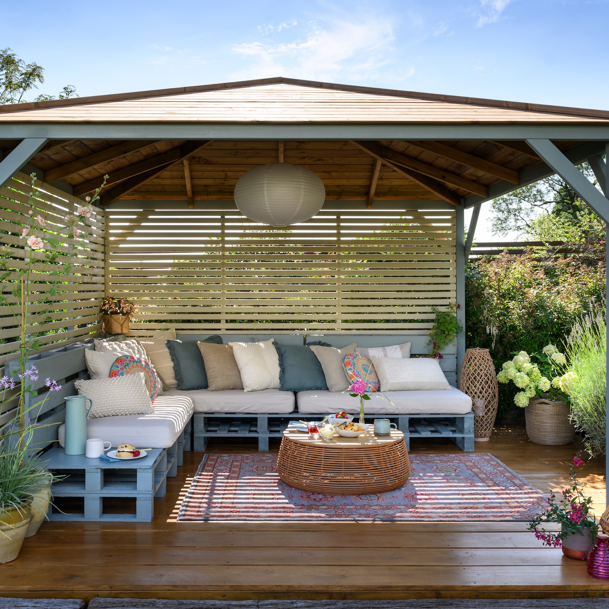 8 budget-friendly ways to create privacy in a garden – with design tips from garden experts
Here are our favourites
By Lisa Fazzani
-
 I wasted £3,000 trying to make my old conservatory usable
This is what I wish I'd done instead
By Sarah Handley
-
 Dahlia gall could be wreaking havoc on your garden plants – here's how to spot it, and what to do if your plants are infected
Nip it in the bud before it affects the rest of your garden
By Sophie King