Modern nursery ideas - 10 clever ways to create a fun space you’ll both love
Design the space right and you’ll have a modern nursery that will appeal to all with plenty of fun
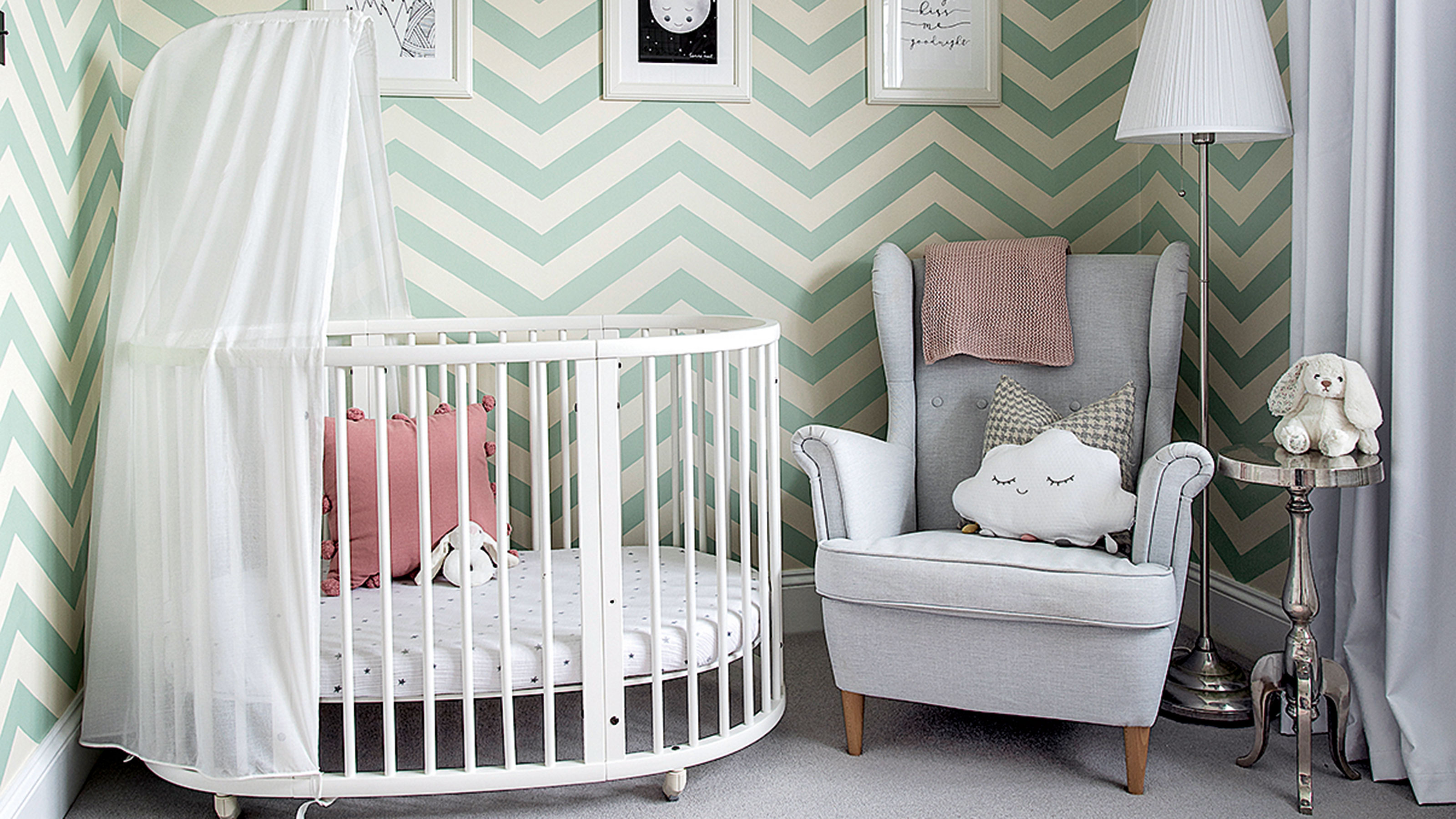

Babies come with lots of stuff, lots of colours, and even a style that’s often far from the one you’ve carefully curated over the years ‘BC’ (before child). But with careful planning and some clever design ideas, you can create a modern nursery that works for all.
There are so many nursery ideas for inspiration, but in a modern nursery, keeping things clean and simple is often the best.
Interior designer Ursula Wesseling at Room to Bloom would always include a practical, beautiful cot bed, a generous-sized chest of drawers and flexible lighting when designing a modern nursery. ‘I love adding bright colours to a modern nursery with accents, such as wall art, decorative lighting, cushions, bedding,’ she shares.
‘We’d advise starting with a neutral colour base and then layer colour on top with decor and furniture,’ says Laura Williams, founder of The Modern Nursery. ‘This creates longevity in the design as your child grows and means you don't have to paint again. Simply switch out the accessories and update the furniture.’
Modern nursery ideas
Dealing with a small children's room idea? ‘Clever storage and avoiding bulky furniture are key to maximising space,’ continues Laura. ‘Simple tricks include wall storage to save floor space and multifunctional storage furniture, while try a changing table that can convert into a chest of drawers as your child grows.’
Contemporary can be child-friendly in a modern nursery – just keep it simple, add character with colour, pattern or something a little quirky – like a oversized cuddly animal friend. Above all, have fun!
1. Keep it monochrome
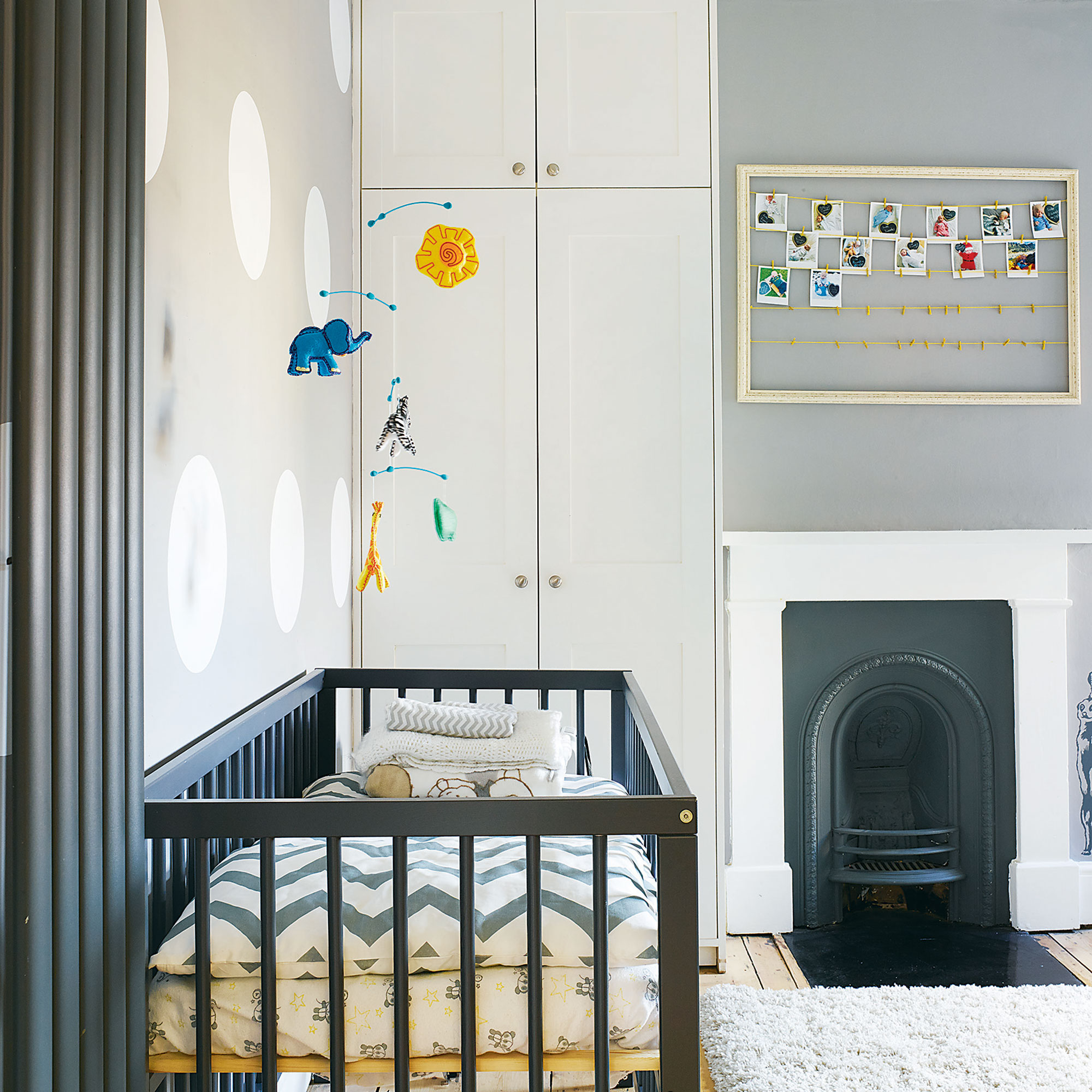
With babies seeing black, white and shades of grey up until around four months, a monochrome nursery is sure to appeal to both of you. Plus it's a surefire gender neutral nursery idea if you want to decorate before your baby arrives. Bring in plenty of interesting shapes, like a dotty wallpaper, zigzag bedlinen and mobile. A snug rug underfoot helps balance the monochrome palette and add cosy texture.
Get the Ideal Home Newsletter
Sign up to our newsletter for style and decor inspiration, house makeovers, project advice and more.
If looking to add an accent colour to a monochrome nursery, try a zingy yellow – it’s the perfect bright partner. You don’t need to go crazy with yellow either; try just a flash on bedlinen, a yellow toy, nightlight, or even something as simple as a yellow picture frame.
2. Create zones within a nursery

Just as a modern home is flexible, so can a modern nursery. Think about how a corner for a child can be a place to sit and be read to, read by themselves or even a gaming station. Storage, a chair or bench and a rug can be used for all three variations.
Look for furniture on wheels, such as an art station with room underneath for supplies, while pegboard keeps wall space adaptable. A modern nursery is about creating a space that grows.
3. Go for a mural
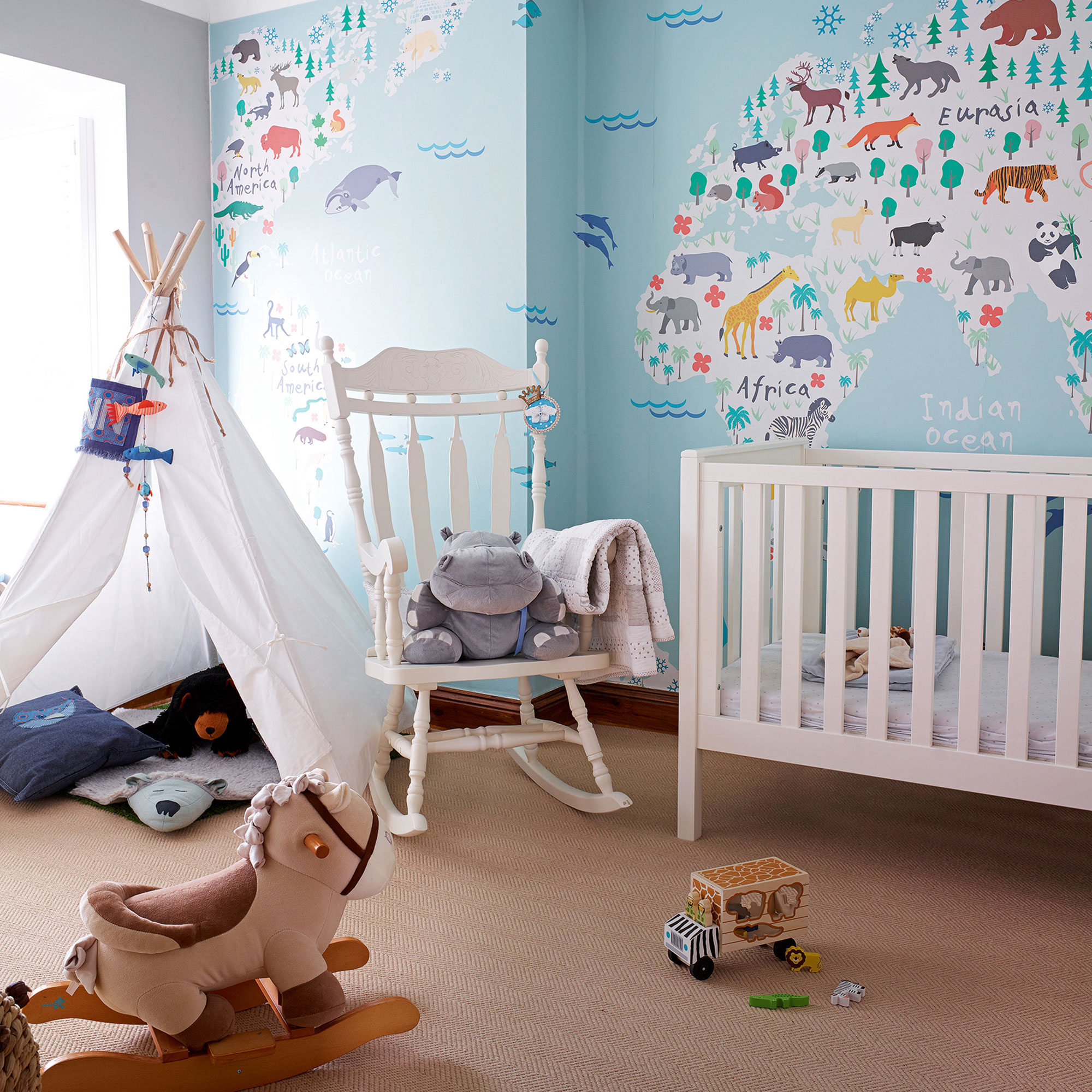
Inspire dreams with a large modern mural – a map is a great way of teaching about the wider world. Choose a fun nursery mural idea with facts or even animals on and team with crisp white furniture, such as a simple cot bed and a rocker.
Teepees are a fun addition to a modern nursery, providing an instant den (plus they are a speed way of tidying up toys off the floor!). Add a few cushions and one makes a great reading spot.
4. Add a pale grey to crisp white
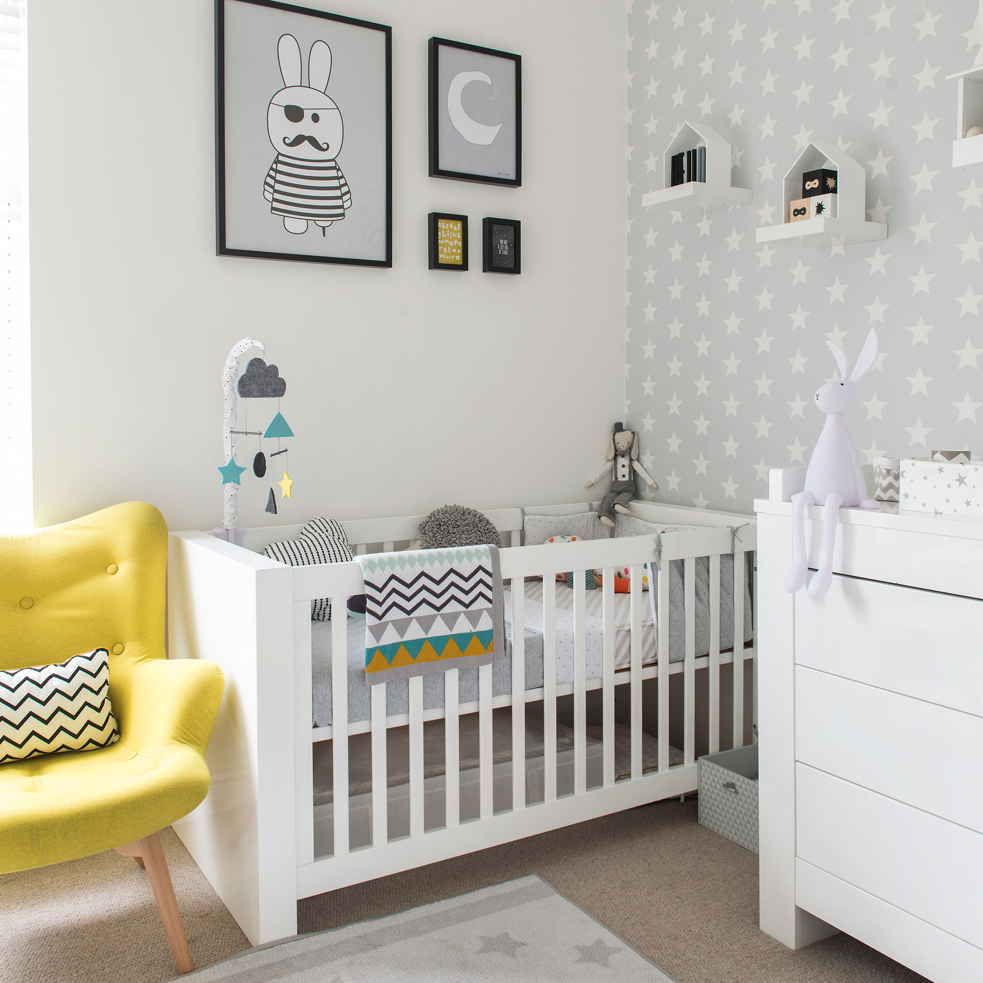
If you’re an all-white lover but finding it too harsh for baby’s room, then introduce a pale dove grey. Try a non-gender specific white-on-grey star wallpaper on a feature wall – the crisp design against the warm grey will add that softness you’ve been looking for. Hang up a few favourite prints above the cot (just make sure they are out of reach), while mini shelves break up the star design with minimum fuss.
Bring in a few zigzags to your grey and white nursery idea – it’s a modern patten motif that works with the stars without making the scheme look busy.
5. Bring in a friend
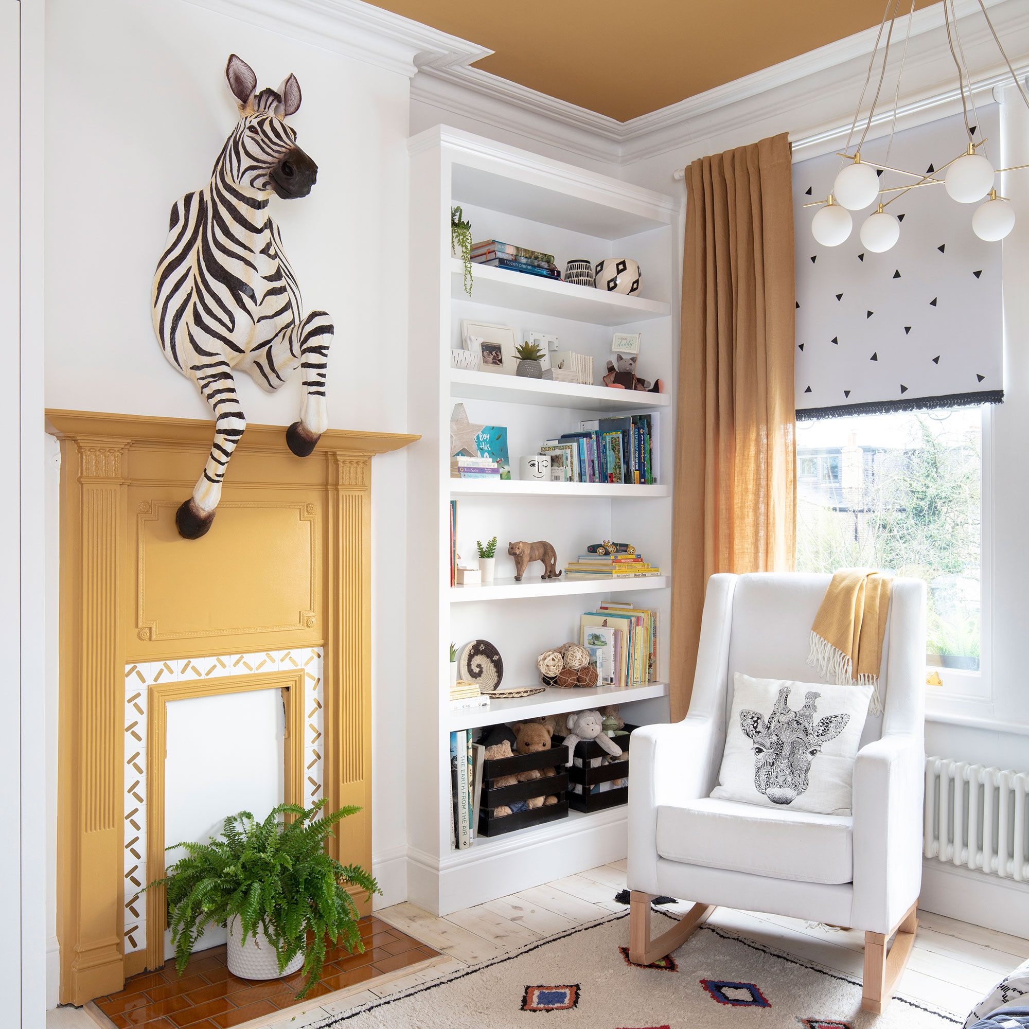
In a modern nursery you can go crazy with a statement piece – like a huge animal head (or even head with body!). This zebra sets the mood, one of fun and friends. Echo the black-and-white stripes with plenty of monochrome, while splashes of accent mustard take this nursery to the African plains.
If your nursery is in a period home blessed with high ceilings, use colour to bring the ceiling lower, making the space feel warm and cosy.
6. Plan in plenty of storage
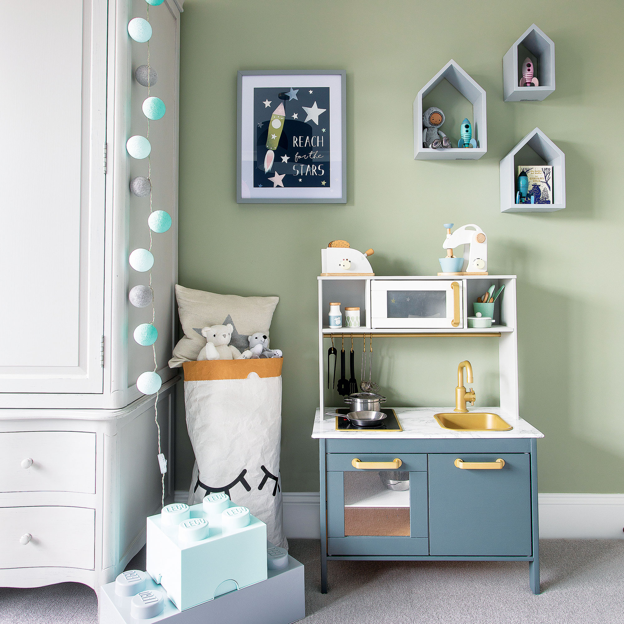
Keep the minimum number of toys out, with the rest stashed in a painted armoire or dresser. Large toy bags and boxes will also help the space not become overwhelmed, while wall shelves allow you to create pockets of display. And be smart when thinking about how to organise baby clothes - ensuring plenty of hidden storage, too.
Choose a play kitchen that echoes your own modern design – and if you can’t find one, then the basic wooden ones are easy to adapt, with chalk paint, stick on marble-effect vinyl and even metallic paint for the taps and handles.
7. Wallpaper all walls
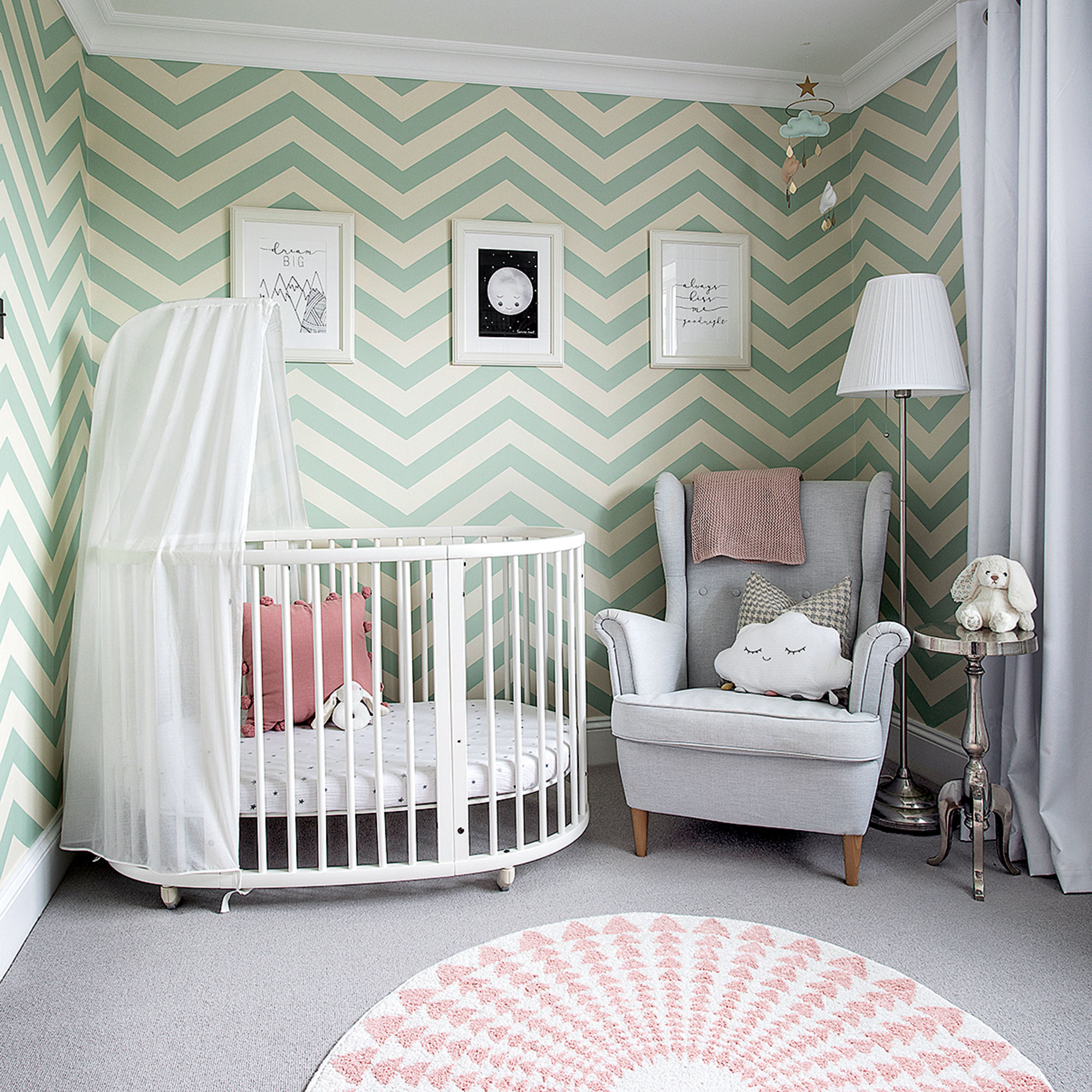
Use a modern zigzag pattern in a soft shade to create a cosy yet contemporary nursery. Bring in plenty of softer shapes, such as a curved cot and round rug, avoiding too many straight lines. Soft grey nursery ideas works as an accent colour to this scheme, while the rose pink could easily be swapped for a denim blue shade if decorating for a baby boy.
Don’t shy away from hanging art on wallpaper; the trick is to keep frames white or black, with a large mount.
8. Paint your own feature
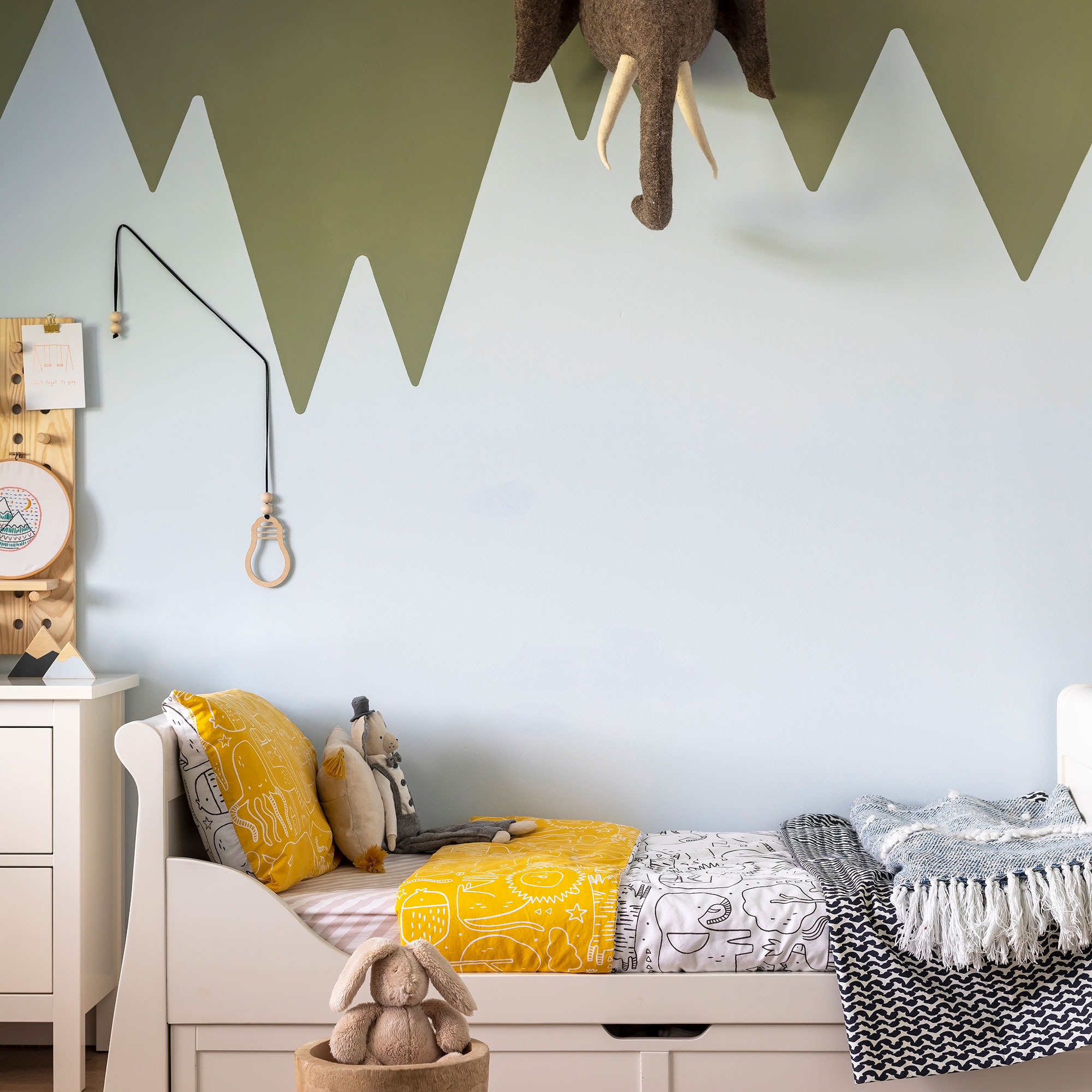
One for budding climbers and explorers! A mountain peak design is easy to paint yourself. Start by painting the wall in the palest section, then mask off peaks once dry and paint a darker shade above.
Bring in an extra dimension with an animal head hung directly to the wall. Choose a character that can be echoed in bedlinen for a coherent touch.
9. Keep it Scandi calm
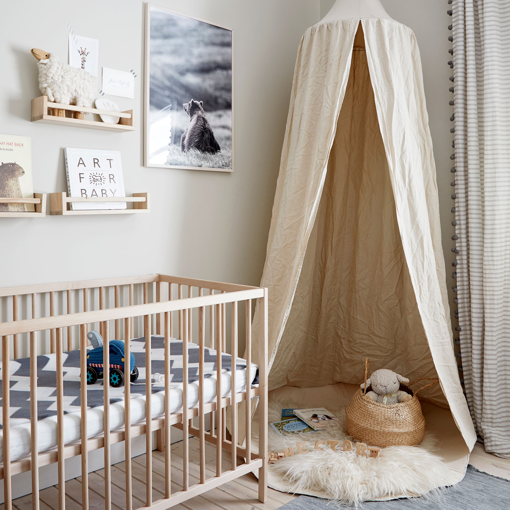
Plenty of textures, neutral colours and natural wood make for a modern Scandi nursery. Spice racks double up as book and small toy wall storage, while a photograph, simply framed, makes a simple yet striking statement. The lack of colour makes this a calming space that can be grown into by baby. ‘Soft, muted colours create a calm atmosphere, which is ideal for a nursery as the room will initially be used primarily for sleep and restful activities,’ says Ursula Wesselingh, Interior Designer at Room to Bloom.
Choose natural linen for sheets and soft furnishings, the relaxed ‘creased’ look is very Scandi, and who has time to iron when there’s baby cuddles to be enjoyed? Bring in a few boho nursery ideas to soften the edges if you prefer a more eclectic look.
10. Choose retro lines
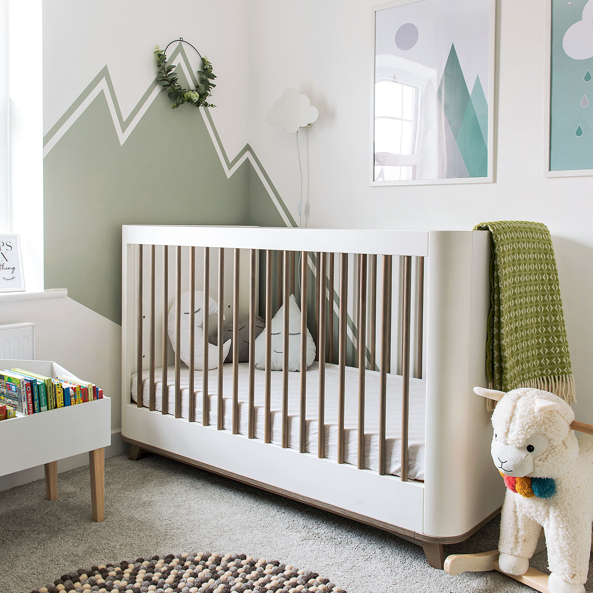
In a modern nursery, introduce retro styling to add character – here a curved cot bed in white and walnut looks great with a crisp mountain scape that’s been edged with an outline. A favourite blanket in a retro weave adds a touch of softness, as does a lovely wool pebble rug – just thing for baby to sink its toes into for those first steps.
A freestanding book tub makes story time easy – and because it stands on legs, enhances the sense of space in this small nursery bedroom.
What’s the best way to decorate a nursery?
‘Features and personalised designs are great when it comes to nursery design,’ says Justyna Korczynska, senior designer at Crown. ‘To add some fun use masking tape to create simple stripes or checks, or for a more complicated pattern go for a stencil. Kids’ rooms have a license to be fun. The beauty of paint is that the scheme can be easily and inexpensively updated as the child grows.’
How can I fill an empty corner in a nursery?
‘When we design, we love to split a room into zones,’ says Laura Williams, founder of The Modern Nursery. ‘A spare corner can become a play area with modern puzzle playmats, toys and toy storage or a cosy reading nook with a teepee, bean bag and bookshelves.’
‘I love using plants to dress a nursery – hanging plants from the ceiling or placing a large plant on the floor. You can also fill a corner with a tall stuffed animal – giraffes are very popular,’ says Ursula Wesselingh, interior designer at Room to Bloom.
How do I make my nursery feel cosier?
‘Experiment with textures,’ says Laura. ‘We use textures, accessories, and soft layers to create cosier rooms. Window treatments are also a simple way of making a nursery cosier. If you use blackout blinds, then still use curtains to frame the window and add texture.’

Jennifer Morgan is an award-winning editor, writer and stylist, with over 25 years’ experience writing, styling and editing home interest magazines. Jennifer was the deputy editor of Ideal Home from 2008-2010, before launching Ideal Home’s sister title, Style at Home in 2010. Jennifer went on to launch several craft magazines and websites, before going freelance in 2016, with a client list that includes John Lewis, Dunlem and Nordic House. Today, she writes for Ideal Home, Real Homes, Waitrose, Woman & Home, Sainsbury’s Magazine and Homes & Gardens.
-
 I tried out this neat little dehumidifier for a month – it dried my laundry in half the time
The 20L SmartAir Dry Zone dehumidifier tackled my laundry drying woes head on
By Jenny McFarlane
-
 I’m seeing pastel garden furniture at all my favourite brands this spring, but QVC’s sorbet collection impressed me the most
Fresh pastel shades are a great way to liven up your outdoor space
By Kezia Reynolds
-
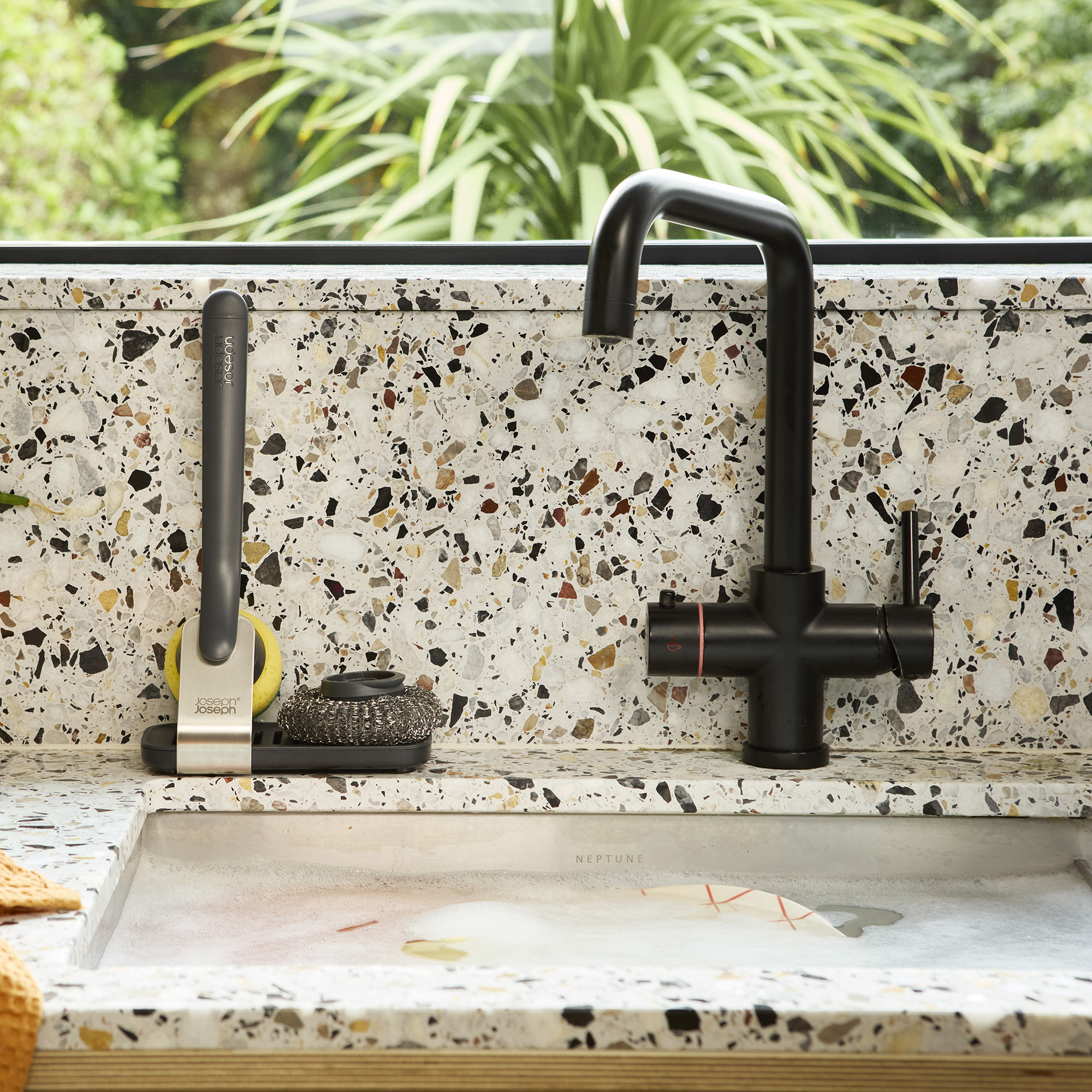 Don't tell my flatmates, but Joseph Joseph's clever new sink range finally made me enjoy washing up
I didn't know stylish washing up accessories existed until I saw this collection
By Holly Cockburn