Stacey Dooley has drenched her dining room in this year's most popular colour – and we've tracked down the perfect paint shade to recreate it
The Strictly star has given her dining and living space a brave green makeover


It’s no secret that at Ideal Home we Iove Stacey Dooley’s home – but who can blame us when parts of her abode look like they’ve been taken straight out of a Pinterest interiors mood board?! Over the weekend, Stacey served up more home decor inspo as she debuted her dining room painted in a brave shade of green.
Green is currently a major paint trend this summer. The season has been dominated by not one but several trending green shades. So Stacey’s living-dining space makeover, which she revealed on her Instagram, is right on trend.
In response, several fans have taken to the comment section begging to know what paint colour Stacey used. While she’s yet to share this, we’ve done a little digging and with the help of our interior expert, we’ve found a shade that will recreate Stacey Dooley’s new dining room look – (we suspect it might actually the paint she’s used herself.)
A post shared by Stacey Dooley (@sjdooley)
A photo posted by on
What colour is Stacey Dooley’s dining room?
This summer has seen four different green colour trends – some of which are likely to continue going strong in the coming seasons.
‘Green is likely so popular due to its versatility,’ says Michael Rolland, managing director at The Paint Shed. ‘Greens are calming and refreshing and, especially when combined with wood accents, can bring a natural and organic look to your home. For those who struggle with exploring colour, green can be a great gateway colour into the world of more unique design choices.’
And one of those popular shades is pistachio green, which is also currently trending on social media, especially Instagram. That’s also what we’d classify the shade seen on Stacey’s walls as.
‘Pistachio green is a lighter, slightly yellowish-green with a fresh, playful vibe,’ says Sam Sutherland, Flitch interior stylist.
Get the Ideal Home Newsletter
Sign up to our newsletter for style and decor inspiration, house makeovers, project advice and more.
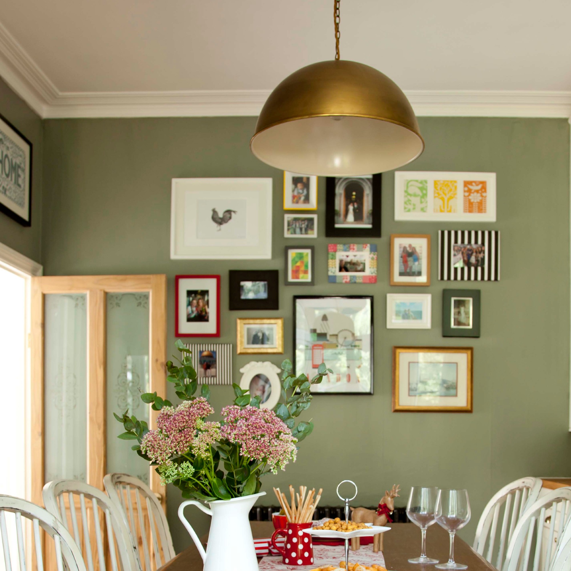
What paint can you use to recreate the look?
It’s no surprise that when she shared a snap of her dining space with the bold green shade coating the walls, many wanted to know the paint she used. And we believe we have the answer.
‘While it’s difficult to pinpoint the exact shade without confirmation, it closely resembles Edith’s Eye from Little Greene. This brand is known for their nuanced, heritage-inspired colours that align with the aesthetic of her space,’ Sam says.
In addition to this, Stacey has partnered with Little Greene in the past when making over her daughter’s nursery. So it’s likely she’s opted for the same brand on this occasion too.
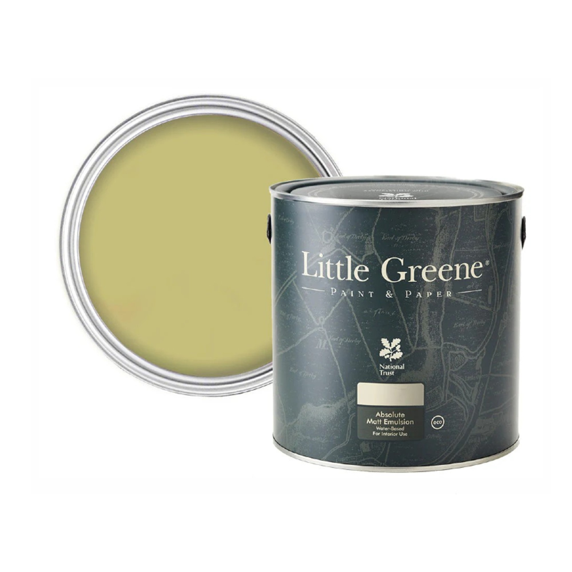
A green with a strong yellow undertone, Edith's Eye is named after the wife of the 7th Marquess of Londonderry who was an influential hostess in the early 20th century and decided to use this shade of green on the columns of the family's summer residence, Mount Stewart in Northern Ireland.
If you too are considering green dining room ideas as your next home project, this shade is a viable option to go for. ‘This green shade is an excellent choice for both living and dining rooms. Its muted tone creates a serene, cosy environment, making it perfect for social spaces where you want to encourage relaxation and conversation. The depth of the colour also adds sophistication and can make a strong style statement when paired with the right decor,’ Sam says.
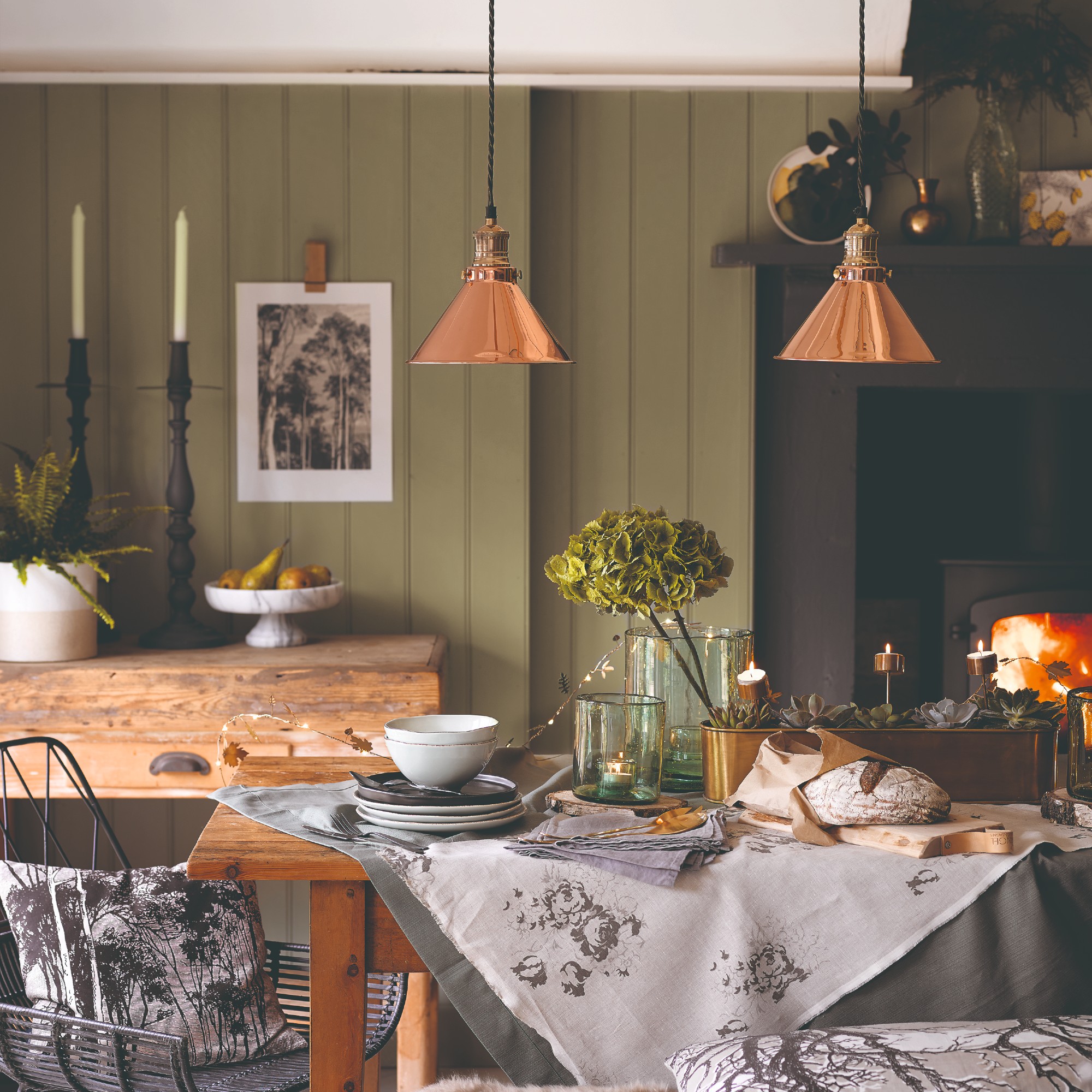
But green living room ideas in this pistachio-esque shade would also look lovely – as seen in Stacey’s space which combines both a living area and a dining table. ‘In the living room, pistachio green can create a sense of serenity, giving it an inviting atmosphere. Painting an accent wall in pistachio green and pairing it with neutral furniture is the perfect way to add a touch of sophistication while maintaining a relaxed ambiance in the space,’ Michael suggests.
However you style it, just be brave to go for it – as Stacey’s bold move has proven, it pays off to be daring with your colour choices.

Sara Hesikova has been a Content Editor at Ideal Home since June 2024, starting at the title as a News Writer in July 2023. She is now also the Ideal Home Certified Expert in Training on Furniture, and so far has tested 80 different sofas.
Graduating from London College of Fashion with a bachelor’s degree in fashion journalism in 2016, she got her start in niche fashion and lifestyle magazines like Glass and Alvar as a writer and editor before making the leap into interiors, working with the likes of 91 Magazine and copywriting for luxury bed linen brand Yves Delorme among others.
-
 George Home’s sold-out striped parasol is finally back in stock - but this elegant design is expected to sell out again fast
I can't get enough of its whimsical design, too
By Kezia Reynolds
-
 I asked a Dyson engineer how you can avoid these common Dyson vacuum cleaner problems — and how to make the most of your machine
From a loss of suction to poor battery life, I asked the questions to get the answers you need
By Lauren Bradbury
-
 'I've now bought 3 different colours' – my favourite affordable linen bedding is currently half-price, and the 5-star reviews speak for themselves
The half-price linen bedding that owners can't stop raving about
By Amy Lockwood
-
 'I've now bought 3 different colours' – my favourite affordable linen bedding is currently half-price, and the 5-star reviews speak for themselves
The half-price linen bedding that owners can't stop raving about
By Amy Lockwood
-
 Want to cook like Jamie Oliver? This is the top-rated casserole he uses from his own collection all the time on Instagram
Jamie's collaboration with Tefal has led to this casserole dish getting the best user reviews I've ever seen
By Molly Cleary
-
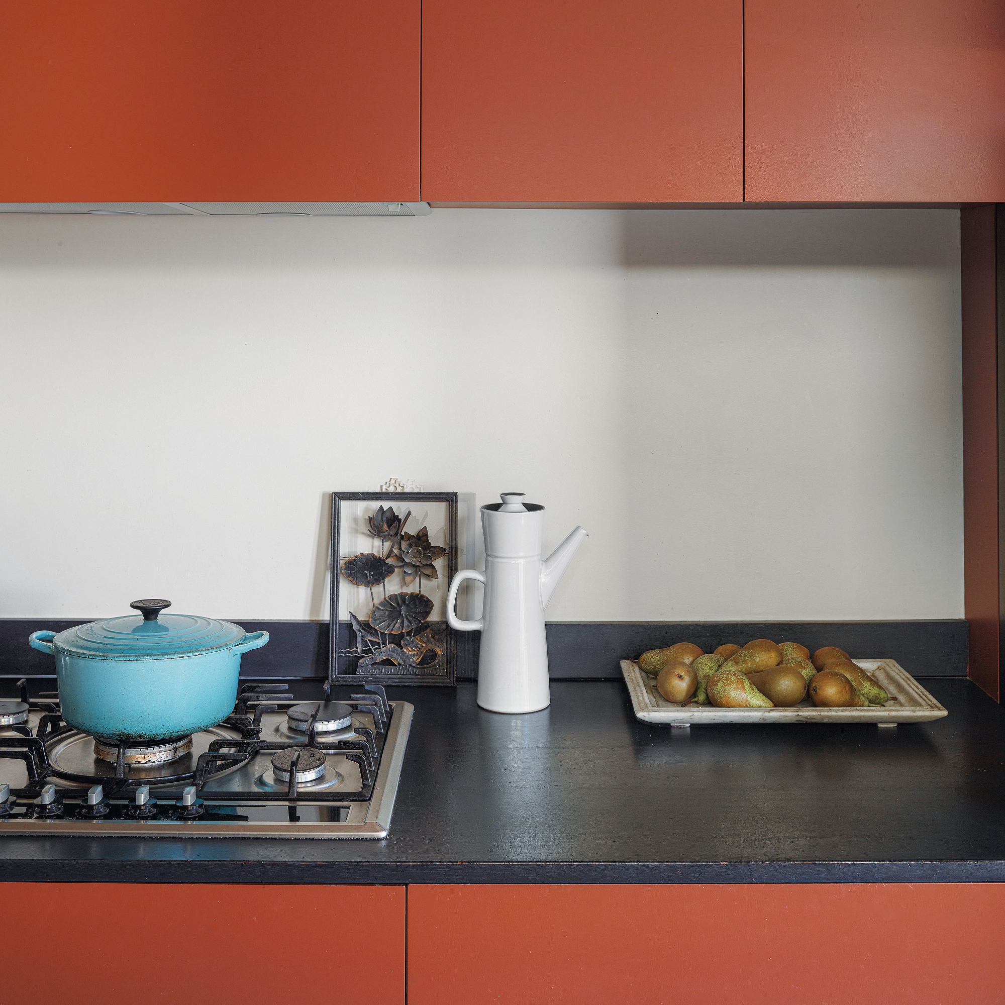 I’ve found a stunning £40 buy that rivals Le Creuset at Wilko - this casserole dish is a dead ringer for one of the most summery colourways
You just can't beat finding a great Le Creuset alternative
By Kezia Reynolds
-
 This beautiful mixing bowl is the unexpected star of so many kitchens – including Mary Berry's and the Bake Off tent
This earthenware bowl proves that you don't have to spend a huge amount for a classic kitchen addition
By Molly Cleary
-
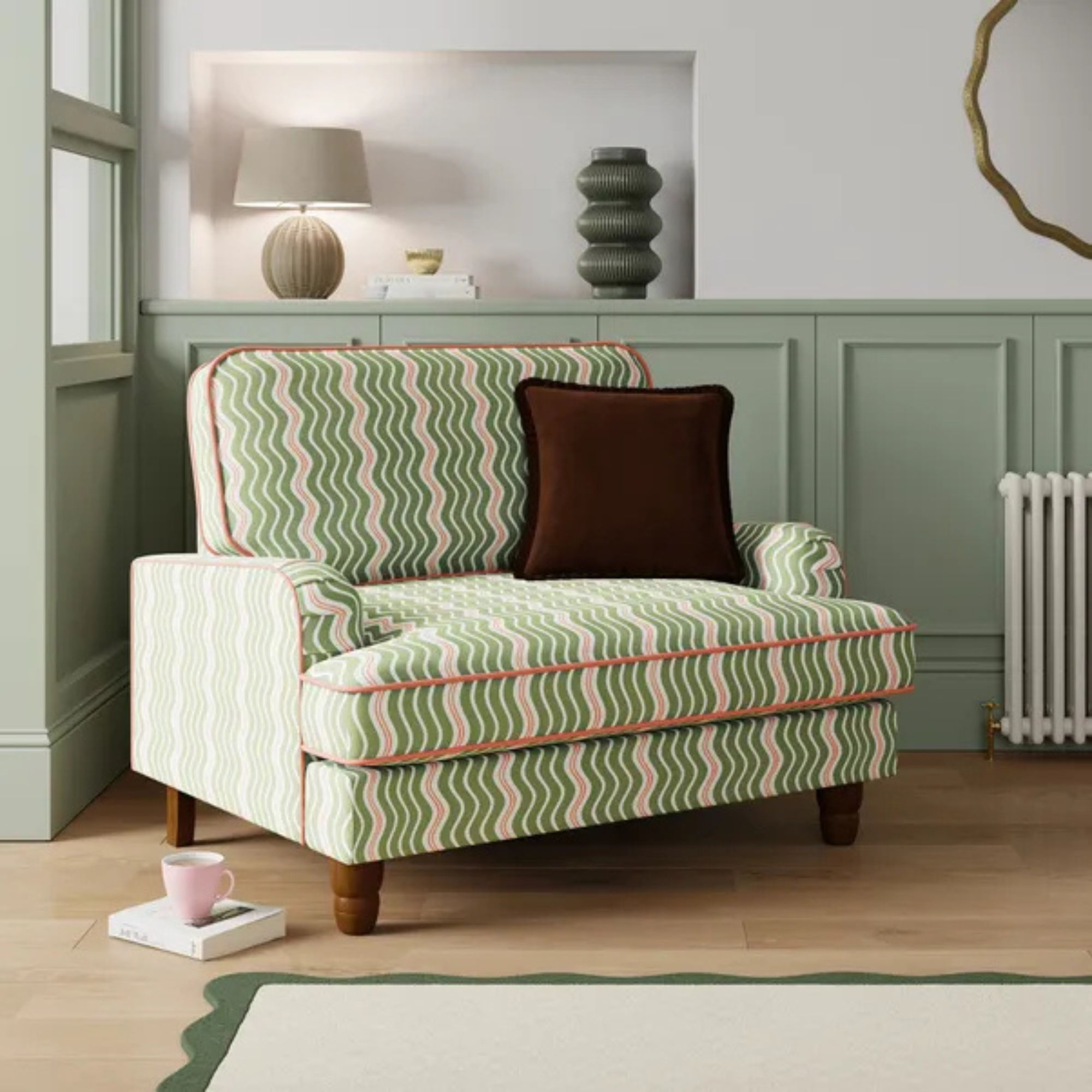 Dunelm has given its cult snuggle chair a new look - it's swapped classic stripes for another emerging pattern trend
I'm obsessed with this fresh new style
By Kezia Reynolds
-
 I tried Joseph Joseph's pan set with foldable handles – the space-saving design is just one of the many highlights
Small kitchen? I tested this innovative Joseph Joseph space-savvy set which has foldable handles — and I loved it
By Annie Collyer
-
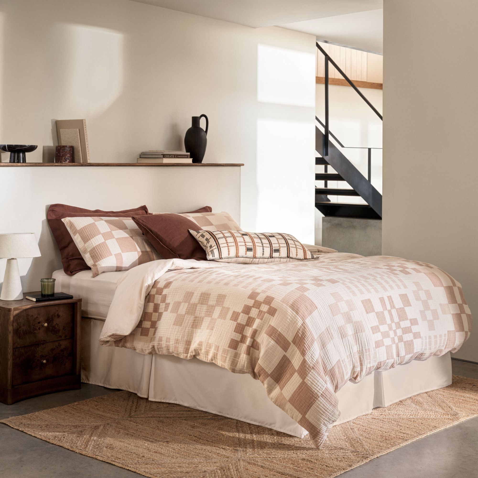 As a stylist, I spend hours looking for bedding for photoshoots, and I just spotted these 6 expensive-looking sets at M&S
Get a little luxury at a high-street price
By Laurie Davidson
-
 I've been waiting to try out the Ninja Slushi for months – this is what happened the first time I tried it
The Ninja Slushi is the stuff of dreams for summer entertaining
By Molly Cleary