5 tips on using bold colour from style guru, Tricia Guild
Style guru Tricia Guild shares her top five tips on how to use bold colour
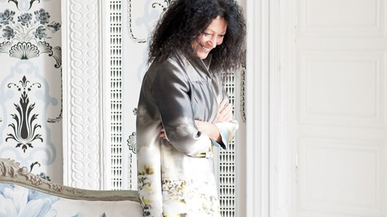

Colour is an essential component to any decorating scheme. It grounds a look, providing unity and cohesion. But it also energises us emotionally - having the power to feed the soul and make our hearts soar. With so much riding on it, it's the one area most people justifiably feel a bit nervous about when tackling a decorating project. There's really no need to worry though. Tricia Guild founder of iconic Designers Guild, knows a thing or two about how to use colour to its full effect. Here she shares some of her insights...
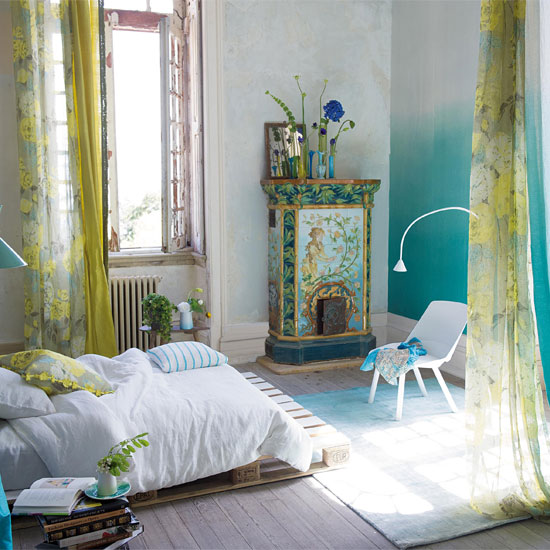
1. It’s all about balance.
I use a lot of black, white and ecru. I like to use hard floors and layer coloured rugs on them, and I work with white ceilings, which is about creating a calm atmosphere.
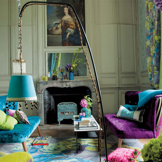
2. Colour should be strong but subtle.
Never garish. That said, one clashing object, like a fluorescent pink lamp in a black-and-white room, will really make a room pop. Educate your eye by making your own collage boards with postcards, bits of fabric, magazine tear sheets.
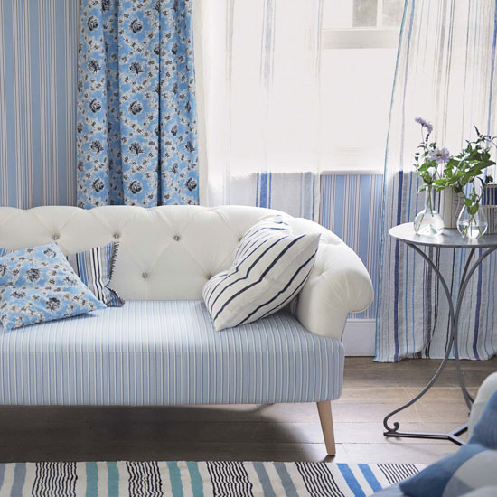
3. Be faithful to the colours you love to live with.
For me, it's ocean blues, lime green... It's fun to work with all sorts of shades, but easier to live with cool hues. That's not to say I don't like shots of warm colour, but the main artery is blues and greens - they are like neutral to me.
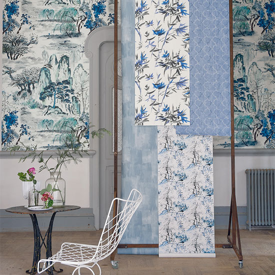
4. Experiment.
Although I'll never tire of cool colours against a white backdrop, I do also practice what I preach. I haven't changed my wall colours for 15 years, but I do update my fabrics - cushions, curtains, trims - as often as my mood takes me.
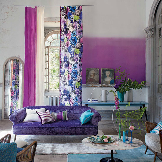
5. Inspiration is everywhere.Travelling has always been key. I go to India every year, and I also have a passion for Italy, where we have a home. I think you find inspiration by looking for it. We go to a lot of theatre and ballet, so I see incredible sets and costumes. And I also love gardening and food. And inspiration can come from anything. It might be a scrap of ancient fabric, an exhibition, an interesting archive, or even a post box. When you get up, and you see amazing blue sky, and wonderful landscape - don't you find that stimulating? It gives me energy.
******
Get the Ideal Home Newsletter
Sign up to our newsletter for style and decor inspiration, house makeovers, project advice and more.
-
 My go-to Ninja coffee machine is on sale for Easter weekend
It makes coffee shop quality achievable at home
By Molly Cleary
-
 When to plant out annual flowering plants for vibrant, colourful garden borders – and give them the best start, according to experts
Not sure when to plant out annual flowering plants? We've got you covered...
By Kayleigh Dray
-
 I'm a kitchen decor editor and didn't like this tableware trend - until I saw H&M Home's designer-look plates
They made it easy to justify a new crockery set
By Holly Cockburn