On paper, yellow is one of those shades with a lot to offer. Bold, bright, friendly, it has the power to uplift and energise. And yet we tend to avoid using yellow in our homes, deeming it a tricky colour to work with. Don't be daunted! Yellow's myriad shades, from primrose to mustard, saffron to sulphur can be used either as a block colour or as a bold accent to add contemporary edge to any scheme. Here's how...

1. Primary brights
In a light-filled space, dyed-linen curtains diffuse light, spreading a warm, sunny glow through a breakfast room. The walls are painted in a chalky egg yolk wash, contrasted by a softer, toning custard shade for the woodwork. The clean black lines of the furniture and lighting anchor the scheme, keeping it a bit more 'grown up'.
Wall painted in Chawka Gul emulsion, Eicó. Curtains made from Grand Bhutan Lattice cotton in Citron, Korla; and Brera Lino linen in Lemongrass, Designers Guild.

2. Ochre flow
The earthier tones of ochre – more exciting than brown, less intimidating than primary yellow – make it ideal for relaxing spaces such as a bedroom. The smart stripes of the duvet and floor runner and chunky texture of the chair also elevate the space with extra sophistication.
Curtain made from Coral cotton in Lion Yellow, Emma Bridgewater for Sanderson. Bed throw made from Orsay Rigato linen in Amber, C&C Milano. Walls painted in Yellow-Pink matt emulsion, Little Greene.

3. Canary notes
If all over yellow is just too much for you, temper the whole scheme with contrasting grey. Here, bold-striped blinds and a statement sofa really sing against the sutble soft grey walls. Decorating in two contrasting tones, like this, always looks
sophisticated.
Walls painted in Mole's Breath and Pavilion Gray, Farrow & Ball. Window blinds made from Jamaica Stripe in Plaintain, Chella at Summit Furniture. Hackney linen sofa, Wrong for Hay at The Conran Shop.

4. Citrus bright
Bathrooms often need brightening up, and the zesty paint effects here offset the white sanitaryware while still keeping the space clean and fresh.
Walls painted in Yellowcake estate emulsion, Farrow & Ball with accent circles and woodwork in Primrose matt emulsion, Designers Guild.

5. Marigold pops
The naturally punchy colour from potted plants pops beautifully against a simple neutral wall. Ain't mother nature clever?
Coloured glass mirror by Johanna Grawunder for Glas Italia at Chaplins.

6. Golden ticket
A little subtle pattern can add impact when set against flat blocks of colour.
Wallpaper is The Vase, by Clarence House at Turnell & Gigon.
-
 My go-to Ninja coffee machine is on sale for Easter weekend
It makes coffee shop quality achievable at home
-
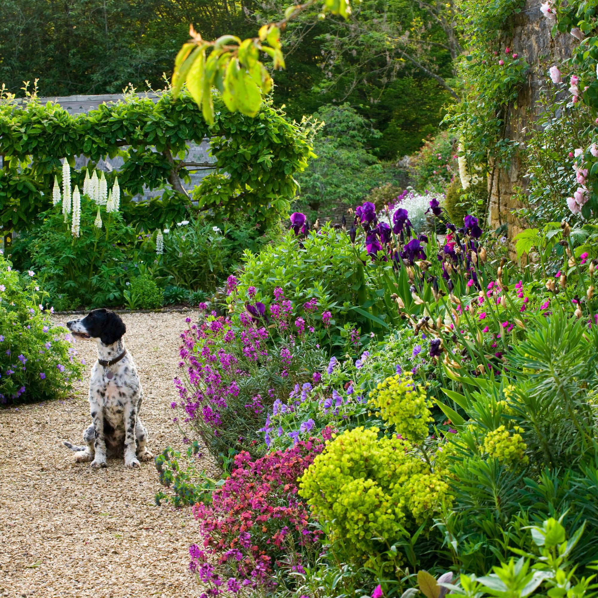 When to plant out annual flowering plants for vibrant, colourful garden borders – and give them the best start, according to experts
Not sure when to plant out annual flowering plants? We've got you covered...
-
 I'm a kitchen decor editor and didn't like this tableware trend - until I saw H&M Home's designer-look plates
They made it easy to justify a new crockery set


