6 great style steals from a lush ‘n’ luxe home
Blend lush foliage with luxe textiles and burnished finishes to bring the outside in
Living in sunny South Africa, it's not surprising that the owners of this Cape Town home
are experts at artfully blending lush foliage with luxe textiles and
burnished finishes in their split-level 1950s home. Be inspired by taking a leaf - or two
- out of their book...
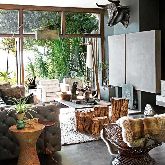
1 Go soft on raw materials with natural textures and foliage
Palm style plants screen the window to the garden creating a jungle feel which is echoed in pops of greenery around the living room. Rather than knock out the dated natural rock fireplace wall, the owners have concealed it with a plaster screen, with lights behind to give a soft glow in the evening. The tables are made from stumps of olive trees.

2. Create a designer-look kitchen
This rustic-meets modern kitchen is actually homemade units, decorated with a stencil and sprayed with ‘two tons of grey spray paint'. Previously separate from the main living space, the owners knocked down a wall to open it up and provide a clear flow through to the back door.
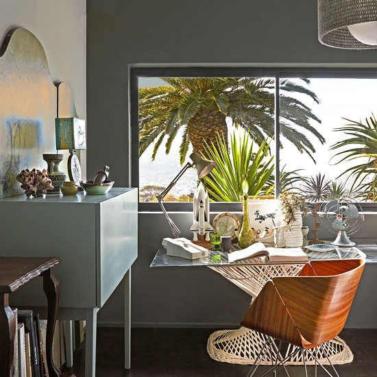
3.Get jungle fresh in the office
Fake the tropical paradise look with indoor lush palms and ferns, if you don't happen to have them growing outside! They add a fresh feel to this study where the owner has set them against upcycled and contemporary pieces mashed together. (The glass tabletop is taken from the original shower enclosure in the house - great idea!
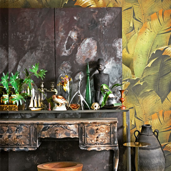
4. Make the hallway a focal point
The entrance to the house is a textbook example of layering - the wallpaper, screen and furniture create a 3-D tableau. ‘It a great place to lose your keys,' jokes the owner. The distressed sideboard was a white-painted flea-market find that the owner blasted with a blow torch, and the wallpaper is taken from a photograph, resized and reprinted to a larger scale.
Houseplants get a contemporary makeover mixed in with flea market finds and set against polished plasterwork.
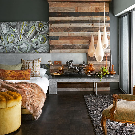
5.Get handy in the bedroom
The owner constructed the wooden wall from old grape palettes that a farmer had thrown away, mainly as a way to hang the three pod lights. He also made the concrete and glass table beneath. Soft fabrics contrast with the hard surfaces and make the bed even more inviting.
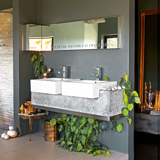
6. Be bold in the bathroom
Mix the rough with the smooth in the bathroom. This one was created from a guest bedroom. The ‘stone' support for the sinks was actually cast in concrete from a clay mould made by the owner. ‘Extremely heavy to put up, but worth,' it he says. Plants are encouraged to trail and love the steamy atmosphere.
Get the Ideal Home Newsletter
Sign up to our newsletter for style and decor inspiration, house makeovers, project advice and more.
-
 Ooni's new stand mixer is already a sell-out success
Here's why the Ooni Halo Pro Spiral mixer is a big deal for at-home breadmakers
By Molly Cleary
-
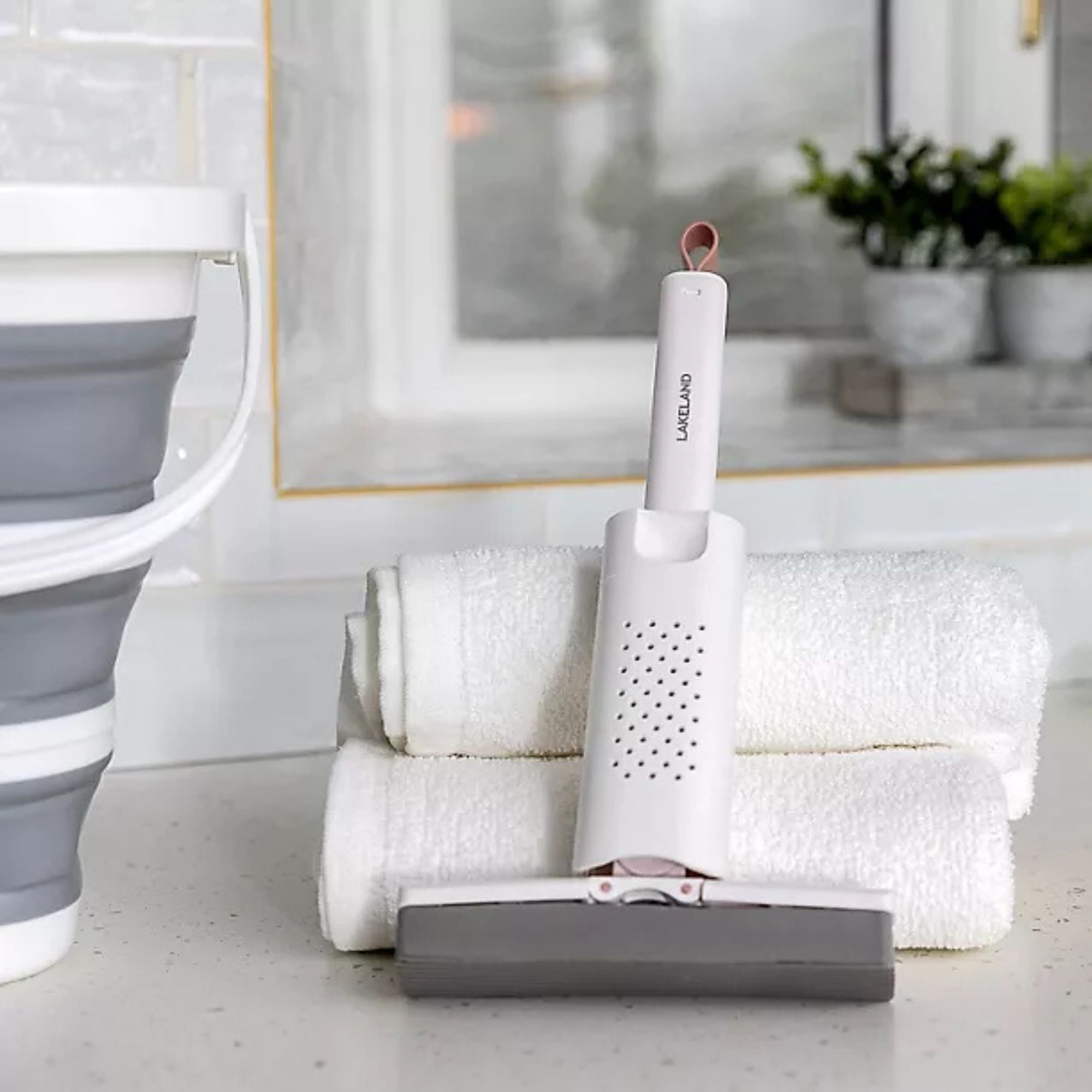 I’ve been using Lakeland’s new £5 mini mop as a shower squeegee, window cleaner and damp duster — it’s the ultimate multi-purpose cleaning tool
Yep, I've added this new mini cleaning tool to my collection
By Lauren Bradbury
-
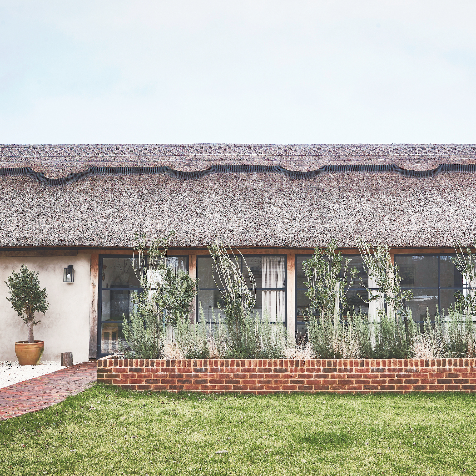 This old dairy barn was brought back to life and is now an amazing home
It's brilliant blend of old and new in West Sussex
By Sara Emslie