Kelly Hoppen and Daniel Hopwood style off: The Great Interior Design Challenge judges go head-to-head
The Great Interior Design Challenge is back on our screens. Judges Kelly Hoppen and Daniel Hopwood share their top trends with Ideal Home...

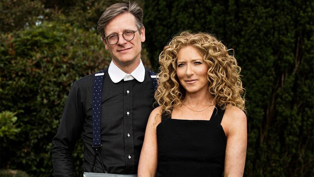
The Great Interior Design Challenge is back on our screens. Each week, three contestants battle it out to makeover a room, with just 48 hours and £1,000 to play with, overseen by judges Kelly Hoppen and Daniel Hopwood - who between them know a thing or two about great interior design.
Here, the two famous faces battle it out in our style off, with decorating no-nos and how to make bold colours work in any room...
Kelly Hoppen and Daniel Hopwood style off
What are your biggest trend predictions?
Daniel: The biggest trend predication (or hope) that I have is that we all start to see through 'trends' and instead become more creative and individualistic. These days there is so much available to us out there, we are almost spoilt for choice. Use that availability as a palette to create your own sense of style. Do avoid though buying from the internet (where possible), go and touch and feel, all our senses are required when buying for the home, not just the visual. Try not to buy everything from one source - mix and match different suppliers, throw in some old things, stuff you love and try a bit of customising. Putting your home together this way is more satisfying.
Kelly: I tend not to follow trends all that much, as I really do believe in classic and timeless design, however there a couple of directions that are making more and more appearances within designs. Cubism is something which I keep seeing more and more and no doubt will entertain the eye for a period of time. Crystals and precious stones seem to be making an appearance in furniture as an extension to the metals craze which took over interiors in previous years.
Which trend would you like to see the back of – and why?
Daniel: Do you remember Edna Mode the fashion designer in The Incredibles? She said, 'I never look back darling it distracts from the now'. How right she was, good design is about designing what people today need - don’t bring things back, create something new. I can see glamour coming back though. During my visits to the shows in Milan and Paris last year there was a distinct move towards, onyx, gold and velvets.
Get the Ideal Home Newsletter
Sign up to our newsletter for style and decor inspiration, house makeovers, project advice and more.
Kelly: I miss neutral back drops! Also the skill to edit down a design instead of trying all different trends in one space would be nice to have back. Basic things that create a huge impact such as colour palettes and textures are being left behind nowadays, and I think that is such a shame because there are the foundations of brilliant design in my eyes
Denim Drift and Greenery were previous colours of the year – which one would you choose?
Daniel: What excites me is when one colour is played against another. Right now I am playing around with palettes that are closely matched and yet slightly clashing - like deep burgundy and paprika. I wonder if Denim Drift might do the same thing with Teal or let’s play with putting Greenery next to a Canary Yellow - it might work.
Kelly: I actually really love Greenery but only when in small doses - over doing it can ruin it!
Is the trusty old feature wall dead?
Daniel: The feature wall is the wall of fear. If you like patterned wallpaper, cover the room in it, get to feel what the designer was intending to do with the wallpaper. You are just dipping your toe in by just covering one wall. If you want to use just a bit of expensive wallpaper put it on a raised panel and treat it as art.
Kelly: I think perhaps the classic 'feature wall a different colour' trend might be dead, however I think the feature wall trend has just expanded and grown with the times. As new designs are emerging you will see clever things such as using paper behind bookcases or in niches as the new type of feature wall – it is about being clever and creative with the space.
Paint or wallpaper – if you had to choose?
Daniel: That’s is a bit like asking to choose a favourite child. You would have to wrench both of them out of my arms. Ok, ok, paint then! It’s easier to transform a room in a weekend using it but no, no wallpaper! I just can’t resist the textures and patterns.
Kelly: I could never choose! I use both in my designs and both can create hugely different affects within a space. There are certain times I can’t imagine using a wallpaper and others I wouldn't think using paint so to chose between them both is too tough.
How can you make the trend for dark colour easy to live with?
Daniel: Try a dark scheme out, and if it doesn’t work for you, paint it out. I love a dark hallway as it makes the other rooms feel so light, or if you have a TV room that you use only at night try it there, as you create a moody, clubby atmosphere. I like to use very dark blues such as Hague Blue from Farrow & Ball rather than dark grey, it looks great set against a tan leather sofa.
Kelly: Well I would say that you can’t but I’m not sure if that’s just because I don’t want to!
Give us three tips to make a small room feel bigger:
Daniel: Enjoy its smallness; stretch the eye by placing objects on diagonals; reduce but over-scale furniture.
Kelly: Buy a bigger home? I joke! Always go with the following: Use light colours on walls and throughout the furniture and accessories in the home. Use as much natural light, paired with mirrors. Go for light wood or ceramic floors.
What’s the most common decorating mistake you see?
Daniel: Lack of confidence. Make a design decision then go for it, don’t compromise.
Kelly: Too much too quickly! People very often forget that you have to live with this space for a long period of time once it is complete and just go with things in the moment. This can make for quick-fire decisions which often end up being the worst ones at the end! Editing down is also key. I know sometimes you can get carried away with different styles and accessories and want it all in one room but remember not to over fill – edit down, leave anything that you love and ditch the things you only like!
When decorating a room, where should you spend your money and where should you NEVER cut corners?
Daniel: What is important is to research and plan your scheme. Create a spreadsheet and put on it all your wish list. If you can’t afford all of it miss a few bits out, but don’t compromise - you’ll get the other pieces eventually.
Kelly: I would never cut corners with lighting, plumbing and hard finishes - these things can make all the difference when looking at the final project. Second to that is furniture.
Which colour would you NEVER work with (despite your client’s requests!)?
Daniel: None, throw a colour at me and let’s see if we can make it work.
Kelly: The colour palette of brown and blue together - it makes me itch! There is something about those two colours that I find so off putting. It isn’t often that it is requested but when it is, it's a straight up no from me – we always find a way around it.
What’s your favourite room in your home and why?
Daniel: The guest loo. It’s the only place I can get a bit of peace. I thought I was being clever installing a movement sensor for the lights, so I now have to wave my arms to turns the lights back on.
Kelly: Every single room is my favourite! If you can’t love them all equally then something has gone terribly wrong along the way. That's perhaps why it is so important to take time and patience when designing every room in the home.
What’s the best thing you’ve ever bought for your home?
Daniel: A double drawer dishwasher from Fisher Pykel. I never have to empty it again, as I just alternate dishwashers. Using one for storage whilst the other is being stacked.
Kelly: That is a tough question to answer because I am in love with everything! My home is still relatively new and every piece was hand selected - the project was my baby. However I really do love my art pieces. I have been collecting for years and I have a few pieces which are priceless to me.
Describe your style in three words:
Daniel: My style? It’s hard to nail as it constantly changes. My inspirations are the clients that I work with. Sorry three words is not enough, maybe a book would be better…
Kelly: Purist; harmonious; gracious.
What’s your favourite thing about working on the Great Interior Design Challenge?
Daniel: Kelly Hoppen, Tom Dyckhoff, Michelle Ogundehin and Sophie Robinson, the contestants and a dedicated production team including Wayne, Stuart, Steve, Jonny, Dicky, Jo, Dean and Darren. There is a lot of love and passion put into the series.
Kelly: I really love working with Dan and Tom - we have so much fun. Right from the beginning I knew we were all going to get on like a house on fire but it actually exceeded my expectations in the end. We laughed right the way through! All the contestants are brilliant, too, so courageous and gutsy to come on a show like GIDC and put themselves out there. It is so inspiring and incredible to watch them all grow individually - a process I have truly loved!
Describe the show in three words:
Daniel: It’s fun, fast-paced and thoroughly entertaining!
Kelly: Inspiring, fun, and humbling.
-
 Typhur Dome 2 air fryer review – a glimpse into the future of air frying
The Typhur Dome 2 cooks food brilliantly and has all sorts of benefits, but is it worth the £499 price tag?
By Ellen Manning
-
 In creating their lush multi-use garden, the owners have cleverly futureproofed the space for years to come
With a zone for dining, a veg plot, a relaxing sun trap, and space for quiet contemplation
By Ginevra Benedetti
-
 5 reasons why your grass seed isn’t growing and what you can do to help, according to garden experts
For a lush, green lawn, you have to ensure the conditions are just right
By Kezia Reynolds