Tile layout patterns to creatively transform walls and floors
Create stylish impact in your home with tile layout patterns that will upgrade any tiled surface - from splashbacks to floors and walls to showers
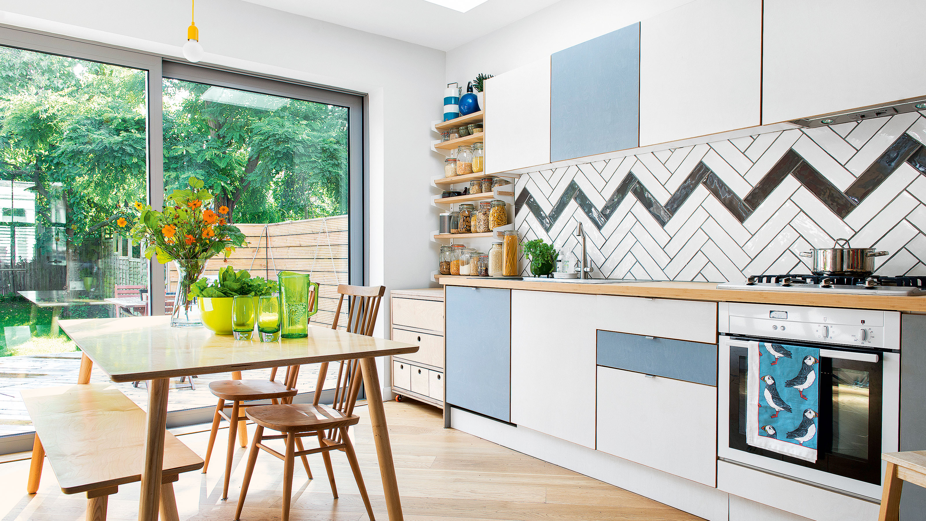
So, you’ve chosen your tiles, job done right? Not quite. In fact, the tile layout patterns you choose can have as big an impact on the overall look and feel of your room as the tiles themselves.
Whether it's kitchen or bathroom tile ideas you're looking for, finding the perfect layout can transform even the most simple of tiles. Playing around with shapes and angles can add a whole new dimension to your space in terms of style.
‘The beauty of tiles is that they can be arranged in a laying pattern that suits your style, adding originality and individual flair to the overall look and feel of your room’, says Harriet Goodacre, tile consultant, Topps Tiles. ‘There’s an array of laying styles to pick from such as brick bond, herringbone, linear and basketweave. The overall finish will depend on the tile shape you use as well as your style preference, so it’s important to give this careful consideration’.
Your choice of laying pattern even has the potential to enhance a room’s dimensions.
‘Taking into consideration the size of the space you want to tile is important when choosing your laying pattern,' adds Harriet. 'Learning how to enhance the space can help create the feeling that the room is bigger than it is.'
Tile layout patterns
How creative you are with your tile layout patterns is up to you, however, you will need to take a few things into account. Firstly, your choice of tile; ornate or patterned tile designs often benefit from simpler layouts, while complex layouts can add interest to plain, neutral tile, for example.
You’ll also want to think about where you’re tiling, and how big the area is. Certain layouts are better suited to small splashbacks, others to bathroom flooring and so on.
Get the Ideal Home Newsletter
Sign up to our newsletter for style and decor inspiration, house makeovers, project advice and more.
1. Brick it
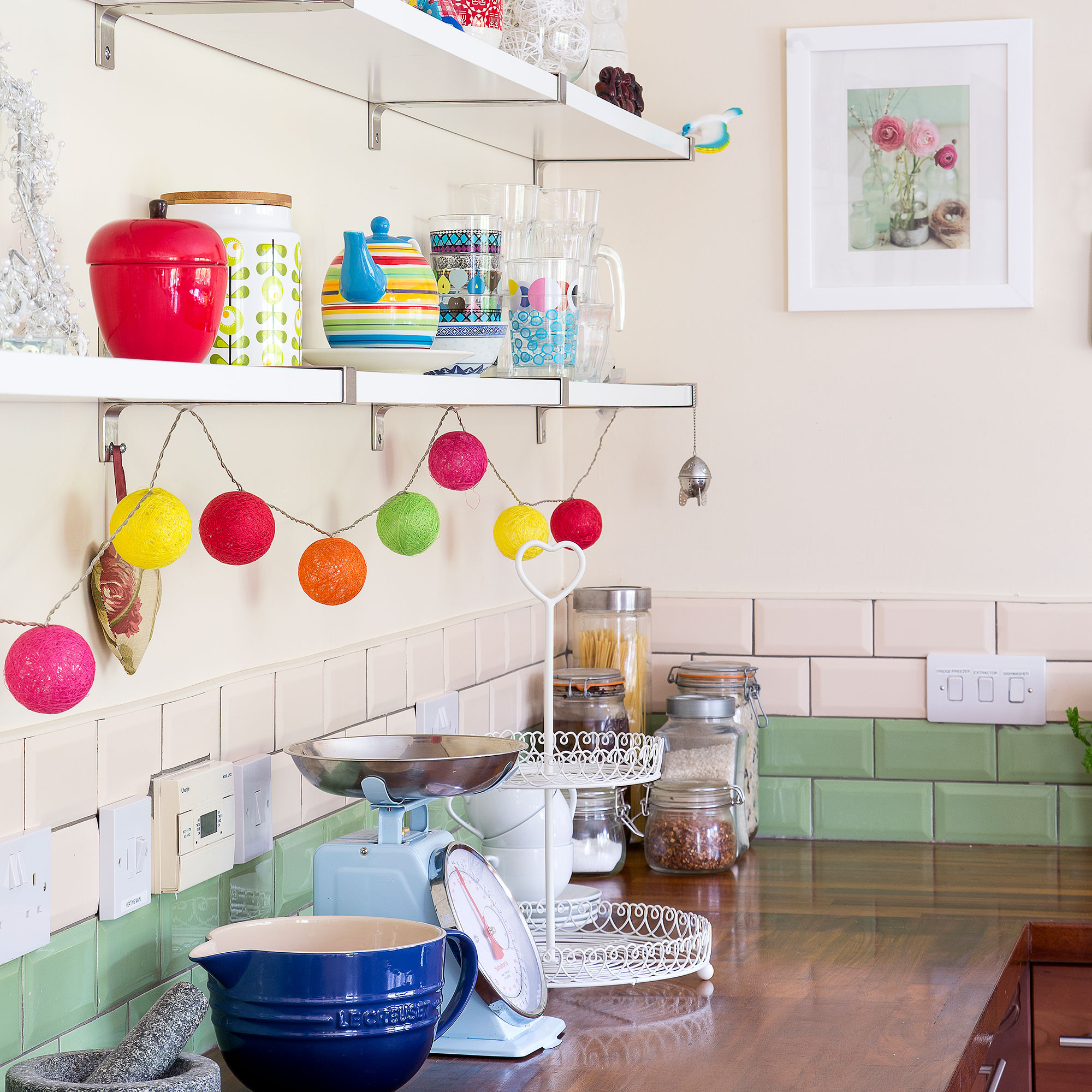
Simply yet stylish, the brick bond layout is a popular choice for tiling walls. Consider jazzing up kitchen tile ideas on the splashback by opting for contrasting colours laid in bands. This cool colour blocking effect not only looks great but helps to elongate your space and make it feel larger.
Pick out a key colour used elsewhere in the room, such as on the kitchen cabinetry, or if you’re using more than one colour with darker tones at the bottom and work up to the lightest shade to create a feeling of height.
2. Mix and match patterns
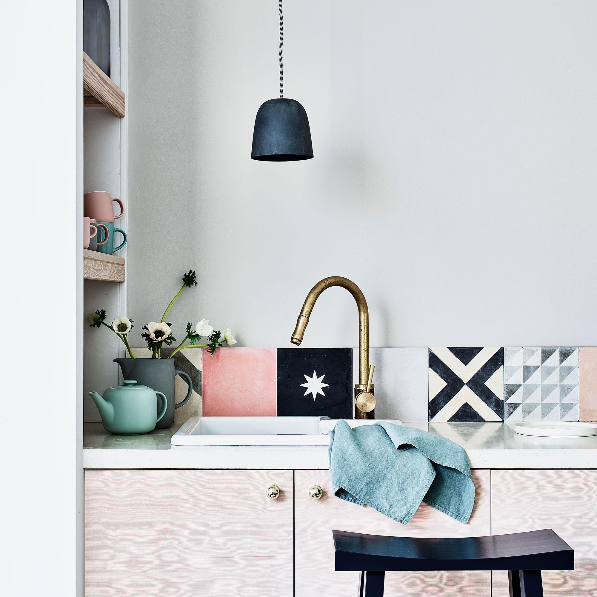
Can’t decide on your favourite tile pattern? Embrace bold prints and vibrant colours and have them all – combine with plain tiles to let the shapes take centre stage or lay side by side to create a modern, patchwork effect.
Keep the rest of the room plain to let your patterns really pop.
3. Take it to the edge
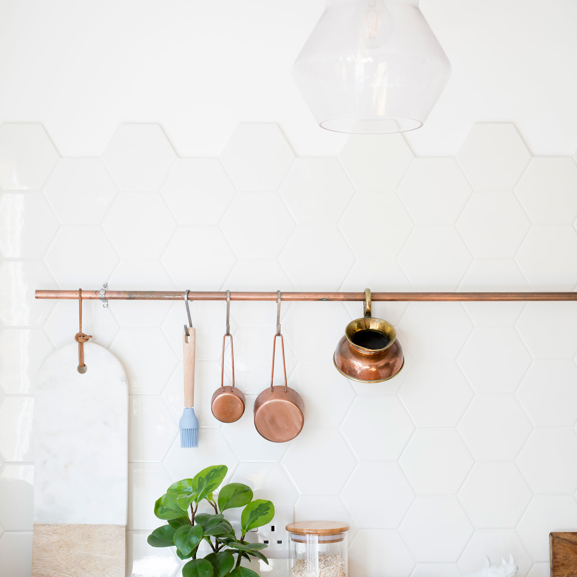
Honeycomb tiles are bang on trend, so why not use them to give walls a bit of an edge – literally.
‘If you want your kitchen tiles to look unique but you’re hesitant to use colour or pattern, consider creating a cloud-effect edge with hexagon shaped tiles’, advises home expert Yvonne Keel at Hillarys.
4. Switch direction
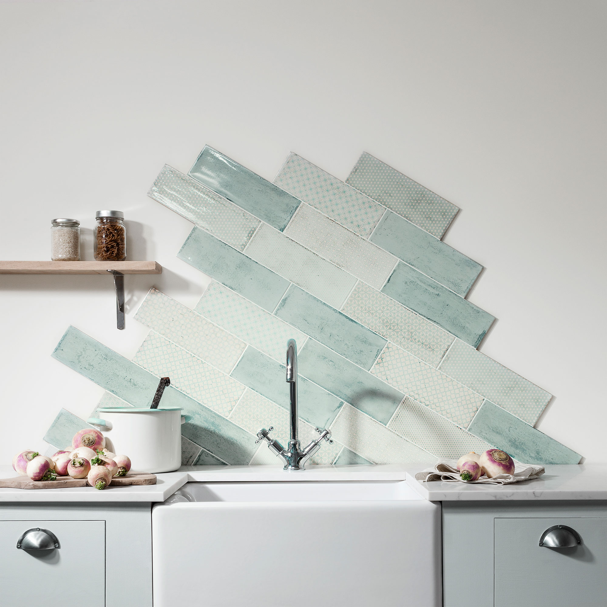
Ever thought about laying tiles on the diagonal? It’s a little trickier to do and there will be more cutting involved (be sure to allow for extra for this) but it yields big results in terms of impact.
Bold kitchen splashback ideas can create a fun focal point in an otherwise neutral and pared back space.
5. Add interest with chevrons
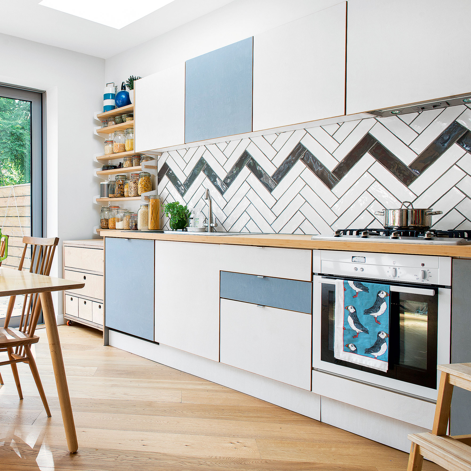
If you’ve played it safe with colours and cabinetry, a herringbone layout is a great way of adding interest to a space. On walls, a traditional horizontal herringbone widens a room, while a vertical take can draw the eye up, creating the illusion of height.
A long, rectangular tile is the ideal shape – give it some extra pulling power by highlighting single chevrons in a bold, stand-out shade.
6. Stack it up
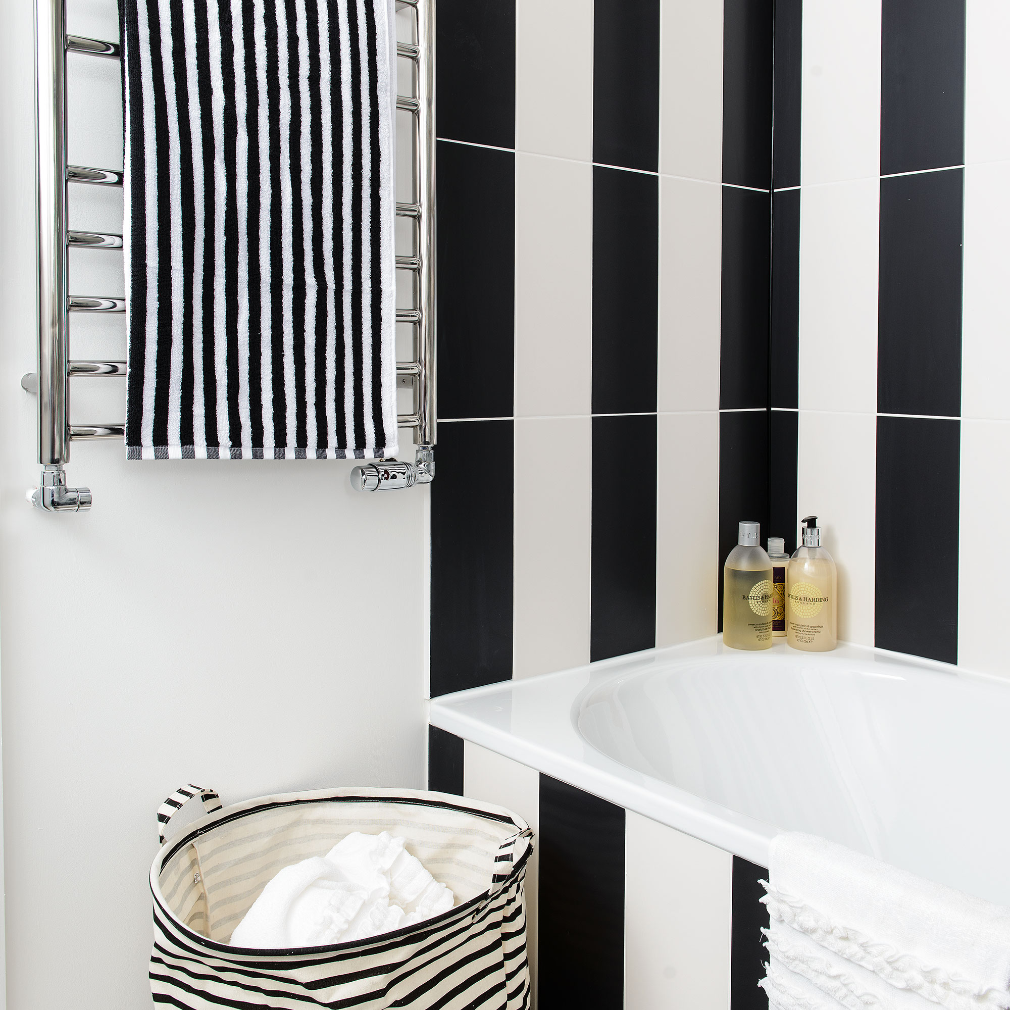
‘If you’re planning to use metro, subway or brick tiles, consider the stack bond layout’, says Emma Hughes, studio manager, Original Style. 'It’s one of the most straightforward. The tiles are aligned to form a basic repeating grid, resulting in a clean and modern look that will bring any kitchen or bathroom up to date’.
Turn the stack bond layout on its head – literally – by laying tiles vertically instead. It’s just as easy to do and works brilliantly in smaller spaces - think bathrooms, cloakrooms and shower tile ideas. Plus it opens opportunities to get creative with colour and pattern.
7. Put a twist on a classic
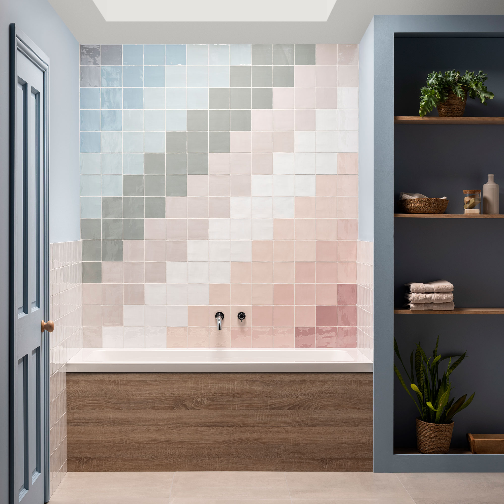
A stylish tile layout isn’t always dictated by shape – being clever with colour can make all the difference. A classic mosaic-style pattern can be given a modern upgrade by choosing tonal colours laid out in a spectrum
A detailed design brings character and depth just as effectively in smaller areas, such as splash-back zones, as it does across full floors and walls, and is a great way of adding a decorative touch to plain tiles.
8. Go ‘on grid’
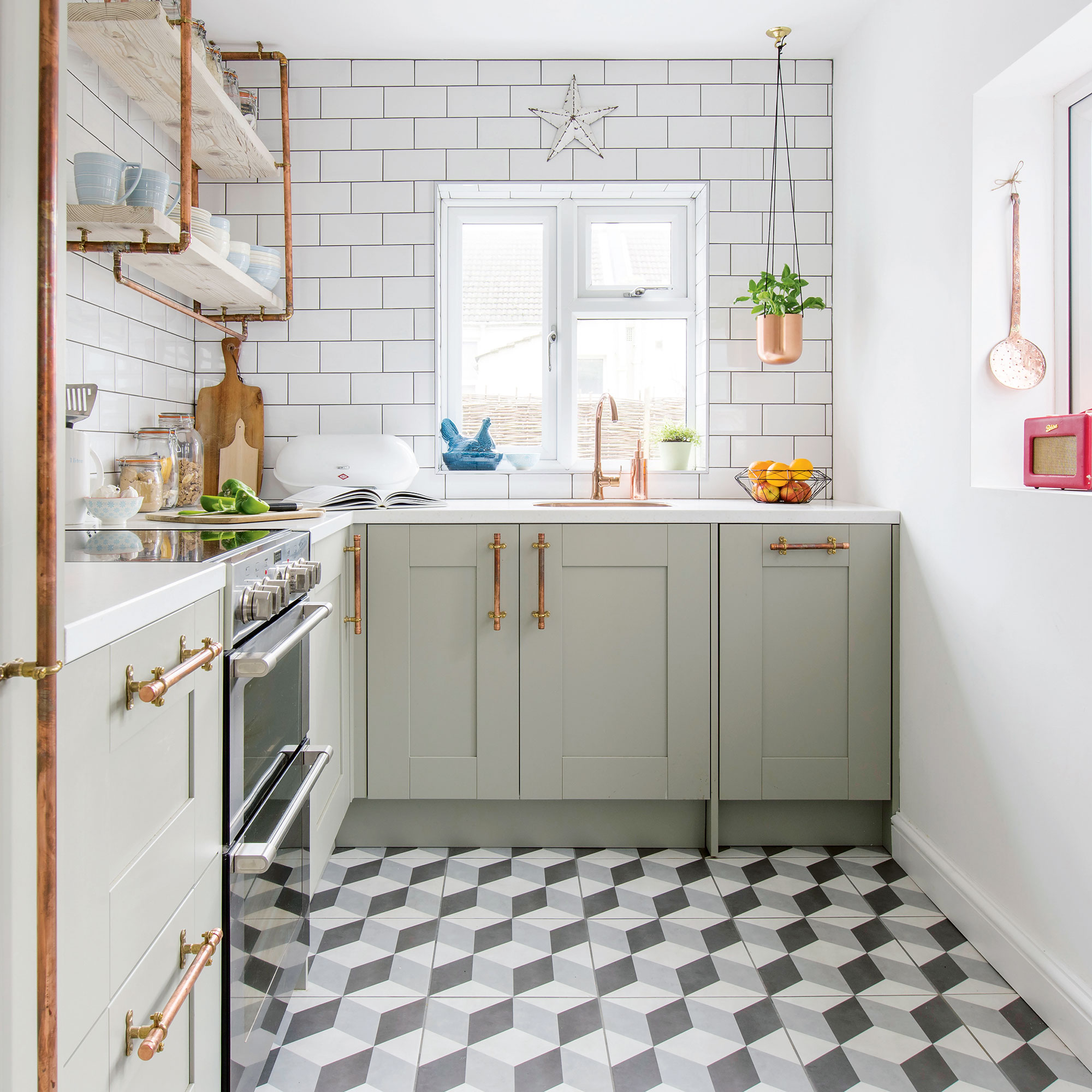
Whether you prefer modern geometrics or rustic encaustic patterns, bold kitchen floor tile ideas make for an instant talking point. A simple, grid-style tile layout is usually your best bet, particularly if your tiles are square or large-format. Laying them in linear blocks won’t distract from the design and shows off oversized repeat patterns beautifully.
If you’re tiling the wall too, opt for a plain metro or subway tile in a neutral shade to allow the floor ‘star of the show’ status.
9. Choose multiple layouts
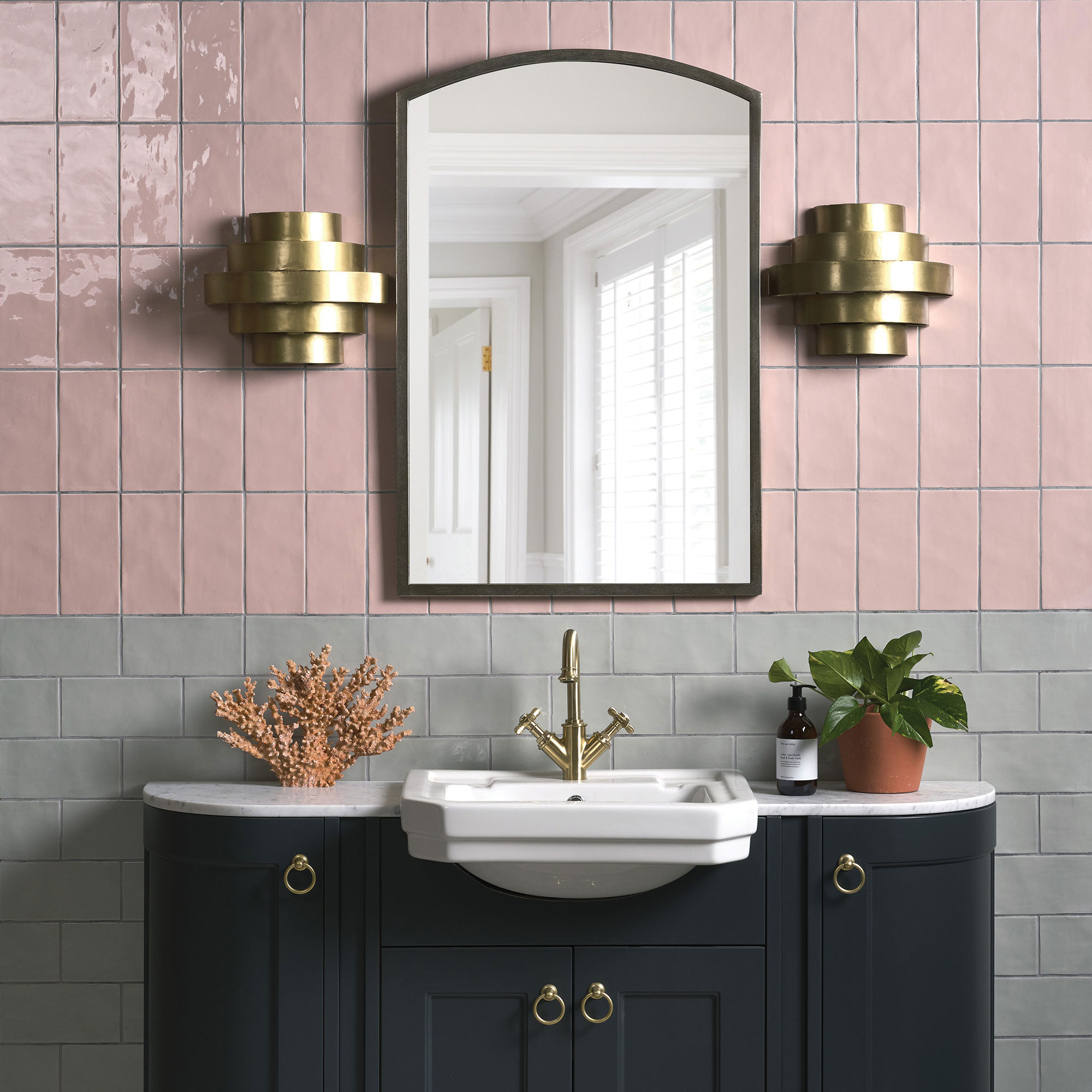
Who says you have to stick to just one tile pattern idea? Create a stand-out feature wall by switching from horizontal to vertical layouts. You can mix it up with your bathroom floor tile ideas, too, for ultimate impact.
By choosing inexpensive metro tiles in bold contrasting colours, you can create the illusion of all-over patterned tiling without the hefty price tag. Plus they’re super easy to lay so no need to hire a professional – unless you want to, of course!
10. Opt for shapely scallops
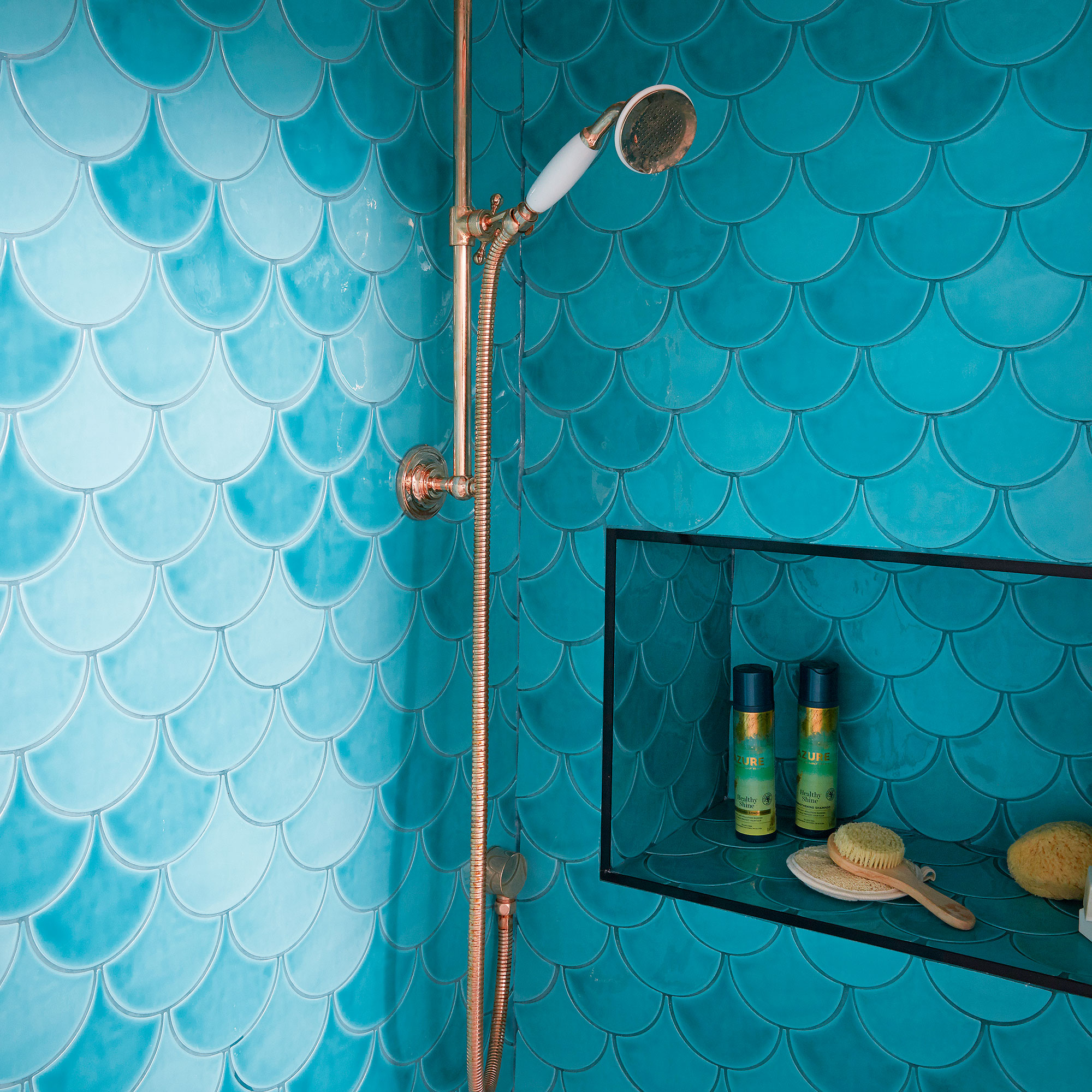
With their soft curves and round edges, scallop or ‘fish scale’ tiles offer an abundance of possible layouts across walls and floors, as well as in showers, hallways and even living rooms, too.
‘This type of tile can be laid in a variety of ways to create different effects,' says Harriet from Topps Tiles. 'A horizontal look gives a fish scale pattern reminiscent of the Art Deco era, making your walls feel as if they flow around the room. Whereas the opposite tear-drop shape creates a more rustic, Moroccan feel.'
Learn how to grout tiles to add extra impact. The type of grouting can also help to transform the feel; a contrasting shade will highlight the shape as demonstrated here, while opting for a similar hue creates a more subtle look.
How do I choose a tile layout?
When choosing a tile layout, there are a few things to take into consideration. Firstly, the tile design you have chosen. Certain layouts work better with certain tile designs, some don’t won’t complement them at all, so this is an important step.
Secondly, the area you want to tile – is it large or small? Again, certain tile layouts are better suited to larger and smaller spaces.
Thirdly, you’ll want to consider the skill level involved. This is helpful if you’re torn between going for a simple layout or something a little more complex – opting for a complex layout might involve costlier tiling quotes, or if you’re doing it yourself, might prove more hassle than it’s worth!
‘The simplest design to go for would be a square-set, grid or brick bonded pattern,' says ays Amanda Telford, marketing manager, CTD Tiles. 'But if you would like a tile pattern which is more interesting and on-trend, then a herringbone or zig zag pattern is a fantastic choice.'
What tile pattern is best for small rooms?
It’s a common misconception that you should stick to small tiles in small rooms. In fact, the multiple grout lines necessary can make the space feel cluttered. Larger format tiles have the opposite effect.
‘Laying larger tiles results in fewer grout lines, which creates a sleek effect and makes rooms feel bigger’, says Charlotte Deprez, national kitchen design and showroom manager, MKM. She recommends a simple stack bond layout for a clean and modern look.
‘For added interest or to bring height to a room, consider placing them vertically instead.'
How do you plan a tile layout?
Once you’ve decided on your tile layout, the next step is to plan how it’s going to work within the space. If you’re using a variety of colours, shapes and patterns, experimenting with combinations to see what works best is a good idea. Place your tiles on the floor first to find your perfect layout, then take a picture so you can replicate it easily and avoid any mistakes.
-
 I ditched my regular vacuum to test Shark’s newest (and cheapest) release — it’s a great entry-level Shark vacuum cleaner
The Shark PowerPro is cheap and cheerful, but might not suit everyone
By Lauren Bradbury
-
 How to make bedding last longer – avoid buying twice with these expert tips for getting the most out of your bed linen
5 top tips for prolonging the lifespan of your bed linen, duvet, and pillows
By Amy Lockwood
-
 I was introduced to this clever heart-shaped trowel 2 months ago, and now I'll never garden without it – it's made planting seedlings so easy
It's affordable and stylish
By Sophie King