The top 54 paint colours of the decade – all the shades we couldn't live without
The are the most popular hues decorating our walls over the last 10 years...
Was it really the 2010s if you didn't paint at least one room in your house in Farrow & Ball's Elephant Breath? Or a bedroom in Little Greene's French Grey? The top paint colours of the decade show we had a healthy obsession with decorating our homes (of course) and that we got more daring with richer, deeper colours as time went on.
That's right, we graduated from Elephant's Breath and went to the dark side in the form of midnight hues like Stiffkey Blue, dark greys like Benjamin Moore's Kendall Charcoal, and even blue-black to full-black colours like Farrow & Ball Railings and Little Greene Jack Black.
The top paint colours of the decade
Peter Gomez, lead designer at Zoffany, explains, 'For the latter part of the decade, we all began to decorate with more confidence. We’ve become braver with darker hues and are not afraid of making a brighter statement. There seems to be a more sophisticated way of using related tones to create a layered and sophisticated interior whether that’s through painting ceilings or decorating all four walls the same colour.'
We might have got more daring with our DIY and decorating choices, but there's always room for a softer side. It explains why plaster tones and dusty pinks like Farrow & Ball's Setting Plaster have also proved ultra-popular.
As we've become increasingly eco-consicous, the end of the decade saw a focus on earthy colours and connecting with nature, including green in many forms, from olives like Farrow & Ball's Sap Green to khakis like Annie Sloan's French Linen.
Keen to know more? We've rounded up the top paint colours of the decade below to see what's rocked our walls for the last 10 years...
1. Elephant's Breath 229 by Farrow & Ball
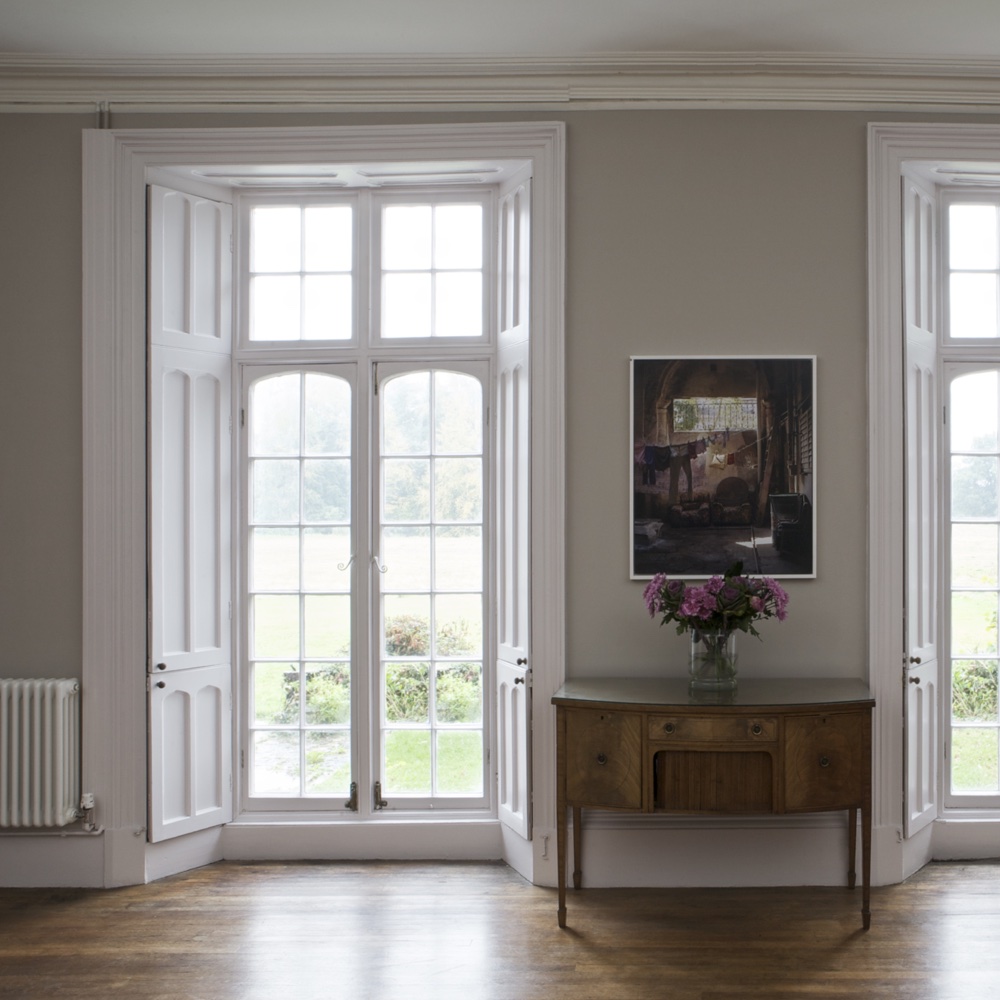
It wouldn't be a top paint colours of the decade feature without Elephant's Breath. 'At the beginning of the decade interior enthusiasts had already begun to turn their backs on creamy warm neutrals and fallen madly in love with grey tones instead,’ says Joa Studholme, Farrow & Ball Colour Curator.
Get the Ideal Home Newsletter
Sign up to our newsletter for style and decor inspiration, house makeovers, project advice and more.
‘However, many were still wary of the cooler feel often so evident in blue greys. Elephant's Breath was the answer – both the colour and the name took the world by storm as it was the perfect mid tone warm based grey that would give your home a contemporary feel without it feeling too gritty cold or industrial.'
2. Aquamarine Light by Little Greene
A post shared by Heather Young (@heatheryounguk)
A photo posted by on
Heather Young, Executive Editor at Ideal Home, says: 'I’m a big fan of a pale Scandi-inspired aquamarine shade, which is halfway between mint and a very delicate, soft sage. I've used it in my living room and in my bedroom as it feels fresh and bright, but also incredibly calming.'
3. Chic Shadow by Dulux
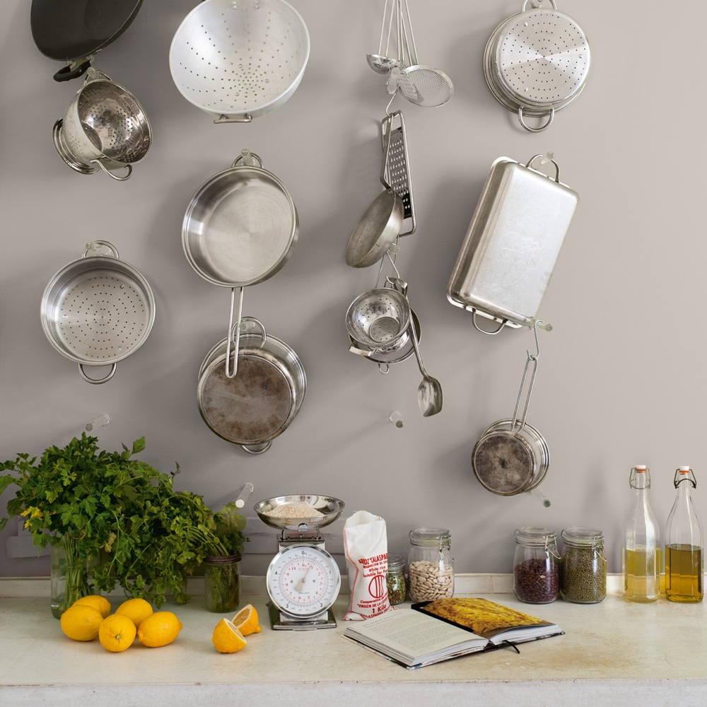
Chic Shadow is a versatile grey that would look at home in any room, from the kitchen to the lounge. 'We painted our living room in Chic Shadow from Dulux, and its the perfect mid-grey to pair our bright pink and navy blue velvet sofas with,' says Ideal Home's features and homes editor Holly Walsh.
4. Burlington Arcade by Mylands
‘Described by Mylands as 'a robust shade influenced by this historic shopping arcade in Central London'. 'I’ve used Burlington Arcade to decorate my downstairs cloakroom idea,’ says Ideal Home editor-in-chief Amy Cutmore. 'Two years on, I’m still madly in love with it. It’s a strong colour; utterly timeless, and brings cosiness and vibrancy to what could seem a cold and clinical space.'
5. Railings 31 by Farrow & Ball
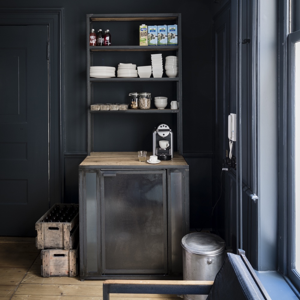
'As grey became more and more popular people became braver with depth of colour,' says Joa. 'Many moved over to the ‘dark side’ using Railings, a, colour that had previously only been used on exteriors, in halls and small cloakroom.'
'Everyone became less concerned about space and more concerned with mood and creating drama. A complex colour that is neither black nor blue ‘Railings’ is respectful of traditional proportions but is particularly useful to create dynamic spaces in contemporary homes.'
6. Stiffkey Blue 281 by Farrow & Ball
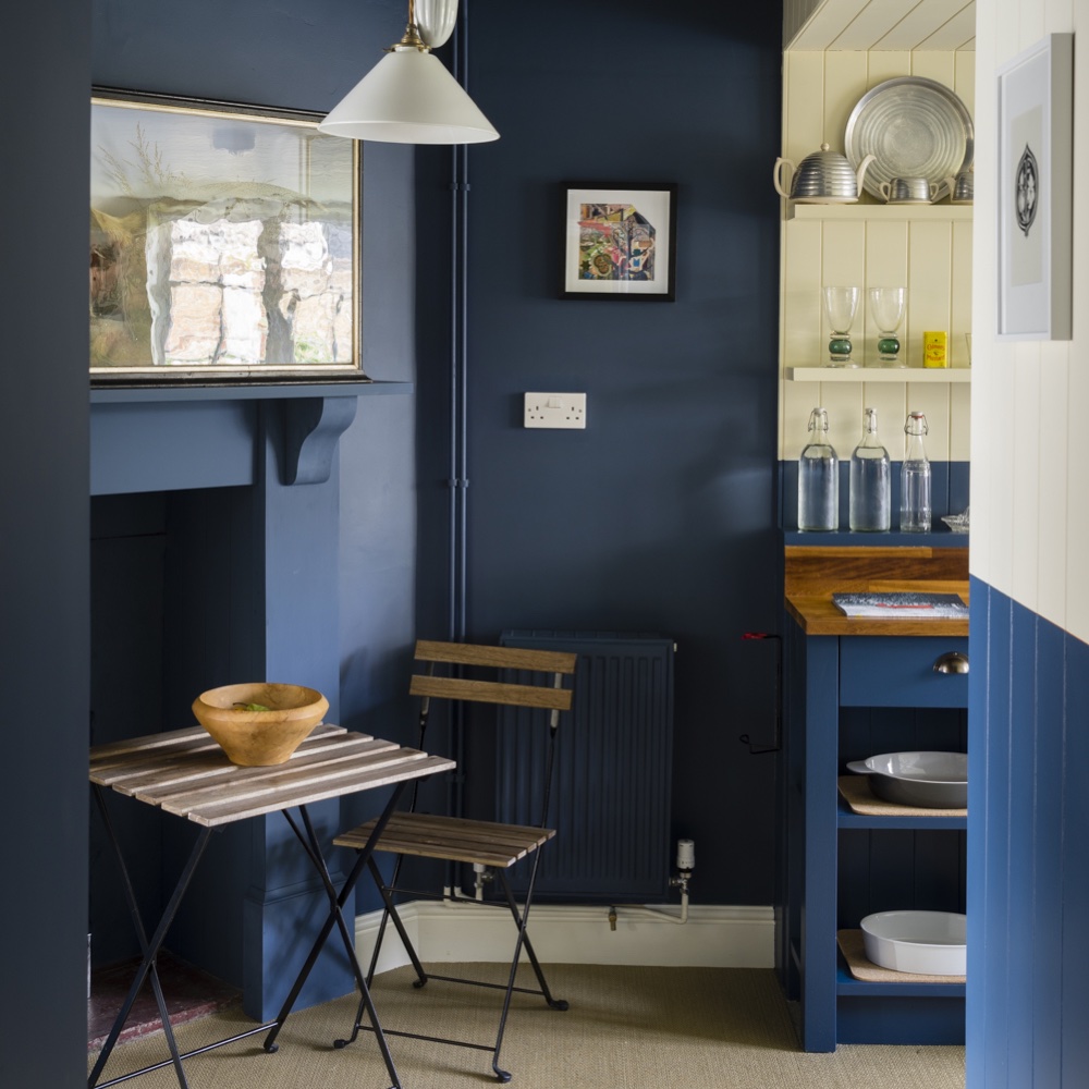
Farrow & Ball's Joa Studholme says: 'As the use of stronger colours on walls became more acceptable, there was an understandable desire to find an alternative to charcoal greys. Stiffkey Blue took on that mantle – a sophisticated dark blue which somehow manages to feel dramatic when used in isolation and fresh when combined with a simple white.'
'Despite its drama, which comes from its unrivalled depth of colour, this is a family friendly colour that proved to be instantly popular.'
7. Setting Plaster 231 by Farrow & Ball
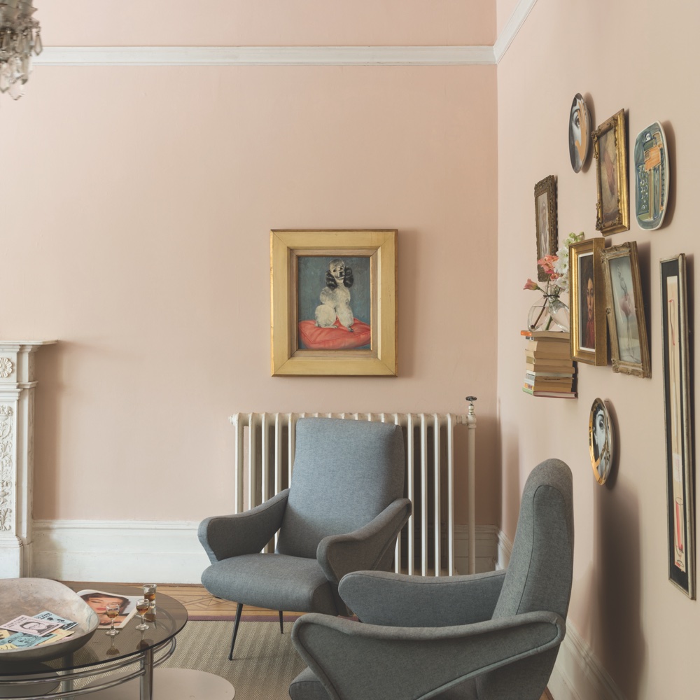
'There came a time in the middle of the last decade when we all felt we wanted our homes to give us a hug,' says Joa. 'Setting Plaster has the most soothing effect, so did just that – wrapping you in a comforting glow that is warm and welcoming.'
'This plaster colour never feels overtly pink, but has a seductive quality resulting in spaces that are soft and gentle but still full of impact. Pink was no longer banished to the bedroom; it was welcoming in any room.' Making pink living room ideas more popular than ever.
8. De Nimes 299 by Farrow & Ball
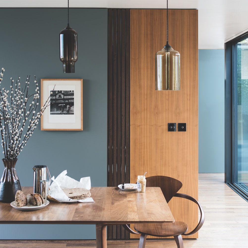
'When the world felt like it was in a bit of turmoil there was a seismic shift in the way we were using colour in the home,' explains Joa. 'We wanted to use colours that comforted us and felt nostalgic – colours that not only enrich our homes but also our souls.'
'De Nimes like the workwear fabric it is named after, straddled a barrier, it is ultimately fashionable but always feels grounded. A complex blue, with a distinct air of nostalgia, it is perfect for those who were wary of moving into a world of colour because it still has a comforting underlying grey tone.'
9. Heartwood by Dulux
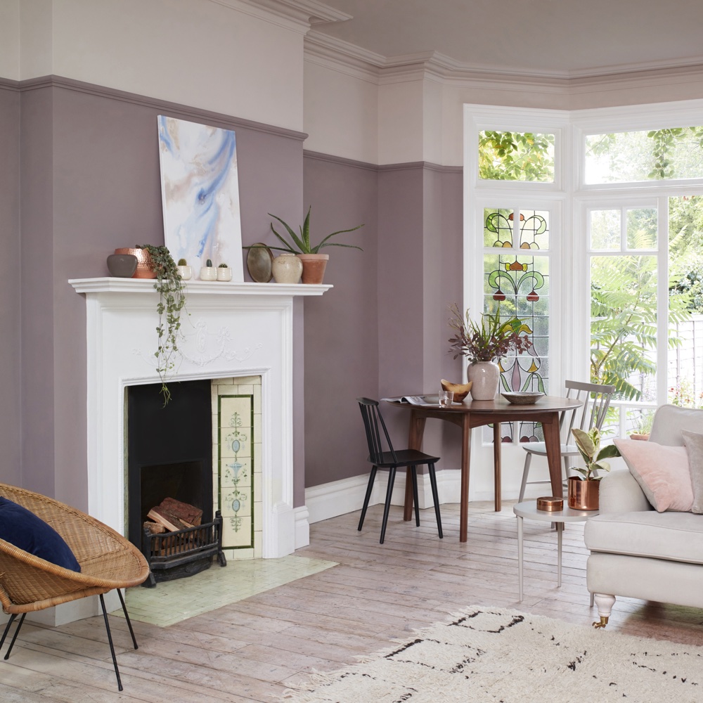
Marianne Shillingford explains, 'Heartwood is a really popular colour that proves we are not a nation of scaredy cats when it comes to using stronger shades. The colour of unfired clay, it’s so popular because it has the magical quality of changing colour as the sun moves across the sky giving it an organic quality that looks subtly amazing without dominating a room.'
10. Sap Green by Farrow & Ball
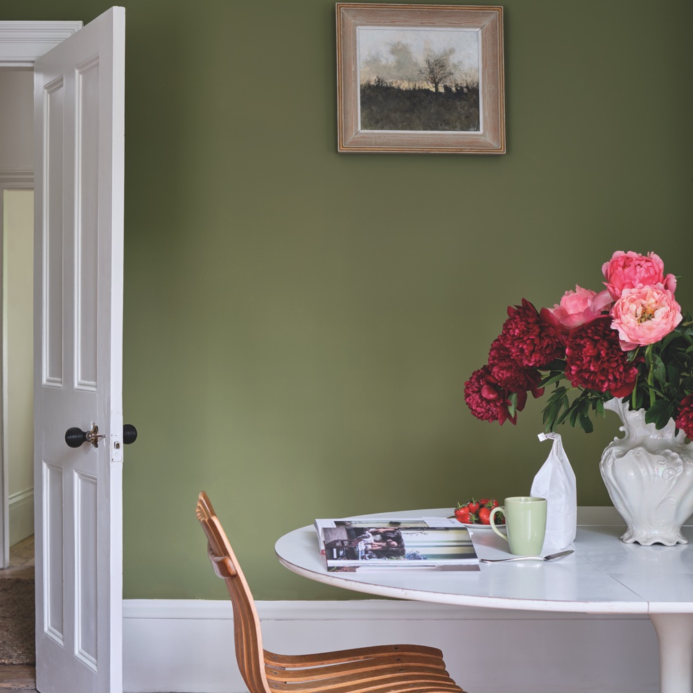
Farrow & Ball's colour curator Joa Studholme says, 'At the end of the decade, as we became more environmentally aware, green became the go-to colour. Sap Green is a sober, olive green that adds modern day glamour to any room while retaining a strong connection with nature.'
'It has an unmistakably organic feel that brings a little of the outside world into your home and works perfectly with the natural materials and pot plants that we love to live with.' Green living room ideas shot up in popularity as a result of wanting to connect indoors to out.
11. Old White by Annie Sloan
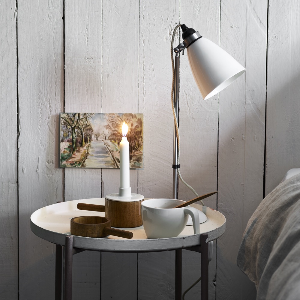
'It’s no surprise that Old White tops our bestsellers,' says paint and colour expert Annie Sloan of this best white paint choice. 'This is the quintessential Chalk Paint choice – suggesting organic chalk, gesso, and European antiquity. It’s a white with personality and history.'
'It’s also the ideal colour for adjusting the rest of the Chalk Paint palette, so every furniture painter has a tin to hand - either to knock back statement shades slightly, to create a brand-new spectrum of bespoke hues, or to colour match to an existing piece.'
12. Graphite by Annie Sloan
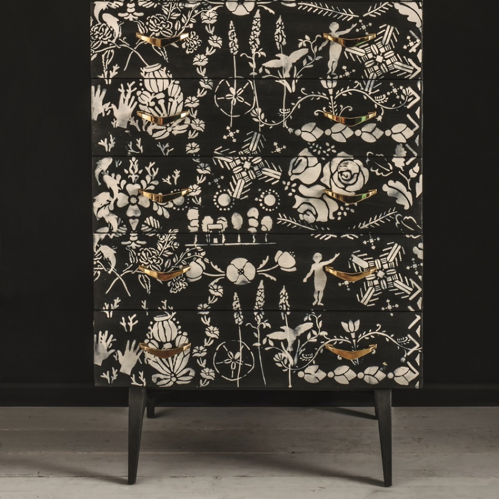
Until recently Graphite was the darkest colour in the Chalk Paint® palette; Athenian Black now claims that title but this nuanced charcoal grey continues to charm. 'Graphite is perfect to bring some backbone and focus to otherwise neutral schemes, on industrial or neoclassical furniture, and breathtaking as a feature wall,' says Annie Sloan.
'This colour is so popular because it brings depth, drama and shadow – unlike other dramatic shades , Graphite complements and enriches almost every other colour. It’s very easy to use but makes a bold statement.'
13. French Linen by Annie Sloan
French Linen is one of those colours that gets more beautiful the longer you look at it,' says Annie Sloan. 'It’s a very complex, rich khaki-grey comprised of both warm brown-red and cool blue pigments. Thanks to that delicate balance we’re rewarded with a multifaceted, resonant neutral which goes with absolutely every colour. A worthy – and very hardworking grey.'
14. All White by Farrow & Ball
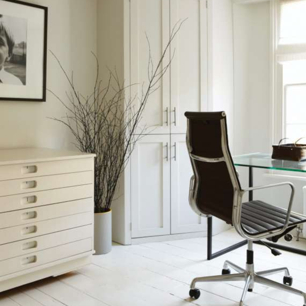
All White is ideal for those wanting a clean white to brighten up the interiors when natural light is slightly lacking. Farrow & Ball's All White is ideal to be used throughout the home, from white bedroom ideas to brightening darker hallway and corridors.
15. Polished Pebble by Dulux
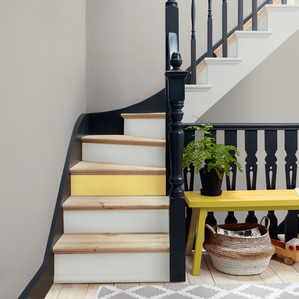
Holly Walsh choose a timeless grey as her hallway colour scheme. 'Our hallway and landing is painted in Polished Pebble, by Dulux - a light grey that looks fresh and light but not too cold.'
16. Jack Black by Little Greene
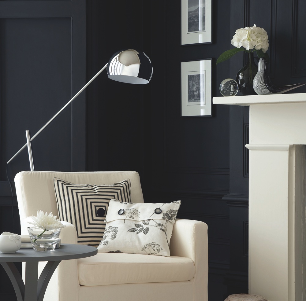
'I’ve fallen in love with black,' says Vanessa Richmond, Editorial Director at Ideal Home. 'Not in an Eighties, glossy, power-glam way – it can look a bit hard if you’re not careful.
'But nothing creates drama and depth like it – a matt black wall hung with colourful artwork, a chalk-painted sideboard or dresser, a really really dark wood floor… And, if you love neutrals, it’s essential for definition – a few black accents turn a blur of greys or beiges into a really smart, tailored look.'
'For a true black I like Little Greene’s Jack Black or, for a softer look try Farrow & Ball’s Railings, which has blue undertones, or Off-Black, which is a really versatile deep charcoal grey.'
17. Guilford Green HC-116 by Benjamin Moore
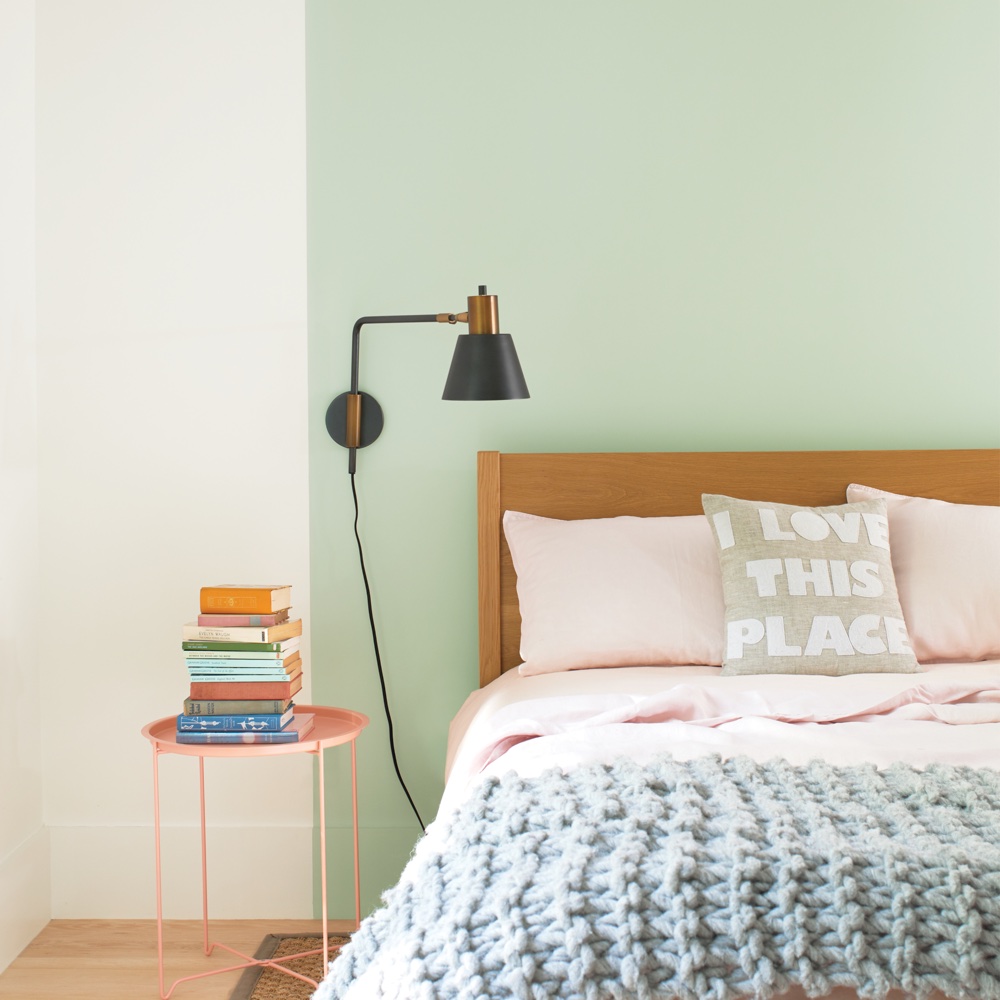
'This was our colour of the year in 2015 and it has been a mainstay of our most popular colours ever since,' says Helen Shaw, director of Benjamin Moore UK. 'The enduring popularity of this colour is down to its peaceful, zen-like quality. The yellow undertones tones of this type of green make it feel warm and comforting.' An ideal shade for a soothing green bedroom idea.
18. Goose Down by Dulux
'Soft greys like Polished Pebble, Chic Shadow and Goose Down are so beloved because they are ‘true’ greys that work with absolutely anything we already have in a room and don’t shout for visual attention,' says Marianne at Dulux.
'These elegant shades are perfect if you live a busy life and need spaces in your home where you can really switch off and relax.'
19. Hale Navy HC-154 by Benjamin Moore
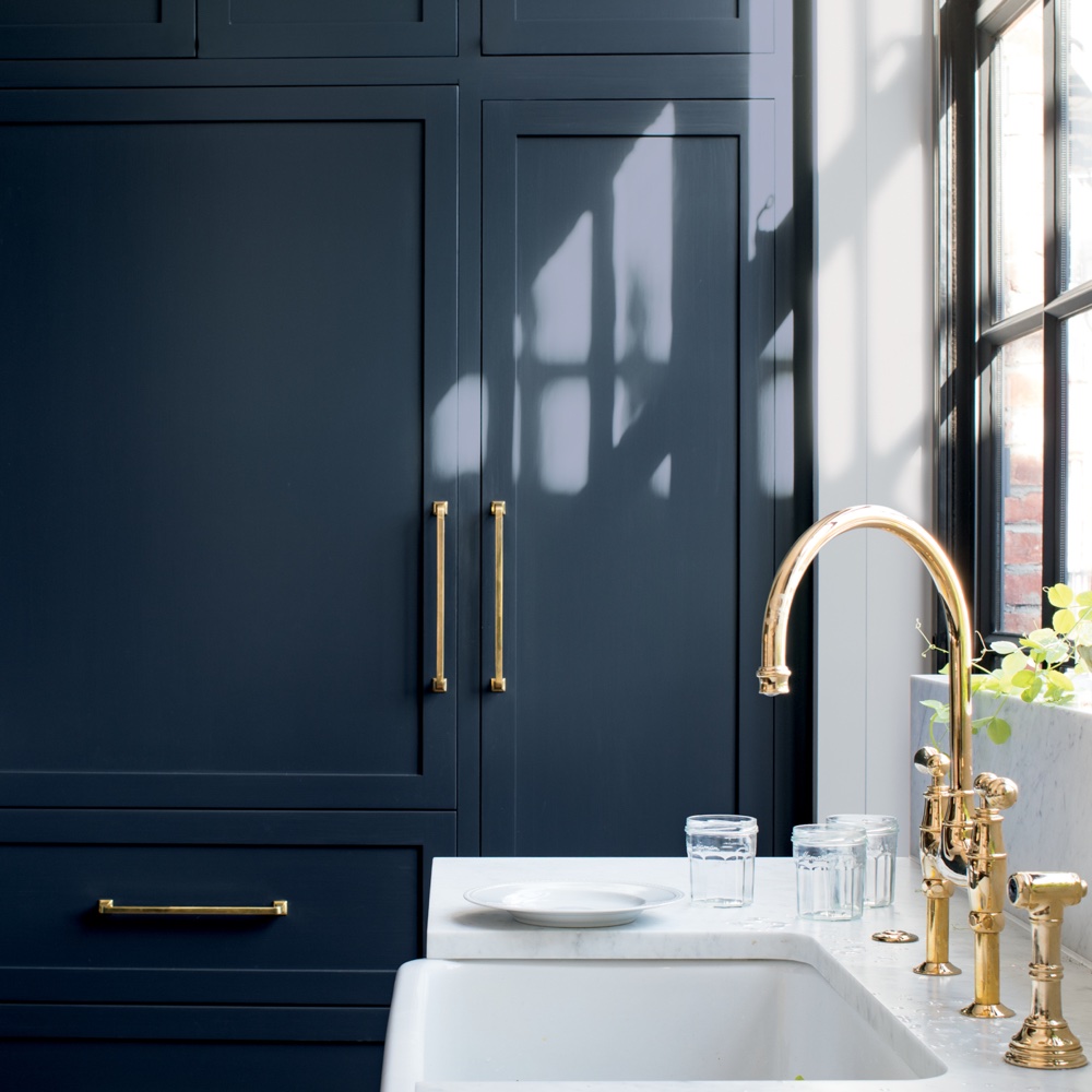
Helen Shaw says, 'Dark blues became very popular in the last decade as people have started to adopt bolder shades in their homes. This shade is particularly popular in busier spaces such as living rooms for making a versatile style statement. This has also been an extremely popular kitchen cabinet shade in recent years.' Navy kitchen ideas add an element of rich colour and sophistication to any design style.
20. Kendall Charcoal HC-166 by Benjamin Moore
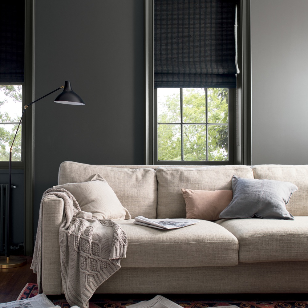
'As with the dark blue above, deep greys have had a surge in popularity as people have sought more dramatic hues for their homes in the last decade,' says Helen Shaw. 'Despite being a statement shade, Charcoal Gray is still an adaptable, neutral tone, so has proven an ideal choice for a range of home styles.'
21. Stonington Gray HC-170 by Benjamin Moore
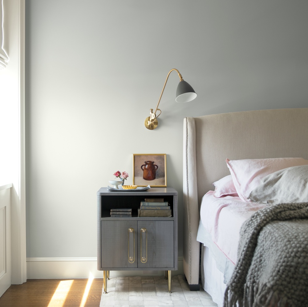
'Light grey continued to be the most popular wall colour and Stonington Gray is a particular favourite because it has enough warmth to not feel cold and steely but not so much that it leans towards stone or beige,' says Helen Shaw.
'Right at the centre of the spectrum, the is an extremely versatile shade that can be easily flatter a range of home schemes.' Especially calming grey bedroom ideas.
22. White Dove OC-17 by Benjamin Moore
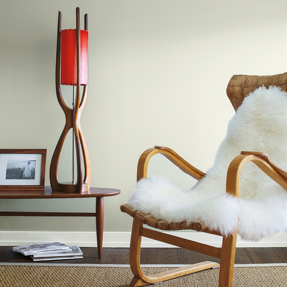
Helen Shaw explains, 'White continued to be a popular choice for people looking for a minimalistic and uncluttered look for their homes. Whites which have a warm undertone such as White Dove, became a widespread choice for those looking to avoid the clinical feel of a pure brilliant white, while still creating a clean and understated look.'
23. Quiet Moments 1563 by Benjamin Moore
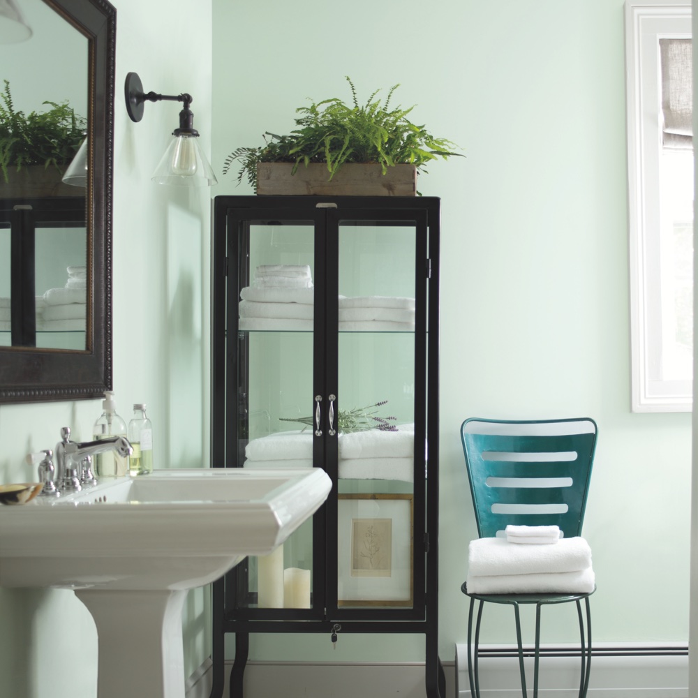
'As the popularity of Scandi-inspired interiors continued to grow this decade, moody green, blue and grey tones became more frequently chosen, due to their soothing and atmospheric properties,' says Helen Shaw. 'Muted and calming, these shades have been the front runners for the Scandi style that has dominated interiors trends in recent years.'
24. Dove Grey by Laura Ashley
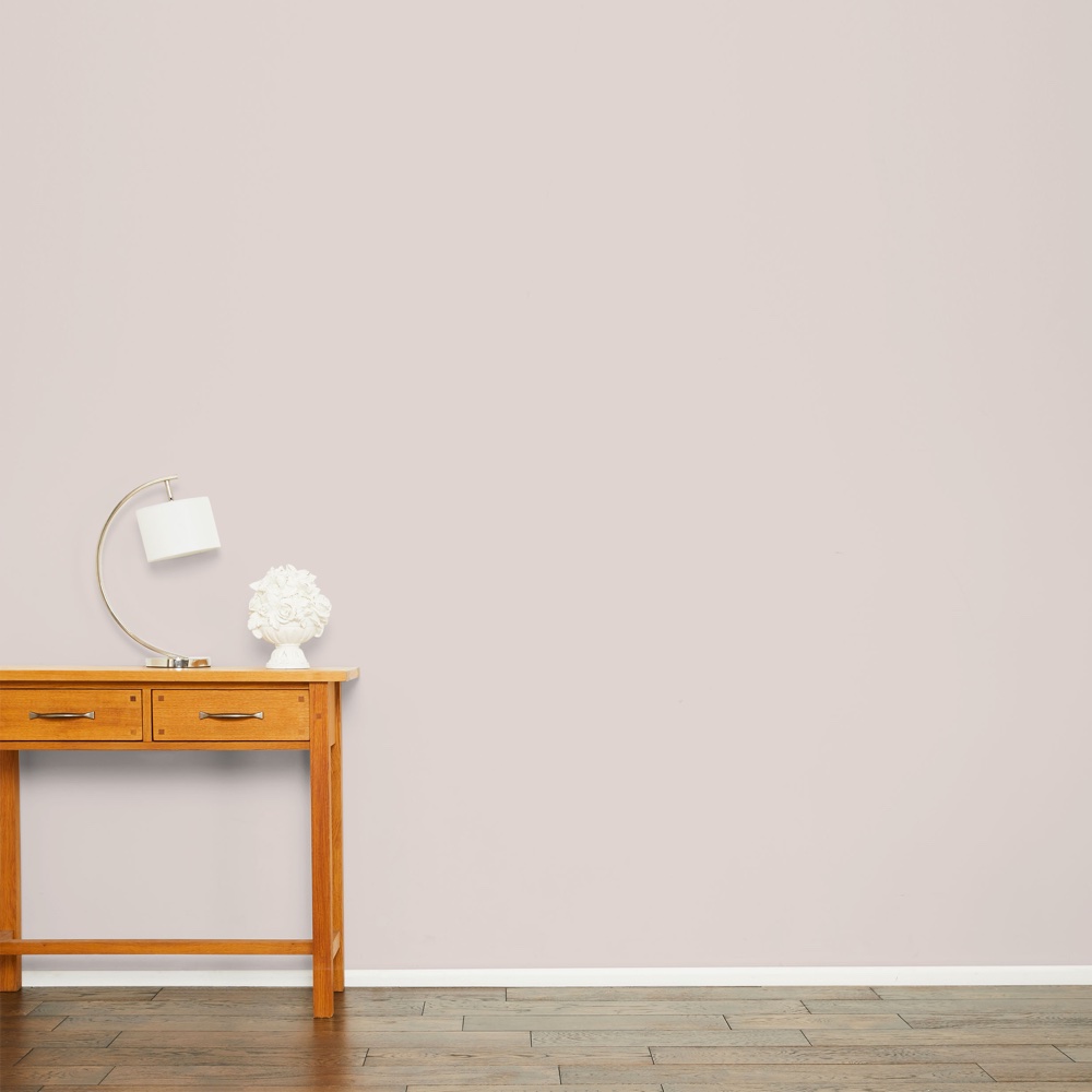
'Grey has been the most popular colour family with our customers for a long time,' says Josephine Bennett, Head of Design at Laura Ashley. 'It started originally with dove grey, with its warm, almost natural tones. This colour still remains a popular addition to the palette.'
25. Pale Silver by Laura Ashley
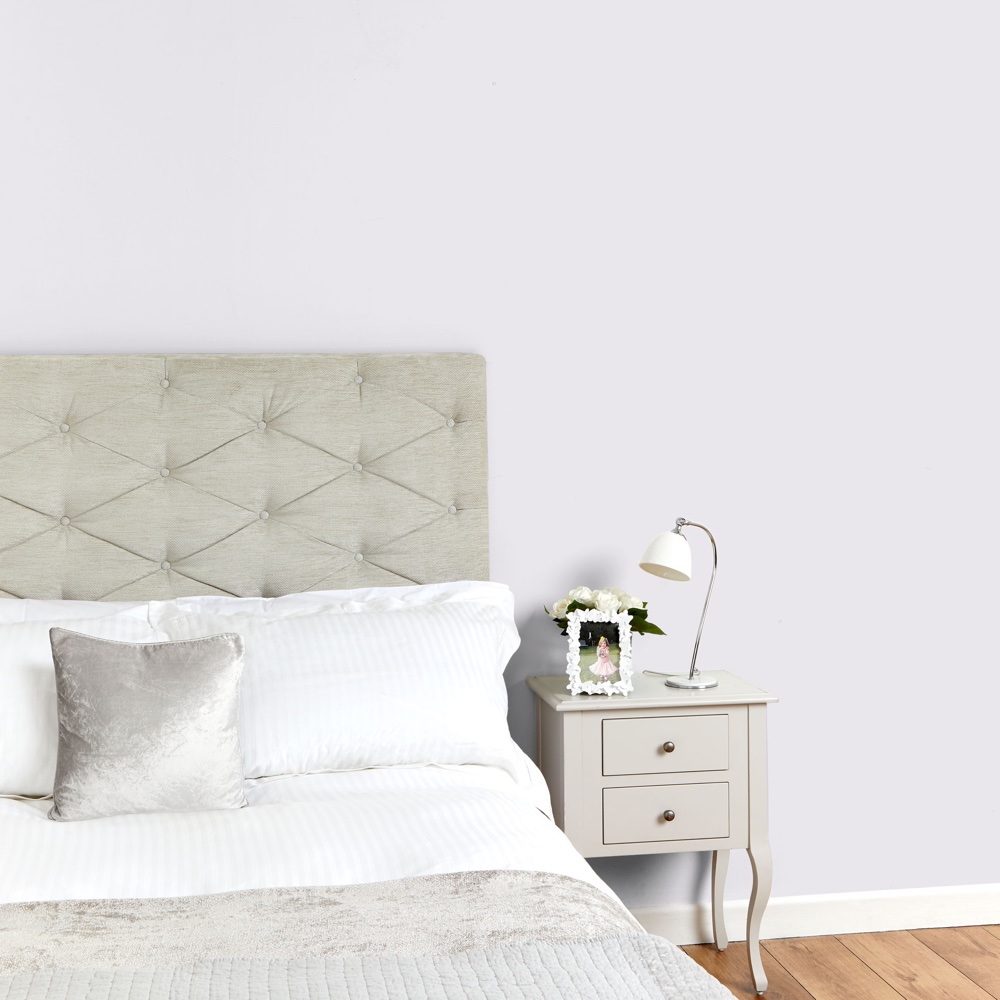
'This is a cleaner, brighter grey than Dove Grey, creating a cool palette,' says Josephine Bennett.
26. Duck Egg by Laura Ashley
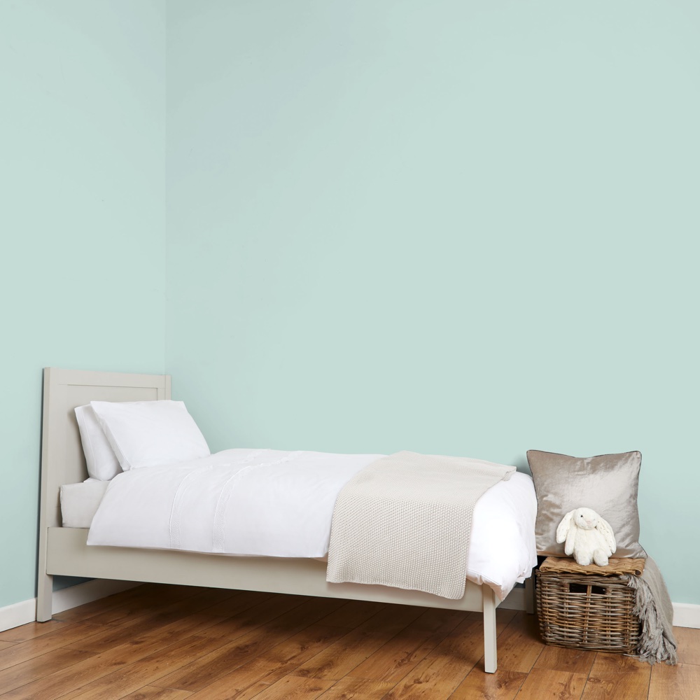
Laura Ashley's Josephine Bennett says this soft hue is ideal for creating a restful sleep sanctuary. 'This blue with a touch of green is perfect for a bedroom,' she states. We happen to think duck egg living room ideas create a beautifully refreshing colour scheme.
27. Midnight Seaspray by Laura Ashley
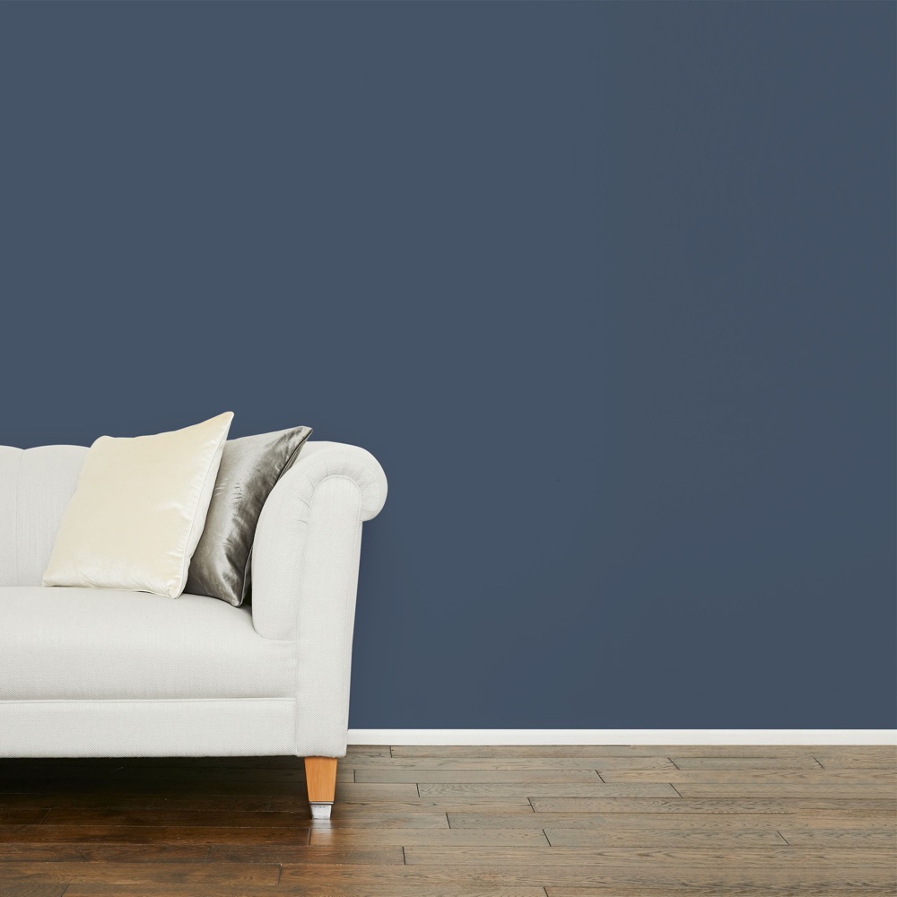
'This is a dark blue that creates drama and is a perfect backdrop for wall art,' says Josephine Bennett.
28. French Grey by Little Greene
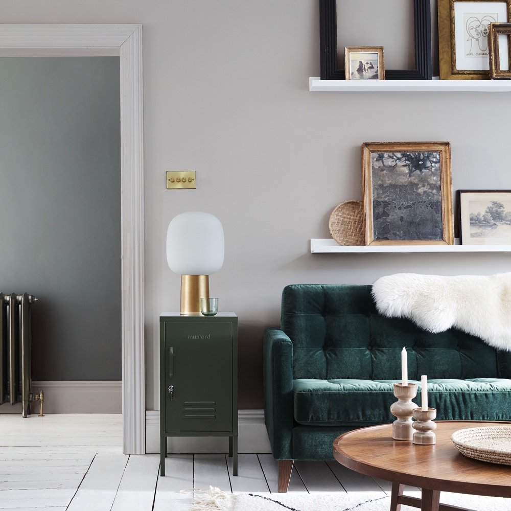
'Grey has certainly been the new neutral of the decade!' says Ruth Mottershead, marketing director at Little Greene. 'There has been a real shift from the use of magnolia to the use of all kinds of different greys. One of our most popular colours of the decade is French Grey.'
'French Grey is a soft, neutral grey. It contains very subtle and differing undertones making it not too cold or too warm but somewhere in the middle! French Grey offers great versatility and for this reason, it is a ‘go-to’ grey for any kind of scheme.'
'To create impact, pair French Grey with something bolder like ‘Tuscan Red’ or create a more muted combination with the use of ‘Livid’ for a scheme that flows from room to room.'
29. Hicks’ Blue by Little Greene
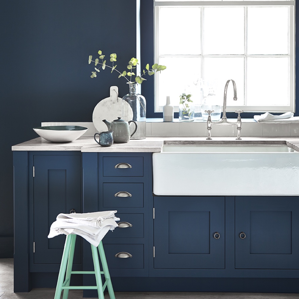
'Dark blues and navy blues have been hugely popular in recent years especially for woodwork, kitchen cabinets and living room walls,' says Ruth Mottershead. 'Little Greene Hicks’ Blue, a deep, inky blue, was used by interior designer David Hicks in the restaurant at the top of the London Telecom Tower in 1962.'
'Blue is popular because it is comfortable, we experience blue in the natural world around us every single day and is subsequently a natural choice for our homes. When using on walls, combine with French Grey Pale for a sophisticated finish.'
30. Blush by Little Greene
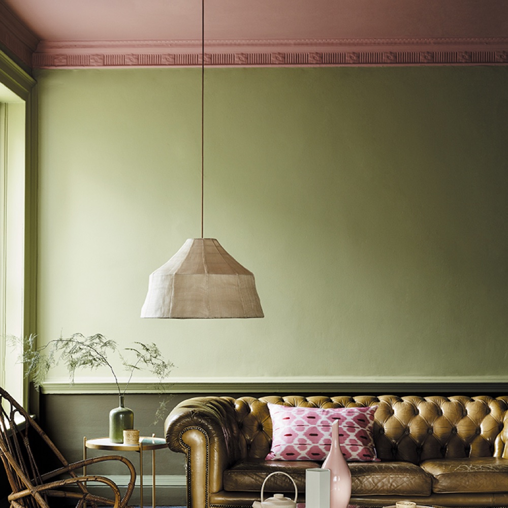
Little Greene's Ruth Mottershead says: 'Soft pinks and rosy tones have been a popular choice over the last decade, particularly muted pinks and plaster tones – in other words, pinks that are not too sweet and therefore are easier to use around the home.'
'The muted, rosy Blush provides just that - a pink that isn’t too sweet. Combining well with green shades like Sir Lutyens Sage, this natural colour pairing creates a striking living space. Consider using Blush on the ceiling for an unexpected colour highlight.
31. Jewel Beetle
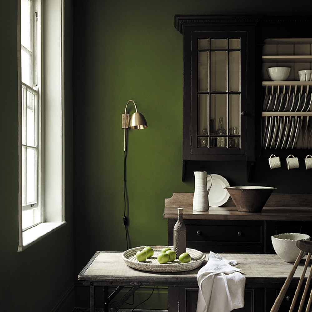
Ruth says: 'Green is another recent favourite and another natural colour – it is, of course, one of the most popular colours of the natural world and therefore a flexible choice.'
'Jewel Beetle is a sumptuous jewel tone that creates a cosy, wraparound feel when used all-over in a living space. Used alongside a green-based neutral such as Pique, it creates a restful, soothing environment.'
32. Slaked Lime by Little Greene
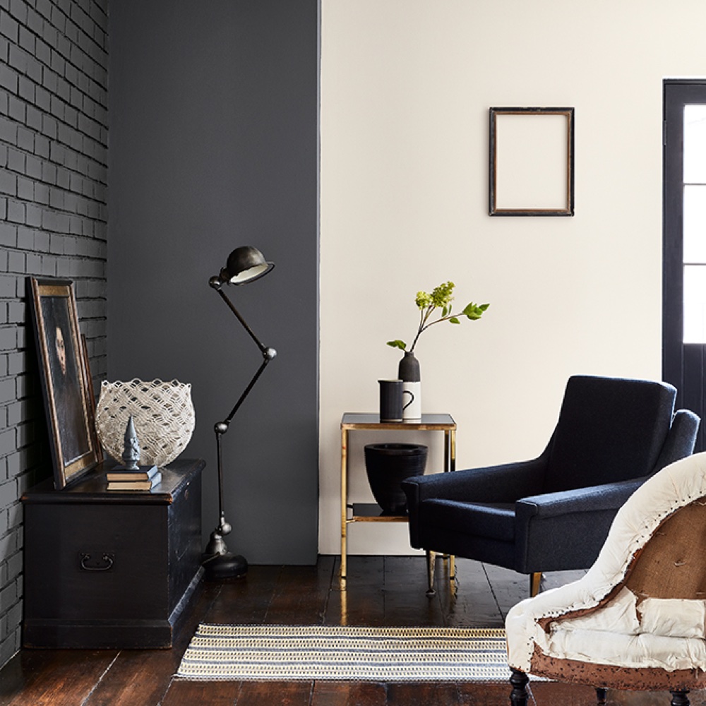
'White of course is always popular and this is because it can be used safely in any space,' explains Ruth. 'It can be sophisticated without making too much of a statement or interfering with an interior. Slaked Lime is a pure, neutral white made with a combination of minerals, giving a warm and soft appearance.'
33. Lazuli by Zoffany
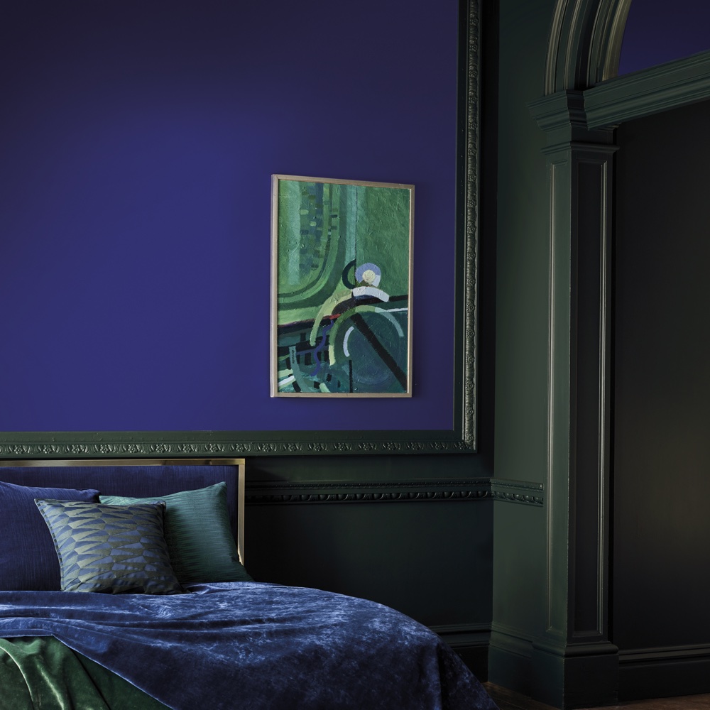
'Influenced by the lighter hues of Lapis, Lazuli Lapis has a regal core,' says Peter Gomez. 'Apply this Zoffany paint in feature areas for a pop of colour or contain in smaller spaces for high effect.'
34. Paris Grey by Zoffany
Speaking about one of their bestsellers over the last 10 years, Peter Gomez, Lead Designer at Zoffany, says: 'Reminiscent of the elusive cream-grey stone of the French capital, Paris Grey is sheer elegance.' We couldn't agree more.
35. Koi Carp by Zoffany
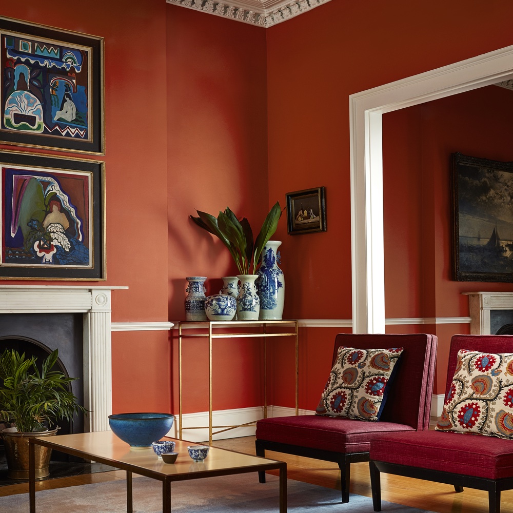
Peter Gomez says: 'Imitating the vivacious tangerine tones of the renowned aquatics, the arresting Koi Carp is centred on vibrancy. Play with this colour to design unique signature spots, for instance the dining room.' Red living room ideas encourage you to curl up and seek comfort within the surrounding.
36. Tigers Eye by Zoffany
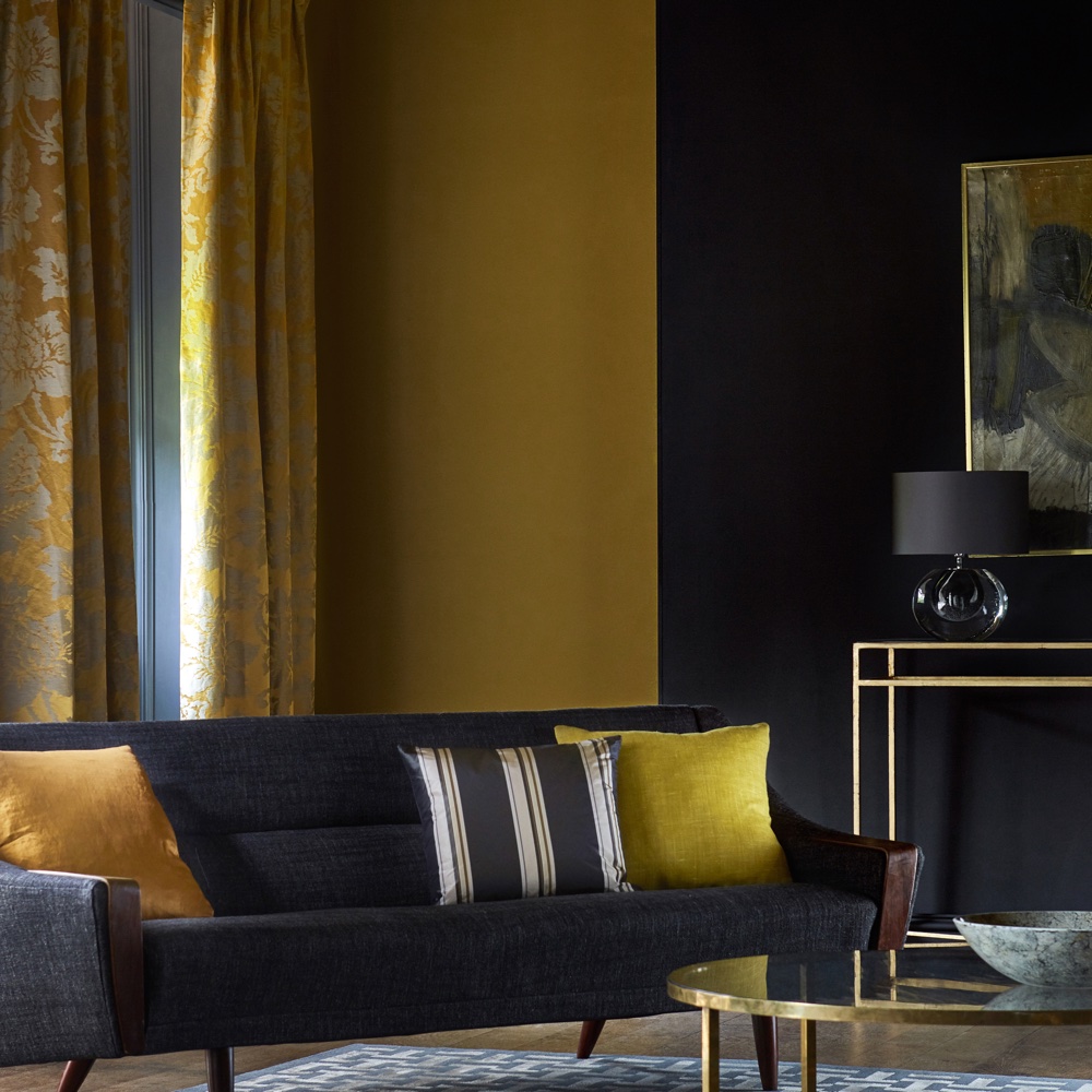
'Awash with energy, Tigers Eye inspires a welcoming aesthetic,' says Peter Gomez. 'A full-bodied yellow carefully crafted to reflect the striking shade found in a historical document from the archive. The brave can use this colour to open up smaller spaces and frame feature areas.'
37. Ink by Zoffany
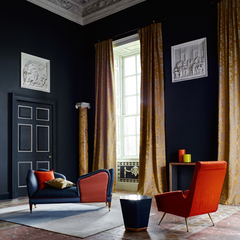
Peter was Gomez says this is the ideal anchoring hue, explaining: 'A deep black-blue, Ink is the perfect backdrop to showcase furniture in the highlight colours of the moment.'
38. Como Blue by Zoffany
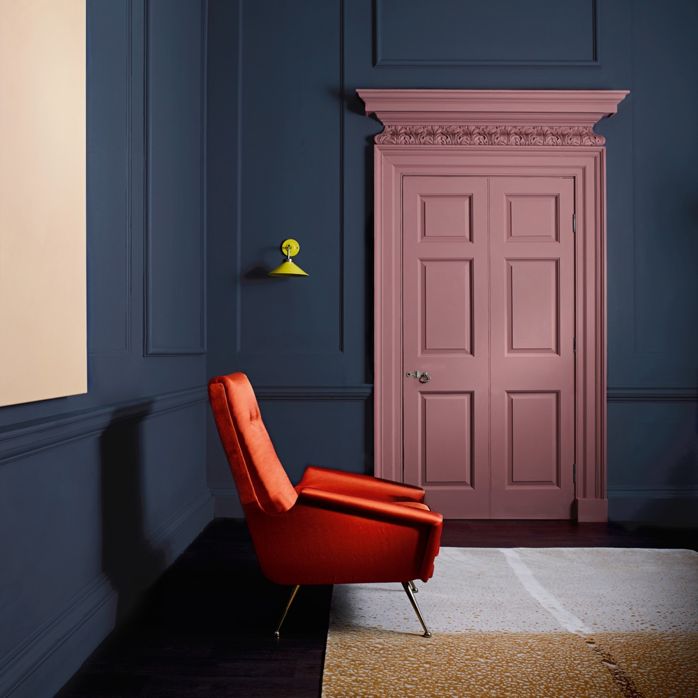
'Inspired by the depths of Lake Como, this deep blue, infused with hints of red, brings calm sophistication to a room,' says Peter Gomez, Lead Designer at Zoffany.
39. Blue Clay by Sanderson
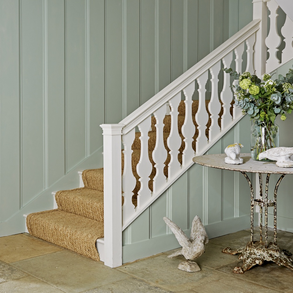
Rebecca Craig, lead designer at Sanderson, says of Blue Clay: 'This is a calm and relaxed, soft airy blue that has a pearly white undertone.'
40. Indigo Blue by Sanderson
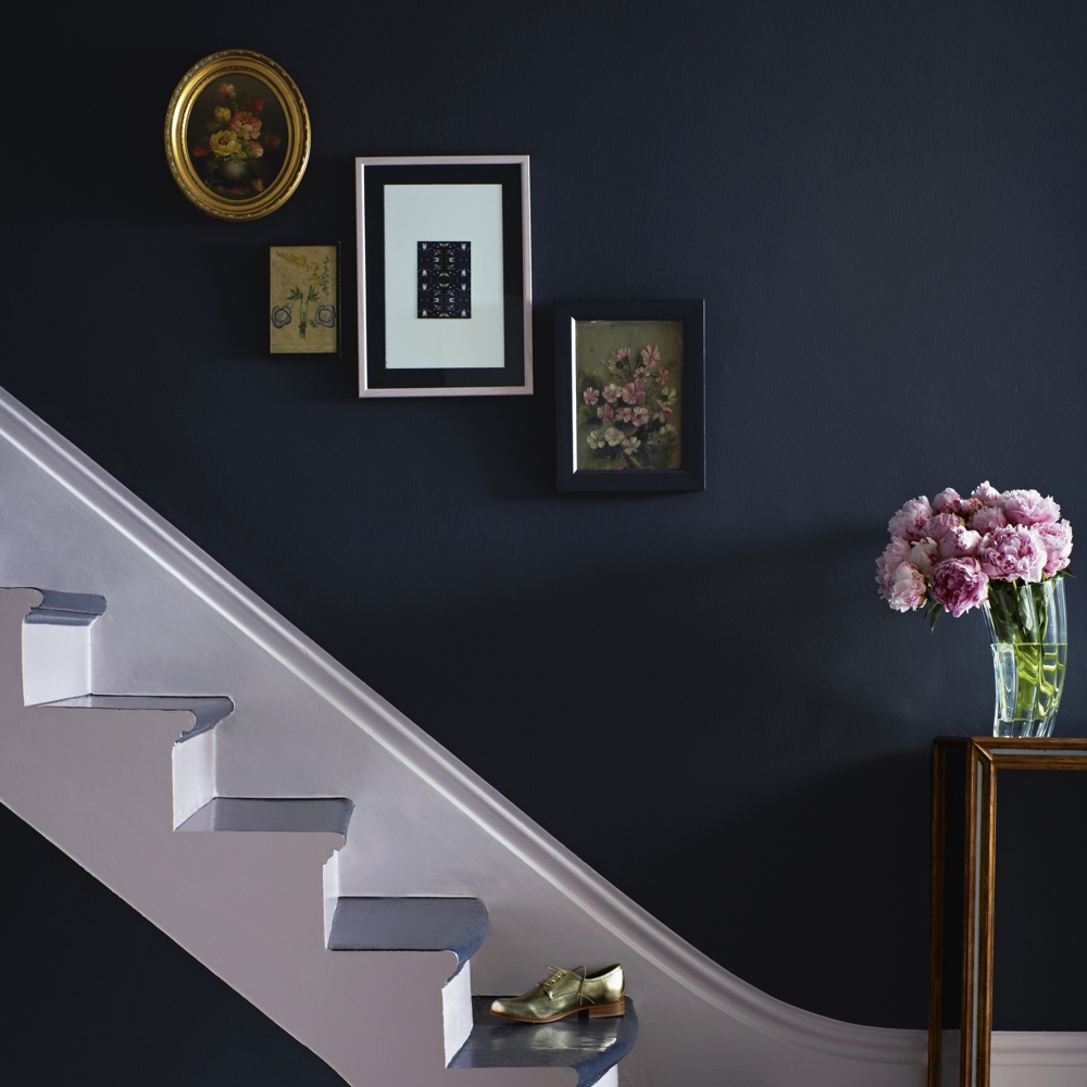
'This is an almost black-blue that sings out a contemporary classic feel,' says Rebecca Craig.
41. Sage Grey by Sanderson
'This is a lovely spring green, soothing and calming,' says Rebecca Craig.
42. Light Rose by Sanderson
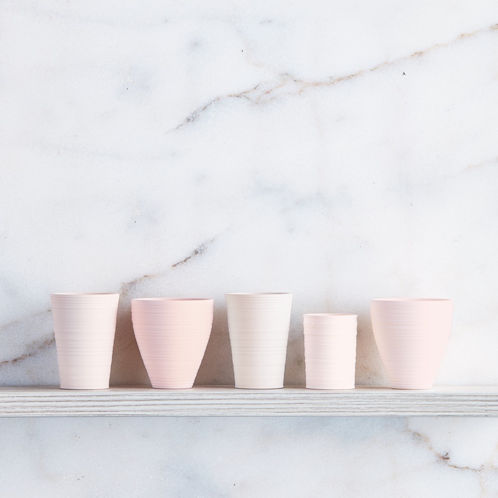
Rebecca Craig says: 'Inspired by roses, this is a graceful soft pastel pink shade with a light pale base, the colour is restful and subtle.'
43. English Grey by Sanderson
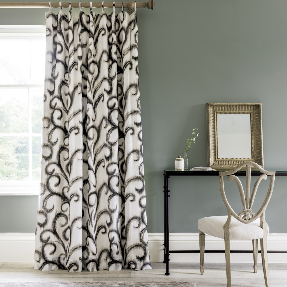
This is perfect for creating a restful and relaxing space, according to Sanderson's Rebecca Craig. She describes it as 'a tonal grey-green shade that evokes harmony and tranquillity.'
44. Denim Drift by Dulux
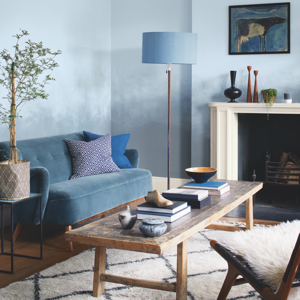
'We are always inspired and uplifted by nature and we love to feel connected with it in our homes,' says Marianne Shillingford, creative director at Dulux. 'Colours like Denim Drift capture perfectly the sky and clouds we see every day and melt away the walls they are painted on.'
45. Sapphire Salute by Dulux
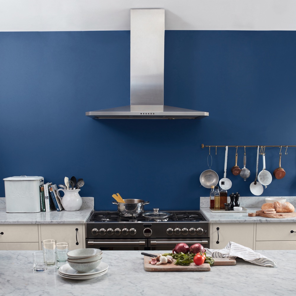
'We love ocean deep and night sky blues like Sapphire Salute which remind us of the majestic forces of nature that make us feel grounded,' says Marianne Shillingford, creative director at Dulux.
'This deep rich blue is perfect for grown up bedrooms in which you want more restful sleep, for sociable, sophisticated kitchens, or it looks incredible teamed with white in a an elegant living room.'
46. Alanna by Graham & Brown
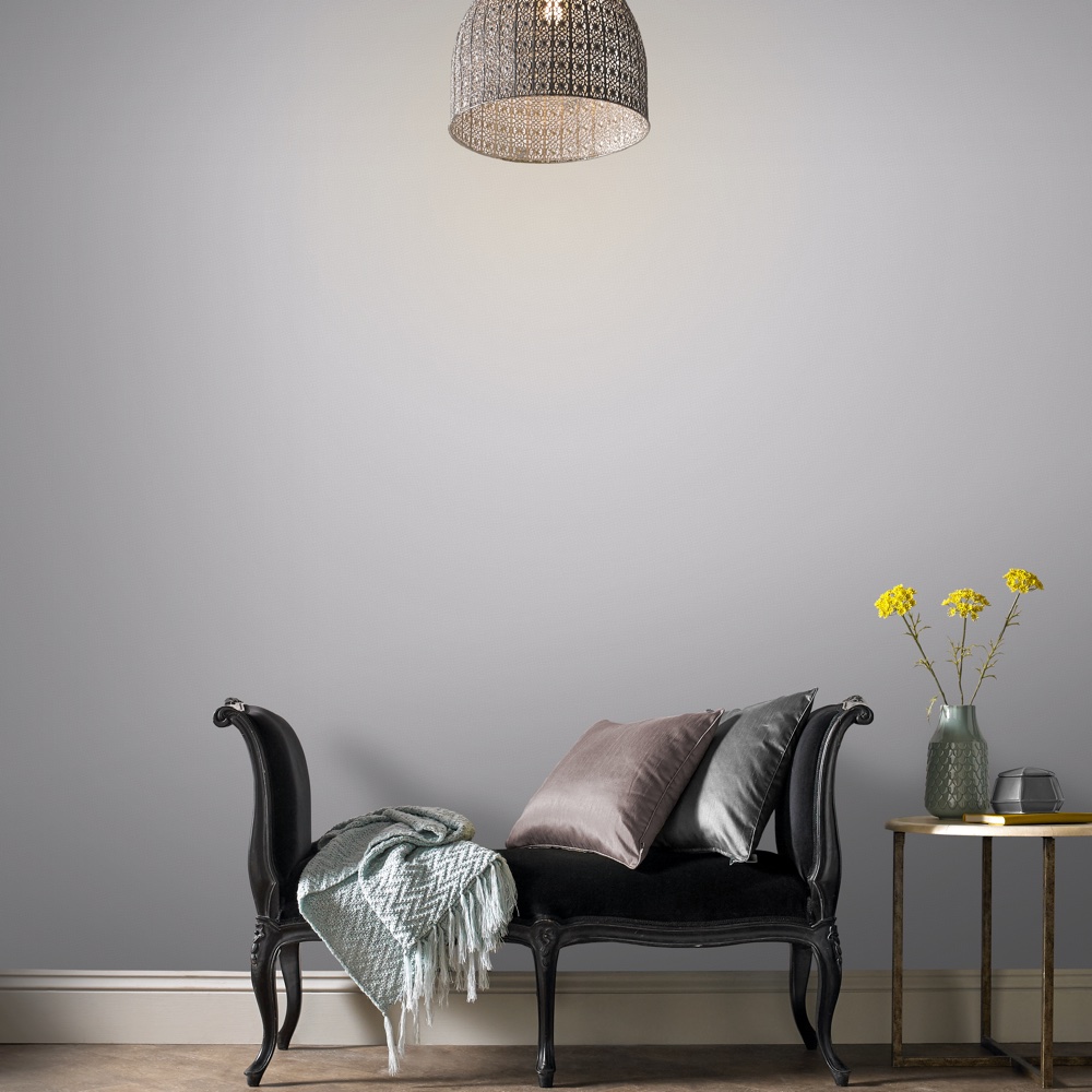
'The last decade started out with a very industrial feel with everyone ditching creams and beige for fifty shades of grey,' says Paula Taylor, Graham & Brown colour and trends specialist. 'Rather than being cold and uninviting, warm greys like Alanna have become the perfect partner for the home creating a contemporary feel without becoming too edgy.'
47. Penelope by Graham & Brown
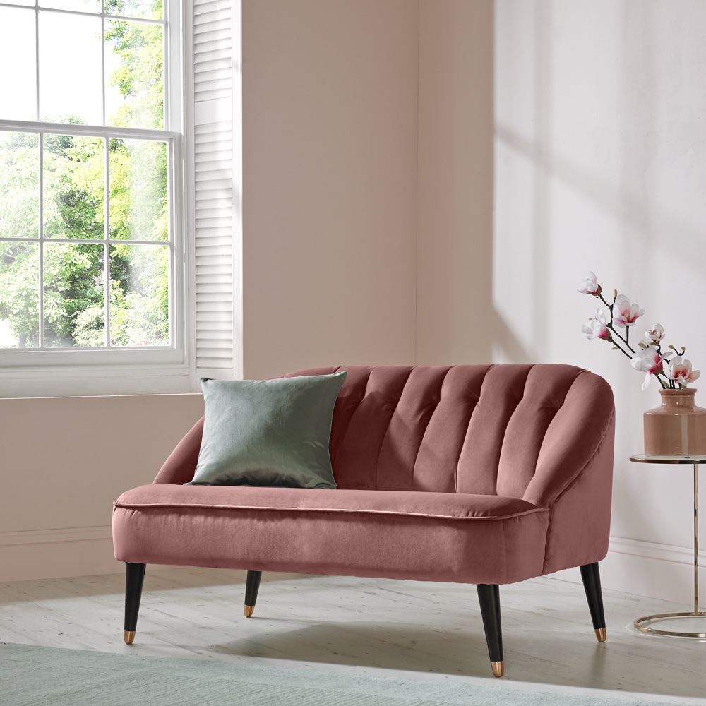
Paula Taylor says: 'We have seen that pink shades like one of our bestselling paints Penelope become synonymous with the millennial consumers and soon partnered up with grey to become the power couple of the colour world.
'From the retro, kitsch painted walls in the Grand Budapest Hotel movie through to our obsession with rose gold this decade, the crown definitely goes to the perfectly Instagrammable Penelope pink.'
48. Tiru by Graham & Brown
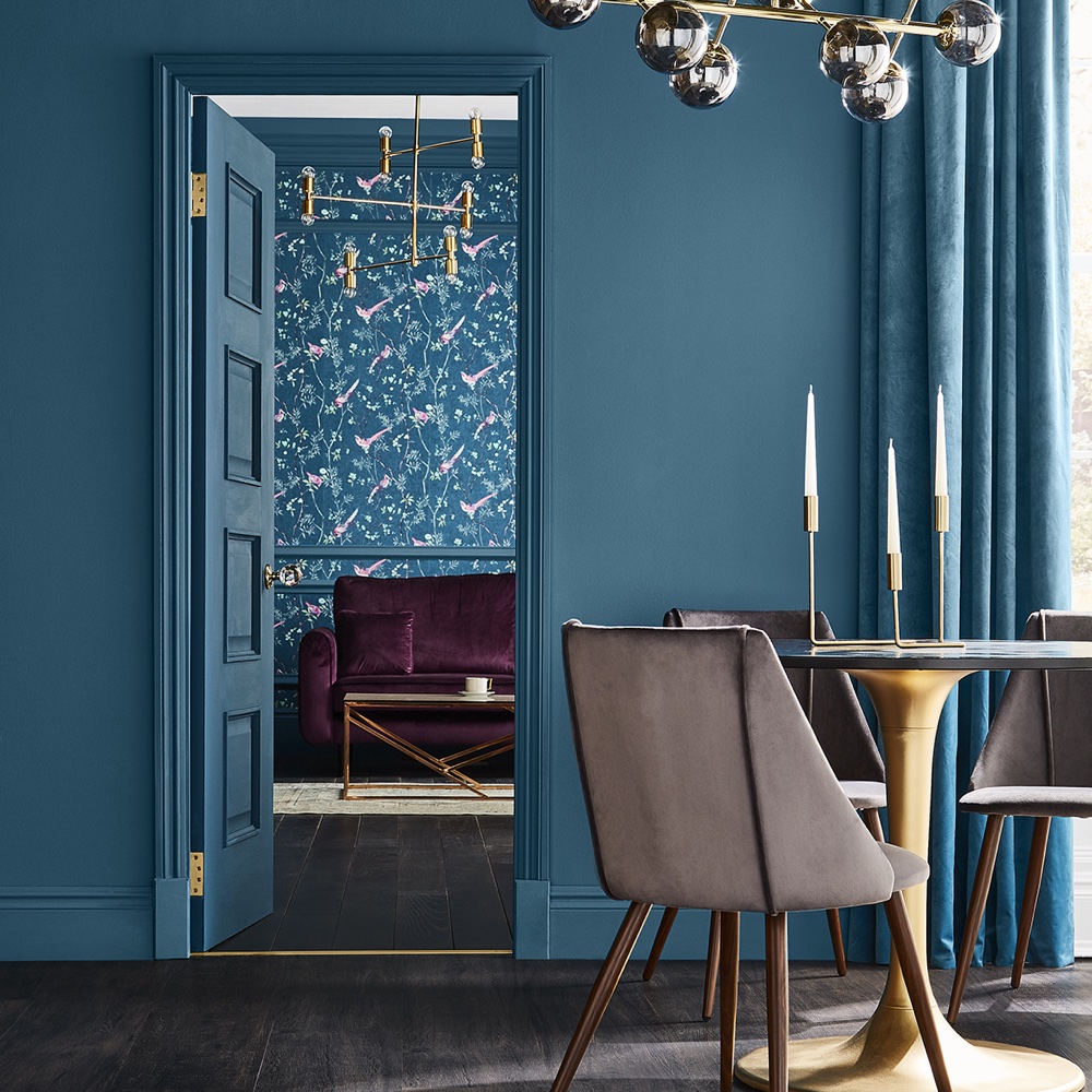
'We became obsessed with all things tropical following the Olympic games in Rio and teal became the deeper moodier cousin with the announcement of the next games in Tokyo creating a lust for oriental colours,' says Paula Taylor.
'Our Tiru paint was inspired by our Kabuki trend based on Japanese dance drama and this bold colour is a stepping-stone to the next colour in this decade.'
49. Rhapsody by Graham & Brown
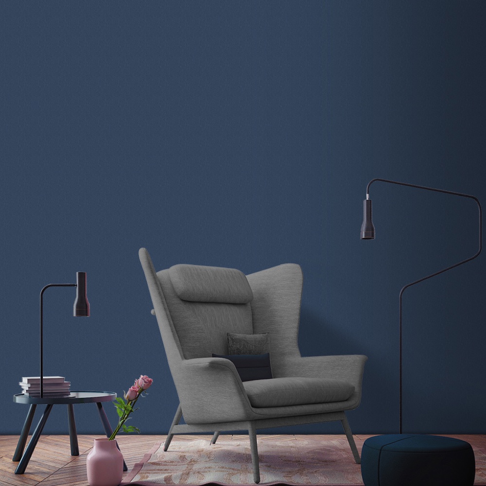
'Midnight blue, such as Rhapsody, has captured everyone’s attention over the past couple of years,' says Paula Taylor. 'This dark and dramatic colour has also sprung from the tropical trends – think midnight garden. It works perfectly in both contemporary homes with copper accessories or in period homes and is a nice counterpoint to the overtly feminine Penelope pink.'
50. Adeline by Graham & Brown
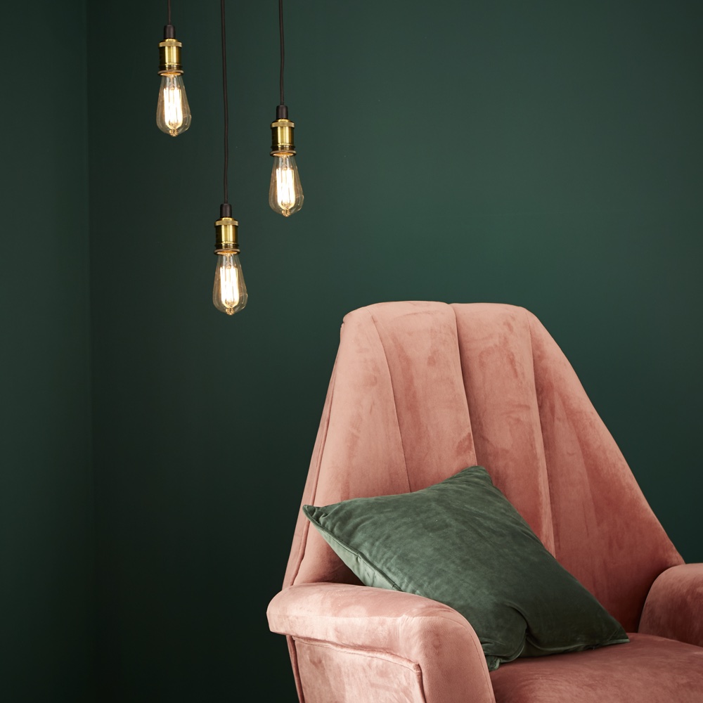
Paula Taylor says: 'To say that ‘eco’, ‘sustainable’ and ‘vegan’ are the buzzwords for the end of the decade would be an understatement. From our Archive trend, Adeline is inspired by the past but looks to the future with a contemporary twist.
'Biophilia is a key trend which brings the outside inside with the healing powers of plants to surround us. As we look towards the new decade, we have to learn from our mistakes, recycle more think of the future of our planet and simply be more green!'
51. Grey Putty by Crown
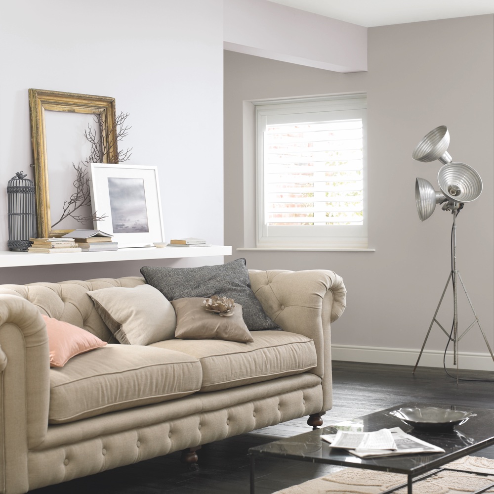
'Over the past 10 years greys have surged in popularity, overtaking creams and beiges as ‘the’ new neutral colour,' says Kathryn Lloyd, colour specialist at Crown. Grey Putty is a very versatile, mid-toned shade which works so well with many other feature colours. It’s got a warm undertone too so it still makes a space feel warm and inviting.'
52. Midnight Navy by Crown
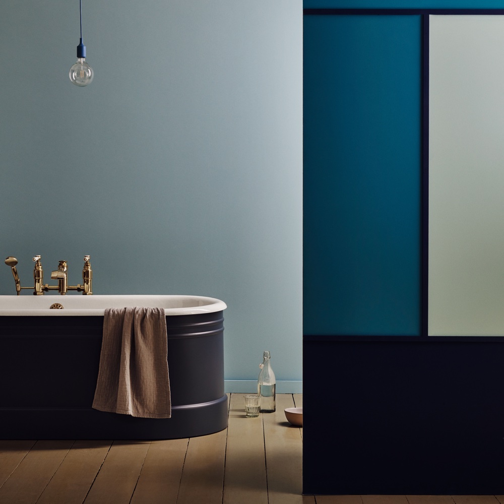
Kathryn Lloyd, colour specialist at Crown says: 'This is a rich dramatic blue which has become increasingly popular over the past five years.'
'This shade is a great canvas for light-coloured furniture and furnishings. Ironically, even though it is such a dramatic shade, dark colours (such as Midnight Navy) draw attention to the lighter-coloured furniture and furnishings within a room.'
53. Silver Birch by Neptune
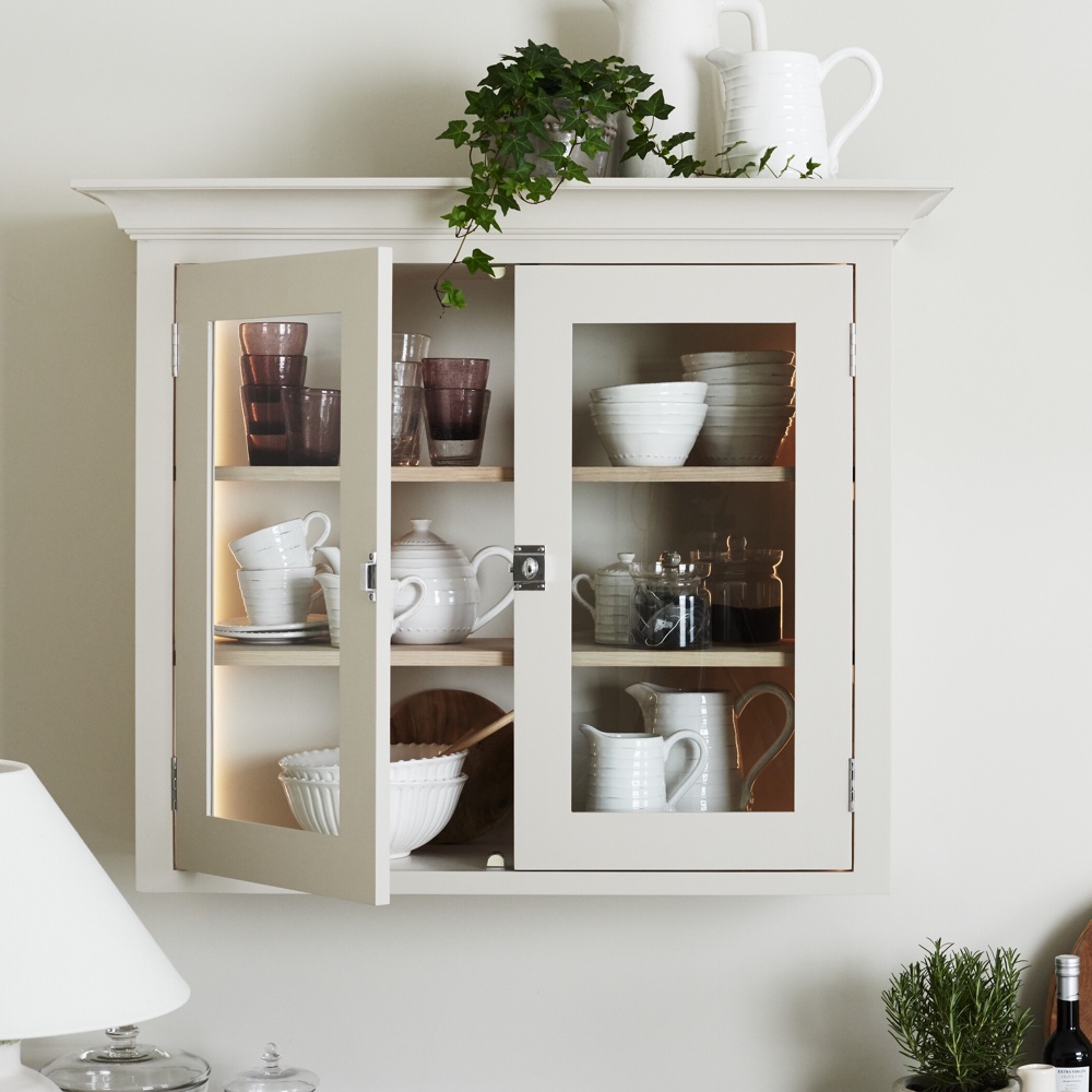
'It’s no surprise that our top five colours of the past ten years are all neutrals,' says Rosanna Farnsworth, marketing executive at Neptune.
'Even in a colourful home, they become the timeless foundation to build upon. Silver Birch is one of the shades we’ve chosen for our Suffolk collection, because it’s neither very creamy and traditional, nor coolly grey and modern. It really is a perfect middle ground if, like Suffolk, your style sits somewhere in between the two.'
54. Shingle by Neptune
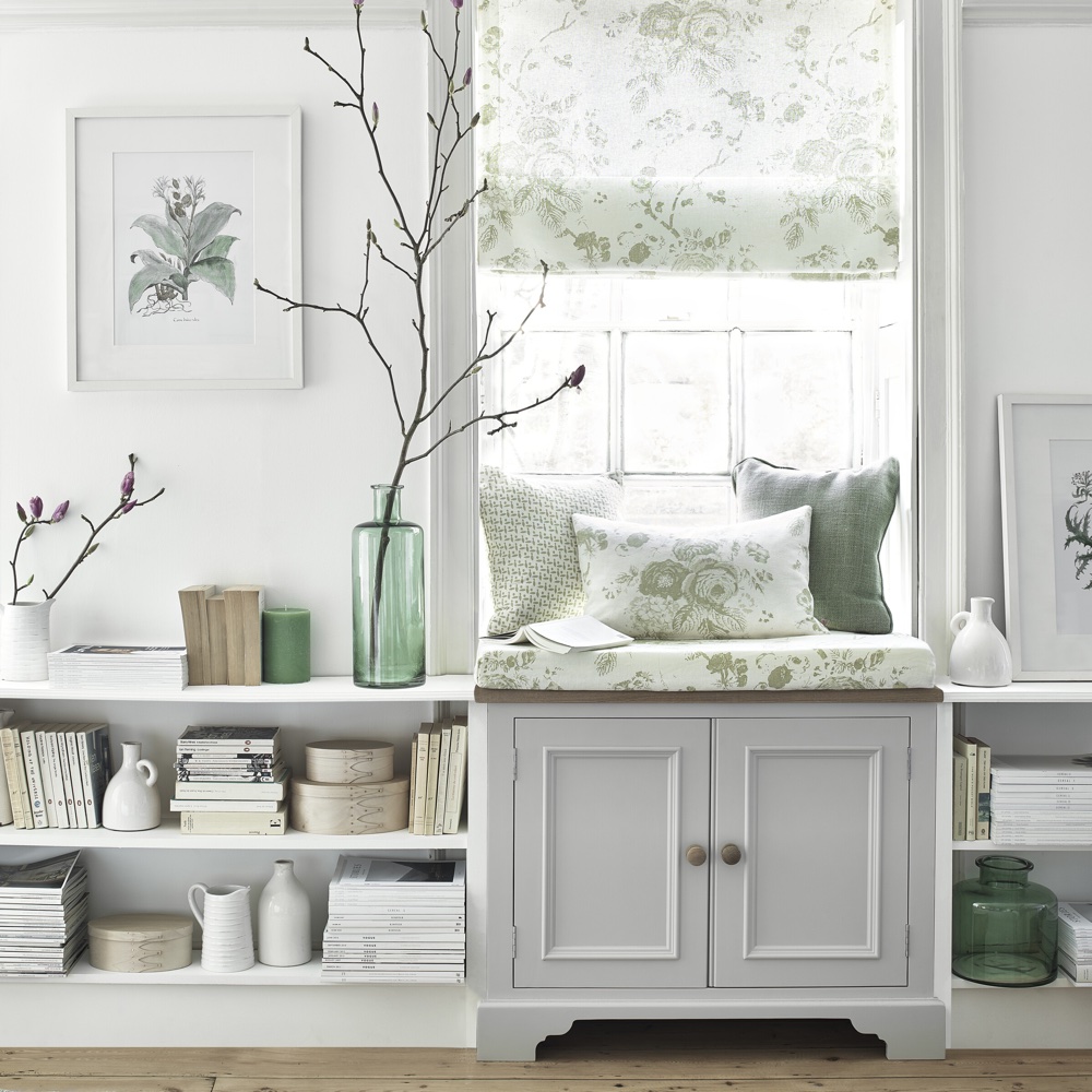
Rosanna Farnsworth, marketing executive at Neptune, says: 'Shingle might be more of a true grey than Silver Birch, but it still doesn’t lean too far into the cool blue-toned territory, which is likely part of its appeal.
What's next for paint trends we wonder?
-
 Monty Don's top tips for banishing slugs and snails make so much sense – they're both kind and effective
Sick of slugs and snails chomping up your garden? Try the Monty Don approach...
-
 Table wardrobes are the genius kitchen storage solution you didn't know you needed - here's how to create one
'It’s the tablescaping equivalent of a capsule wardrobe' 'It’s the tablescaping equivalent of a capsule wardrobe'
-
 IKEA's new Oxford Street city store is the start of a huge change to how we shop the Swedish furniture brand
Is this the return of the high street?