You should never paint your hallway this colour, according to colour psychologists
Experts reveal the paint tone that could make guests see red

The often-neglected hallway is the trunk of the home that every other room branches off from. Colour psychologists believe the colour you should never paint your hallway is highly saturated red.
Thoughtful hallway colour schemes set the tone for the rest of your home, welcoming both you and guests in. We spoke to colour experts about red flags when it comes to decorating this high-traffic area.
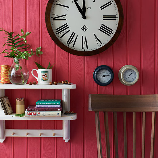
Country Homes and Interiors | Housetohome.co.uk
The colour you should never paint your hallway
'The first colour to really consider before using is red,' begins colour psychologist Lee Chambers. 'For some people, this can feel like walking into a warning sign.
'The sense of threat and danger can feel anything but welcoming,' he adds. If you like the idea of a rouge hallway, deeper shades like a rich maroon or oxblood could work.
They're also having a moment after featuring heavily in Adele's new music video... But anything too bright and vivid could feel jarring - and Christmassy when you don't want it to be.
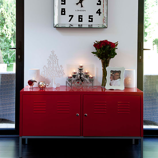
Contemporary hallway with red sideboard | Hallway decorating | Style at Home | Housetohome.co.uk
Natasha Bradley, Lick’s Head of Colour and Lead Interiors Expert agrees with Lee. She says that since it's the first room you enter, you don't want anything 'too much,' or tones that might make you feel agitated.
She recommends staying away from bright red, orange and yellow. 'Those three colours, which are highly saturated, are the completely wrong colours to put in a hallway,' she says.
Get the Ideal Home Newsletter
Sign up to our newsletter for style and decor inspiration, house makeovers, project advice and more.
Instead, Natasha recommends warmer, earthier versions that are a little more muted.
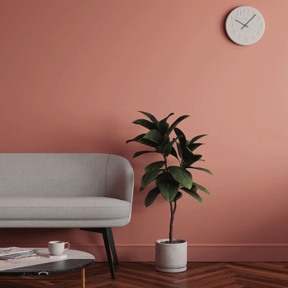
So, what are the alternatives? Lee Chambers suggests steering clear of red hallway ideas and going for a light, cheery yellow or a mellow peach.
'Both bring warmth, a subtle positivity and a feeling of refreshment when returning after a long day,' he muses. But what about if you want to make a statement?
Hallways are known for being a brilliant space to have a bit of fun because we don't spend hours on end in them. Natasha loves seeing people make a feature of their hallway.
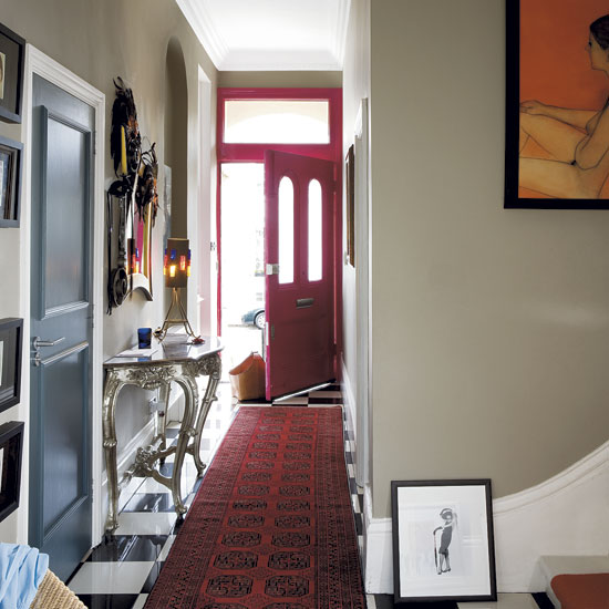
Ornate hallway | step inside Queen of Shops' Mary Portas' vibrant Victorian home | house yours | housetohome
'You don't spend all your time in this space so you can afford to be brave, but this doesn't mean you need to go mad,' she says. 'I recommend choosing darker tones in a hallway because it makes the rooms leading off feel lighter,' says Natasha.
We previously wrote about a similar Farrow & Ball hallway paint secret one of the brand's colour experts uses in her own home. Dark hallways aren't for everyone, though.
Colour consultant and therapist, Suzy Chiazzari warns against using dark shades of green, blue, grey and purple. These can have a negative effect on your mood and energy levels, she says.

Millie Hurst was Senior Content Editor at Ideal Home from 2020-2022, and is now Section Editor at Homes & Gardens. Before stepping into the world of interiors, she worked as a Senior SEO Editor for News UK in both London and New York. You can usually find her looking up trending terms and finding real-life budget makeovers our readers love. Millie came up with the website's daily dupes article which gives readers ways to curate a stylish home for less.
-
 Will a conservatory add value to your home and how can you maximise it?
This is what the pros say
By Amy Reeves
-
 I’ve been looking for a new signature scent for my home and The White Company's new fragrance is the exact summer holiday smell I needed
Santorini smells fresh, summery and sophisticated
By Kezia Reynolds
-
 How to remove algae from garden walls in five steps – and the cleaning product experts rave about for tackling it fast
Experts share their top tips for getting garden walls algae-free
By Katie Sims