Trust us, these are the colours to avoid when painting a small hallway
Swerve these small hallway colour fails and create a welcoming entrance that makes you happy to invite guests inside…
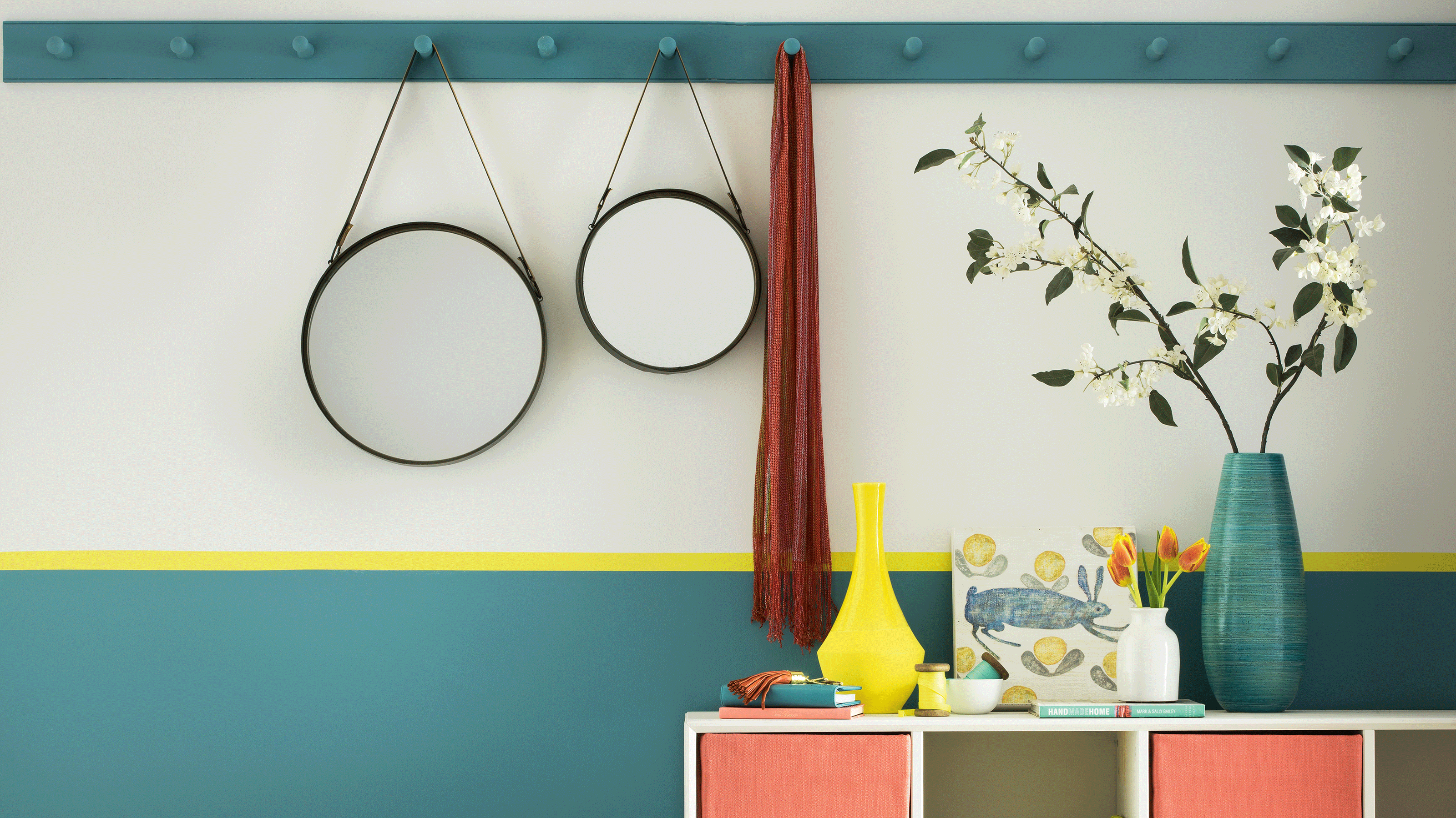

Choosing the best colour for any hallway can be challenging, but when the space in question is a tight squeeze, it’s more important than ever to establish which colours you should never paint a small hallway. And, even more crucially, which colours yield space-boosting powers.
As easy DIY projects go, most of us can handle a quick lick of paint and refreshing the colour is one of those small hallway ideas that can make a huge difference. ‘A warm bright colour such as peach, yellow or green is a great option to add a little vigour to a small hallway,’ says Emma Bestley, Co-Founder of YesColours. ‘For a comforting, immersive feeling, consider opting for a deeper more saturated shade of blue, green or burgundy.’
When thinking about how to choose the perfect paint colour for a small hallway, tester pots are your friend, especially if the light levels are low or non-existent. ‘Many hallways can feel starved of natural light, so most people tend to address this by painting it a shade of white - whilst this should feel like a logical solution, it can often be a big no, no. What can happen is you end up in a cold and gloomy space,’ explains Patrick O’Donnell, International Brand Ambassador, Farrow & Ball.
Colours you should never paint a small hallway
While it’s true that some colours work better at boosting the feeling of spaciousness in a small hallway, the great thing about paint ideas is that mistakes can easily be rectified.
‘Most people panic over how to decorate their hallways, often due to the limitations of natural light, but as these are essentially transient spaces to lead you to the primary rooms of the home, you can be more experimental than you might imagine,’ encourages Patrick O’Donnell.
Read on for more expert insight and inspiration to help steer your next small hallway paint purchase in the right direction and avoid some disastrous paint mistakes.
1. Vibrant pink
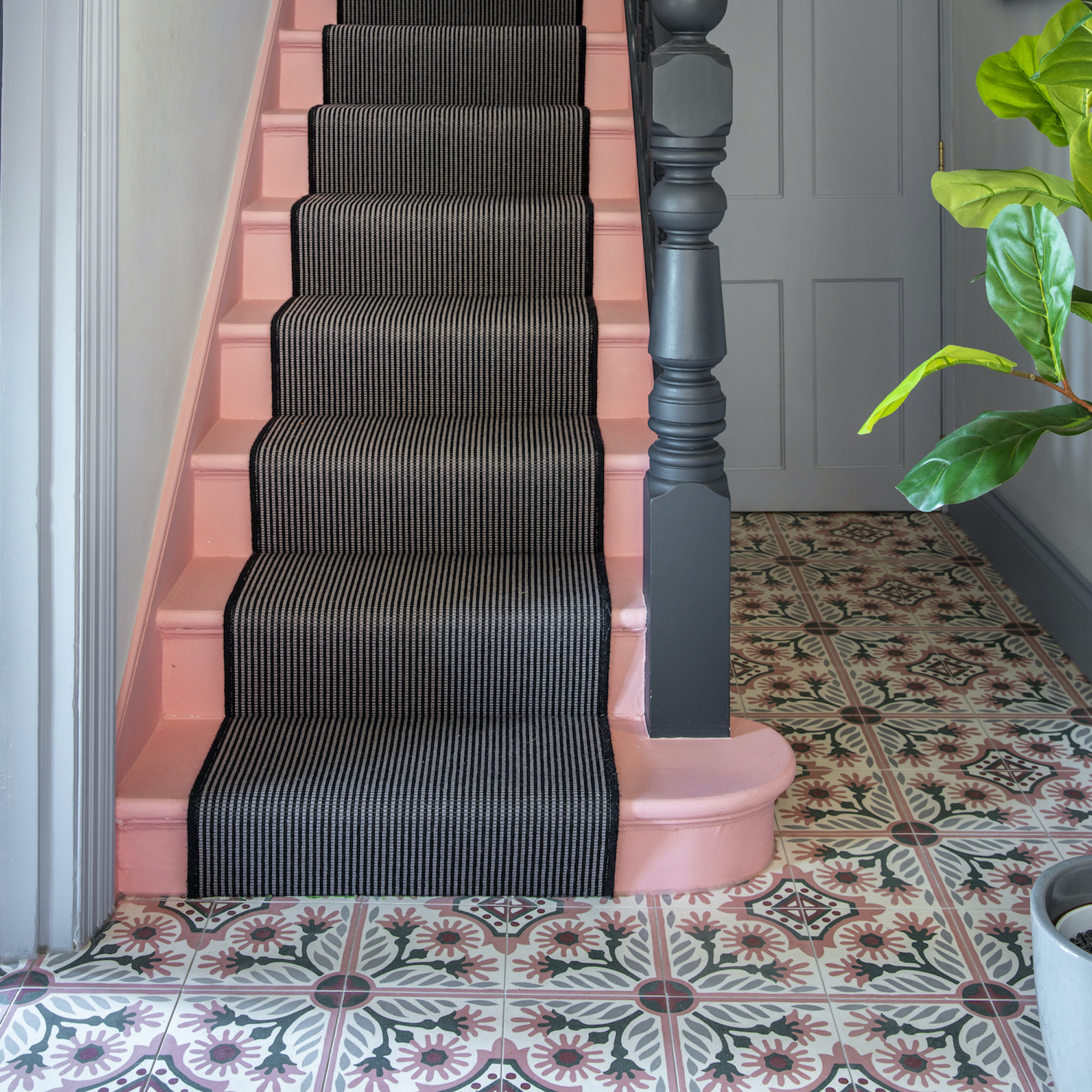
The huge success of the new Barbie film may have seen vivid pink’s popularity soar this year but embracing vibrant pink tones such as bubble-gum and fuchsia in the hallway could be a costly mistake, according to Amy Wilson, creative director, 247 Curtains.
Get the Ideal Home Newsletter
Sign up to our newsletter for style and decor inspiration, house makeovers, project advice and more.
‘While these colours can be fun, bold colour statements can often overwhelm smaller spaces. They are particularly stimulating and intense when used in the hallway and can look quite harsh in an area of the home that is designed to be welcoming and inviting,’ she says. ‘Vibrant pinks can also be difficult to coordinate with and are likely to date quite quickly which means it could be a costly decor choice.’
If pink really is your thing, Amy suggests introducing pink in lighter shades with cooler undertones that won’t overwhelm you. ‘You can accessorise with stronger pinks to elevate the hallway, rather than make it the star of the show,’ she adds. ‘Whether this be through a pair of beautiful pink curtains or a striking pink light fitting that draws your eyes up, there are many simple yet effective ways to add pink to uplift your small hallway.’
2. Brilliant white
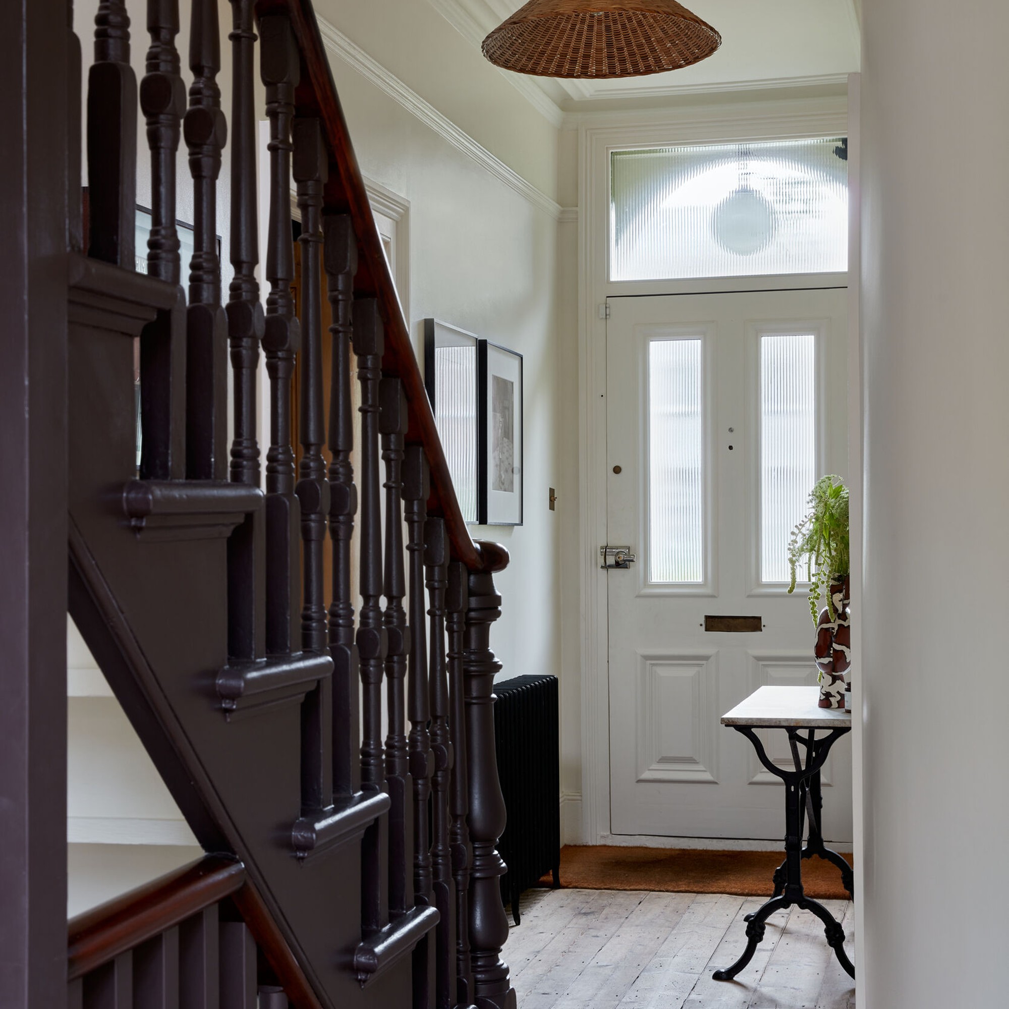
It’s often tempting, especially in smaller hallways, to just layer on generic brilliant white in the hope of brightening up the space, believes James Greenwood, colour and interiors expert at Graham & Brown. ‘The hallway, big or small, is usually the first impression both you and visitors get from your home, so it’s important to create an environment that’s welcoming and warming. Stark white can look sterile and give a cooling effect, plus will show dirt from this high traffic area,’ he explains.
‘Try a neutral warmer tone instead, from the taupe family,’ James suggests. ‘This warm colour area will add warmth and a welcoming embrace into your sanctuary. Warmer earth tones are also more forgiving on any muck that may be brought into the home.’
3. Bright red
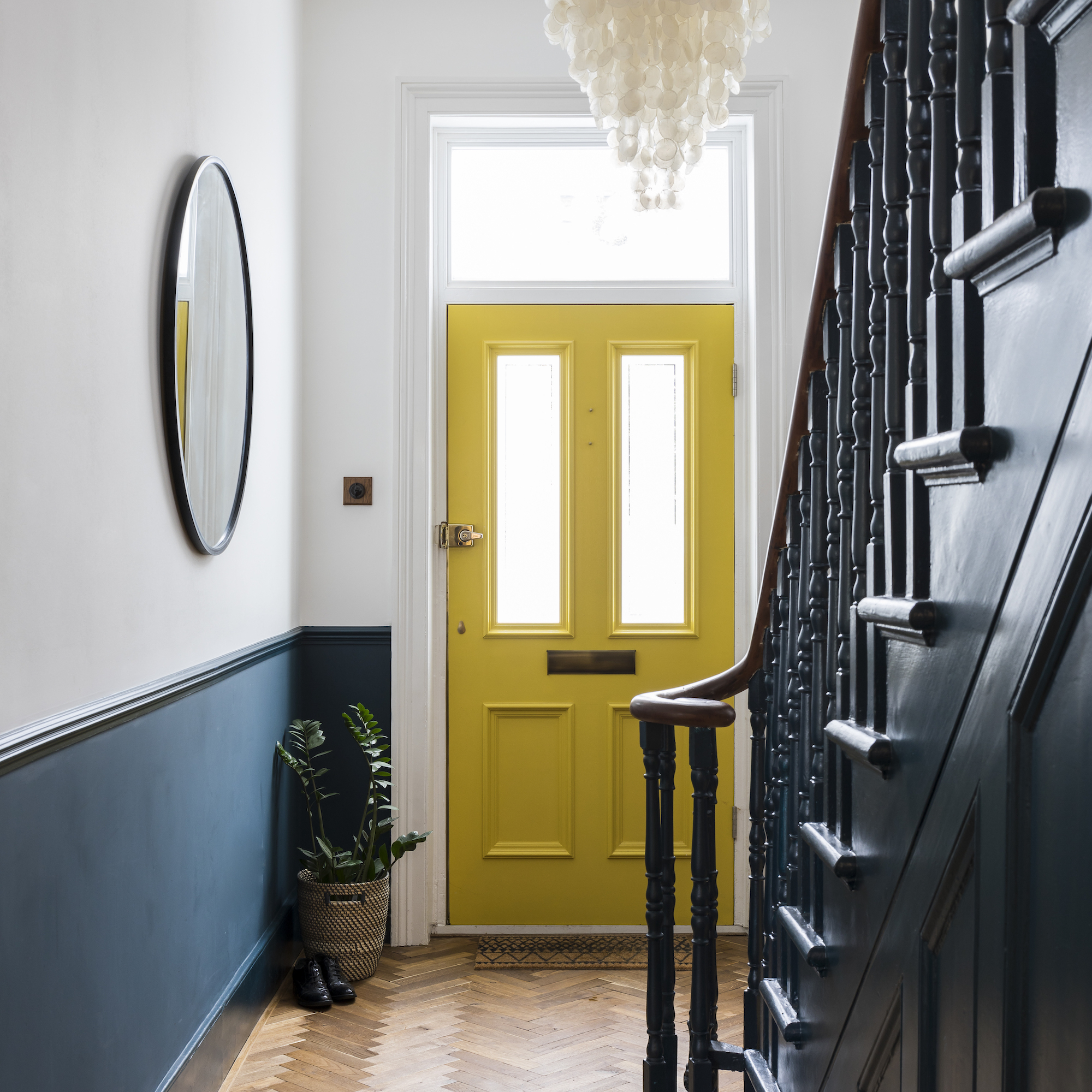
Although it is undoubtedly a warm, cosy colour, that’s perfect for a snug, red can be too intense and emotionally stimulating to be the first shade you encounter when coming home.
‘At the end of the day, if you love red, then use it where it’ll make you feel happy. That said, there are some reasons why it should be avoided in a small hallway,’ says Anna Hill, brand director and colour consultant, Fenwick & Tilbrook. ‘Bright red can visually shrink a space, making it feel smaller than it actually is. In a small hallway in particular, red can make the space feel even more confined and cramped.’
For an equally heartwarming shade that’s less in-your-face, Anna recommends yellow, a paint trend that happens to be having a moment. ‘Yellow is a lovely choice for a hallway – it’s a happy colour and instantly sets a positive mood for any guests entering the house, but not overwhelmingly so,’ she explains.
4. All black
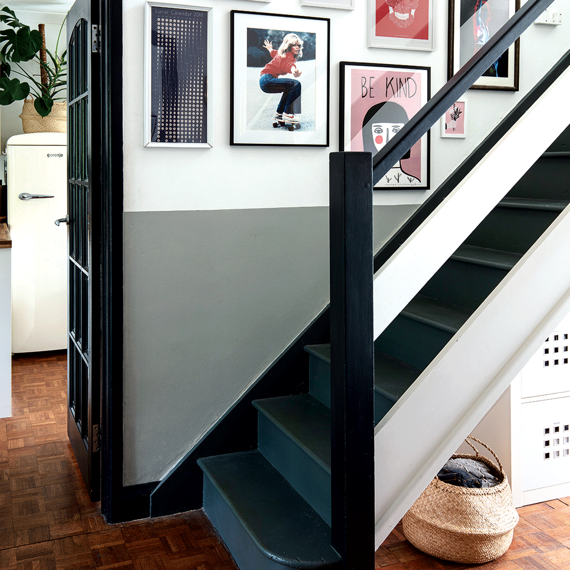
‘A popular and contemporary colour, black can add drama and impact to any room. However, due to its light-absorbing persona, this sophisticated colour may not bode well in a small hallway. Often offering a narrow and naturally dim space, fully painted black walls could make a hallway space feel even darker and confined - creating a gloomy and unwelcoming atmosphere,’ believes Emma Bestley, co-founder of YesColours.
Instead, Emma suggests breaking up the palette by painting only the bottom half of the wall in black, and the other half in either white or another subtle hue like calming blue. ‘It will allow light to move freely around the space, making the area feel open, and will enhance the style of the scheme too.’
Another way to embrace black without overpowering a small hallway is to go light on the woodwork, including skirting boards and architraves, as well as the ceiling and flooring. This classic monochrome colour combo never fails to look sophisticated and is utterly timeless.
5. Washed out neutrals
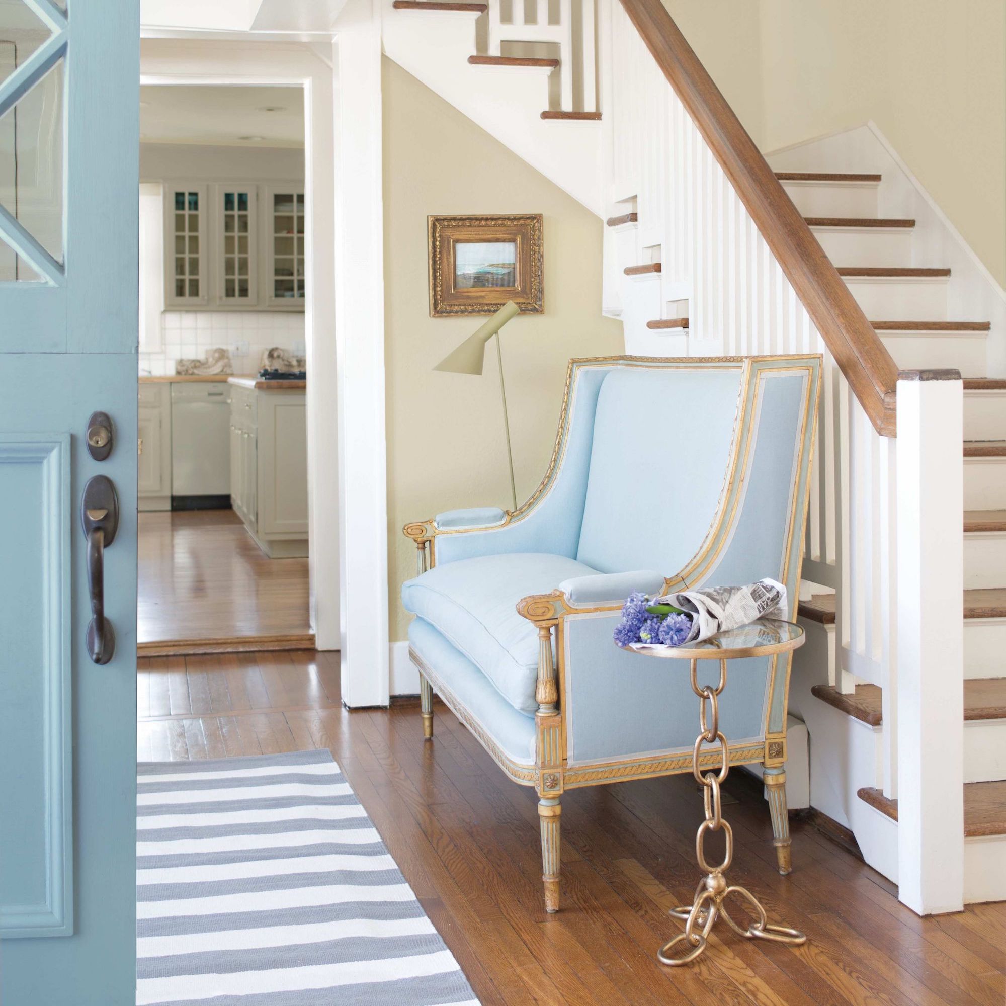
Opting for pale, airy colours in a small hallway that lacks natural light is always a good idea, right? Wrong. While warm neutrals will absolutely deliver in this scenario, beware the insipid ‘nothing’ neutral. We’re looking at you, magnolia! Bland, washed out neutrals won’t offend, but they will not enhance your home or make a great first impression on guests, either.
To use light-boosting neutrals to their full advantage, Benjamin Moore’s Helen Shaw recommends using warm neutrals in the hallway to create a cohesive home. ‘Remember a hallway helps to create colour stories from room to room, therefore a neutral hue will provide optimal versatility and flexibility,’ she says.
‘When picking a neutral, consider the rest of the rooms in your home. For example, if your hallway is connected to spaces in blues, greens and purples a cooler grey shade can work particularly well. If your home tends to lead towards warm tones – reds, oranges, yellows - try a warmer neutral or even white paint colour with warm undertones.’
6. Harsh neons
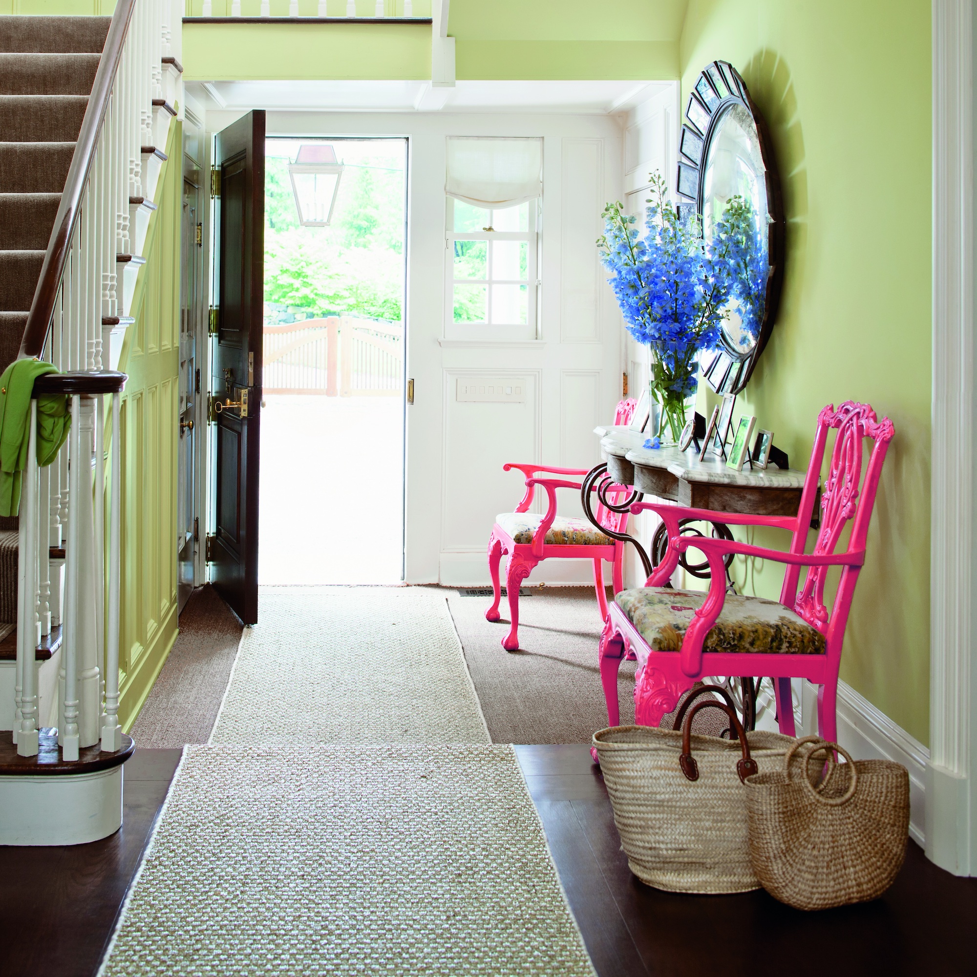
Retina-burning neons will certainly make an impression, but it won’t necessarily be the one you’re aiming for! Neons can be playful used in small doses, perhaps on a mirror frame, painted chair or framed print, but in high volume, they have a tendency to give off teen skatepark vibes…and massive migraines.
‘A hallway sets the tone and leaves an impression. That’s why I’d avoid neon colours in this part of the house. They don’t tend to blend well with other colours and can be overpowering and garish,’ agrees Kate Conrad, interior design expert from Madison and Mayfair. ‘If you are going to use neon I’d do it in a more discreet way, on moveable items, not plastered all over the hallway walls.’
7. Battleship grey
The natural light levels will have a considerable impact when mulling over shades of grey. ‘If you have enough natural or artificial light in the hallway, you could use a moderately darker grey that complements the other colours in your interior,’ concedes Nicolene. ‘Once you've narrowed down your final selections, I always recommend painting a few samples on the hallway walls to observe how the colour reacts to the change of light during the course of the day and night.’
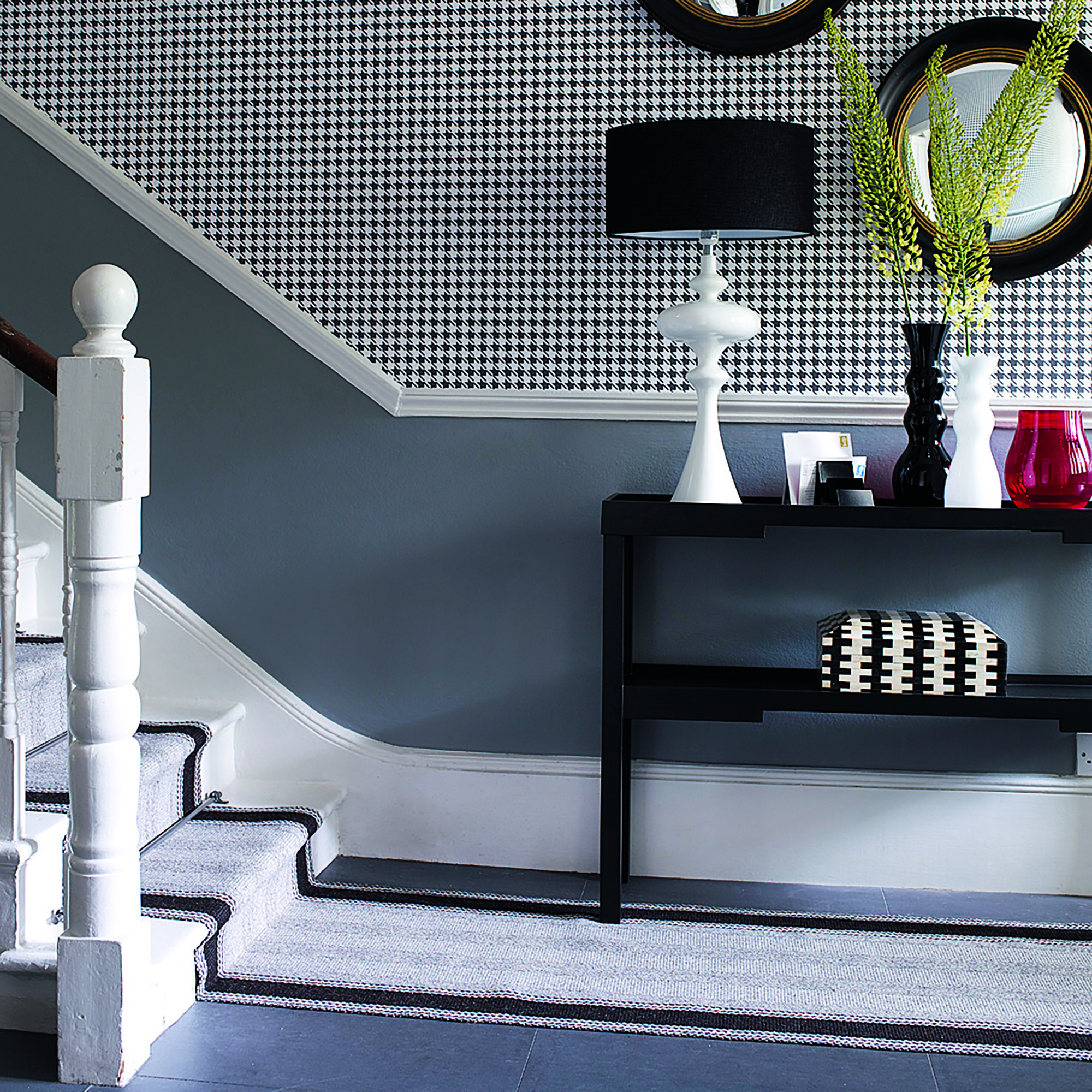
While grey is still a popular choice that’s celebrated for its innate sophistication and timelessness, small hallways can require a more sensitive approach. Steer well clear of dark, cold greys with blue undertones in particular, to dodge the battleship effect! Warmer greys with yellow undertones, aka greige, will feel much more welcoming in a small hallway.
Choosing the right shade of grey for your hallway can be trickier than one imagines, as not all greys work equally well in every interior. If grey is your wall colour of choice, smaller spaces like the hallway is better suited to a lighter, but not too light, grey,’ advises interior designer Nicolene Mausenbaum, from Dezyna. ‘This will help make the hallway appear larger, brighter and more inviting, compared to dark grey, which can make a small hallway seem even smaller and closed in.’
FAQs
What is the best colour for a small hallway?
‘When space is at a premium in a hallway, but you don’t want to compromise on injecting some colour, lighter shades or blues are a great choice. We particularly like a soothing mid-blue, perfect for creating calm and peaceful spaces. It is dark enough to add colour and depth but light enough to remain refreshing,’ says James Greenwood, colour and interiors expert at Graham & Brown.
‘Where ceilings are low try painting your coving in a colour tone slightly stronger to the wall paint, this will draw the eyes up and create the illusion of a higher ceiling.’
What colours brighten a small hallway?
To brighten a small hallway, colours with pink and red undertones will always help warm and open the space. ‘A soft, dusky rose tone will flatter any hallway and helps to balance the natural light that is coming into the room to create a soft glow and welcoming mood,’ explains Benjamin Moore’s Helen Shaw.
‘Use a more saturated pink on the walls to instantly brighten up any hallway, and then use a pink that’s a tone lighter on the ceiling for a perfect pairing. Pale pink hues work especially well with natural woods and linen textures to add depth to the scheme; opt for oak stair spindles with an upholstered linen chair or seating bench. You can also add accessories – a mirror is a great choice as will help bounce light around the space.’
What colours make a hallway look bigger?
‘To create the illusion of space, lean towards lighter colours of paint in order to make an area feel bigger – especially if you don’t have any natural light,’ says Flora Hogg, colour expert at Craig & Rose.
‘Neutrals and whites are a popular choice if you’re going for a classic, minimalist feel but just because you’ve opted for a lighter paint doesn’t mean you have to sacrifice using colour. Light pastels can make a great addition to any small hallway, making the space feel bigger whilst still adding a pop of personality.’

Linda Clayton is a professionally trained journalist, and has specialised in product design, interiors and fitness for more than two decades. Linda has written for a wide range of publications, from the Daily Telegraph and Guardian to Homes & Gardens and Livingetc. She has been freelancing for Ideal Home Magazine since 2008, covering design trends, home makeovers, product reviews and much more.
-
 I tried out this neat little dehumidifier for a month – it dried my laundry in half the time
The 20L SmartAir Dry Zone dehumidifier tackled my laundry drying woes head on
By Jenny McFarlane
-
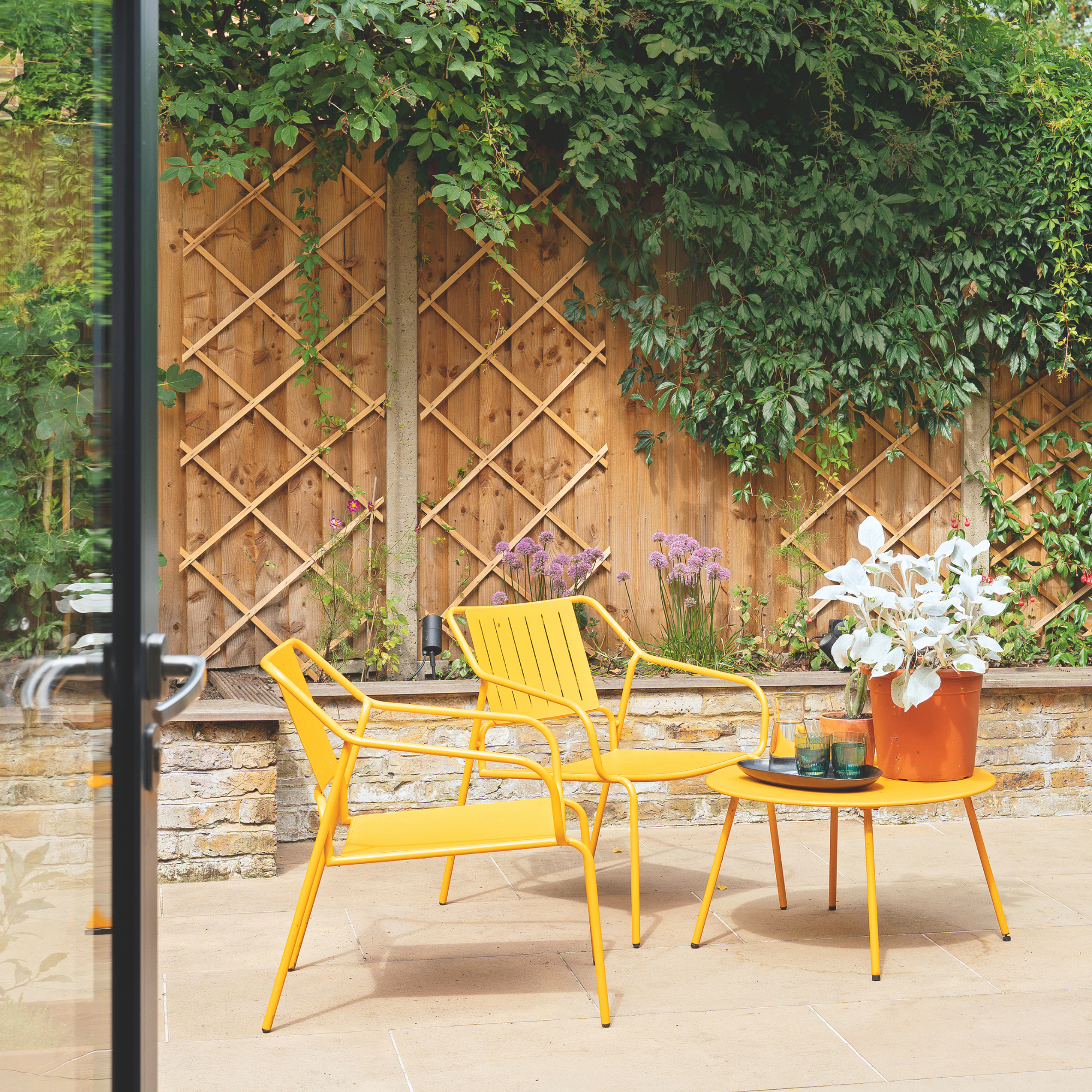 I’m seeing pastel garden furniture at all my favourite brands this spring, but QVC’s sorbet collection impressed me the most
Fresh pastel shades are a great way to liven up your outdoor space
By Kezia Reynolds
-
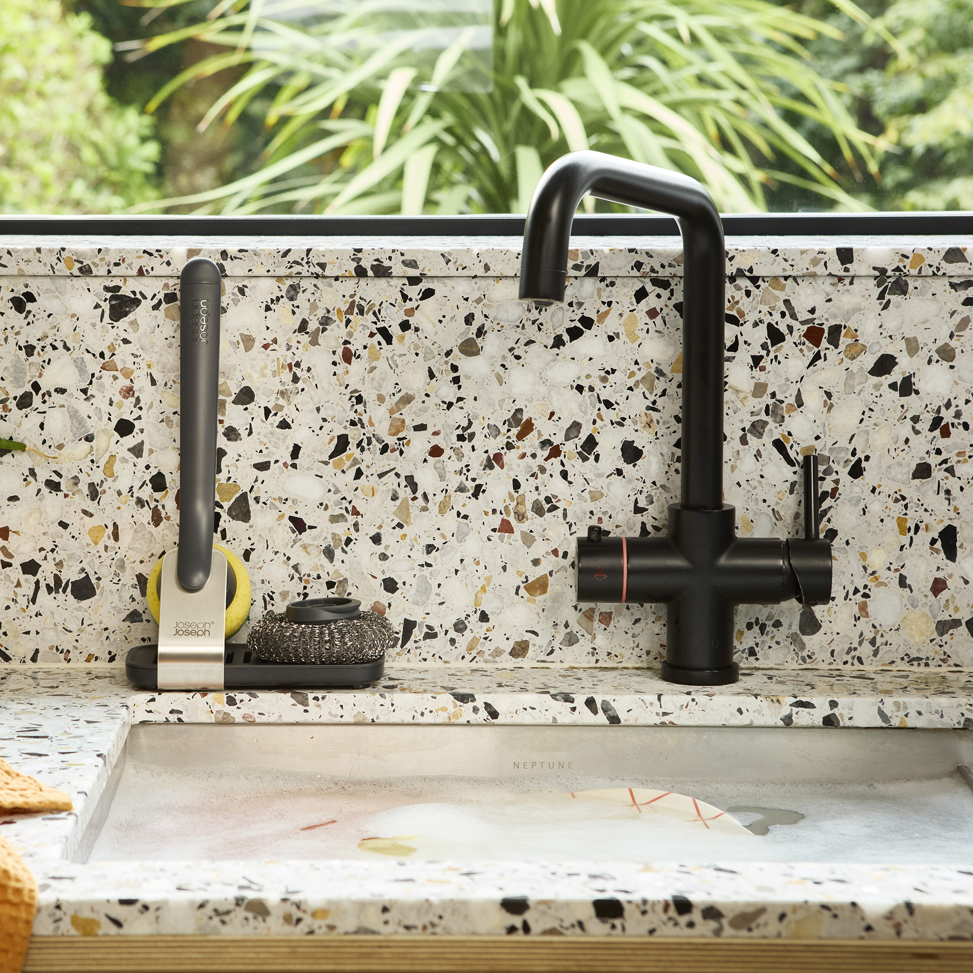 Don't tell my flatmates, but Joseph Joseph's clever new sink range finally made me enjoy washing up
I didn't know stylish washing up accessories existed until I saw this collection
By Holly Cockburn