By mixing period and modern design, this 1920s home has become a style triumph
A combination of period and modern design with bold colour and pattern are core to the success of this gorgeous family home in Buckinghamshire

Louise O'Bryan
A masterclass in how to combine period and modern design successfully, this six-bedroom detached house in Buckinghamshire was built in 1928 and retains many of its original features.
Home to a couple and their three children, thanks to welcoming colour and pattern into their home, the space balances a classic, elegant vibe with a truly fun and fresh family feel.
The hallway
Having previously lived in an ’80s house that lacked character, the owners found that the period features and high ceilings of this house to be a dream.
They could see past the existing garish wallpaper on the walls and knew they could transform the generous sized rooms into a wonderful family home, even if it did mean redecorating every inch.
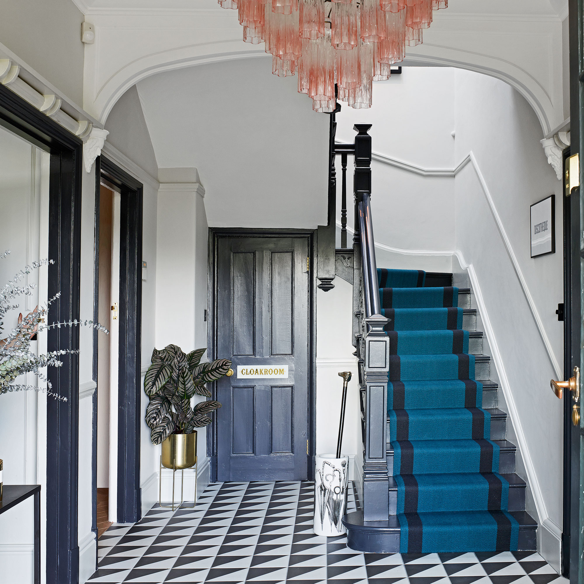
In a striking example of successful hallway lighting ideas, the large blush pink glass chandelier adds diffused light near the front door, while adding a pop of subtle colour.
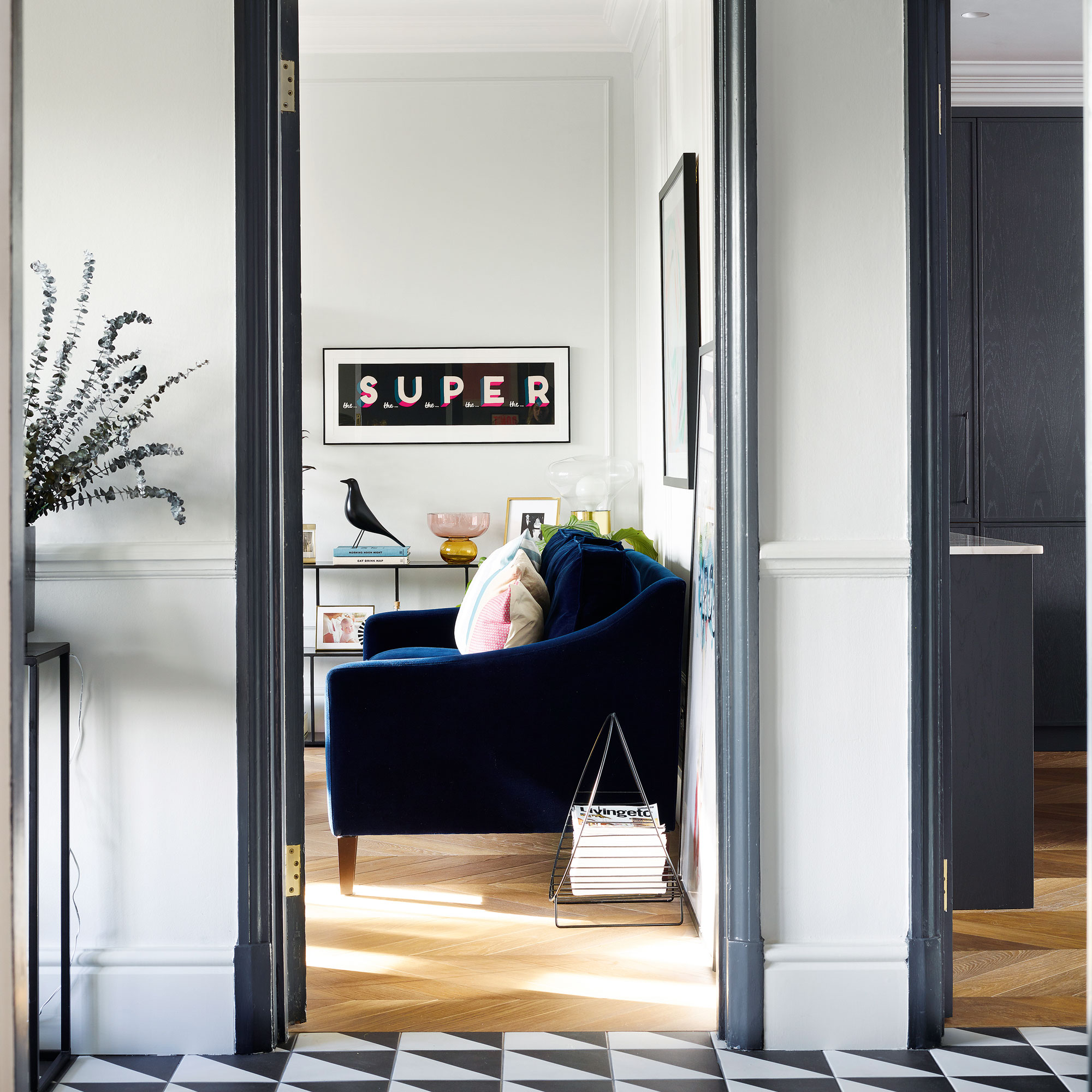
Their vision for the hallway was to create a dramatic combination of period and modern design with the entrance featuring geometric tiles in contrast to the traditional architraves and cornicing.
The kitchen
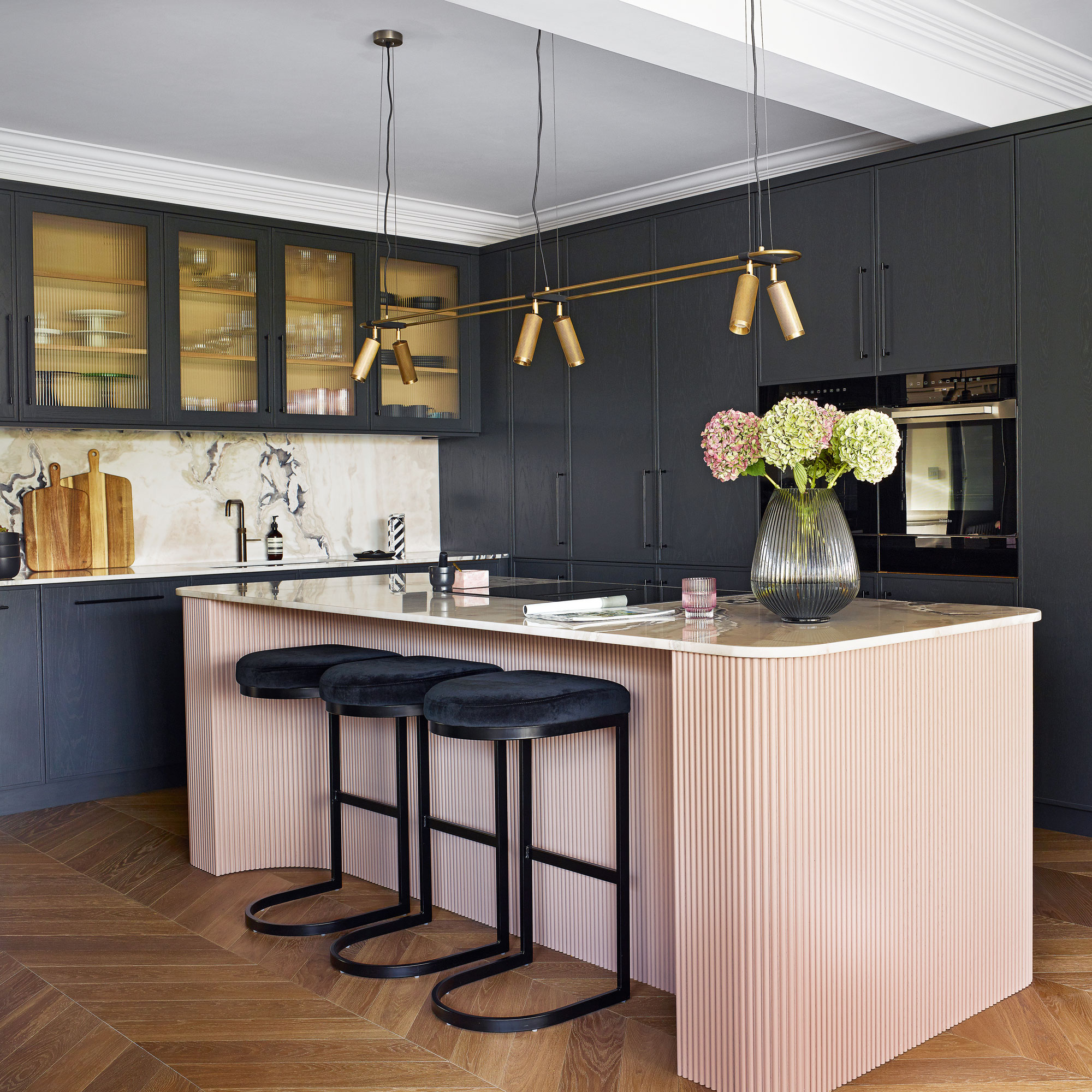
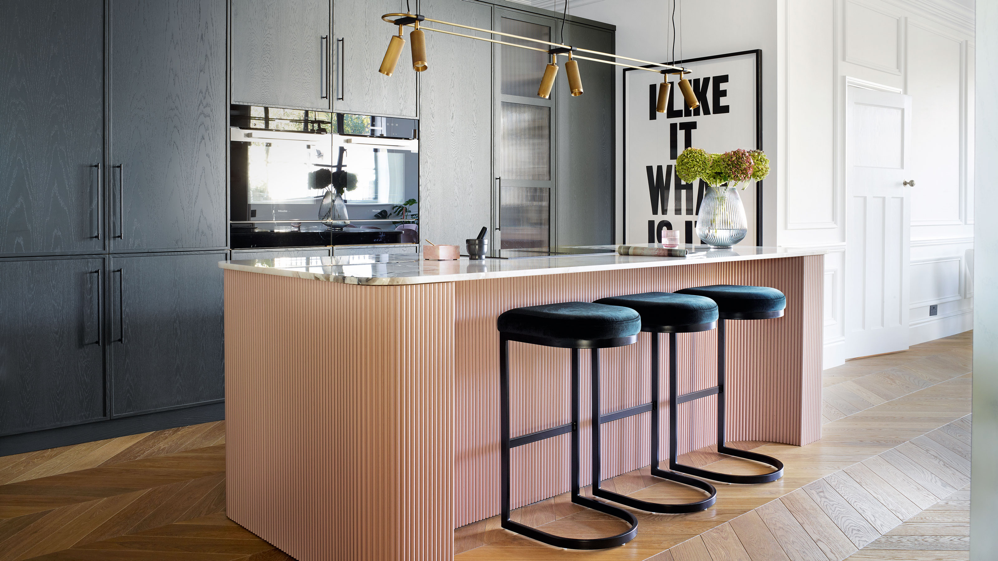
After they moved in, the family lived with their old kitchen for two years, so they had plenty of time to plan their new one and build up an ultimate wish list. The pink kitchen ideas included an island where family and friends could congregate, a pantry and a beautiful bar area.
Get the Ideal Home Newsletter
Sign up to our newsletter for style and decor inspiration, house makeovers, project advice and more.
They kept the existing layout as it flowed efficiently and they worked with Goodwood Interiors to design a kitchen full of rich and luxurious textures that would complement the period setting, including a pink ribbed island to steal the show.
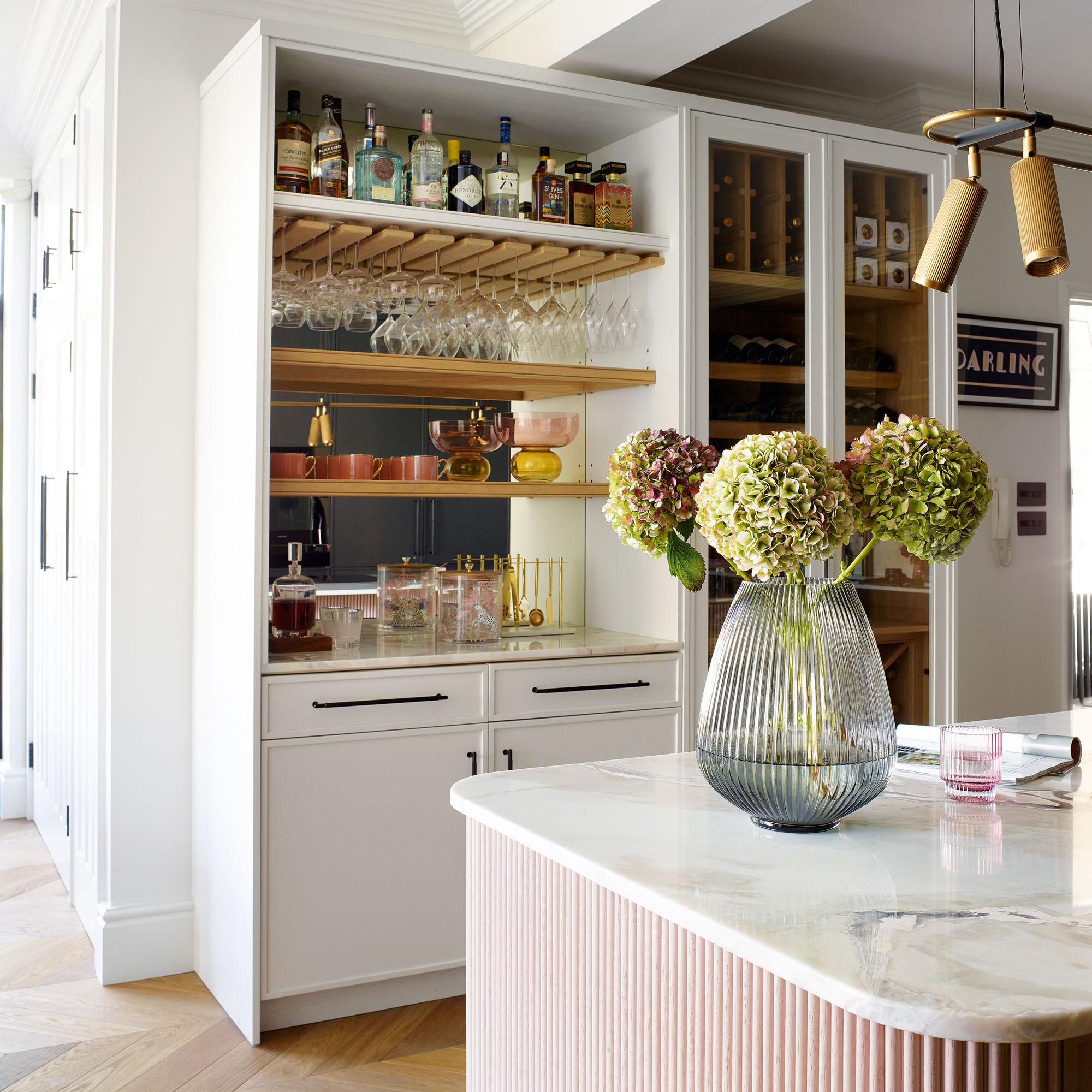
Reeded glass brings a sumptuous, vintage feel to the space, and it gives the contemporary units a period touch. It’s also a practical finish as it distorts the contents of the kitchen wall cupboards just enough to disguise any messy areas.
The fluted and reeded elements have added layers of architectural interest to this room, and they’re always a talking point with their guests.
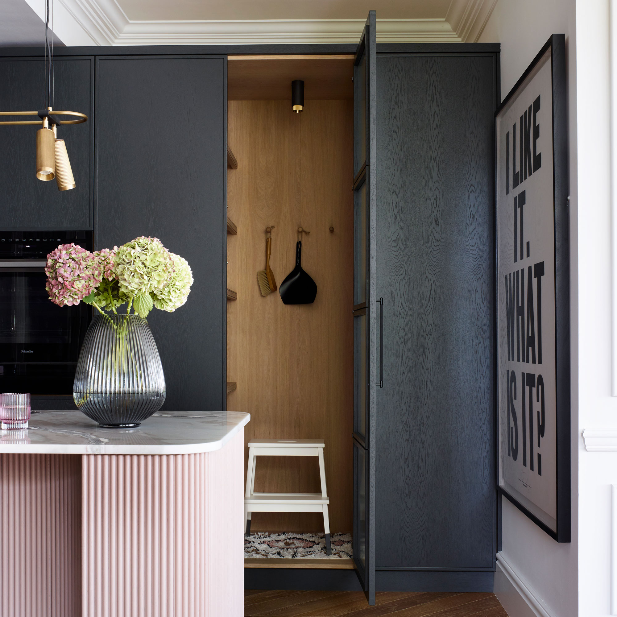
The room’s greatest success is its versatility, easily transforming from a kid’s play zone to adult entertaining space.
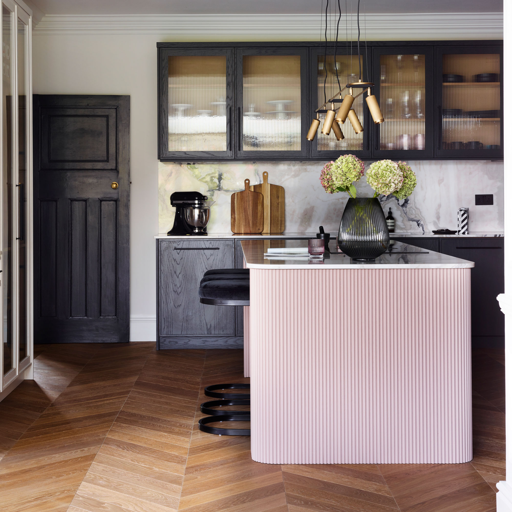
With regards to wood flooring ideas, the herringbone flooring adds an extra layer of subtle pattern to the space. Lightly brushing and oiling wood flooring exposes the natural charm of the grain, creating a traditional look with a matt finish. Layers of oil also protect it from wear and tear.
The utility/boot room
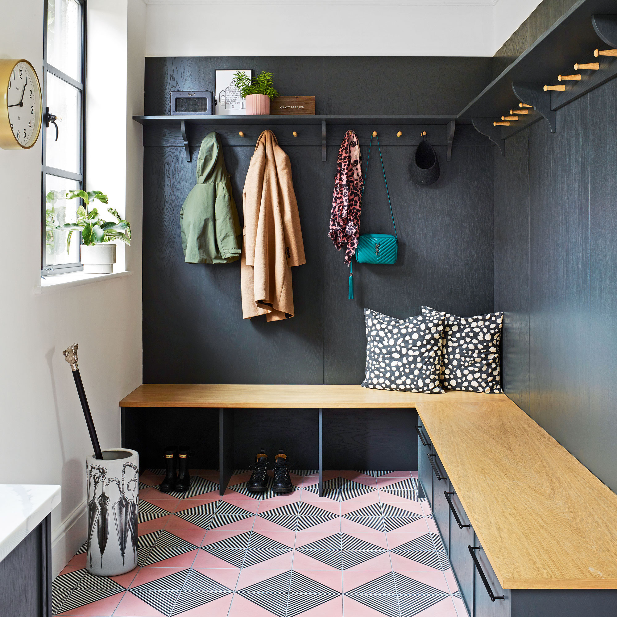
The large utility room design ideas is just adjacent to the kitchen. Originally this space had a simple run of units and a spare fridge but the owners found it to be a waste of useful space, so they commandeered it as a boot room/utility by adding good-looking coat and shoe storage.
They asked their joiner to add panelling around the walls for a hardwearing surface and added a bench with cubby holes and drawers underneath. The fun floor tiles create a functional space that has character, too.
The living room
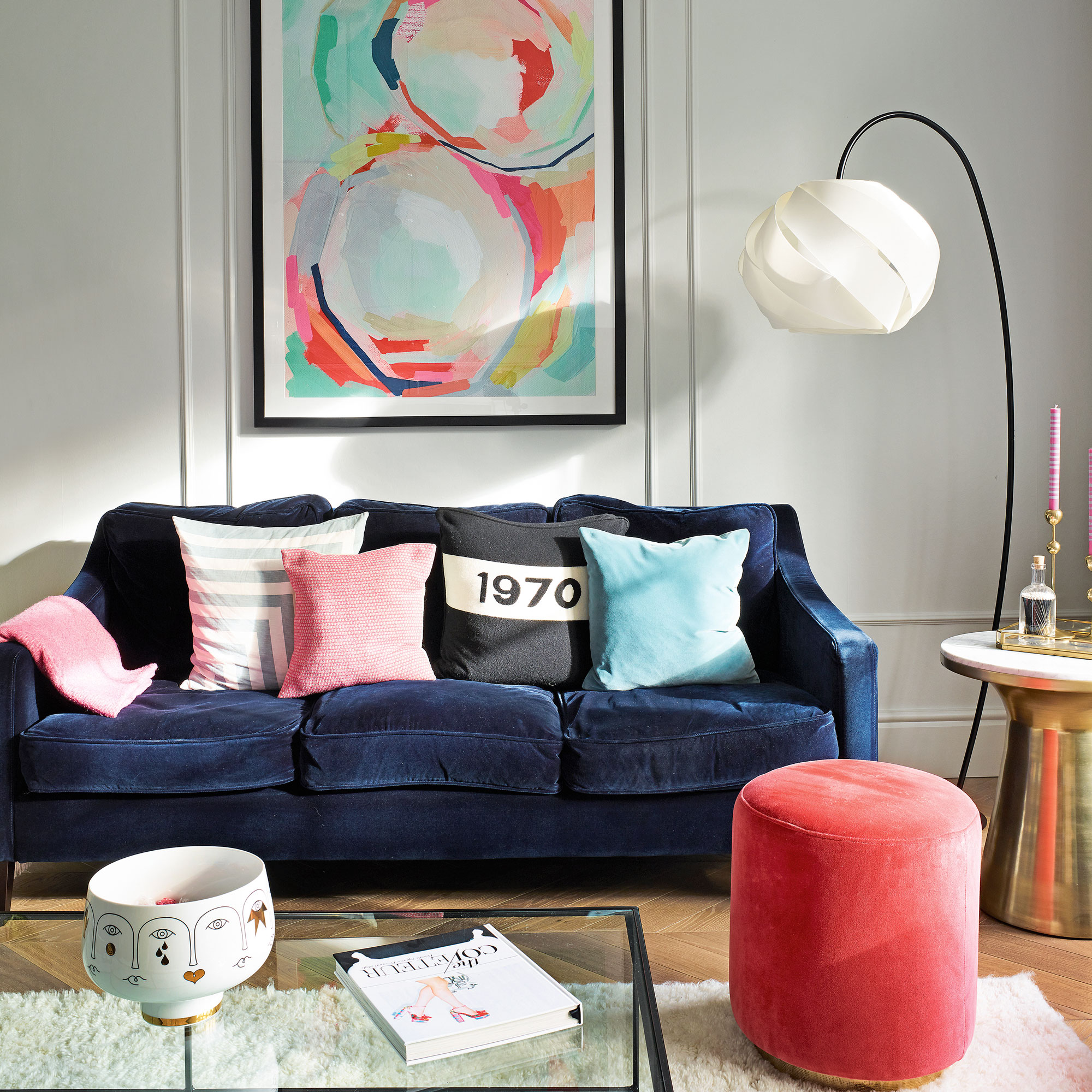
This is the couple’s ‘grown-up space’ - somewhere with no toys, where they could retreat when their kids were in bed.
To complement the original ceiling mouldings, they added simple MDF wall panels to draw the eye upwards and heighten the grandeur.
They softened the space with sumptuous textures, like velvet, wool and brass, to ramp up the luxe factor. By keeping the walls pale grey, the artwork pops against the light background. Touches of brass and pops of pink feature in every space to create a flow from room to room.
The family room

As the house is double-fronted, they have big reception rooms either side of the hallway. One is the living room, while the other one is a vibrant family space where the kids can play. At weekends, they all spend time together in this room, watching family movies.
The mix of gallery wall ideas pack a visual punch. The bold stripes, squares or rectangular patterns are a useful tool for drawing attention to a particular feature or area in a room.
The upstairs landing
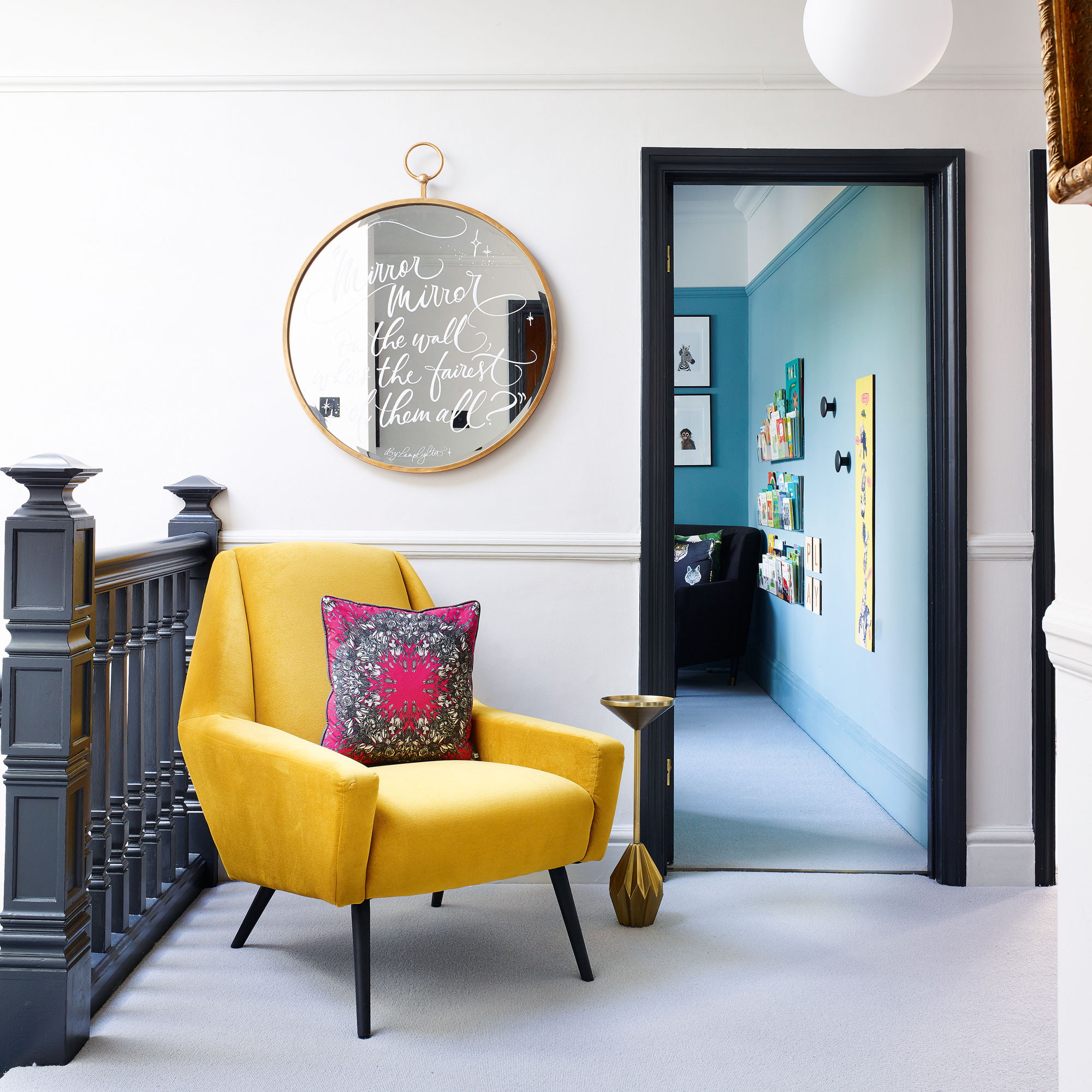
They replaced an old and ugly PVC skylight with a contemporary flat roof light above the landing which has made a huge difference to the space and allows natural light to flood into the stairwell.
Their kids often play here or read a book in the armchair. It's a very successful transitional space that’s not only welcoming, but also proves to be useful for many household chores, such as sorting the laundry and prepping school bags.
The main bedroom
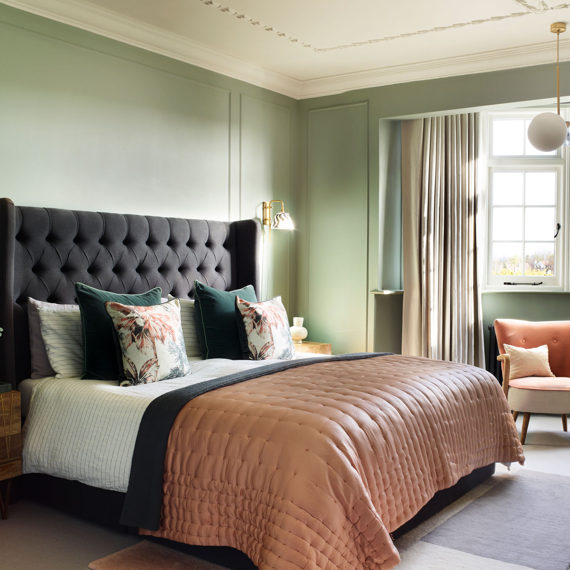
This soothing space is the perfect spot to retreat to at the end of a long day. Green is a wonderfully calming colour thanks to its connection with nature, while blush pink ensures cosiness.
The son's room
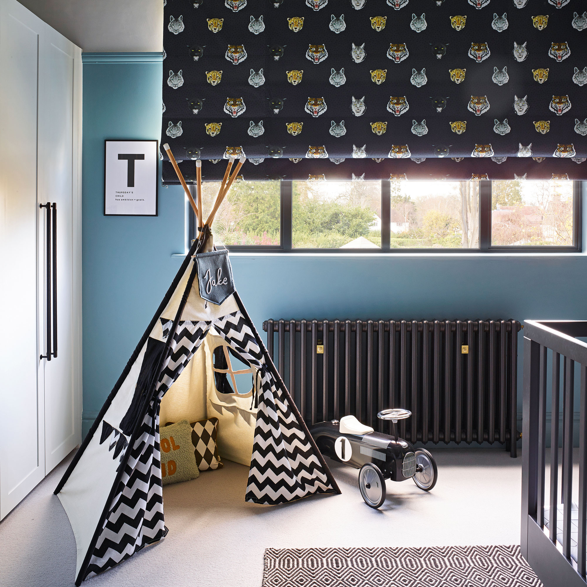
The key to decorating children’s rooms is to design a scheme that will grow with them over the years.
In their son’s room, they picked out a black animal-themed fabric for the blind and built the scheme from there, choosing their favourite rich blue for the walls and refining the look with black accessories.

With a few decorating tweaks, their kids’ rooms can change as they get older.
The family bathroom
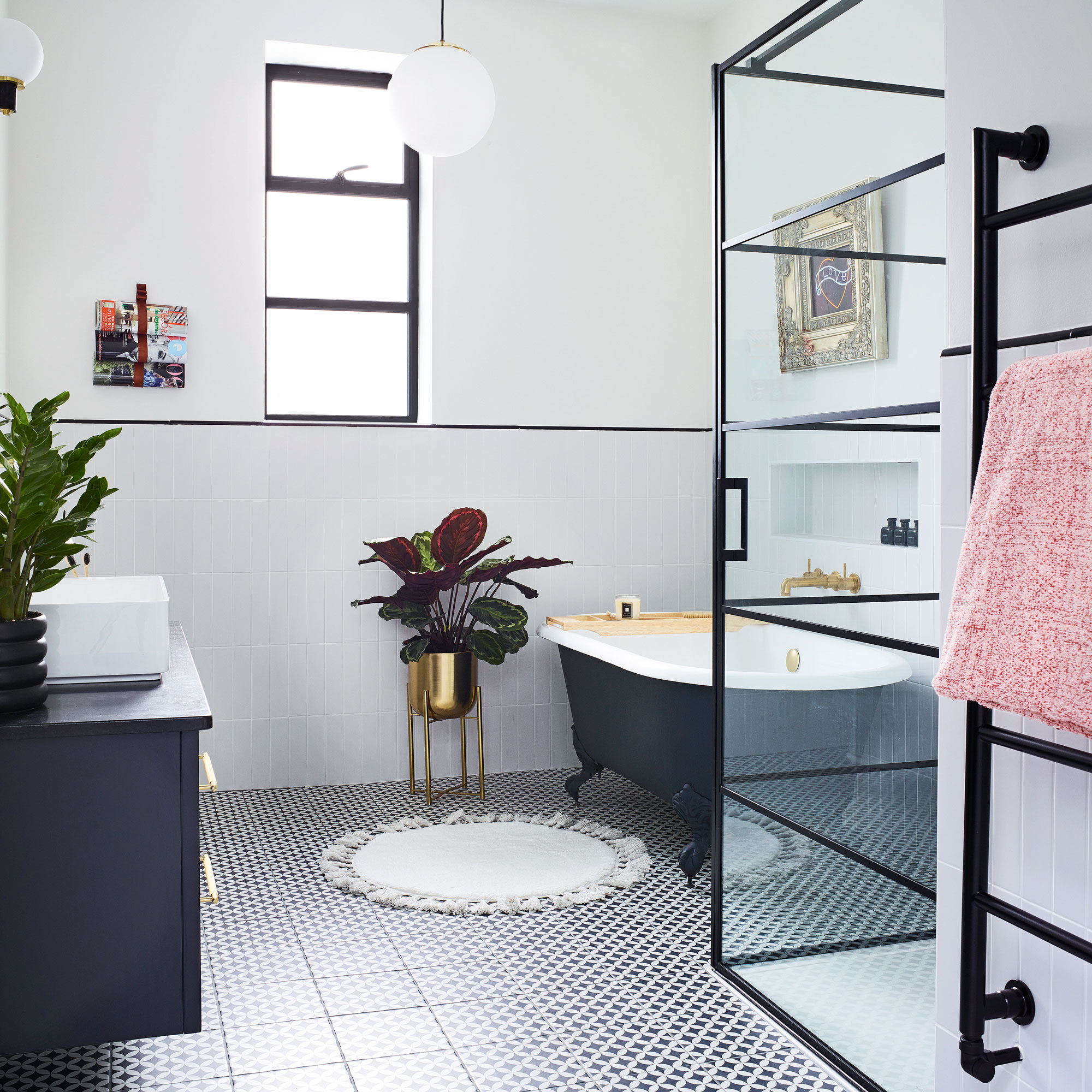
Swapping an old airing cupboard for a chic shower enclosure has made all the difference in the family bathroom. The owners wanted a look that wouldn’t date, so they took inspiration from 1920s monochrome style and mixed both period and modern design with metro tiles laid in a stacked pattern.
The roll-top bath is second hand and they had it painted to match the black steel-frame shower doors. A chic black pencil tile along the top of the white tiles draws the eye around the room and mirrors the black horizontal lines of the shower for a cohesive feel.

Ginevra Benedetti has been the Deputy Editor of Ideal Home magazine since 2021. With a career in magazines spanning nearly twenty years, she has worked for the majority of the UK’s interiors magazines, both as staff and as a freelancer. She first joined the Ideal Home team in 2011, initially as the Deputy Decorating Editor and has never left! She currently oversees the publication of the brand’s magazine each month, from planning through to publication, editing, writing or commissioning the majority of the content.
-
 I ditched my regular vacuum to test Shark’s newest (and cheapest) release — it’s a great entry-level Shark vacuum cleaner
The Shark PowerPro is cheap and cheerful, but might not suit everyone
By Lauren Bradbury
-
 How to make bedding last longer – avoid buying twice with these expert tips for getting the most out of your bed linen
5 top tips for prolonging the lifespan of your bed linen, duvet, and pillows
By Amy Lockwood
-
 I was introduced to this clever heart-shaped trowel 2 months ago, and now I'll never garden without it – it's made planting seedlings so easy
It's affordable and stylish
By Sophie King