This 1960s bungalow has been given a Scandi-style overhaul - and the prettiest pantry we've ever seen
A 1960s split-level bungalow has been revived with contemporary extensions, cleaned lines, and Scandi-inspired interiors.
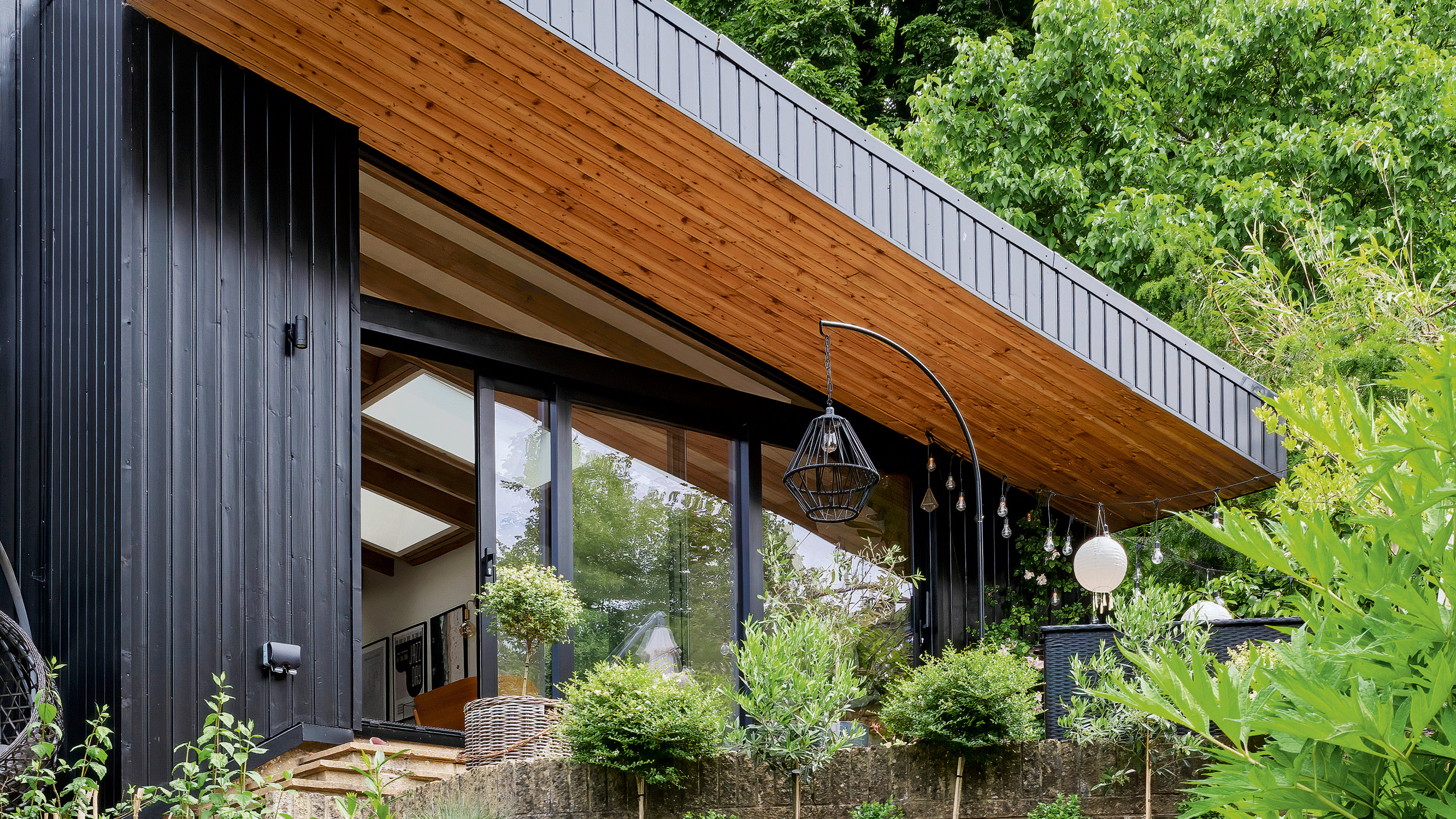
In 2018, Susanna and her family decided to move with their two children to the city of Bath. 'The city was always on top of our list as we had spent our honeymoon there.' The couple traded their red brick Victorian house outside west London for a 1960s split bungalow, which was was in good condition but a bit tired looking.
When Susanna began documenting her design sense via her blog and Instagram account @shnordic, little did she suspect that six years later her house would be Instafamous. Today her Scandinavian living style inspires more than 900,000 followers.
The journey to Susanna's Scandi property
Moving to a 1960s split level bungalow overlooking the city of Bath definitely wasn't plain sailing for Susanna, her husband, and their two teenagers.
They acknowledge the property had significant limitations… no upgrades had occurred since the 1990s, rooms were small, corridors narrow, windows too small and too high - 'we could not see outside when we were seated', Susanna said.
The layout was badly configured, necessitating access from one bedroom to another. But the garden and views captivated them, winning their hearts and intention to achieve its potential. 'We absolutely loved the plot as it was so secluded and surrounded by big trees.'
Their first year was spent living in the house, getting to understand what modifications they wanted to make. Then with planning permission and a builder chosen, they moved out to a small two bedroom flat.
They anticipated they could survive well enough for the six months with the children in school and weekend trips away. This proved challenging when the pandemic meant all four had to share its space for work and schooling needs 24/7, and slowed supplies extended the time to nine months. 'It was a bit of an adventure, but it was alright in the end', Susanna reflects.
Get the Ideal Home Newsletter
Sign up to our newsletter for style and decor inspiration, house makeovers, project advice and more.
Initial renovations
The renovation brief achieved all their hoped-for alterations… almost all internal walls were knocked down, ceilings were stripped back to the beams and an entire new floor was added above one section of the house. Pleasingly, the newly installed tall windows revealed those views.
'It made a massive difference. Every morning I go to my kitchen and have a look at the fields and the city of Bath.'
A pink kitchen
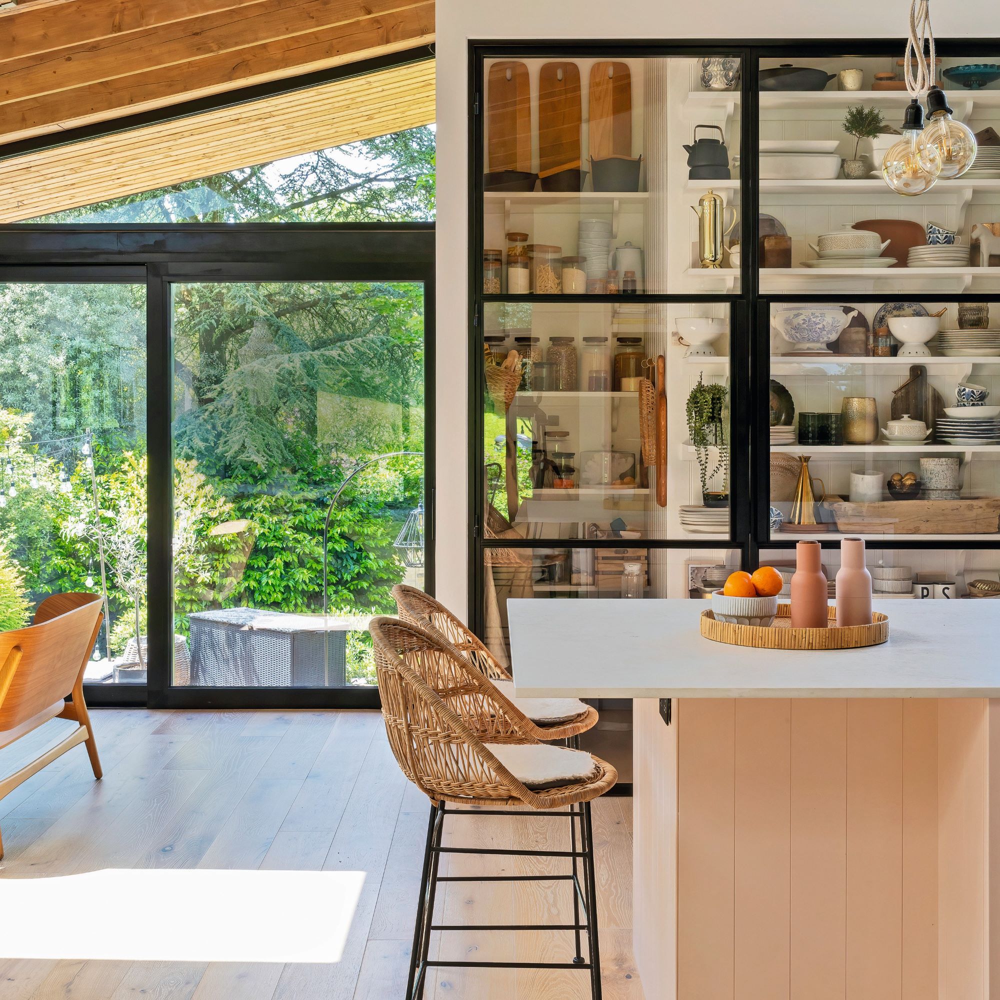
'Finding the right colour for the kitchen cabinets was incredibly time consuming; we tried many palettes and to my surprise the right colour was pink! It took me a few days to admit it but now I absolutely love it.'
Pink kitchen ideas might not have been what Susanna had in mind initially, but she's certainly happy with her culinary space now. The internal ceiling was also removed to maximise the height of the kitchen, and new extra tall windows were installed to add much needed natural light. 'Looking at the city of Bath from my window makes me happy', says Susanna.
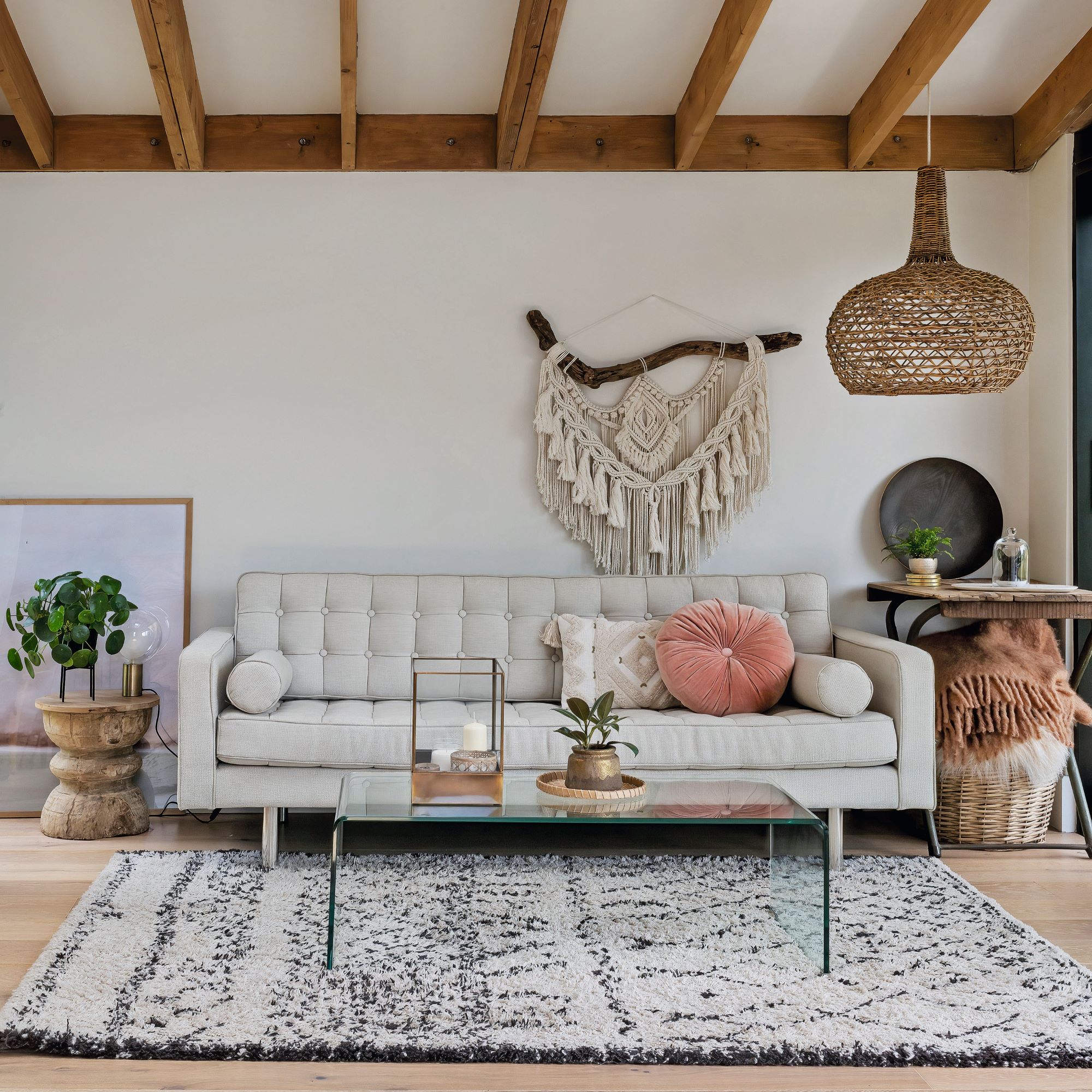
A relaxed sofa is where the family chooses to hang out together in the kitchen. Textured cushions and a macramé on the wall add a pop of interest to the neutral scheme. According to Susanna, 'texture is more important than pattern.'
The master bedroom and en-suite
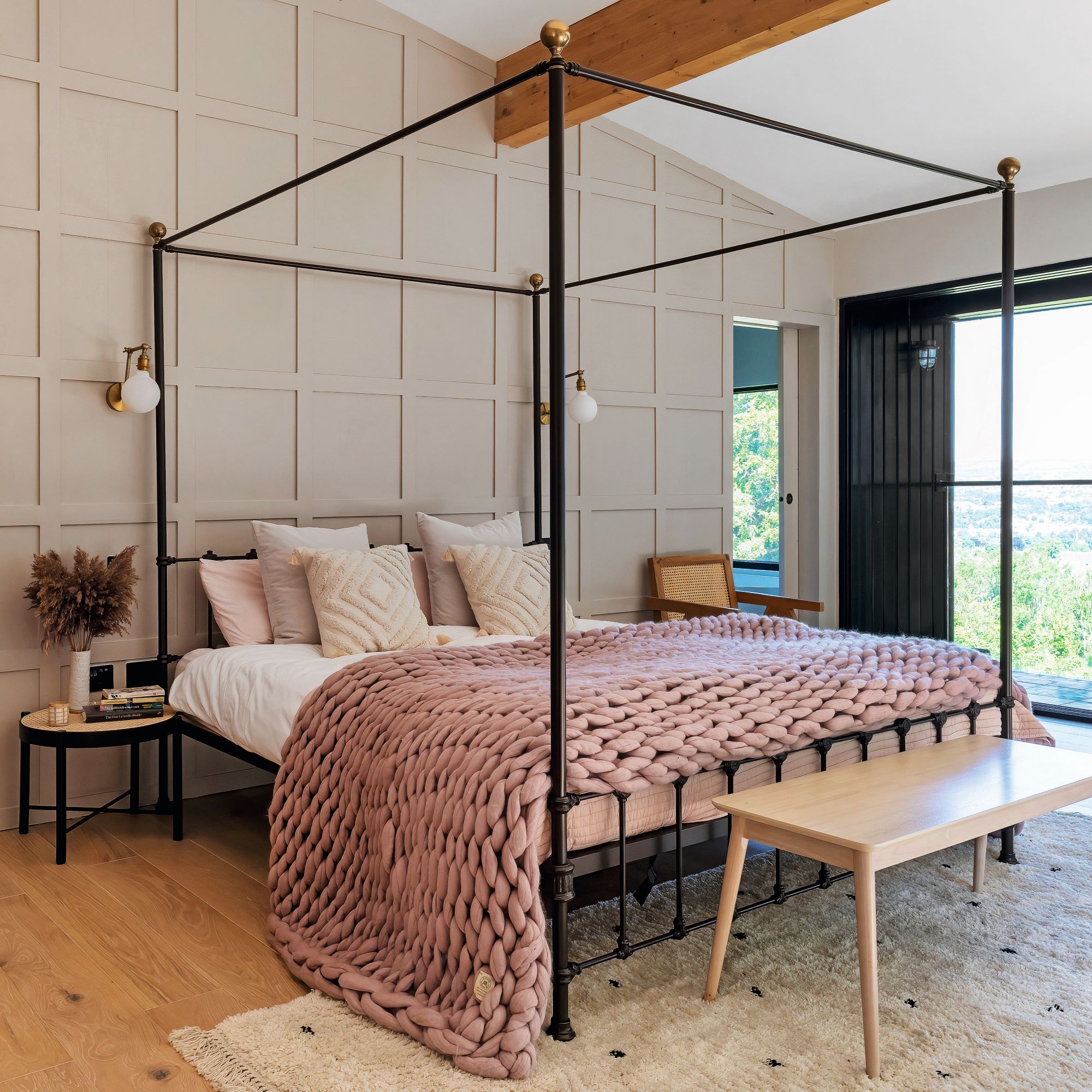
Susanna wanted to keep the bedroom calm and relaxing. 'The sideboard provides extra space for storage without cluttering the bedroom.'
She suggests for a successful layout, to keep the colour palette limited and as a further tip adds that when her bedroom felt too vast she 'added wood panelling. It would have looked empty without it.'
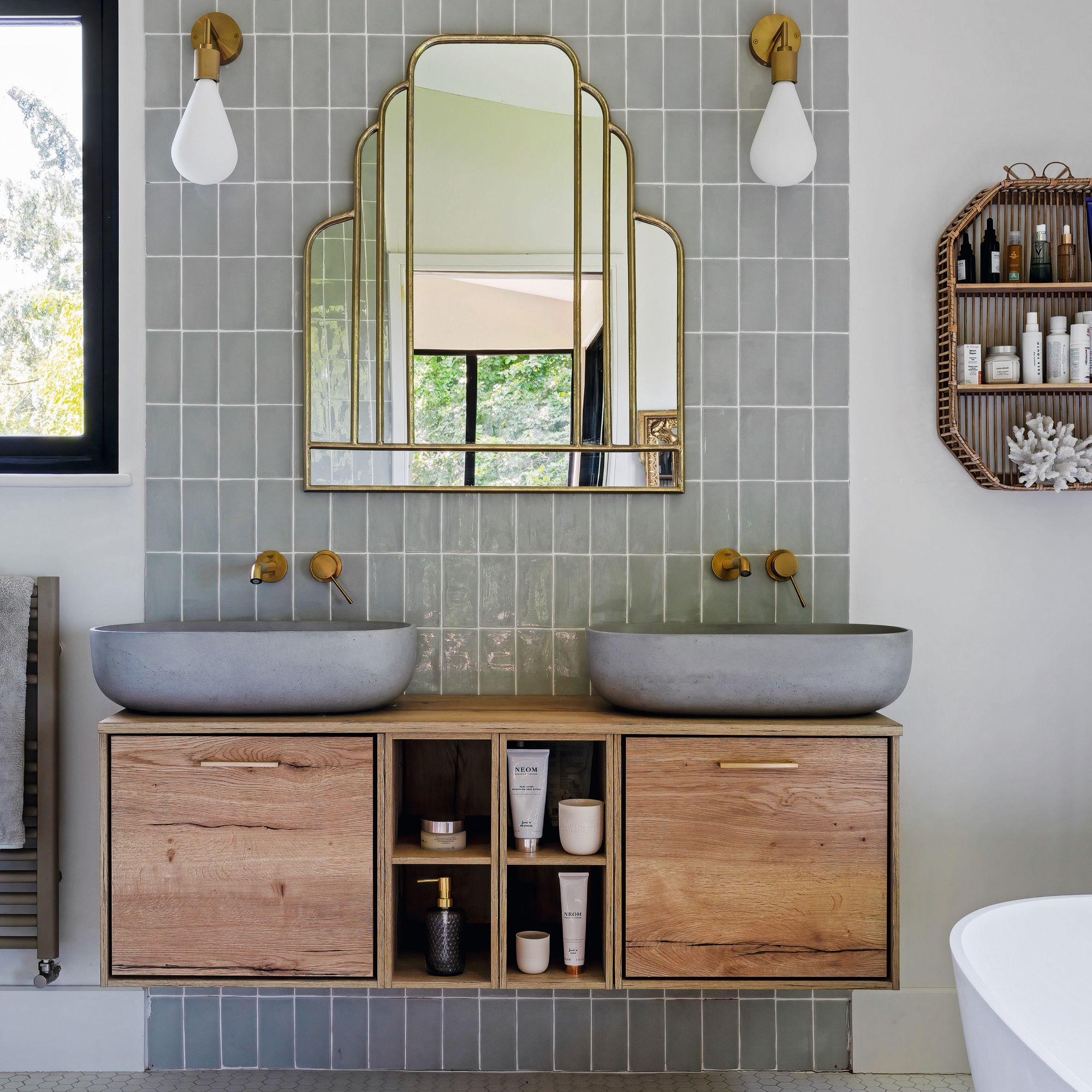
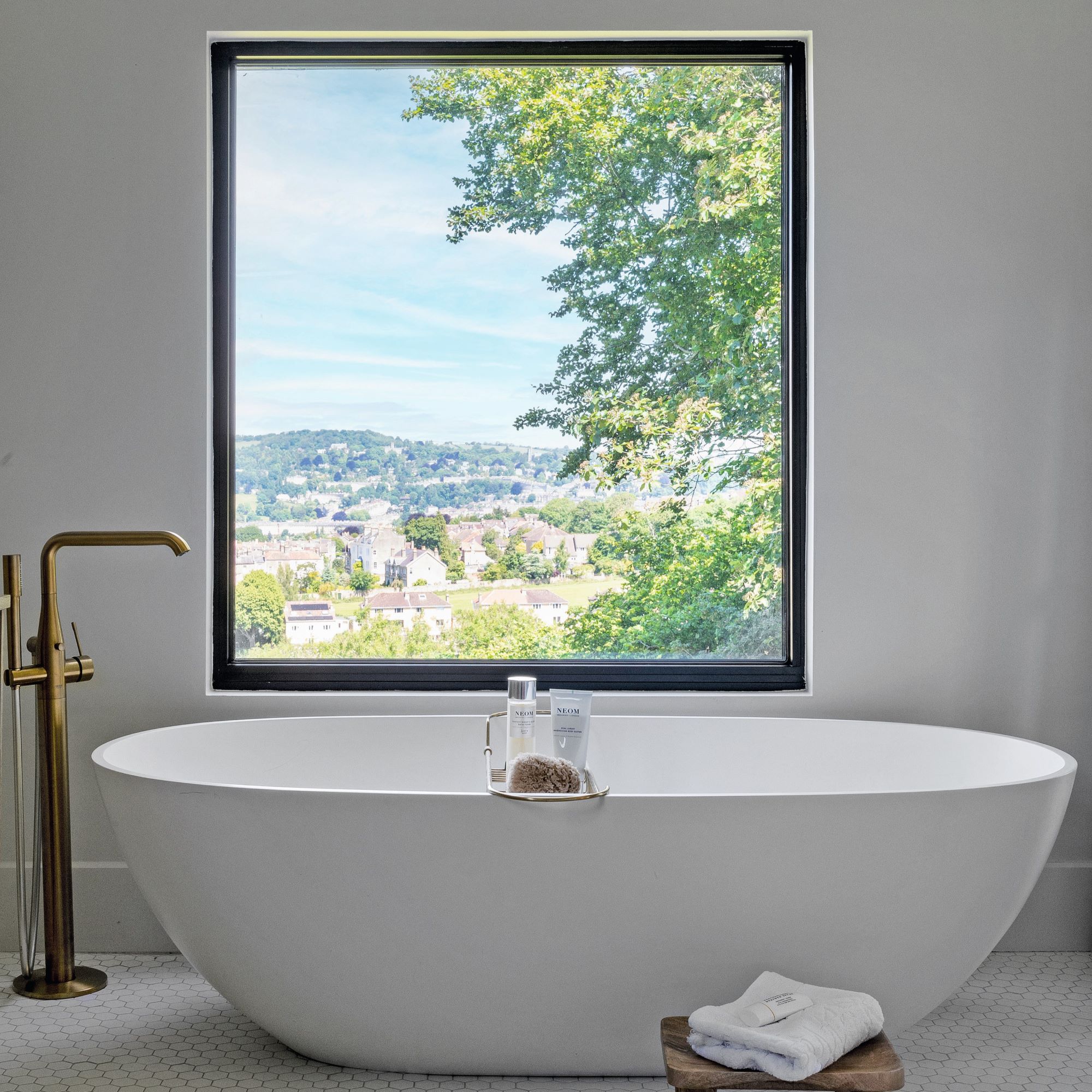
Regarding the master en-suite, Susanna said 'I did not want the bathroom to have a ‘new build’ feel. Adding a wooden vanity and rattan shelves has softened it.'
The large windows also frame the view of the bath and add a dramatic effect. 'I wanted a bath next to the window to enjoy the view on the city of Bath. It is the most relaxing setting.'
Dining area
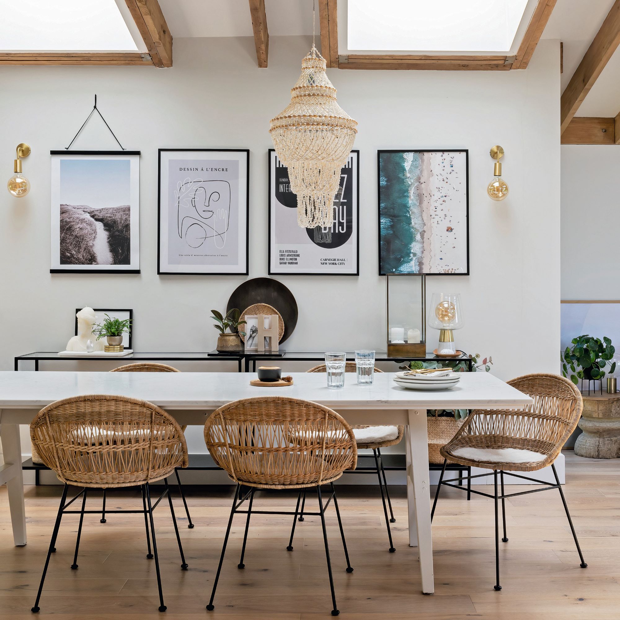
This part of the house was the darkest; adding windows on either side of the space and skylights allow light to stream in. 'I am so happy on how light and spacious it looks!'
Decorative elements such as the wall prints, the candles and the macramé pendant light add personality and warmth to the open space. The dining table is an upcycled old Ikea table that was repainted and had new feet added.
Large sliding also doors give the kitchen direct access to the garden and connect the two areas. 'It's ideal to have outdoor seating close to the house.'
The snug
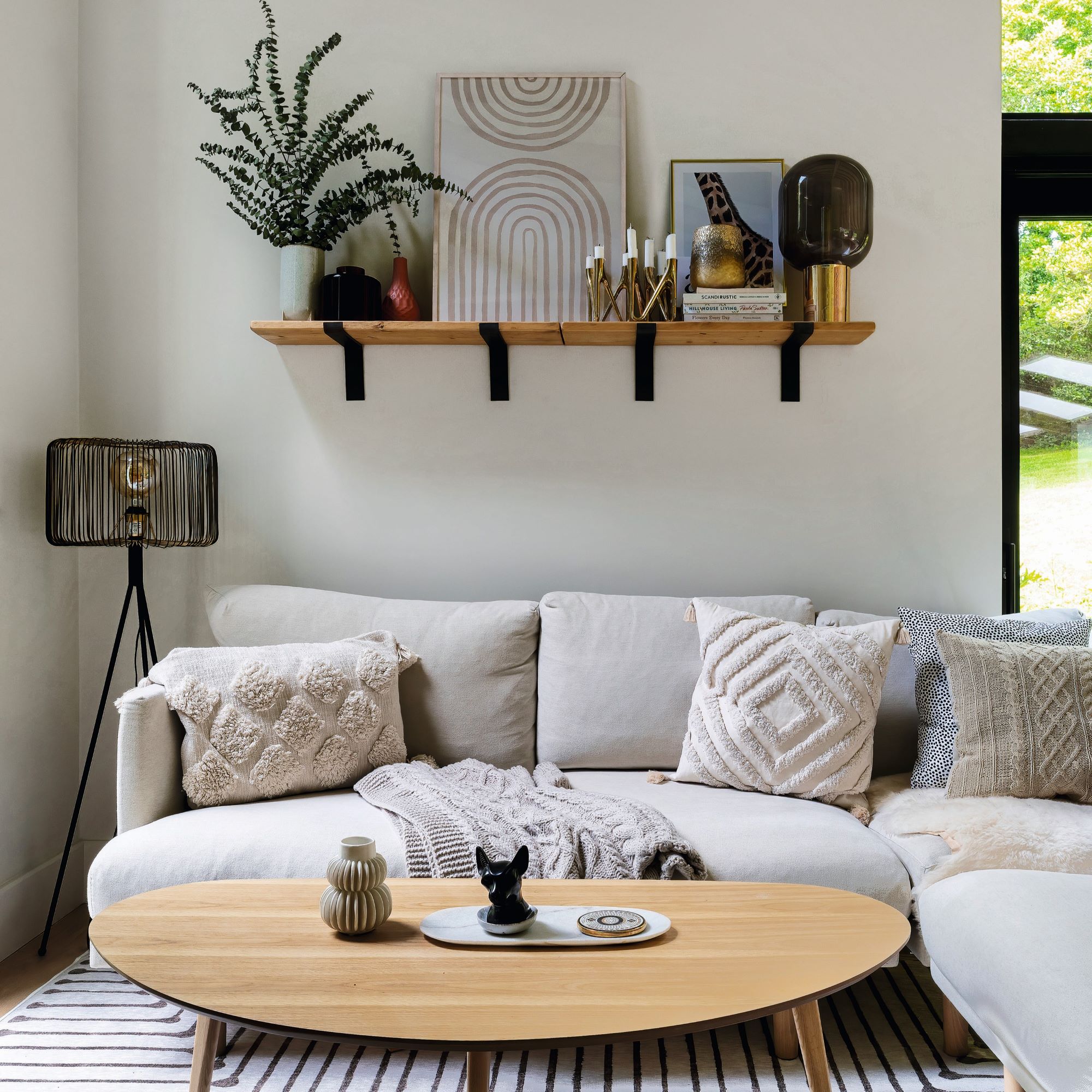
To maximise the cosiness of this space, Susanna added a chunky blanket, texture cushions, candles and some greenery for a splash of colour. ‘I love watching TV with my family on the corner sofa.’
The garden
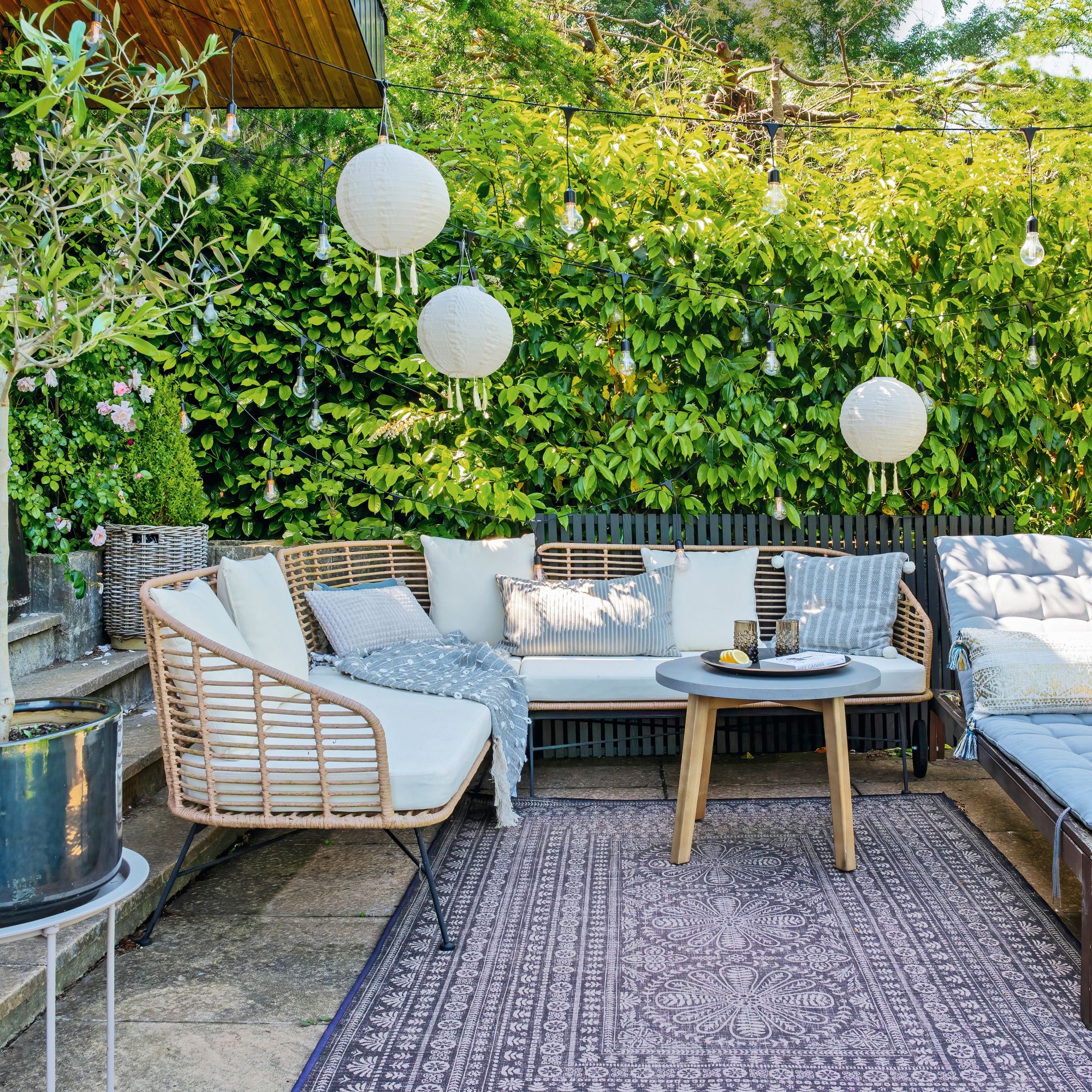
When they redesigned the house, creating a patio was very much high on Susanna and her husband’s wish list. 'I wanted a large creamy sofa to create a relaxing, cosy outdoor space where we can all enjoy spending lots of time.'
The full beauty of the house and its terraced garden can be seen as you enter the gate from the front, into the expansive rural vista that envelops the family’s home.
A Nordic taste
Susanna’s house is largely a blend of Nordic minimalism and comfort. 'I added lots of warm pink to my muted colour palette to make it more interesting. Texture to me is also essential when it comes to interiors. I like to mix rough fabric with smooth and knitted ones to add softness.'
Behind large glass windows, Susanna displays her collection of ceramics and vases to which she always includes natural materials like wood to keep a neutral palette. Carefully chosen objects are curated and displayed to add warmth and personality. She shares, 'I love rearranging my shelving; it is one of my favourite chores in the house. If you want beautiful open shelving you need to select only one or two colours.'
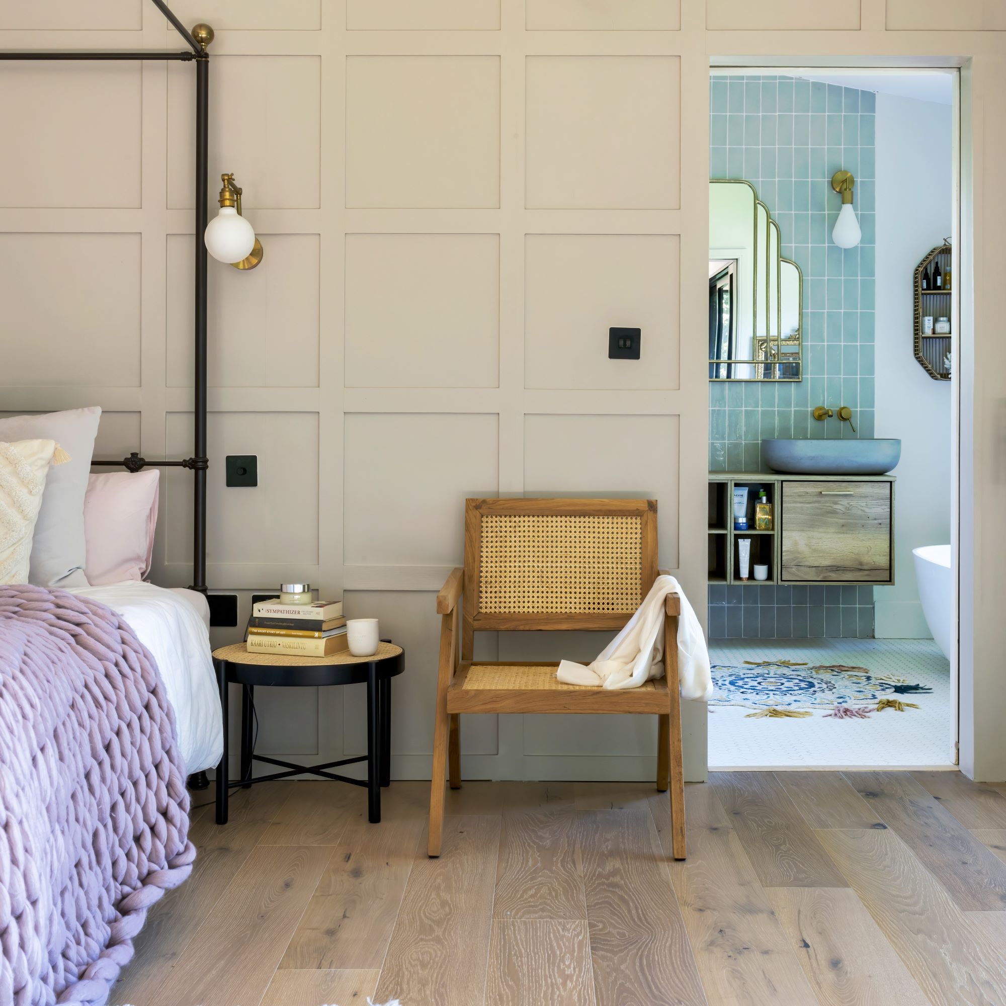
Asked how she herself would describe her style she replies, 'I just want to be happy in my home. I don’t care about trends or being outstanding.'
Susanna and her husband have ongoing projects and future ones planned. 'We are currently extending and doing our front garden, so we are having our existing patio clad with a new composite decking. It is very similar to my floor colour so I think it will look lovely and will unite the two areas. I will keep you posted!'
-
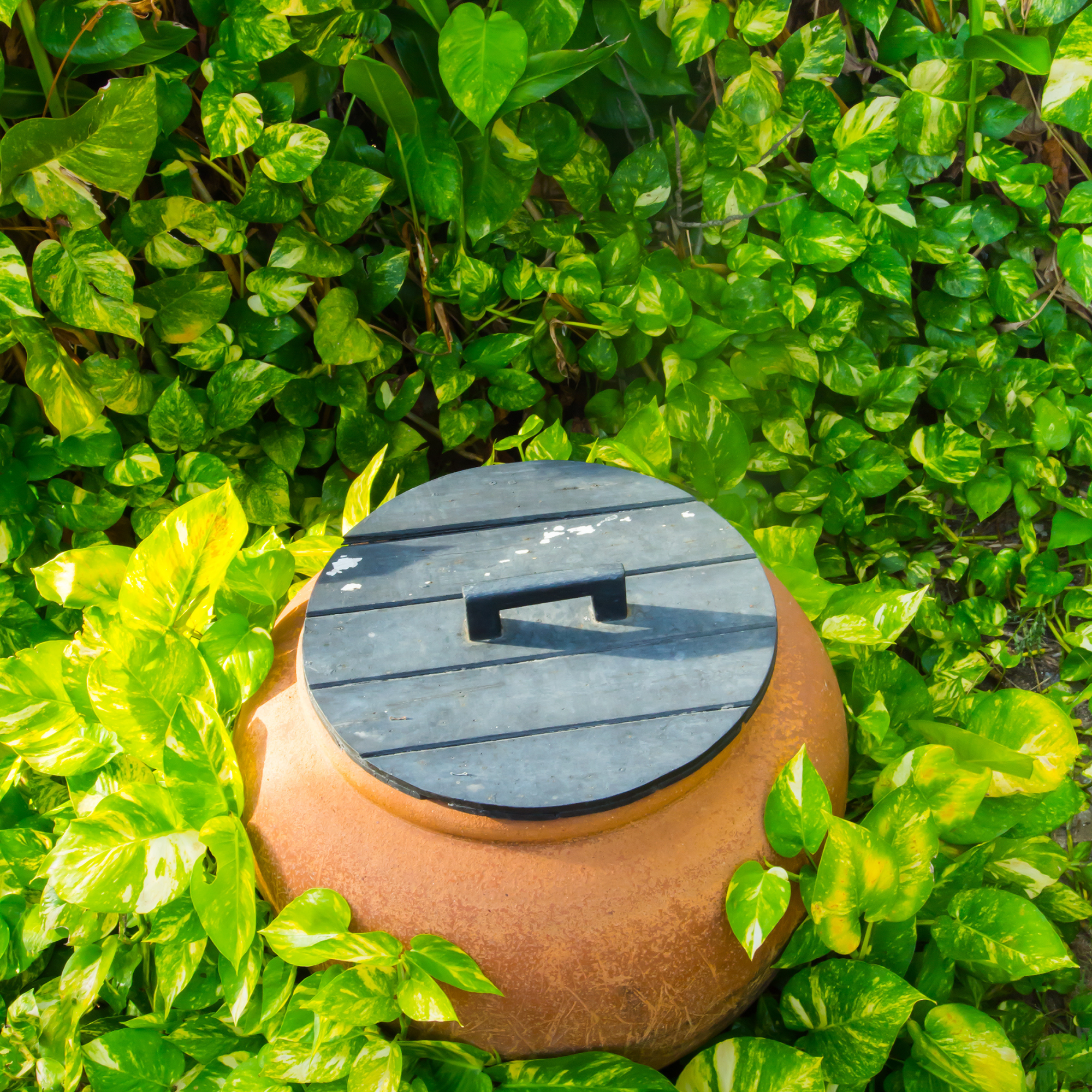 This easy method means you can water your plants while on holiday - it’s so effective that people have been using it for thousands of years
It's simple and really effective
-
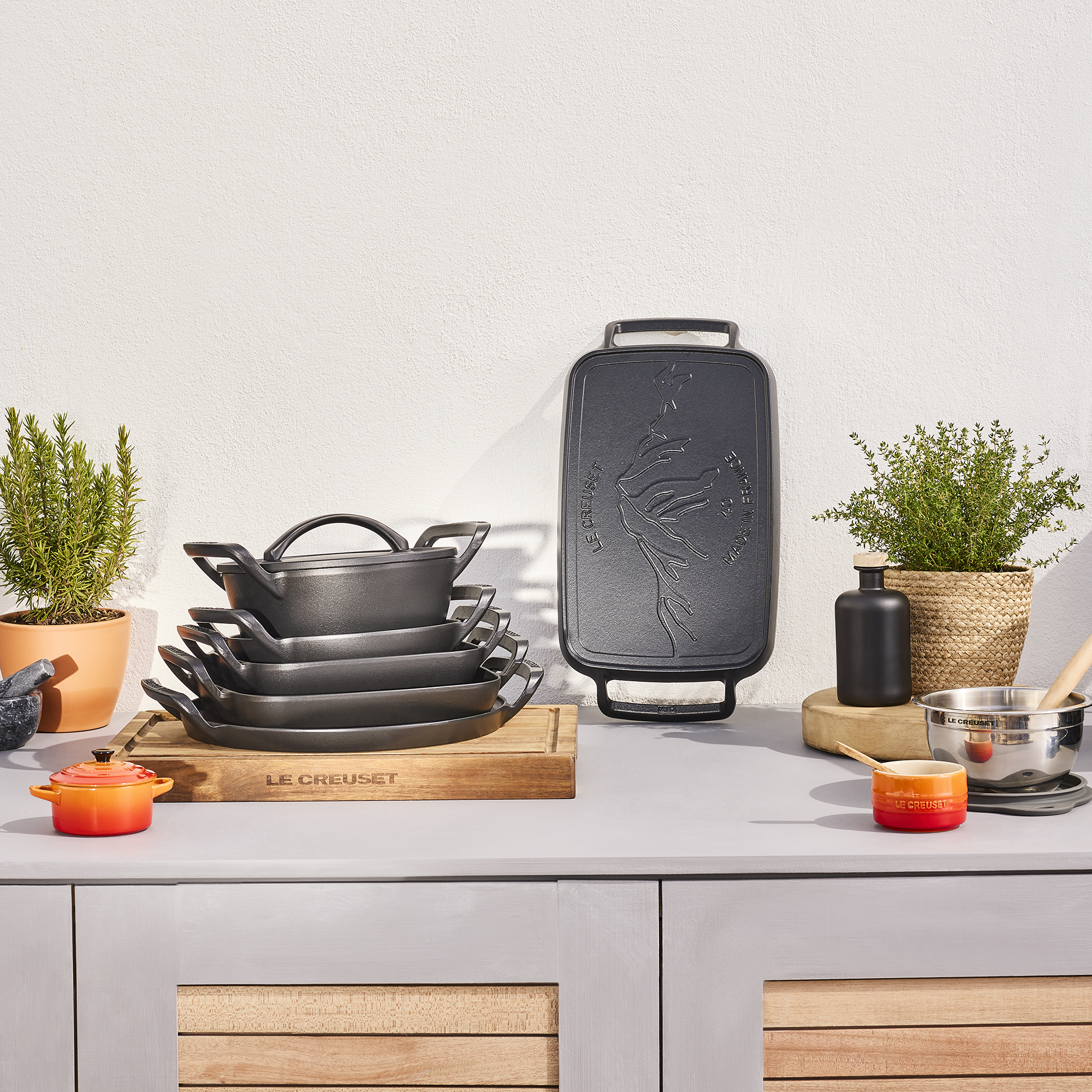 Le Creuset just added some seriously clever BBQ cookware to its cast iron range
I'm already eyeing up the pizza pan
-
 Is it a huge mistake to sacrifice a bedroom to create a bigger bathroom?
Experts reveal what it could do to your home’s value