An awkward kitchen layout transformed into an open space to cook and entertain
How this homeowner gained more by building less and reconfiguring an awkward kitchen layout into an open space instead
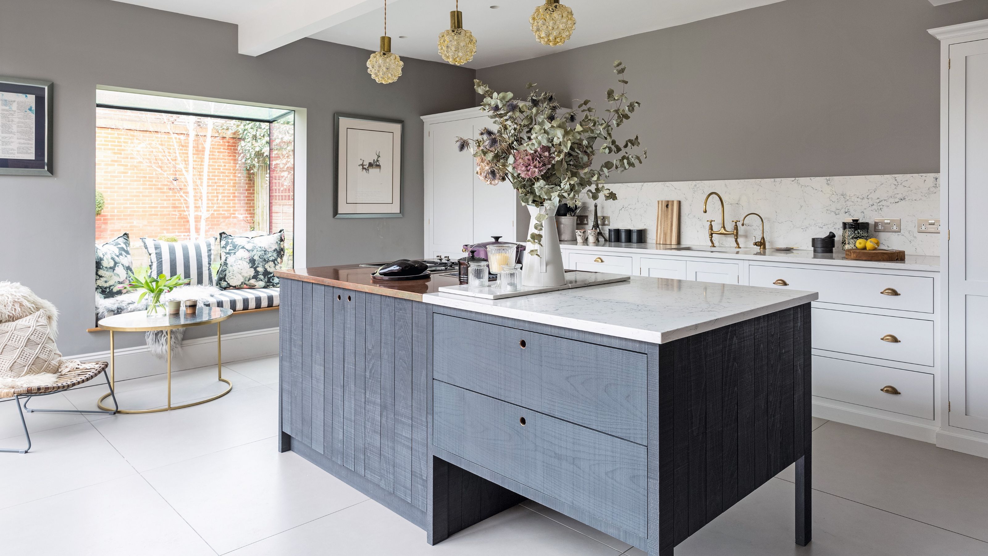

By reconfiguring the ground floor of this five-bedroomed detached Edwardian house in East London, this homeowner turned an awkward kitchen layout into a space to cook, entertain and relax.
They had outgrown the higgledy piggledy layout of their old kitchen, but rather than resorting to kitchen extension ideas, they reconfigured the L-shaped space.
Working through many proposed L-shape kitchen ideas, they landed on knocking down internal walls and installing three steels to maximise space, instead. Once an open area was achieved, a kitchen island and shaker-style units stood at the top of their wish list, as well as a calming colour scheme and handcrafted features to ensure the design would last a lifetime.
Before
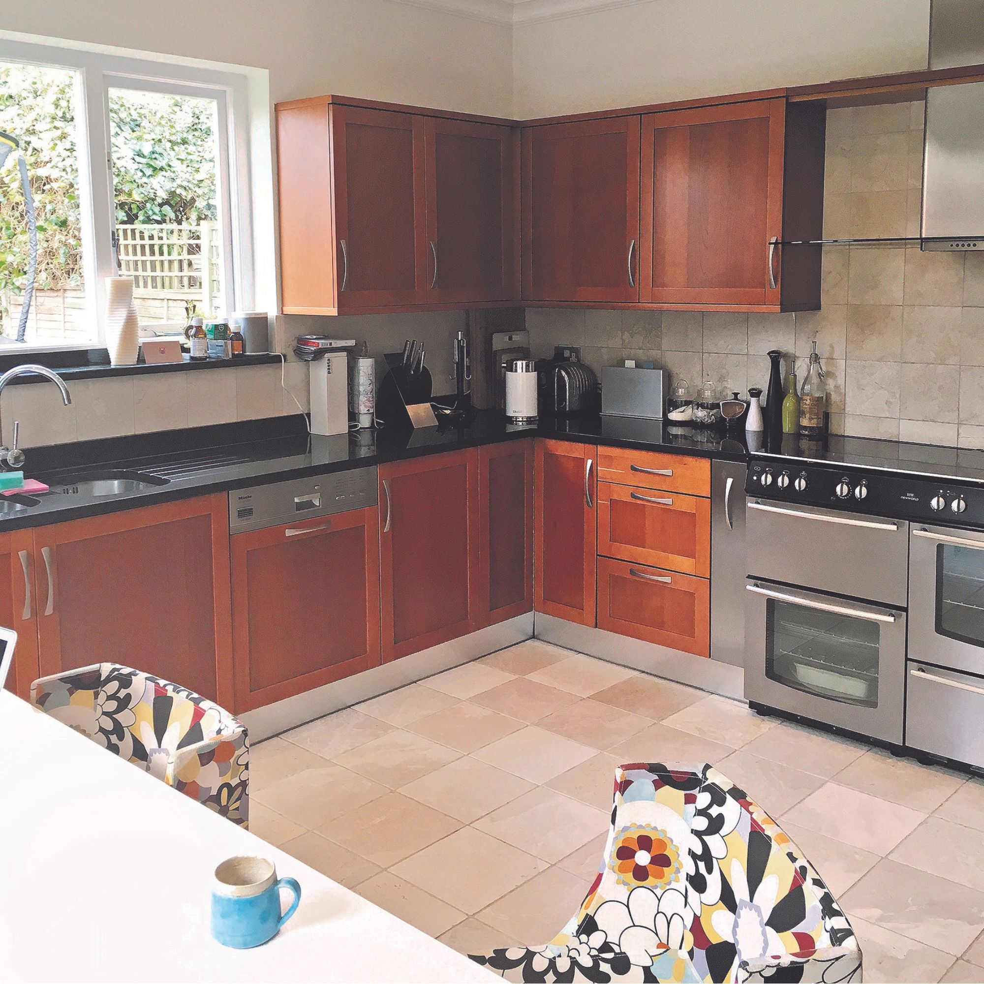
A developer installed a new kitchen when they moved in 15 years ago, but they were ready for a radical change. After working closely with interior designer Lisa Burke , it was Lisa who suggested architect Charlotte Blythe, and together, they designed the new kitchen layout.. The project took over a year, but now this home flows better than ever.
The design details
1. Vintage touches
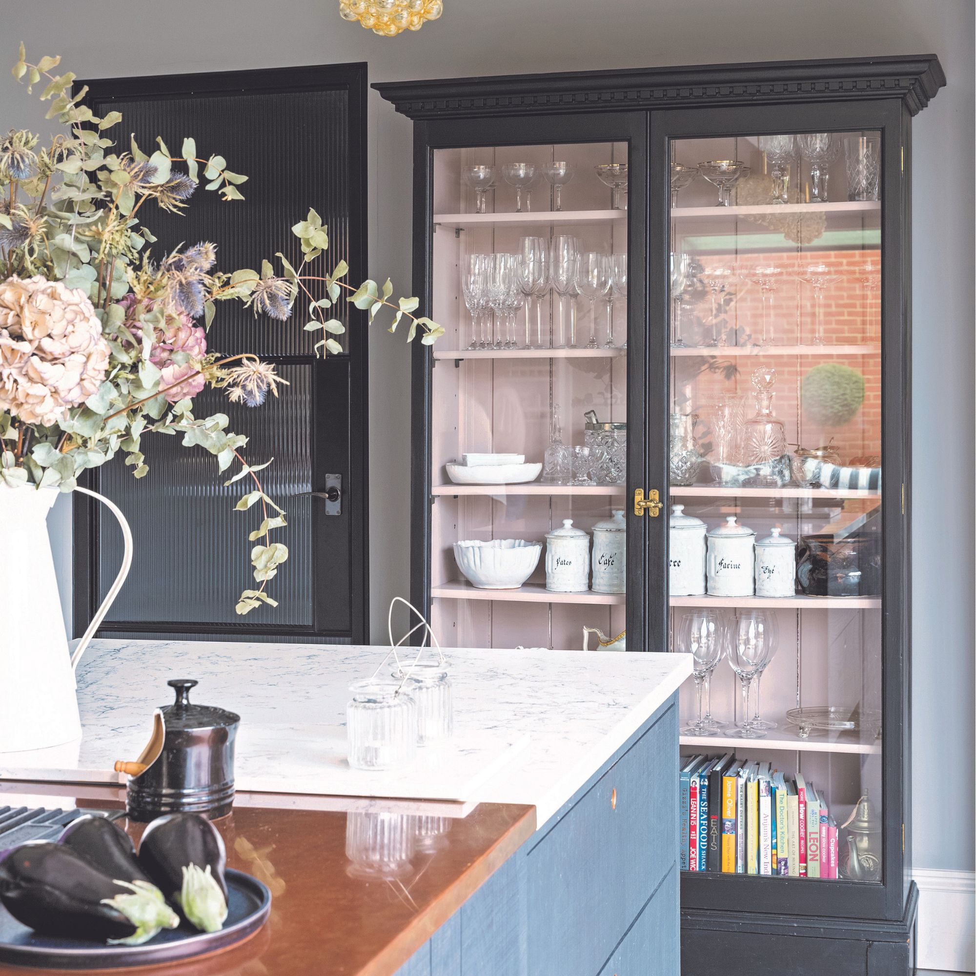
This design ethos mixes old with new, for a timeless look. They sourced this vintage display cabinet, had it restored by a local carpenter and painted to match the new kitchen colour scheme. It now houses antique champagne coupes and family heirlooms.
2. Composite marble worktop
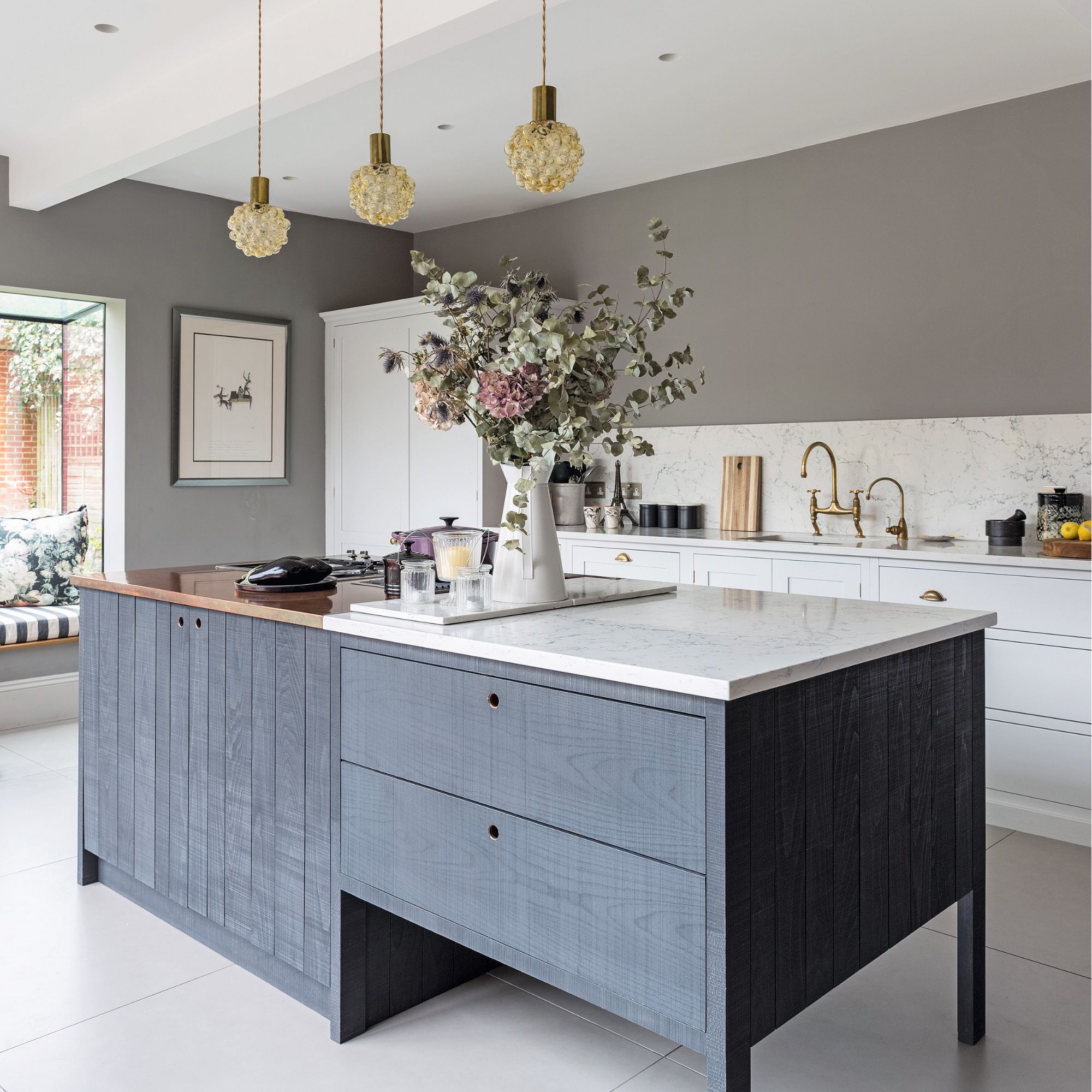
After chatting with their interior designer, Lisa, they decided against marble kitchen worktops and chose a composite countertop as it’s more practical. Plus, they could use it as a splashback for a seamless look.
3. Brass and copper finishes
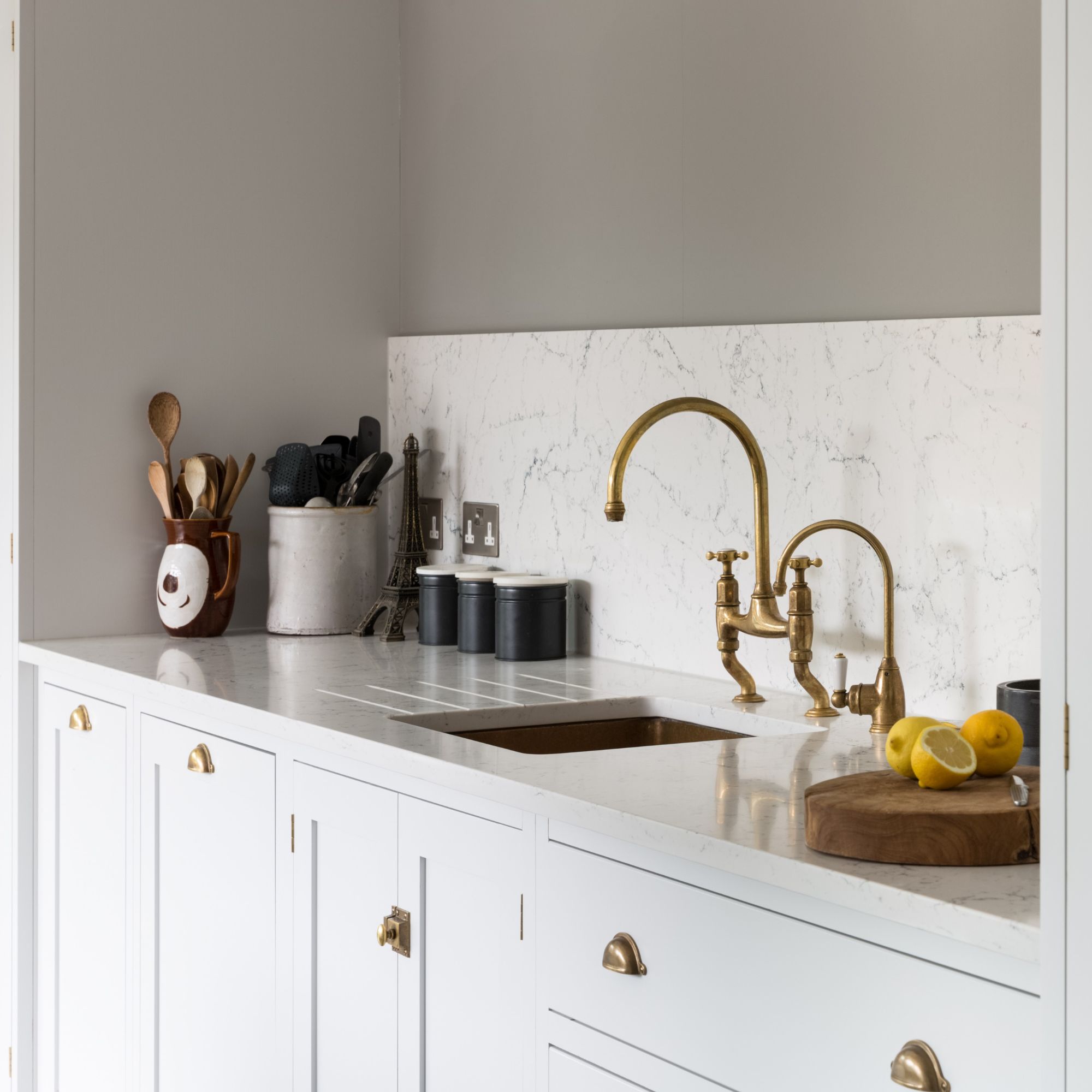
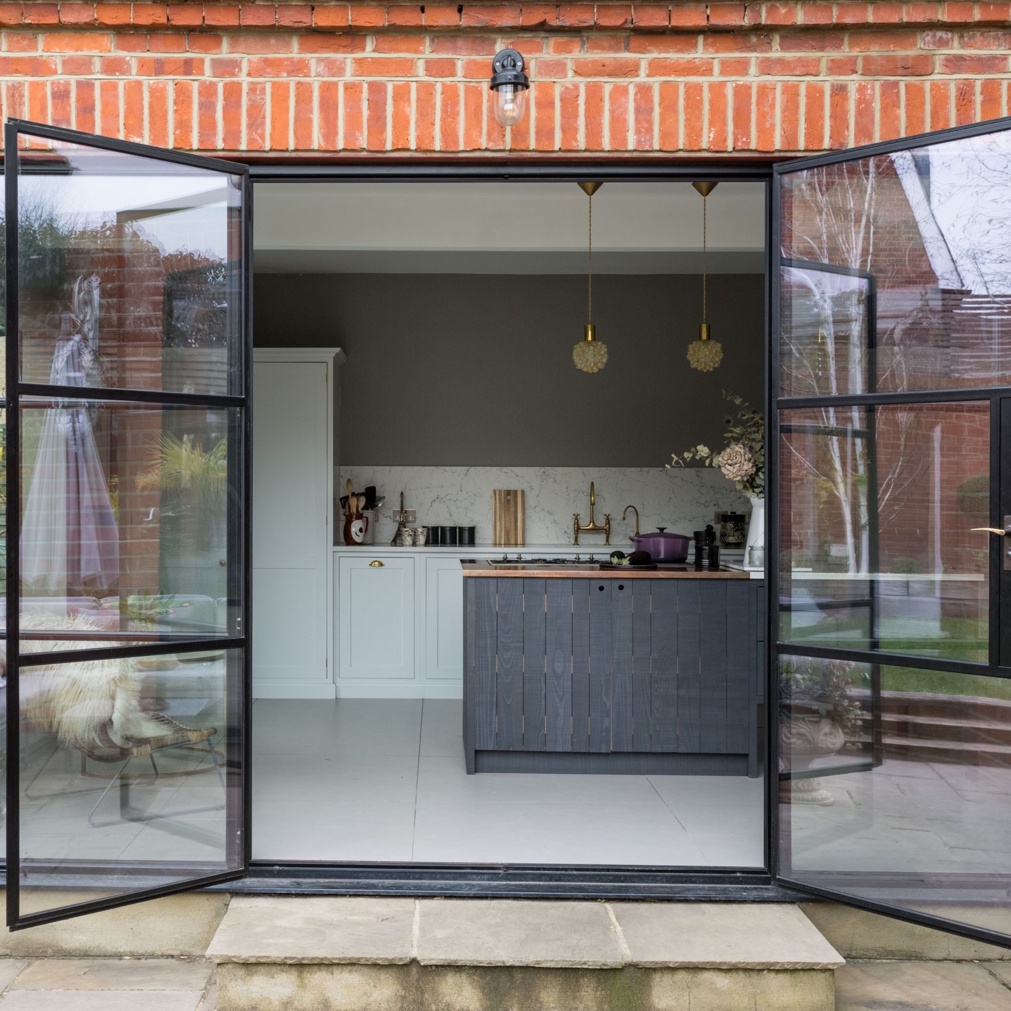
A warm option for the taps and cabinetry hardware ties in with the vintage lighting. For around the hob, they went for a copper worktop, which is an antimicrobial metal. At one end of the island open legs, were chosen, as being able to see under the island helps with the flow of space.
Get the Ideal Home Newsletter
Sign up to our newsletter for style and decor inspiration, house makeovers, project advice and more.
Focus on: Oriel Windows
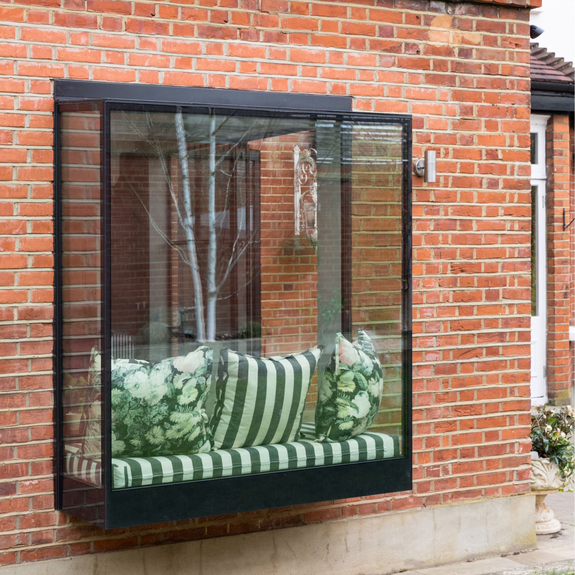
Love the idea of fitting an oriel window in your kitchen extension? Follow our design guide below :
- An oriel window is a structural glass window solution which creates a 3D window design that protrudes from the wall of your building, supported by brackets. This style gives a modern twist to your home and provides a lovely place to sit.
- The window design is constructed in high specification glass that is sealed together without any framework, using structural – grade silicone. To create a frameless look, the vertical panes of glass require a strengthening interlayer to the inner pane, meaning no steel supports are needed.
- You’ll need to consult your architect to ensure there is adequate support for the window. It may need planning permission if it will be over-looking a neighbour’s property.
- There are limitations, such as the size of the glass, the weight that can be supported, the thermal performance required and whether openings are needed. All these elements will affect the cost.
Additional words by Maxine Brady

Millie Hurst was Senior Content Editor at Ideal Home from 2020-2022, and is now Section Editor at Homes & Gardens. Before stepping into the world of interiors, she worked as a Senior SEO Editor for News UK in both London and New York. You can usually find her looking up trending terms and finding real-life budget makeovers our readers love. Millie came up with the website's daily dupes article which gives readers ways to curate a stylish home for less.
-
 Will a conservatory add value to your home and how can you maximise it?
This is what the pros say
By Amy Reeves
-
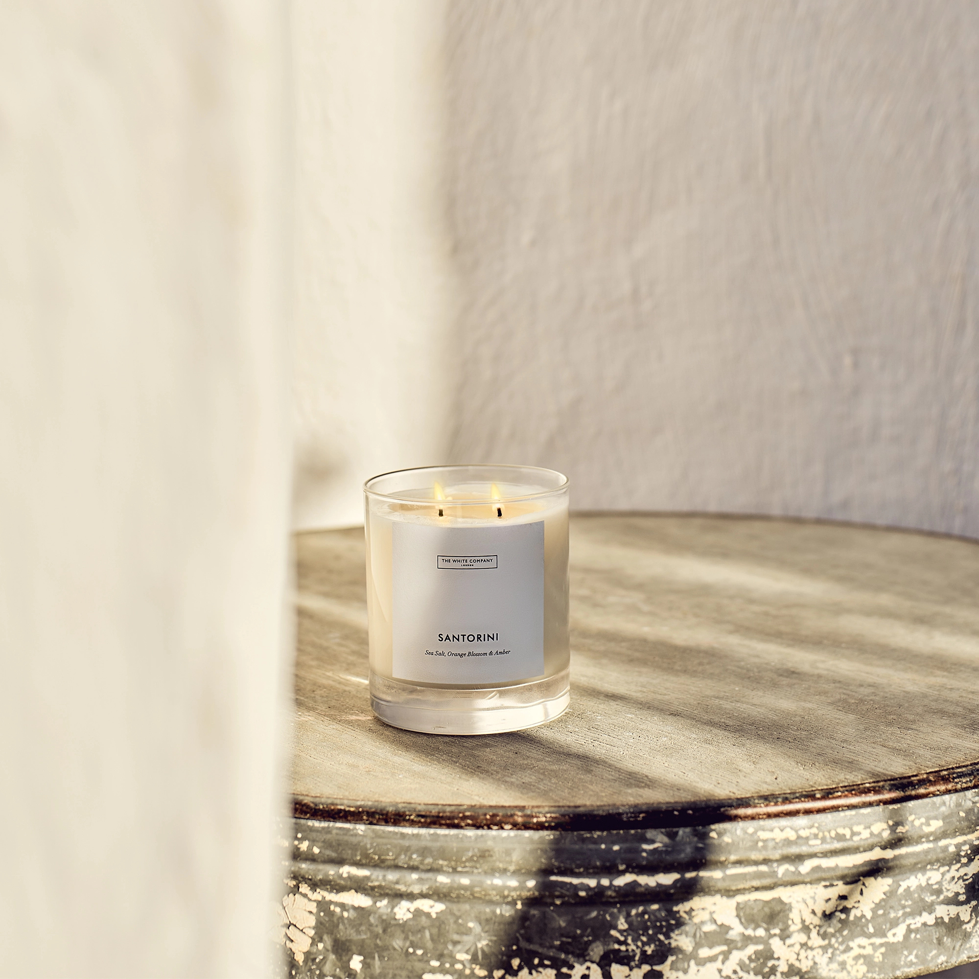 I’ve been looking for a new signature scent for my home and The White Company's new fragrance is the exact summer holiday smell I needed
Santorini smells fresh, summery and sophisticated
By Kezia Reynolds
-
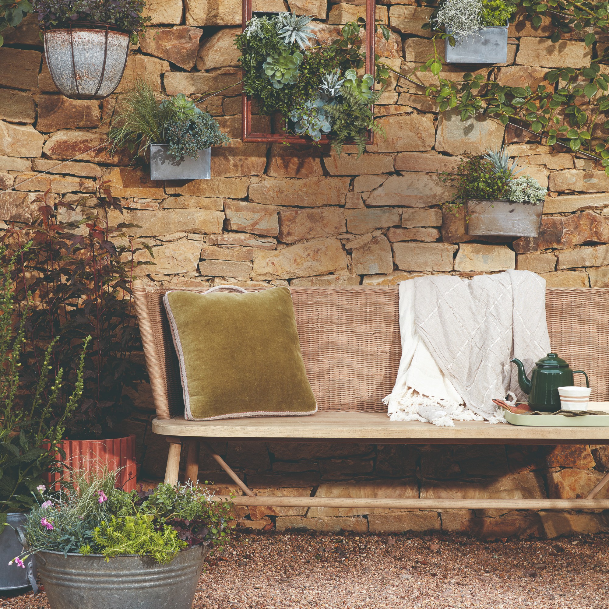 How to remove algae from garden walls in five steps – and the cleaning product experts rave about for tackling it fast
Experts share their top tips for getting garden walls algae-free
By Katie Sims