'We wanted colour and were prepared to be pushed – and that’s what our interior designer did'
These homeowners called in a design expert to give their open-plan kitchen and living area a 'grown up' makeover, and the results are bold and bright
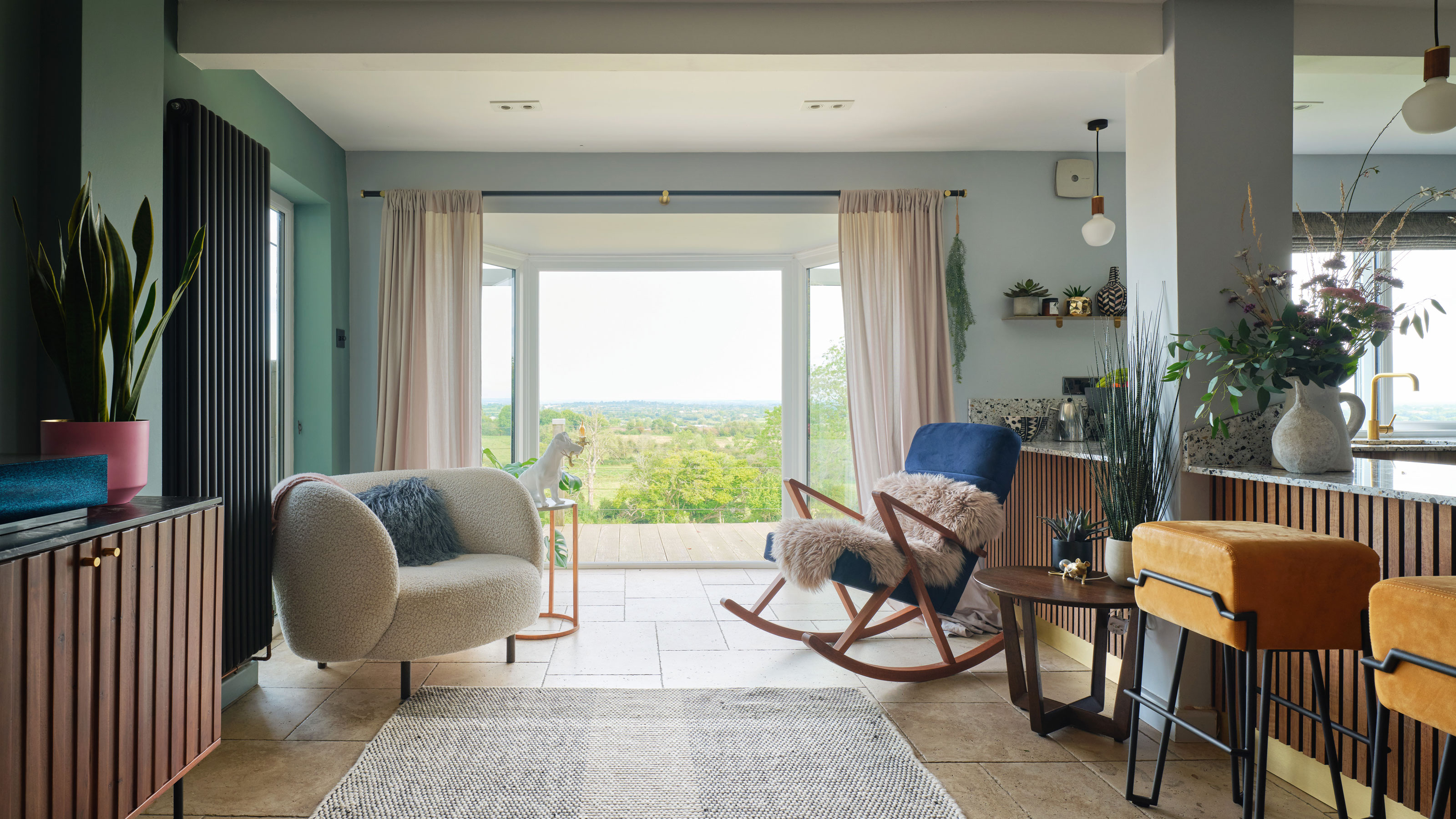
After 10 years of making-do with practical but rather uninspired decoration in their 1970s-built family home in Purton, the owners decided it was finally time to give their downstairs space a more open and grown-up feel.
The pair had moved into their five- bedroom house after outgrowing their small cottage in a neighbouring village just outside Swindon. At the time, they had two little ones who are now teenagers.
They made the bigger home a comfortable space for their growing family. But as the children got older, they seized the chance to be more ambitious in their design choices, remodelling the kitchen into a sophisticated, open-plan living area that’s packed with colour and personal touches. We chatted to them to find out out how they brought their project to life.
Before
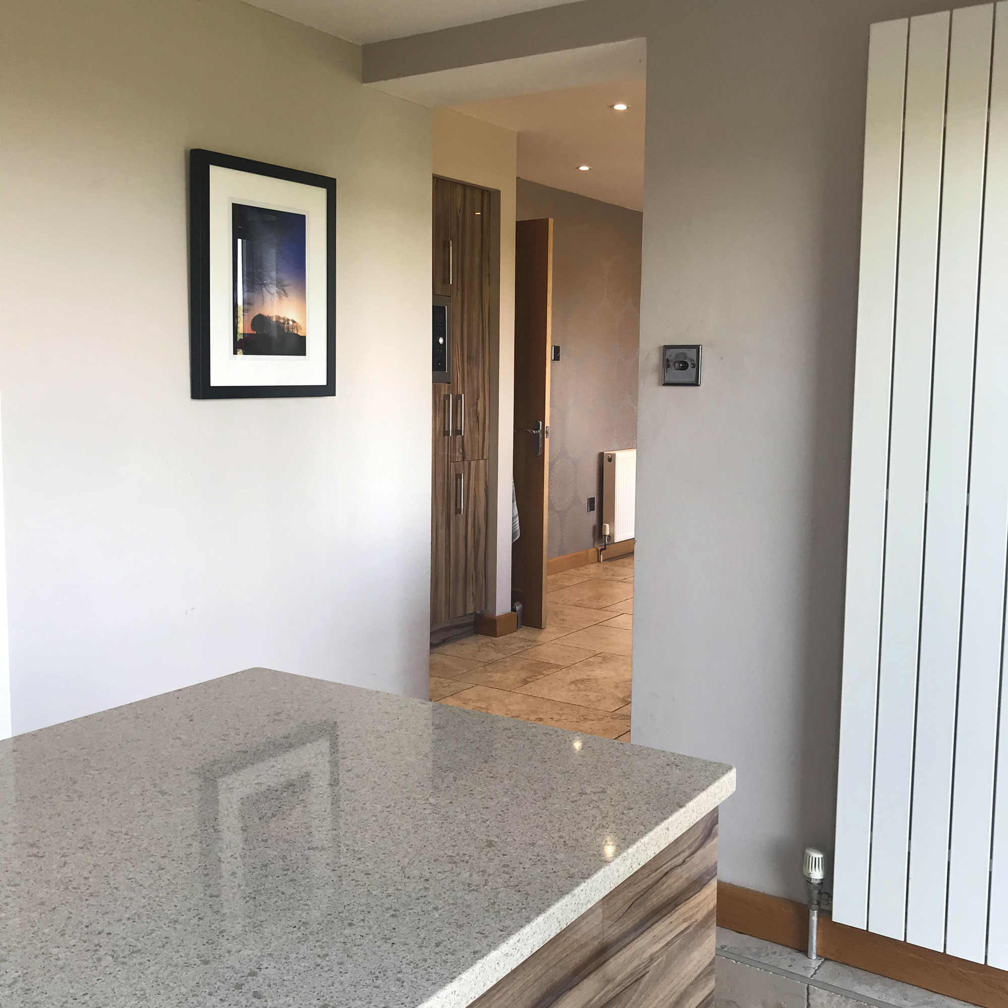
'When we moved in around 10 years ago, we redecorated the house really quickly to make it liveable for our growing family, Five years later, we knocked through the dining room to make the kitchen bigger and replaced the white cupboard fronts with wood.
‘We always knew we’d redecorate to really suit our style once the kids were older. However, life got busier and we realised we hadn’t got the time to commit to this renovation. That’s when a friend introduced us to Mark Pepperall, who was a local interior designer. Mark’s got a really distinctive style, so we decided to give him a call, and let him loose in our home, occasionally reining him back in again.'
After
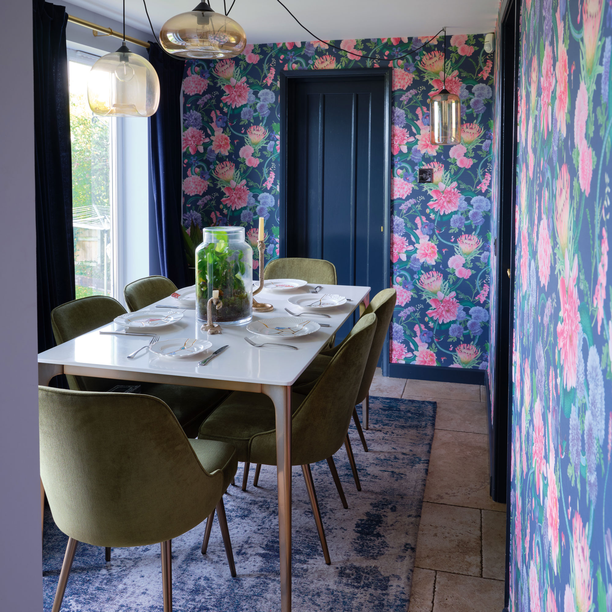
‘Before, both the kitchen and dining room were beige. The kitchen had a dining table and chairs in it, while the dining room had a breakfast bar that was never really used. It was just dead space, as nobody ever sat there.'
‘We didn’t give Mark much of a brief to work towards. We wanted a colourful grown-up space, where we could sit, but somewhere that’s practical, too. Yes, the kids are now older, but they’re still teenagers. So we needed to make our kitchen and dining room more usable. The idea of how it was going to look evolved as we went.’
Get the Ideal Home Newsletter
Sign up to our newsletter for style and decor inspiration, house makeovers, project advice and more.
Before
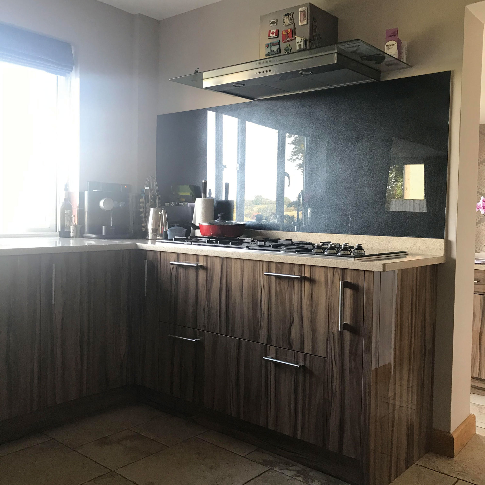
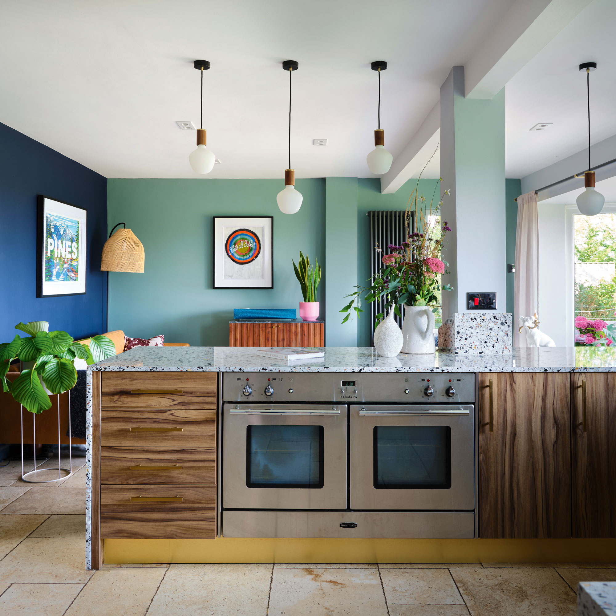
‘We knew we wanted colour and we were prepared to be pushed – and that’s what Mark did. Choosing the colours of the kitchen was easy – Mark got it right first time. He showed us his idea of navy blues, teals and gold finishes, and straight away we said “yes”. We knew we wanted to reuse the kitchen fronts, because they were still in good order and we love them.'
After
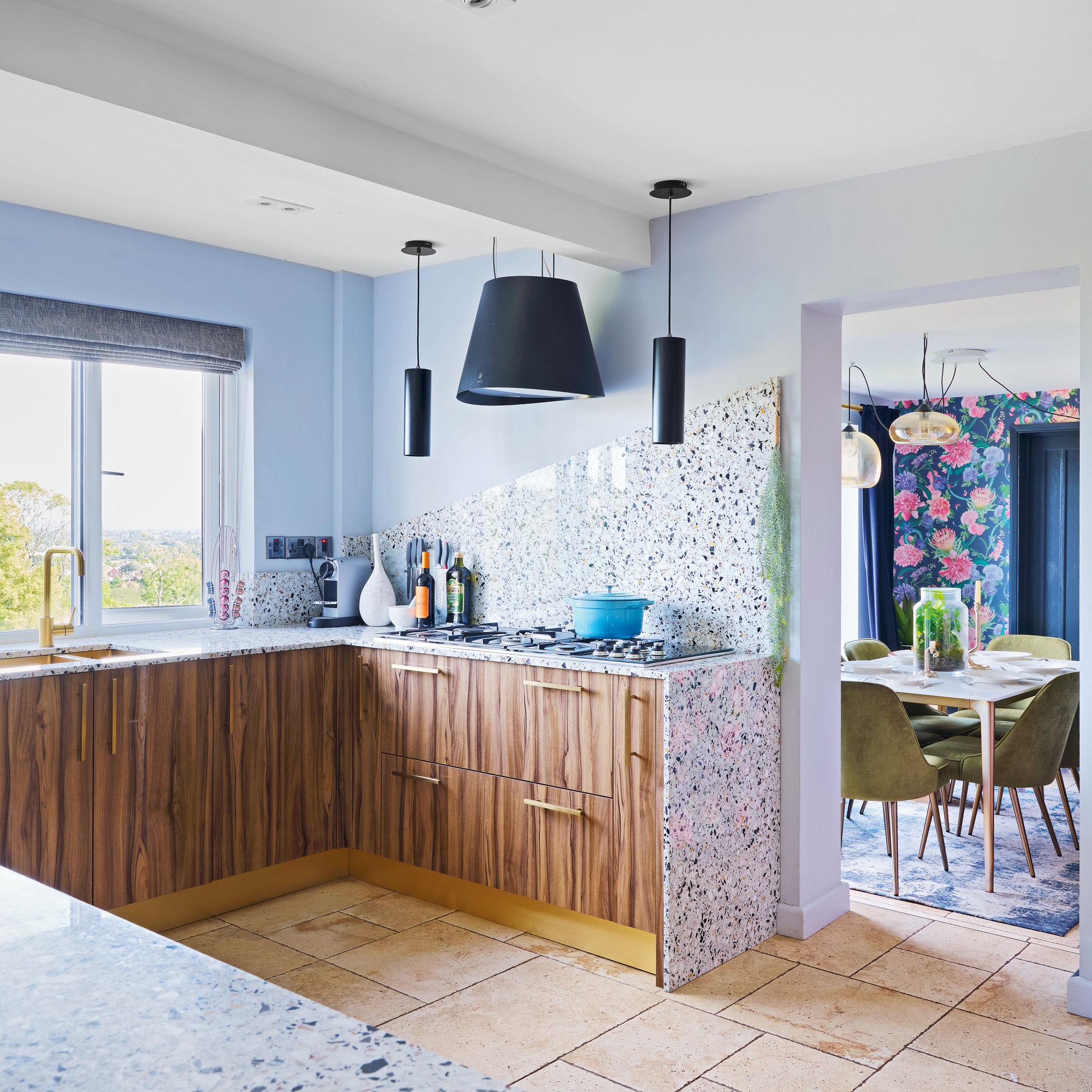
'Our kitchen overlooks the whole of Gloucestershire. Subliminally, I think we took inspiration from our surroundings for the stools, cabinets, and artwork. Even the wallpaper is floral. My wife wanted the quirky dining room wallpaper, whereas I am probably more of a plain colour man. But I think it works well.’
Before
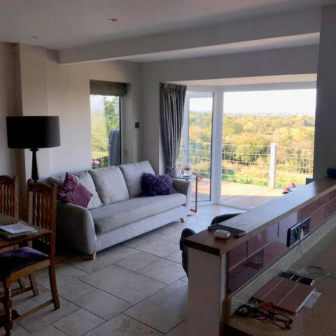
‘Work got going pretty quickly, and we lived in the house throughout. It was interesting and challenging at times, but we didn’t have any other option. There wasn’t enough work to make us move out, as it wasn’t a rebuild – it was redecorating.
After
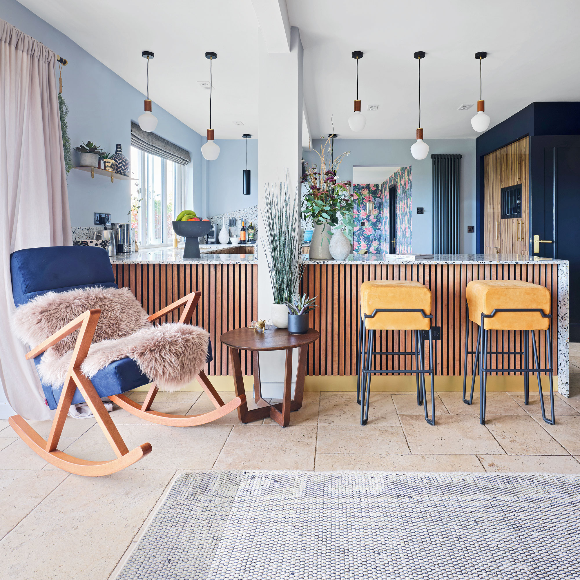
‘The kitchen was knocked about quite a bit as the builders took down a very small wall on the kitchen worktop that separated the kitchen and living space. This helped join the one room together. We also got wider worktops, meaning we could use this area as a breakfast bar with stools underneath.’
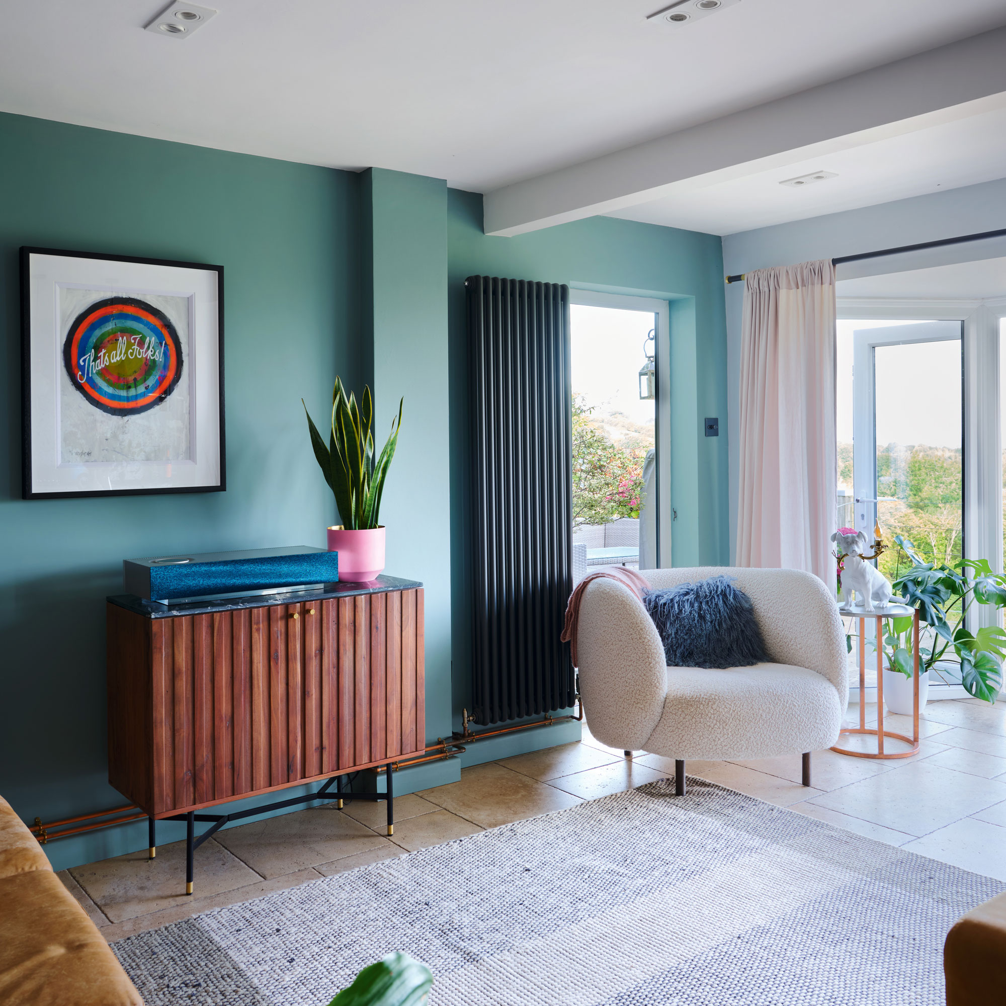
‘Now that the project is finished, we spend most of our time in the kitchen. It’s more sophisticated than we could have ever imagined. I don’t have a favourite part of the kitchen because I love it all. If I had to change one thing, it would have to be the terrazzo worktop. It’s great to look at, but it’s quite a pain to maintain. However, it’s not a big enough regret to change.'
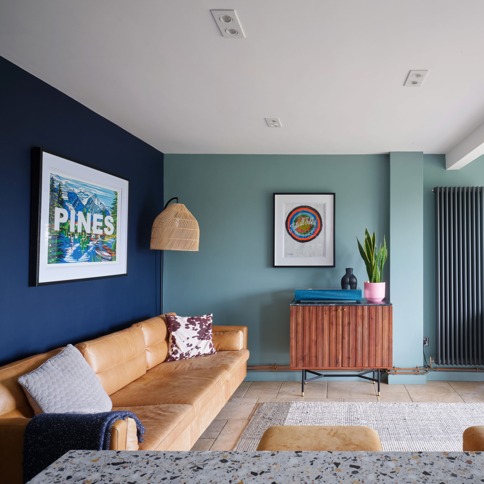
‘For anyone thinking of doing a similar refresh, I’d say try and stay as relaxed as you can. If you are working with a designer, you should expect to be challenged. But don’t be scared to challenge back – that’s how you get a better result.’
-
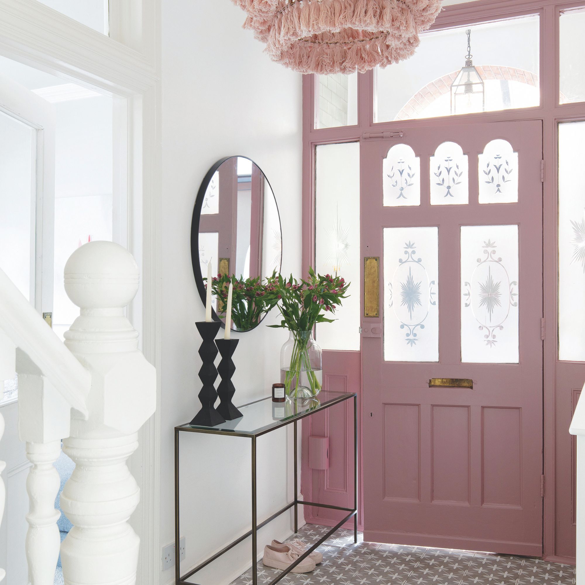 Should your front door colour match your hallway? Interior experts reveal 3 reasons why it should (and 3 reasons it shouldn't)
Are you team matching or contrasting?
By Ellis Cochrane
-
 This £200 limited-time discount makes this Dyson vacuum cheaper than I’ve ever seen it - run don’t walk to Argos for this bargain
It's the most affordable Dyson on the market right now
By Lauren Bradbury
-
 Martin and Shirlie Kemp’s pastel flower beds has given their Victorian renovation a romantic look - how you can get the look
Their pastel garden is the cottage garden inspo you've been looking for
By Kezia Reynolds