'We’ve taken our time over every decision, and the results have been so rewarding’
This couple transformed the blank canvas of a new build with bold, bright colours and some clever DIY

Sign up to our newsletter for style inspiration, real homes, project and garden advice and shopping know-how
You are now subscribed
Your newsletter sign-up was successful
Just like an artist, a creative homeowner needs a blank canvas to allow their personality and style to really shine. So when this couple decided it was time to move into a new home in Faversham, Kent, in 2021, they were drawn to a new build – much to one the surprise of one of them.
‘This house is our second; we used to live in an old timber-framed property,’ she explains. ‘But with old houses come old house problems. We didn’t want to be dealing with lots of maintenance for years to come, so agreed on a new build. It’s not something I thought I would ever want because I always saw new builds as quite basic.’
So there may not have been a lot of structural work, but the transformation would require a full face lift.
When she and her partner moved in, they were faced with a daunting amount of stark white paint, which she felt looked too clinical.
Article continues below‘It had no character to it; I wanted to add colour immediately. We started mood boarding and decorating pretty much straight away. The positive was that it was a total blank canvas.’
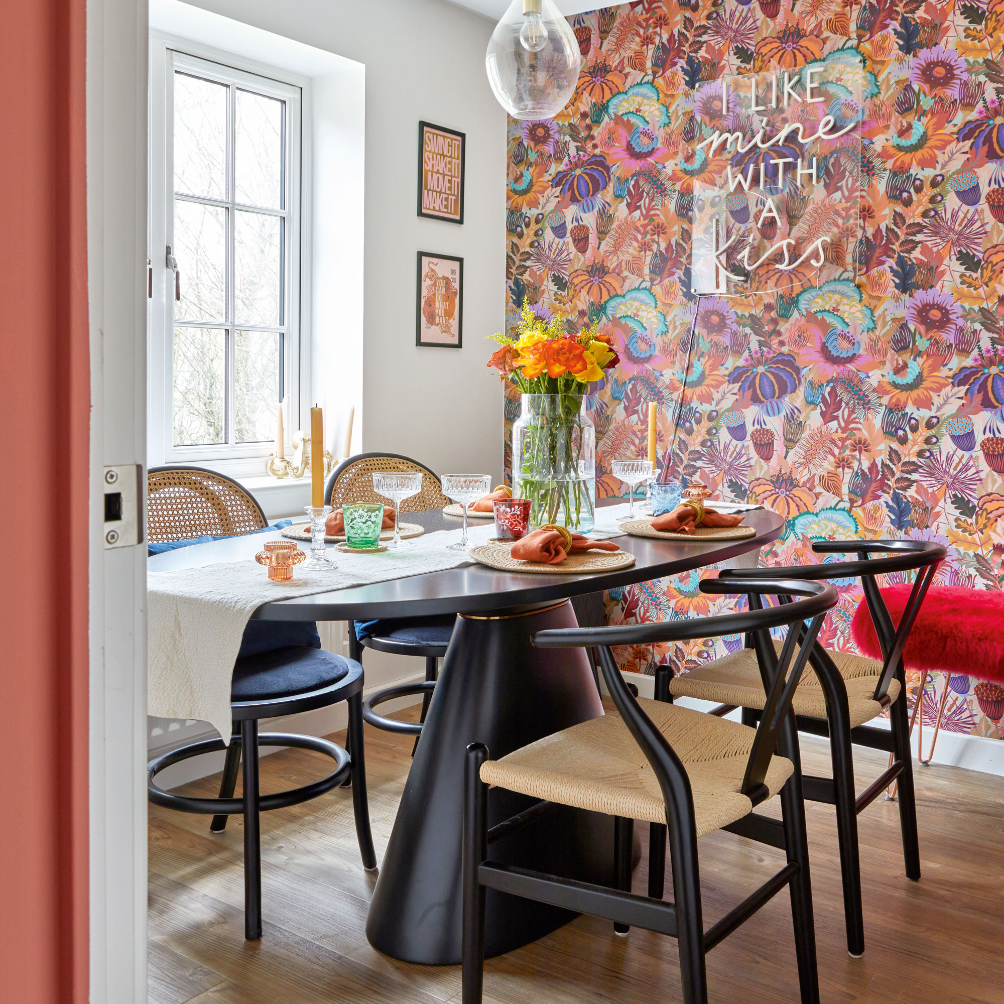
Project makeover began in the master bedroom, so the couple would have a cosy place to retreat to. The two-tone walls form the basis for the scheme, and the handy pair used a laser-level to get the edges perfectly straight.
‘The single line creates the illusion of a picture rail, which adds character and stops the painted walls looking flat,’ she explains.
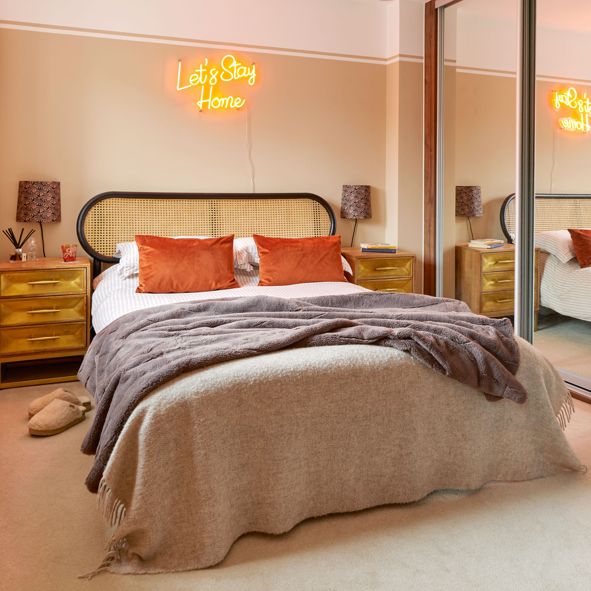
The kitchen-diner was next, and since the couple had already chosen the navy units as part of the house build, the challenge was to detract from the newness and add some colour.
Sign up to our newsletter for style inspiration, real homes, project and garden advice and shopping know-how
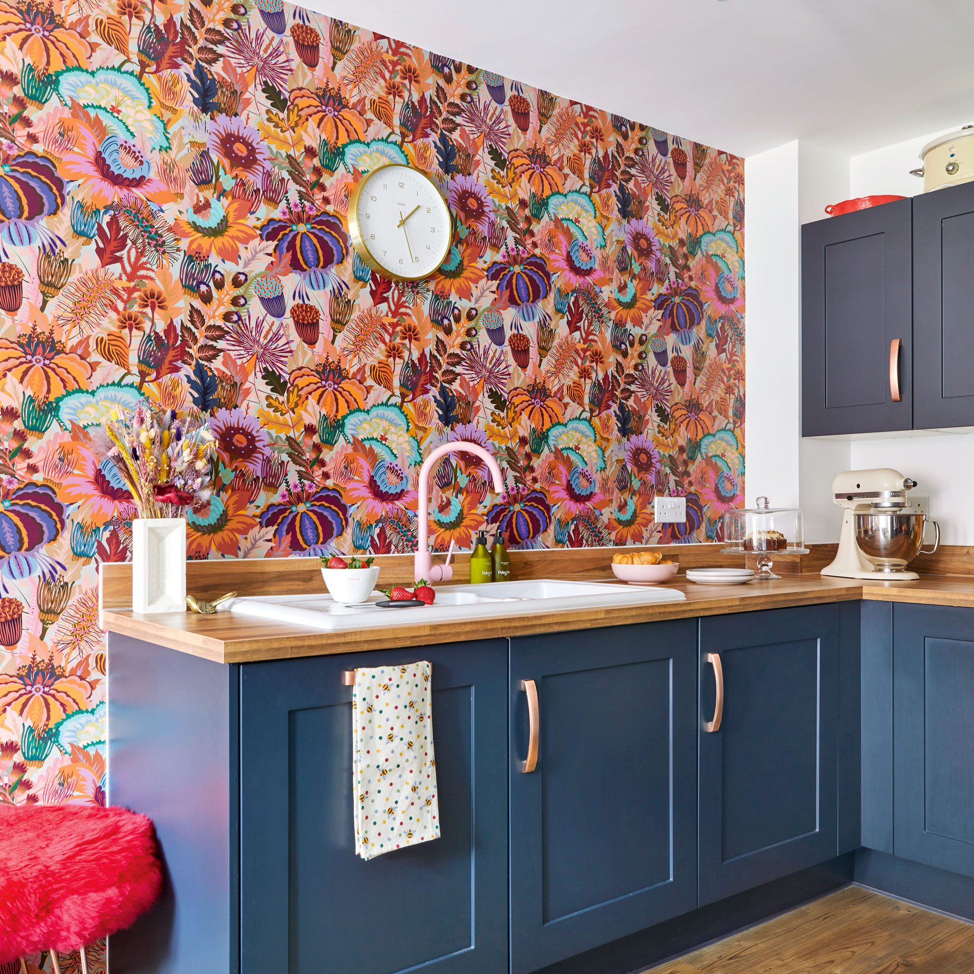
The answer lay in a bold wallpaper designed by Natasha Coverdale for Lick, which came in a statement orange and pink – two shades that then formed a design thread for the whole house.
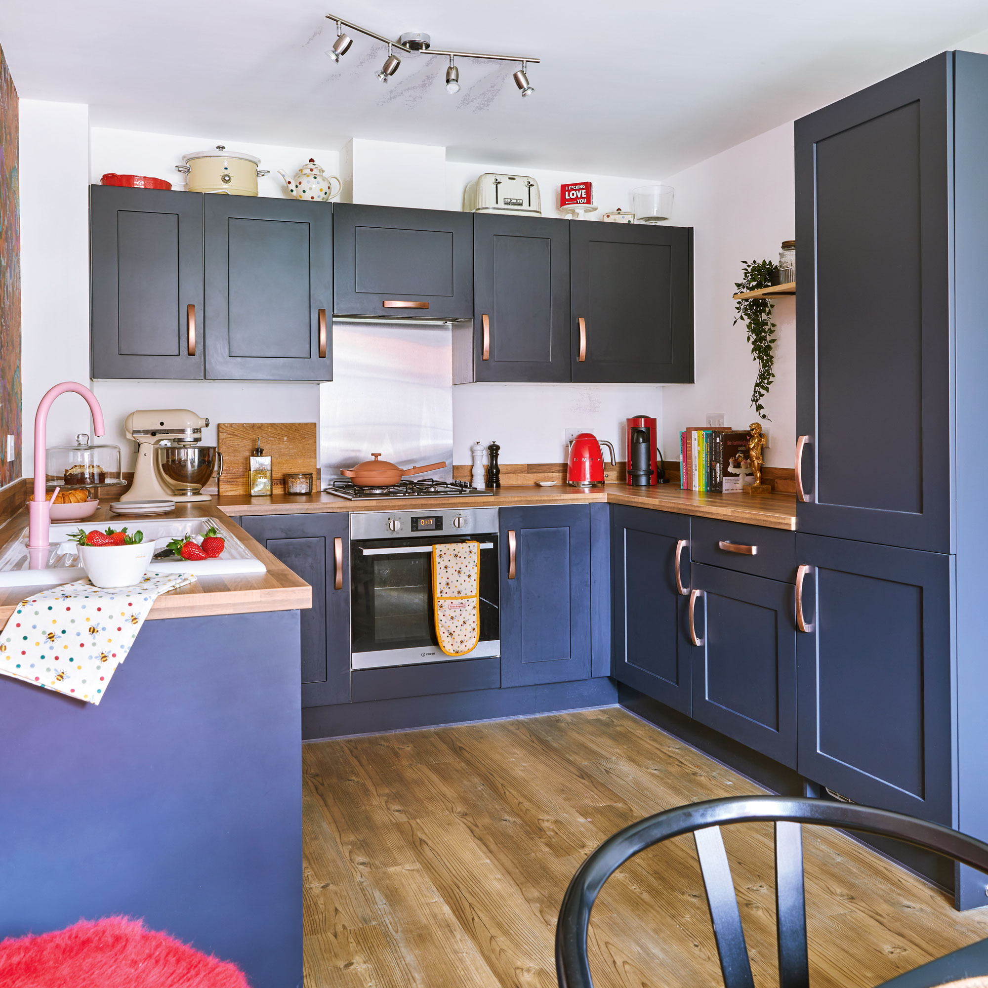
‘Some people might think it’s a risk putting it behind the sink, and we did worry about that,' the homeowner says. 'But this one has an almost vinyl-like quality to it, like it’s been varnished, so it’s easy to wipe down – though I try to be careful.’
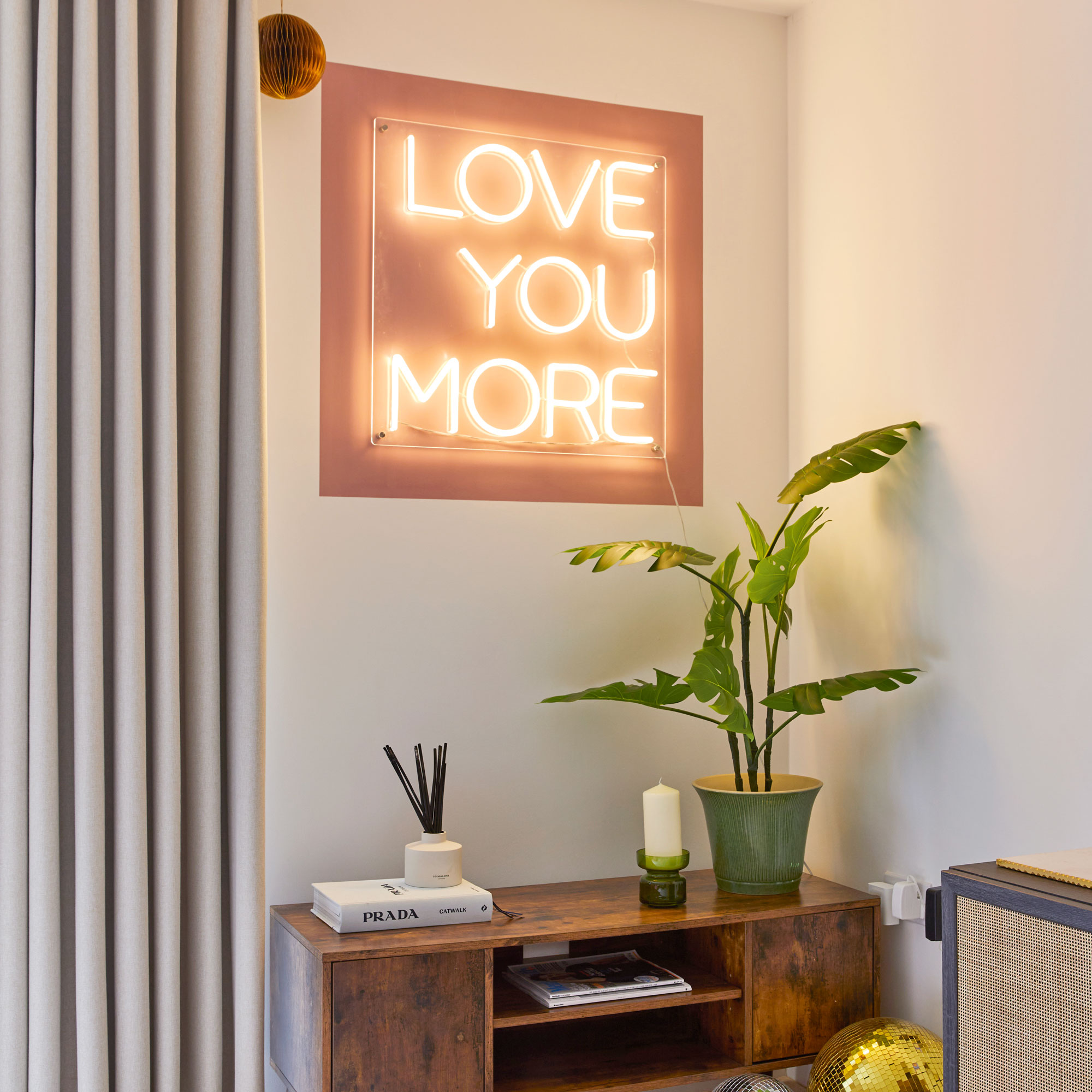
A neon sign, fun prints and a matt black dining set, complete with wishbone chairs, finish the space.
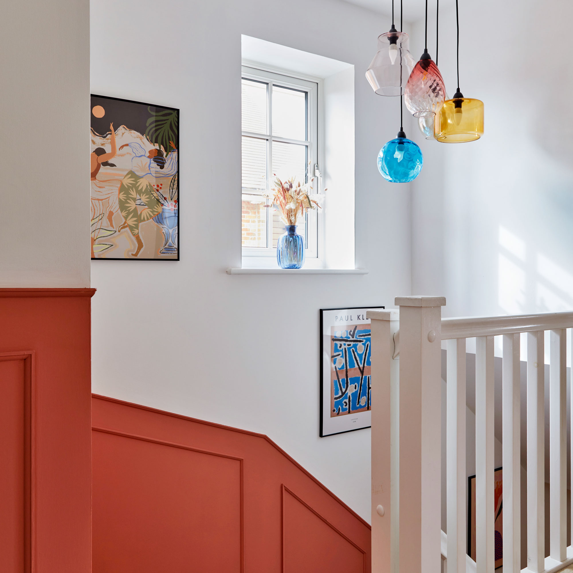
One of the handy pair is an electrical engineer, so he had the skills to add a new pendant light to the top of the stairs. They also built the panelling which runs from top to bottom and was painted in a pinky orange tone.
‘I was inspired by the older house we’d lived in and love how panelling adds character and colour,’ says the homeowner. ‘We painted the skirting boards to match for a seamless finish.’
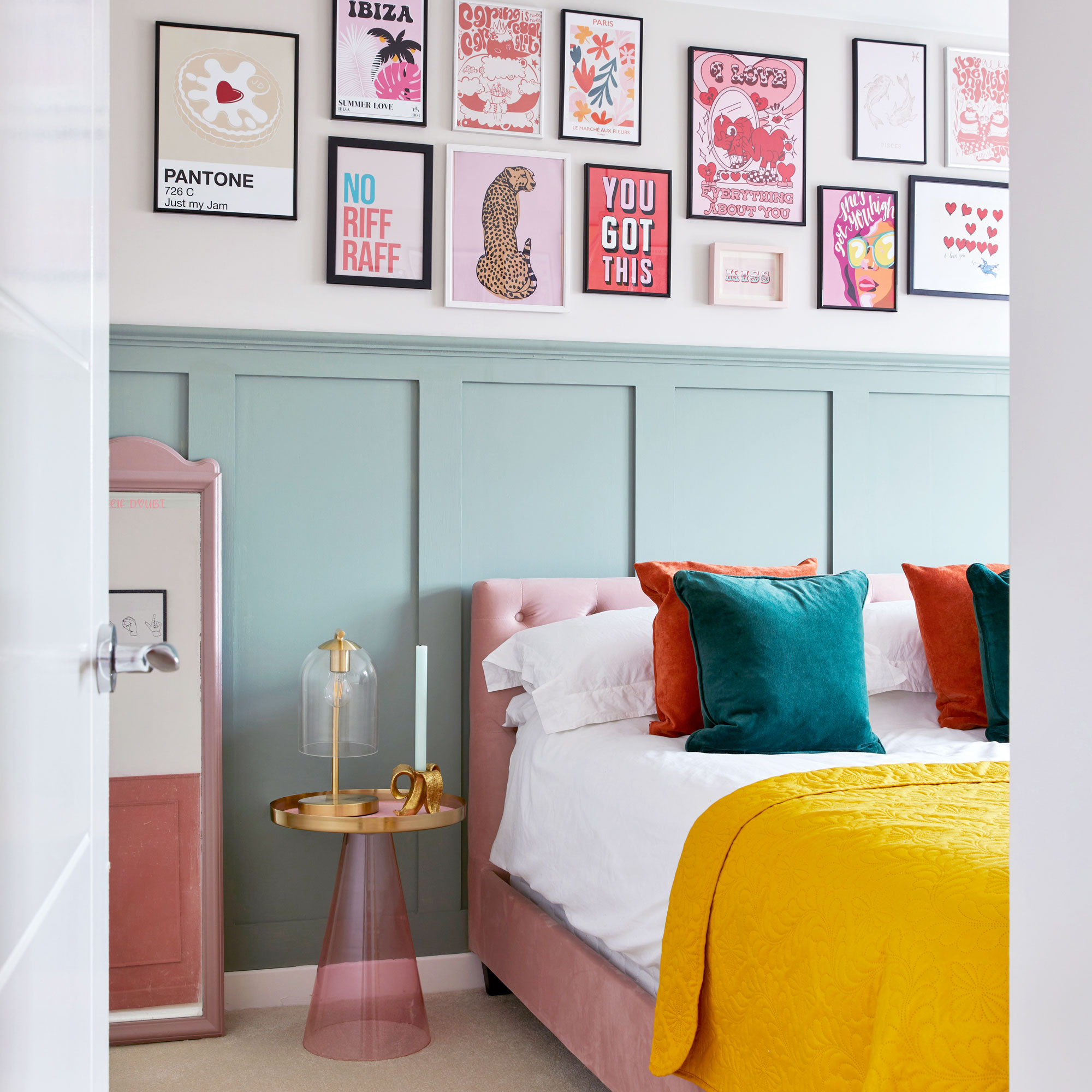
They also put up panelling in the guest bedroom and painted it in a sage green, with the homeowner styling a contrasting gallery wall above.
‘I love buying prints from all over, and I’ve kept to a pink theme for consistency,' she says.
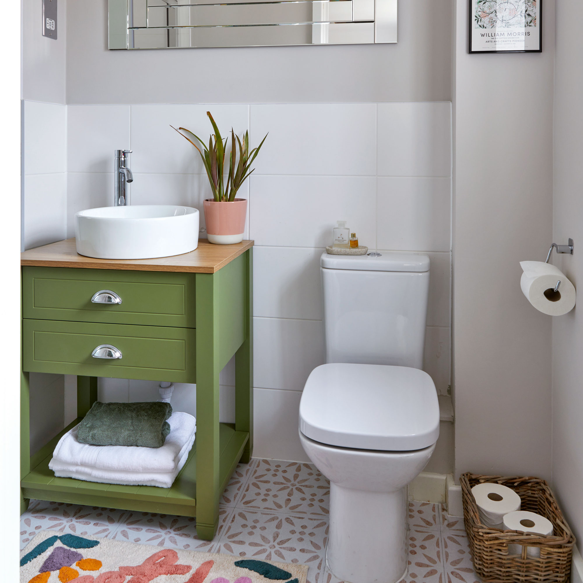
For the bathrooms, clever decisions not only saved money, but redesigned the previously drab rooms, as they painted vanity units and walls, and brightened up floors with stick on tiles.
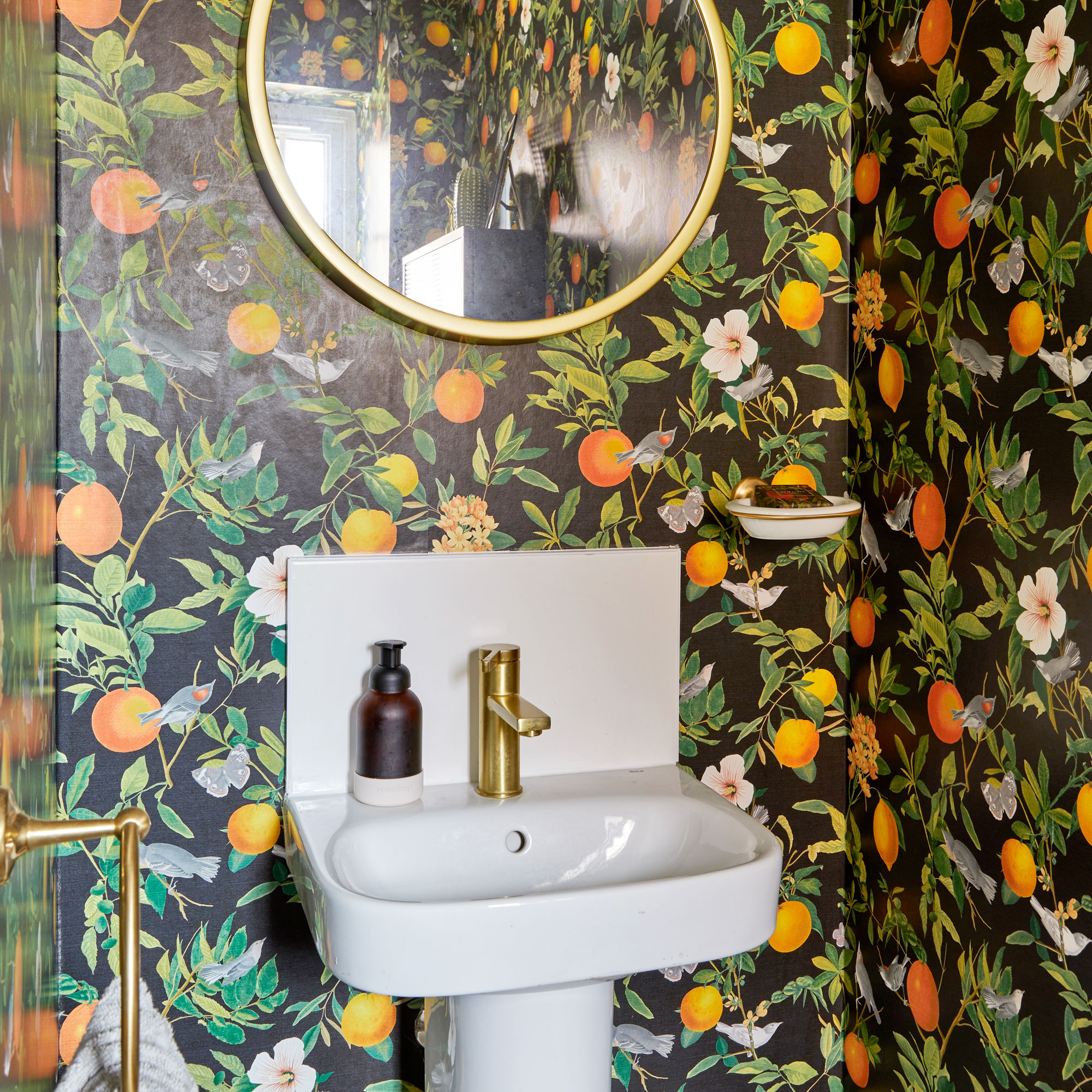
Downstairs, a bright citrus wallpaper encases the cloakroom and offers a wow for anyone entering. A glazed bathroom cabinet lined with the wallpaper has been cleverly used to disguise the electrical mains box behind it. ‘We bought it for a different bathroom, but it worked better in here to hide the ugly box.'
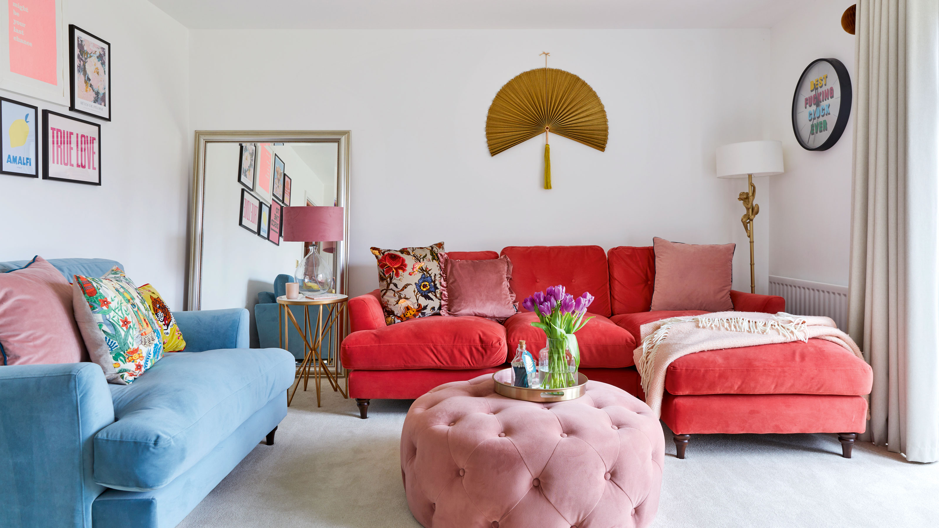
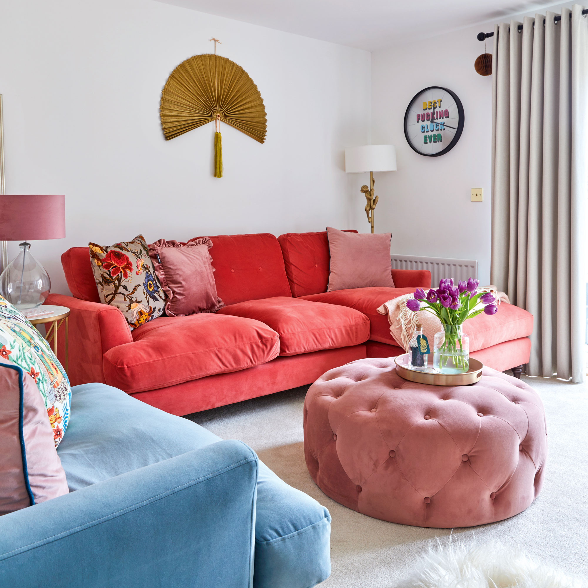
The only room still to get a full makeover is the living room, but they’re taking their time to make sure what they do is right. 'While we’ve bought new furniture which adds the colour we’re after, we’re playing around with ideas for the layout and would eventually like to install a media wall,
'We’ve taken our time over every decision so far, it hasn’t been stressful, and the results have been so rewarding.’
And as for life in a new build? ‘I was totally wrong about it being a basic choice,’ she laughs. ‘It’s low maintenance, and we haven’t spent money on anything structural so have been able to invest in adding colour and character. I’m so proud of what we’ve achieved with such a blank canvas.’

Lindsay Blair is an editor, writer & content consultant with a focus on home design, interiors & lifestyle. Previously editor KBB Magazine and thesethreerooms.com, she has also contributed to The Times, Ideal Home, Build It & more.