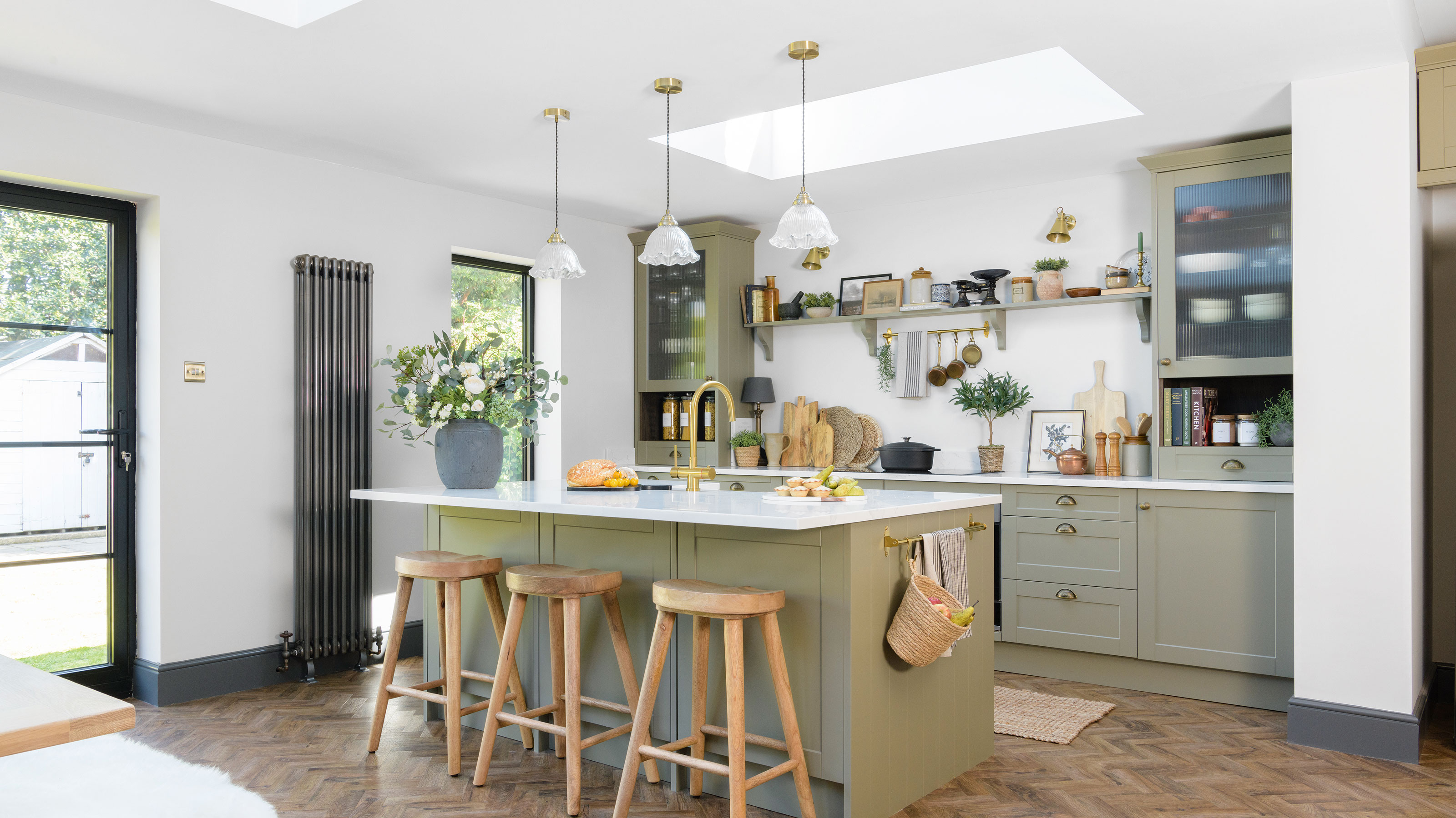
This 1930s home has been injected with a lovely cottage feel through vintage details
This 1930s semi has been carefully crafted into a calming family home with soft tones and clever design

Sign up to our newsletter for style inspiration, real homes, project and garden advice and shopping know-how
You are now subscribed
Your newsletter sign-up was successful
Having only just finished a two-year project renovating a two-bedroom terrace, a determined couple spotted this place and decided to do it all again. Their friends thought they were bonkers. But the couple wanted space to create a family home and, with the possibility of extending into the garden, they jumped at the chance.
Sarah Williams, a primary school teacher (@our_1930srenovation_story), took on the challenge of renovating the1930s extended semi-detached house in Southport, Merseyside, with her husband Michael, a lead manager for United Utilities, and their son.
The starting point
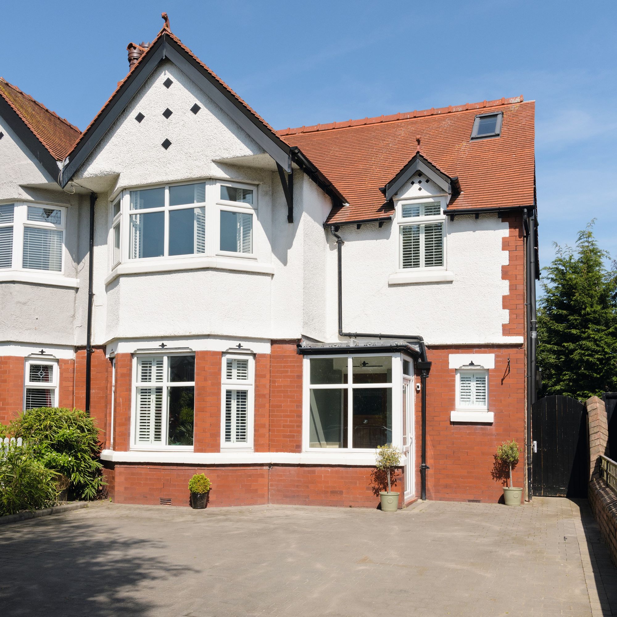
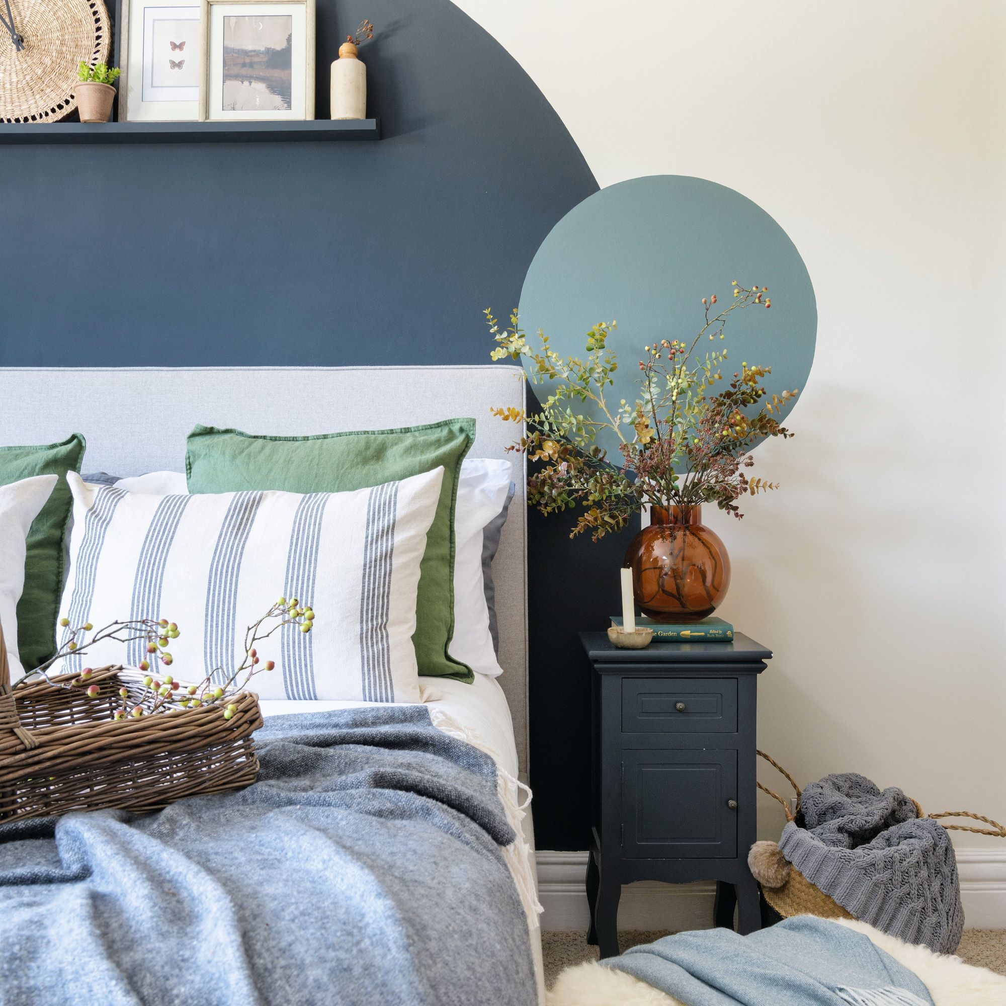
‘Extending the kitchen was our main focus, but having done a reno before we knew how to get quick wins while waiting for planning,' Sarah explains. 'The bedrooms only needed cosmetic attention, but to add some charm Michael attached simple and inexpensive panelling to the walls, while I painted a colour-blocked feature in the third bedroom.'
Article continues belowThe couple also removed an ugly electric fire in the living room hoping to reveal a beautiful fireplace; sadly there was just brick, but a lick of paint gave it a quick update.
'The internal doors had been replaced with a modern design that wasn’t in keeping with the house so we changed them to stripped original 1930s doors,’ Sarah adds.
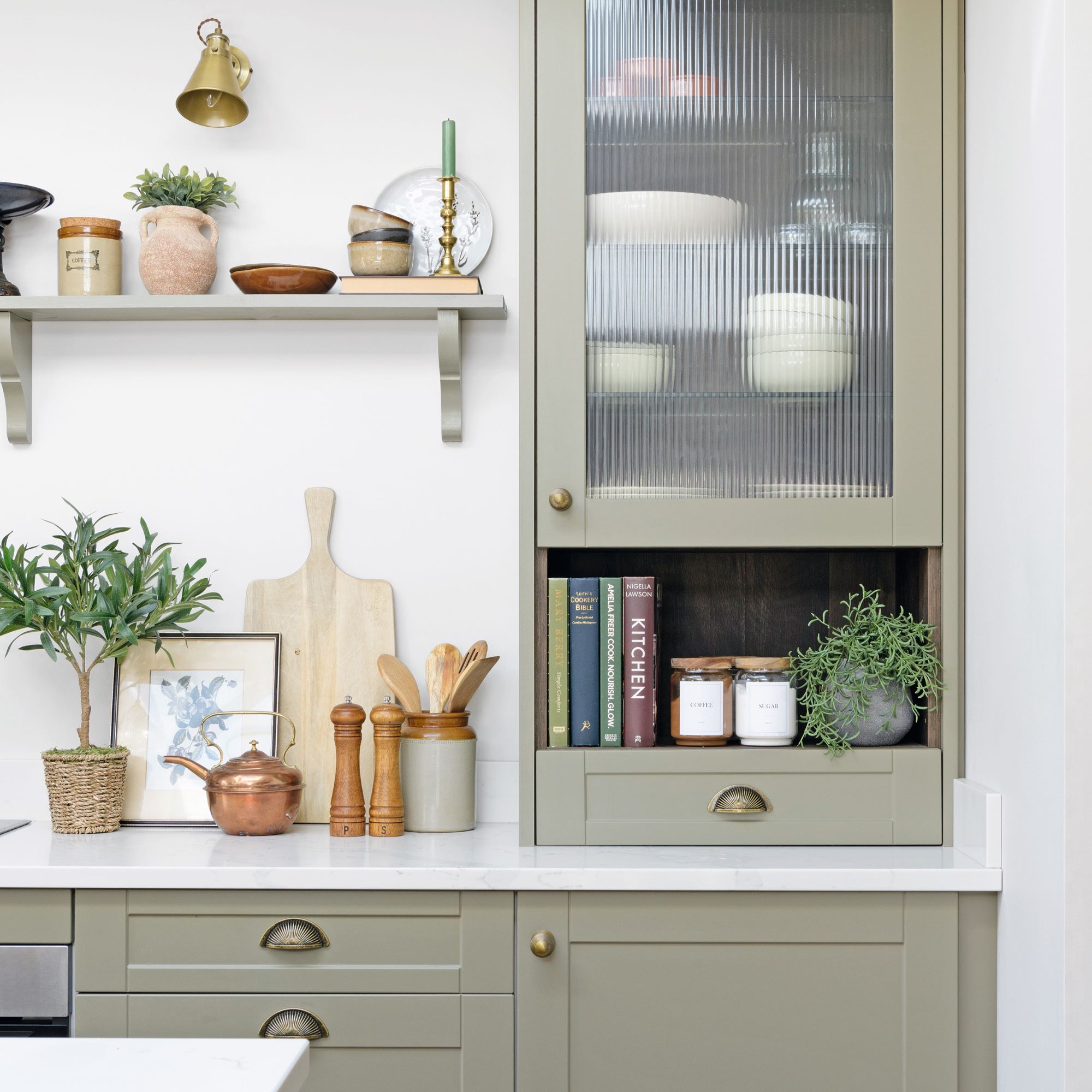
‘We decided to add a large kitchen-diner along the back of the house and luckily the garden was big enough to allow for this. This space has seen the biggest transformation and is exactly the vision I had, and after living for months with a small galley kitchen, dreaming of a large space with an island, it was a relief when it was finished.'
But the journey wasn't plain sailing. Sarah says that the build was straightforward enough, but living in the house was tricky during the work; last time they had moved in after the work was done. 'This time, I also found out I was pregnant and living with morning sickness without a kitchen was tough.'
Sign up to our newsletter for style inspiration, real homes, project and garden advice and shopping know-how
'Michael used to be a plumber, so when he asked me what I wanted to do one Valentine’s day, I said, “rip out the bathroom”. But it turned into a bigger job than we initially expected because we decided to “steal” some floor space to increase the size of the fourth bedroom, so ended up moving a wall.'
The statement chrome bath also took seven months to arrive and wouldn’t go up the stairs, so the couple had to remove a bedroom window to get it in.
Bringing the home to life
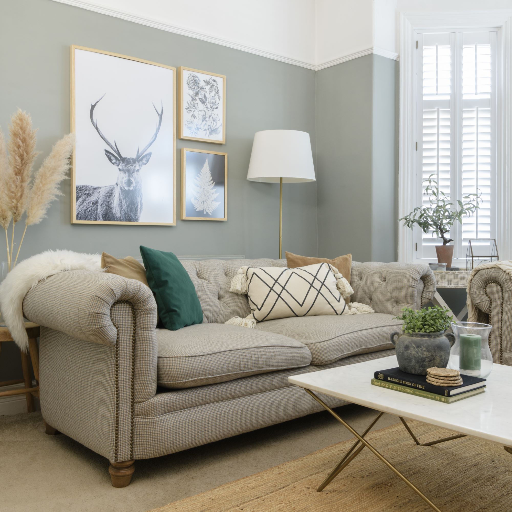
‘Although it’s a 1930s semi, I wanted to inject a cottage feel to soften the edges of the fairly box-like white rooms,' Sarah explains. 'The styling is what brings heart in to a home, so the gentle colour palette and cottage-core accessories were as important to me as the build.'
She created a moodboard for each room, starting with wall colours then adding furniture, after which they were ready to hit the floor running and start decorating.
In the house, the entrance hall leads to a living room and the open-plan kitchen-diner, which includes a snug and utility. The back of the house has glass doors that lead into the garden. The first floor includes three bedrooms and a family bathroom and on the top floor is the main bedroom and en suite.
Here's a closer look at what transforming each room looked like.
Kitchen
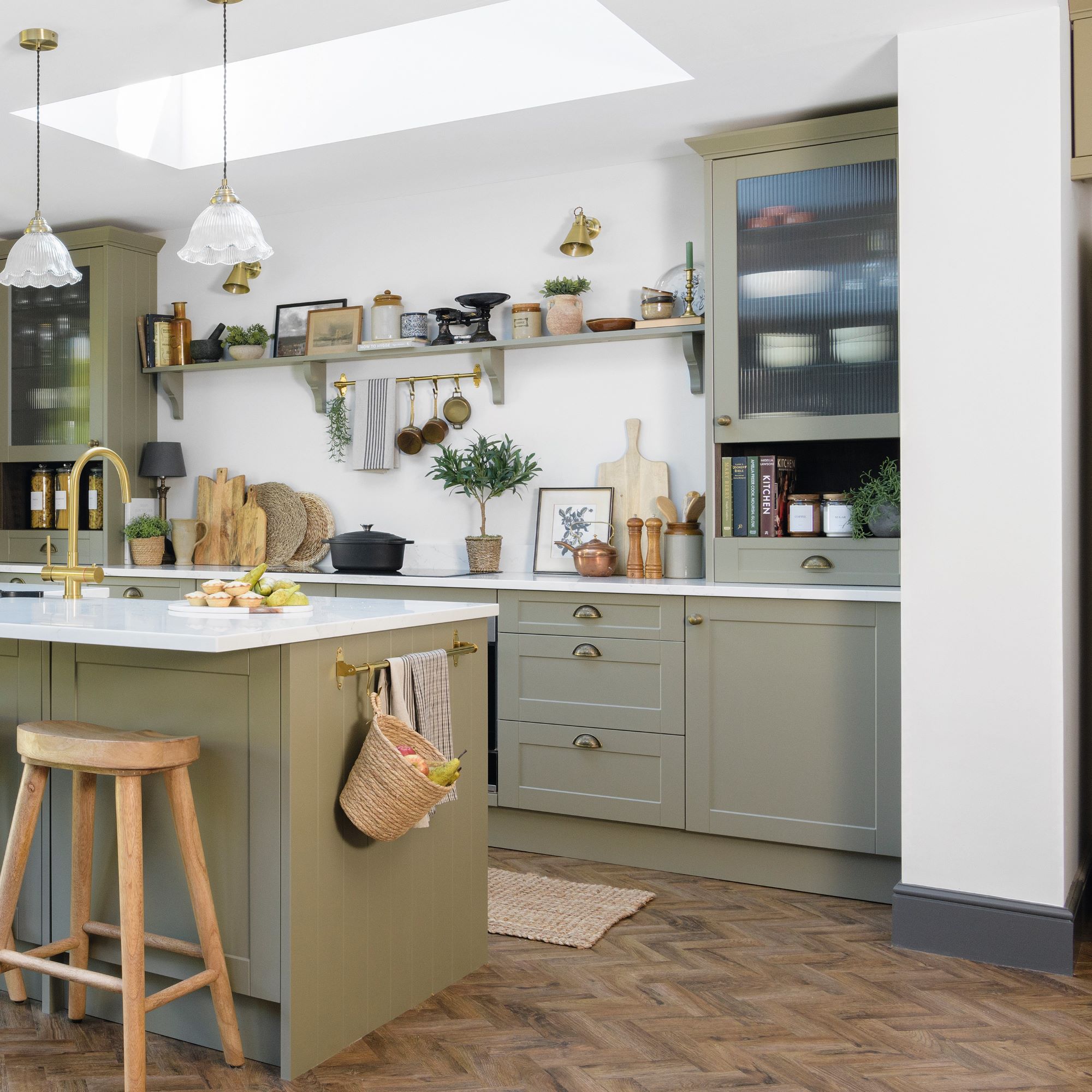
‘The kitchen island was non-negotiable because I knew it would be the heart of our home. I wanted a look that stood the test of time, but still made a subtle statement, so we chose a soft olive green.’
Sarah loves the relaxed look a neutral palette brings, but believes it needs pace and interest. She chose velvets juxtaposed with metals, linens and greenery, tied together with cohesive shades.
Dining area
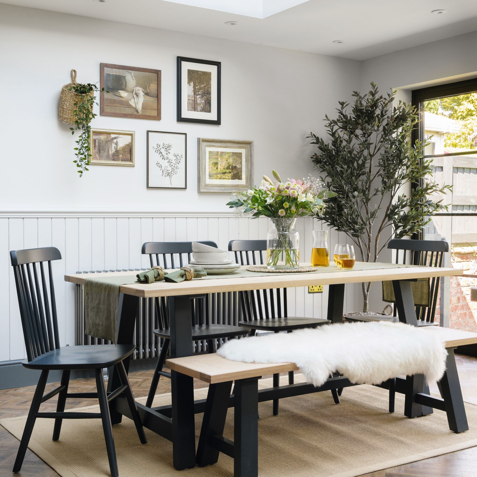
‘Putting the table by the doors allows us to bring the outside in on warmer days,' Sarah says. 'I’ve used black as an accent colour throughout to ground the neutral look. The print frames are from charity shops.’
Snug
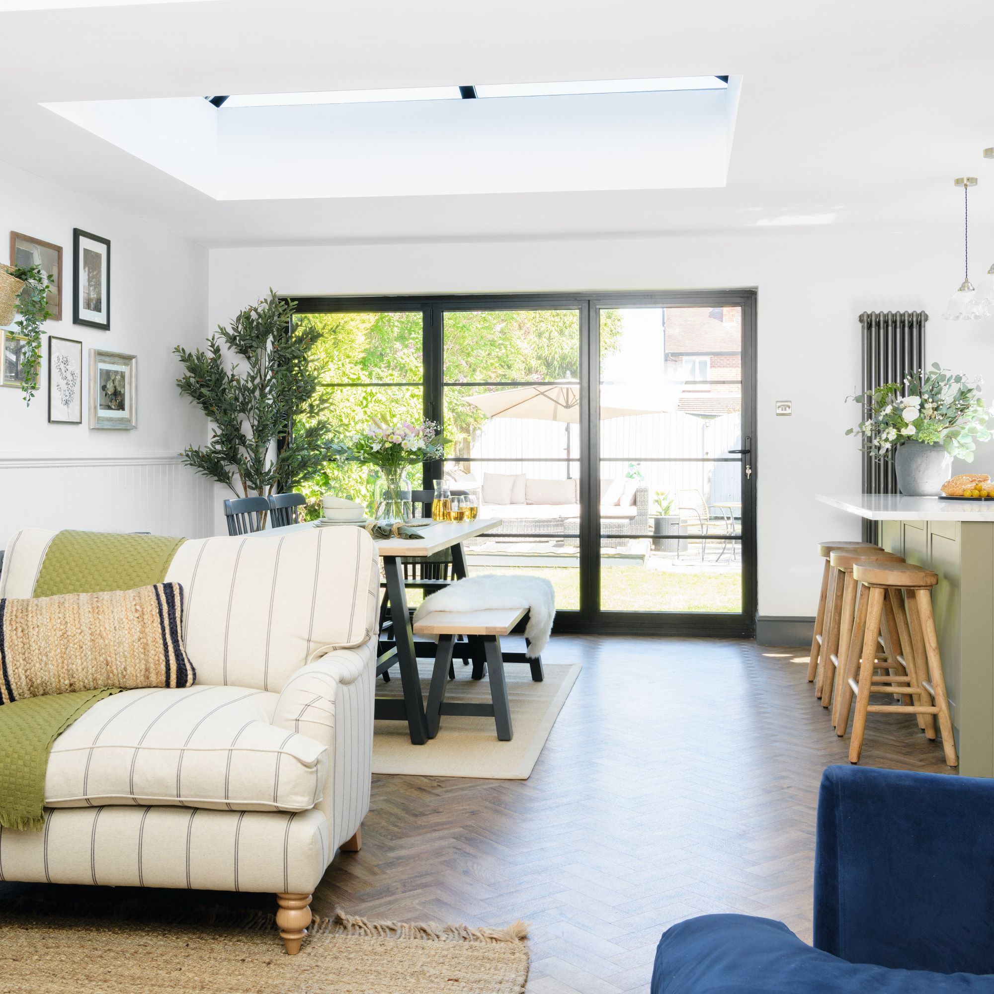
This cosy little area was brought about with a kitchen extension project, which the large garden allowed for. 'The original galley kitchen stopped where the snug now is,' Sarah explains.
Living room

‘This room is all about cosiness and snuggling down, so I specifically picked out soft colours and textures for a relaxed space,' says Sarah. Traditional fireplace ideas replace a modern electric heater, bringing an authentic feel and a nod back to the period when the house was built.
Main bedroom
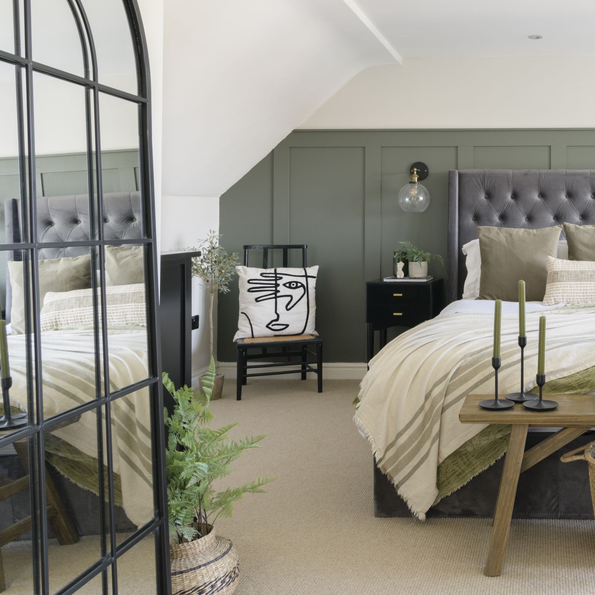
‘The size of the loft conversion was a real selling point as it’s such a big, bright room compared with what we had before. To create a sanctuary, I kept the décor simple with panelling.’
Large-scale panelling adds quick and easy character to a big bedroom, as well as a more modern look. Sarah always loved the idea of having something at the end of the bed. 'A sofa can look bulky, so we went with a rustic bench, which also adds texture.'
Guest bedrooms
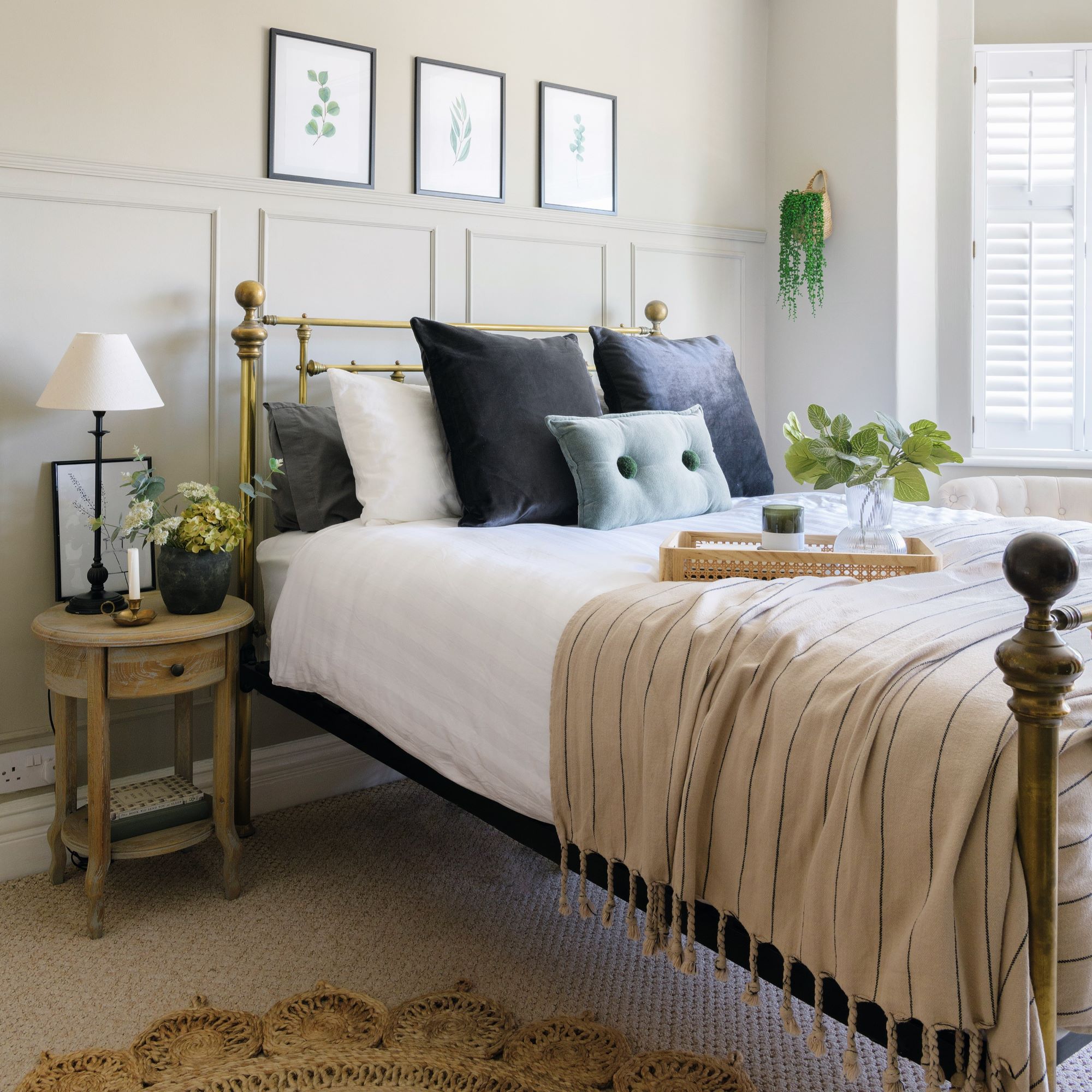
‘You need to work harder with neutrals, but mixing metals with textures and fabric is an easy way to inject interest,' Sarah says of the stunning guest bedrooms. 'I chose velvets juxtaposed with linens and jutes, but made sure to use a cohesive colour palette.’
She painted the arch as an extension of the headboard in one of the guest bedrooms, and then added circles for fun. 'I used tester pots, so it’s been one the cheapest transformations in the whole house.’
Bathroom
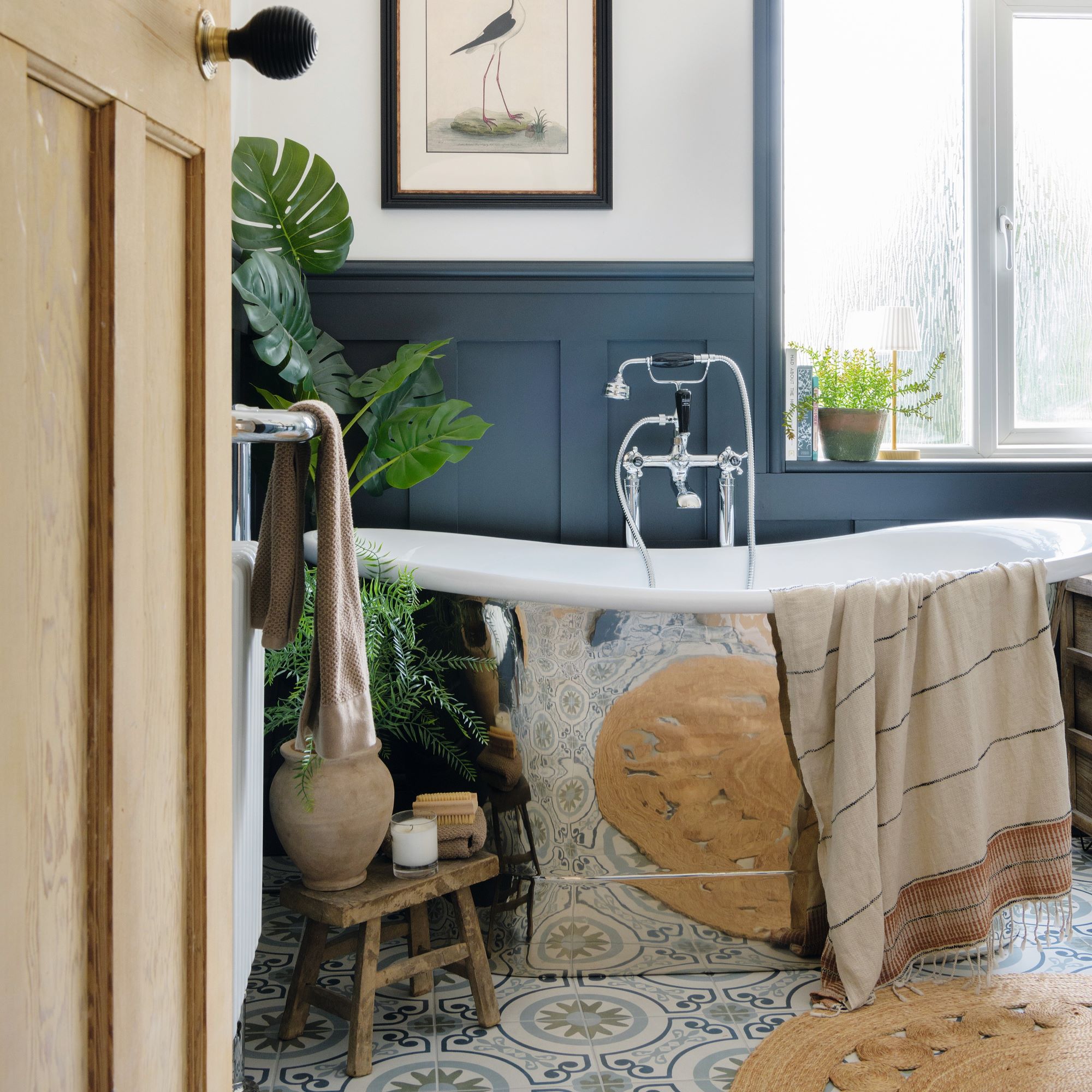
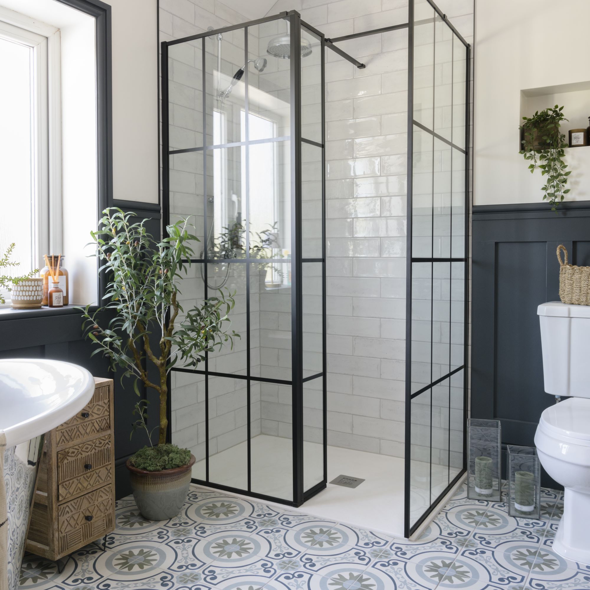
‘I normally prefer to accessorise with gold fixtures and fittings, but I fell in love with the show-stopper chrome bath.’ Bathroom tile ideas create a showstopping finish, and potted plants bring a relaxing, spa-like feel.
Focus on: luxury vinyl tiles
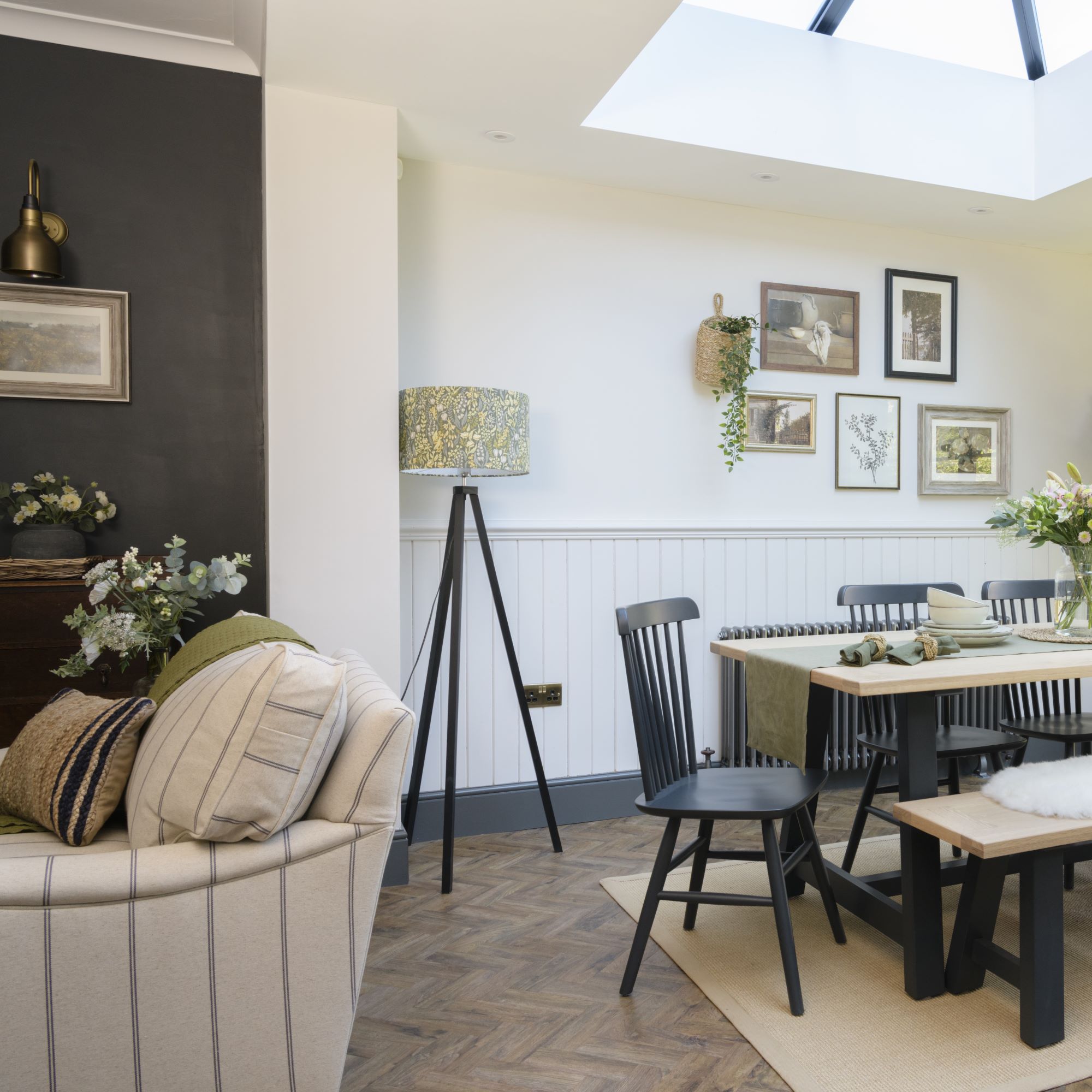
Sarah and Michael chose wood-effect luxury vinyl tiles as a low-maintenance, cheaper alternative to a real wood floor.
Often referred to as LVT, luxury vinyl tiles are made from multiple layers, usually of PVC, making them a durable and moisture-resistant choice. The top layer is produced to imitate real wood or stone and they are supplied as planks or square tiles.
- Pros: Waterproof and more resistant to scratches than real wood, LVT are also warm underfoot and the protective top layer makes them easy to clean. They are a cheaper option than hardwood flooring and also easier to lay, which means lower labour costs.
- Cons: Heavy furniture may dent the tiles and, although more durable than real wood, they can still scratch if not looked after.
- Green credentials: Because of its composition, LVT flooring is not recyclable and will eventually end up in landfill. However, its durability and waterproof qualities make it long lasting if well maintained.
Reflecting on the renovating and decorating process, Sarah says, 'I love what we’ve achieved. Although this may not be our forever home because when it’s finished I may be itching for something else, at the moment we are definitely here for the long term.’

Katie has been writing freelance since early 2022, specialising in all things homes and gardens, following achieving a Masters in Media and Journalism. She started out writing e-commerce content for several of Future’s interior titles, including Real Homes, Gardeningetc, Livingetc, and Homes and Gardens. Since then she’s been a regular contributor on Ideal Home’s digital team, covering news topics, how-to guides, and product reviews.