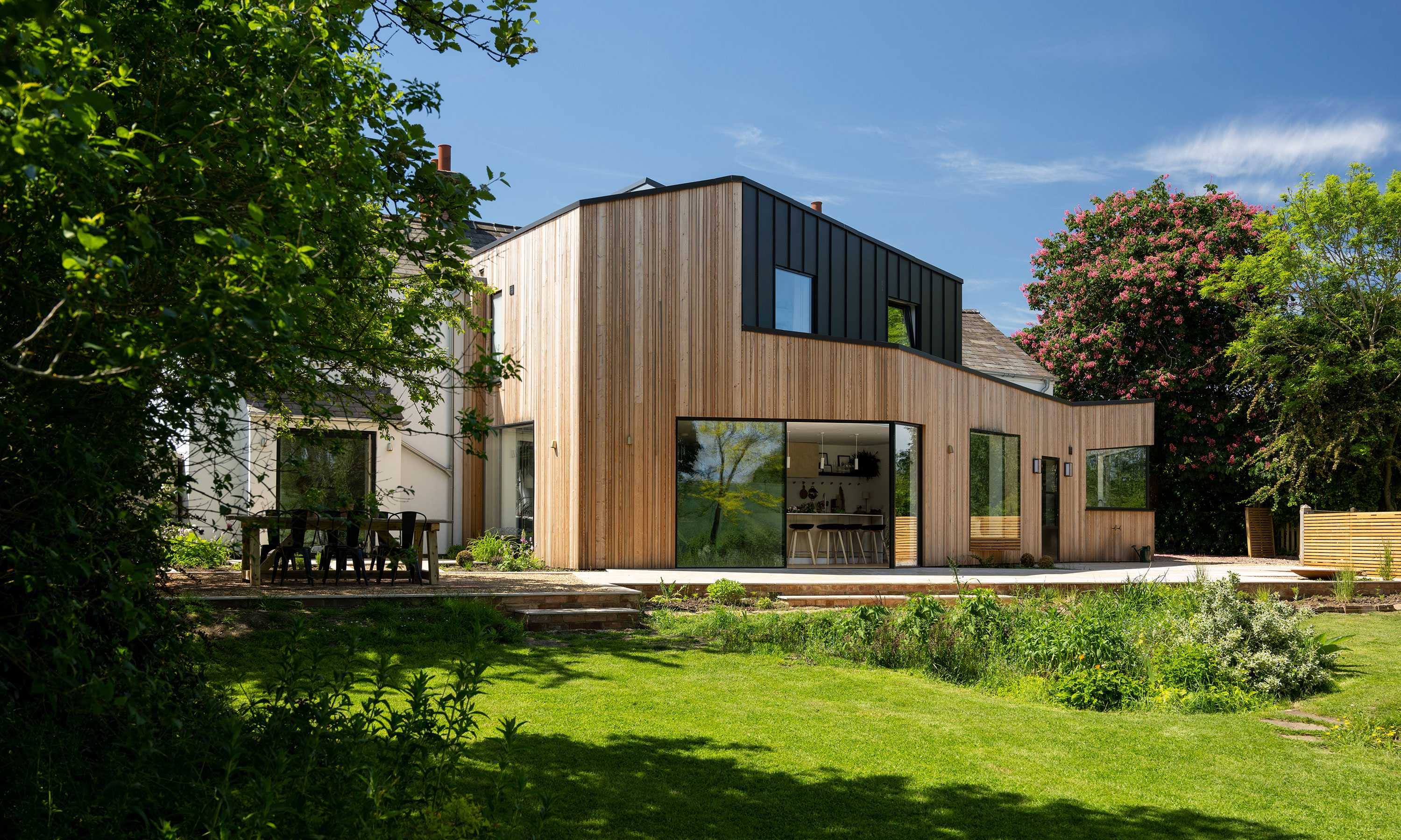
This Victorian cottage has been transformed by a modern angular extension
A double-story extension has brought light and space into this four-bedroom cottage in Market Harborough

Ifeoluwa Adedeji
When the owners' thoughts turned to starting a family, they knew it would be important to find a place they could call home for the long term. This detached Victorian cottage in Market Harborough, although dated, was in the perfect location.
Some of the property’s faults were superficial, such as the tops of the windows, which had been painted black and gave the house strange-looking eyebrows. Overall though, it looked like a pretty period cottage, and so they decided to take a chance on a bit of an ugly duckling of a house.
The front exterior
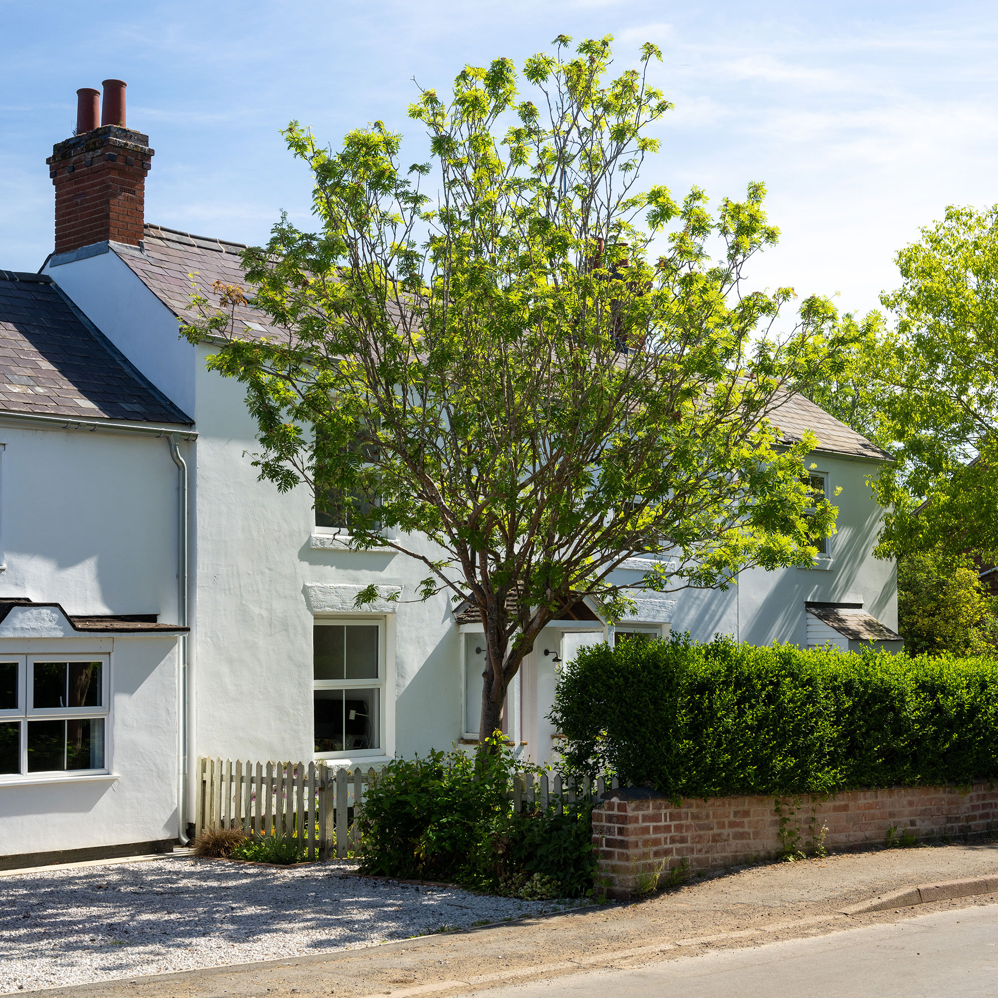
At the front, the owners only painted the door, re-roofed and replaced the guttering, so it is virtually unchanged from when it was first built. This means that it hasn’t had an impact on the overall look of the street. All the new work is at the back of the property.
The rear extension
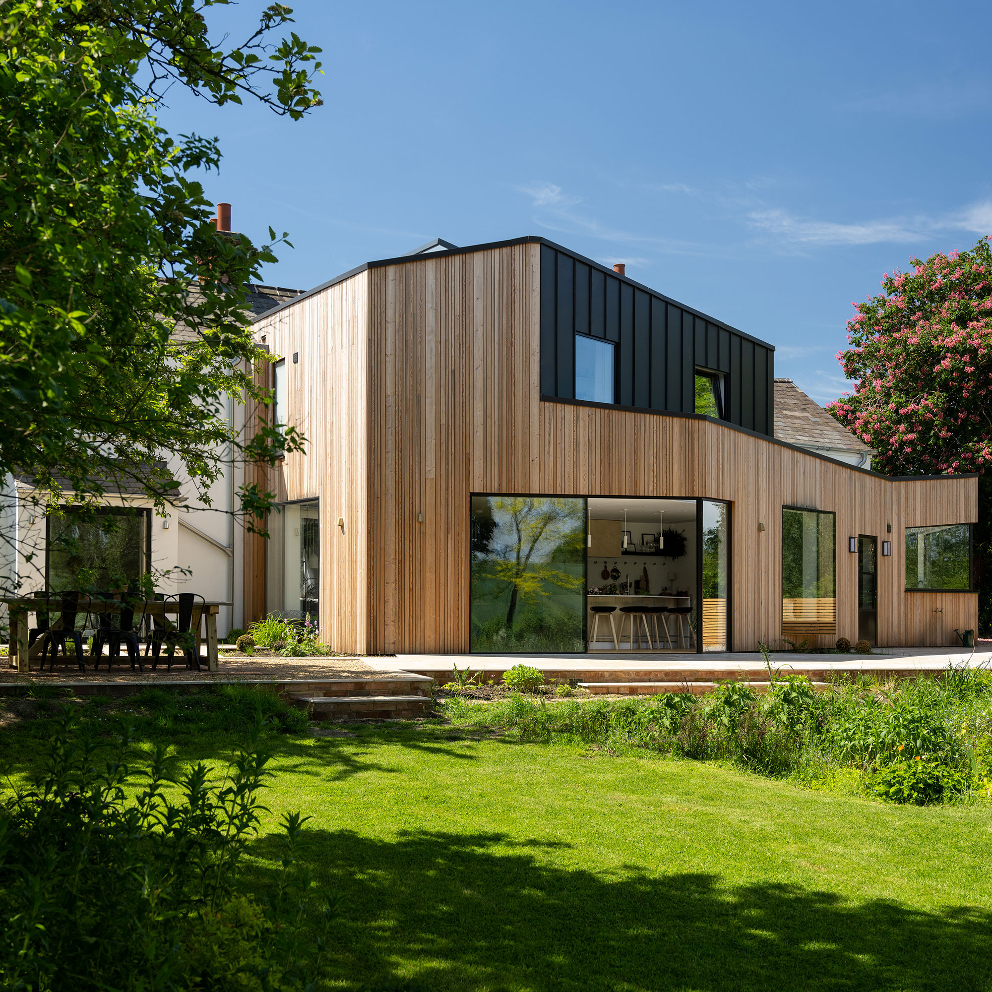
The family lived in the property for three years before starting any work, although they knew they wanted to update it from the offset. They consulted several different architects but found it difficult to find someone who didn’t just want to 'stick a square glass box' at the back of the property.
They eventually found Bedfordshire-based architects, Tye Architects, who seemed to understand what they didn’t want.
'We gave them free rein and asked for something contemporary that would open the space up to improve on the existing warren of rooms,' they told us. 'We live in a conservation area, and we were lucky that our plans went straight through unopposed. I think that the fact that we didn’t try to blend the new design in, but have made it stand out instead, went in our favour.'
The entire back of the house was knocked down and an angular extension was added, with larch cladding and zinc, on the second floor.
Get the Ideal Home Newsletter
Sign up to our newsletter for style and decor inspiration, house makeovers, project advice and more.
The entrance hallway
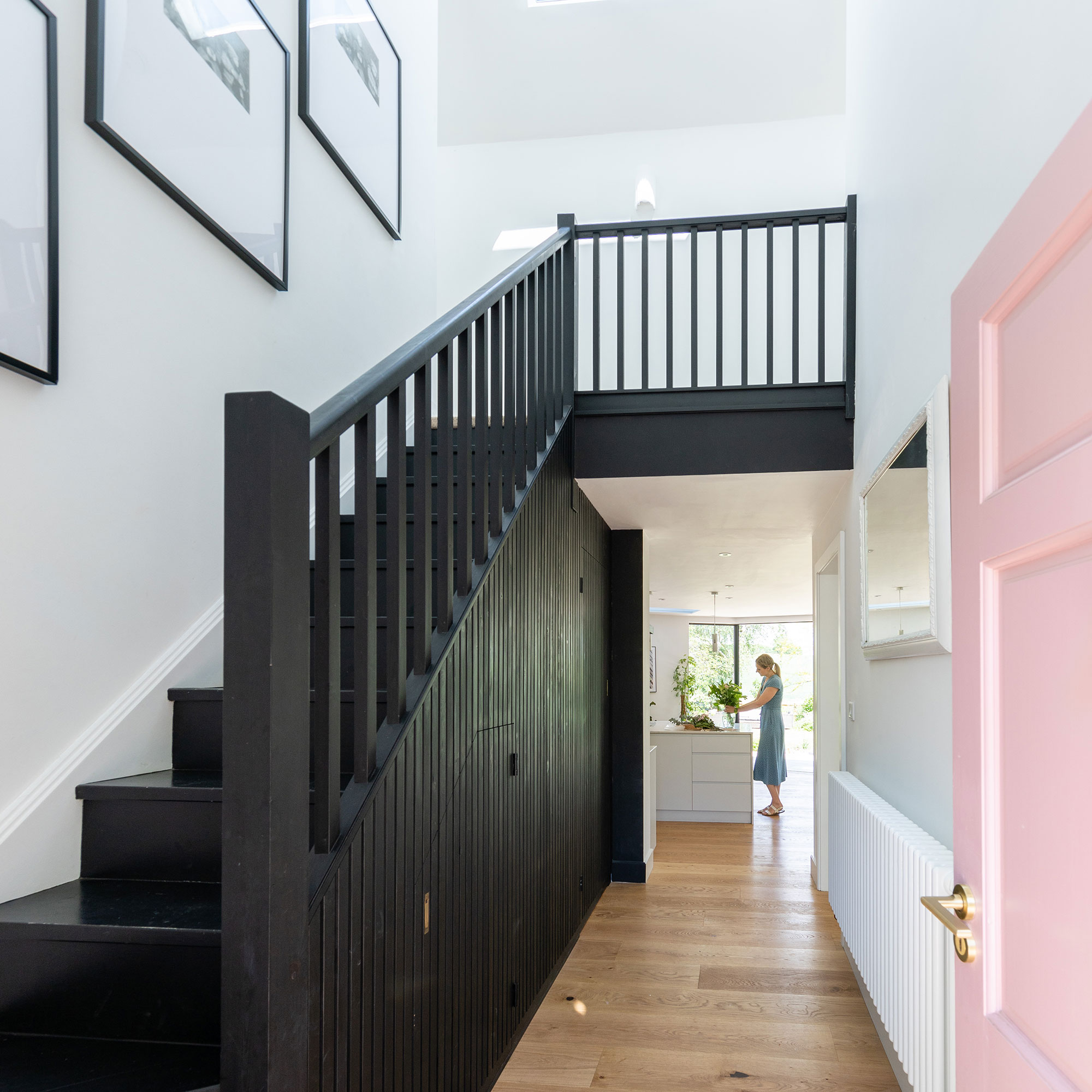
Downstairs, the couple amalgamated the stair room and kitchen into one space, moving the stairs back to what they assumed was their original position, by the front door.
The vertical wood slats wall panelling idea on the stairs influenced the rest of the house. After having that installed, the owners realised that they like the look of light interiors with dark wood accents.
The living room
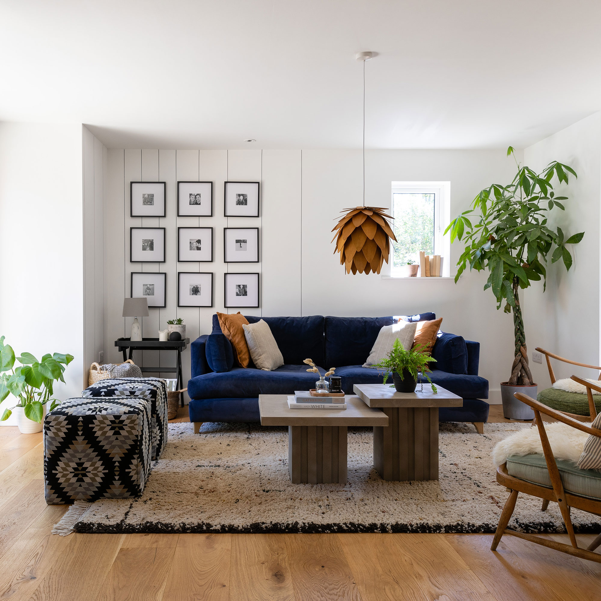
By removing a wall between the lounge and stair room, there is now a big open plan kitchen idea and diner that flows into the lounge.
'We haven’t needed to extend that much at all, but instead we’ve reconfigured the space and opened it up. Having this space gives us so much more freedom; the children can even ride their tricycles around the kitchen.'
However, while the two spaces are now connected they are not completely open, which helps with noise and for creating different spaces.
The kitchen
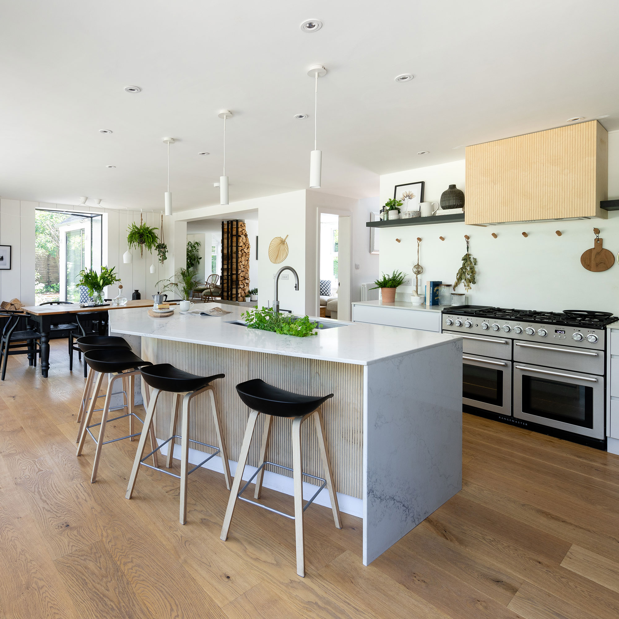
The kitchen island idea is a mirror of the extension’s angles: 'Before we had a rectangular island, then we spoke to a designer who said the island doesn’t need to be rectangular. That has made a huge difference because it’s much more sociable as you’re not just sitting in a line,' says the owner.
The utility room
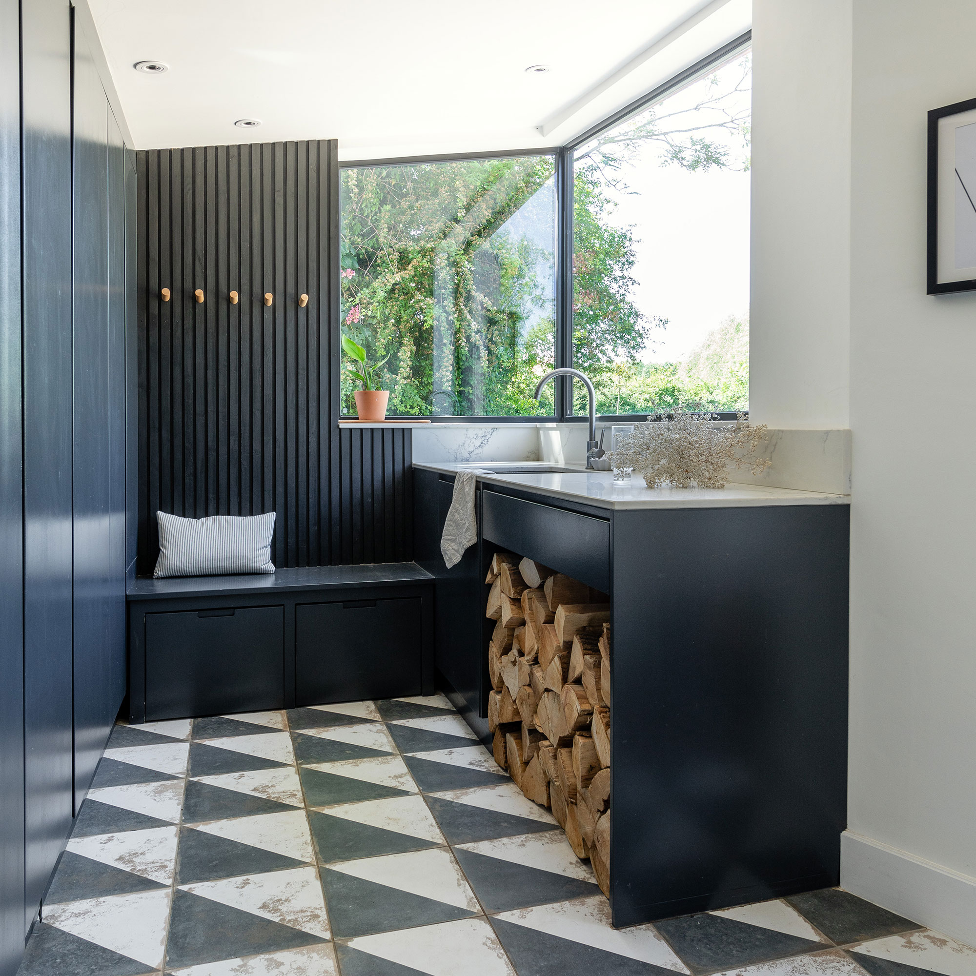
As well as having two children, the owners also have two dogs, so having a utility room idea is useful for keeping muddy walking boots, etc.
'The corner window in the utility room is another thing he [the builder] suggested and probably persuaded us to go with this design.'
The dining area
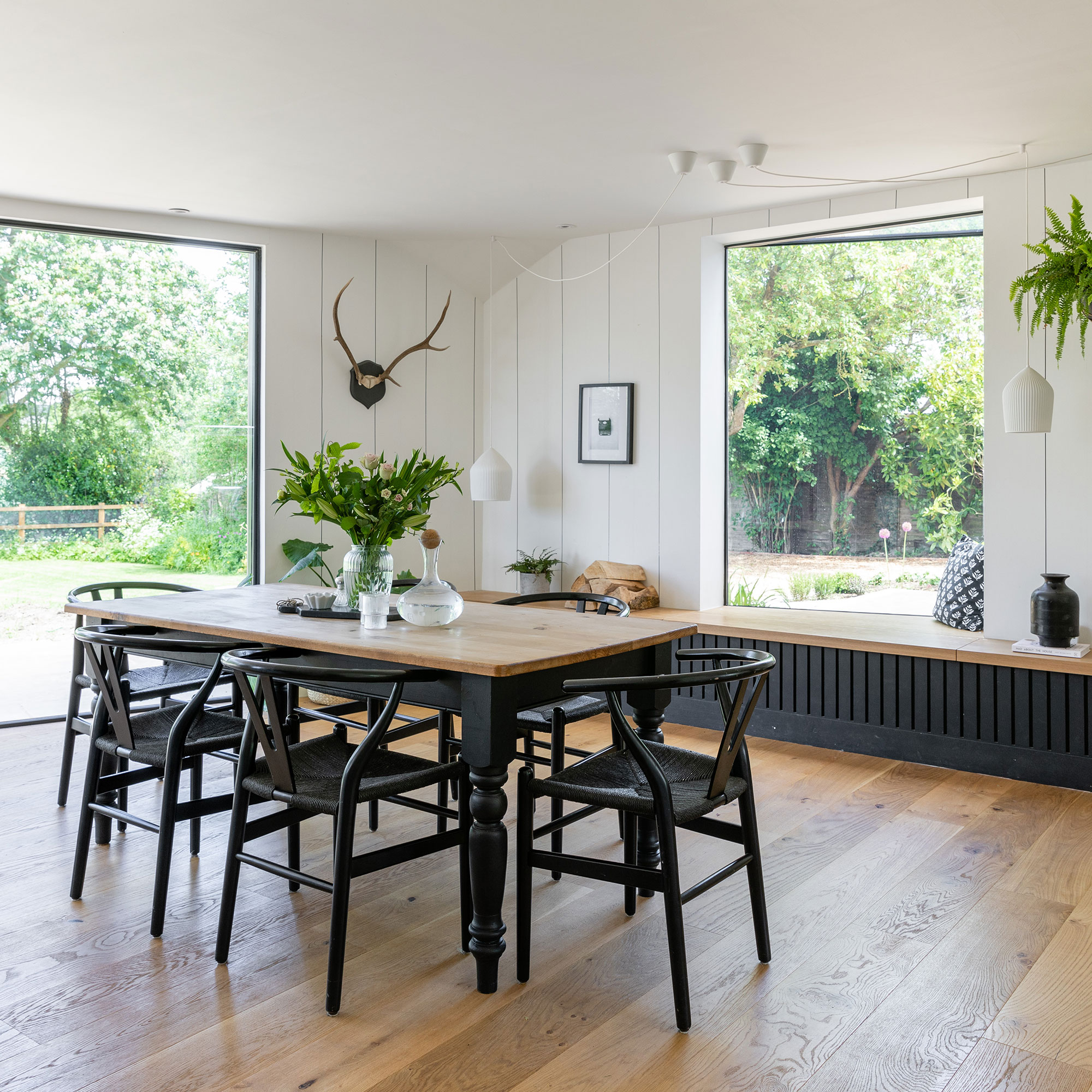
The architect suggested an oriel window (a window which protrudes from the main wall), and the owners loved the idea so much, they installed two.
'They somehow give the feeling of being outside. The clever layout and the different aspects of the house give us so much flexibility as a family,' says the owner. 'I can cook and the children can ride around and play and I know where they are.'
'For me one of my strongest memories of my childhood home was the bench seat which we had running along our table,' she continues. 'Every day we would squish on it, it’s perfect for squashing multiple children on and for storing jam and crisps in.'
The master bedroom
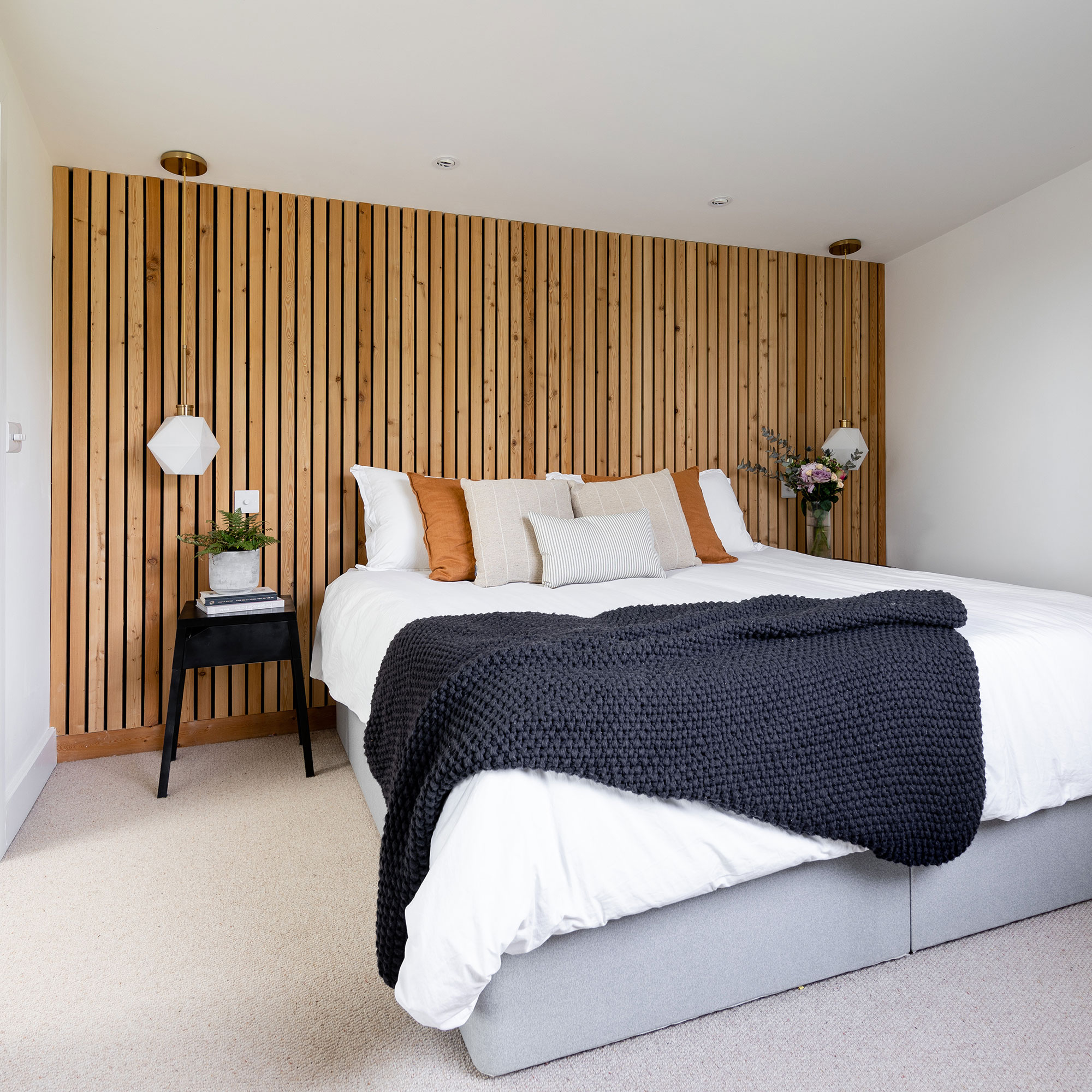
The owner has created a cosy bedroom idea and saved headboard space by making the wall the headboard using wooden wall panelling. This also further reflects the exterior cladding.
The bathroom
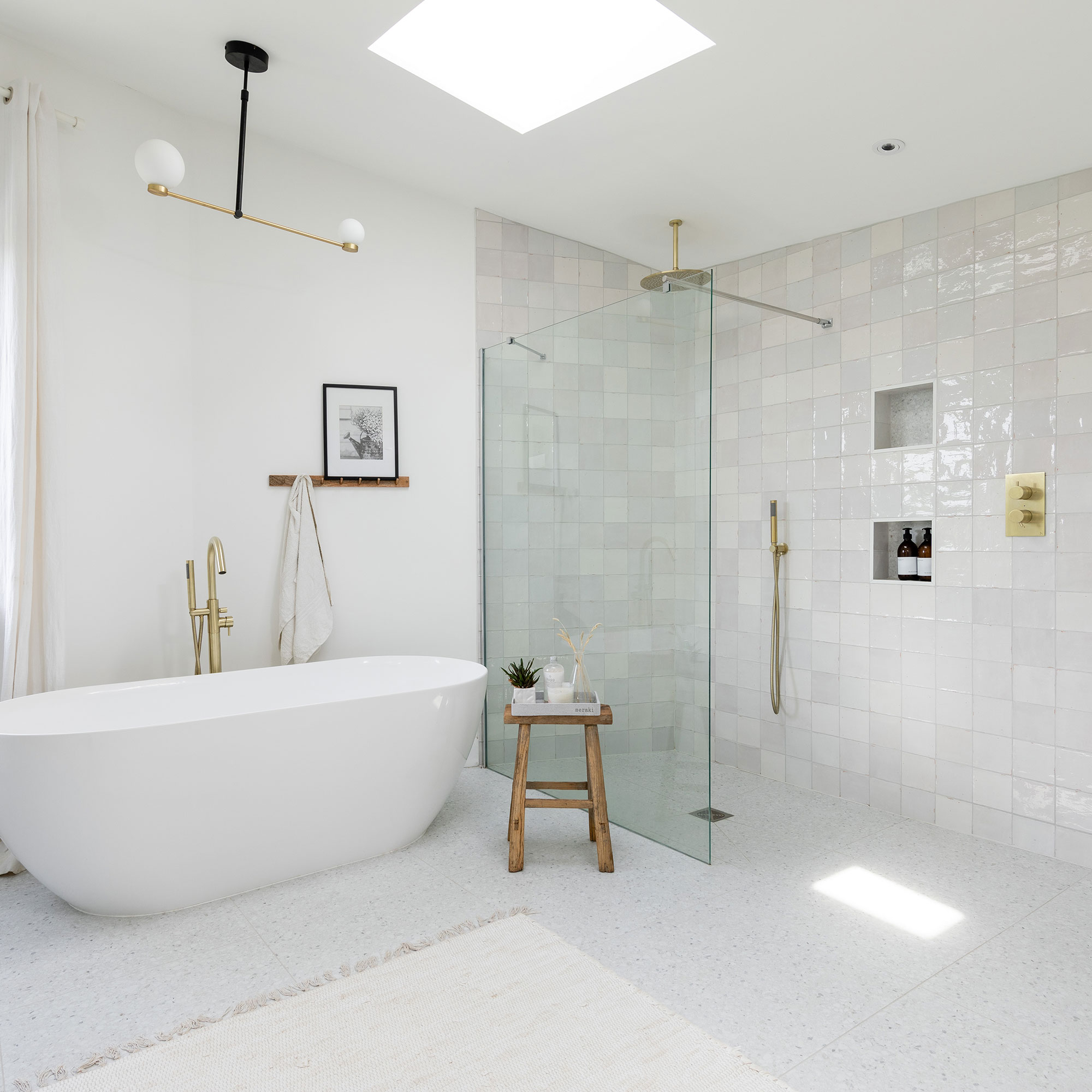
Having three children, the owners wanted to have a bath, but knew as they got older they would want a shower too, so opted for both a freestanding tub and walk-in shower idea.
'This used to be my daughter’s bedroom, because we took space off the room we moved her into the one that was ours and turned this into a bathroom,' she explains.
The boy's room
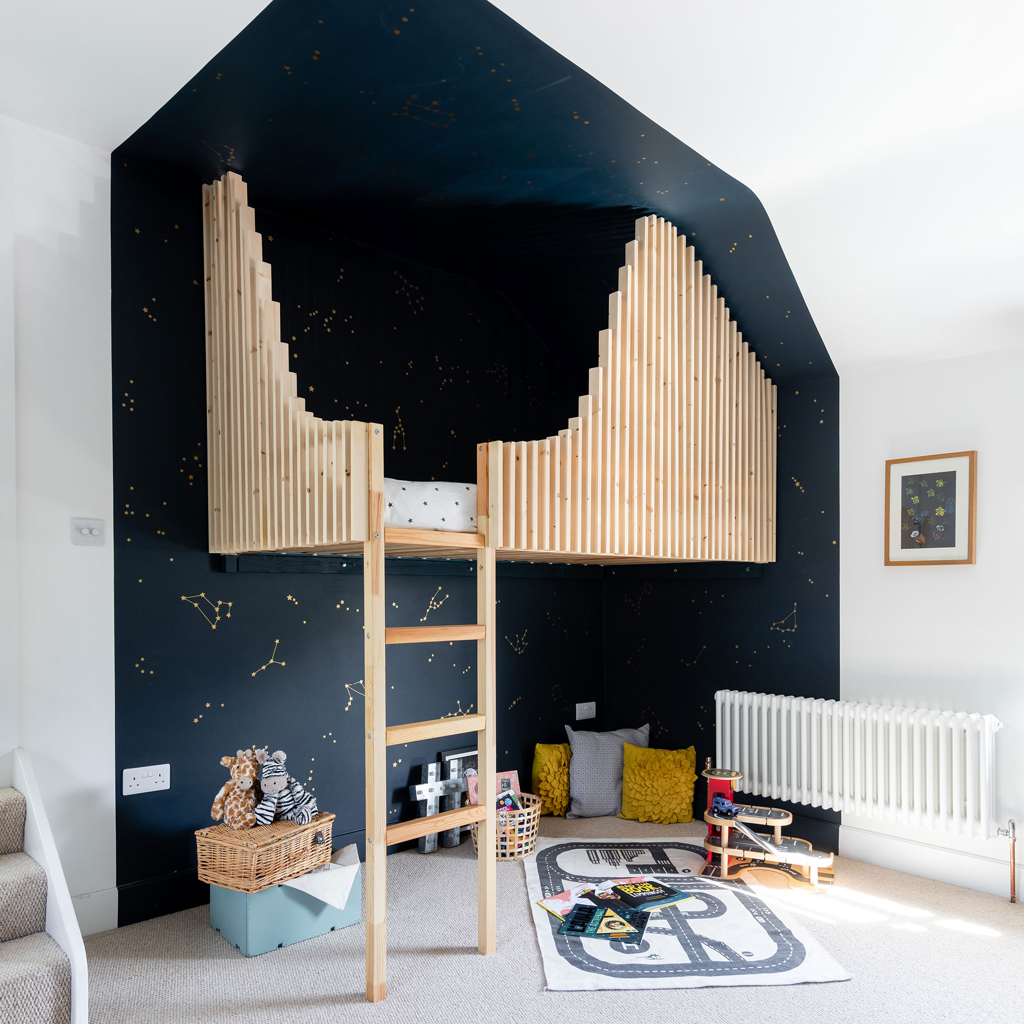
To create this clever suspended cabin bed kids room idea, the owner bolted a standard IKEA bunk bed to the wall, moved the ladder and added wooden slats. There’s a huge joist underneath that’s bolted to the brick wall and painted black so you can’t see it.
The girl's room
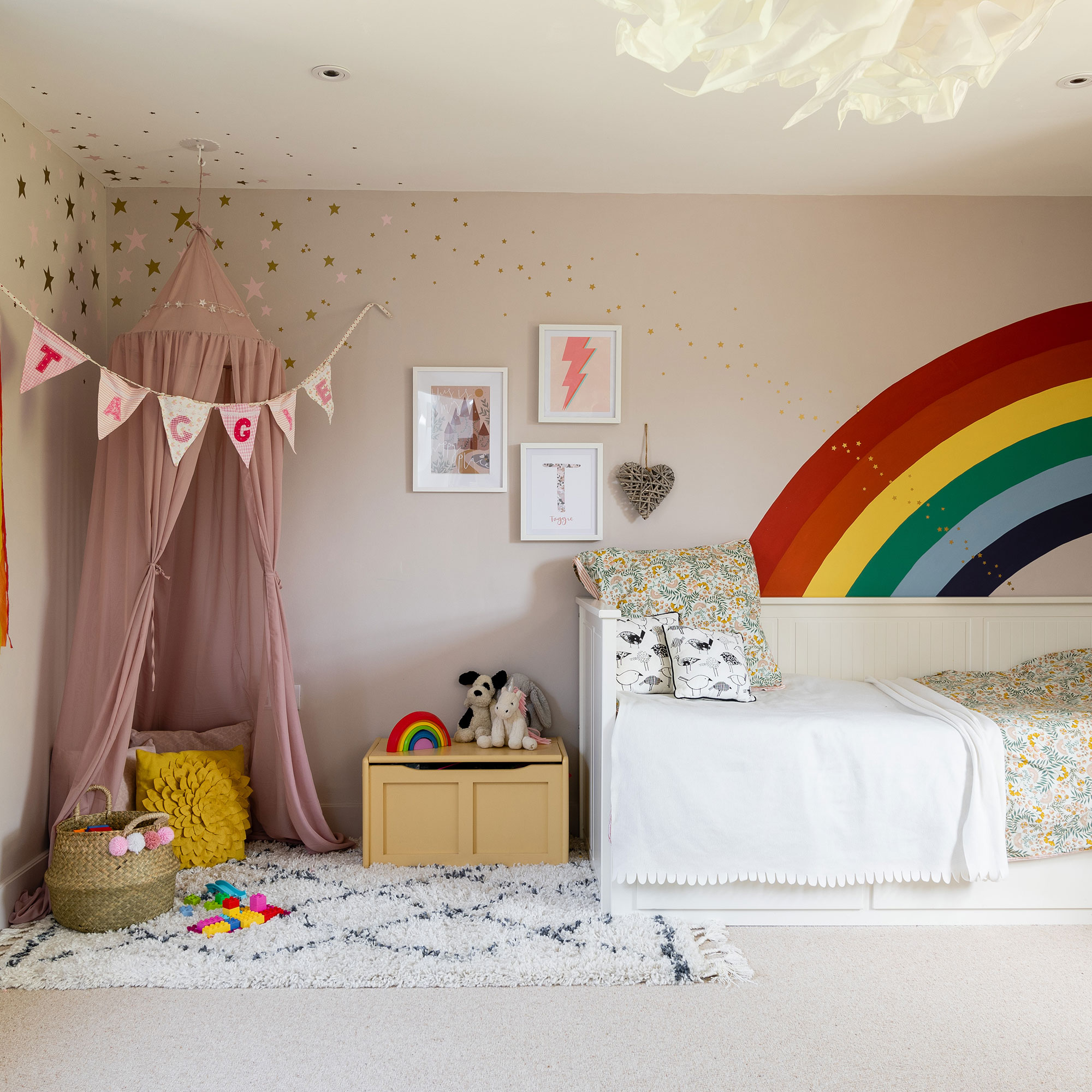
'My daughter requested a rainbow unicorn room, but while I toned down the unicorn part, there is definitely a rainbow.'
The play room
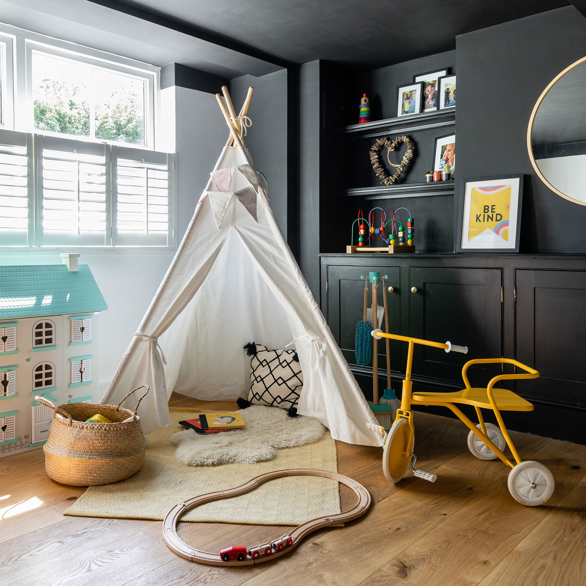
This is old room features clad metal beams and really low irregular ceilings, so the owner wanted to make it more snug-like and decided to paint it black. This helps to hide the different levels of the ceiling.
'I love the original old cottage part of the house because of the nooks and the crannies, which create great spaces in which to display things,' says the owner.
What is larch cladding?
Modern Style
Timber cladding can look just as good internally as it does externally, especially when you’re trying to create a contemporary finish. Externally you can leave the timber untreated to weather to a silvery hue.
Durable
A softwood material such as larch, which has been applied here is surprisingly durable with Siberian larch being one of the most popular options. A low maintenance wood, it has a resin, which offers natural protection against rot and decay.
Internal Use
When timber cladding is incorporated internally, you can form a clever link with the property’s external facade. Known to work well in hallways and living spaces, installing wood on the walls, floor and even ceiling of a bathroom could help you create a seamless link from your living to external space.
Cost
Expect to pay from around £31 per m2 for Siberian larch cladding.

Steph Durrant is the Deputy Editor of Ideal Home’s sister magazine, Style at Home. Steph is an experienced journalist with more than 12 years under her belt working across the UK’s leading craft and interiors magazines. She first joined the team back in 2016 writing for both homes brands, specialising in all things craft, upcycling and DIY.
-
 5 signs you’ve taken decluttering too far — and how you can pull yourself back, according to organisation experts
You might have to start resisting the urge to purge
By Lauren Bradbury
-
 What is the Party Wall Act 3m rule and is it something you should be worried about? This is what the experts say
Don't get caught off-guard by the Party Wall Act 3m rule — our expert guide is a must-read
By Natasha Brinsmead
-
 Shoppers can’t get enough of The Range’s lemon tree, but I’ve found an even cheaper bestseller at B&Q - it’s perfect for a Mediterranean look
Welcome the summer with this glorious fruit tree
By Kezia Reynolds