This dated bungalow 'stuck in a timewarp' has been given a sophisticated glow-up
See how first-time buyers used their DIY skills to give this tired bungalow a high-end look
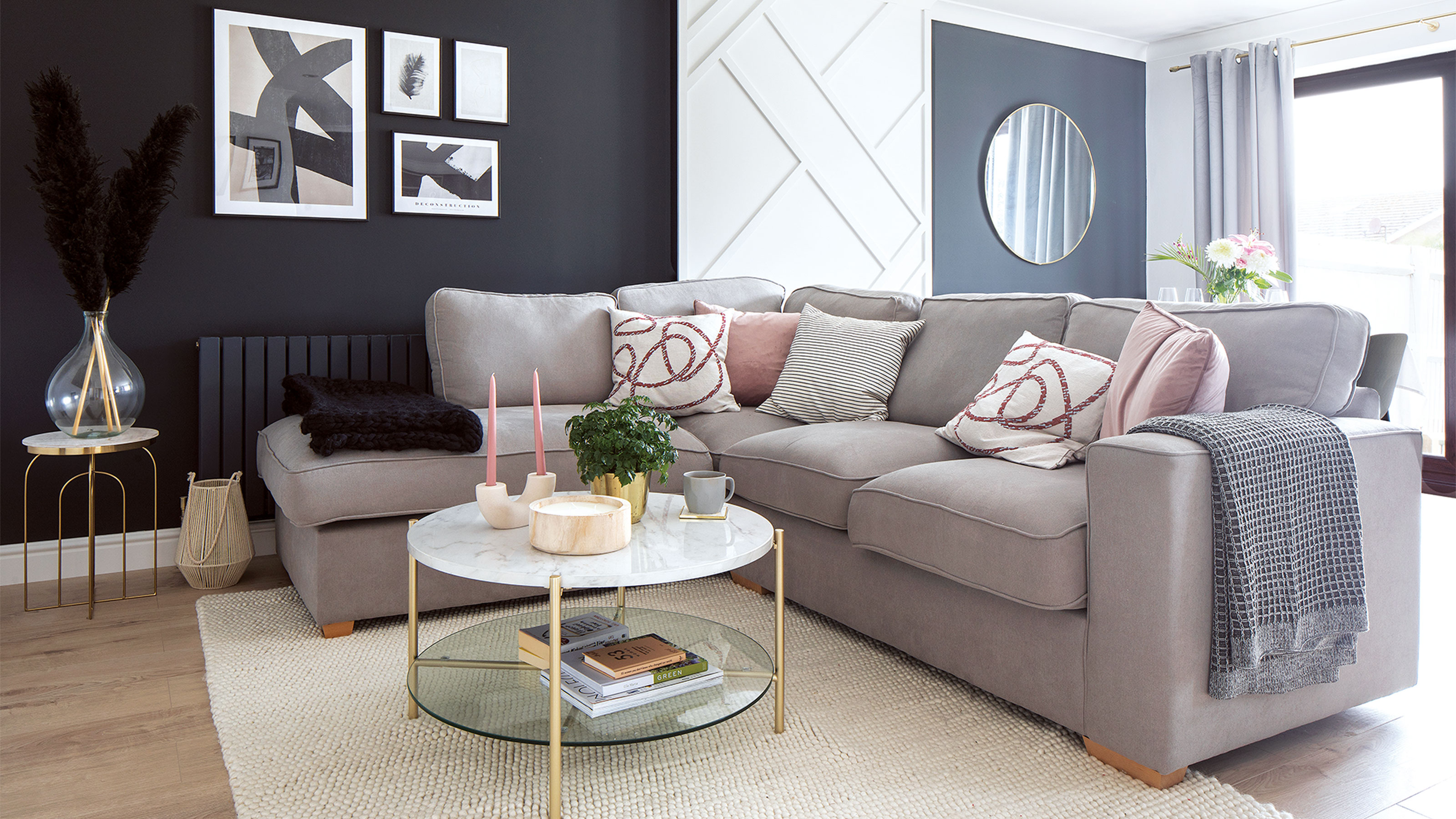

‘Stuck in a timewarp’ was how the homeowners described this semi-detached bungalow near Brighton on first viewing. With swirly Artex ceilings, dated pastel carpets, beige decoration and a rundown kitchen and bathroom, it was far from ideal. But with a sound structure, an affordable price and a great location just minutes from the beach, the bungalow still had plenty going for it.
‘We were determined to get on the property ladder,’ says the homeowner. ‘Our goal was to find an affordable property we could renovate, as my partner is a carpenter and builder and could do most of the renovation work himself. Although the bungalow was drab and dated, we both had an instant feeling that this was the one and we could make it look amazing.’
The bungalow's exterior
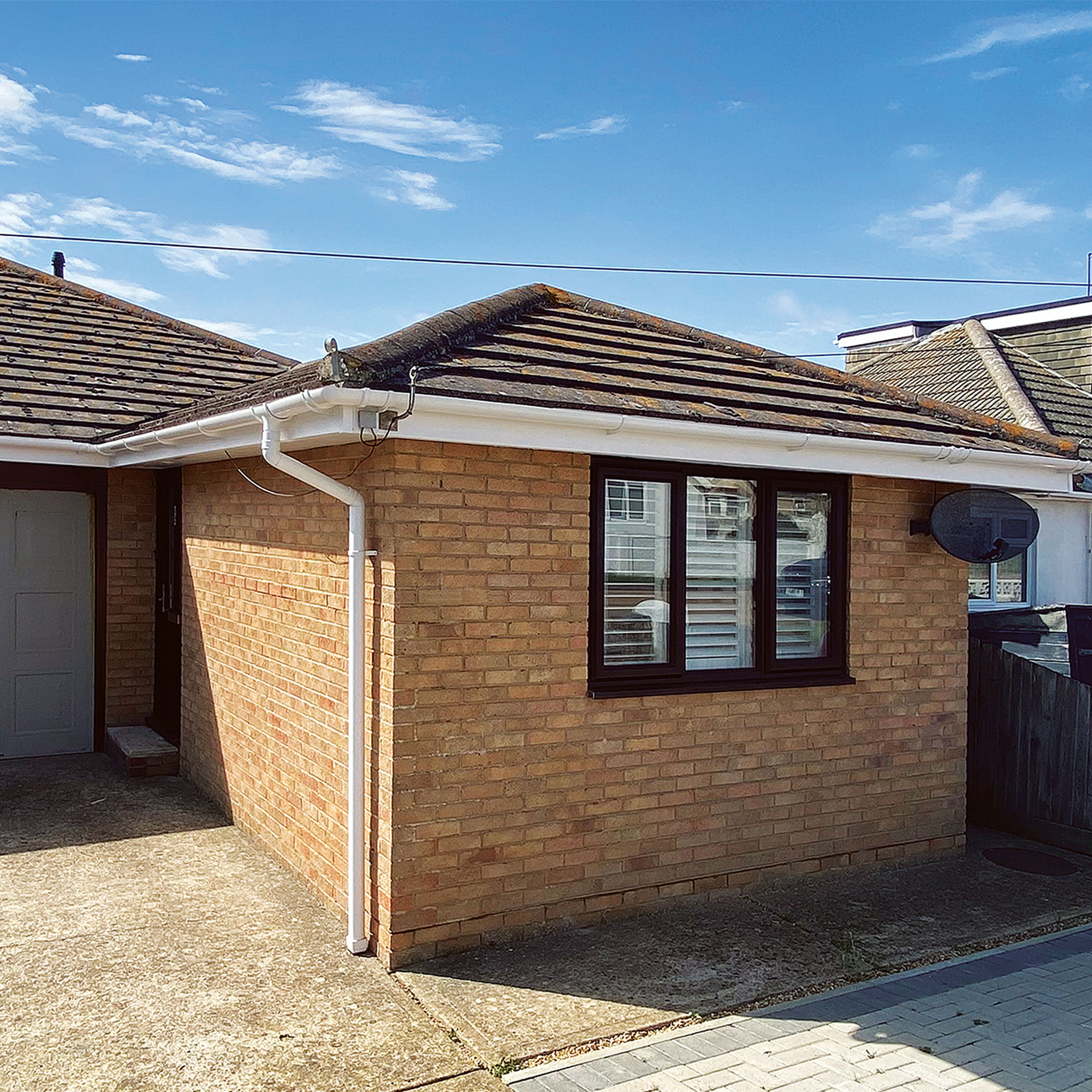
‘The semi-detached bungalow was the biggest property we’d seen and had a decent-sized garden,’ says the home owner. ‘We knew straight away we wanted to knock down the wall between the kitchen and living room ideas and create a more social, open-plan room. Structurally, everything was okay, the windows had recently been changed and the rooms were just very old-fashioned.’
Living room
As soon as the sale went through, the couple got to work stripping walls, ripping out carpets and the old kitchen, while still living at home with their parents. The whole bungalow needed rewiring, plus the boiler and heating system needed replacing too.
‘My partner took every job as far as he could and then he’d bring in an electrician or gas engineer to certify the final stages. We put together a spreadsheet to keep an eye on our £30,000 budget, outlining a cost for each room to keep us on track. Sometimes it was hard to stick to the budget – we made compromises like sourcing a great marble-effect worktop ideas in laminate instead of the real thing.’
Living room seating area
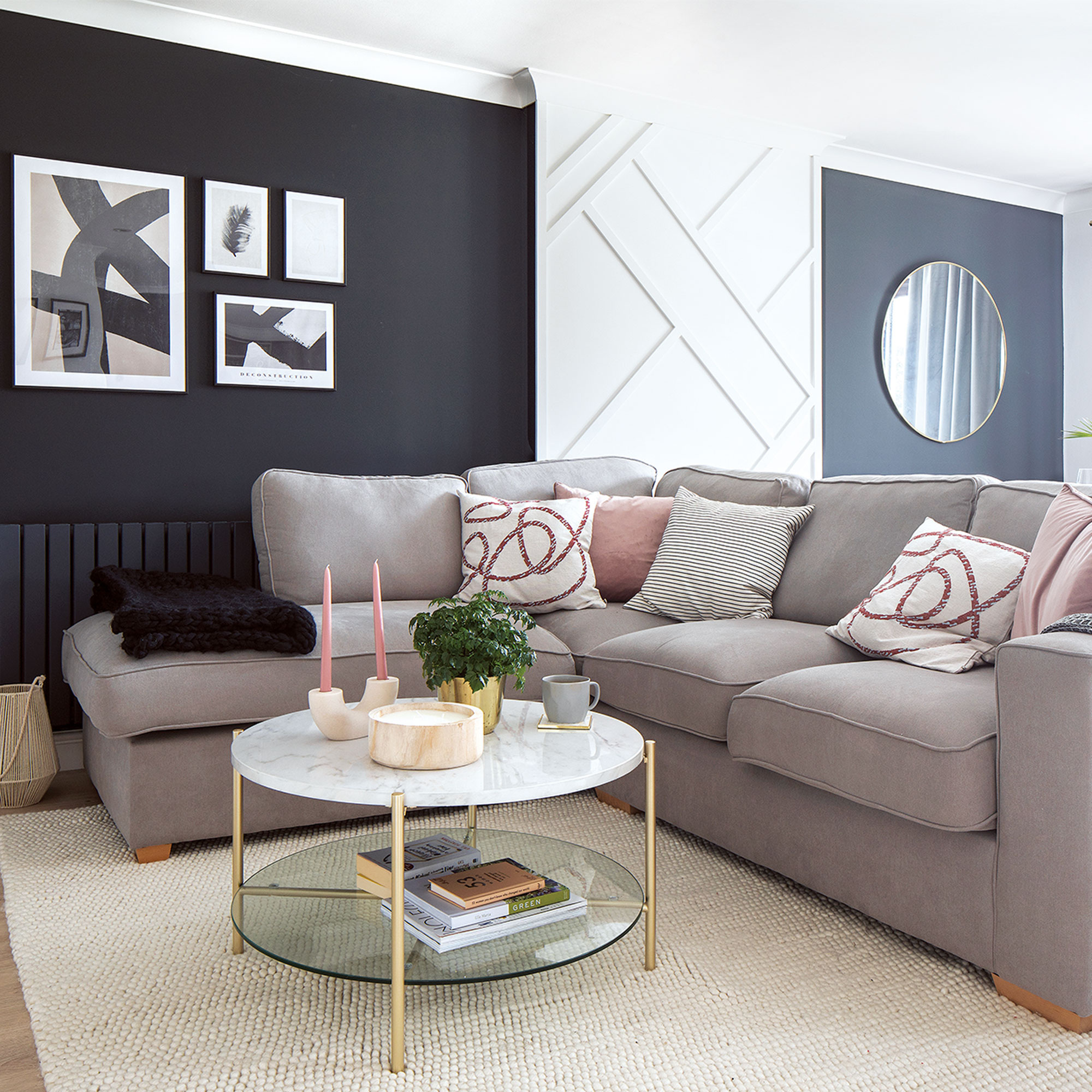
In the living room, the home owners blocked up the existing chimney, soundproofed the adjoining wall and made the striking abstract wall panelling using strips of wooden beading bought from a DIY store and cut to size.
‘The walls are a close shade to the kitchen with a colour-match to Farrow & Ball’s Off Black by the Decorating Centre Online.’
Get the Ideal Home Newsletter
Sign up to our newsletter for style and decor inspiration, house makeovers, project advice and more.
Kitchen
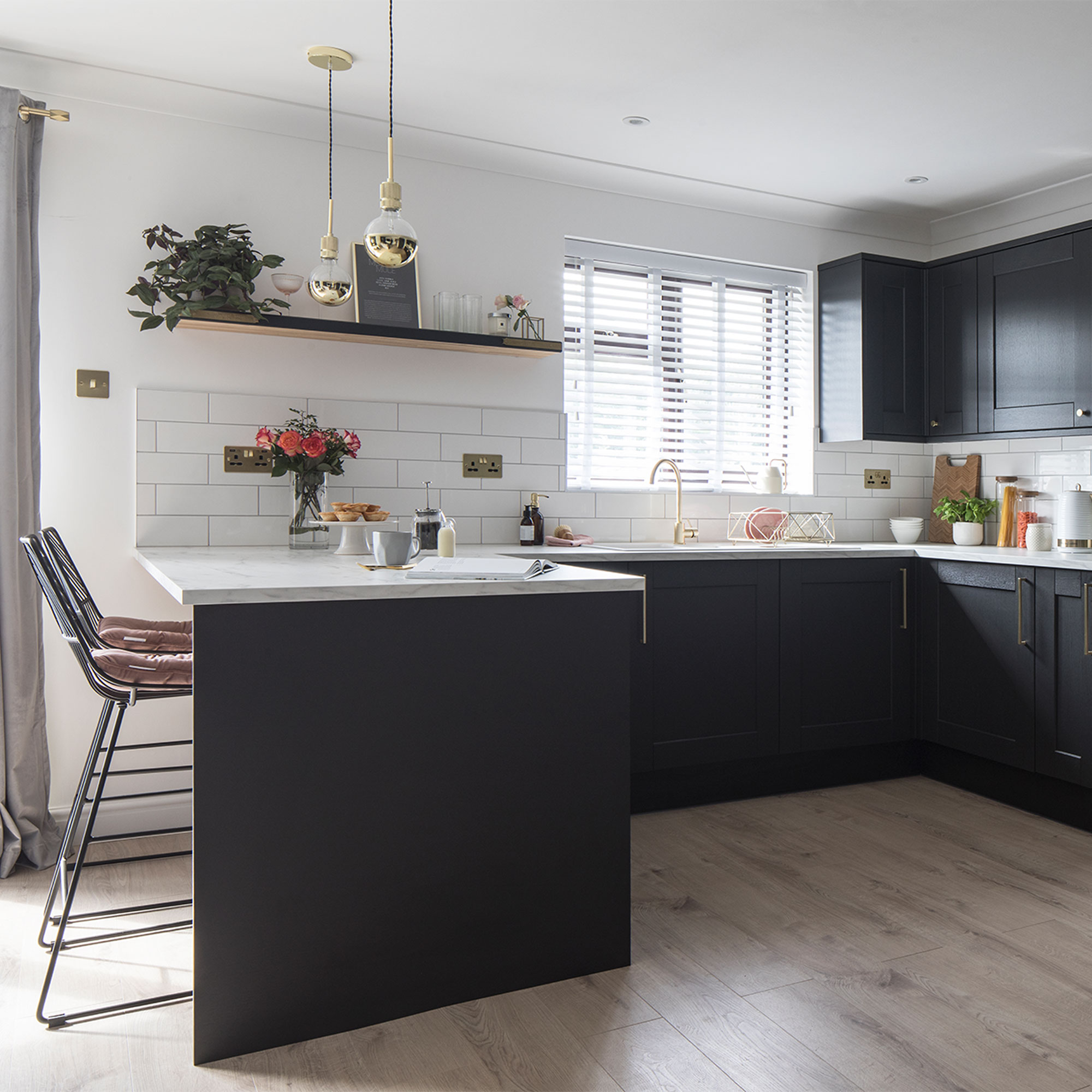
Black makes a powerful neutral in the main living space with charcoal kitchen ideas and black walls that the home owners have balanced with crisp white decoration, a white worktop, white tiles and pale oak-effect flooring.
‘Howden’s Fairford kitchen in charcoal became the starting point in our decorating scheme. The tone’s relaxing and cosy – white would have looked too cold and bright.’
Kitchen breakfast bar
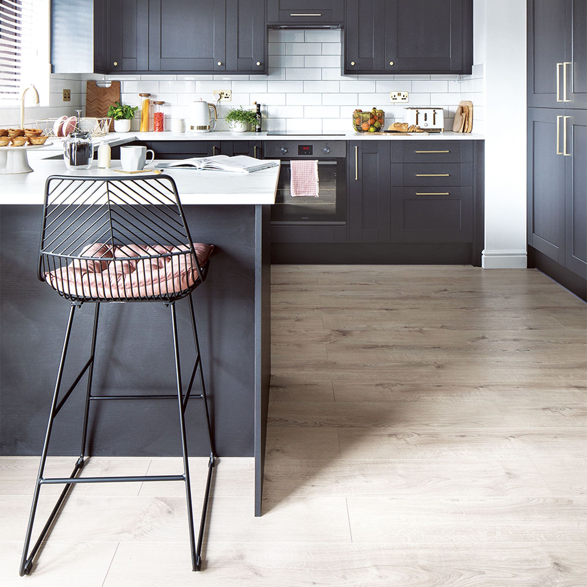
Knocking two rooms together gave the home owners a social space plus a kitchen with a breakfast bar, which they've kitted out with bar stools from Dunelm. They then focused on the details, choosing brushed brass for the tap, handles, plug sockets and radiators fittings, which looks luxe against the black cabinets. For the worktop, the couple chose a marble lookalike.
‘Ikea’s Ekbacken marble-effect laminate is brilliant and only cost £500. I recommend it to everyone!’ adds the home owner.
Dining room
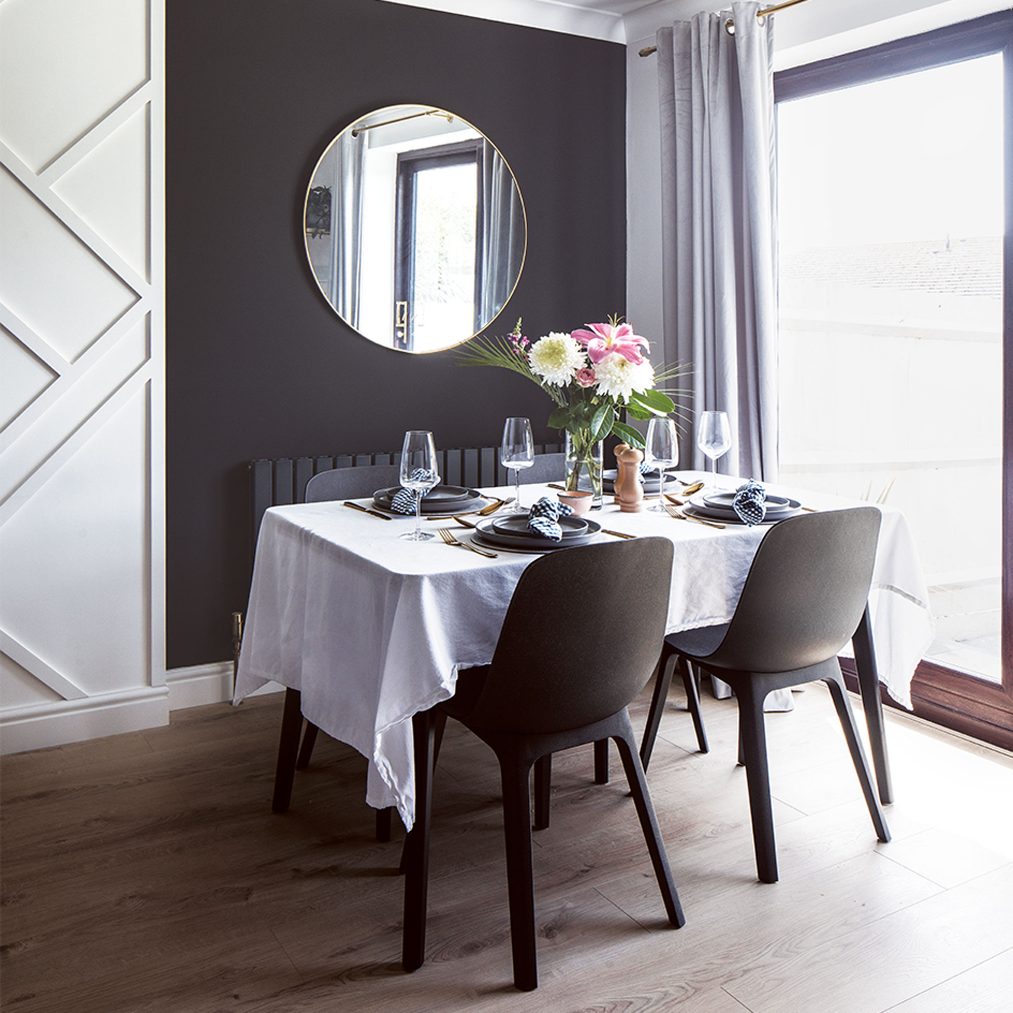
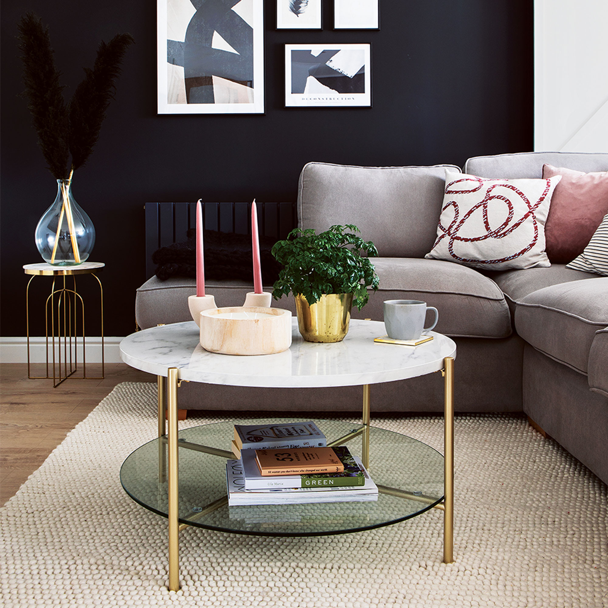
When it came to the decor, the aim was to create a space that was cosy and calm with lots of natural tones and tactile textures against the mainly monochrome colour palette.
‘I’m drawn to neutral colours, but I didn’t want our entire home to be white as it would look too clinical,’ says the home owner. ‘I like to wear black, white and nude clothes and I took a lead from this. We both like dark interiors but nothing too heavy or gothic.’
‘The round brass mirror from Wayfair looks good against the black wall and in the alcove reflects the light and garden,’
Master bedroom
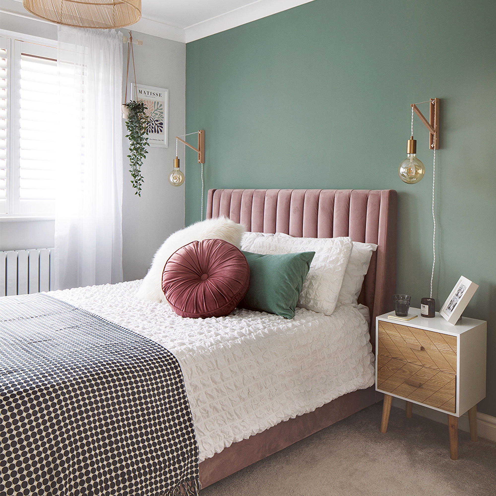
‘We’ve gone lighter in the bedroom ideas and bathroom decor because neither of us are keen on bright colours as that would feel overwhelming and not relaxing,’ says the home owner. ‘Pale grey, light green and dusky pink work because they’re soft, muted tones.’
‘Going to Bali inspired us to buy the rattan lampshade, sheer curtains and plants to make our bedroom feel chilled and tranquil.’
Upholstered bed
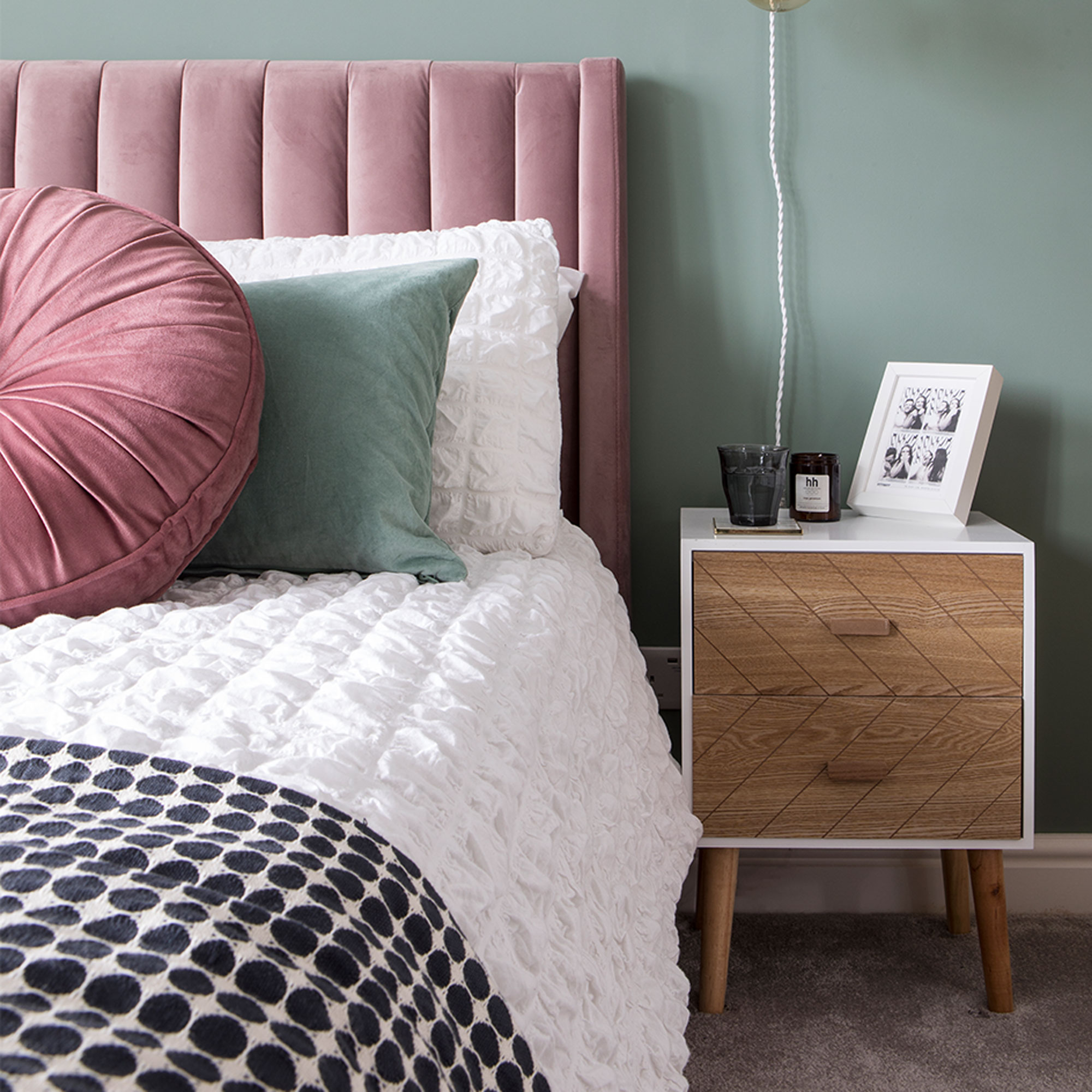
‘The dusty pink Stella bed from Next was inspired by an Instagram account I follow @lustliving and I knew it would look lovely against Valspar’s paint in Shadow Ivy,’ says the home owner.
En-suite
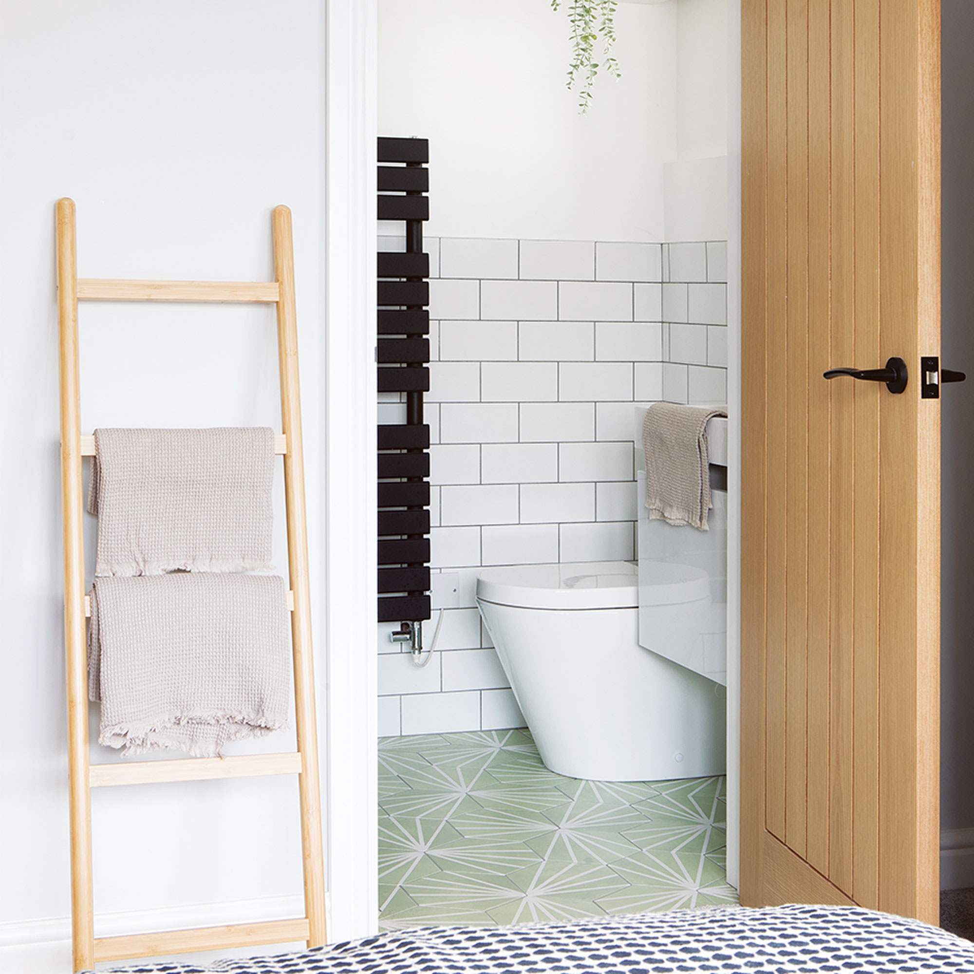
‘When it came to en-suite ideas, I fell for the Hex Waterlily floor tiles from Metro Tiles and carried the shade of green through to our bedroom.’
Bathroom
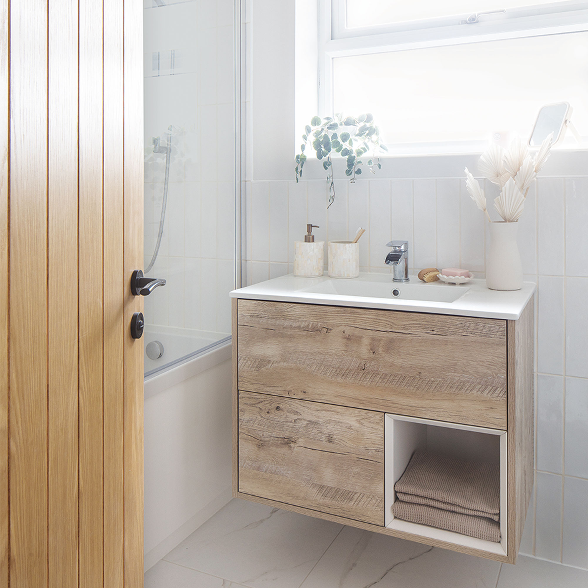
‘For bathroom ideas, to make it feel bigger we laid Porcelain Superstore’s glossy white metro tiles vertically and white marble-effect tiles on the floor.’
‘The textured vanity from the Big Bathroom Shop contrasts with the white tiles. I fell in love with the wood-effect style for its Scandi look.’
Home office
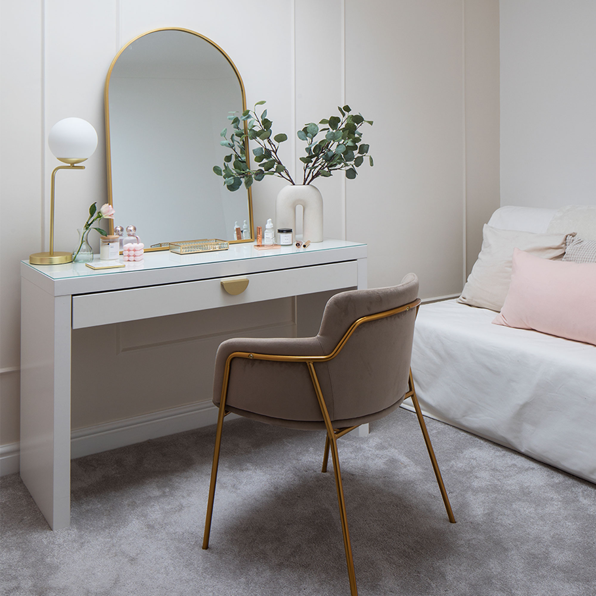
‘We turned our guest bedroom into a home office idea, making wall panels with beading and painting in Coty 1, a nude shade by Decorating Centre Online.’
‘We customised Ikea’s Malm desk with a moon-shaped brass handle from Amazon and found a bargain buy gold-framed mirror from Homesense for £30.’
'We’ve both absolutely loved working on our home, it’s become a real passion. I hadn’t realised how into interiors I would get – I care more about renovation Instagram accounts than fashion now! We’ve become real homebodies and love having friends over for cocktails, a takeaway or a movie night, it’s fabulous.’
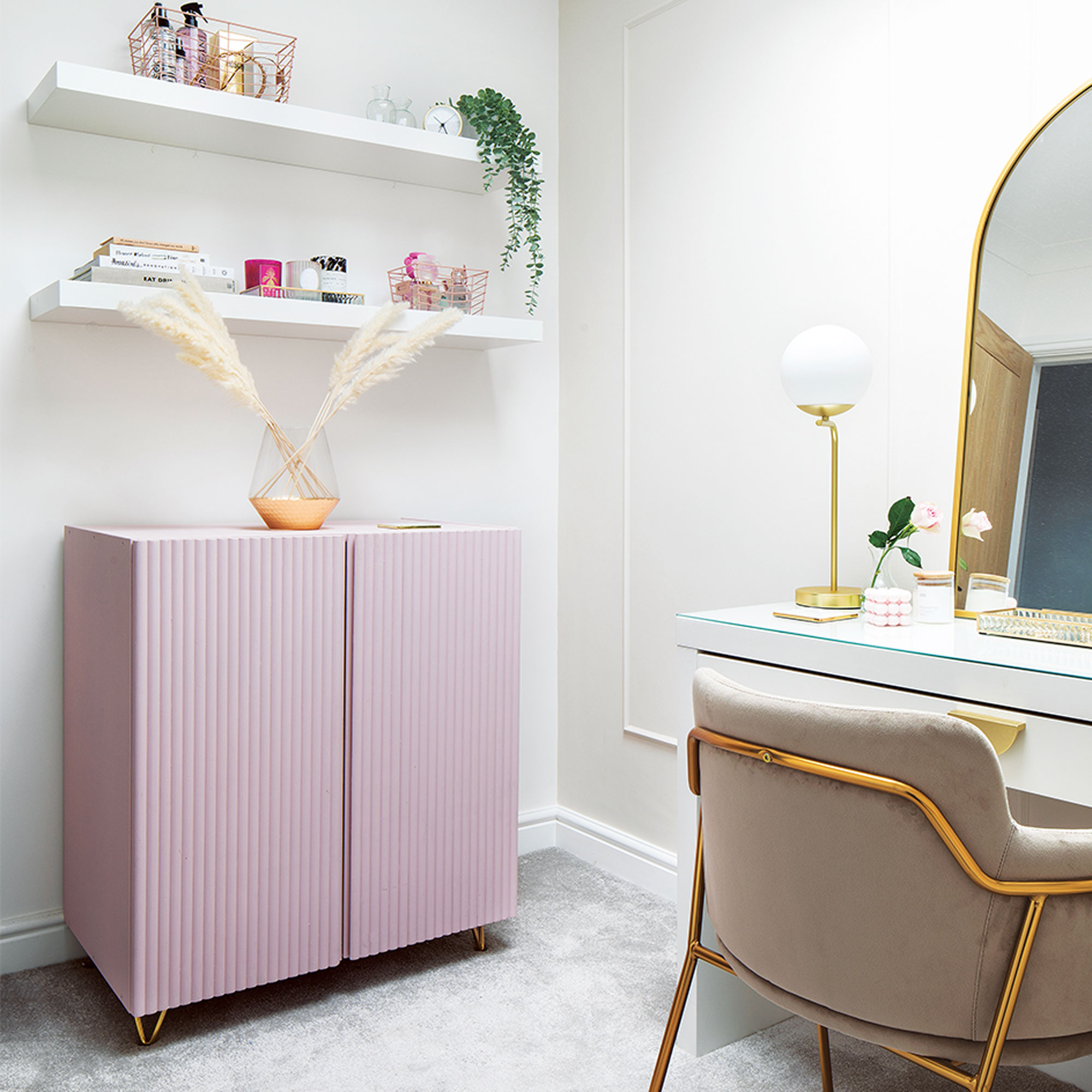
How to customise a cabinet
Here's an easy and inexpensive idea that the homeowners used to give a plain cabinet a luxe new look.
- Start with a second-hand buy or the Ivar cabinet from Ikea. You'll need some wooden dowels in long, thin lengths to decorate the front. The curved profile of the dowels, when cut to size, creates a textured finish to cupboard doors, which can be painted and then finished with handles.
- Start by measuring the door height. Look for a similar dowel length (less wastage) and flat on one side so the pieces can be easily nailed on.
- Then measure the door width. Lengths need to fit snugly side by side so choose the dowel width carefully. Aim for the total width to be the same as the door to avoid tricky cuts.
- Then simply nail gun the dowelling lengths to the doors. Finish off by lightly sanding, then prime and paint the whole unit. Lastly, screw in brass feet.
Additional words Jane Crittenden

Lisa is Deputy Editor of Style at Home magazine and regularly contributes to sister title Ideal Home. She has written about interiors for more than 25 years and about pretty much every area of the home, from shopping and decorating, crafts and DIY to real home transformations and kitchen and bathroom makeovers. Homes and interiors have always been a passion and she never tires of nosying around gorgeous homes, whether on TV, online, in print or in person.
-
 Will a conservatory add value to your home and how can you maximise it?
This is what the pros say
By Amy Reeves
-
 I’ve been looking for a new signature scent for my home and The White Company's new fragrance is the exact summer holiday smell I needed
Santorini smells fresh, summery and sophisticated
By Kezia Reynolds
-
 How to remove algae from garden walls in five steps – and the cleaning product experts rave about for tackling it fast
Experts share their top tips for getting garden walls algae-free
By Katie Sims