'The overall feel is grown-up but a little eclectic' - This renovated terrace house nails modern decorating
This renovated terrace has been given the personal touch with a serene colour scheme and characterful styling

Whether to move or improve is an all-too-common quandary for plenty of homeowners who are beginning to feel a little too cramped in their current property – something that was certainly the case for this homeowner and her husband when they outgrew their three-bedroom Victorian house in East Dulwich.
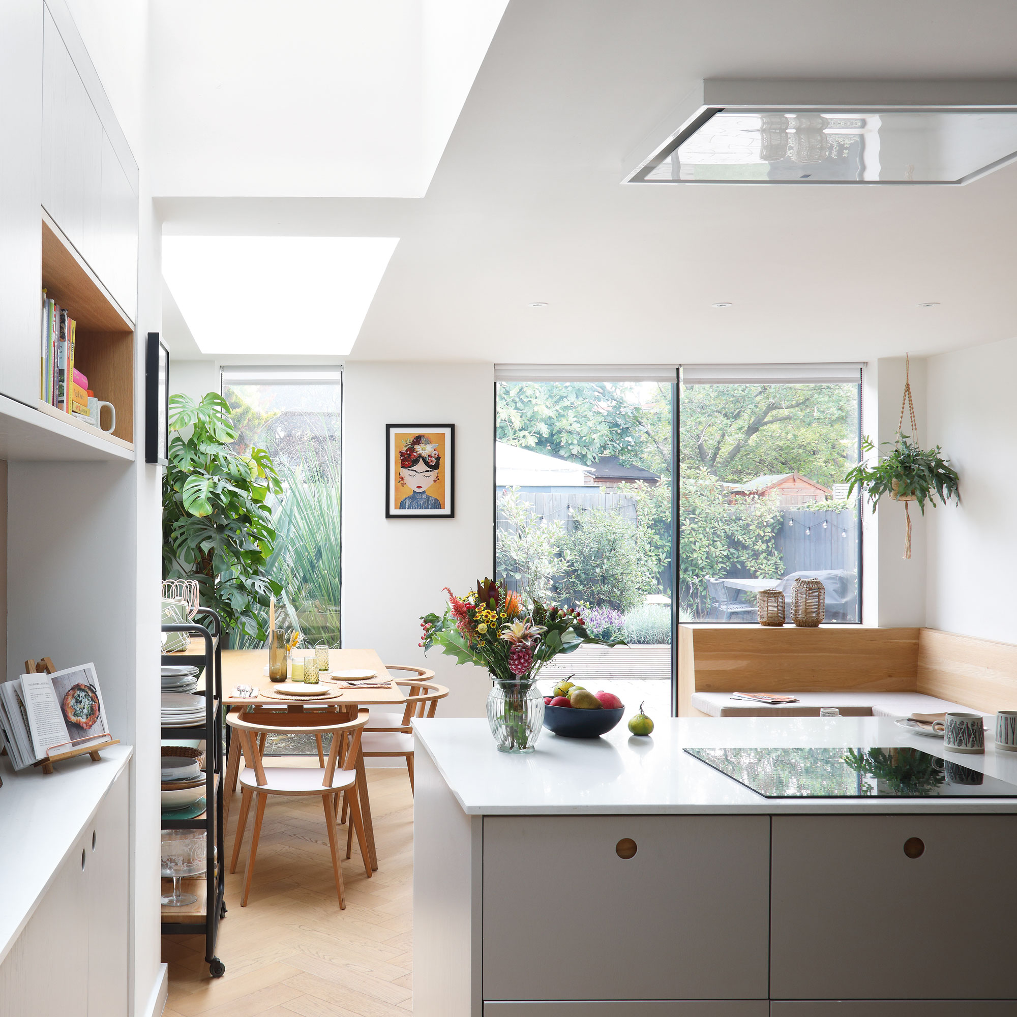
The couple moved to south-east London in 2016, having previously rented in Battersea for several years. ‘We love it here and were keen to stay in the area,’ she says. ‘But we really wanted an extra bathroom, a fourth bedroom and a larger kitchen that was open-plan to the living space.’
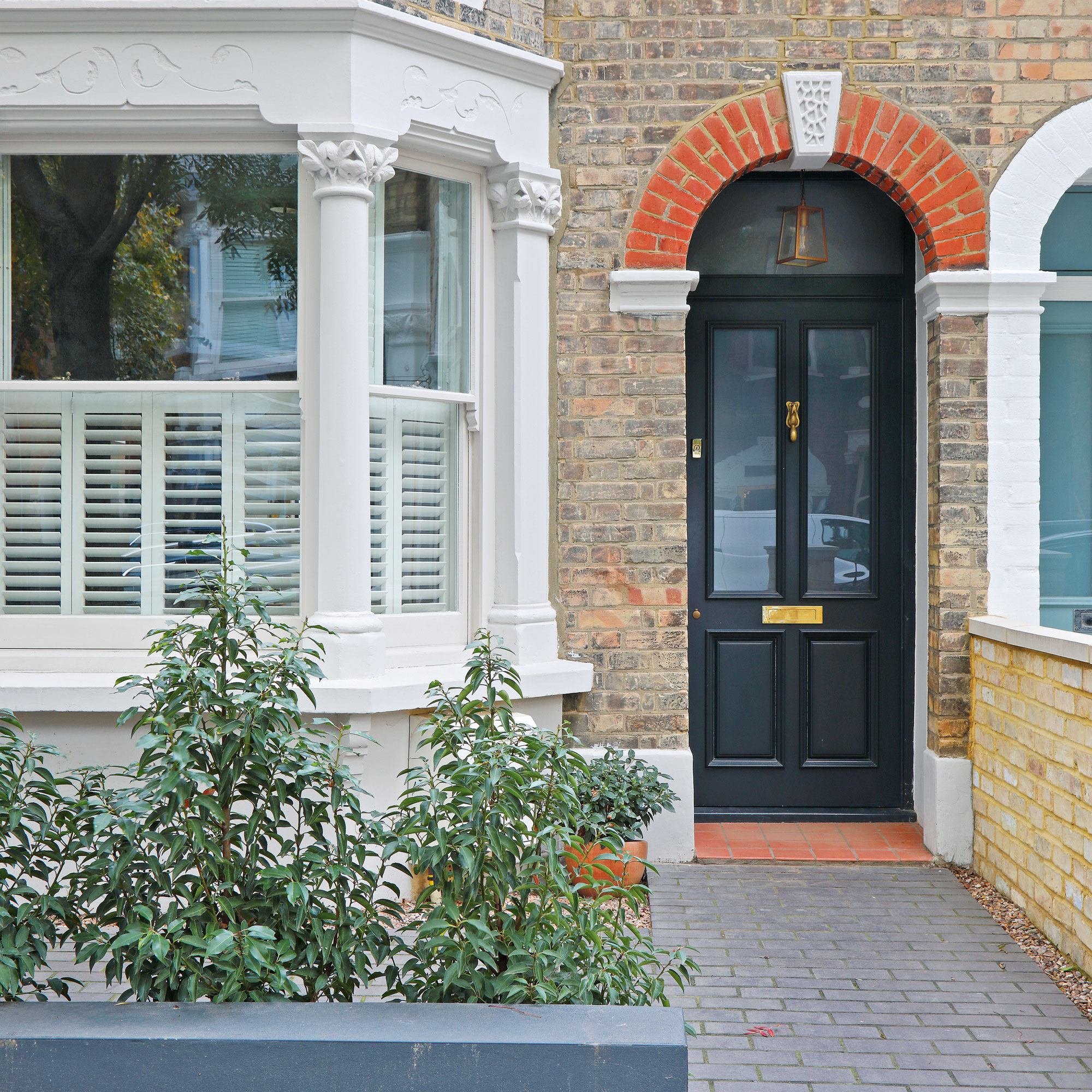
The pair had already spoken to architects about extending their small kitchen and secured planning permission for a loft conversion – but later changed their minds. ‘When we weighed up the costs and the hassle of having to move out while the work was done, it was going to be far more expensive than we’d realised,’ she admits.
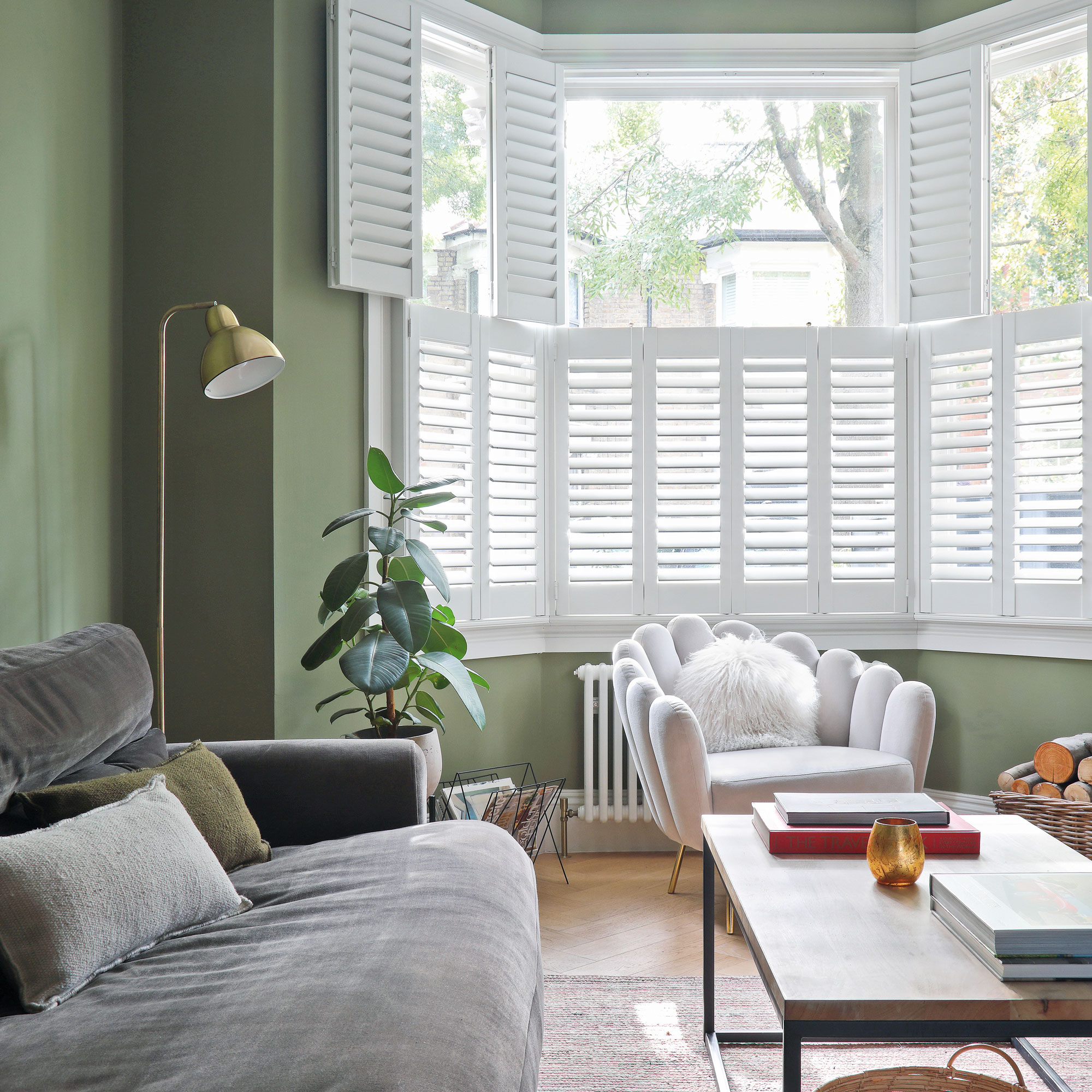
‘So we put our home up for sale, which sold quickly, and found a four-bedroom Victorian house in East Dulwich that had already been renovated and extended. I loved the open-plan living space, and the converted loft was perfect as a dedicated guest space for family and friends visiting from Ireland. It was also in a small, quiet and leafy street, close to amenities and the two train stations.’
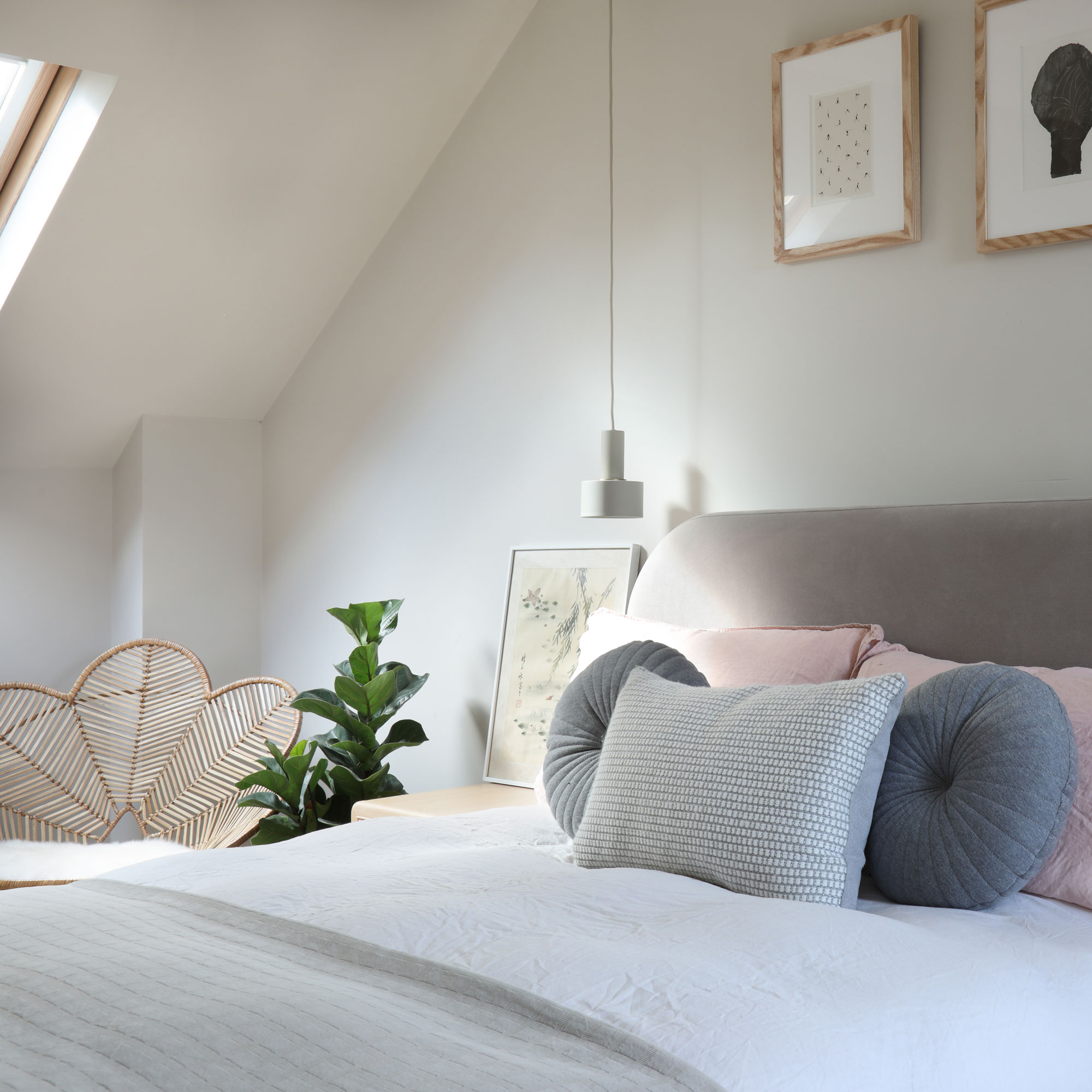
As the previous owners had bought the house with a view to selling it on, the couple were faced with a blank canvas. ‘They’d done a really nice job in terms of the structural stuff and it was staged very nicely, but everything was white so it felt a bit cold,’ she says. ‘Also some of the finishes were obviously not what you would chose for your forever home.’
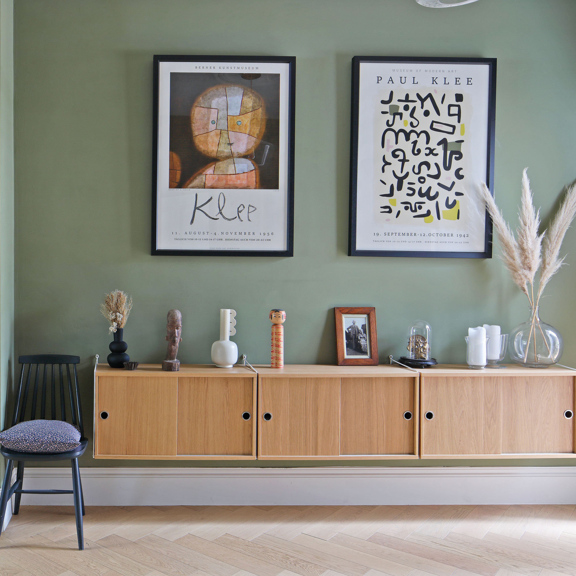
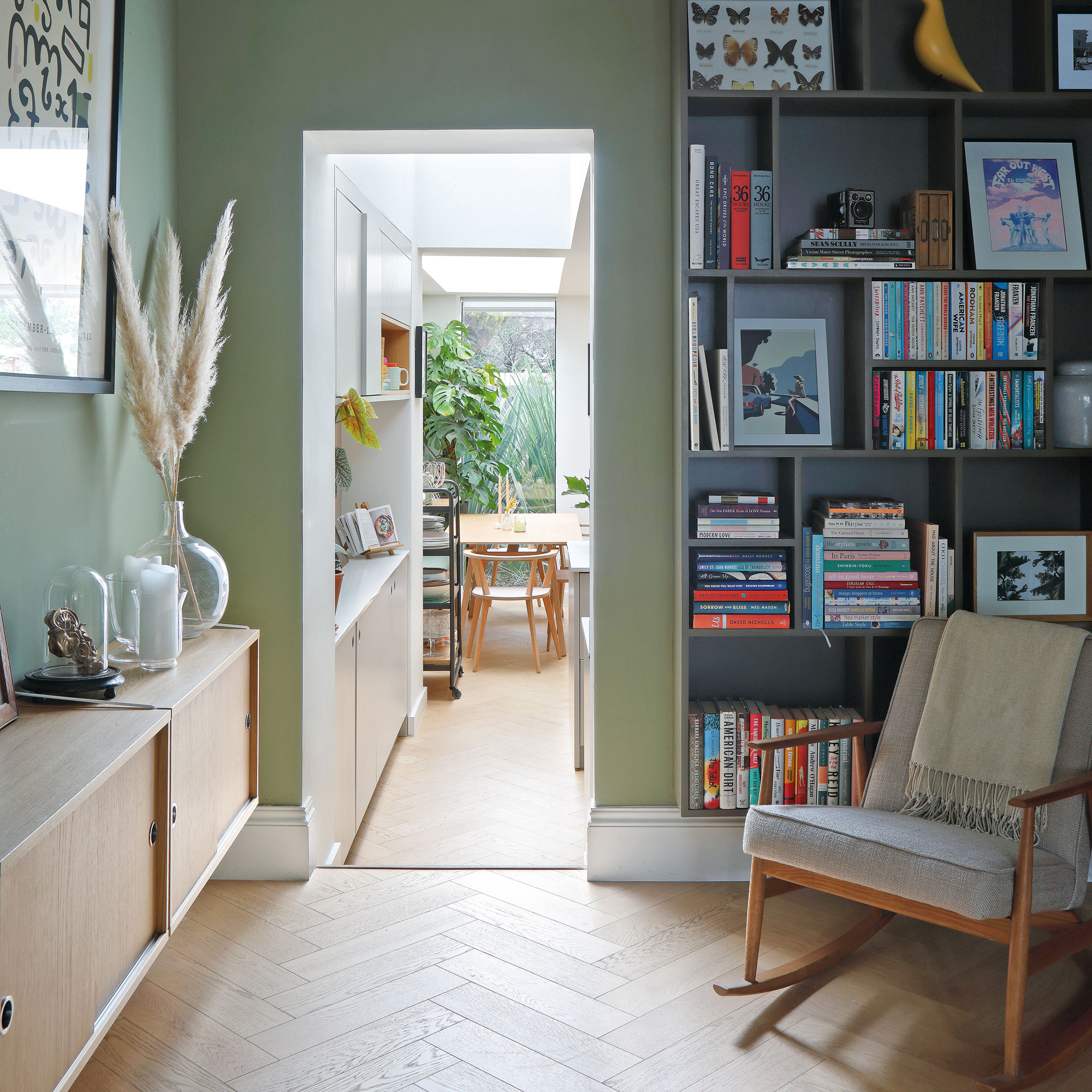
Over the course of the next year, the couple set about putting their own stamp on the house by adding warming colours and making it feel homely with personal artworks, upholstery, furnishings and vintage trinkets.
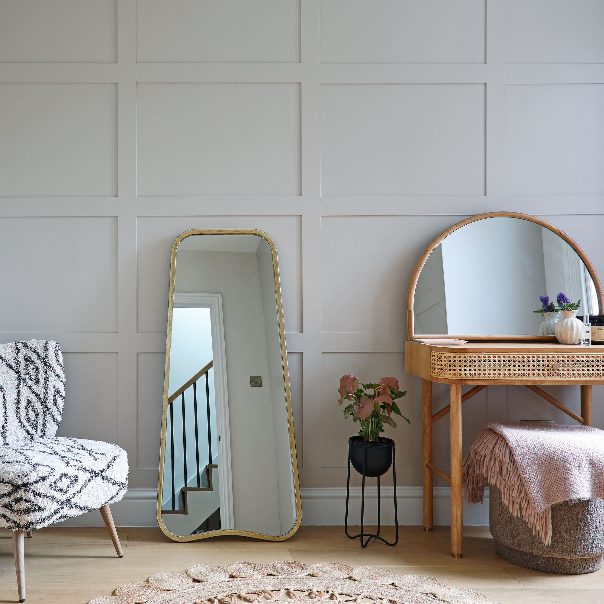
They also added panelled wardrobes in the dressing room, main bedroom and guest bedroom, commissioned a bespoke floor-to-ceiling bookcase for the living room snug and upgraded the kitchen with a new tap, open shelves, tiling and wall lights.
Get the Ideal Home Newsletter
Sign up to our newsletter for style and decor inspiration, house makeovers, project advice and more.
‘When we moved into our last house we didn’t know if we would have children or not. With this house, it has felt quite freeing to design a home with two adults and two dogs in mind, that also has space for entertaining and overnight guests.
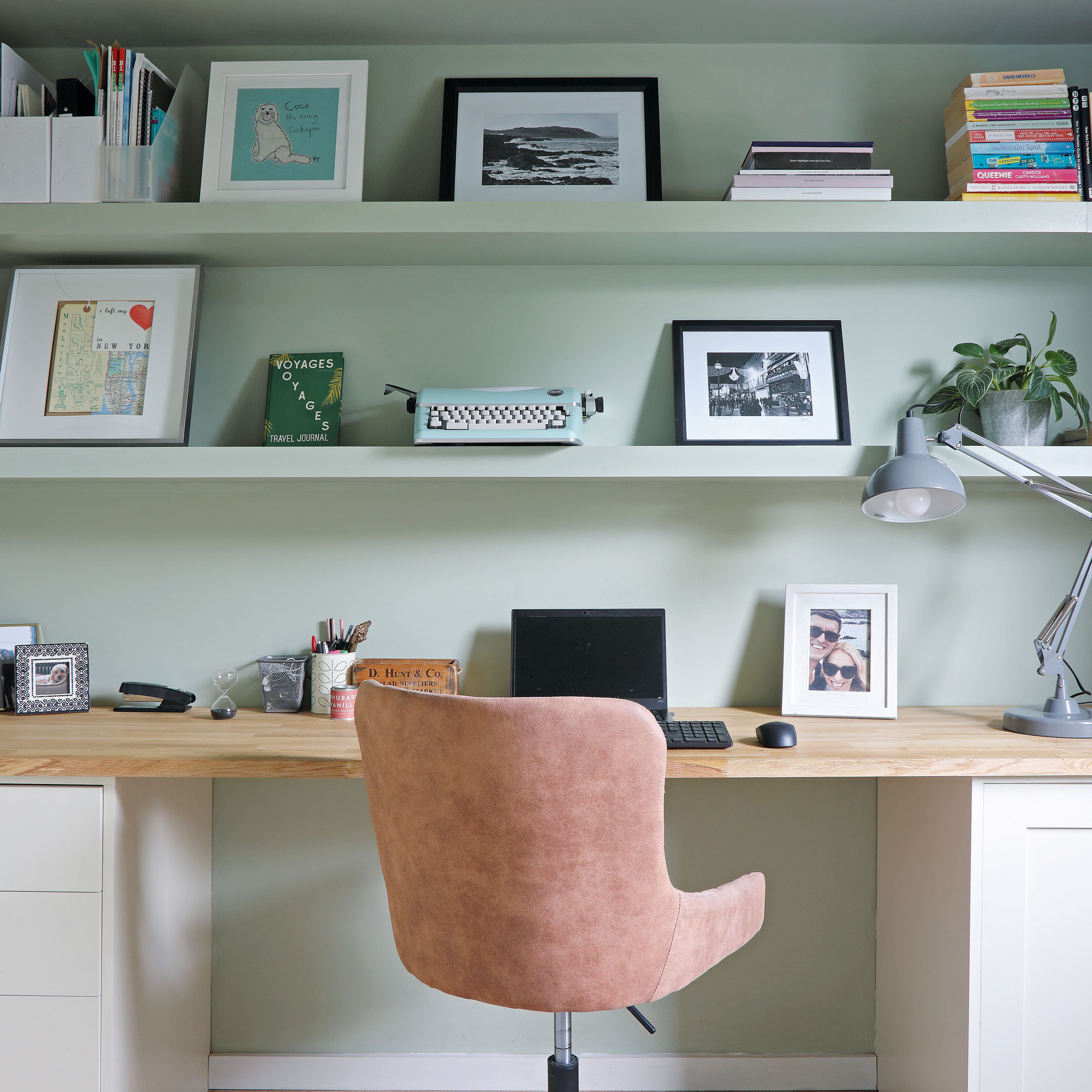
'One of the bedrooms on the first floor is used as my dressing room and yoga space, while a bedroom off the half-landing has become an office where we can both work from home on alternating days. The extended open-plan kitchen is definitely the room we spend the most time in together, though.’
Buying new pieces of furniture to mix in with items from their last home has certainly been more fun than dealing with extensive building work. ‘In our old house, everything was a little bit more Victorian in style and quite vintagey. We’ve had to adapt our style a little bit,’ she explains.
'Although this house is also Victorian, it’s definitely more modern in parts, so we’ve gone for a design mix of contemporary and vintage here. The overall feel is grown-up but, at the same time, a little bit eclectic.’
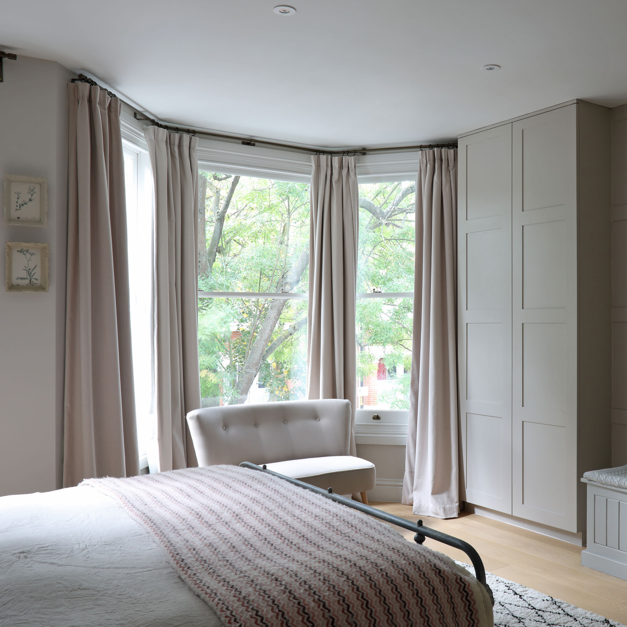
The couple loves combining items from bigger stores like Anthropologie, West Elm, Graham & Green and Rose & Grey, with unique pieces from small, local, independent shops like Maison Curate, iyouall, Jo’s House and Design Vintage.
‘Most rooms have some pieces that are meaningful to us or artwork that reminds us of our travels,’ she says.
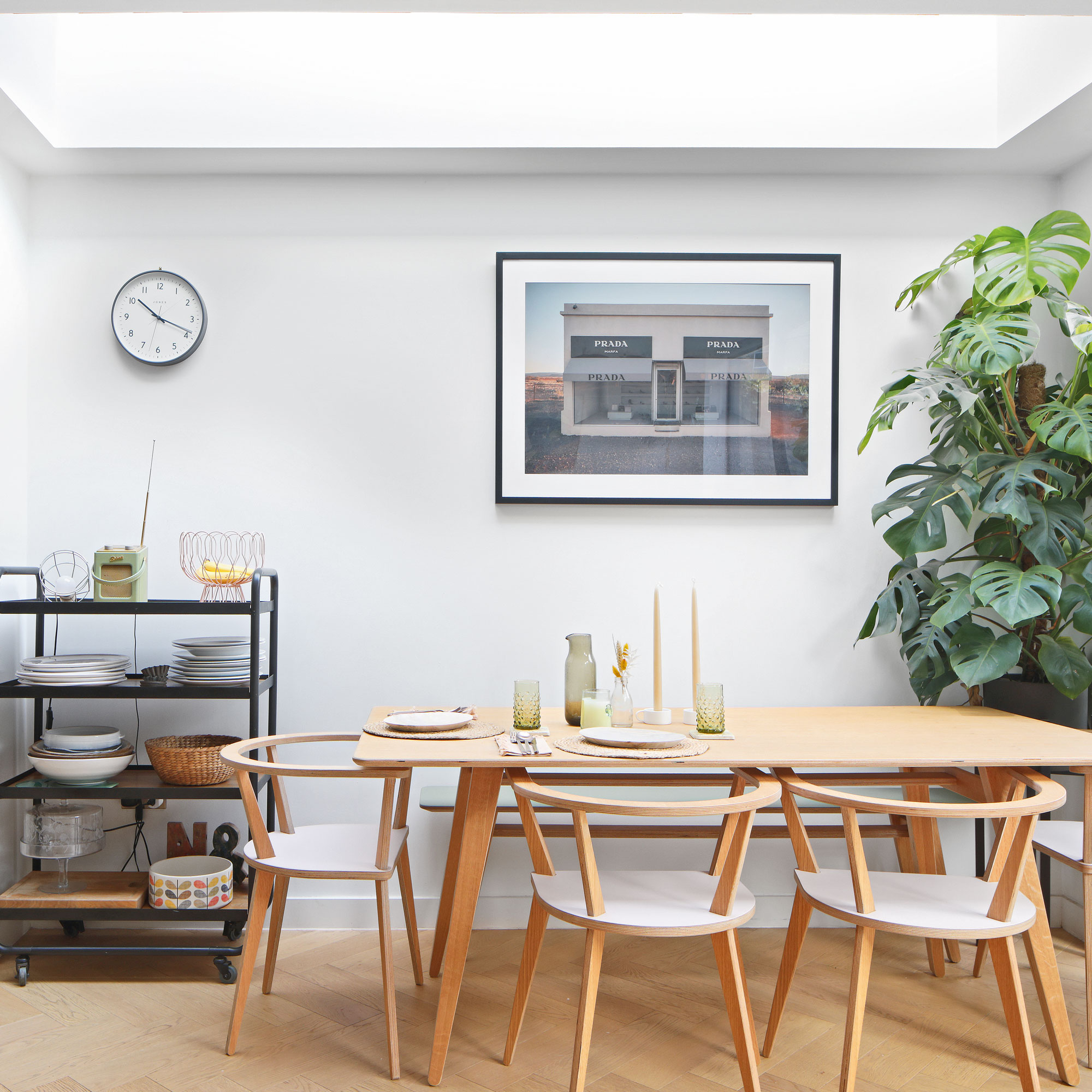
Even with a mix of eras to contend with, there’s a definite thread that runs through the décor – a clever touch that demonstrates the homeowner's design confidence. ‘The colour scheme is quite cohesive with a mix of warm neutral tones, including greens and pinks, alongside natural wood and brass finishes,’ she explains.
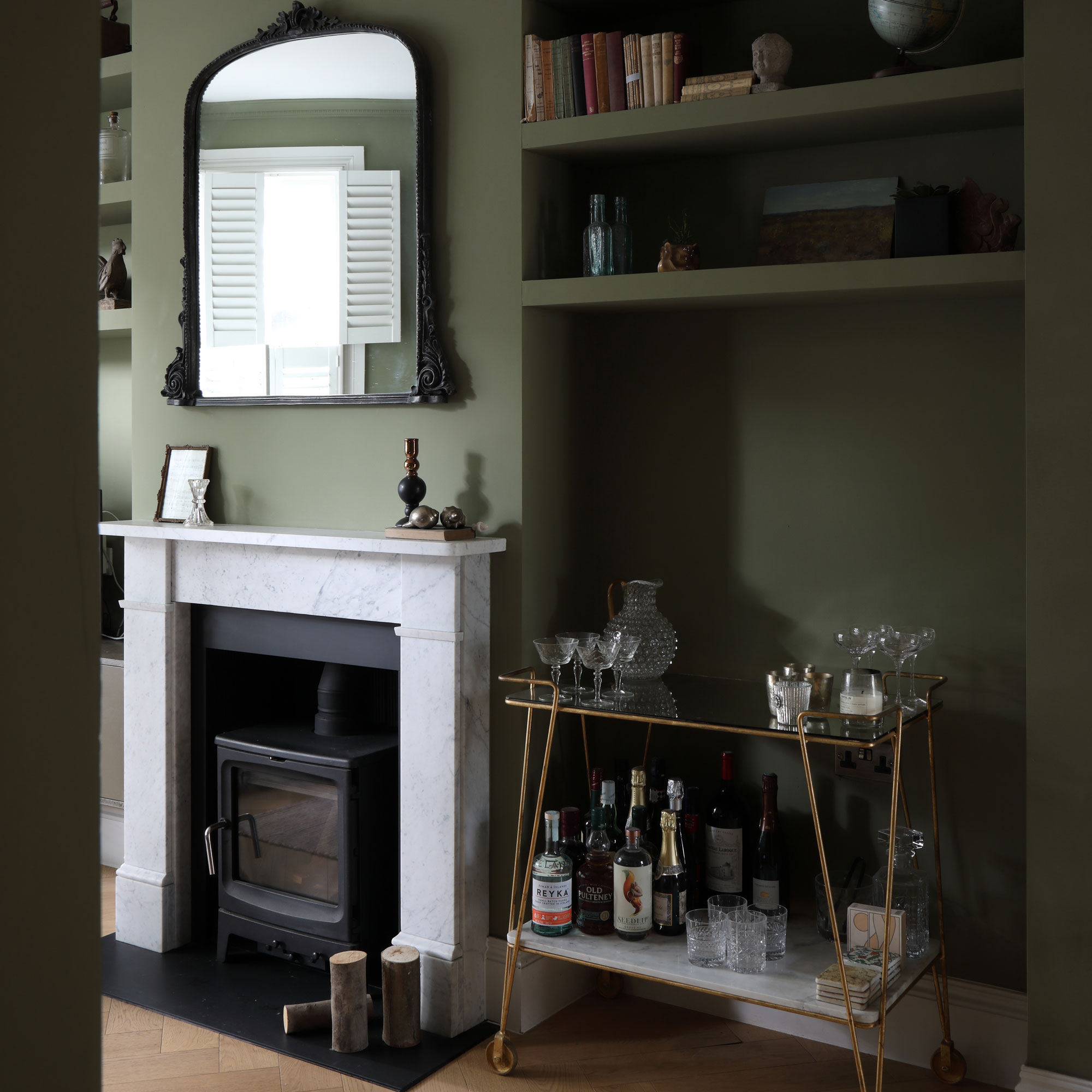
The pair have been boldest in the double lounge, which includes a snug area in the middle of the house. ‘When planning a space, I always ask: what’s the mood I’m trying to evoke?’ she says ‘This room gets the least light and is mostly used in the evenings, so we embraced that with a deep green colour, which makes it feel super cosy.’
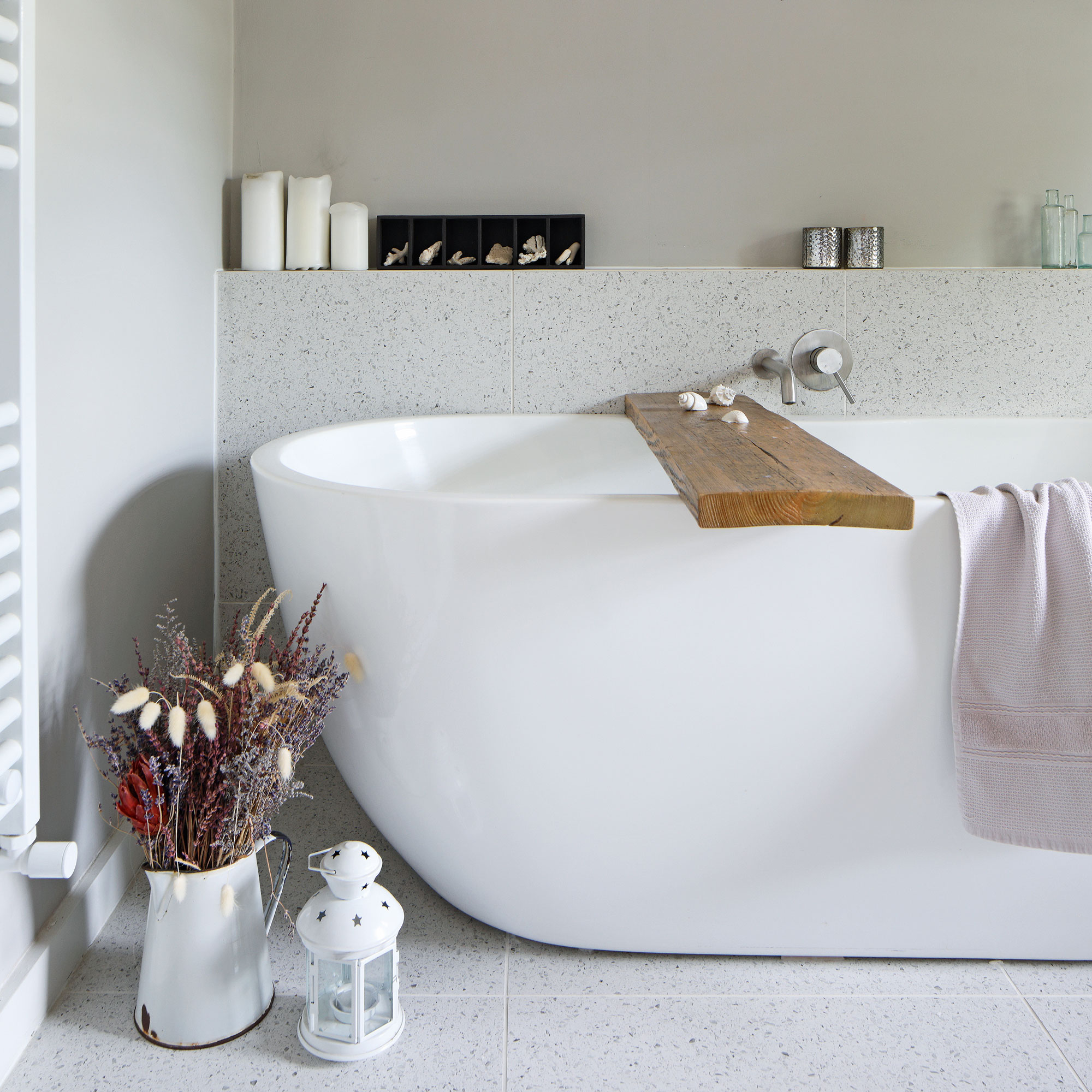
By taking her time and putting together mood boards for each space, she has avoided costly mistakes. ‘In our old house I bought some pieces of furniture that didn’t work and I ended up selling them, so I’m much slower to buy things these days,’ she says. ‘Something might look nice in isolation but doesn’t always work when you bring it into the room.’
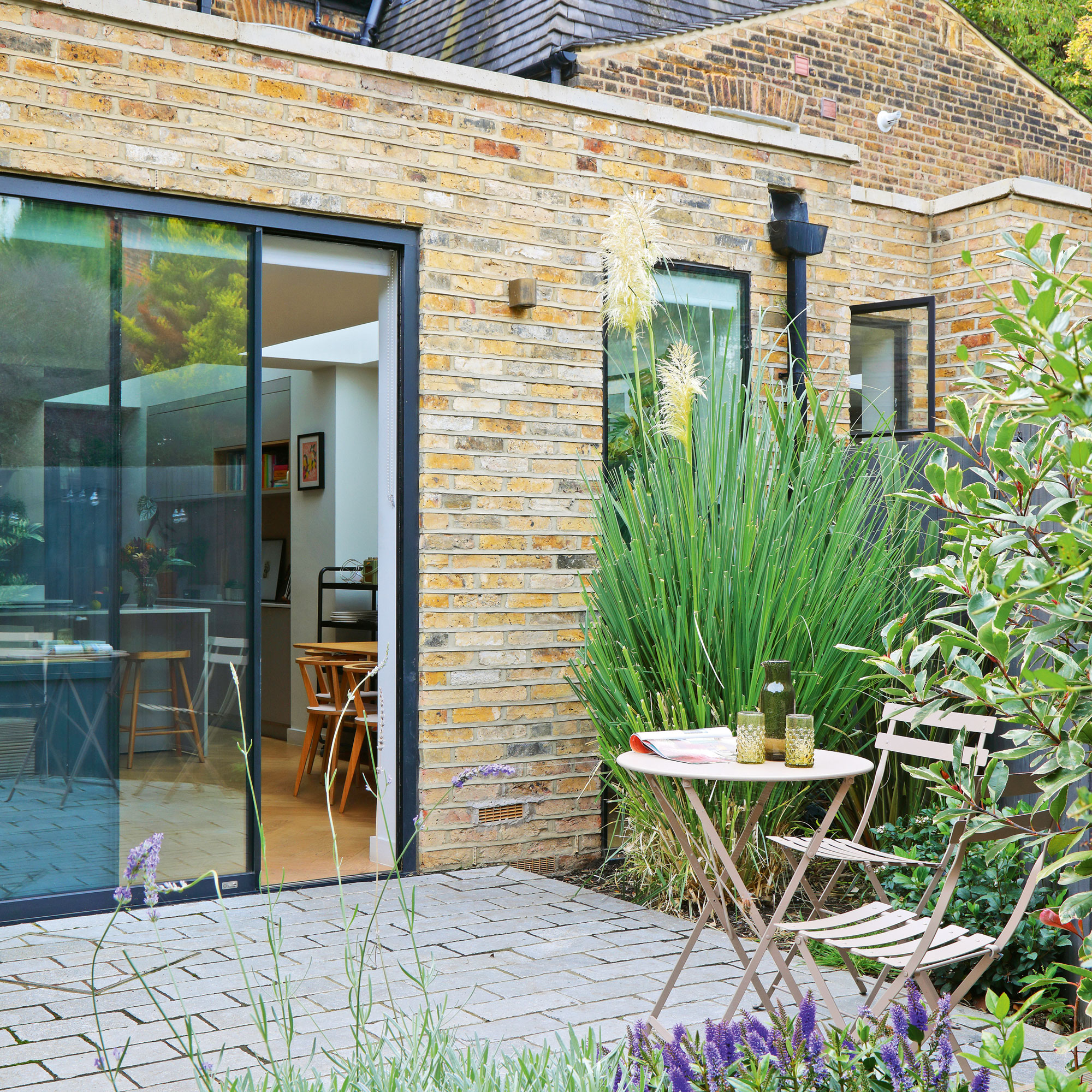
Although one day the couple would love a second place in the countryside – or perhaps even in France – they’ve no plans to move from this friendly corner of London for the foreseeable future. ‘It’s such a lovely community here,’ she explains.
'This neighbourhood has heaps of independent shops and cafes, and everything is on our doorstep – I’m not sure we would find that mix anywhere else. This home feels like the perfect oasis for us to enjoy it all from.’
-
 5 signs you’ve taken decluttering too far — and how you can pull yourself back, according to organisation experts
You might have to start resisting the urge to purge
By Lauren Bradbury
-
 What is the Party Wall Act 3m rule and is it something you should be worried about? This is what the experts say
Don't get caught off-guard by the Party Wall Act 3m rule — our expert guide is a must-read
By Natasha Brinsmead
-
 Shoppers can’t get enough of The Range’s lemon tree, but I’ve found an even cheaper bestseller at B&Q - it’s perfect for a Mediterranean look
Welcome the summer with this glorious fruit tree
By Kezia Reynolds