‘Our house is full of second-hand finds – we call it cost-of-living chic!’
This eclectic family home is packed with quirkiness and sociable spaces
Lisa Fazzani
Moving into this 1950s U-shaped bungalow in Buckinghamshire, the home owners found it beautifully preserved with retro features and a stunning central courtyard garden, but despite the wonderful vintage vibe, it lacked any mod-cons and the place was full of narrow corridors and pokey rooms.
‘When we decided to make the move back to our home town in Buckinghamshire, we were instantly attracted to this vintage bungalow, just a few streets away from my parents,’ says the home owner.
‘Its unusual U-shaped layout meant it had a cute courtyard in the centre, and we could imagine ourselves sitting out there enjoying al-fresco meals. And while the retro features, like the parquet flooring in the living space, were a dream, I knew that once we started our renovation, we could inject it with our playful and energetic style.’
The kitchen
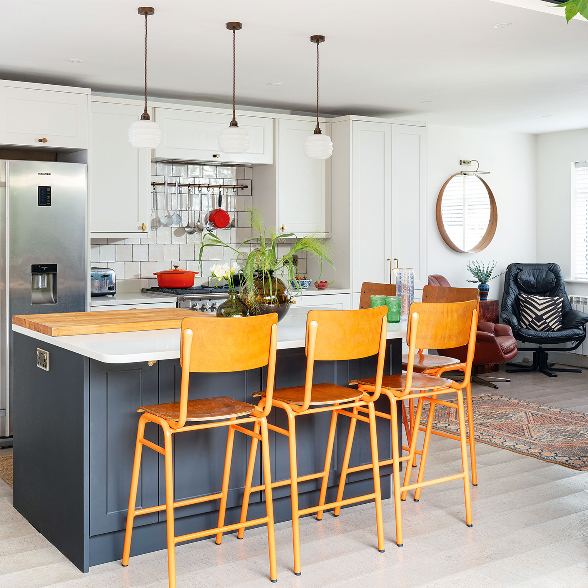
‘The bungalow was totally unmodernised with dark, narrow corridors and pokey rooms. Our first job was to knock the corridors out and join all the rooms together to create an open-plan kitchen-diner that connected to the living room.'
'We decided to leave the original fireplace wall so we could have a TV on one side in the living area. However, just recently, we’ve knocked the fireplace through and added a double-sided wood-burning stove so it can be enjoyed on both sides. It creates such a lovely ambience in the kitchen and dining space.’
‘We would have loved a polished concrete floor, but the cost meant we opted for eco-friendly cork flooring instead, which is super cosy underfoot and creates a warm balance against the light units and marble worktop.'
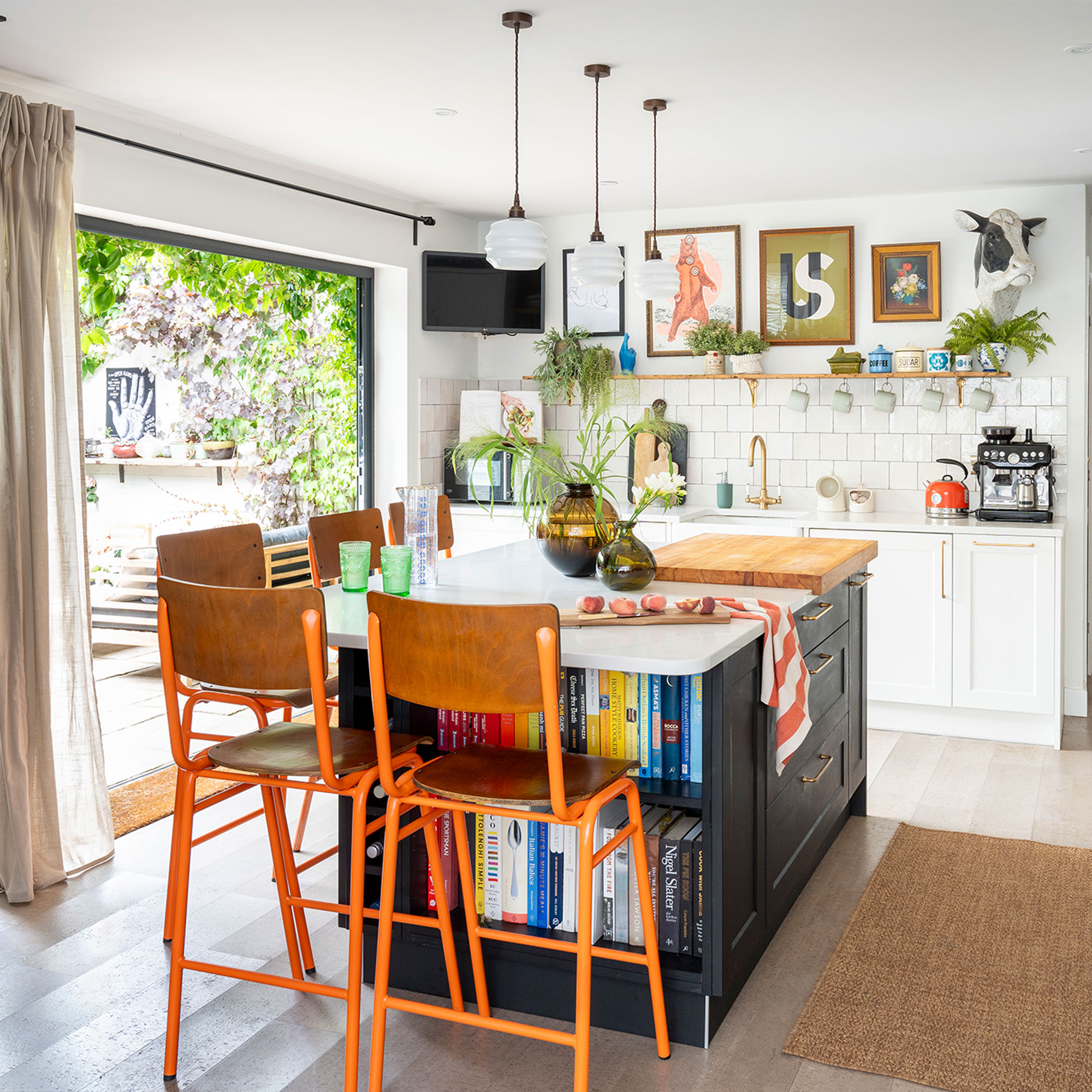
‘Creating a large, open-plan space for the kitchen-diner meant we could have a big kitchen island in the middle and somewhere for us to eat at, too. The bi-fold doors onto the courtyard were also a brilliant addition and we spill out into there on warm days – it’s become a natural extension of the kitchen.’
Sign up to our newsletter for style and decor inspiration, house makeovers, project advice and more.
‘If we hadn’t been on such a tight budget, I would have picked a trendy plywood kitchen that I could have repainted when I wanted a change, but as it was, we had to buy the kitchen on finance, so we went with one from Wren Kitchens, which our builder then installed.'
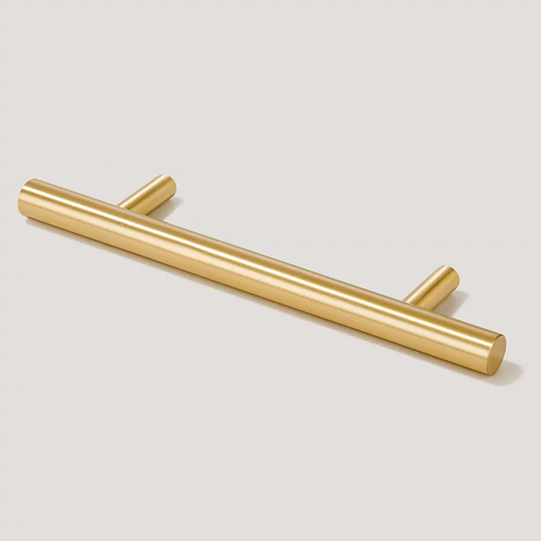
'We made the most of what we could afford by teaming pale units with dark cabinets at the island as a focal point and adding timeless brass handles.’
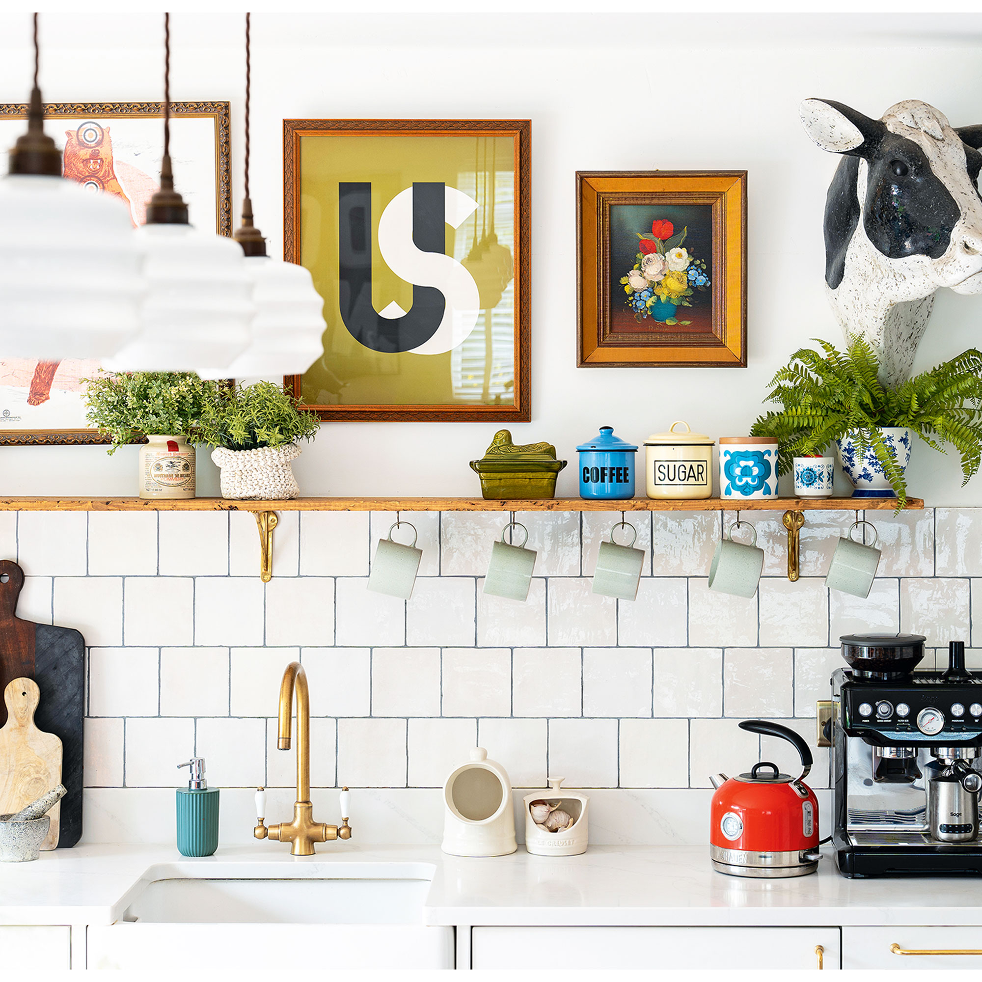
'To add a punch of colour, I painted some retro-style stools in zingy orange, and then dotted further elements of orange around the room to add energy,' says the homeowner.
'To add a classic touch, we chose a brass swan-neck tap at the kitchen sink and continued the timeless feel with brass shelf brackets and brass cabinetry handles.’
‘I love the old café-style lights – they bring a lovely vintage feel to the space.’
The courtyard garden
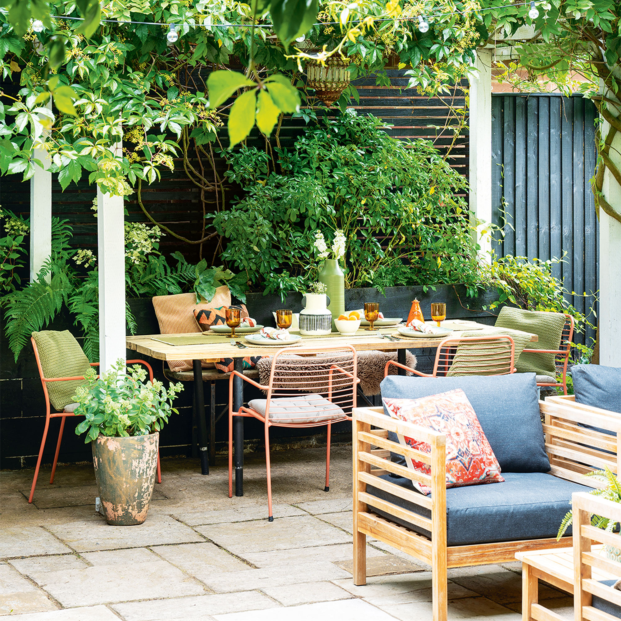
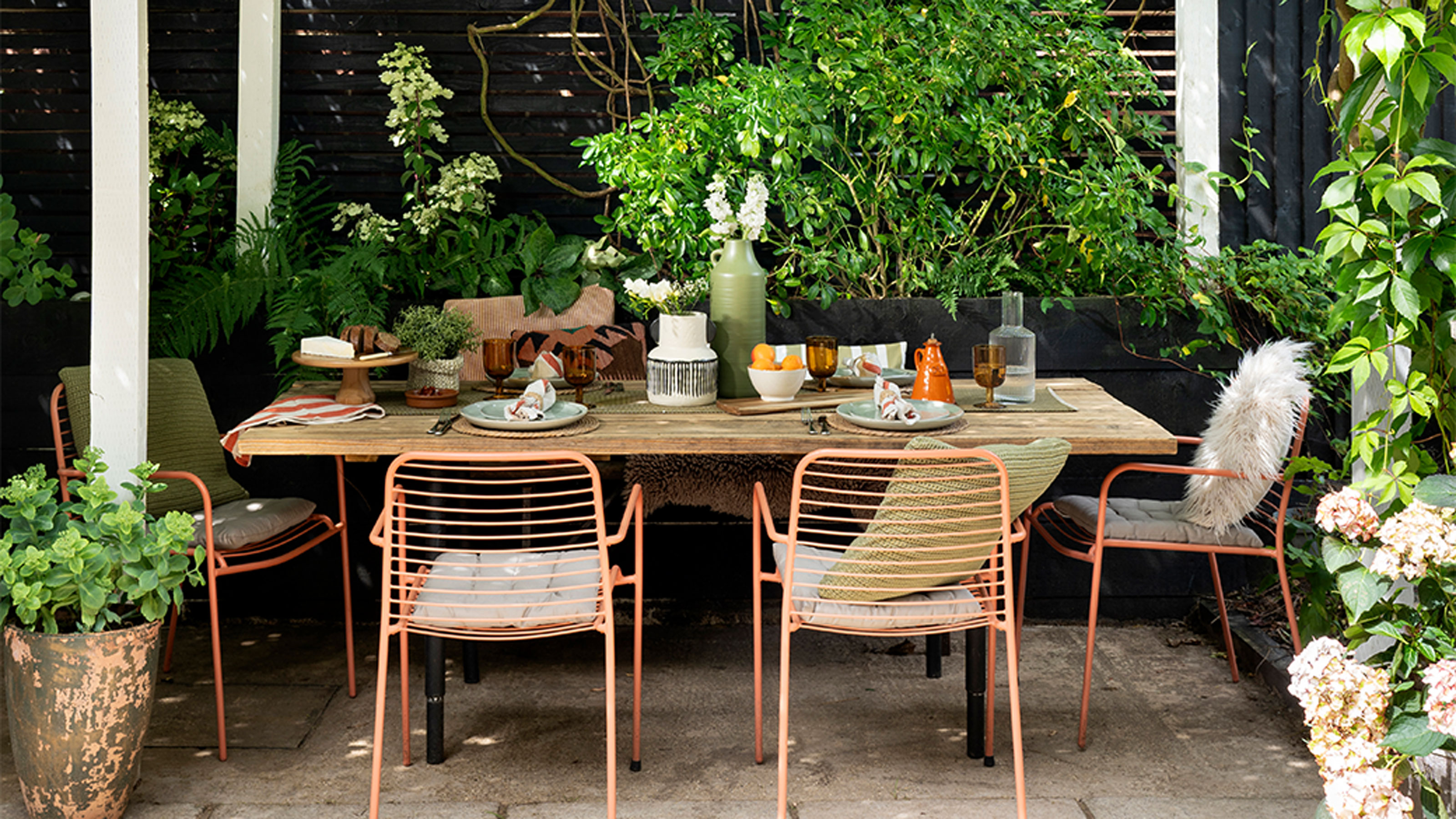
‘As we can’t see the back garden from the front of the house, it’s lovely being able to watch the seasons change in the courtyard, with the pretty wisteria flourishing across the pergola in spring, and then the lush green ferns and hydrangeas blooming in the summer. We’ve kept it quite rustic out here, with a dining table made of scaffold planks and vessels salvaged from all over the place.’
‘We have, however, invested in good garden furniture that is comfortable and will stand the test of time. I do like to splash out on certain items that I know we’ll use a lot, however, I then combine them with second-hand things for a relaxed look. A smart, polished look wouldn’t suit this house. I prefer a worn feel, adding old pieces and rustic materials that wear gracefully.’
The living room
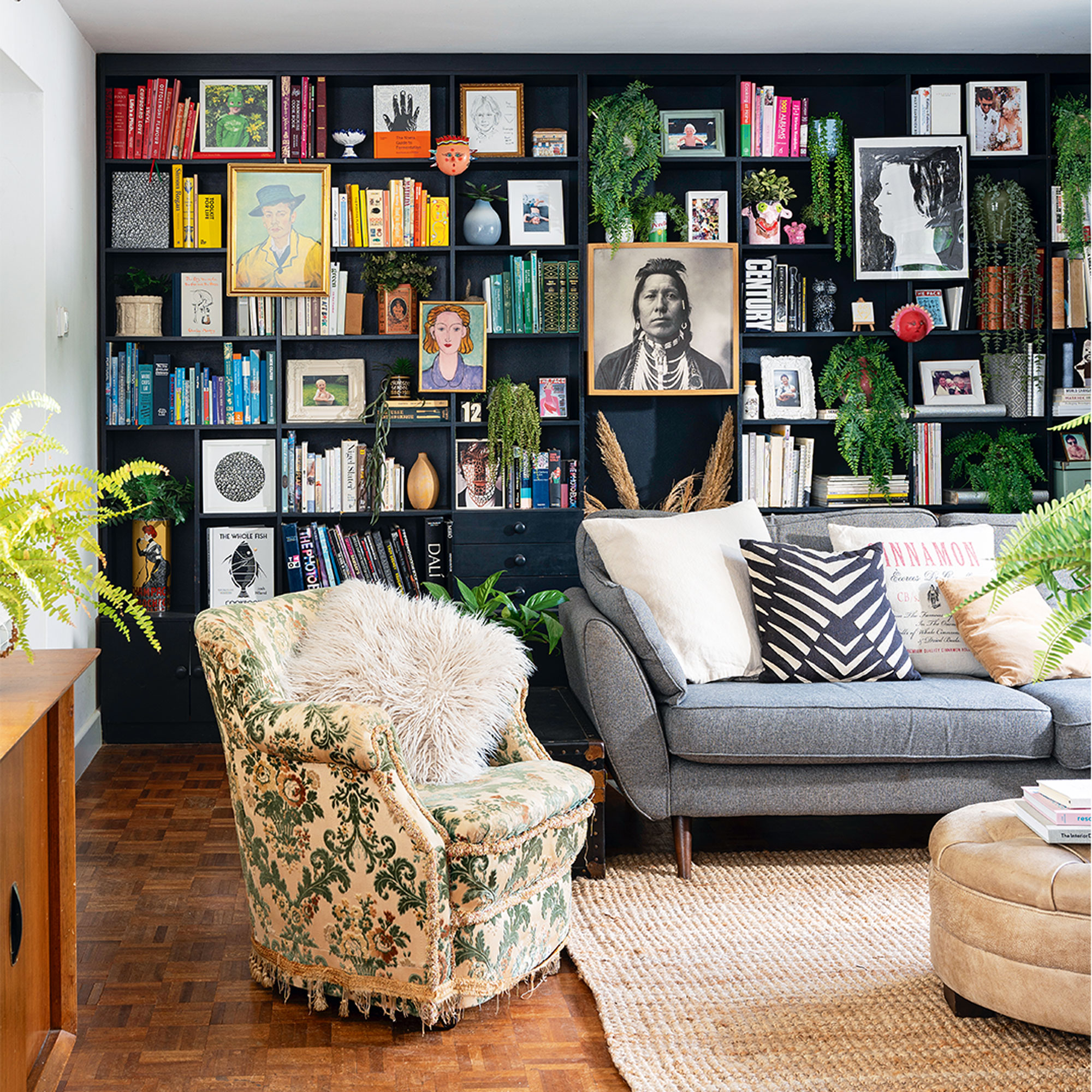
‘Before having children, I was a graphic designer working in branding and identity. Then when I had the boys, I decided to go freelance and start my own bespoke print company Burnt Peach. Initially, I was designing kids’ portraits in a bold, graphic way that would bring a modern edge to people’s homes, but then more and more people asked me to design one-off typographic prints to match their interiors, and my bespoke service evolved into a graphic wall print company.’
‘I now display my prints in almost every room, either on the wall or lent on shelves, as they blend perfectly with all my vintage treasures and keep the space feeling contemporary. I also like adding blocks of vibrant colour on the walls to bring focus to wall displays.’
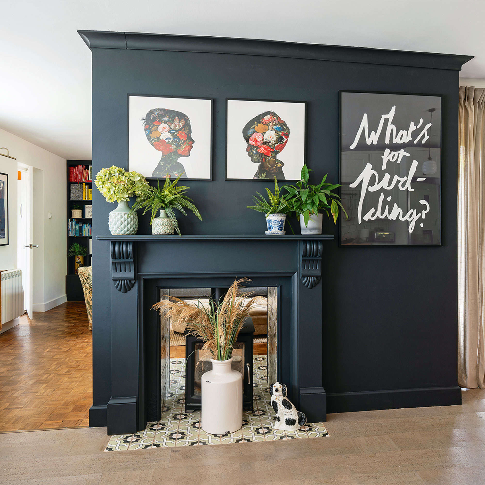
‘It’s fair to say I’m addicted to charity shops and Facebook Marketplace. My husband and the kids never know what they are coming home to as I’m always adding new finds, moving furniture, or restyling the spaces. I particularly love re-arranging the objects on the shelves in the kitchen, living room and our bedroom, as well as switching around the prints so I can try out my new designs.’
‘It gives me a lot of satisfaction to change things up and give things a new look, which is handy as I’m pretty good at DIY. I recently tiled the hearth around the fireplace, and I also gave the shelf in our bedroom a Shou Sugi Ban look by beating it up with a hammer and adding browning wax.’
The garden office
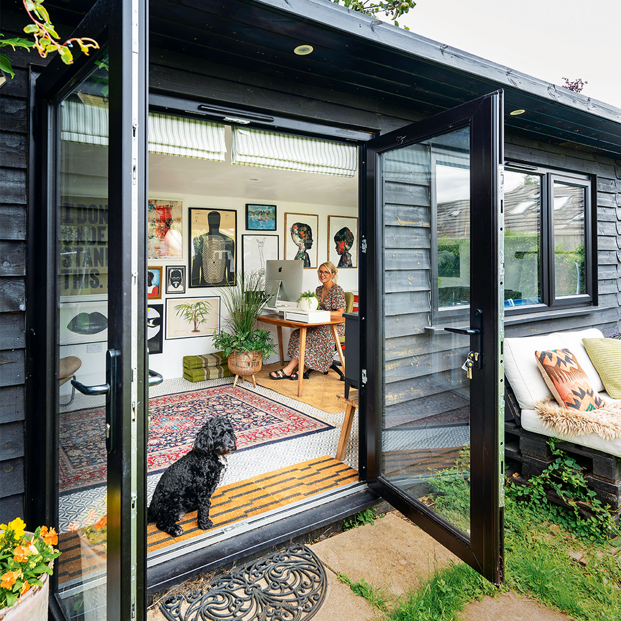
‘A recent addition has been the garden office where I create my designs for my print business. I’ve given the cabin’s interior a similar vibe to the house with tons of prints on the walls, second-hand furniture scattered around and an old orange Formica unit from the bungalow’s original kitchen.’
‘I’m planning to change the wall display in here soon – no surprise there! – and I’m sure the house will also continue to evolve as I scour the internet for more vintage bargains.’
The living and dining area
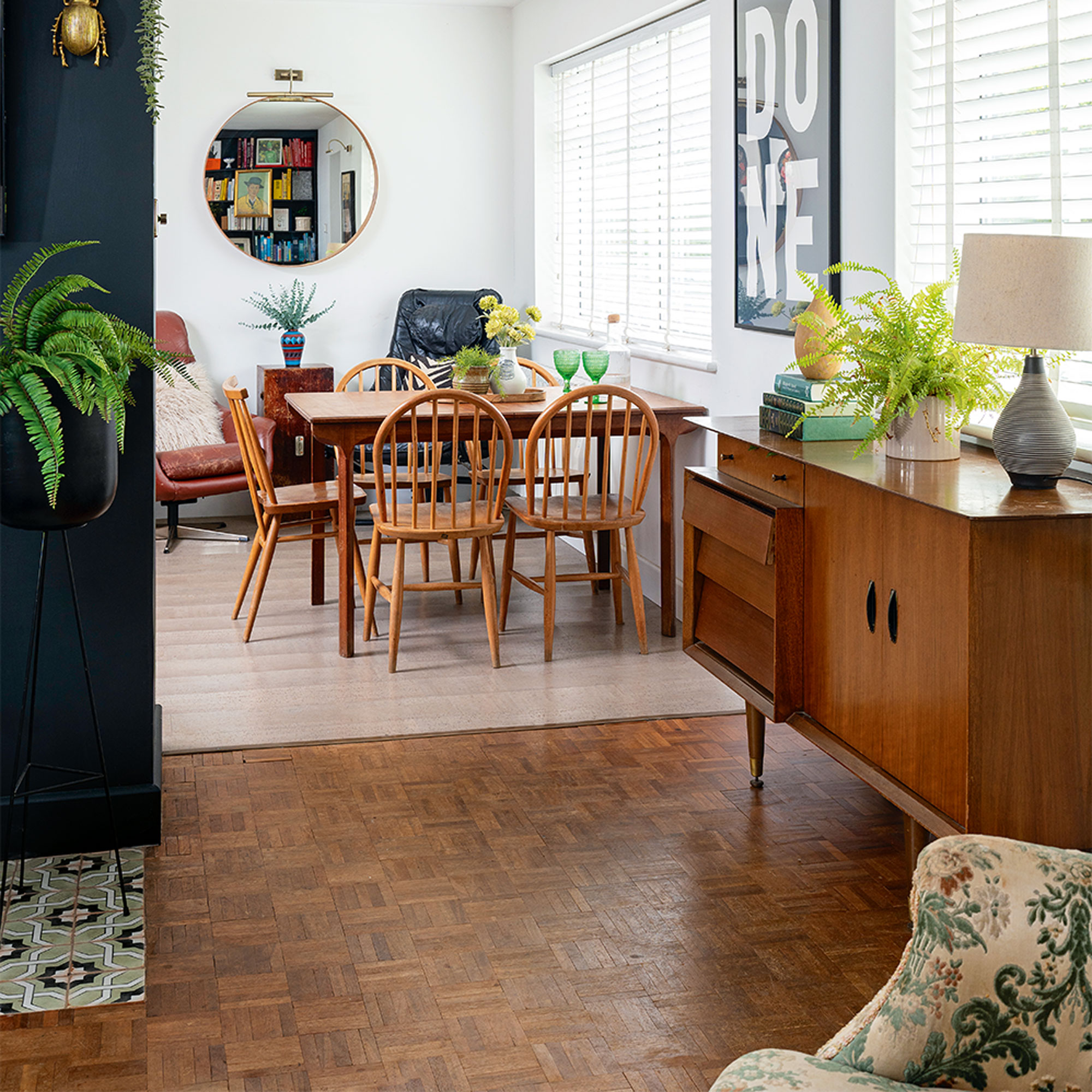
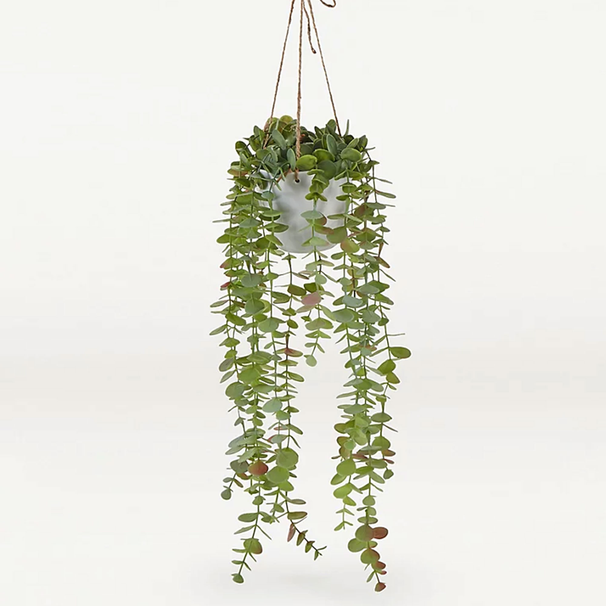
'I can’t do without faux plants and flowers. I love greenery but I can’t keep real plants alive, so I make do with fake ones. I style them up in vintage pots from charity shops and move them around the house. They are brilliant for adding instant colour and shape to boring shelves or corners.’
‘We’ve kept many of the bungalow’s original features, such as the gorgeous parquet flooring in the living room. It works perfectly as a foil for my random mix of second-hand finds and modern buys, like the vintage armchair, 80s leather footstool and Ikea jute rug.’
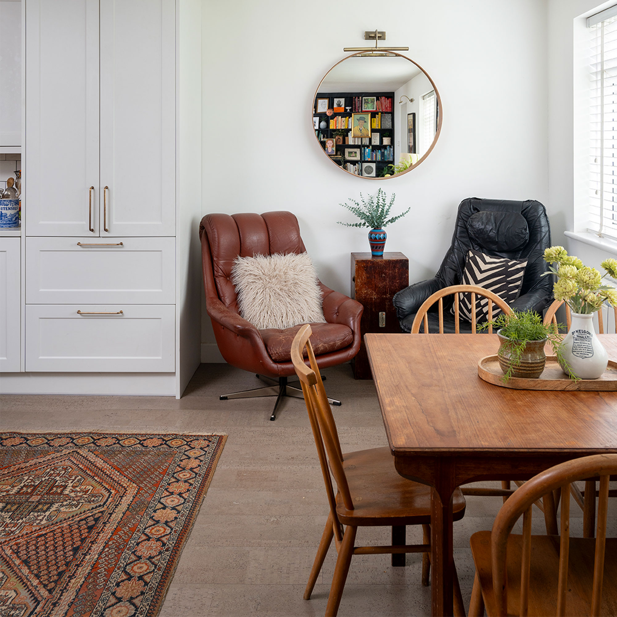
‘Originally there was a corridor here, leading from the living room to the dining area, so we knocked it through to open the space and added practical cork flooring from the Colour Flooring Company to define the kitchen dining area.’
The master bedroom
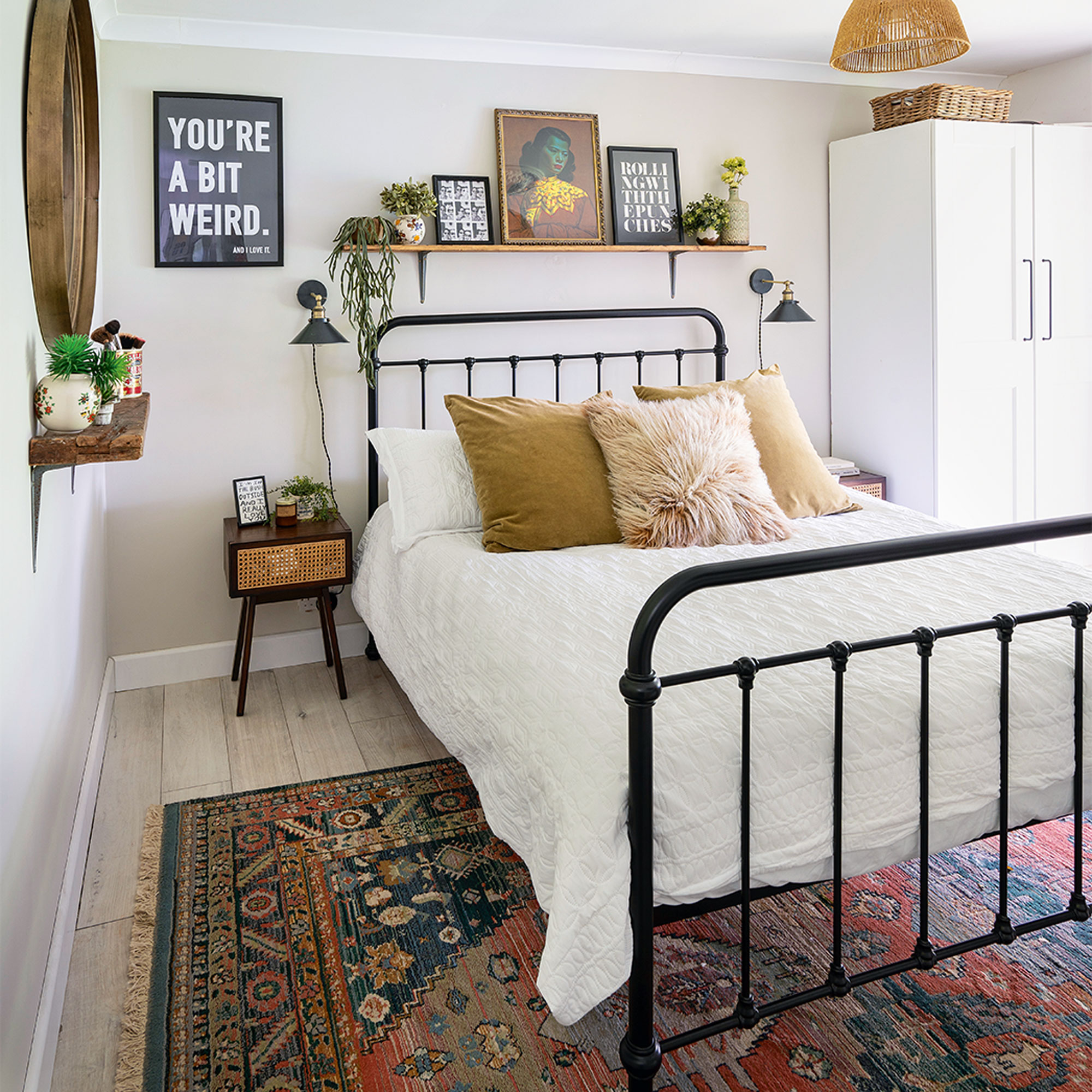
‘I did all the decorating in our bedroom. I added the coving and skirting and painted the walls in Dulux’s Egyptian Cotton for a fresh look. Our wrought-iron bed is framed by my DIY shelf that I’m always restyling with my favourite prints, faux plants, and objects’
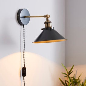
‘Plug-in wall lights are a brilliant solution if you don’t want to channel the wall. These are from Dunelm, and they complement the industrial vibe of the metal bed and rustic shelf.’
The boys' bedrooms
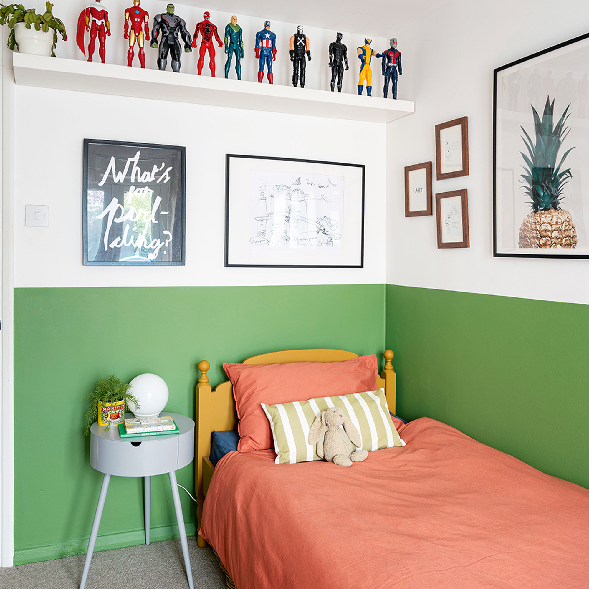
‘Making a quirky display of plastic superheroes above the bed in the boy's bedroom acts as nifty storage, while playful prints give his room a smart, yet light-hearted touch.’
‘To zone the desk area, I painted the corner of the room in Dulux’s Jungle Fever, continuing the colour around the lower half of the walls for balance.’
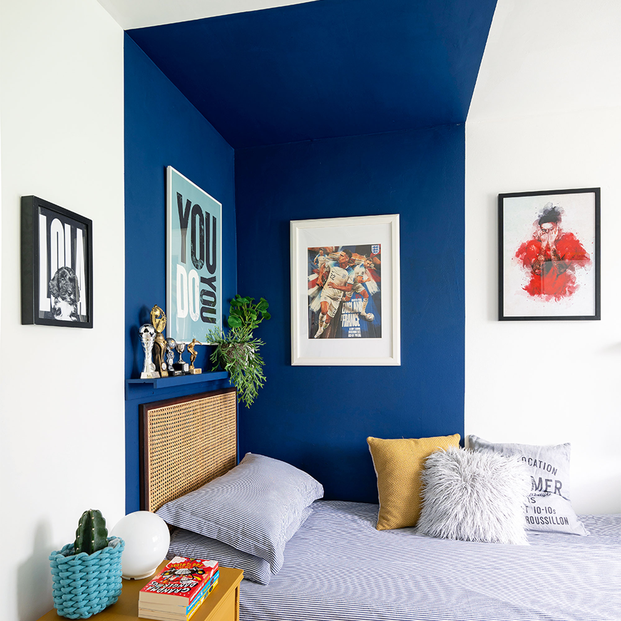
‘I gave this bedroom a similar treatment to his brother’s room, by colour blocking the bed area in Dulux’s Sapphire to bring focus to his favourite prints. I also updated a second-hand bedside table using furniture paint.'
The bathroom
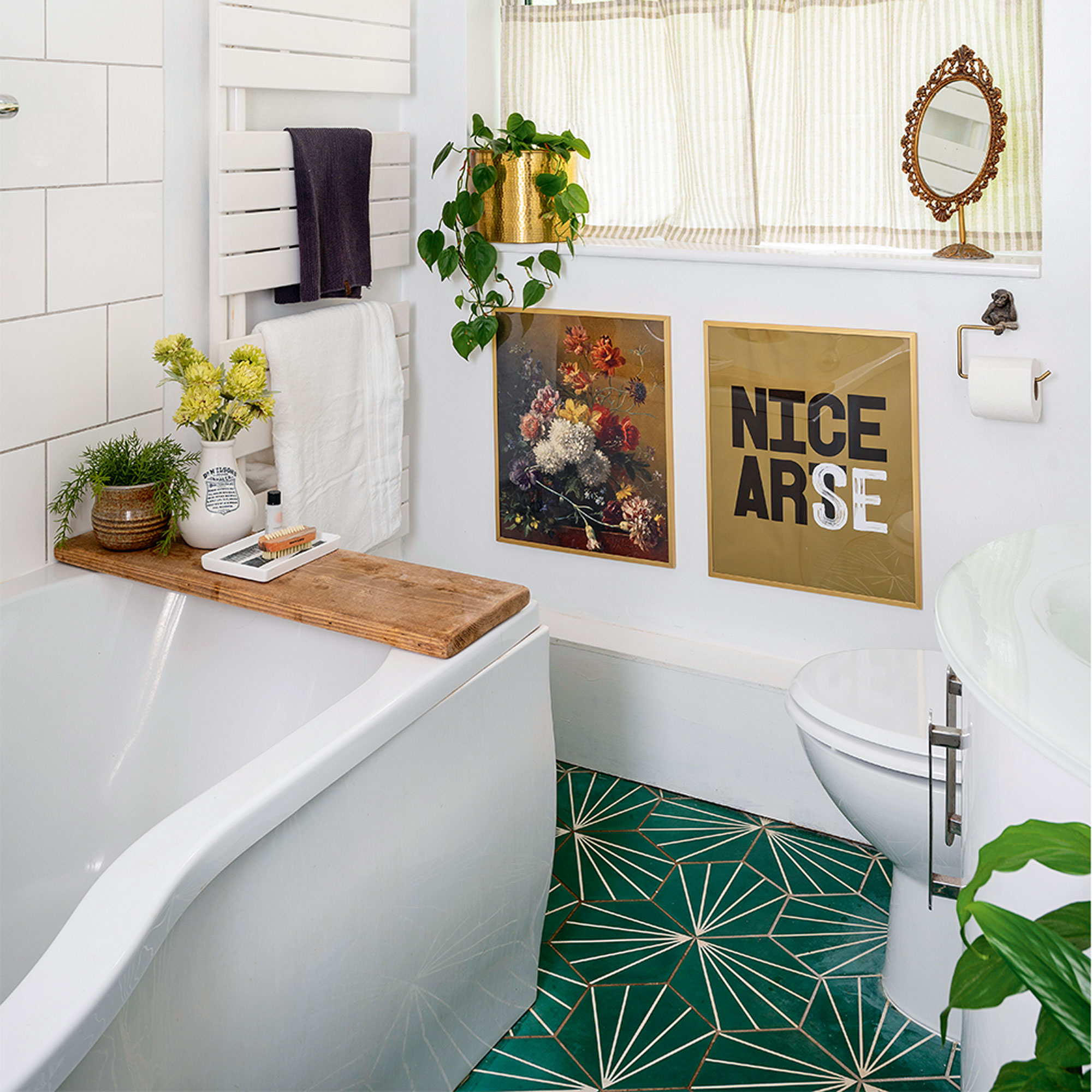
‘The bathroom was an early job as it needed a total overhaul, however, that was a bit of a disaster as the suite we ordered online didn’t turn up in time, so we had to buy an emergency suite. We don’t love it and will replace it one day, but for now, I enjoy updating it with quirky bits.’
‘We livened it up with patterned tiles and eye-catching artwork. To create the bath bridge, I sanded down an old scaffold board and gave it a smooth finish with browning wax.’
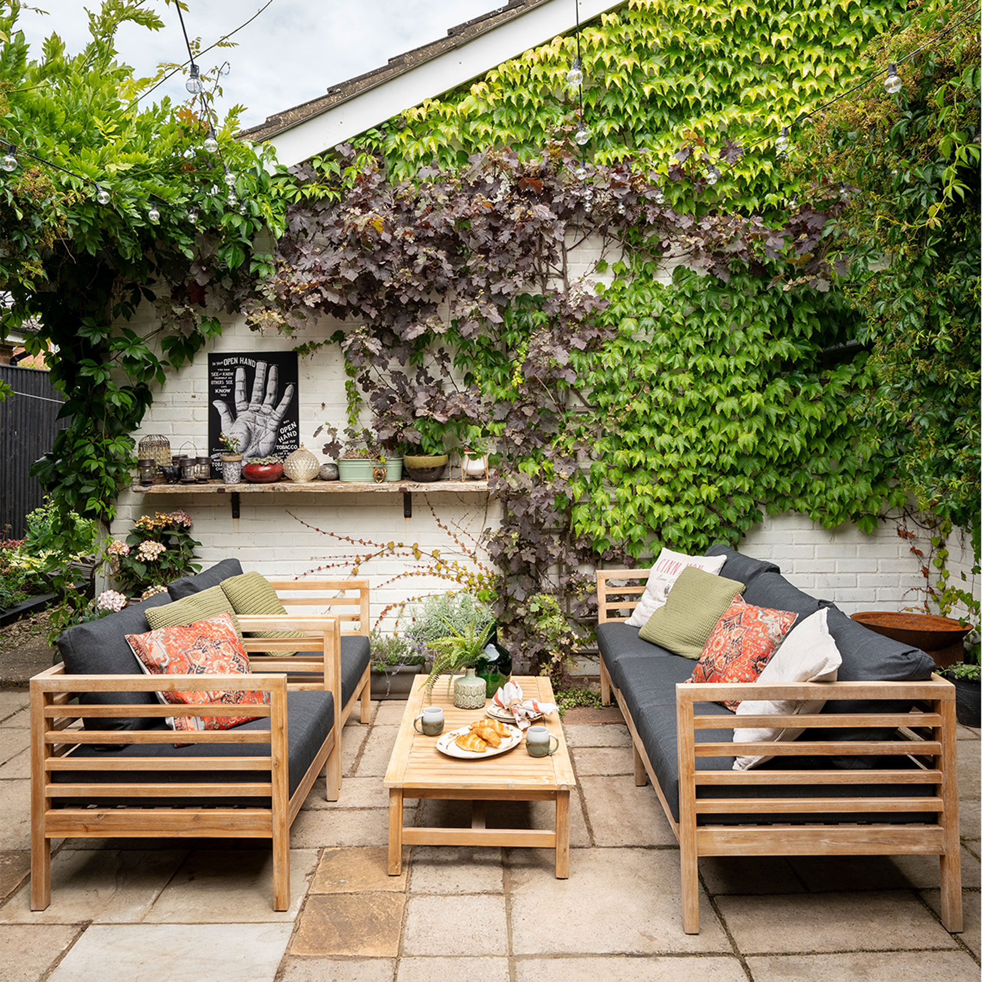
‘This internal courtyard is what sold us the house. We love how it flows from the kitchen to create a lovely al fresco area, and we’ve kept it rustic and relaxed in line with the house’
‘I’d love to add a glass roof over this courtyard at some stage, to make it an all-weather space. But for now, we just love to enjoy our coffee out here on warm mornings.’
Get the look
- Lisa FazzaniFreelance content editor
