Filling this neglected Edwardian cottage with dark colours, rich patterns and second-hand finds has given it back its character
These homeowners have brought personality back to their period home
Lisa Fazzani
Taking on an unloved property that had been poorly maintained and was stuck with a dated 70s decor didn’t phase these homeowners. Instead they rose to the challenge and took the opportunity to strip the place back and start from scratch so that they could restore it to its former glory.
‘We got the keys for this place the day before lockdown, so it was just the two of us and a load of boxes on moving-in day as no one was allowed to help,’ says the homeowner. ‘Initially I had a few days of panic because the house was in such a state. In fact, it was so bad that that we didn’t even bother with a survey as we knew we’d have to strip everything out and start again.’
‘But even though the 70’s hadn’t been kind to the house, and everything was extremely dated and badly maintained, I was excited by the idea of bringing character back into the house and transforming it by replacing the Edwardian features that had sadly been ripped out.’
The kitchen
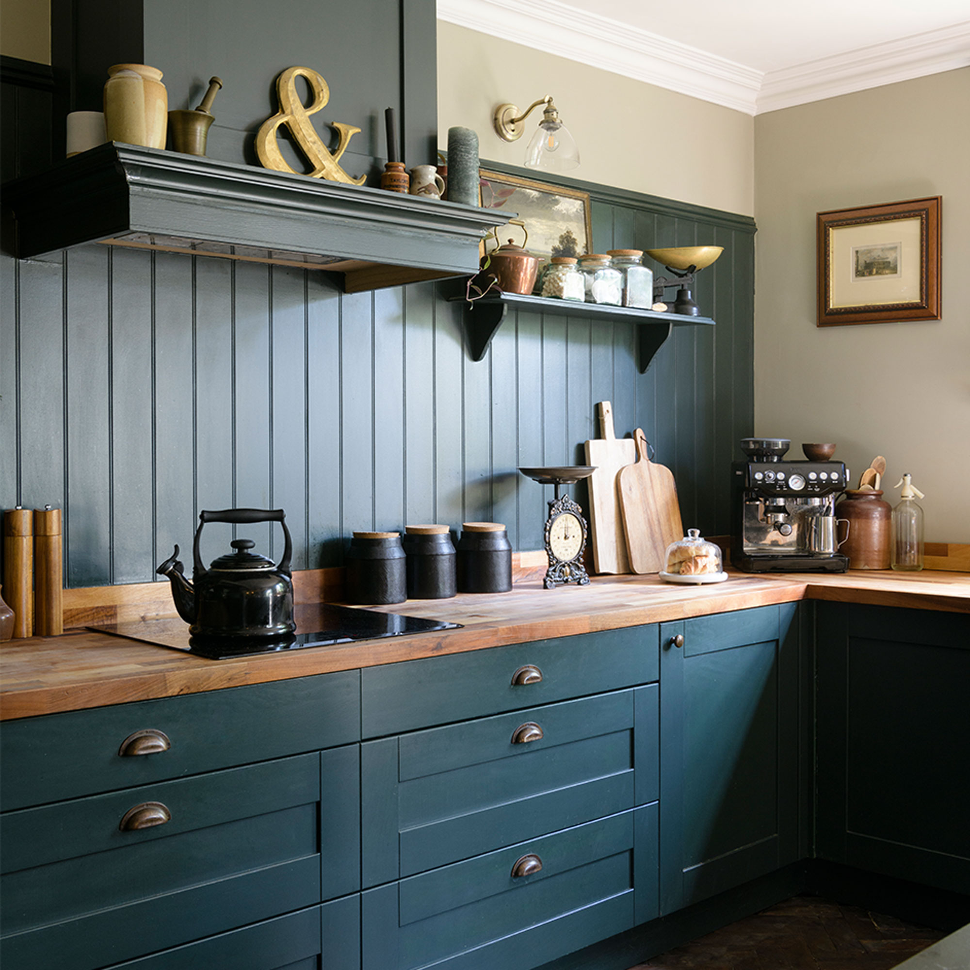
‘After the initial panic subsided we made a plan of action, deciding to start with the ground-floor layout which was initially a warren of tiny rooms. We knew it was going to be a messy job creating a new kitchen and one of the biggest investments so it made sense to start there.’
‘Luckily construction was still able to continue during lockdown so we had the internal walls knocked down and four steels installed to help create a large kitchen-diner. We also enlarged the door into the garden, which was originally only 80 centimetres wide, replacing it with wide Crittal-style doors to let the light floor in, as the new space we created was quite dark.’
Kitchen display space
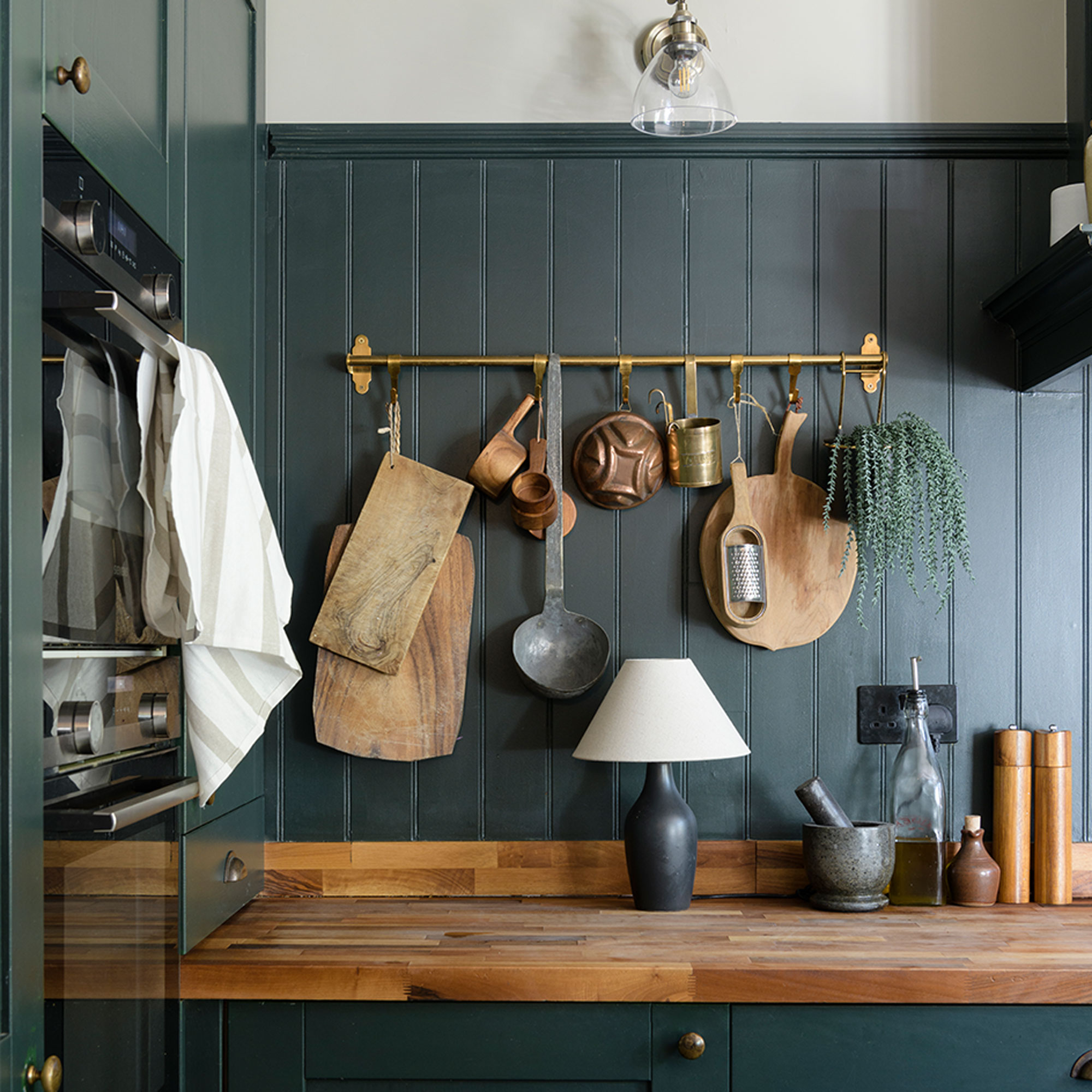
‘The room lent itself to a natural U-shaped kitchen area but I didn’t want loads of wall units as I felt they would make the space feel claustrophobic, so we went for one bank of storage cupboards and then put up a hanging rail and open shelf to create a kitchen display space and show off my vintage kitchen accessories.’
Statement island
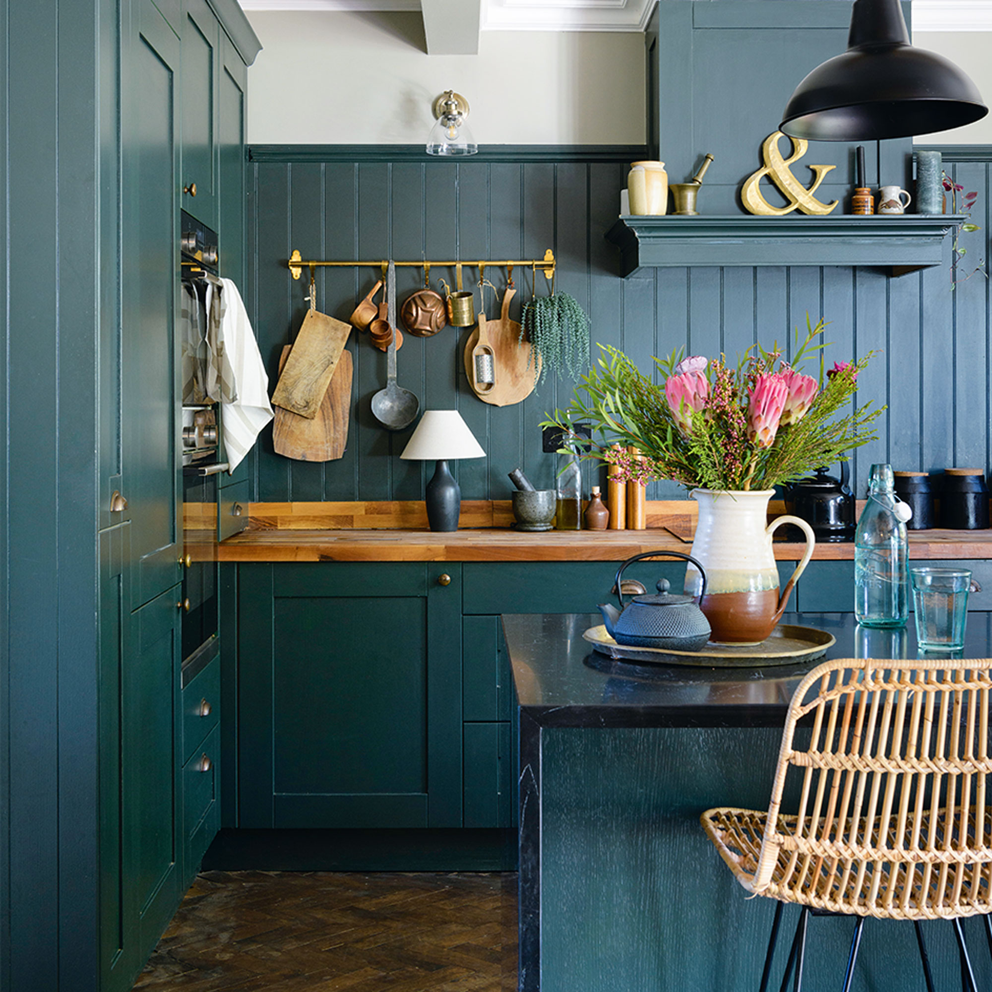
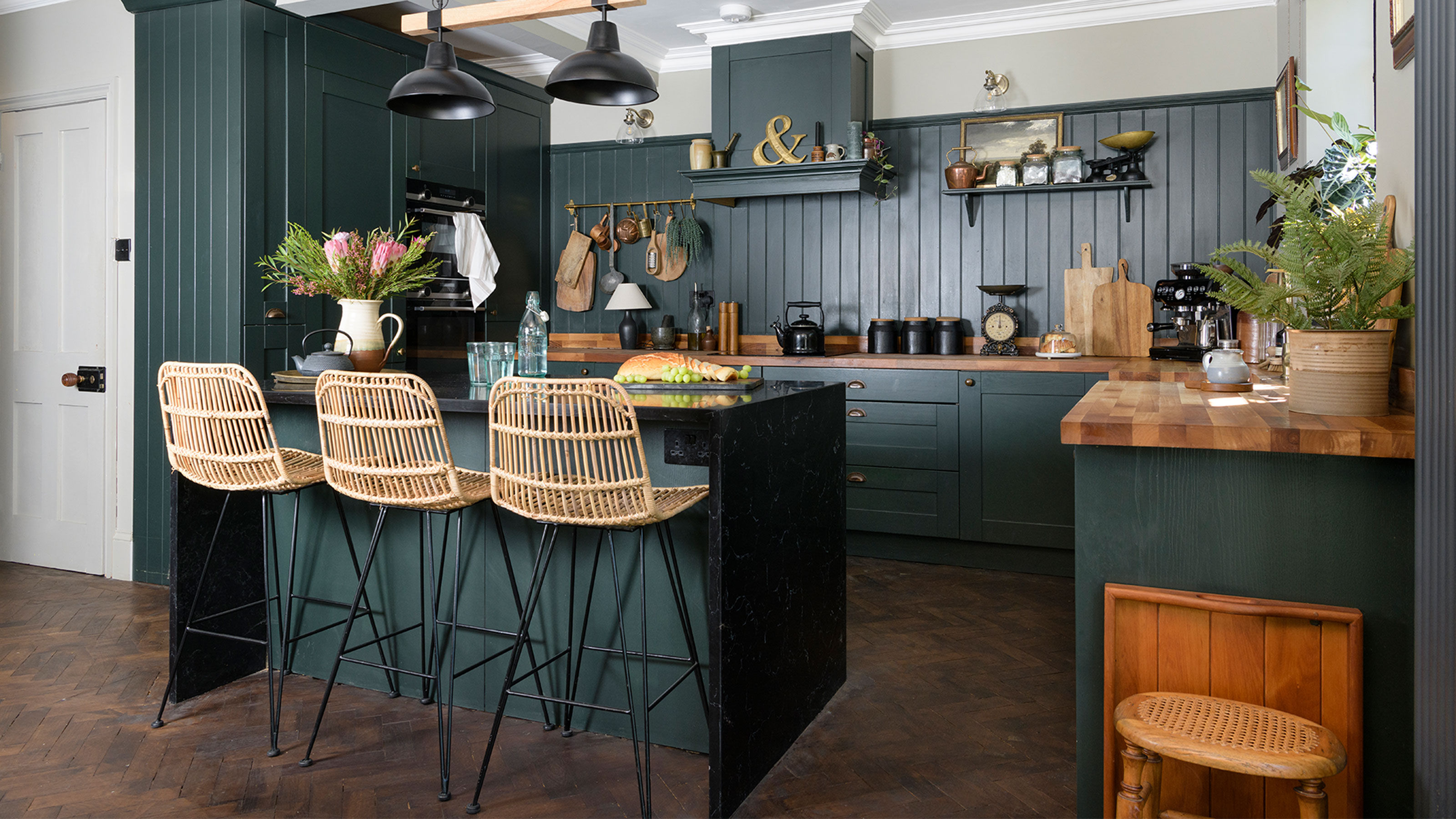
‘We chose a paintable kitchen, which came ready-prepped and I initially painted it in Duck Green by Farrow & Ball, but it felt too bright for my liking so I repainted it in Studio Green, a much darker shade that changes tones depending on what the light is doing.'
Get the Ideal Home Newsletter
Sign up to our newsletter for style and decor inspiration, house makeovers, project advice and more.
'My non-negotiable was a kitchen island as we socialise a lot and I wanted to be able to cook and chat at the same time. I also wanted to inject a touch of drama to the space so I chose a black marble-effect waterfall worktop, and it’s really done its job as everyone congregates around the island now.’
The hallway
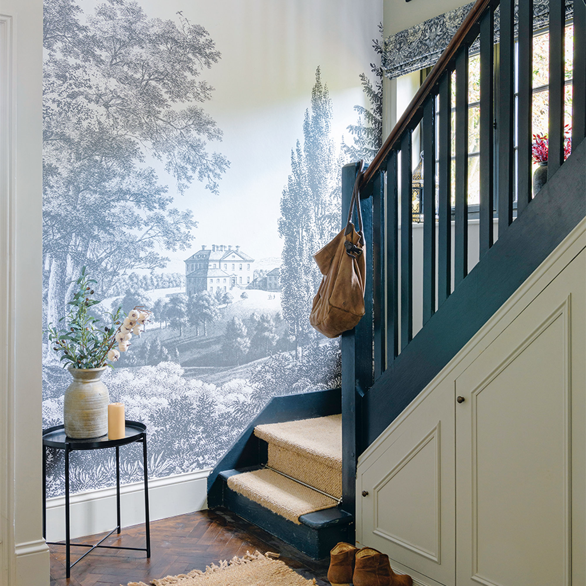
‘I loved the impressive hallway the moment we stepped inside but we had to remove layers of dated wallpaper, and we also ripped up the threadbare carpet, sadly not revealing any beautiful floorboards.'
'Instead I managed to source enough original parquet to cover the whole hall and kitchen, offered for free from Facebook Marketplace as long as we collected it. So four carloads later we had a pile of potentially amazing flooring, though it took six months to lay as none of the pieces fit – it was like doing a jigsaw puzzle without the picture! By now we were running out of funds so we had to lay the flooring ourselves.’
‘I wanted to add a wow feature on the large wall by the stairs and although it took a year to source the right product, it was worth it as the ‘Stately Manor’ mural wallpaper by Graham and Brown is really impressive.’
Staircase gallery
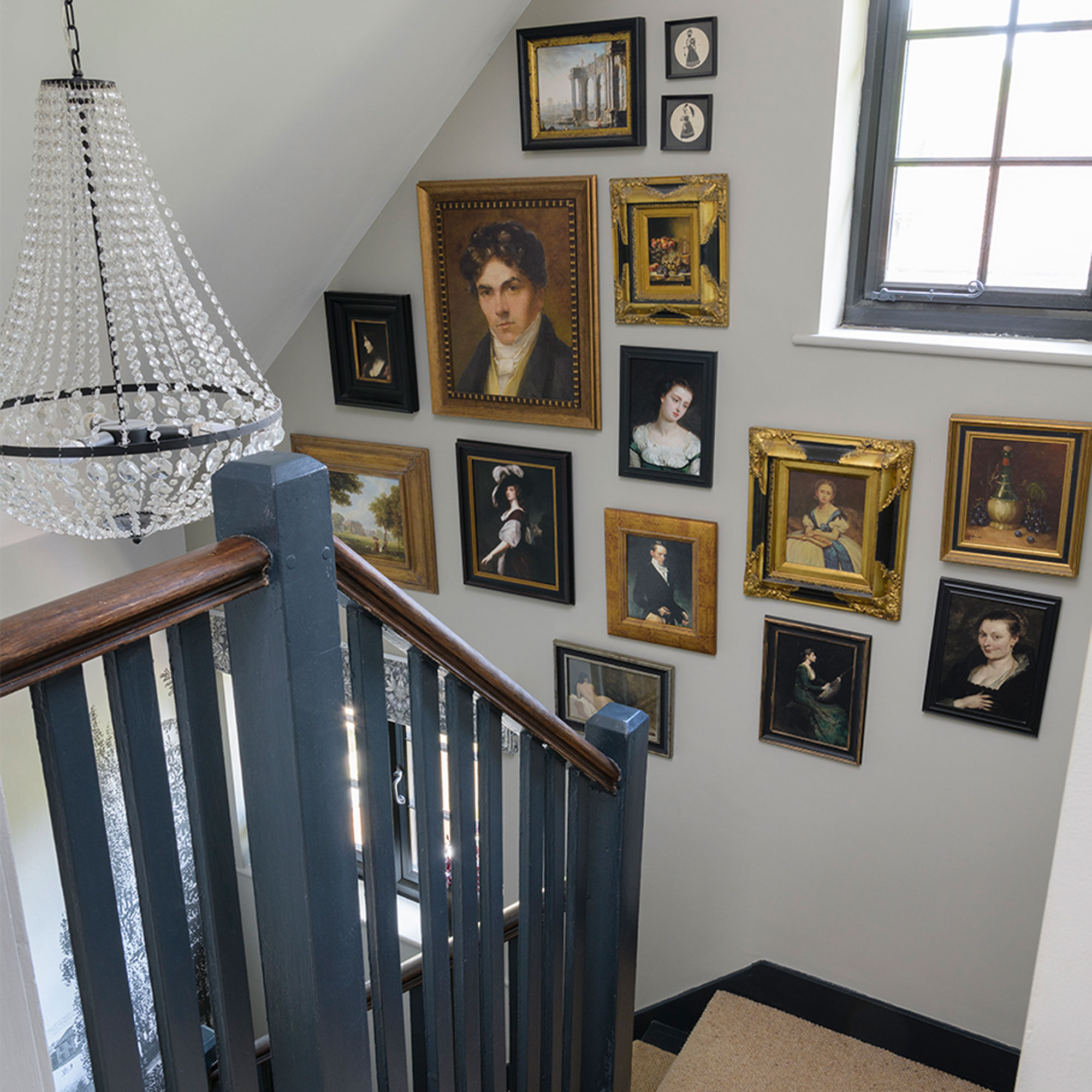
‘I love old oil paintings and I’m obsessed by Harry Potter films so I decided to combine the two by creating the feel of a ‘talking staircase’, choosing gilt frames to warm up the monochrome look, positioned going up the staircase.’
‘When it comes to buying second-hand, I target my online searches. I decide what I want for a particular space and then set up alerts. It might take time to find the right piece, but it means I’m more focused on my search so get what I want.’
The living room
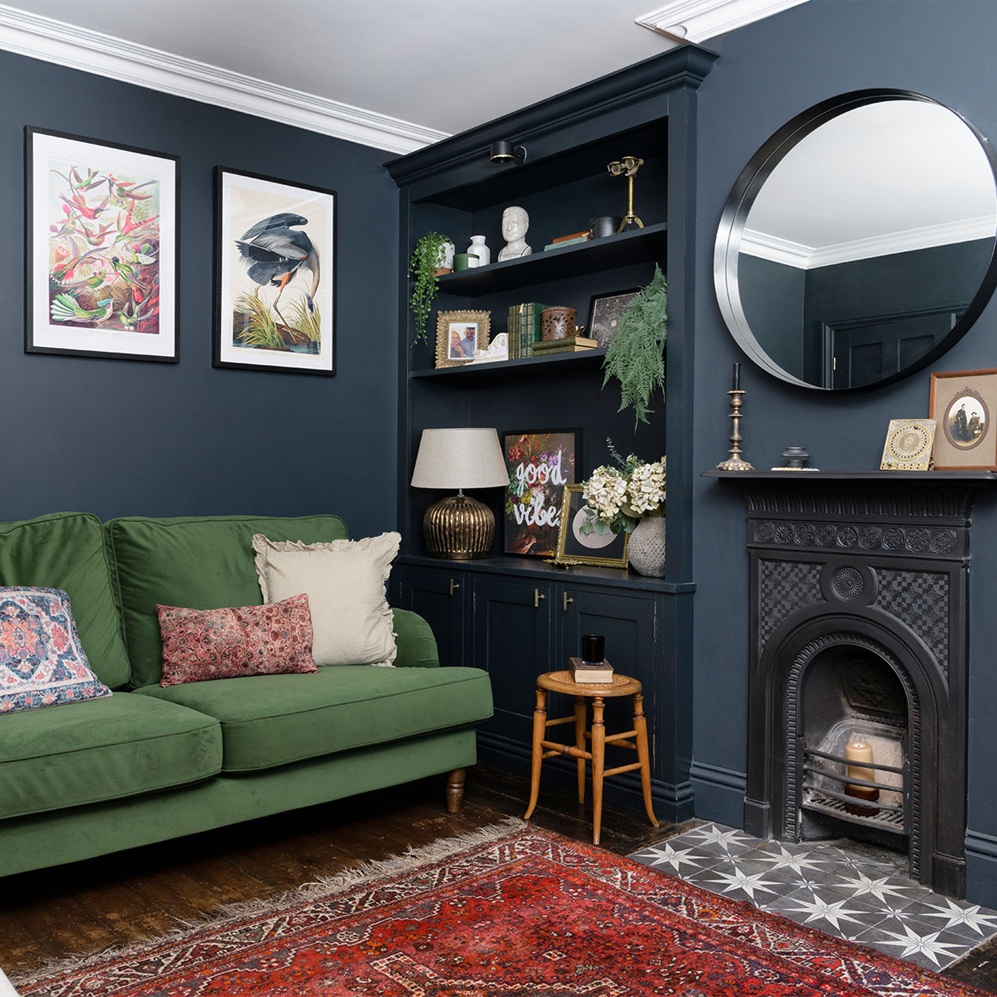
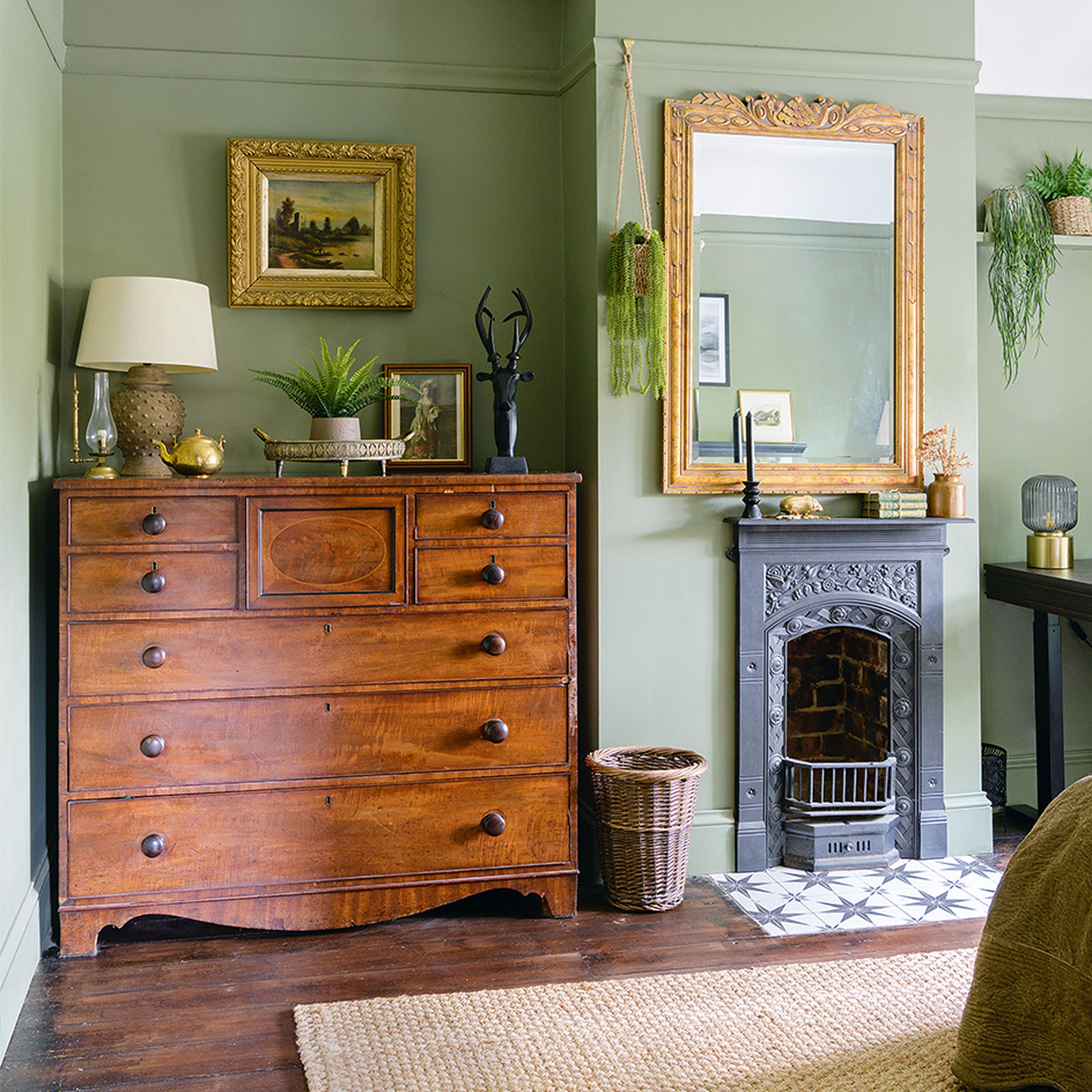
‘We wanted to inject a dark, cosy vibe into the living room but first we needed storage, so we had the floor-to-ceiling cupboards built into the alcoves. We also replaced a massive, ugly concrete fireplace with a beautiful design more in keeping with the era of the house.’
Colour-drenched scheme
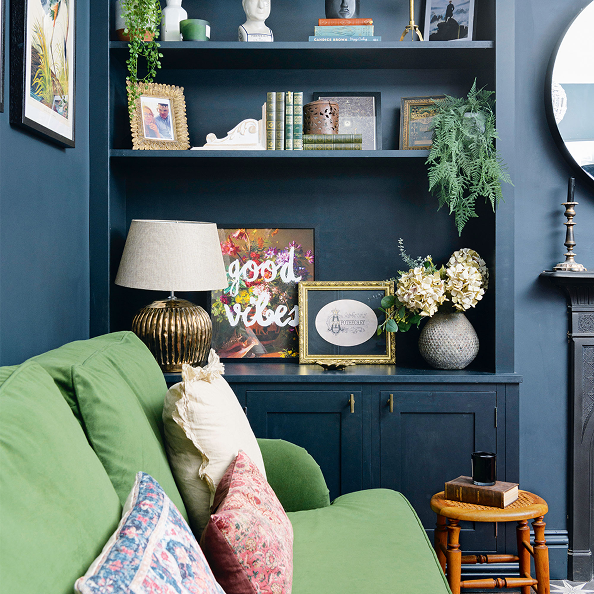
‘I’m drawn to dark, moody colours, which I believe the Americans in the interiors world call Dark Academia, but I simply see it as modern traditional with a hint of the gothic.'
‘I colour-drenched the walls and woodwork in Railings by Farrow & Ball then chose the sumptuous green velvet sofa and deep red rug to add rich colour and texture to the scheme.’
‘I originally intended the living room colour scheme to be completely monochrome but colour began sneaking in, starting with the sofa and finishing with the colourful bird prints from Ink and Drop.’
The dining room
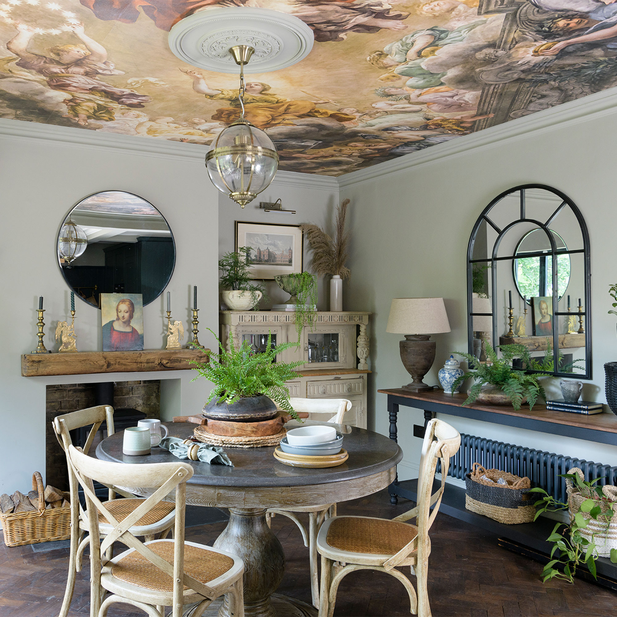
‘The dining room felt a bit safe so we created a feature utilising the often ignored ceiling, or ’fifth wall’. We chose ‘A Priori’ by Rebel Walls, a mural wallpaper that looks like a fresco.’
‘The cream antique cabinet came from Facebook Marketplace; I loved the elaborate detail and it was already painted, which was a bonus.’
The master bedroom
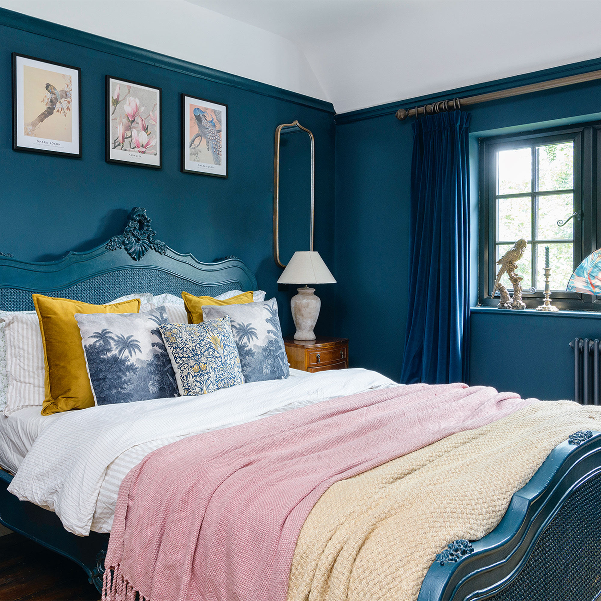
‘When it came to decorating the bedrooms we realised the upstairs needed more work than expected. There was woodworm in the joists so we had to remove the floorboards to replace them, and some of the wall came down when we ripped out cupboards that had been fitted into the brickwork, meaning we had to re-plaster the rooms.’
Dramatic blue colour scheme
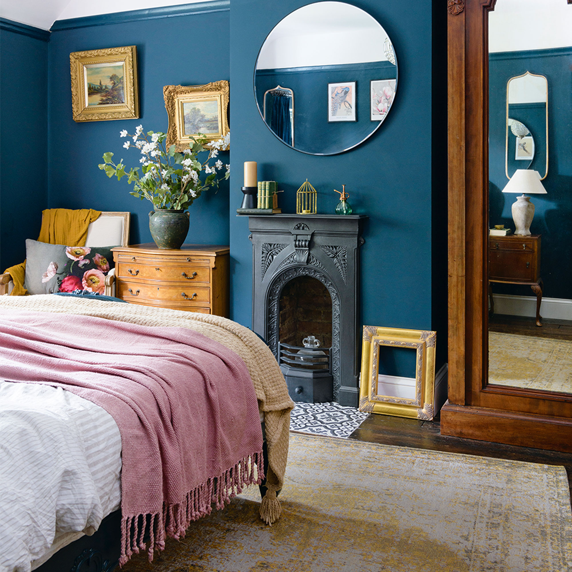
‘Also, because the blocked-up fireplaces hadn’t been vented they had caused a lot of mould, so we decided to unblock them and reinstate the fireplaces sourced from a salvage yard.
‘The vintage-looking paintings are actually modern prints sourced from Desenio and placed in elaborate gold frames to buy into the Victorian look that I love.’
‘Blue can often look a bit cold so I’ve warmed it up using different tones of wood and gold frames, and I’m considering taking the blue above the picture rail to the ceiling.’
The bathroom
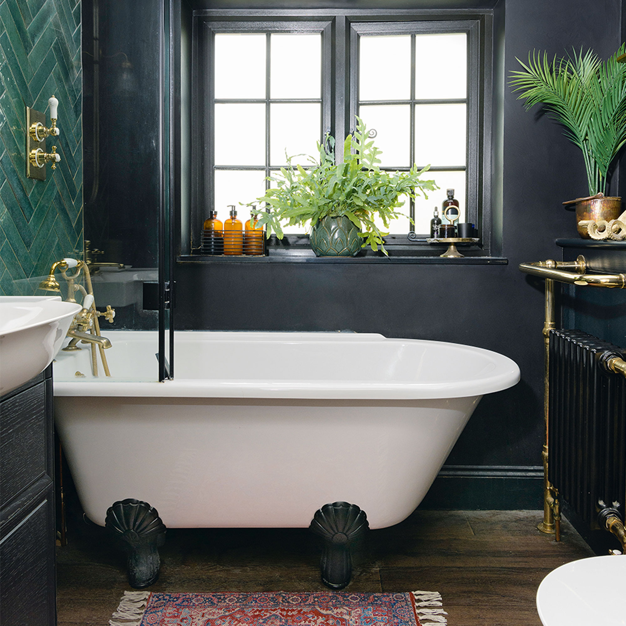
‘Finally moving onto the bathroom and ripping up the blue hospital-style grippy floor that never felt clean was one of my high points as it was the most horrendous room in the whole house. Initial planning was quite tricky as it's an awkward space with the door in the centre of the wall, but I’m a plumber’s daughter so I had an idea on what was possible.’
Statement basin
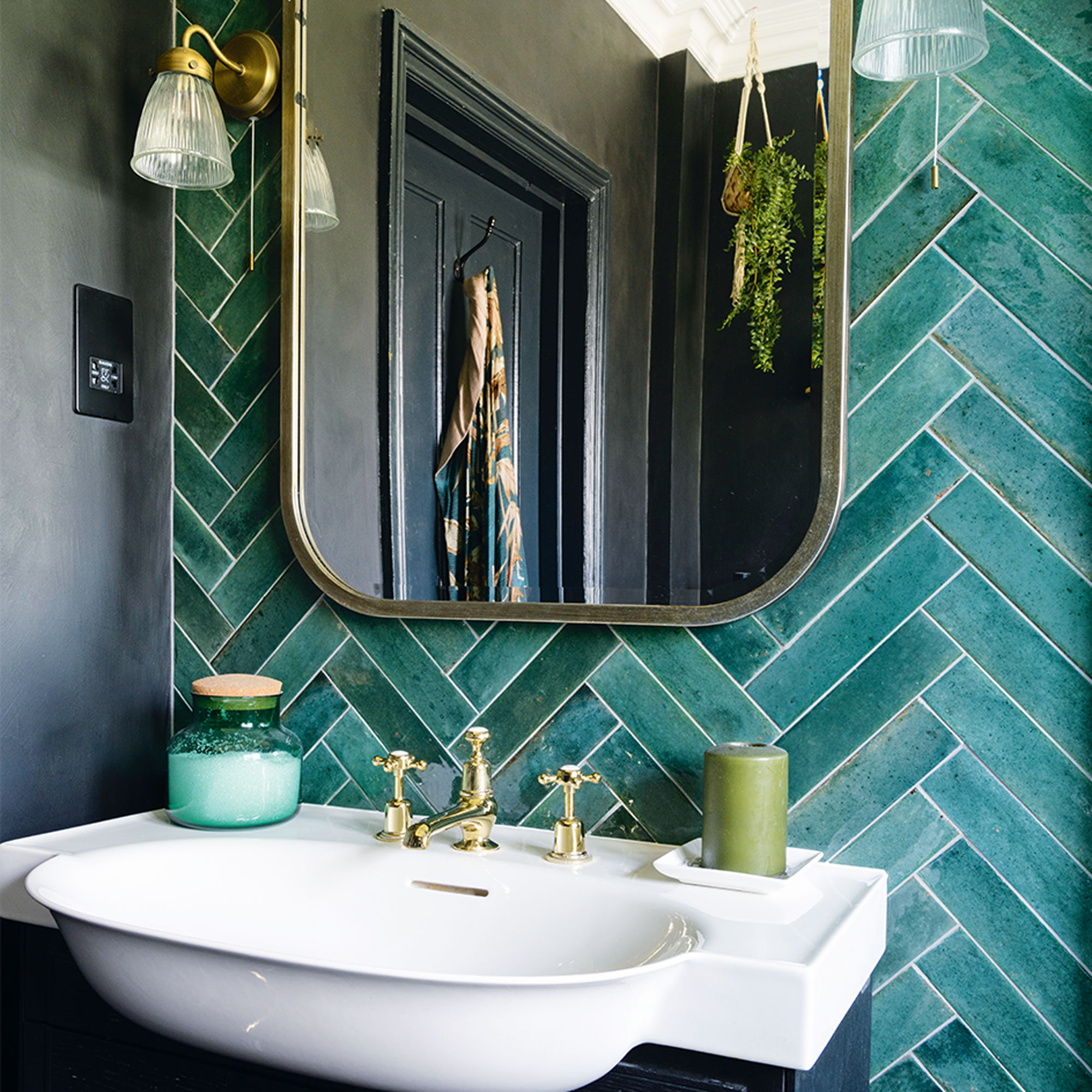
‘Having a bath was a non-negotiable but it could only fit under the window, so that dictated the layout, although the actual scheme began with the wall of lux green Mandarin Stone tiles.'
'Rather than tile the other walls we used micro cement, a waterproof product that is textured and gives a minimal pared-back look. I decided to be daring and paint it black, buying into the dark look I love and have injected throughout our home.’
The guest bedroom
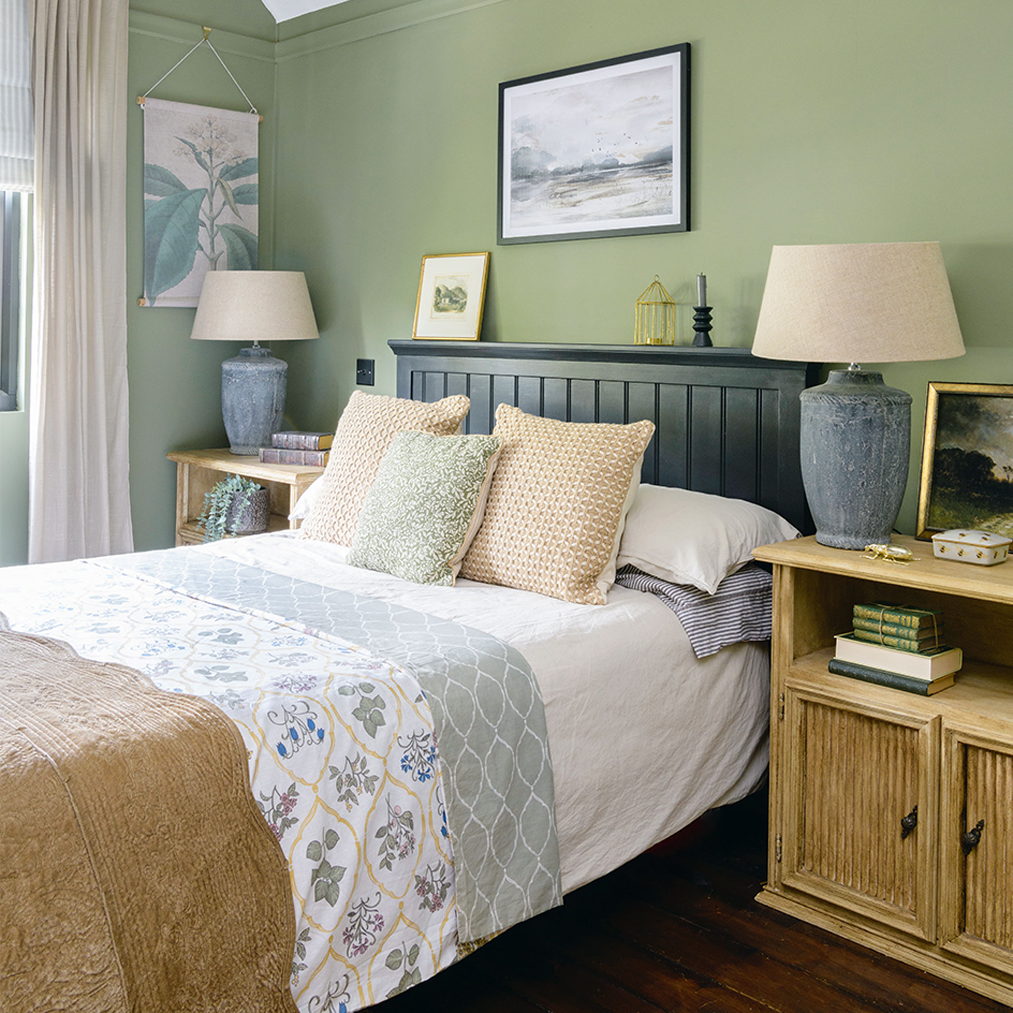
‘I wanted to create a calming space for my guests so painted the walls using Little Greene’s Sage Green, which compliments the botanical vibe I’d chosen for this room.’
‘I gave the veneer bedside cabinets (from Facebook Marketplace) a wood-effect look using a Frenchic hack. I chose a classic cream shade from the self priming and self sealing ‘The Lazy Range’, and then used the Browning Wax to add an aged, rustic look.’
Finishing touches
‘It was hard living in the space while the renovation was done as it took about two years to get to a good livable state. We focused on where we lived most, ie the downstairs, but in hindsight I think we should have started at the top because although we weren’t knocking any walls down, it was still messy and the builders were walking through finished spaces with materials, so there was a lot of making good afterwards.’
‘I’m sure I’ll always make tweaks as I believe all homes should evolve with time, but I still love every room and am so proud of what we’ve achieved.’
- Lisa FazzaniDeputy Editor
-
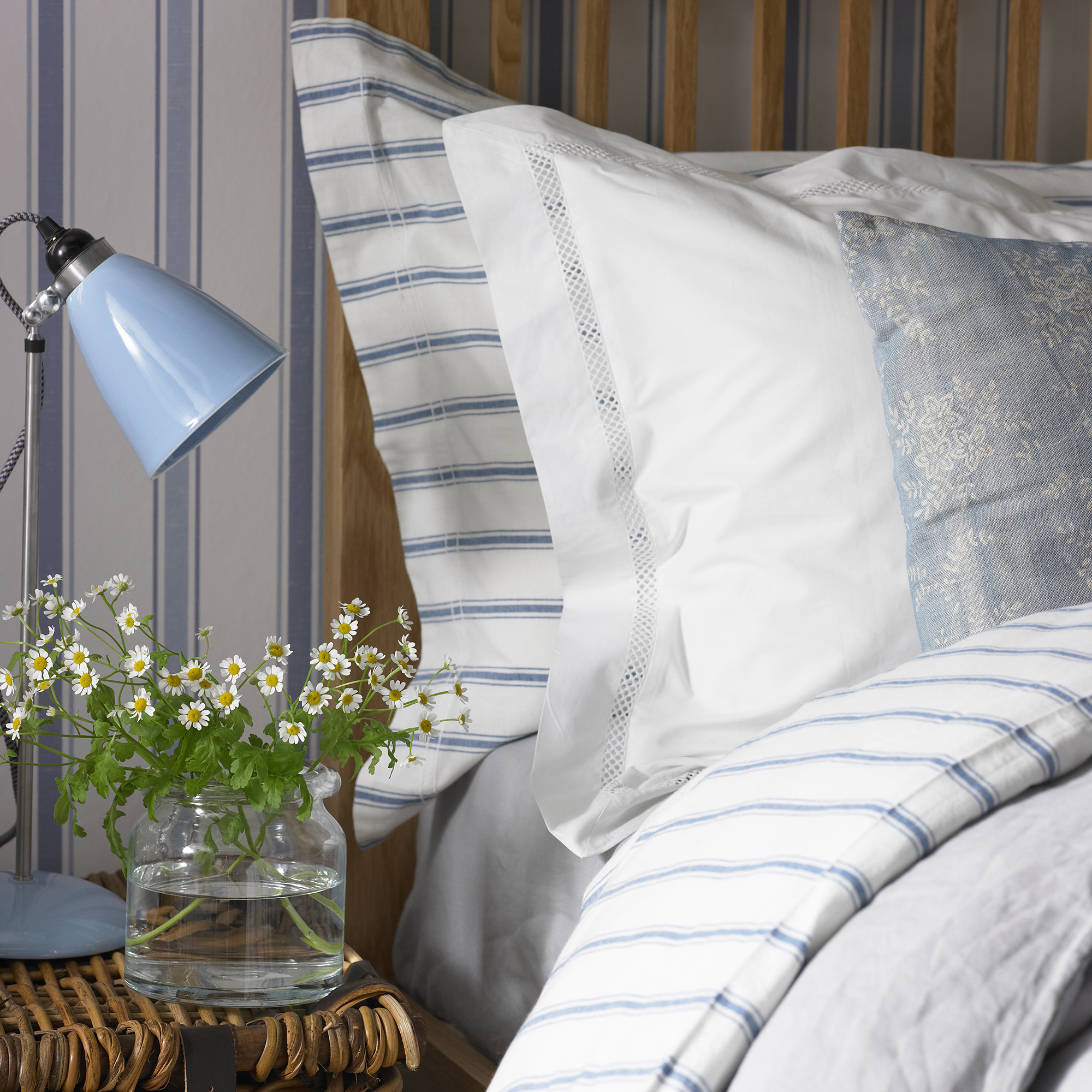 Is M&S or John Lewis bedding better? I'm a Sleep Editor and this is my go-to brand
The battle of the bedding is on
By Amy Lockwood
-
 5 things you should never put in your garden waste bin – experts warn these items could land you with a £400 fine
You should avoid these waste items at all costs
By Kezia Reynolds
-
 Typhur Dome 2 air fryer review – a glimpse into the future of air frying
The Typhur Dome 2 cooks food brilliantly and has all sorts of benefits, but is it worth the £499 price tag?
By Ellen Manning