‘Renovating this house has been a labour of love…but it puts a smile on my face every day’
Ditching dated décor and introducing rich colours and classic pieces has turned an unloved Victorian property into a luxurious yet homely space
Lisa Fazzani
While the dated decor, drab kitchen and dodgy plumbing and electrics might have put many house viewers off, this homeowner was up for the challenge and eager to get started on the home renovation as soon as she could.
‘I fell in love with this house the minute I saw it,’ says the homeowner. ‘I’ve always liked period homes and this place has such high ceilings, I’m obsessed with them! Two of the three bedrooms are a really good size too, and I liked all the period features, like the picture and dado rails and the fireplace in the dining room.’
The house exterior
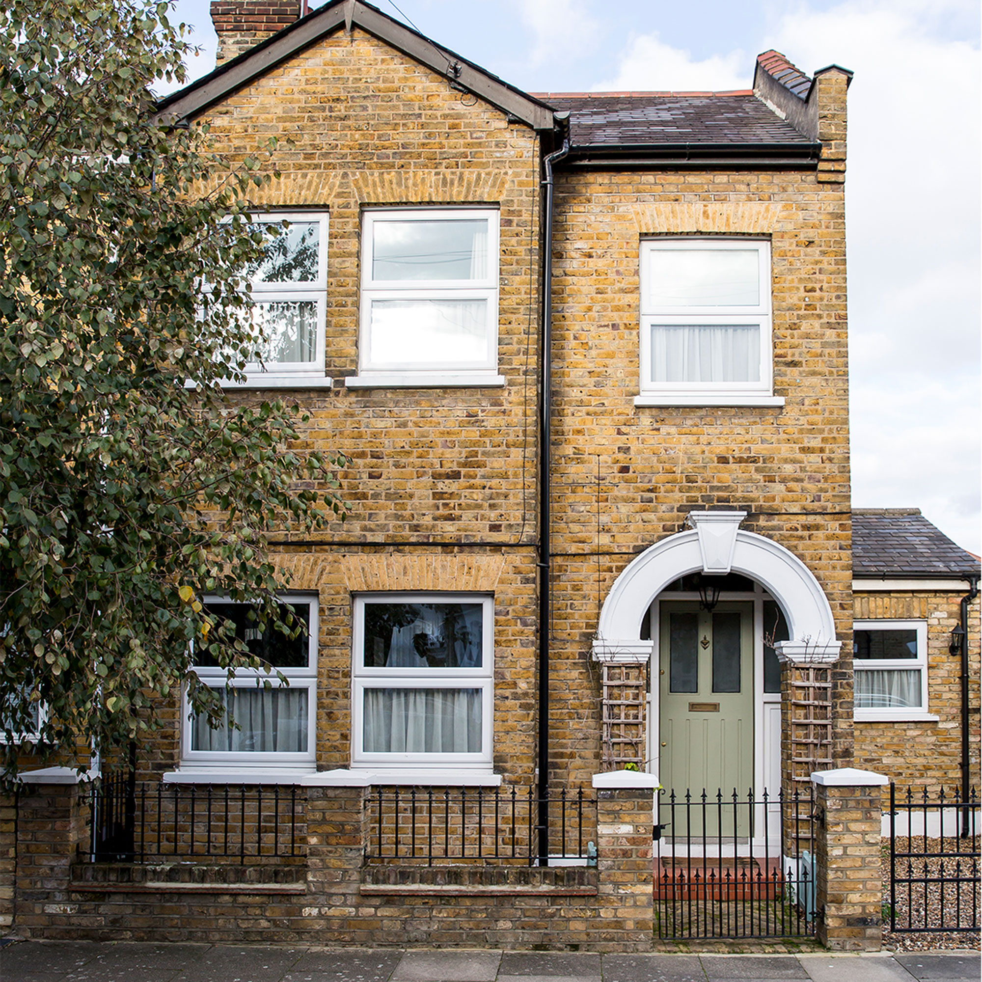
'This house and the one next door were originally built by a local builder for himself and his daughter in the 1900s. The windows were blasted out by a bomb that was dropped on the road during the World War, so it has a slightly different frontage than some of the neighbouring houses.'
‘When we moved in in October 2015 I had lots of ideas for the place. The house had a small extension added, but it wasn’t really being utilised, and the décor throughout was quite dated. I hated the kitchen with a passion and we also needed a new bathroom – but they were big jobs that I needed to take time to save up for.’
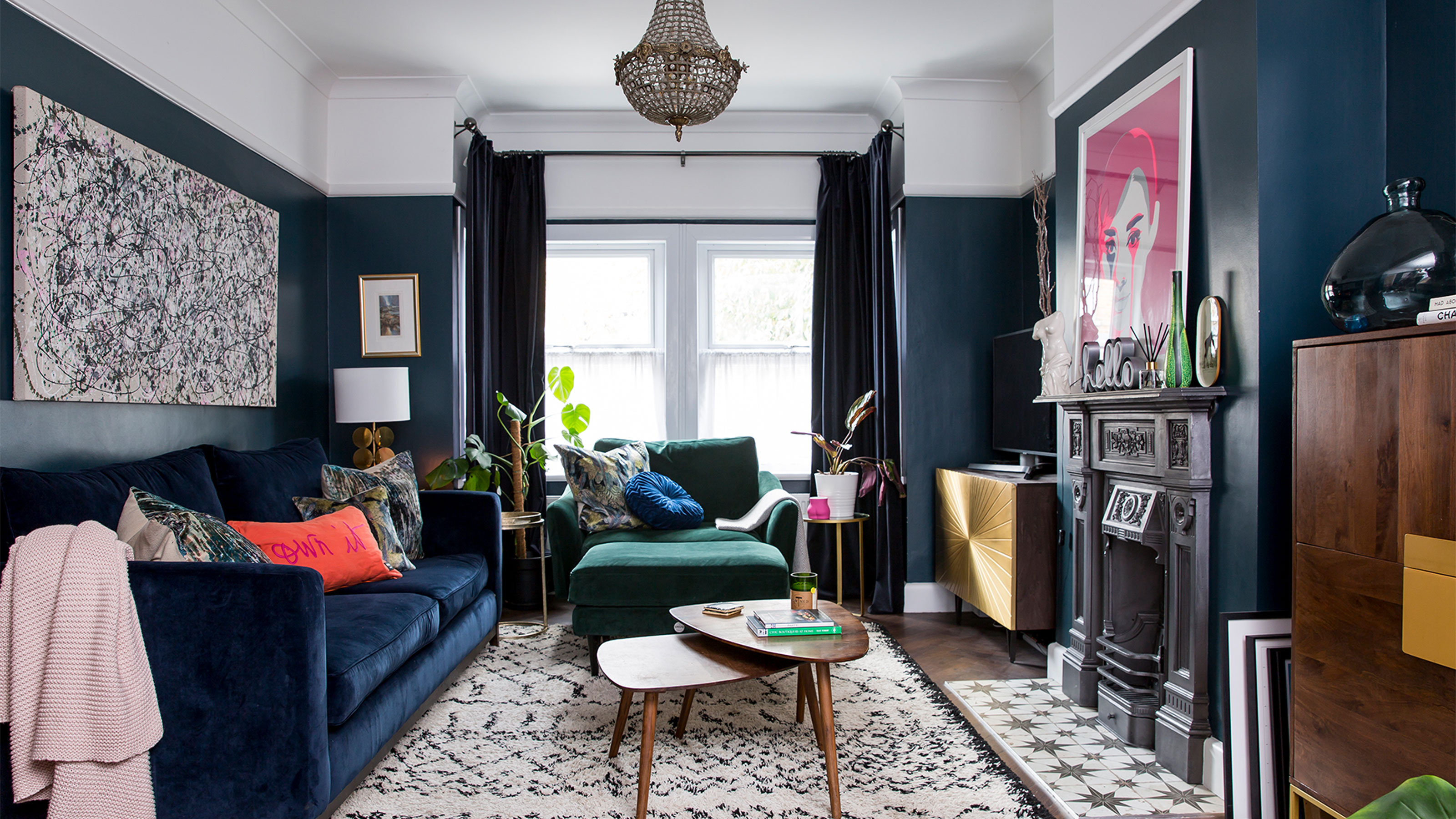
Elegant living room
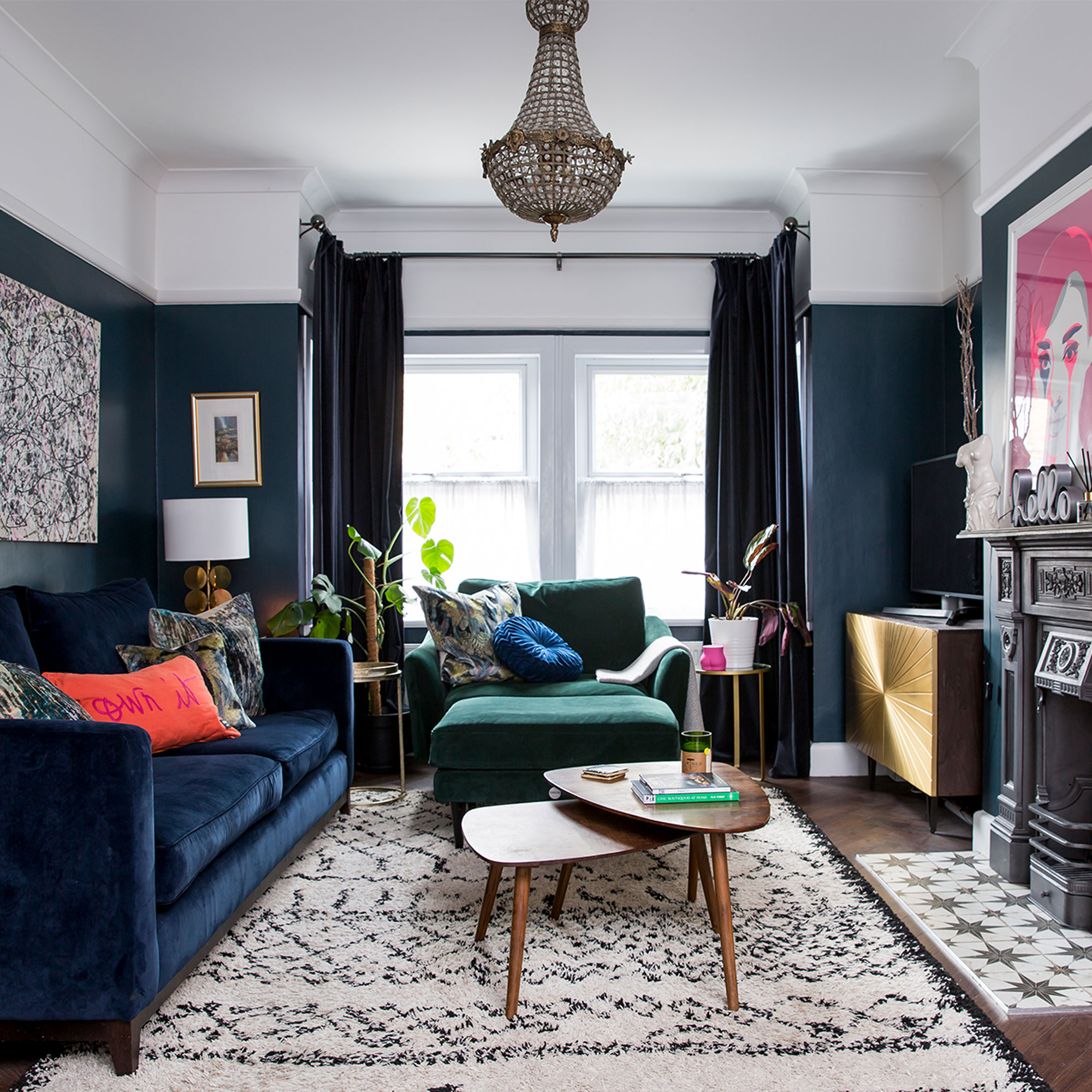
‘Aside from the dated decor, we also had to rewire and replumb along the way because both the electrics and wiring were like Spaghetti Junction! At the same time as getting the electrics done, we plastered, decorated, and laid new flooring in the living room.’
‘I’d advise anyone to take their time with decorating. We reinvented the living room several times because we didn’t and that can be costly (and frustrating). We added a faux chimney breast in here to create alcoves and added a restored Victorian fireplace surround and grate to it.’
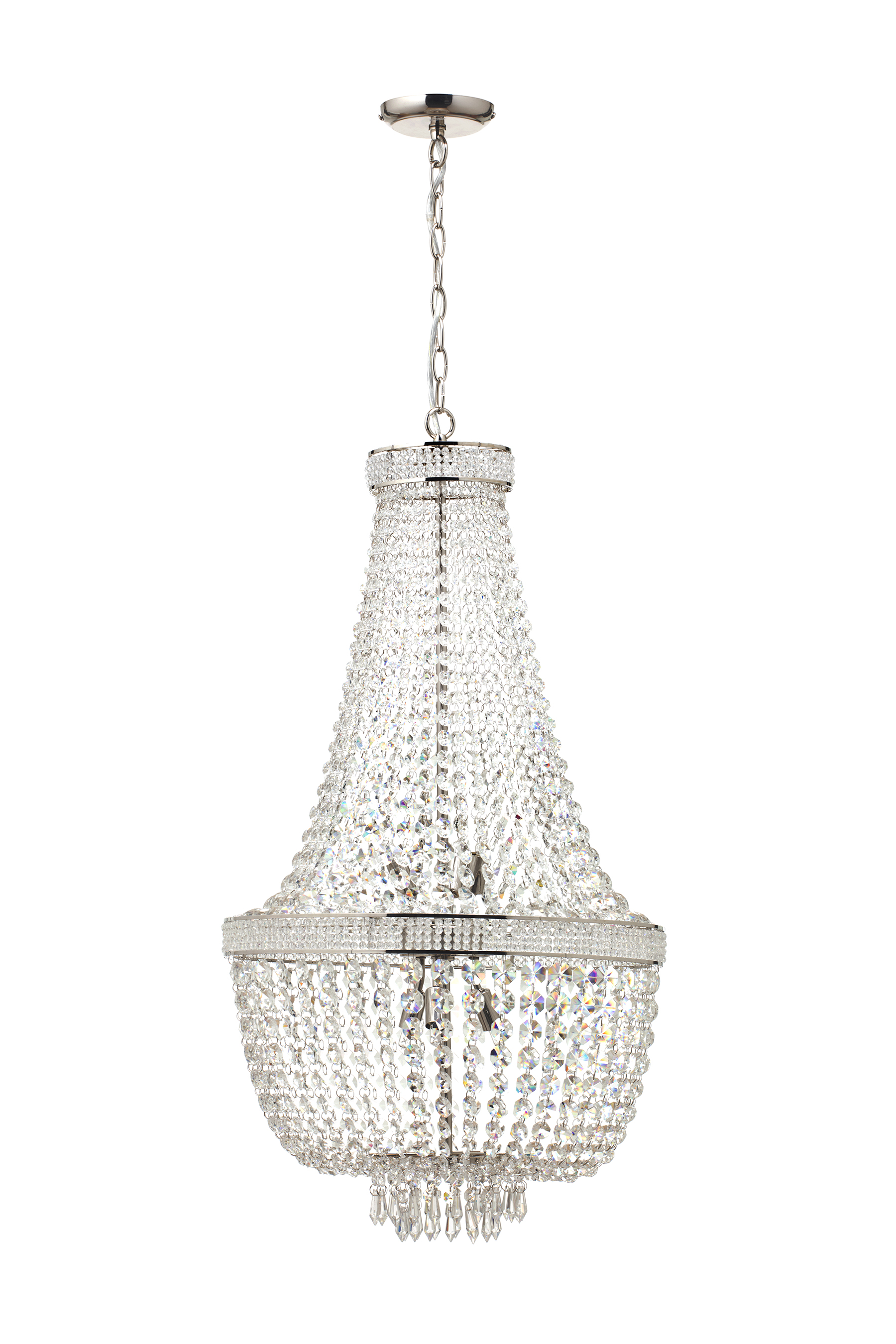
‘My favourite thing in the whole house is probably the empire chandelier, which is vintage and weighs a tonne – we had to reinforce the beams in the ceiling to hold it. The living room has gone through various incarnations before we settled on the current layout and I still think we could squeeze in another high-backed armchair. The green velvet snuggler chair and footstool are from Snug.’
Get the Ideal Home Newsletter
Sign up to our newsletter for style and decor inspiration, house makeovers, project advice and more.
Traditional fireplace
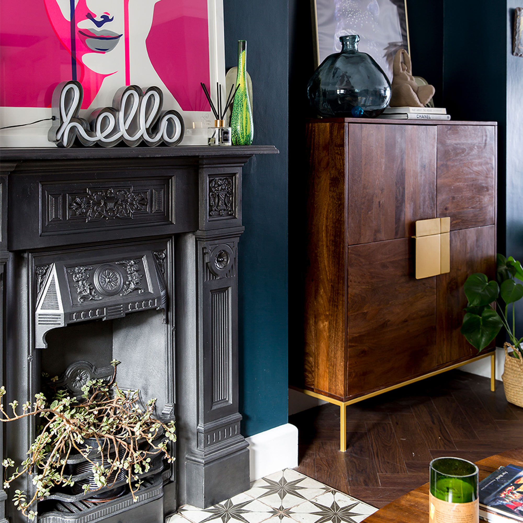
‘We tiled the hearth using leftover bathroom tiles and also did the same with the dining room fireplace. The Audrey artwork is an artist’s proof of a limited edition by artist Charlie Udell.’
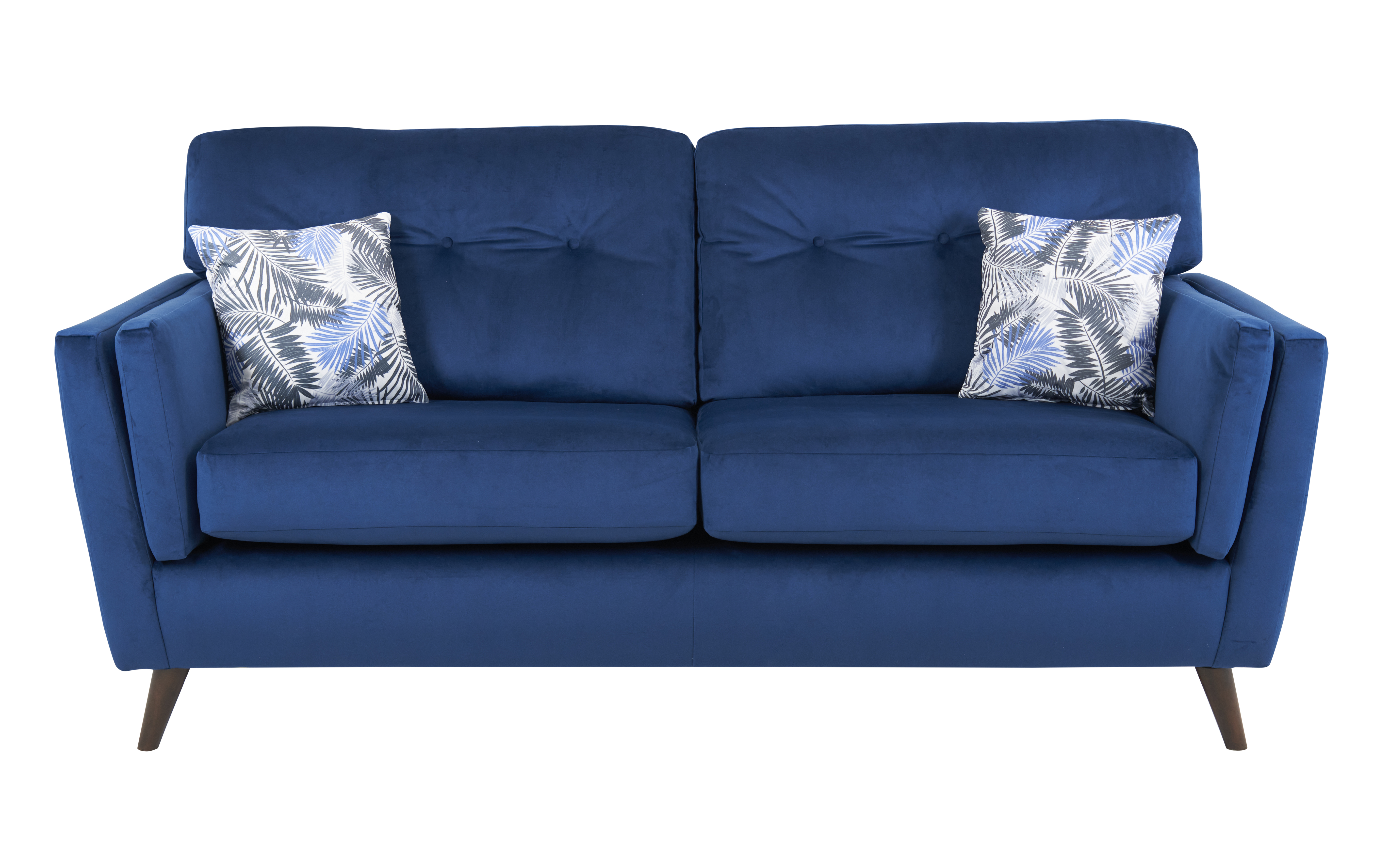
Plush velvet sofa
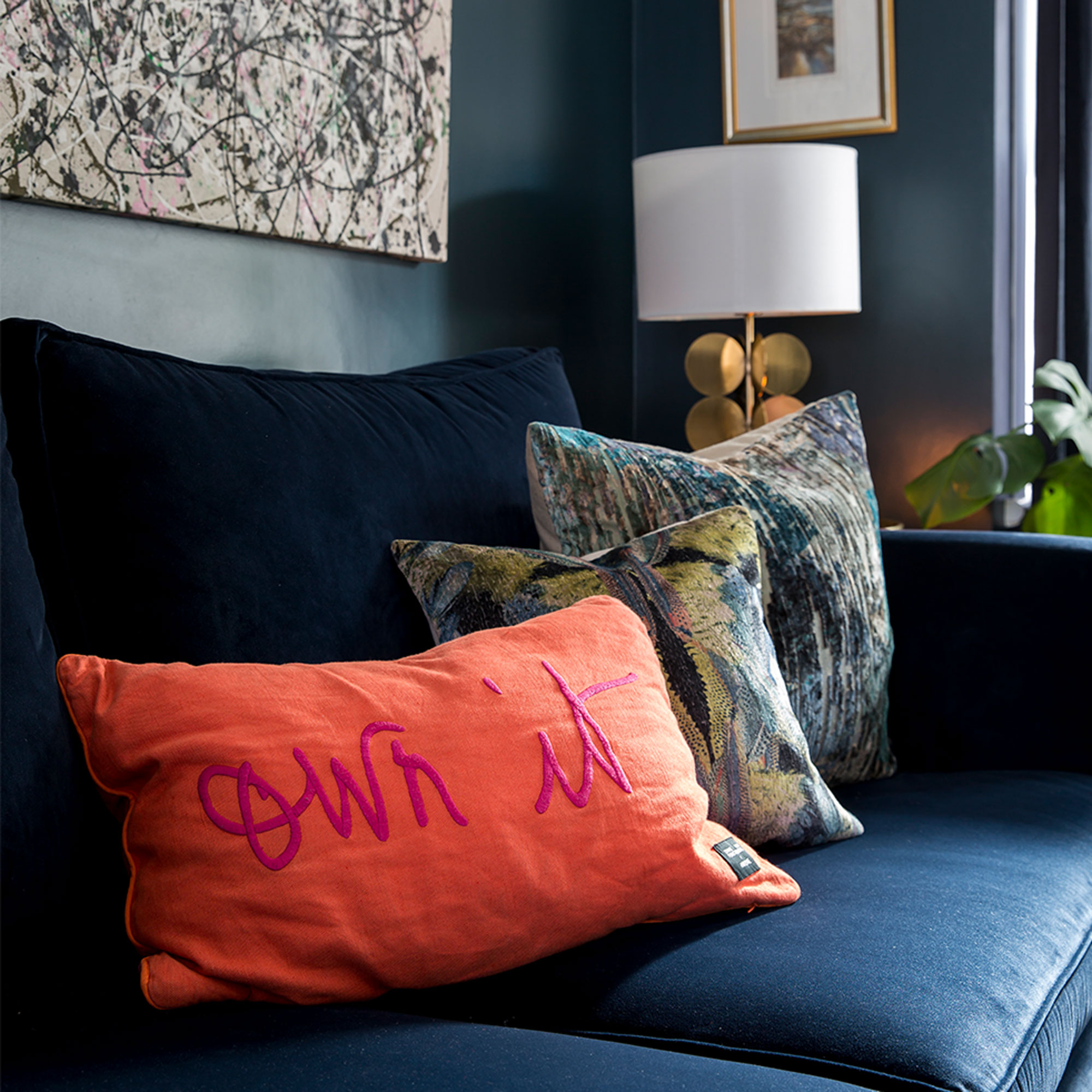
‘I love relaxing in the plush living room with its deep wall colour, and the velvet and gold in there makes it feel really luxurious and cosy, especially with the curtains drawn and lamps and candles lit in the evening.’
Classic kitchen
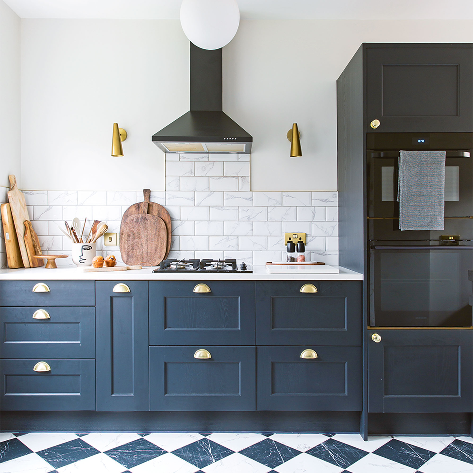
‘The kitchen took around five or six weeks from start to finish, and we took the base units and worktop all the way round into the extension to make better use of the space.’
‘Our cabinets came from a local firm called F&L Kitchens and the team were so helpful. I made requests for lots of samples and went to the showroom to choose them, before opting for these Graphite ones. I sourced the brass handles separately from Amazon to match the brass trims elsewhere in the room’
Tiled splashback
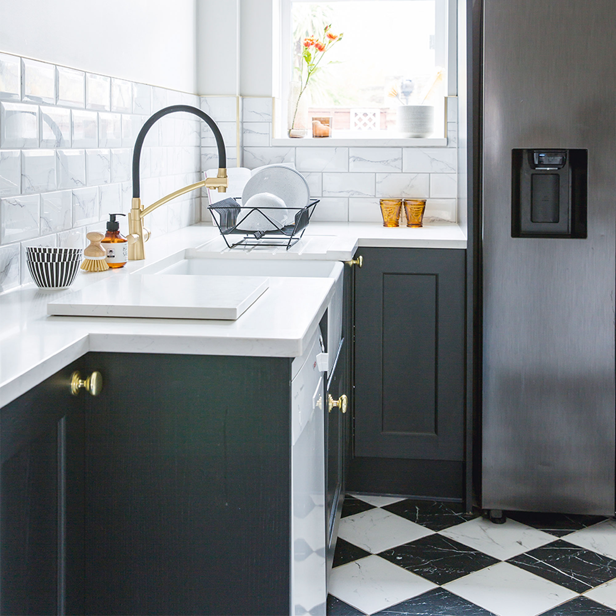
‘I love painted walls in the kitchen but knew I needed a splashback, so chose these marble veined ones from Topps Tiles.’
‘When it came to the floor tiles, I originally wanted penny floor tiles with a mosaic inlay, but affordability forced me to go for something bigger. I love that these black and white tiles are smooth, as previously there were textured slate tiles in the kitchen which were a nightmare to clean.’
Sleek breakfast bar
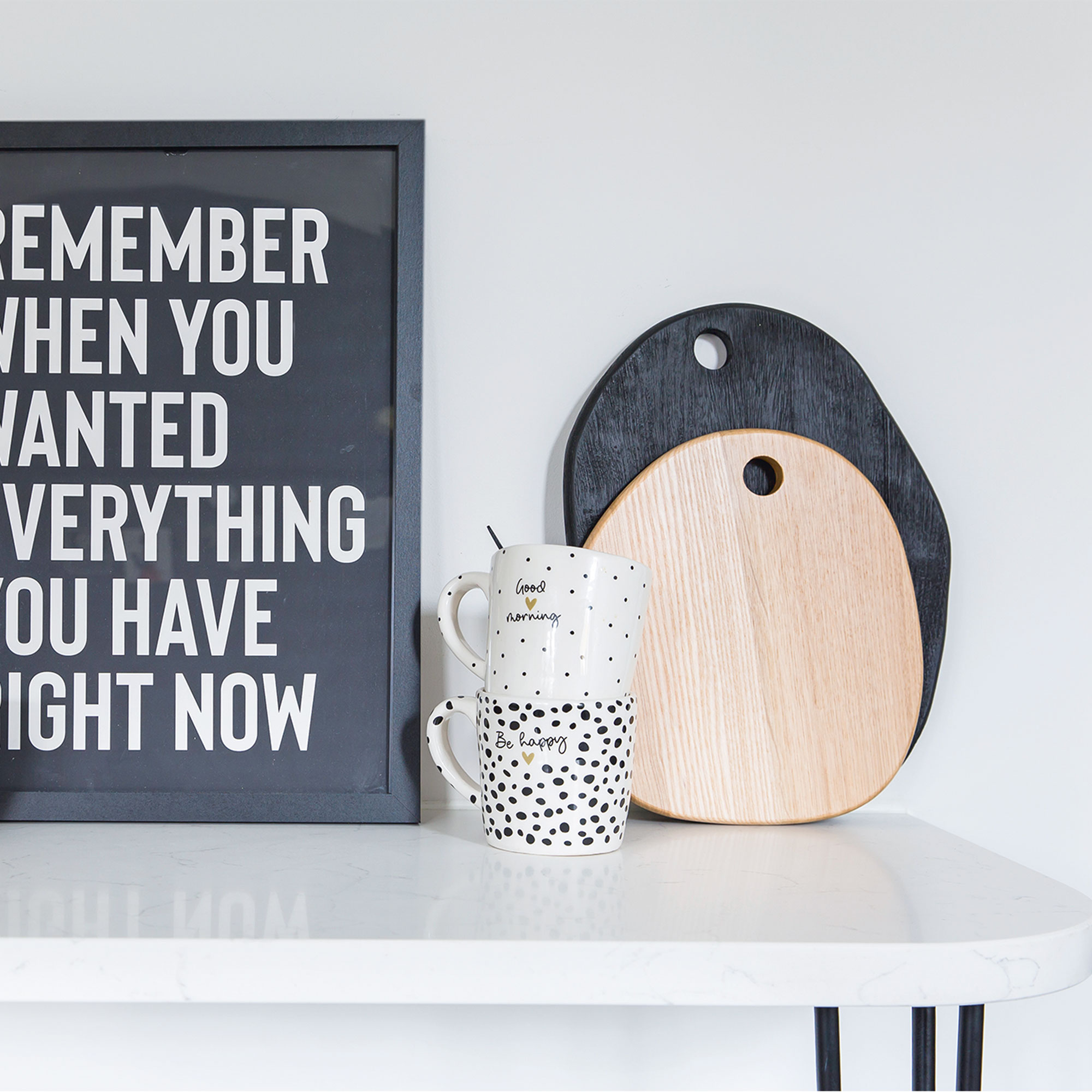
‘The breakfast bar in the kitchen is something we had custom made by the company who provided our worktop. Everyone told me it wouldn’t fit in the space and would make the kitchen too narrow to walk in, but having a curved edge means it fits and I think it softens the room.’
Cosy dining room

‘Both the dining room and living room are painted in Dulux Azure Fusion 1, which is a close match to Farrow & Ball’s Inchyra Blue. Painting the whole dining room and living room blue was one of my best ideas.’
‘I always find it really hard to describe my style, but I did have a clear vision of how I wanted this house to look. I think your home should tell a story so I like interesting pieces of furniture or art that gets people’s attention – that probably comes from having an auctioneer as a Dad. I love pops of colour too and texture is something I’ve learnt to embrace and include as we’ve gone along.’
Statement artwork
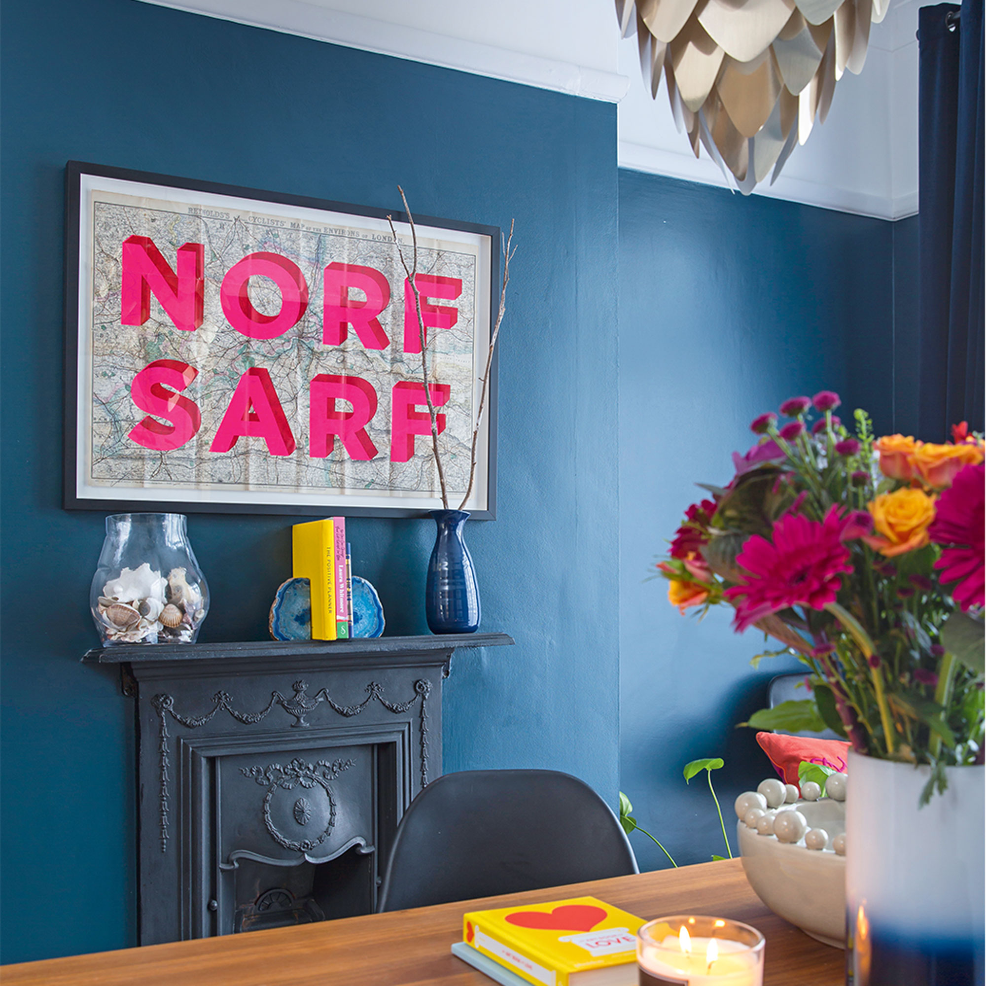
‘‘I think I’m a bit of a melting pot of old meets new and definitely more maximalist than minimalist – although that’s a bit of an internal struggle because I also like a place for everything. When it comes to home décor, if it grabs my attention and makes me smile then it generally goes in.’
‘I love artwork and this limited edition piece is from Nelly Duff Gallery. Each map that he does is different and this one runs from Croydon (where I lived previously) to Enfield, where I am now. I try to support small, independent businesses that stock quirky, colourful stuff whenever I can.’
Relaxing bedroom
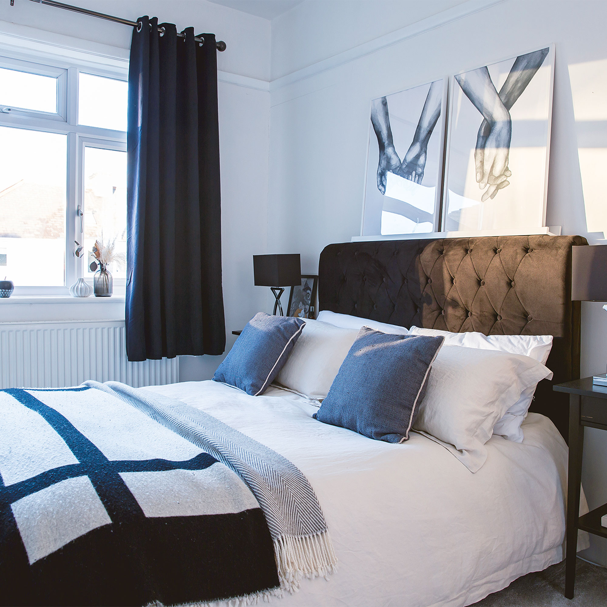
‘I’ve gone for linen bedding from Soak & Sleep in the bedroom, which I love. It’s a natural colour, which brings an element of warmth to the monochrome scheme.’
Compact bathroom
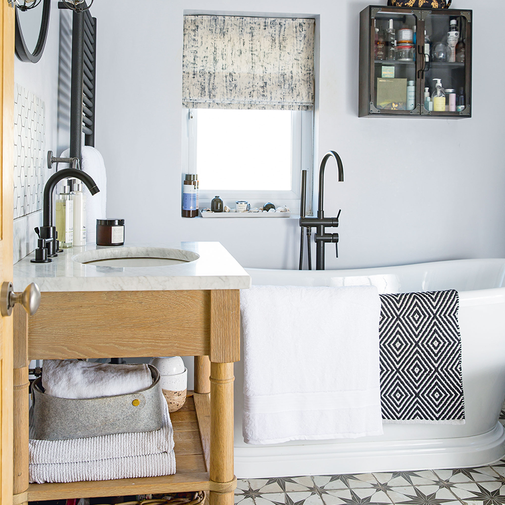
'The roll top bath and classic black and white colour palette gives the bathroom a traditional vibe that I love.'
‘I like snuggly towels, and swear by Soak & Sleep for these big white bath sheets – they’re ideal for wrapping up in after a bath.’
Chic vanity area
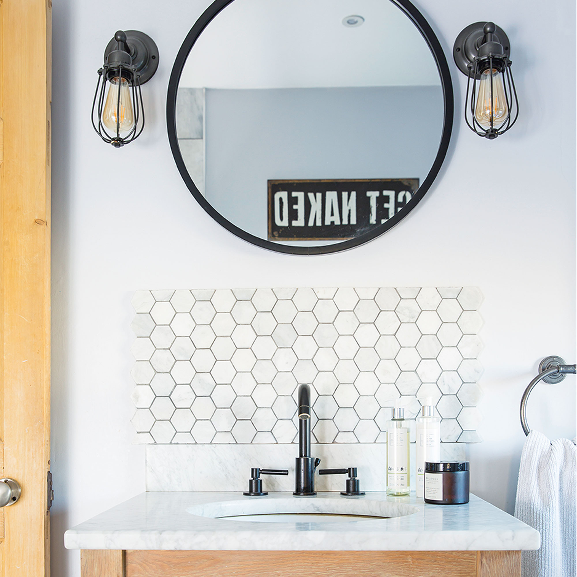
‘I also really love the vanity unit in the bathroom – it took ages to find one I liked before I finally discovered this wood and marble-topped design from Neptune.’
Sleek shower enclosure
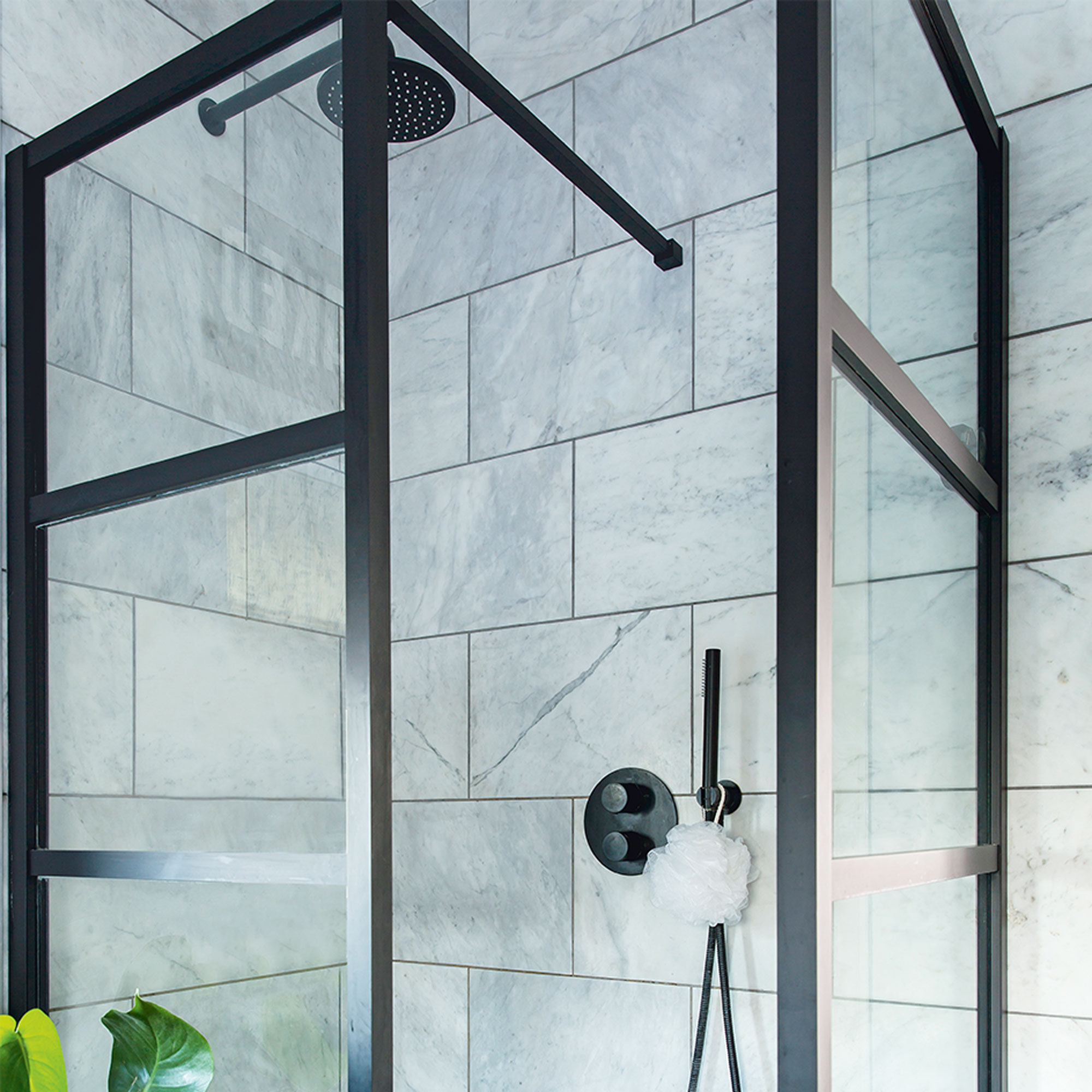
‘I was designing our bathroom and started pining for a Crittall-style shower door – so when I found this one it was a game changer. Everything else was planned around that.’
Cute nursery scheme
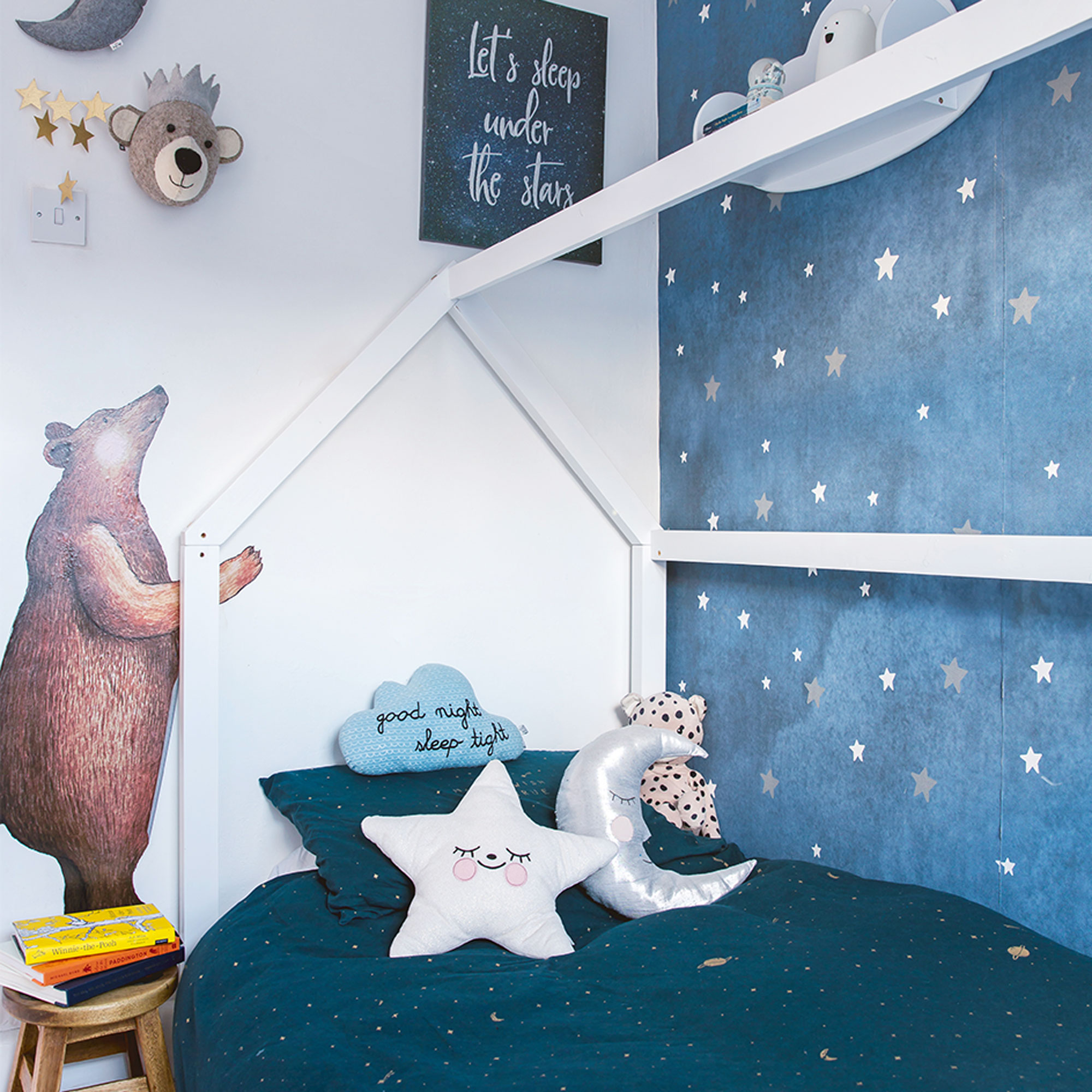
‘‘The nursery was decorated before I knew if I was having a boy or a girl and I wanted a scheme that would work for either. It’s been really adaptable and we’ve since evolved it to include planets and rocket ships, just by changing the bedding. The bear wall sticker is by Hartendief. I’m planning to move my son into the spare bedroom soon, and turn this room into a small office.’
Traditional hallway
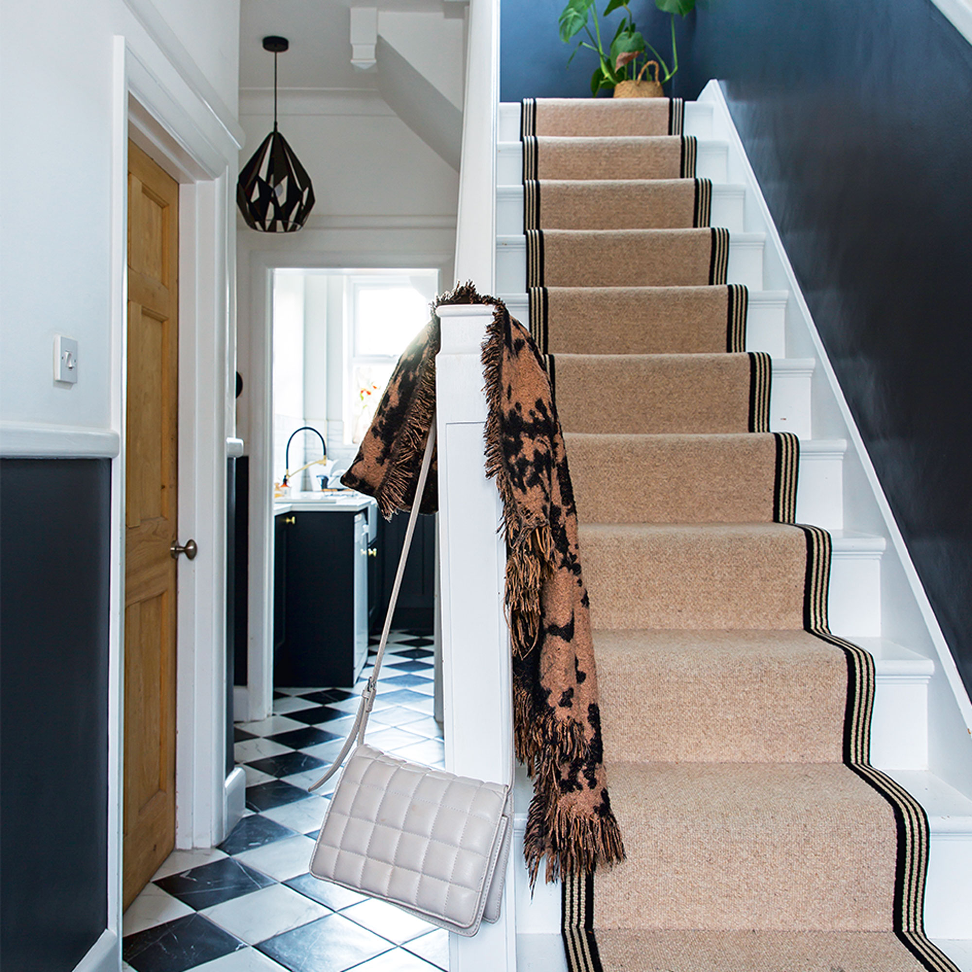
‘In the hallway, I had the wool stair runner custom made by Bridge Flooring, which I love, although I do have a bit of a love-hate relationship with it – mainly because I’m constantly trying to clean either side of the stairs as they show up every speck of dust.’
‘On reflection, I’d have a runner again, though, and I might add stair rods next time.’
Neat storage
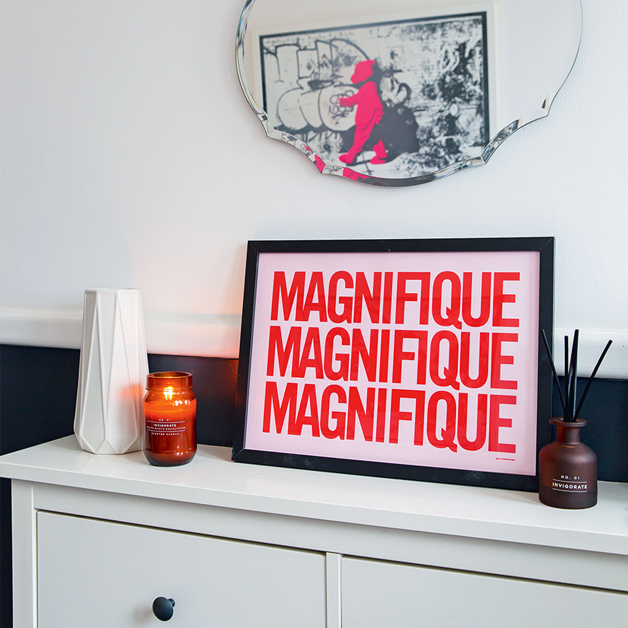
‘The mirror in the hall looks vintage but is actually from Argos. Underneath we have the Hemnes shoe cupboard from Ikea, which I actually got secondhand, for storage.’
‘I’m so pleased with what we’ve achieved. I think the house is stylish and timeless and I love that we’ve been sympathetic to some of the original features. It’s a house that works for us as a family home – we added a big bath and a shower, and because we took our time to renovate the kitchen we were able to work out exactly what we needed from the layout.’
‘This house has been a labour of love, but I can genuinely say that I love living here.’
Get the look

Laurie Davidson is a professional stylist, writer and content creator, who lives and breathes interiors. Having worked for some of the UK’s leading interior magazines, styled homes up and down the country and produced sets for TV shows, adverts and top brands, it’s safe to say Laurie has had a pretty exciting career. Find her on Instagram at @lifeofaninteriorstylist or over at lauriedavidson.co.uk
- Lisa FazzaniDeputy Editor
-
 Will a conservatory add value to your home and how can you maximise it?
This is what the pros say
By Amy Reeves
-
 I’ve been looking for a new signature scent for my home and The White Company's new fragrance is the exact summer holiday smell I needed
Santorini smells fresh, summery and sophisticated
By Kezia Reynolds
-
 How to remove algae from garden walls in five steps – and the cleaning product experts rave about for tackling it fast
Experts share their top tips for getting garden walls algae-free
By Katie Sims
