Clever design hacks have made this two-bedroom apartment feel miles more spacious
We learn how this unloved and neglected ex-rental property was transformed in less than a year
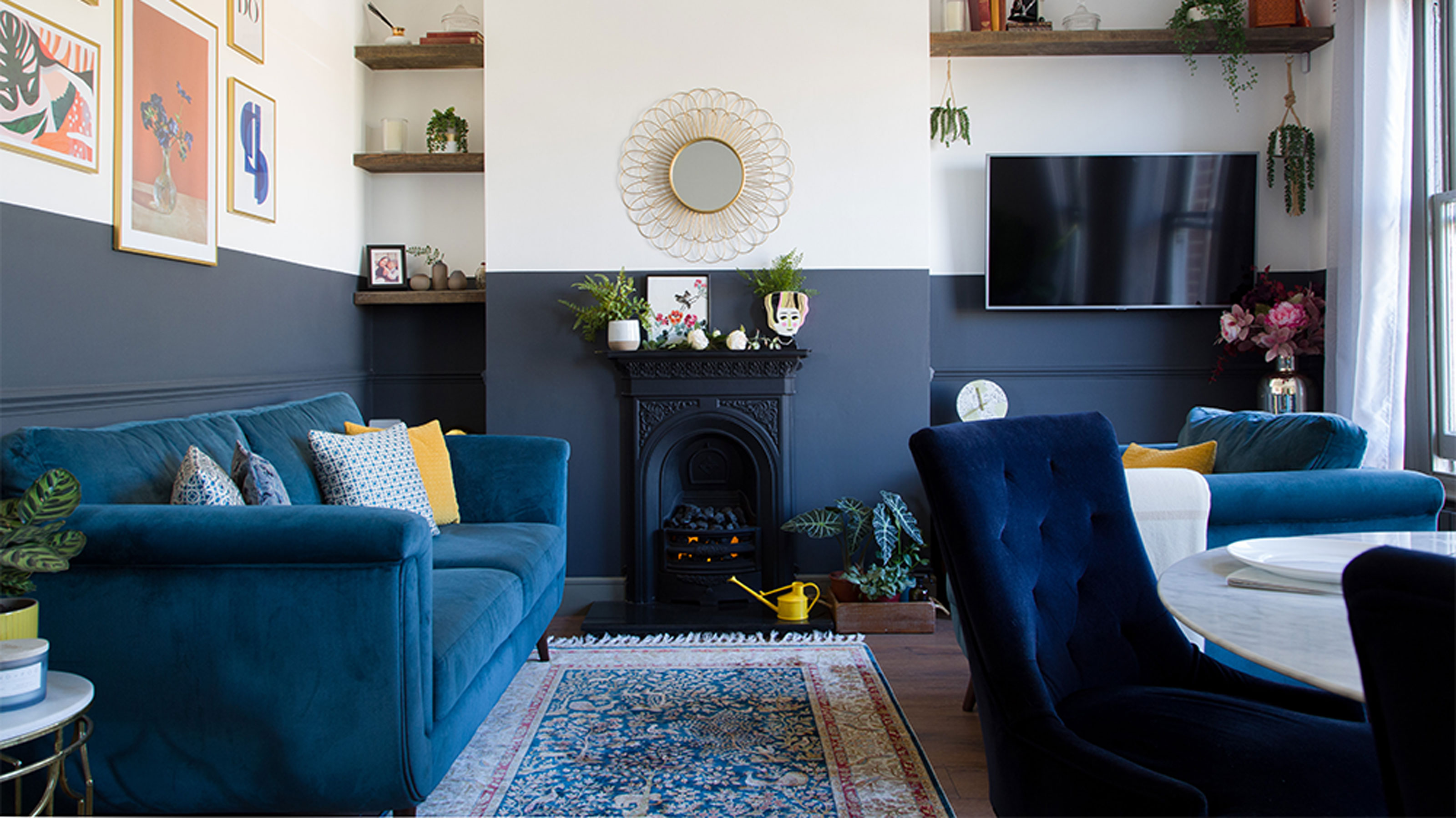

Finding a dream property was the easy part for this homeowner. The challenge was making the higgledy-piggledy space in a period conversion feel modern, spacious and homely. But with clever design hacks, a layout reconfiguration and meticulous planning, she has managed to pull it off with a stunning transformation.
'I had a really clear idea of the kind of property I was after,’ recalls the homeowner. ‘I wanted to find a nice-sized period conversion apartment that felt welcoming, warm, homely and was in a convenient location.'
'Despite being very basic and somewhat underwhelming internally, I could see so much potential. The Edwardian building it’s situated in is full of character, overlooking a quiet leafy avenue and with beautiful original sash windows.'
Reconfiguring the layout
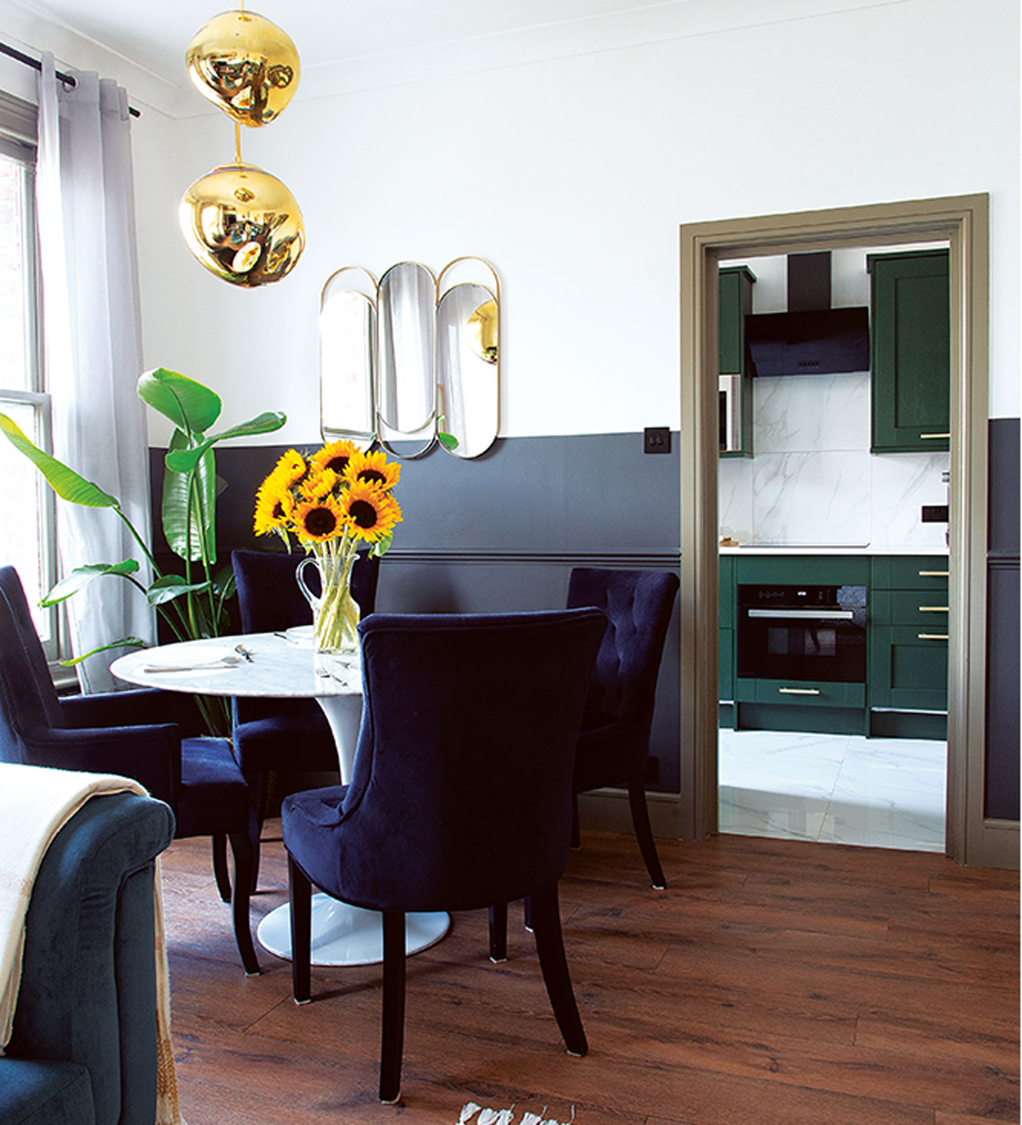
‘The interiors were nothing short of neglected, having previously been an unloved rental property, but the large windows allow natural light to flood in and the outdoor greenery – framed by the famed sash windows is like a kind of unique, ever-changing piece of artwork. I couldn’t walk away, so I made it our home.’
‘When we moved in, the living room was walled-off, painted red and mauve and, although a good size, lacked character,’ recalls the homeowner. ‘To make better use of the room I opened up the space, removing walls and doors, and incorporating the wide hallway too. It has made a huge difference – there’s a much better flow and it’s full of natural light, now.’
Upon moving in the home owner set to work stripping the entire flat and ripping out the kitchen, bathroom and flooring throughout. A wall that separated the living room from the dining room was taken down and doors from the hallway and kitchen entrances removed to create an open-plan space.
A rug and strategically-positioned lighting help to separate the open-plan area into two zones – one for dining and one for lounging - a good takeaway trick for multi-purpose rooms.
Get the Ideal Home Newsletter
Sign up to our newsletter for style and decor inspiration, house makeovers, project advice and more.
‘It has made a huge difference,’ says the homeowner, ‘as the new layout allows natural light to travel through the core of the flat and enables a much better flow.’
The living room
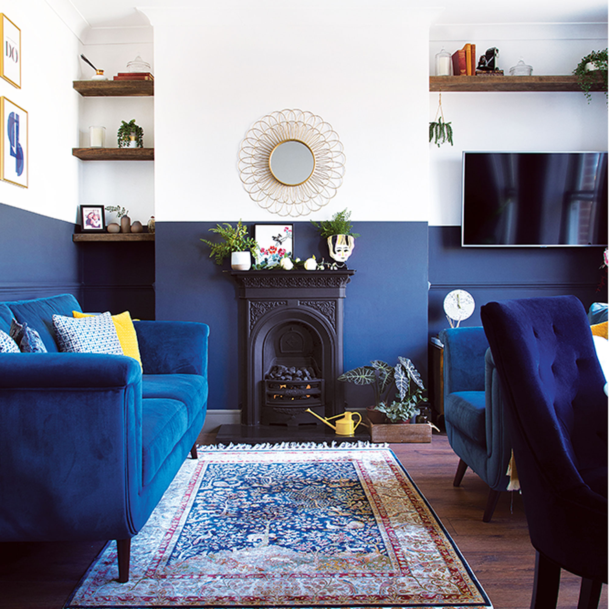
‘As an interior designer, I have a tried-and-tested method for mapping out room schemes, and I used it when designing my own home, too. I begin by looking at the limitations of a space – whether it has a low ceiling, small windows, or is irregular in shape, for instance, then I consider how the room will be used.’
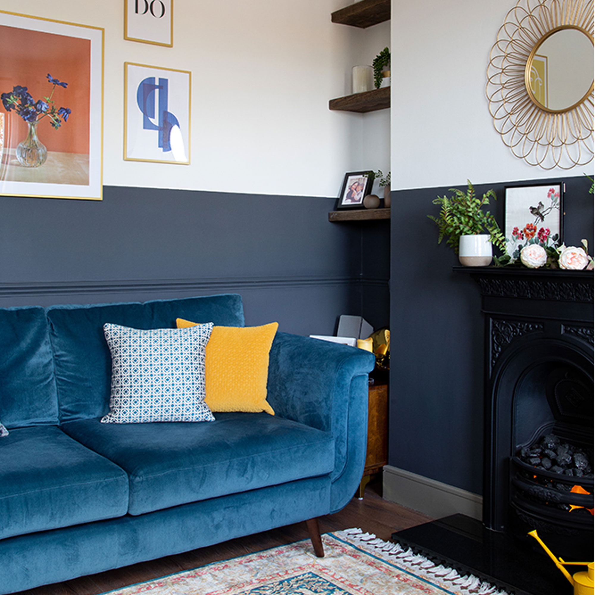
‘I painted half the height of the walls in the living room in Dulux’s Scottish Loch Matt paint to elongate the space, and make it appear as though it’s endlessly spacious. By sticking with white for the top half, it keeps the room bright and not too heavy.’
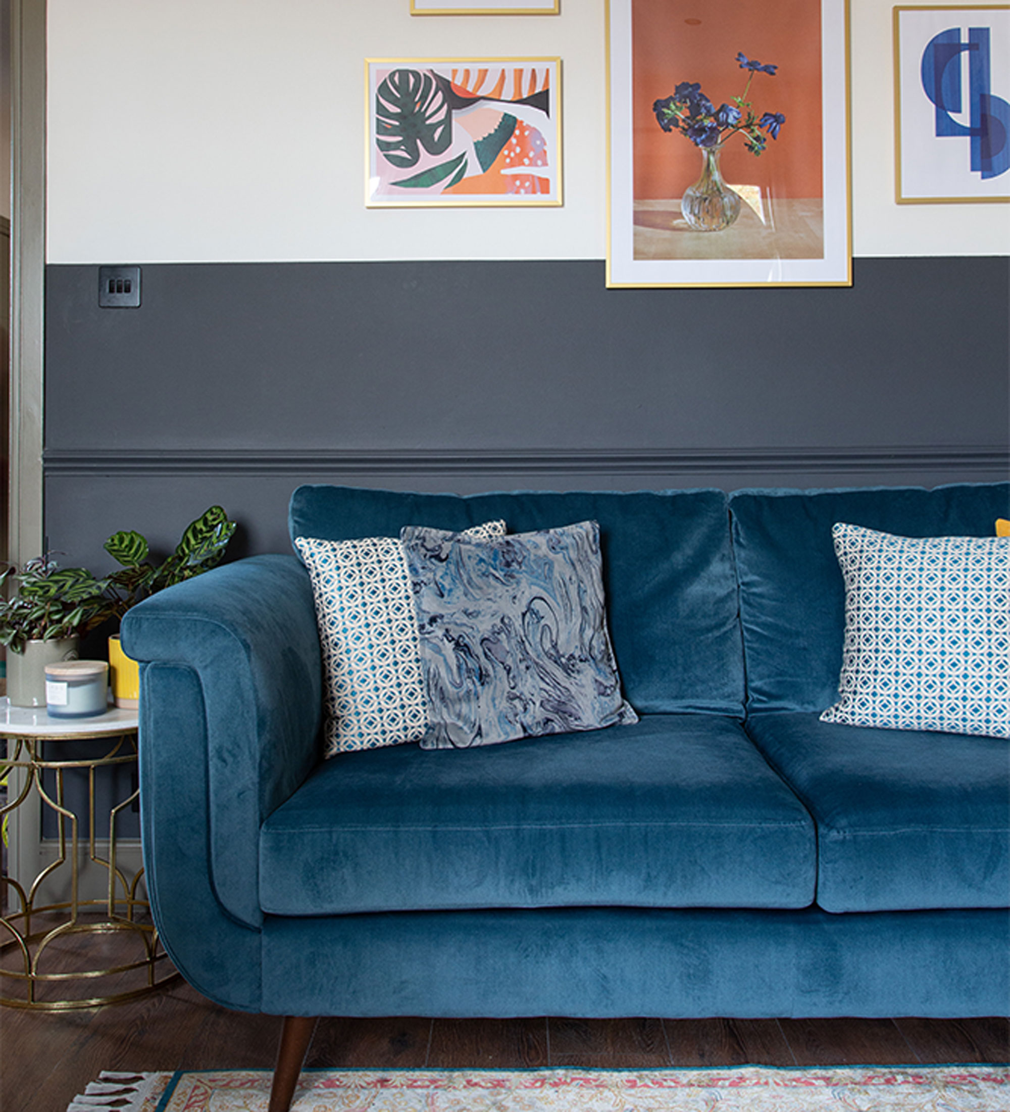
‘None of my interior schemes happen by accident – I plan them meticulously to ensure I make the very best use of the space, and that each room elicits particular emotional responses,’ says the homeowner.
‘I wanted my own home to feel warm, comfortable and relaxed. I looked to museums, art galleries, restaurants and online sources for scheme inspiration, however, I’m usually attracted to colourful, bold and modern looks with mid-century living room furniture and nods to Art Deco design, so I can safely say I stayed true to myself when decorating this flat.’
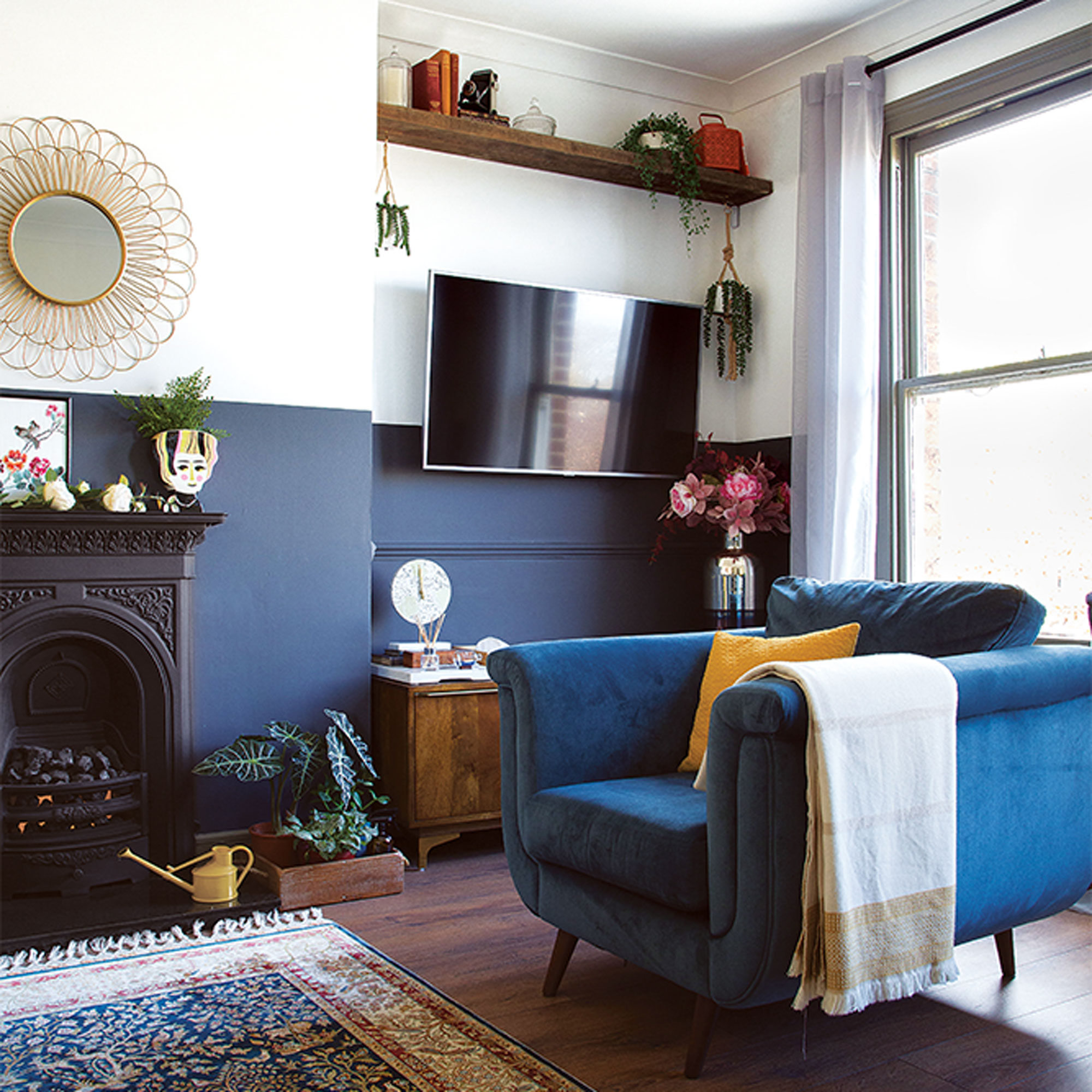
‘The vintage Chinese embroidery piece on the fireplace is one of my favourite items. I bought it from a charity shop for £3, and I just love the vibrant colours and intricate needlework. It also serves as a great reminder of my heritage and culture.’
The kitchen
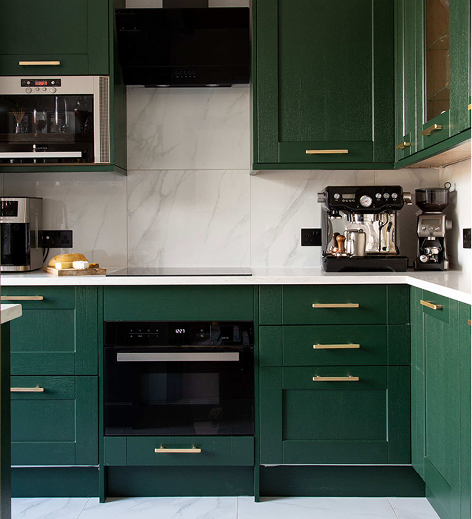
In the kitchen, Howdens’ Fairford dark green units were chosen to complement the beautiful greenery outside, with a one tile design throughout for walls and floor to prevent the scheme from feeling overcomplicated.
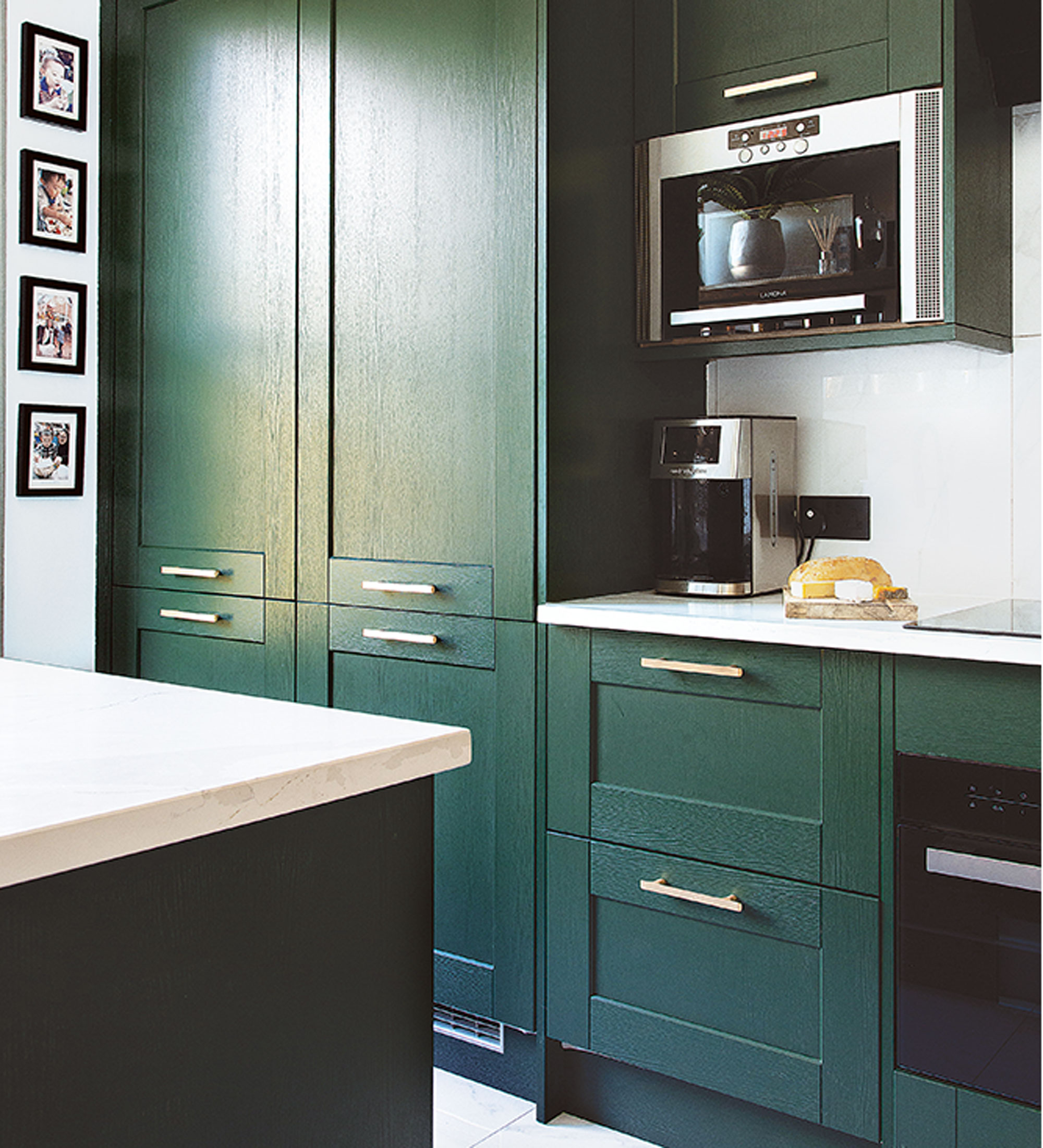
‘Because I had settled on such bold kitchen units, I tried to strike a balance by using just one tile design, with marble-effect tiles from Roccia for both the walls and floor. I much prefer larger tiles for kitchens as they’re easier to keep clean.’
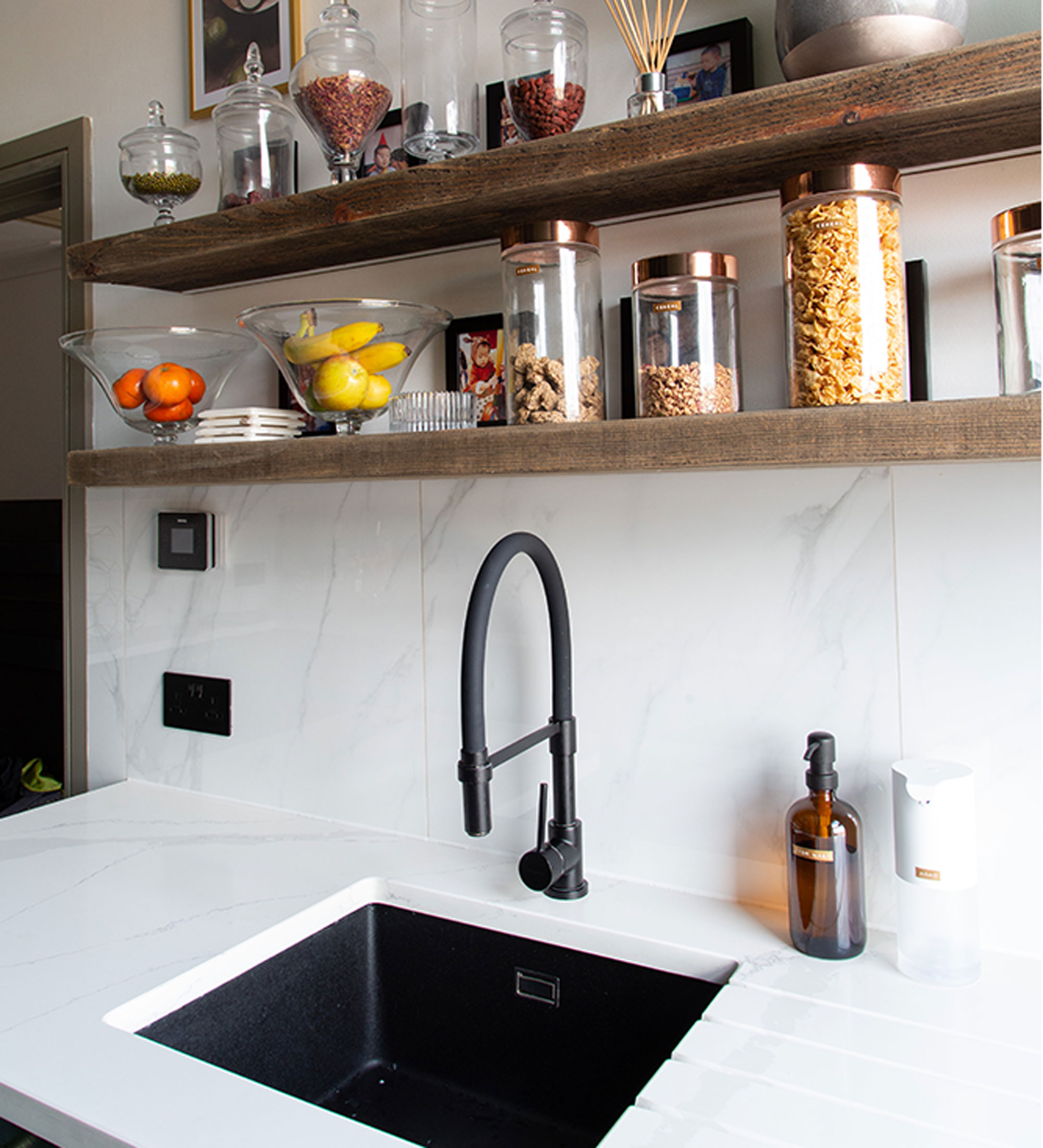
One wall in the kitchen has been kept free from wall units, with chunky, natural walnut shelves instead. This helps to open up the space and allows the homeowner to display glass and favourite kitchenware that helps add extra colour and character.
The master bedroom
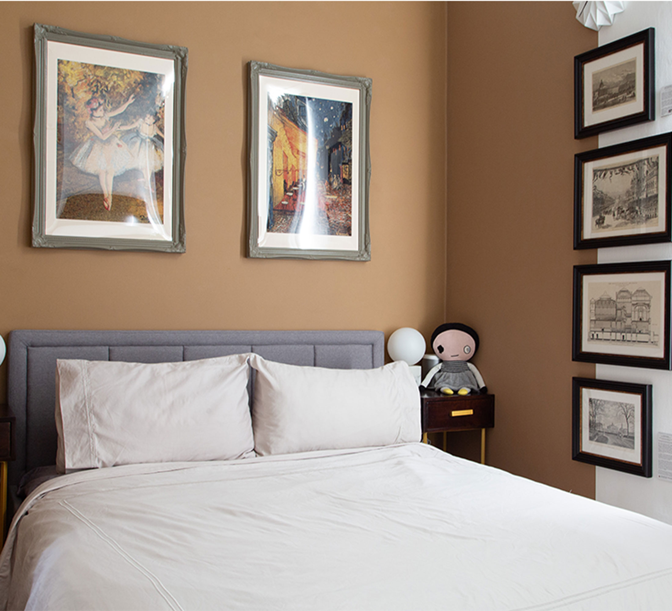
‘Before, the master bedroom had blue carpet and clashing, bright lemon-yellow walls. I tucked my bed into the nook where wardrobes were previously and painted a feature wall in Dulux’s Spiced Honey around the headboard to give it a snug, cosy feel,’ says the homeowner.
‘I mounted and framed a number of antique prints from the 1800s to display on the bedroom wall. They all feature locations I am very familiar with, including the South Kensington Museum and Liberty London. It’s easily my favourite feature in the room.’
Child's bedroom
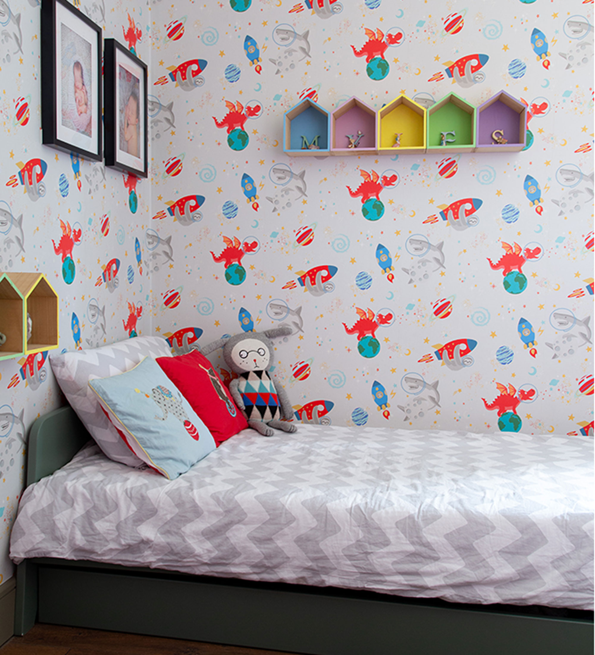
‘My son was given free rein to design his own boys' bedroom and, on reflection, I wish I had offered him a more restricted palette so we didn’t end up with wallpaper and red paint.'
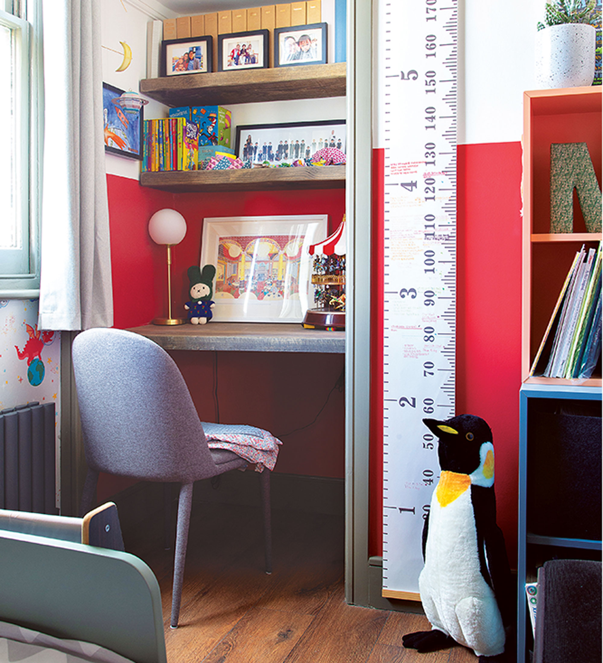
'But it’s vibrant and fun and he loves it, which is what matters!’
The bathroom
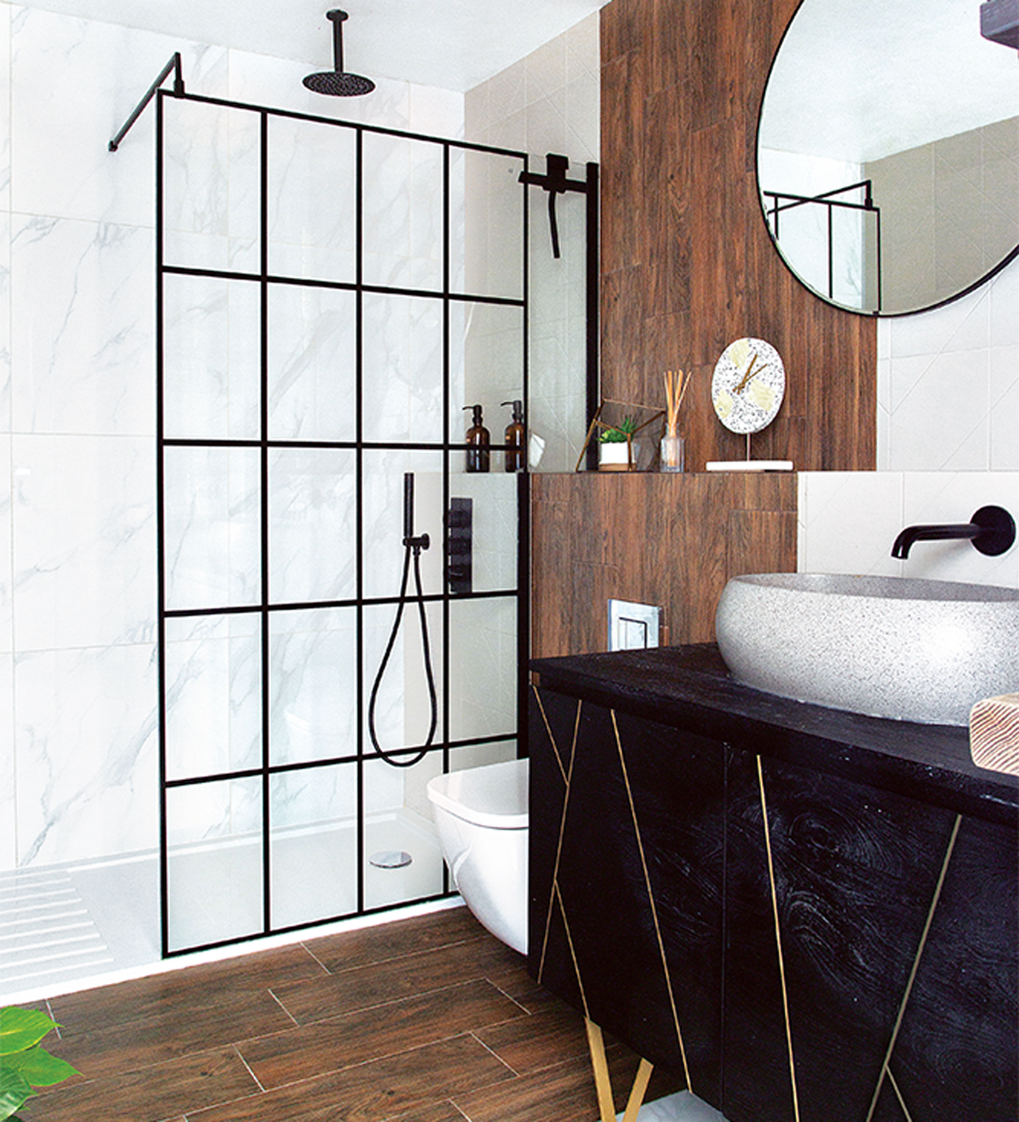
The bathroom became one of the biggest projects in the apartment. The homeowner originally thought it too spacious so considered splitting it into two bathrooms, having one as an en-suite to the main bedroom and the other as a separate, family bathroom.
‘I realised how much time we actually spend in the bathroom every day, and how often bathrooms feel drab or clinical and not at all enjoyable, so decided to make it luxurious, and a stand-out feature in the flat.’
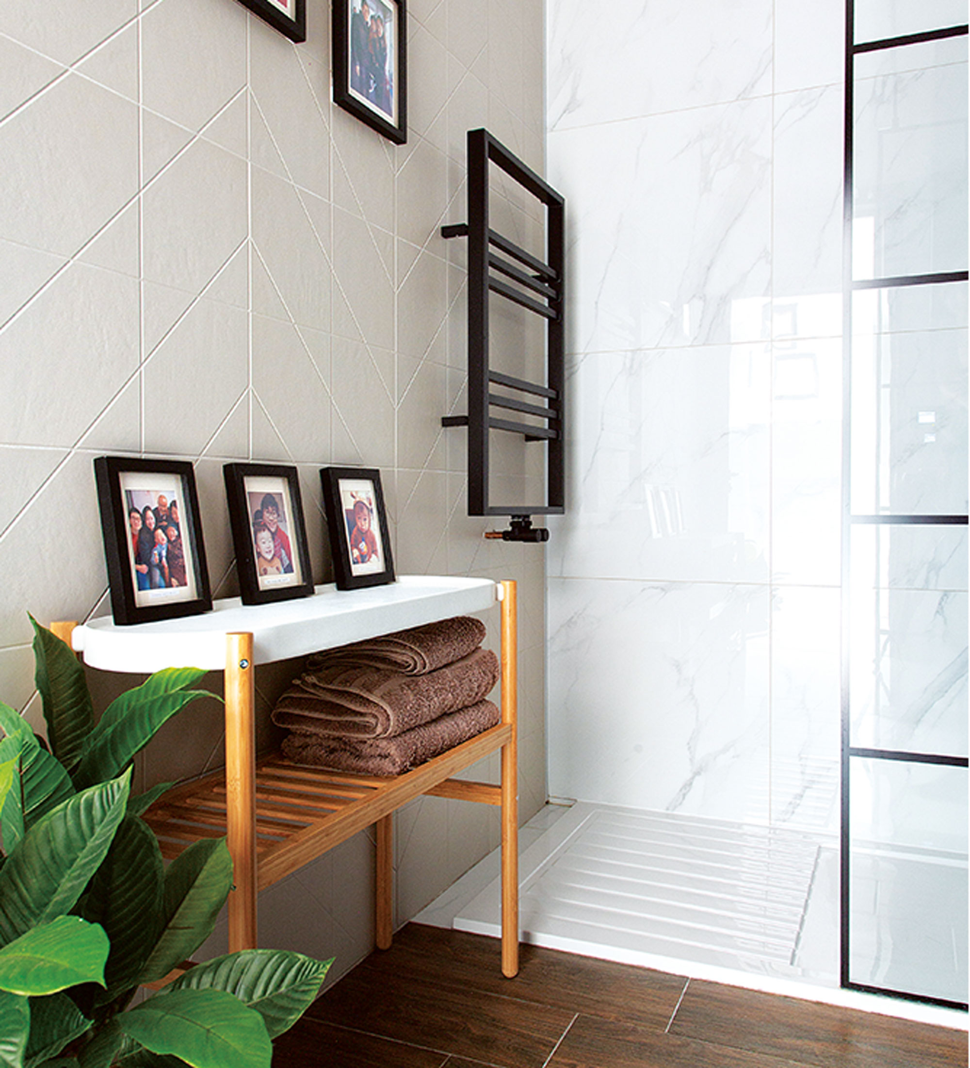
‘To avoid the bathroom looking stark and clinical, I made a feature of the space using three different types of tiles on the walls and floor. I chose wood, marble, and 3D matt cream tiles to add texture and visual interest and I’m so pleased with the result. Though, it was a risk, as it’s near impossible to get an accurate idea of what the end result will look like until they’re all in situ.’
‘I bought the Crittall shower screen second-hand from Facebook Marketplace for £80. The previous owner had purchased the wrong size so, unable to make use of it, sold it to me for a bargain price. I had to drive for hours to collect it, but it was worth it – it fits the space perfectly!’
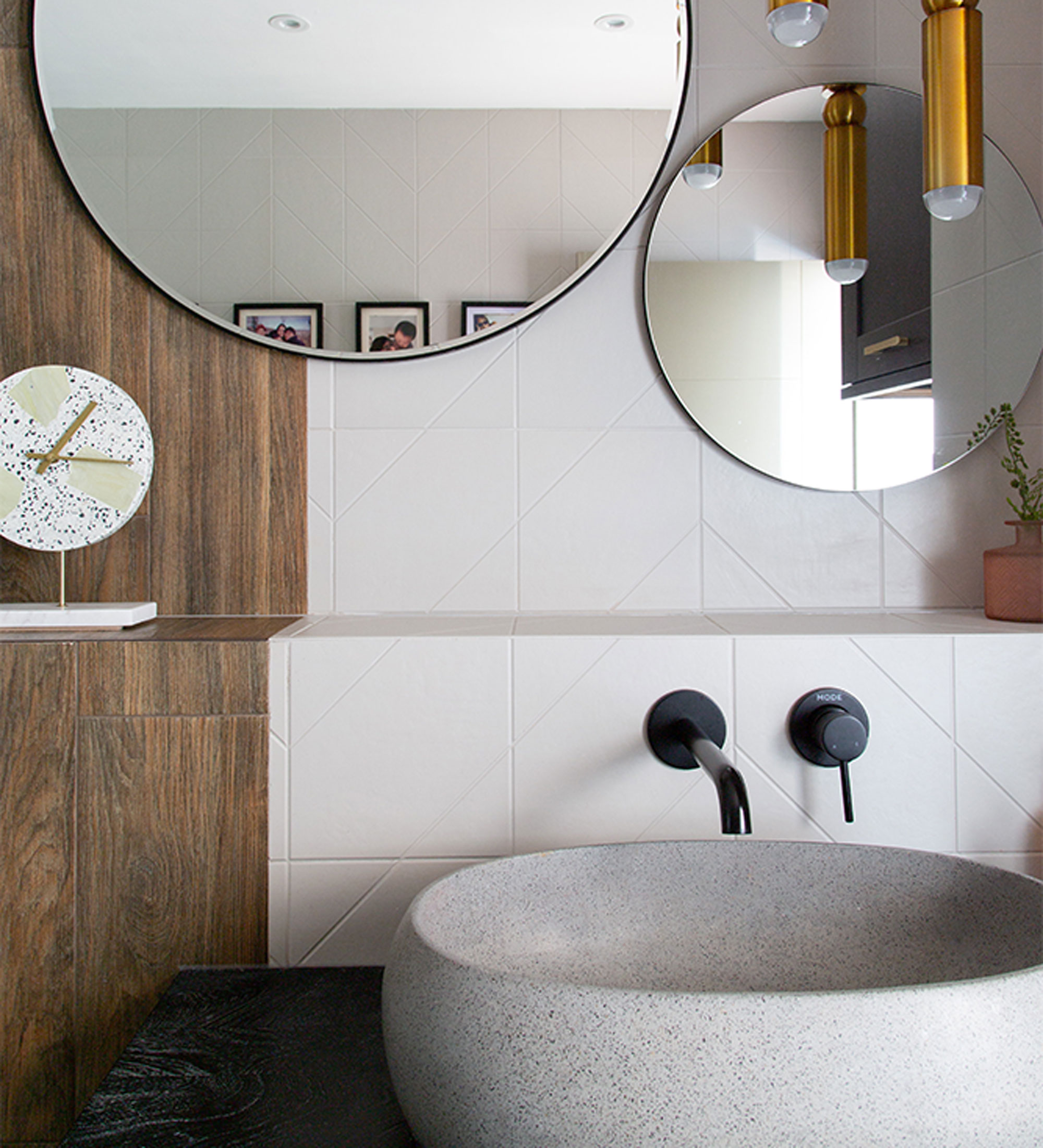
‘I wanted something other than the standard white ceramic sink in our bathroom, so instead I chose an Orion grey terrazzo washbasin and a gorgeous vanity cabinet, both from Tikamoon.’
'The very best thing about living here is how much it has improved our quality of life and out states of mind. It really is our safe space and we feel happy and proud to live here.'
'I love to think I've inspired others to make confident choices with home decor - but always remember that your home is just for you and your family. There's no need to try and please everyone.'
How to zone an open plan space
First, figure out how you want to use the space. Are you in need of an area to work and one to rest, for example? Or perhaps a space to cook and another to eat. Either way, finalise your requirements and allocate an area of the room to each one.
One way to visually separate different areas in a room is by manipulating the flooring. You could fit tiles in one section and wood in another, for example, or you could simply use a large rug to frame an area.
Consider room dividers. Shelving units and folding screens – or anything large enough to replicate a kind of temporary wall – can be used to zone spaces in the home. They’re ideal for adding storage, too.
Don’t forget the lighting. Lighting sets the tone of a space, so it’s key to get it right in every zone. Think: task lighting for kitchen countertops and work spaces, pendant lighting for dining areas, and lamps in the living area.
Additional words by Abbi Henderson

Lisa is Deputy Editor of Style at Home magazine and regularly contributes to sister title Ideal Home. She has written about interiors for more than 25 years and about pretty much every area of the home, from shopping and decorating, crafts and DIY to real home transformations and kitchen and bathroom makeovers. Homes and interiors have always been a passion and she never tires of nosying around gorgeous homes, whether on TV, online, in print or in person.
-
 Wood drenching is the calming new twist on the colour drenching trend – here’s how to make the look work in your home
It’s easier than ever to embrace natural materials
By Maddie Balcombe
-
 Aldi is launching a £200 day bed with four different features - its sleek design is suited to the whole family
You don't want to miss out on this Specialbuy
By Kezia Reynolds
-
 How to set up a drip watering system that saves water and a lot of effort
Keep your plants hydrated (and your water bill down) with this clever garden watering solution
By Natalie Osborn