This family home has been given a coastal vibe with bright and breezy colours
See how a budget-friendly makeover breathed new life into this tired seaside home in North Wales
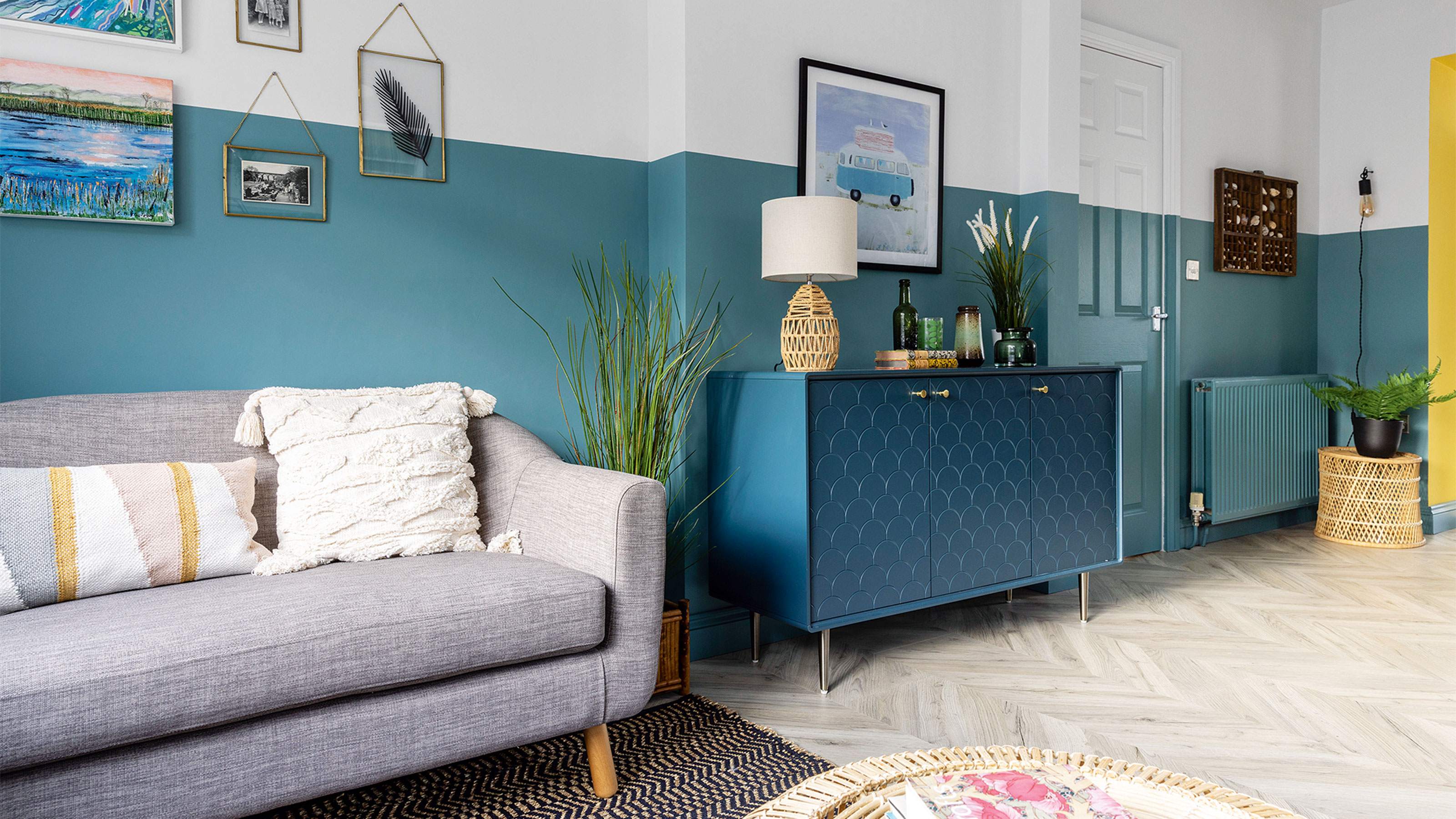

Inheriting a family home that hadn’t been decorated in decades was a challenge for this home owner. But in a prime location just a 10-minute stroll from the beach, and with happy memories of summer holidays gone by, it was the coastal setting that provided the inspiration for the bright and colourful new scheme.
‘I grew up here,’ says the home owner, ‘and when my mum passed away four months before her hundredth birthday, I couldn’t bear to say goodbye to the house she loved. It’s close to the beach, with country walks just a stone’s throw away and holds so many precious memories that we decided to keep it.’
The exterior
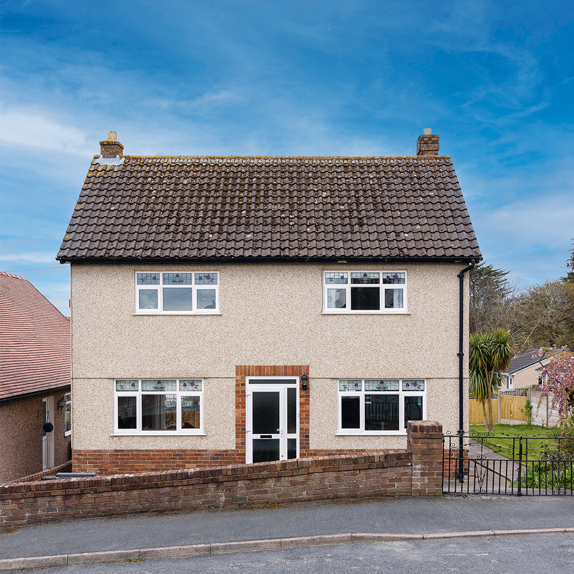
The house hadn’t been decorated in decades so looked pretty tired and worse for wear. There was only one bathroom, it needed rewiring throughout and most of the rooms also needed to be replastered, so it was quite a daunting task to take on.
'Because the house was built in the 1950s, there weren’t many features worth celebrating, although it still had the original floorboards in the hallway and living room, which we definitely wanted to keep,’ says the homeowner. ‘However, we didn’t have a massive budget, so needed to find clever ways of adding character without spending a fortune.’
The kitchen-diner
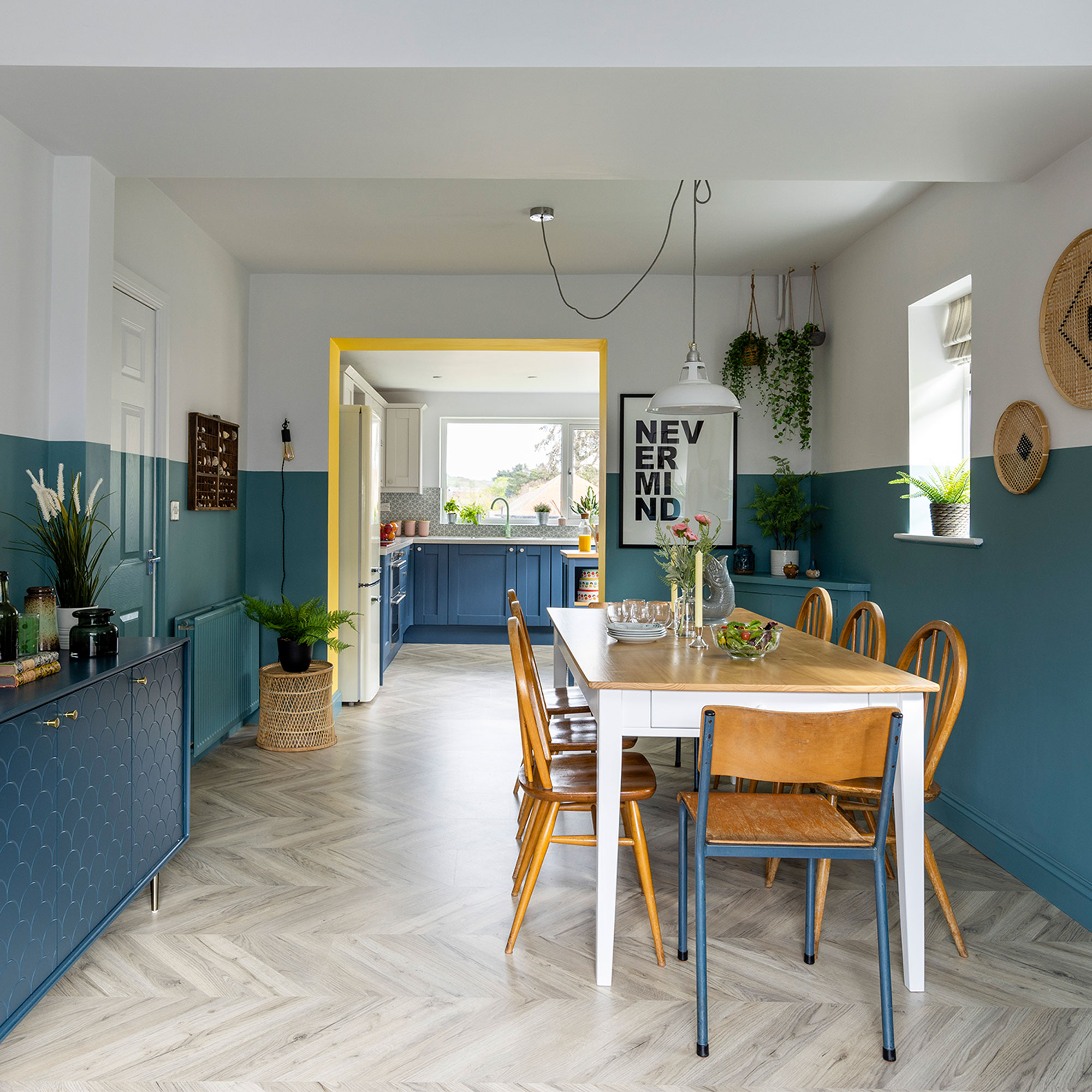
The first thing to be tackled was the layout, which needed tweaking in order to make the most of the available space and allow the home owner more creativity with kitchen ideas.
‘There was a small kitchen-diner, but two living rooms, which was a bit of a waste,’ says the home owner. ‘One of the living rooms was next to the kitchen, with a sliding door separating the two spaces, so we removed the sliding door to create a large, open-plan kitchen-diner with a separate sitting zone, and then we took out the chimney breast to make room for a large dining table. This is where we spend the most time, so we needed it to be a really sociable space.’
The living room
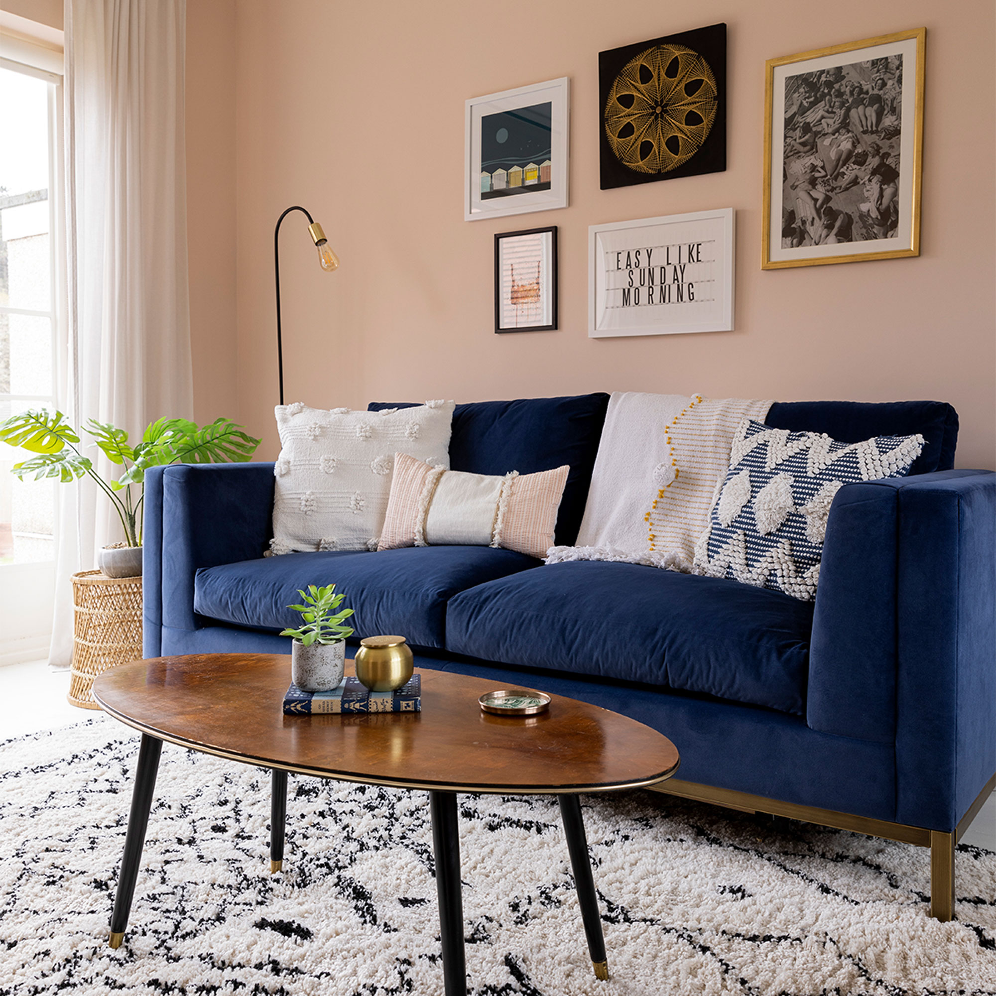
The home owner wanted the house to feel relaxed and uplifting, so chose a calming coastal palette of blues, greens and pinks, which flow through all the rooms including living room ideas.
Get the Ideal Home Newsletter
Sign up to our newsletter for style and decor inspiration, house makeovers, project advice and more.
‘This room was so dark and cold before. We painted it in Pink Ground by Farrow & Ball and now it feels warm all year round.’
‘For the furniture, we kept to simple shapes and chose mid-century, Scandi styles in keeping with the era of the house,’ adds the home owner. ‘Rattan, cane and bamboo accents suit the coastal setting perfectly and they’re great for adding warmth and texture, so we dotted them around each room. We also added lots of tufted and textured soft furnishings for a cosy feel.’
The dining area
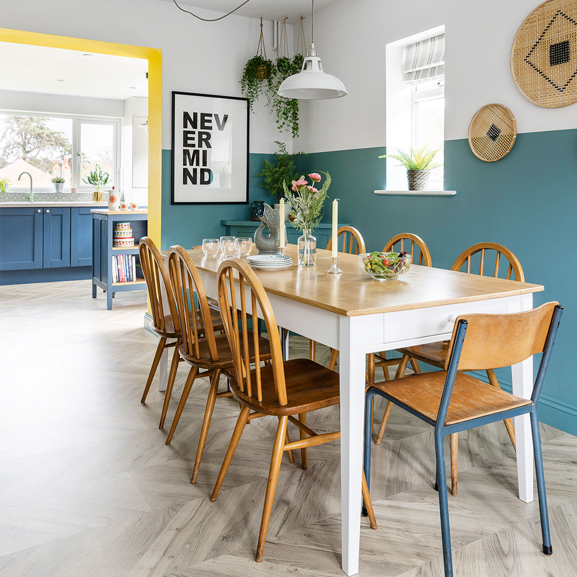
‘Using different paint techniques is an affordable way of adding character. We decided to do two-tone walls in the dining room to make the ceiling seem higher, and now it feels really light and airy.'
'At first, I wasn’t sure about going for the two-tone effect on the doors as well, so we painted it all white, but my daughter who is an interior designer, convinced us to go for it and I’m glad she did – it looks so much better!
The kitchen
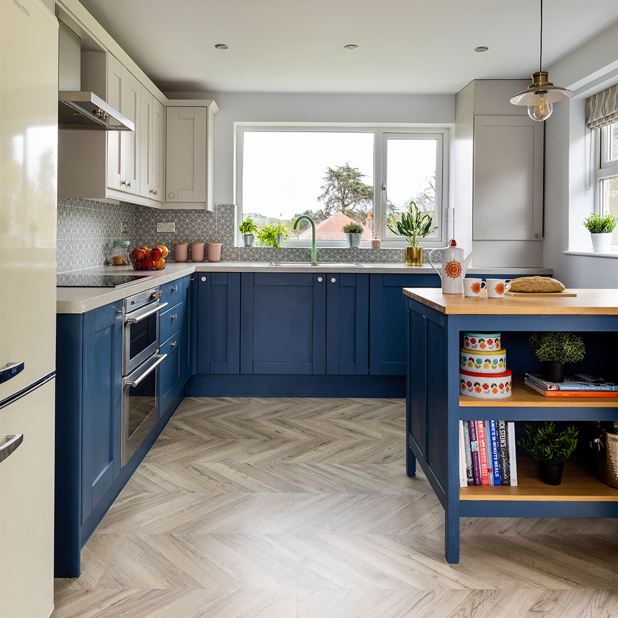
The original Howdens kitchen units were in good condition, and with a tight budget to keep to, the home owner decided to refresh them with two tone kitchen cabinet ideas and simply change the handles and worktops.
‘We chose a dark blue for the base units to tie in with the overall colour scheme, with a paler shade on the wall units to make the room feel bigger and less enclosed. It’s made such a difference!’ says the home owner.
The island area
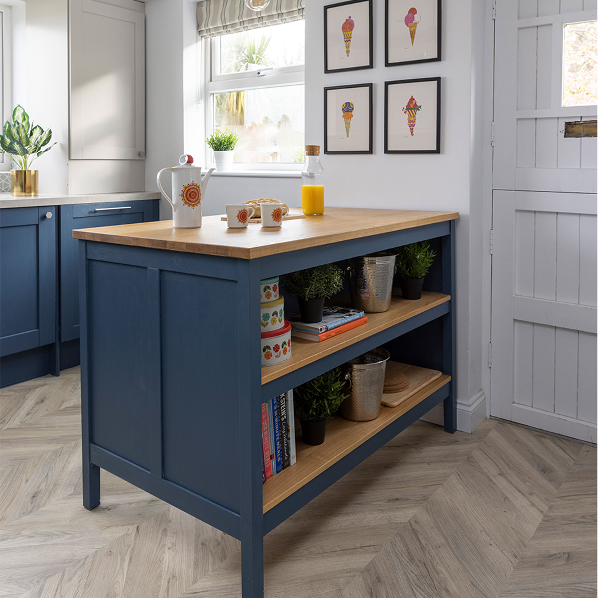
‘Our joiner fitted a new door to hide the washing machine and boxed in the boiler so all the ugly white appliances are hidden. We didn’t need a dining table in the kitchen area, so we added a small kitchen island idea instead and painted it to match the base units. It’s created much-needed extra worktop and storage space, as well as a breakfast bar area, so it’s easy to chat while cooking.’
The main bedroom
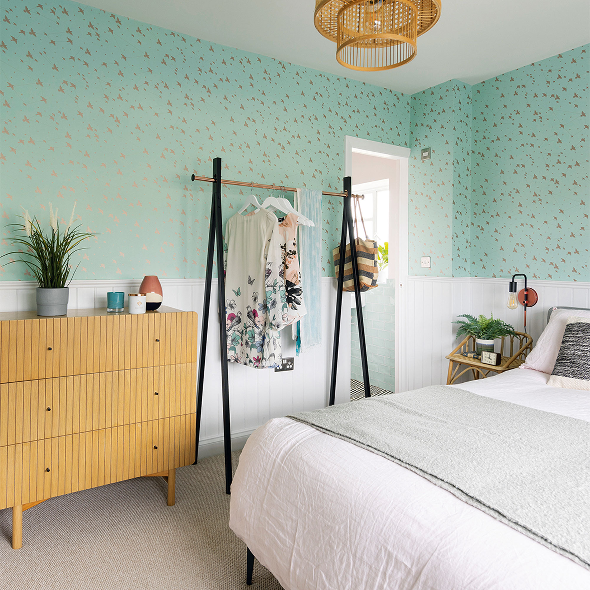
The upstairs layout has also been re-worked to make the bedroom ideas and small bathroom space flow better.
‘The house could sleep eight people, but there was only one bathroom, so we came up with the idea of separating it in two, creating an en-suite off the master bedroom and a separate family bathroom,’ explains the home owner.
‘Instead of a wardrobe, we chose a hanging rail from La Redoute. It saves on space and the room feels much more open.’
The en-suite
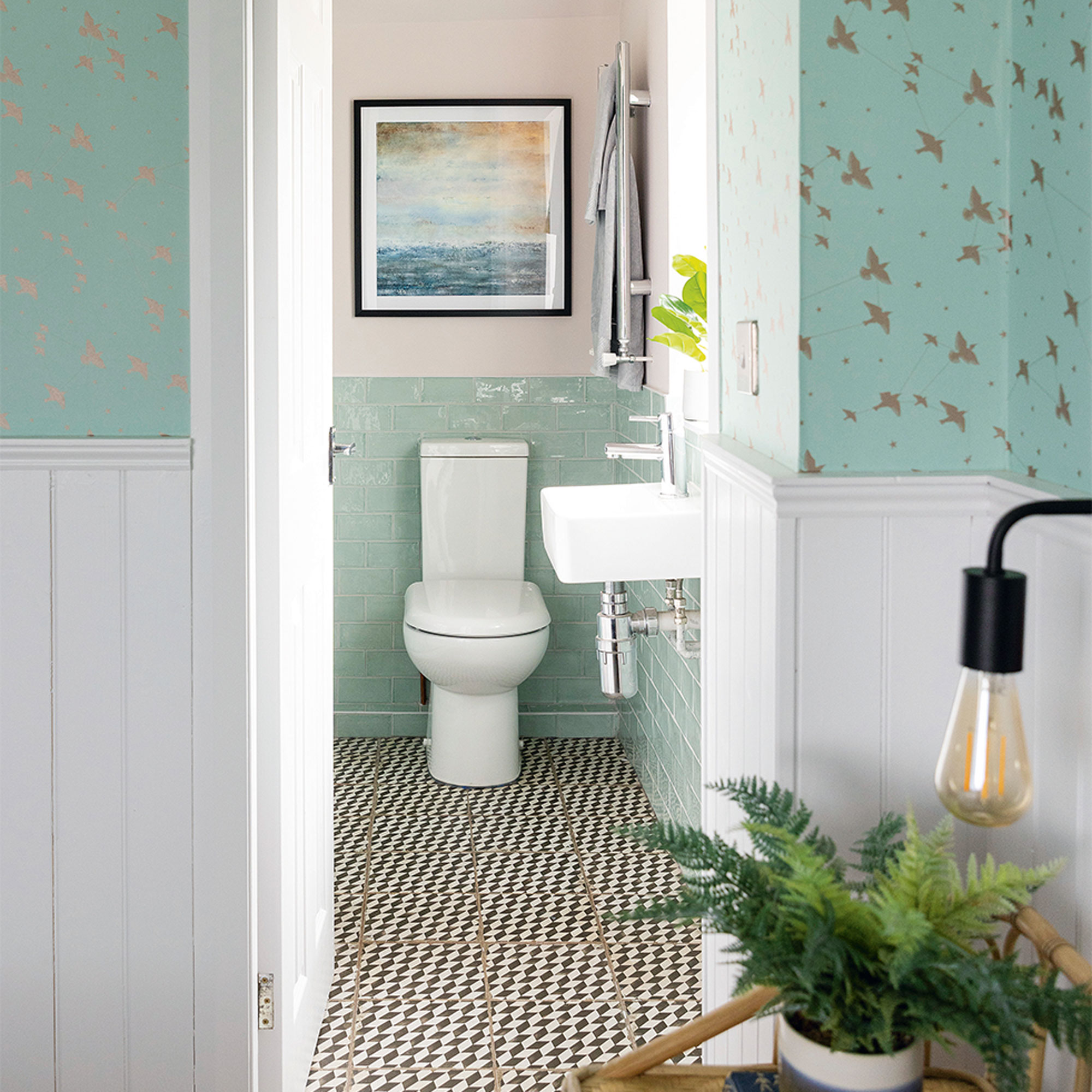
‘We continued the pink and mint green colour palette from the bedroom through to the en-suite for a nice flow.’
Black and white geometric tiles on the floor add a smart touch and are super practical to keep clean.
The guest bedroom
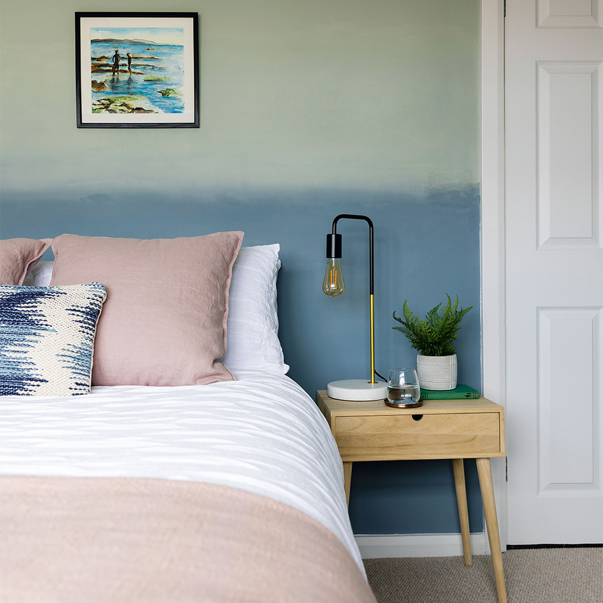
‘I painted an ombre wall behind the bed using Tranquil Dawn and Denim Drift by Dulux. I also painted the seascape above the bed to match the scheme.’
‘This bedroom is packed full of texture. The seersucker duvet cover from Made reminds me of waves and it’s a really cosy space.’
The guest en-suite
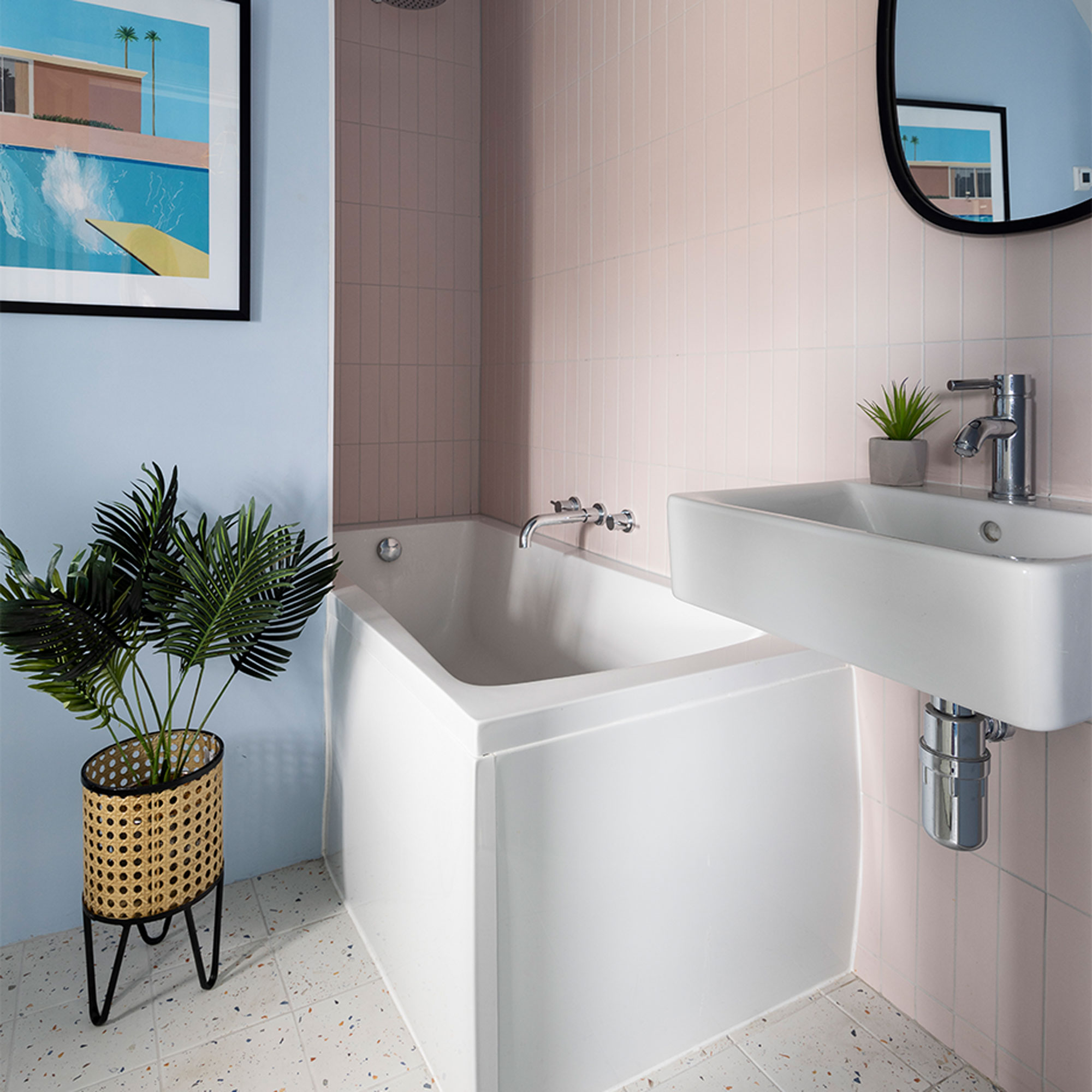
The partition wall between the guest bedroom and en-suite acts as a shower screen.
‘I’m a big fan of David Hockney and this art print pulls all the colours in the room together perfectly.’
The hallway
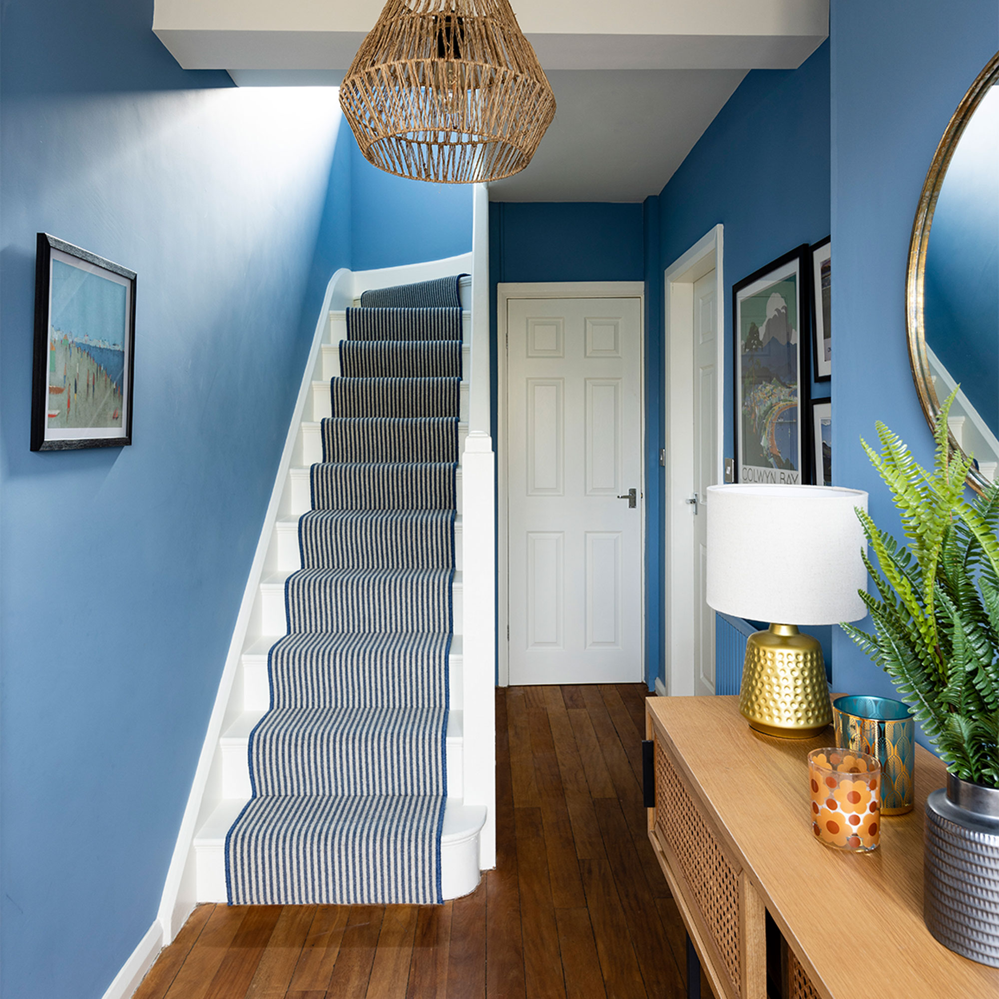
The hallway was painted in Boathouse Blue by Dulux with a striped runner going up the stairs from Carpetright that adds to the relaxed, seaside feel that runs throughout the house.
‘A lot of the artwork is inspired by the Welsh coast. I used to be an art teacher and I took up painting as a hobby when I retired, so I painted some seascapes to complement the décor,’ adds the home owner.
'We weaved mid-century touches throughout, in both the pattern and furniture, as a nod to the era of the house; the vintage pieces were eBay bargains or found in local antique shops. We're thrilled with how our home looks, it's such a happy place to be.'
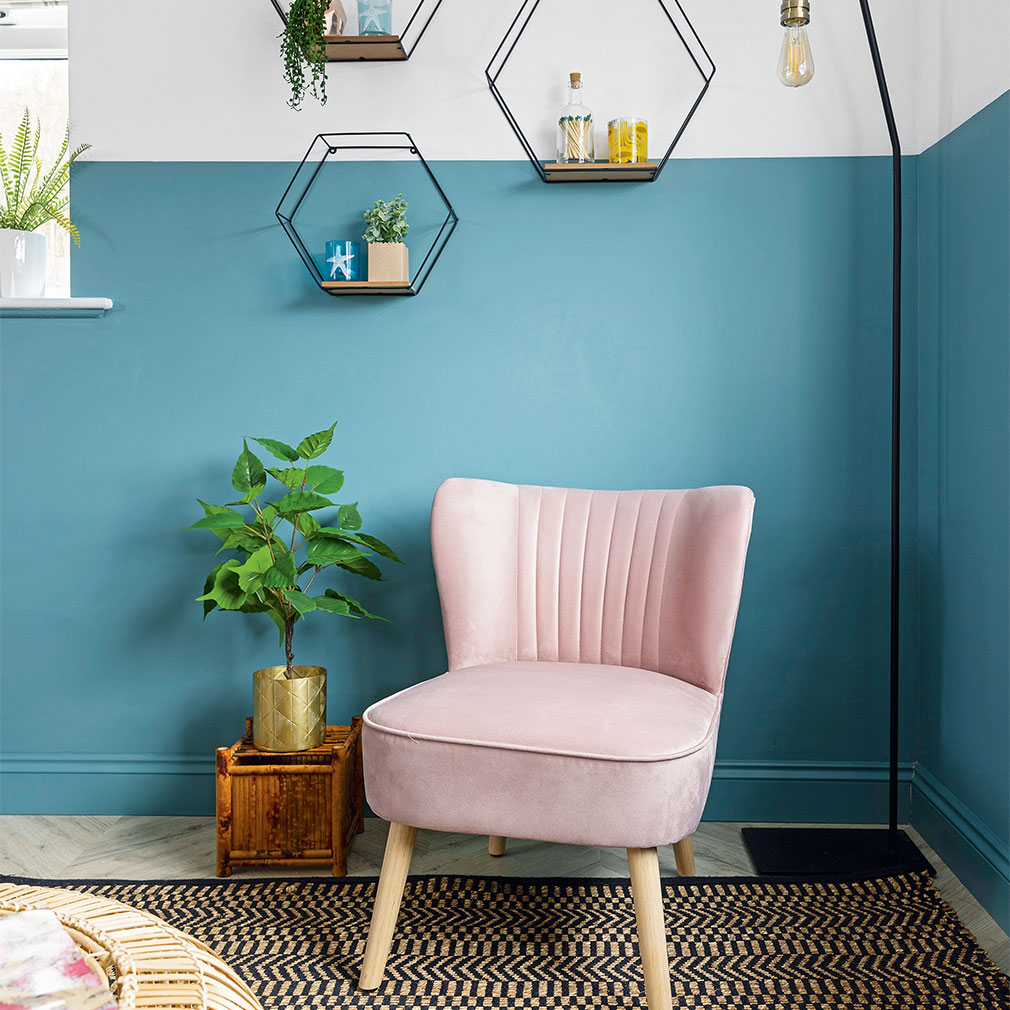
How to paint a two-tone wall
- Choose an emulsion colour and a coordinating white, such as the Maritime Teal and Swedish White paints by Dulux used here.
- Apply the lighter colour to the ceiling and top section of walls, painting slightly over where you want the dividing line to be.
- When the paint is dry, use a spirit level and pencil to lightly draw a straight line around the room.
- Apply frog tape just above the pencil mark, making sure it’s fully sealed.
- Paint the lower section of the walls, slightly overlapping the tape.
- Remove the tape while the paint is still wet.
With additional words by Florence Shaw

Lisa is Deputy Editor of Style at Home magazine and regularly contributes to sister title Ideal Home. She has written about interiors for more than 25 years and about pretty much every area of the home, from shopping and decorating, crafts and DIY to real home transformations and kitchen and bathroom makeovers. Homes and interiors have always been a passion and she never tires of nosying around gorgeous homes, whether on TV, online, in print or in person.
-
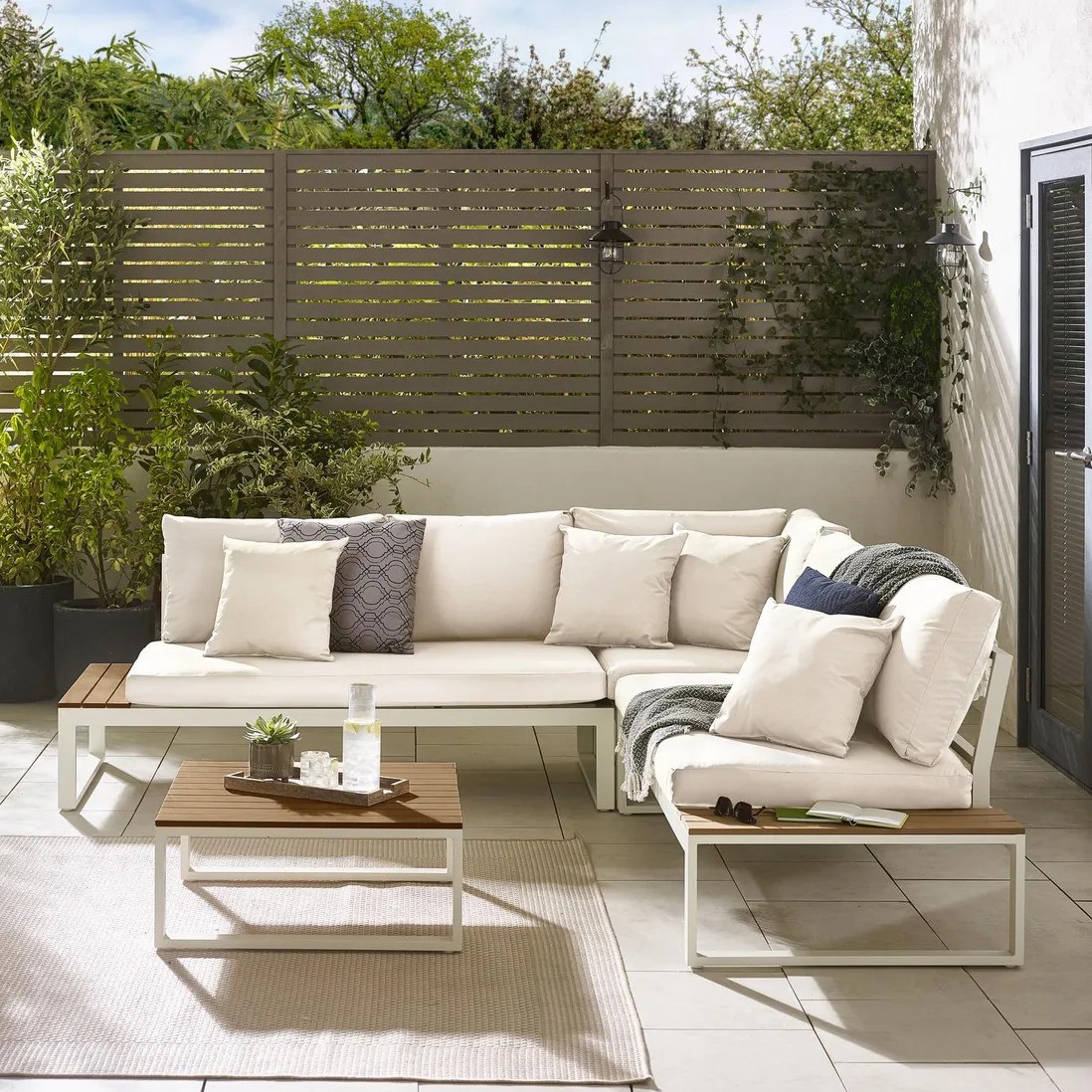 I'm a Homes Editor with expensive taste, but Debenhams just made me do a double-take with this bargain designer-look outdoor sofa
This is the last place I thought I'd find my dream outdoor sofa
By Rebecca Knight
-
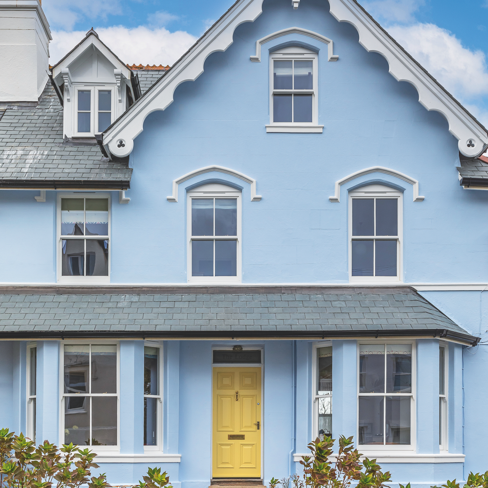 15 ways to add kerb appeal to your home – experts share what really works for a stylish first impression
Make your home's exterior pop with these ideas
By Jenny McFarlane
-
 Aldi is selling a robot lawn mower for under £200 - it's one of the cheapest on the market
I never thought I'd see 'Aldi' and 'robot mower' in the same sentence...
By Kezia Reynolds